Saturday, April 14, 2012

MARK ENGLISH

Eddie Bauer catalog cover, 1982

The career of famed illustrator Mark English can be divided into three phases.

His first job was picking cotton in the fields around Hubbard Texas for $1.50 per day.  There were no museums or art galleries in Hubbard, but one day English saw a picture on a sign in a store window saying "Welcome Rodeo Fans."  He escaped the cotton fields by teaching himself to paint those signs and earned a living chasing rodeos around the Texas countryside.  After being drafted into the Army he was able to put his experience to work lettering signs for latrines.

In the second phase he became a nationally renowned illustrator who received more awards from the Society of Illustrators than any other illustrator.

English's beautifully sensitive portrait of Dracula

Victorian Interior


In the third phase he became a fine artist, selling his artwork in galleries. 


Right now, some of you are probably saying, "Hey wait-- go back to that part about going from painting latrine signs to being a nationally renown artist.  How the heck did he manage that?"


Well, studying at the Art Center in Los Angeles after he got out of the army surely had something to do with it, but when he was asked about his "biggest break in becoming a nationally known illustrator, " he responded:
[T]here was one job.  I had moved to Connecticut and in my first year there I made 20% of the salary that i had made in my last year.... It was a tough year and I had a lot of time on my hands.  I think not having much work enhanced my career more than anything else.  I spent a lot of time experimenting, trying to come up with something unique and different, and I think toward the end of that year I managed to do that on a job for the Readers Digest [for the book, Little Women]....I think that three or four of the illustrations were accepted into the Society's annual exhibition that year.  One of them won an award and got me a little attention.  After that I got into magazines and my career was launched.
English recalls that during that dry spell at the beginning, he went 8 months without getting a single assignment. His wife was worried and money became very tight but he didn't surrender. "I think [it was] the best thing that ever happened to me, but at the time I didn't think so." English studied Vuillard, Bonnard and other painters, and gradually developed a style that worked for him. "I don't think that I ever worked harder at anytime than I did during those eight months, trying to get better and be more competitive."

That, friends, is how you go from painting latrine signs to becoming a nationally renown illustrator.

Sunday, April 01, 2012

THE OTHER LESSON FROM THE SUPERMAN CHECK


Everyone knows the story of how two Cleveland boys, Jerry Siegel and Joe Shuster, created the character of Superman and, short of money, signed all their rights away to a corporation for $130.  That corporation went on to reap hundreds of millions of dollars from their creation while Siegel and Shuster went hungry.

The infamous check which purchased the rights to Superman is now being auctioned.  As of today the bidding stands at $36,000.


The check is one of those wonderful avatars that remind us how artists will always be prey to accountants on the food chain, and that the largest share of the profits will always go to those with the cunning to exploit someone else's creativity.

(It also reminds us why corporations should not have the legal rights of a natural person.  In the words of  Lord Chancellor Thurlow,  a corporation is not a person because it "has no soul to be damned, and no body to be kicked.")

 Lots of people (and also lots of lawyers) have spent years debating the lesson of the check for Superman.  In long drawn out court battles and press campaigns, the corporations that prospered from Superman have been shamed or pestered into making supplemental payments and concessions to the families of Siegel and Shuster (who seemed to have the typical artist's penchant for mishandling their affairs).

But today I am interested in the other lesson of the check for Superman.

It is difficult to place a value on art because art has no inherent value aside from the value created by its context.  A few years before selling the rights to Superman, the creators themselves placed little value on it; artist Joe Shuster burned pages of superman artwork because he couldn't find a single publisher willing to touch it.  Then, a few years after buying the rights to Superman, the new owner had to sue those same publishers to keep them from infringing on the now valuable idea.   What created the "value" in the art?

John Chipman Gray noted, "Dirt is only matter out of place," and the same point could be made about art.  What is important and valuable art in one context may be worthless as dirt in another.

Much of the art we talk about here is art "out of place"-- it is located in ads for dish washing detergent,  in faded magazines of fiction for housewives, or scratched on the wall of a hermit's basement apartment rather than hanging in a gold frame on a gallery wall.  Art out of place-- unrecognized, misunderstood or unappreciated-- seems to have very little meaning or value.

Rather than being cause for despair, this should serve as a reminder to keep our eyes (and minds) open.

The next time two boys down the block tell you they have invented a really cool superhero, don't wait for some grandee of the art world to transport their creation into its "proper" place before you are capable of seeing it.

Sunday, March 18, 2012

FRANKLIN McMAHON 1921-2012


Franklin McMahon, the last of the great illustrator-reporters, died last week at age 90.

McMahon worked in a bygone era when newspapers and news magazines relied on artists to add class and grace to the reportage of current events.  For 50 years, McMahon went everywhere and witnessed everything on behalf of news publications such as The New York Times, The Chicago Tribune, Look, Life, Time and Sports Illustrated.

His career as a reporter began in 1955, when McMahon covered the infamous Emmett Till murder trial for Life Magazine.

Emmett Till's aged uncle points a quavering finger at his nephew's murderers

He went on to cover the key events of the Civil Rights movement, the space program and numerous political campaigns.  Unlike a camera, McMahon prioritized the essential elements of his images and conveyed his impressions, adding an important dimension.


Pope John xxiii

The Vatican

McMahon recalled that he was hired by publications that were "confronted with mountains of material and a need to transcend the usual dreary recitation of facts and figures."  His role was to "heighten the emotional reaction to a printed piece and transmit the special flavor of a [subject]."


The Duomo, Milan

Detail of Duomo, above

His documentary artwork also added distinctive elements to annual reports and trade journals:
 

The day of the illustrator-reporter is now gone, just as the newspapers and news magazines where these pictures once appeared are in the process of disappearing.  Many of the professional photographers who replaced illustrator-reporters are being replaced by internet stock photos and amateur cell phone users.


But for many years, talented illustrators such as Franklin McMahon logged a lot of miles pursuing an important craft, making great sacrifices to do quality work.  The death of McMahon is a good time to remind ourselves of their contributions and honor their role. 

Sunday, March 11, 2012

ONE LOVELY DRAWING, part 40

Artists who can't draw have become emboldened by the excuse that traditional drawing skills are less relevant today.  The focus of art has shifted, we are told, from visual appearance to intellectual concept, making the technical skills of yesterday obsolete. 

I've had fun making unkind remarks about this fashion trend, not only because I find the drawing so bad but because the "concepts" that supposedly justify this trade off frequently turn out to be mewling platitudes.  Any artist who claims, "I'm so smart I don't have to draw well" better have more convincing evidence than the pop psychology that pervades so much of today's drawing. 

But every once in a while, some artist gets it right.  They shed the straightjacket of representational drawing while still preserving the important elements: a sensitive, meaningful line, a deep appreciation for form, a strong sense for design and composition.  And they use their freedom from realism to infuse their work with a conceptual profundity that was never witnessed in the golden age of illustration.

Exhibit A is this excellent drawing by John Cuneo:
   

This is a small drawing, about 8 inches tall.  We can tell from Cuneo's subtle treatment of color and line that this picture will require genuine attention if we are to understand what the artist is up to: 

Strange, mismatched eyes give this face a distinctive character

Cuneo recognizes that if you are going to reinvent the human form, it can't just be because you're too lazy to learn anatomy.    Here is an artist who has made an emotional investment in his variations.

There are a thousand ways one might draw a doll with a loose, casual line but it is extremely difficult to achieve the kind of unnerving distortions that frighten us in voodoo dolls and African totem figures.

A hilarious masterpiece of dehumanization

Below, Cuneo adds another layer of horror:


Note how subtly the artist diminishes the distinction between men and dogs by putting a business shirt on the dog in the corner.  At the same time, in the same corner, we are reminded that dogs are slobbering beasts:


That wonderfully drawn "slobbering beast" visually echoes a slobbering human beast on the left:


But this drawing is no simple polemic.  The slothful dog under the table in the background adds a very different (and important) flavor, as does the falling cup of coffee (I love that shadow).

It would be a mistake to go on vivisecting this brilliant little drawing, speculating about symbolism or second guessing the artist's intentions.  I have no idea how much of this drawing is conscious and how much is intuitive.  Cuneo steadfastly refuses to explain any of his drawings, and for good reason.  They are better than that.  

For me, this drawing is the visual equivalent of a Pinter play or a Kafka short story, every bit as profound and smart and funny.   I think it is work of enduring value.

Saturday, February 25, 2012

THE CARTOONIST'S REVENGE

Everyone knows what it takes to have a successful career.  A college education is essential.  A graduate degree is even better (preferably in a field such as technology, business or finance).   You have to dress for success, build a network of important contacts, and cultivate the  Seven Habits of Highly Effective People.  Language proficiency in Chinese wouldn't hurt.

But on the other hand, if you have none of these you might try sitting alone in a ratty T shirt and drawing doodles.  When you lack the necessary credentials, or even basic literacy, a simple line can still be The Great Equalizer.


Cartoonist Thomas Nast could scarcely read or write but he had a greater impact than all the lawyers, accountants,  famous writers and powerful government officials combined in bringing down the corrupt politicians who controlled New York.  Nast's drawings resonated with the public and knocked the Tweed politicians off their throne.  He also created many popular symbols, such as the Republican elephant and Democratic donkey, and influenced presidential elections.  (Nast's wife Sarah corrected the spelling in his captions).  Nast became so wealthy from his drawings that he was able to hire scholars to read to him from Shakespeare, Dickens, and Twain as he worked. 

David Low: the Nazis shovel more troops into Stalingrad

David Low was born in a small remote town in New Zealand.  He had little money, no contacts and left school at a young age.  Yet, the lines he drew had an impact on international relations.  Hitler was enraged by Low's biting drawings, and the Nazi government formally protested to the British government.  After the war, Winston Churchill protested that Low's cartoons about a politically sensitive situation should be censored for the sake of "western democracy." 

Albert Dorne, from the Famous Artists School materials

Albert Dorne never made it past 7th grade.  A sickly child, born in the most brutal poverty and squalor, he leveraged a knack for drawing into great wealth, prestige and influence.  Dorne went on to fill many roles, as the head of a multinational corporation, a lecturer, author and instructor.  He consorted with movie stars and senators.  But each step of the way it was his drawing that made everything possible.

The great Jeff MacNelly captures President Carter's dilemma

Jeff MacNelly dropped out of college but his brilliant drawings gave him influence with a huge audience that was the envy of career politicians and policy experts. When he won his first Pulitzer prize at age 25, MacNelly said he was hanging the certificate high on his wall to fool visitors into thinking it was a college degree.


In the last few years there have been several incidents where drawings of the prophet Muhammad have upset the balance of international relations, inspiring wild mobs to riot, kill, invade and burn down embassies.

 Cartoonists may not be paid the way investment bankers are paid.  They don't get preferential treatment in fancy restaurants the way movie stars do, or command armies the way political leaders do.  They mostly dress like slobs.   But in their ability to make a line on paper, they still have the means to shake up the world.

Tuesday, February 14, 2012

Saturday, January 28, 2012

ONE LOVELY DRAWING, part 39

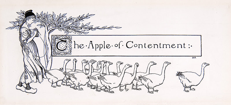
Howard Pyle illustrated more than 125 books. 

Of those books, he wrote 24 himself. 

Of those 24 books, one-- Pepper and Salt-- contained 90 of his illustrations.

Of those 90 illustrations, one was this small pen and ink headpiece of a girl with 17 geese:

Many thanks to Molly and Mary at the Delaware Art Museum for locating this drawing that I recalled seeing there 20 years ago.

The first thing you notice about these 17 geese is that Pyle treated each one differently, with its own angle or stance or personality.  Each has its own dignity: 


There are no stray lines to suggest geese in the background that Pyle didn't feel like drawing completely.  No Photoshop.  No photocopiers.

Charles Dickens wrote:
I should never have made my success in life if I had been shy of taking pains, or if I had not bestowed upon the least thing I have ever undertaken exactly the same attention and care that I have bestowed upon the greatest.

Tuesday, January 24, 2012

BEFORE BOB PEAK WENT HOLLYWOOD

Illustrator Bob Peak was probably best known for his movie posters.  As far as I am concerned, that's unfortunate. 

James Bond: The Spy Who Loved Me

Peak has been described as "The Father of the Modern Hollywood Movie Poster."  He created over 100 movie posters, including significant posters for blockbusters such as Apocalypse Now, Superman and the Star Trek movies.

Star Trek
Personally I find much of his movie work artistically disappointing.  Opinions will differ of course, but to me these posters often seemed formulaic and uninspired.  Worst of all, Peak-- or his Hollywood clients-- became enamored with a "diamond diffraction" gimmick which I find totally cheesy.


I thought about this recently when I visited the archives of the legendary Famous Artists School and came upon a lovely, neglected collection of drawings that Peak used for teaching in the early years, before he went Hollywood.  I think these simple drawings have more enduring value than Peak's movie posters:


These drawings have originality and sensitivity, but most of all they have a truthfulness about them.  Such qualities give humble drawings a strength and stateliness that outweigh all the budget and muscle of a Hollywood extravaganza.


Man, that's drawing!


These drawings have not had the same worldwide audience as the movie posters-- for the most part, they have only benefitted art students who pass through the Famous Artists School training-- but as far as I am concerned they are more inspirational and instructive than the movie posters for which Peak is so well known. 

Saturday, January 14, 2012

HOWARD PYLE'S WEEKLY DRAWING SESSIONS

All images courtesy of the Delaware Art Museum

Howard Pyle, the father of modern illustration and one of America's most important painters, died just over a century ago.  To commemorate the anniversary of his death, the Delaware Art Museum mounted a splendid centennial exhibition reminding us of Pyle's contribution.  (You can find information on the show here and here.)

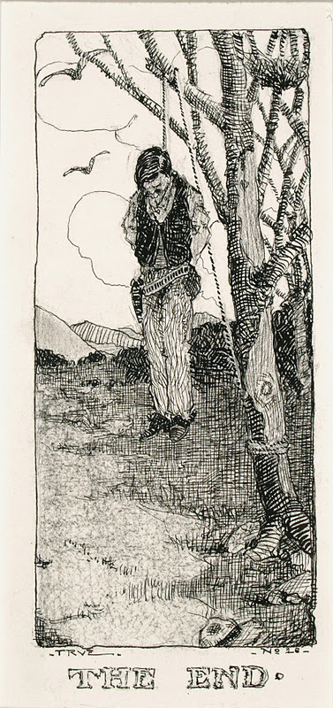
Eight years before he died, Pyle asked his art students to sketch their own concept of "The End."  The Delaware show includes a selection of those drawings:
In 1903, Howard Pyle and his students gathered for weekly drawing sessions, in which Pyle assigned a subject for everyone to sketch. On the evening of March 25, 1903... sixteen members of the class created sketches of "The End."
Sitting around that room was a charmed circle of young talent.  Pyle had received nearly 100 applications for every opening in his school that year.  Students such as N.C. WyethFrank Schoonover, Stanley Arthurs, William Aylward, and Harry Everett Townsend were at the beginning of what would turn out to be brilliant careers.  But on that day in 1903 they had no idea of what lay in store for them, or what  their own "End" might be.

Death would catch up with Pyle unexpectedly during a trip to Italy with his family.  Who would have guessed that this most American of artists was destined to be buried in a foreign land?

It is hardly surprising that the future nautical painter W.J. Aylward chose a sinking ship for his theme.
 

Fifteen years later, Aylward would find himself on a ship steaming toward World War I as an artist for the Armed Expeditionary Forces (along with his fellow student Townsend).  Passing through the enemy submarine zones with their constant alarms, Aylward had plenty of time to meditate on his choice of an end.

N.C. Wyeth's idea was to draw a man who succumbed to the cold:


Wyeth had a fertile imagination but even he could never have predicted that 42 years later, after a long and fruitful career, he would meet his own fate in a car stalled on the railroad tracks, with his helpless  grandchild trapped by his side.

Another student in that room, Frank Schoonover, outlasted all his comrades.  He met his end peacefully in the 1970s at the age of 95.  He lived long enough to see the empire of modern illustration that arose from such humble origins, and to lecture to the public about those early days at the Pyle school. 

Henry Jarvis Peck envisioned a prisoner's end:

Allen Tupper True, with his preference for western art, envisioned a cowboy hanging from a tree:


Samuel Palmer took a more whimsical approach, apparently viewing the End as the end of a circus performance:


Pyle's huge influence was due in part to the fact that his imagination and talent were perfectly suited for his moment in history.  Pyle worked in an era of change, when technology transformed the quality of mass reproduced pictures, and economics transformed the methods of delivering those pictures to the public.  His career began when a small handful of black and white journals such as Century and Scribners contained primitive wood engravings, and ended as dozens and dozens of color magazines were beginning to blossom with innovative illustrations and graphic design. 

Just as Gutenberg's invention of the printing press in 1440 led to the democratization of knowledge, these changes in the 19th century led to the democratization of art.

Pyle had the vision to hitch his great talent to the technological and economic changes of his day, but the Delaware museum show makes clear that the crucial ingredient for his success remained heart, rather than technology or economics.  In his excellent chapter in the Catalog accompanying the Delaware show, painter James Gurney quotes Pyle's students:
Thornton Oakley recalled "During three years with him he did not mention a word about materials, methods, mediums or techniques." Too much emphasis on technique, Pyle warned, would result in a kind of mannered overindulgence, where the means become more important than the message.
Instead, Gurney writes, for Pyle "the expression of an emotion or an idea was paramount."  Rather than instructing his students on the technical applications of the new photoengraving processes, he assigned them themes such as "Coming Home From the War" or "The End."  He told his students, "Project your mind into your subject until you actually live in it." He wanted them to be able to "smell the smoke" when painting a battle scene. "Throw your heart into the picture," he said, "and then jump in after it."

Then as now, improved delivery systems were not enough to change the world.  Pyle could never have been a major catalyst for the Cambrian explosion of modern illustration if his pictures had a less persuasive heart.