Saturday, April 20, 2019

WHAT DO THESE 70 ILLUSTRATIONS HAVE IN COMMON?


Dean Cornwell

Skidmore
James Montgomery Flagg
Pruett Carter

Gruger
Harrison Fisher


Charles Mitchell


Richard Flanagan


Answer: they were all in a typical issue of Cosmopolitan magazine in the 1920s.  (In this case, September 1923).

Tuesday, April 16, 2019

ONE LOVELY DRAWING, part 60

I love C.F. Payne's drawing of the great illustrator, Charles Dana Gibson.


One reason Payne draws so damn well is that he draws insatiably.  Within the confines of traditional drawing, he never stops looking and exploring.  He fills sketchbooks with drawings like this of artists, writers, actors and others who interest him.  Through trial and error he invents different techniques to achieve the results he wants.  Here he employed an unusual approach:

1. Start with a solid drawing. It can't be lightly drawn because it must have enough weight to handle the next phase. 
2. Roll acrylics thinned with water and ultra matte medium using a brayer. The ultra matte medium is what gives the added texture that allows the final phase to work so well. 
3. Draw with colored pencils, adding acrylic paints as desired for whatever look you want to create.

 Payne occasionally adds color with a palette knife incorporating acrylic gel medium to thicken it up for application.

Of course, the key (as with all things in life) is to "start with a solid drawing."  But looking at the edges of the drawing you can see what the brayer, matte medium and colored pencils contribute.  


His color combinations may seem unusual but the warmth of the colored pencil adds an organic feel to the cold gray/green midtones.


Subdermal warmth from an unorthodox colored pencil choice.
But most of all, I love the opinions in Payne's drawing.  These highly magnified details show Payne's editorial choices at work.


Saturday, April 06, 2019

MUSEUM OF ABSTRACT ART AND 1950s WOMEN'S HAIR

In the 1950s abstract expressionism was in full flower.


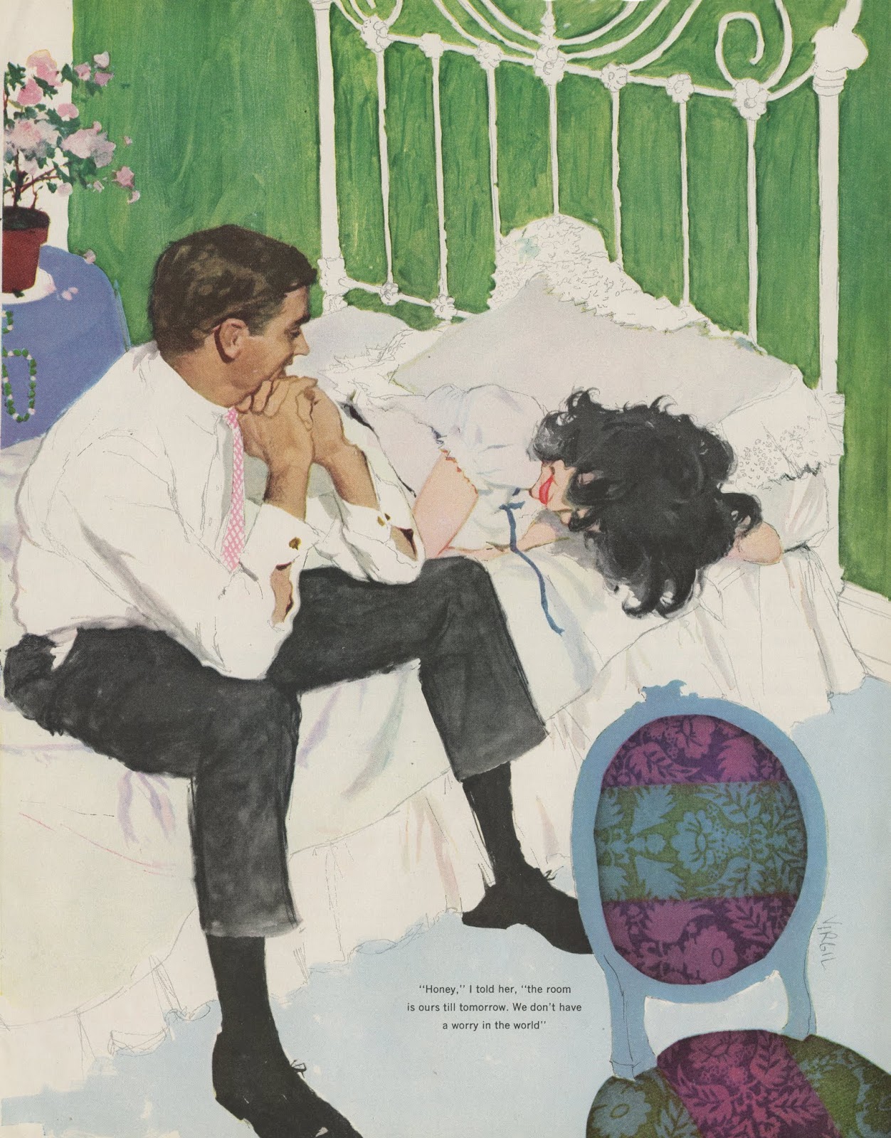
American magazine illustrations, on the other hand, remained fairly tight and realistic.  Yet, these representational illustrations often contained abstract flurries of brush strokes and color, frequently in the tousled hair of stylish women. 

Andy Virgil

Compare Coby Whitmore's treatment of hair...

Coby Whitmore
...with Willem de Kooning's abstraction:

de Kooning

In fact, flipping through the typical illustrations in women's magazines in the 1950s and 60s is like visiting a museum of abstract art: 

Joe de Mers

Virgil

Whitmore

Joe Bowler
The prevailing style, across a variety of illustrators,  was that skin and facial features remained sharply realistic but illustrators enjoyed an almost unlimited license for the treatment of hair.  

These artists were perfectly comfortable with the same abstract values that were the pride and joy of the abstract expressionists.  Illustrator Robert Fawcett wrote that he was amused by the "misconception that abstract qualities are new to contemporary painting, whereas they have been the comparison of excellence since painting began."

Whitmore

Walter Skor
Whitmore

de Mers

de Mers

Stan Klimley

Al Parker


de Mers

Whitmore

Saturday, March 09, 2019

LOOKING AT CLOUDS FROM BOTH SIDES

Before he became an illustrator, Harold Von Schmidt was a cowboy.  

He loved the old west: "I had a chance to be with the Indians, to take part in trail drives and get to know cattle and horses."  He also had long, long days to study the immense clouds hovering over the western landscape.  

Here are two very different ways he looked at those clouds: 

The first view used traditional tools of accurate painting, such as light, color and perspective to capture a likeness.


Illustration for the Saturday Evening Post

The second view forced every element of the landscape into either black or white.  No compromises.

Illustration of a goat herder watching a distant storm in Willa Cather's Death Comes for the Archbishop
You can bet when Von Schmidt was riding the range, he never saw clouds with thick black outlines. Here he has created a strange binary world by pushing the contrasts in the landscape to the far end of the spectrum.  Like the hot desert sun, he bleached out the nuances of color and shading.  He annihilated any fine lines that might be used to create the crutch of a half tone.  You'll find no wrinkles or folds shading that goat herder's cloak:


The drawing was done big and bold, with thick lines on a large illustration board nearly 28" wide.  Who draws like that anymore?

Both views of clouds capture their immense scale and majesty. The painting achieves it primarily through a likeness but the drawing achieves it more through abstraction. Welcome to the wonderful world of drawing. 

Abstract art is nothing new; the first abstract art was created when our first human ancestor drew the first line in the dirt with a stick.