Saturday, March 30, 2013

WARRING WITH TROLLS, part 3

"To live is to war with trolls." --Ibsen 

While researching my upcoming book on illustrator Bernie Fuchs, I was amused by the imitators who encircled his ankles wherever he went.

For example, Fuchs' groundbreaking illustration for Cointreau...
 

... was imitated by some of the top illustrators of the day:

Even Bob Peak tried a version of Bernie's approach

The Cointreau drawing was blatantly copied by illustrators as far away as Korea:


I love how this imitator re-purposed Fuchs' line for the woman's hair into a dotted coupon line.
The thefts became so ridiculous that Advertising Age magazine even sponsored a competition challenging readers to send in ads that copied the Cointreau drawing.  Fuchs never tried to do anything about it, just moved on to a different approach.

He got a lot of attention with this bold new illustration for McCalls in 1964: 


Among the artists "influenced" by Fuchs' picture was Aldo Luongo, who painted the following version and sold it as a limited edition print,  advertised heavily in fine art magazines:


When Fuchs changed directions, painting with a series of thin acrylic washes...

Fuchs

...illustrations by others in the same style began popping up a few months later:

Andy Virgil

I suspect the imitators who hurt the most were the capable illustrators who did not copy a specific image but just adopted the Fuchs "look."  They were the hardest to distinguish.  More than anyone else, these images diluted the the Fuchs "brand."  But he just kept changing the brand.

When Fuchs began painting bright yellow floors... 
...bright yellow became the flavor of the month for imitators such as this anonymous artist. 

Fuchs' agent used to become indignant when people called to compliment him on a new Fuchs illustration that turned out to be by an imitator.

But when I interviewed Fuchs before he died, he never mentioned it.  One good way to fight trolls is not to notice them. 


Saturday, March 23, 2013

THE BEST COLOR THEORY


In 1704, the great Isaac Newton wrote the first scientific treatise on color theory (the physics of color interaction).  Newton's color wheel began the transformation of color from the unsupported intuitions of artists to the science that it has become today.

Goethe's color wheel from 1810

Chevreul's color wheel from 1855

Today we recognize that our sensory impressions of ideal colors were unreliable.  Instead, we measure vibrational frequencies and map spectrum space, defining quality in quantitative terms.   The science of colorimetry and organizations such as the International Commission on Illumination to help us achieve the miracles that digital color accomplish today.

As Galileo said, "The book of nature is written in the language of mathematics."

Many great scientists have made valuable contributions to this growing body of knowledge.  But the most important and useful color theorist remains Elizabeth Barret Browning:
"Yes," I answered you last night;
"No," this morning, sir, I say.
Colors seen by candlelight
Will not look the same by day.


Wednesday, March 13, 2013

JAMES GALLAGHER

.

James Gallagher takes a few meaningless scraps of paper and combines them in strong visual statements.


Such materials would be disastrous in less capable hands:  blank pages from books and magazines in a dozen muted shades of tapioca.  Random stains or wrinkles, and an occasional stray bit of text.  Fragments of old photos clipped from anonymous publications.  Yet, Gallagher glues them together in a way that creates powerful compositions:  


He even manages to imbue these primitive materials with meaning, significance and mystery:


Gallagher says:
I collect my source materials from such places as recycled vintage books, sex manuals, clothing catalogs and anything else that can be folded into my world. With a combination of calculated moves, and unrehearsed accidents, my scraps find each other and solidify....  This spontaneous process often generates raw, emotional images that I feel excited and personally moved by. Ultimately I hope to capture something that feels natural (or unnatural) and then leave it up to the viewer to decide its significance.
Gallagher never needs to fret about whether a brush is genuine Kolinsky sable, or whether Strathmore bristol board takes ink quite as well as it once did.  The limitation of his materials rewards him with the gift of simplicity. 


I recently complained about the plague of photoshop collages that have infested the field of illustration, but in my view Gallagher does collage right.


Wednesday, March 06, 2013

WARRING WITH TROLLS, part 2

. 
 
"To live is to war with trolls"  --Henrik Ibsen

In my view, there was no better draftsman in 20th century illustration than the great Robert Fawcett.

Some might look at this drawing for Good Housekeeping and dismiss it as "typical boring 1950's photo referenced illustration."  (Oh, don't deny it-- you know who you are).


But let's take a closer look:


Up close, the drawing reveals an extraordinary array of marks on paper, from drybrush swirls to bold, virile stripes.  Who could squeeze more character into brushwork than Fawcett?

Look over here and you'll see Fawcett's trees, like exploding miniature constellations:

 
Always, design was paramount for Fawcett.  Compare his trees above with the following "fine art" painting by the famed Adolph Gottlieb, a contemporary of Fawcett's: 


Here are a few more trees in the background of Fawcett's drawing, each one crackling with its own distinctive energy:


And it ain't just trees, buddy.  Fawcett's opinionated brush aggressively sought out the rhythm and design in buildings, cars and other geometric shapes:


Many regard Fawcett's style as too tightly controlled for today's taste.  But at the atomic level his pictures seem wilder and more abstract to me than the work of many contemporary artists who consider themselves free because they draw loosely and don't use photographs.  

For me, Fawcett is a more serious anarchist than the artist who gives himself permission to draw sloppy. 


Which brings me to the "warring with trolls" portion of this post: 

Much of the special character of Fawcett's picture was never seen or appreciated by the public because it was shrunk and mutilated by some clueless art director at Good Housekeeping: 

Good Housekeeping attempts to go trendy

To his credit, Fawcett persisted despite the fact that his work was not always understood by clients and advertisers flailing around for the latest fashion.  It took Fawcett longer to achieve the kind of result he wanted, and he knew it might not be appreciated in the end, but apparently he did not find it to be a waste of time.

He held fast in the long war with trolls.  For that reason alone, he deserves our respect.

(Thanks to Illustration House gallery for the use of their original Fawcett illustration.)


Thursday, February 28, 2013

THE CHURCH DRAWINGS OF JOHN HENDRIX


Illustrator John Hendrix draws in church.  Over the years, he has has compiled an impressive collection of church sketchbooks, many of which he has posted on his web site.  Writes Hendrix:
I attend church every Sunday, and I draw during the sermon. All of these pages were done in a pew....  Simultaneous drawing and listening transforms familiar language into something new- a feedback loop of symbols, theology and wonder.


Paul Klee said, "Drawing is taking a line for a walk."  In a sketchbook, sometimes the line takes you for a walk.

When it does, it can take you to lands where client specifications rarely go.  Hendrix notes:
Drawing in my sketchbook is the very best part of my work. I love it because it is linear improvisation. Much like jazz, it is unpredictable, exciting and unfiltered.
But there's another reason I especially like Hendrix's sketchbooks.  Perhaps because of the soundtrack, his drawings often muse over great big subjects:  


In the words of William Blake, 
Great things are done when men and mountains meet;
This is not done by jostling in the street.
I have a special fondness in my heart for pictures that attempt big, unfashionable subjects-- life and death, injustice, war and peace. 


Artists illustrating "the place where men and mountains meet" frequently lapse into pretentiousness and melodrama, but Hendrix's sketchbooks avoid that pitfall.  His sketchbooks are not dense, linear philosophical treatises.  As a result of his stream-of-consciousness approach, cosmic words and symbols weave in and out of his designs in a light and elegant dance.  Definitely worth a look.


Friday, February 22, 2013

DELAWARE EXHIBITION: MORT DRUCKER


This post is the last in a series on the artists featured in the exhibition at the Delaware Art Museum,  State of the Art: Illustration 100 Years After Howard Pyle. 

Comic strips were still new when Howard Pyle passed away.  In the century that followed, comic strips evolved into a major part of modern illustration.  Comic books, graphic novels, webcomix and other forms of sequential art now attract serious art reviews and win cultural prizes.

So when it came to selecting a living artist to represent sequential art in the Delaware Art Museum show, there was no shortage of artists to choose from.  There are sequential artists who are innovative designers or Pulitzer prize winners or web pioneers, there are sequential artists who have written poignant personal memoirs or witty observations of the human condition.  But ultimately, for me the choice became easy.  If we focus on the actual drawing (whether with pen or stylus),  I don't know of any current sequential artist to compare with the remarkable Mort Drucker, whose 50 year career drawing parodies for MAD and covers for TIME is an astonishing accomplishment.


Drucker's uncanny ability to capture a likeness from any angle, in any lighting, with any facial expression, is enough to make him a legend in the industry.


Furthermore, the high standards that he maintained, decade after prolific decade, drawing with fresh enthusiasm and humor, is an example to us all.
  

But mostly, I am damn impressed with the drawing of it all-- how Drucker designed and constructed thousands of panels, the distinctive style with which his eyes and fingers embraced his subject, his sensitive, descriptive line which could be so exhausting in some panels and yet so incisive and selective when necessary.


Because some "high art" types tend to look down on MAD as slapstick, I wondered how some of the more serious gallery painters in the exhibition would react to Drucker's inclusion. But when I spoke with Phil Hale, whose large and powerful oil paintings are the opposite of slapstick, he responded "when I was younger, my dream was to work for MAD, alongside Mort Drucker."


These and other original works by Drucker are on display at the exhibition.

Monday, February 18, 2013

DELAWARE EXHIBITION: JOHN CUNEO

This post is one in a series on the artists featured in the exhibition at the Delaware Art Museum,  State of the Art: Illustration 100 Years After Howard Pyle. 


One of the major themes of the Delaware Art Exhibition is that technological innovations of the past century have enhanced the expressive power of illustration.  Even museum visitors who loved traditional oil paintings by Howard Pyle or N.C. Wyeth stood transfixed in front of video screens where Finding Nemo, Wall-E and Ice Age movies played.  The sound, the movement, the changing facial expressions and the glowing colors from an LED screen had a gravitational pull that made it difficult for traditional pictures to compete.

That's why it was important for the exhibit to demonstrate that even the simplest, most ancient media could still produce pictures as powerful as any in the show.  For this purpose, I chose the work of John Cuneo.  The newest annual from the Society of Illustrators, which documents Cuneo's Hamilton King award for the best picture of the year, says this about his work:

Using the most delicate materials-- a tremulous little line like a spider's filament and a few dabs of water color-- John Cuneo creates drawings with the atomic weight of weapons-grade plutonium.
Take for example this devastating drawing of a poacher: 


The poacher placing the horn on his head is an inspired way to symbolize the regal and priapic delusions of the man and his loathsome species;  the grin as he proudly shows off his new hat to the audience, his sagging face, the stoicism of the mutilated beast...


Note the marvelous jagged teeth on the saw

...none of these lines come from a template or anatomy book.  They are all invented fresh, with a chilling effect.  This is a beautifully orchestrated drawing.

Another example of Cuneo's dark and trenchant humor:


I like the way Cuneo's intelligence is integrated into his line, and does not coexist side by side in separate categories of picture and text (as too often happens today).  These are not diagrams or symbols, they are not linear messages that can be read like a sentence, they are organic creations which thwart our ability to dissect them with words.  But I think they are terrific, thoughtful drawings.


These and other original works by Cuneo are on display at the exhibition.

Thursday, February 14, 2013

Tuesday, February 12, 2013

DELAWARE EXHIBITION: STERLING HUNDLEY

This post is one in a series on the artists featured in the exhibition at the Delaware Art Museum,  State of the Art: Illustration 100 Years After Howard Pyle. 

Sterling Hundley built a strong following at a young age, winning multiple gold and silver medals from the Society of Illustrators for his work in magazines such as Rolling Stone, the New Yorker, The Atlantic, and Entertainment Weekly.


Hundley likes to employ a creative friction between contrasting elements.  For example, he combines traditional, representational narrative illustration with conceptual design.  In this illustration he uses the rules of anatomy and perspective to create the illusion of three dimensional space...

Illustration of the inaugural address of President Harrison who spoke too long in bad weather, caught pneumonia and died. 
... but he also uses the design to symbolize editorial content.  Viewed vertically, the above illustration of President Harrison is the president standing at a podium.  Viewed horizontally it reveals President Harrison lying in his coffin.  The faces in the audience slip back and forth between well wishers and skeletons:


 Similarly, in this poster for the musical, Hair (in which a hippie joins the army) the top half of the picture with the hair employs psychedelic lettering and rainbow colors, while the bottom half employs uniform military lettering and olive drab colors.


Just as Hundley attempts to combine narrative illustration and conceptual design, he also attempts to bridge the gap between what he calls "blue collar" and "white collar" art, as well as the gap between digital and traditional media.  He has painted "fine" art for galleries as well as illustration for publications.  The tension between these contrasting ingredients seems to inspire much of Hundley's work.

Hundley works from a throrough knowledge of the classical traditions in illustration, which reveals itself in his pictures.  I especially like the way he combines old fashioned romantic themes with a modern style of presentation.   

These and other original works by Hundley are on display at the exhibition.

Saturday, February 02, 2013

DELAWARE EXHIBITION: RALPH EGGLESTON

This post is one in a series on the artists featured in the upcoming exhibition at the Delaware Art Museum,  State of the Art: Illustration 100 Years After Howard Pyle. 


Digital animation is one of the most important aspects of modern illustration, but it was difficult to identify a single artist to represent this rich and burgeoning field in the Delaware show.  A feature animated film requires a group effort, combining the skills of hundreds of artists, sculptors, writers, computer scientists and electrical engineers, so it was a challenge to isolate an individual artist whose imprint made a conspicuous difference.

Ralph Eggleston, production designer and art director for some of the greatest films from Pixar Animation Studios, didn't make my search any easier by insisting that his own work on films such as Toy Story, Finding Nemo and Wall-E was one small part of a team effort, combined with "many talented artists and film makers at Pixar who continually challenge and inspire me...."

Some of the pioneering artists of digital animation have now taken management jobs, but the Delaware exhibition is not an exhibition of business executives, it is restricted to artists who retain the eyes and fingers to craft images of enduring value.  Eggleston frequently works in digital media but adds,  "I thoroughly enjoy working in traditional media like gouache, oil, chalk and pastel."

Pastel concept drawing for Finding Nemo

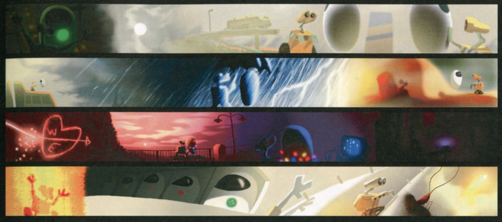
The scope, duration and movement of a digitally animated film present Eggleston with a very different set of artistic challenges than those facing great illustrators of the past.  One hundred years ago, illustrators painted a single image on canvas, illustrating a single moment from a story.  In his "color scripts" below, Eggleston plans the movement of color and mood and the change of scene throughout the movie Wall-E:


Howard Pyle would have been astounded by this art form and its tools.  Yet, at its heart, animation requires the same aesthetic concepts-- design, composition, balance, harmony, contrast, proportion, variety-- that Howard Pyle applied to his oil paintings. This continuity between old and new masters points us to the most important elements of picture making.

In his statement for the show, Eggleston included this insight on his role as an animation artist:
Pretty pictures are nice.  But a good idea-- clearly communicated to an audience-- is my focus.  In doing my artwork, the element of time is foremost in my thoughts... I approach visuals with the idea of burning into the audiences's retina as much information as is needed as clearly and quickly as I can so they can focus on the characters and the emotional content of the story they are being told.
These and other original works by Eggleston, as well as film clips from Finding Nemo and Wall-E, will be on display at the Delaware exhibition.