Monday, May 19, 2014

THEY'RE CLOSING MAX'S ART SUPPLY STORE


What causes artists to gather in one location or another?

How did Athens in the 4th century BCE become a center of cultural activity?  What made Florence so appealing to artists in 15th century Italy?  What brought artists to Paris or St. Petersburg in the 19th century, and why did so many artists gravitate to fin de siecle Vienna to sip from the "Sacred Spring"?  Was it because of the quality of the light in these locations?  The economic opportunity?  Pixie dust in the tapwater?

Whatever the secret ingredient, it similarly lured hundreds of artists-- mostly cartoonists and illustrators-- to Westport, Connecticut.

Westport was an artist's community for much of the 20th century but it became the supernova of American illustration in the "Madmen" era of the 1950s and 60s. Lights blazed all night long in art studios around Westport where some of the hottest and most talented illustrators and cartoonists in the world worked long hours to satisfy the great demand for their art.  It was not uncommon for an artist to climb into his (yes, almost always "his") fancy sports car at two in the morning to visit another artist's studio where they drank, compared notes and worked until dawn.

Westport became the home of the Famous Artists School where illustrators such as Norman Rockwell,  Albert Dorne, Stevan Dohanos, Robert Fawcett, Ben Stahl, Harold Von Schmidt, Al Parker, Austin Briggs, Jon Whitcomb, Peter Helck, Fred Ludekens, and later Bernie Fuchs and Bob Peak performed a consulting role. 

Art director Howard Munce, another resident of Westport, proudly wrote about his town:
Records show that at least 160 illustrators have lived and worked here. In the 1940s an influx of cartoonists from the Disney Studios migrated here, as did other illustrators from Chicago, Detroit and Cleveland. Later, the Famous Artists School brought a group of young artists to act as instructors.
Westport was also the home of Walt Reed, founder of the modern discipline of illustration art history.  Unlike other public libraries, the Westport Public Library offered massive filing cabinets of reference pictures for illustrators and cartoonists to use in their assignments.

And of course Westport also had Max's Art Supplies, the local art shop that sold the raw materials for those fabulous pictures, beginning in 1956.

Some of Max's famous clientele, 1981

Some of Max's famous clientele, 2006


Some of the talented artists who lived or worked in the Westport area included:

John Held, Jr.
Rose O'neill
Arthur Dove
Everett Shinn
William Glackens
Paul Cadmus
Henry Raleigh
Leonard Starr
Albert Dorne
Harold von Schmidt
Kerr Eby
Guy Pene du Bois
Leland Gustavson
Ben Stahl
Steven Dohanos
Tom Lovell
Al Parker
Austin Briggs
Robert Fawcett
Bernie Fuchs
Stan Drake
Fred Otnes
Mark English
Whitney Darrow
Robert G. Harris
Mel Casson
Alex Raymond
Randall Enos
Jim Sharpe
Ward Brackett

The creative energy and talent that these artists and their peers poured into thousands of pictures for all the top accounts was truly astounding-- the challenges, the craftsmanship, the fierce competitions, the innovations.  This was a remarkable site.  And now the moving finger, having writ, moves on.

When Bernie Fuchs died in 2009 I was contacted by a young reporter working for the Westport newspaper, looking for background information for an obituary.  As I described Bernie's era the reporter said, "Oh, yeah... I remember now.  Somebody once said that some artists lived around here."

In the salad days: Fuchs with Porsche, beautiful wife and large home with studio.


And today we received the word that Max's Art Supplies is closing for good.


Monday, May 05, 2014

STYLE


Where does style come from?

Frederick Taubes (who was a real smart guy) wrote that an artist's personal style "seems to stem from geography, climate, diet and other factors."  Some people speculate that "other factors" might include eye disease.

Others suggest that that stylistic distortions might be an artist's way of covering up for technical weaknesses.  For example, illustrator Seymour Chwast, who draws with a flat, simplified style,  stated that he avoids pictures "that require craftsmanship and a drawing ability that I do not have."  Illustrator Edward  Sorel, famous for drawing with loose swirls, said “I have never had the confidence that I could draw.... To me, a person with drawing skill is a guy who can sit down to a piece of paper and draw upon his familiarity with the body and with gesture, and do whatever he wants to do...”

But ahhh, when an artist possesses the skill to "do whatever he wants to do,” and  uses that skill to develop a personal style out of strength rather than weakness, the result can be a joy to behold.  It becomes a full throated expression of the artist's personal reaction to the world's forms and colors. 

Which brings me to Carter Goodrich.

Goodrich is one of those artists with the formidable drawing skill to do whatever he wants. The following Forbes cover from 1989, an illustration of Europeans courting the Russian bear...


...shows that Goodrich not only understands anatomy, facial expressions and body language (what Sorel called "gesture") but also that he has that rare and wonderful ability to spin his knowledge into all kinds of imaginative scenarios.  Does he need to take a revealing human facial expression and posture, put them on a huge shaggy bear and dress her up in a fancy gown (complete with ursine cleavage)?  Not a problem.

Note the marvelous spread of her haunches-- a masterful touch, one that would escape a less imaginative artist.

Unlike many artists with great technical skill, Goodrich never seems to have been tempted to waste his abilities on hard realism.  Instead, he knew to follow his imagination and his powers of observation into a distinctive personal style.    His wide faces, exaggerated bodies and distinctive palette have made his work instantly recognizable to readers of the New Yorker:


More of Goodrich's delicious style is displayed in this illustration from The Emperor's New Clothes:

Weird hairdos and faces, extravagant gestures and bizarre fabrics all given credibility by excellent drawing.


Goodrich is such a master of visual story telling, he is free to take liberties with accuracy: 


In the following detail, note how Goodrich conveys speed with just the direction of those pencil strokes in the shadow of the hockey player, or how the white trail of that one skate dramatizes the ominous, searching approach,  or how Goodrich directs our attention to that puck by engineering the highest contrast spot in the picture (a dense black shape framed in a white window) or how effectively he uses that foreshortened purple hockey stick to establish the spatial relationship with the goalie.  Brilliant.


Contrast how the lines under the player show directional speed while the lines surrounding the puck-- both horizontal and vertical-- do not.  You wouldn't notice such tiny touches in the printed version, yet their effect would be unmistakeable.

With such a rich assortment of tools at his disposal, Goodrich doesn't need to worry about drawing that front skate accurately in order to be understood.  He has the freedom to play games with the foot (exaggerate it or draw it like a tiny stump) with no risk of confusing anyone.  Similarly, he can disconnect that pelvis and make the skater look like a sack of bowling balls hurtling down the ice.  The audience still gets it because Goodrich maintains such exquisite control over the image in other respects.

You can't just take such liberties; if your style is genuine you have to earn them.

Goodrich has not only earned his freedom, he knows how to put it to good use.


Wednesday, April 30, 2014

DEAN CORNWELL PAINTS A NEWSPAPER

 The following design was created by renowned international artist Jean Arp, a pioneer of abstract art and one of the founders of Dada:


The next design was created by illustrator Dean Cornwell:


So was this one:
 

And this one:


 Unlike Arp,  Cornwell put his designs to use in order to achieve something addiitonal:

Original from the Kelly collection of American illustration.  
Note the first design in the crook of the man's elbow


In my view,  Cornwell's abstract designs are at least equal to Arp's, yet Arp is celebrated in museums around the world, while Cornwell is not.  The reason for Arp's fame is not so much the appearance of his designs but the concepts behind them.  As the Museum of Modern Art explains, Arp's designs were  part of "a search both for the absolute and also for a new order, following the disorder and chaos of war."  Cornwell's designs, on the other hand,  were mere illustrations of some potboiler about a sobbing dame.

How should we compare the two artists?

Cornwell's art was able to communicate with multiple audiences at multiple levels, both high and low.  Many of today's critics turn up their noses at art that is accessible to "low" audiences; they tend to rate such work at the lowest of those levels.  Yet, Shakespeare kept the uneducated crowds titillated with violent melodramas and overheated romances, while simultaneously employing some of the most lovely and elegant prose the world has ever seen.

As for Arp, his claim to "search both for the absolute and also for a new order" may gain him access to certain social venues, but does anyone over the age of 21 seriously believe his designs contribute useful insight to these philosophical problems?

Illustrator Bernie Fuchs referred to this painting as "the picture of the guy with the newspaper."  It apparently escaped his attention that the subject of the picture was a young woman breaking down in tears in an office before two officials.  But then, it really doesn't matter. What interested Fuchs was the way Cornwell flattened the shape of the newspaper to create an important abstract compositional element with rich colors unrelated to the form, then highlighted it with a graceful white swoosh.  That swoosh serves two purposes:  an insightful representational feature that restores three dimensionally and  a compelling abstract shape.


I've been to a lot of museums, but I've never seen anything by Arp that I like as much as Dean Cornwell's newspaper.

Monday, April 07, 2014

THE BILLION MISSING ART WORLDS


Last month's remarkable discoveries about the big bang have all right-thinking people pondering the impact of this news on illustration art.

from Scientific American

At the moment of the big bang, the universe exploded into two kinds of particles: matter and anti-matter.  For each particle of matter there was a corresponding particle of anti-matter.  As soon as the two particles touched, they annihilated each other.

Thus, in one huge cosmic conflagration matter nearly crackled out of existence.  Anti-electrons canceled out electrons.  Anti-neutrons cancelled out neutrons.

If the number of matter and anti-matter particles had been equal, there would be no matter left anywhere in the universe.   However, scientists calculate that for every billion pairs of matter and antimatter particles, there was one extra particle of matter left over.  That tiny imbalance is why any matter remains today (Scientists at the Stanford linear accelerator note, "to that particle we and the stars owe our existence).

Art owes its existence to that particle too.  All the art that we have ever known is merely leftovers. A billion times more potential art vaporized at the moment of creation.  This raises many profound questions.  For example: why was the comic strip Nancy spared?


And did the particles that would later become Jeff Koons re-emerge from the inferno unintentionally, like some sort of cosmic acid reflux?

Jeff Koons, "Waterfall Couple"

And performance art-- are we sure that isn't really anti-matter in disguise?

But most of all, this presents an opportunity to reflect on the potential worlds of art that vanished as the universe came into being.  Alien arts of epic greatness,  evanescent shapes with evolving meanings,  images sculpted of pure light...  a billion times more  art than we have ever experienced, and a billion times different.

Of course, some things could never ever happen, even in a billion alternative art worlds, such as rapidograph pens that don't clog.  But  here are a few suggestions for what might have been lost in the instant that followed creation:

1.  Access to the absolute:  Our one billionth particle of matter left us with a physical universe which severely limits the characteristics of our art, such as its size or color or permanence.  If an artist wants to convey something absolute or universal, such as making a mark that is totally dark or infinitely long, the artist's only recourse is to imply those characteristics using symbols or suggestions.  (For example, artists create the illusion of an infinite mark by making a short mark on a relatively small piece of paper.)  We are similarly limited to the colors on the light spectrum that our eyes can see, or the sounds our ears can hear.  Like a composer confined to the notes of the scale,  we can only work our way up so high before we must circle back down again.

I don't know about you, but I am pretty convinced that one of the alternative realities that died at the birth of the universe would have enabled us to slip these limitations. So much of the effort of art involves developing persuasive ways to lie about the things that are physically unattainable.  If matter had formed differently, in a way to make them attainable, it would certainly have put our conceptual side to the test.

 2. Healing the rift: Our world evolved with a gap between human consciousness and the surrounding physical world.  As a result, our art has always been split: we live with vexing dichotomies we cannot resolve, such as the fissure between perception and reality, between form and content, between mind and body, even between faith and reason.  This schism runs right through the middle of our culture, and perhaps it is part of the reason we struggle to make art.  But I'll bet we wouldn't have to struggle so damn hard if a different set of particles had survived the big bang.

3. Coming home: Last of all (and this could be the biggie) art might be more enriching and meaningful if it was integrated into our lives the way the bower bird decorates its nest with artistic ingredients.  Instead, art for us is mostly something we perceive separately.  It is framed on a wall or presented on a stage.  We don't appreciate the design and colors of a Brillo box in the store until Andy Warhol places it on a pedestal at an art gallery.   Then we see it with new eyes, at least for a short time.  Art about love or sex or joy or hate always suffers if it is attempted during the lived experience.  Our art requires us to step back from the primacy of experience and apply various filters.  The particles that would have enabled us to bring art home into the moment of experience probably burned up at the beginning of the universe.

If you have any thoughts on what else we lost or how we might get it back, I'd be interested in hearing them.


Sunday, March 23, 2014

EXHIBITION OF WATTERSON AND THOMPSON ART


 Art critic Robert Hughes distinguished between two different aspects of a picture: the part "which can survive reproduction-- the story, the moral, the iconographic detail" and on the other hand "the authentic, expressive, incarnated touch of the artist."

If you want to appreciate the difference, go to the Billy Ireland Museum at Ohio State University to see their new exhibition of art from Bill Watterson's Calvin & Hobbes and Richard Thompson's  Cul de Sac.


I greatly admired these two strips when I first saw them reproduced in newspapers and compilations  but the original pictures on display in Ohio add a whole different dimension-- highs and lows of color and line well beyond the reproductive capability of the modern printing press;  preliminary pencil lines and mid-course changes which demonstrate the honest thinking of craftsmen at work; and most of all, the intimacy of what Hughes called "the incarnated touch of the artist."
  
Rather than reveal the secret tricks used to create the illusion of magic, these originals confirm that, indeed, the magic was true.
People have rightly bemoaned that history and economics have been unkind to the syndicated comic strip.  Newspaper circulation has dwindled, strips have shrunk to postage stamp size, and other more explosive forms of story telling have stolen away key audiences.  No wonder we are told that the medium can no longer attract Alex Raymonds and Walt Kellys.  But if you look at the diminutive originals on display at the Billy Ireland Museum, you'll see that artists who are good enough can prevail over such limitations.  Watterson and Thompson both simplified their images to the bare essentials.  They were also generous with their labor, not seeming to fret too much that nuances in color might not fully reproduce, or that a few delicate lines might drop out of the printed version.  

These two comic strips are my favorite strips of the past thirty years because of their marvelous drawing and imaginative themes.  But as I walked through the two adjacent galleries I was most overwhelmed by the incredible heart in this work.  I don't know how I missed it before... perhaps I had to see the originals to appreciate it fully.  But in my view, that's the single most important bond between the work of these two terrific artists.

 Big hearts are such a rare commodity these days, it's worth a trip to Ohio to witness the phenomenon for yourself.       

Thursday, March 13, 2014

CLARIFICATIONS


Last week's series on the importance of good drawing prompted the following observations from other web sites:
"Apatoff is always infuriating...."

"He seems to have a real bug up his behind.... "

"[F]or fuck’s sake."

"You don’t understand comics."
 

"cartooning isn’t drawing,"

"[Y]ou invariably write nonsense."
 

"Chris Ware’s comics... do not employ drawing.... "
Others might rest on their laurels at this point, but I have three additional clarifications to offer on the subject of good drawing:

1.  I do not equate good drawing with 1950s photo-realism.   Compare this excellent drawing by Picasso


with this terrible drawing from the Smithsonian Book of Comic Book Stories


Both drawings show distorted figures locked in an embrace.  Both employ bold, loose, rapid lines.  But in the first example, the distortions are compelled by expressive necessity while in the second, they result from technical ignorance.  Too many artists today think their technical ignorance is concealed simply because drawings are no longer expected to be realistic.  But viewers can still tell the difference.


2.  Technical skill can empower, not diminish,  imagination.  Look at John Cuneo's splendid drawing of an alligator excited by the arrival of his goldfish martini:


The subject matter is anything but realistic, yet it is obvious from special touches such as the alligator's excited little hands or his smiling eyes that Cuneo is a brilliant draftsman. 
 

 Last week I wrote about how Leonard Starr's ability to draw hands provided a separate stream of information, parallel to the text, which enhanced the expressive quality of the picture.  Cuneo's alligator hands won't be found in any anatomy book, yet note the great precision with which they were rendered.  A few fingers in different directions or a few of those seemingly casual lines moved to the left or the right would make the hands less perfect.

I think Cuneo is just about the most psychologically complex illustrator working today.  Look at the following detail from a different picture of an alligator, this one lolling with snakes and empty wine bottles on a living room floor. 


For those who argued last week that drawing is less important than the "emotional resonance" of the subject matter, consider how Cuneo's dark  imaginative content would be diminished if it were not accompanied by his great drawing skill.


3.  A drawing should not be excused from excellence merely because it is one panel in the service of a larger narrative.  Disney animator Preston Blair drew a hippo dancing in a ballet tutu for the movie Fantasia.  His sketches are not "realistic"--  you'll never find photo reference to show how the rolls of fat would hang from a hippo  prancing on her toes-- yet they are persuasive to us because Blair's drawing ability and his understanding of forms enabled him to project how a dancing hippo might operate in real life.  


These sketches are another wonderful example of how imagination is empowered by technical skill.

A number of commenters explained to me last week that the drawings inside those little panels in graphic novels should not be evaluated as "drawings" because they are merely in the service of some story.  It is the "larger narrative" I should be concerned about, not the qualities of some component.  But take another look at Blair's loving drawings of that hippo, which make up a far smaller part of Fantasia's narrative than a panel in a graphic novel.  Rather than impede the flow of the narrative, they insure that every ingredient contributes its own holistic excellence. If Blair had told his boss Walt Disney, "these individual drawings don't need to look good because they are in the service of a larger narrative," Disney would have fired his ass, and he would have been right to do so.   


Monday, March 03, 2014

THE LOST VOCABULARY OF VISUAL STORYTELLING, day 4

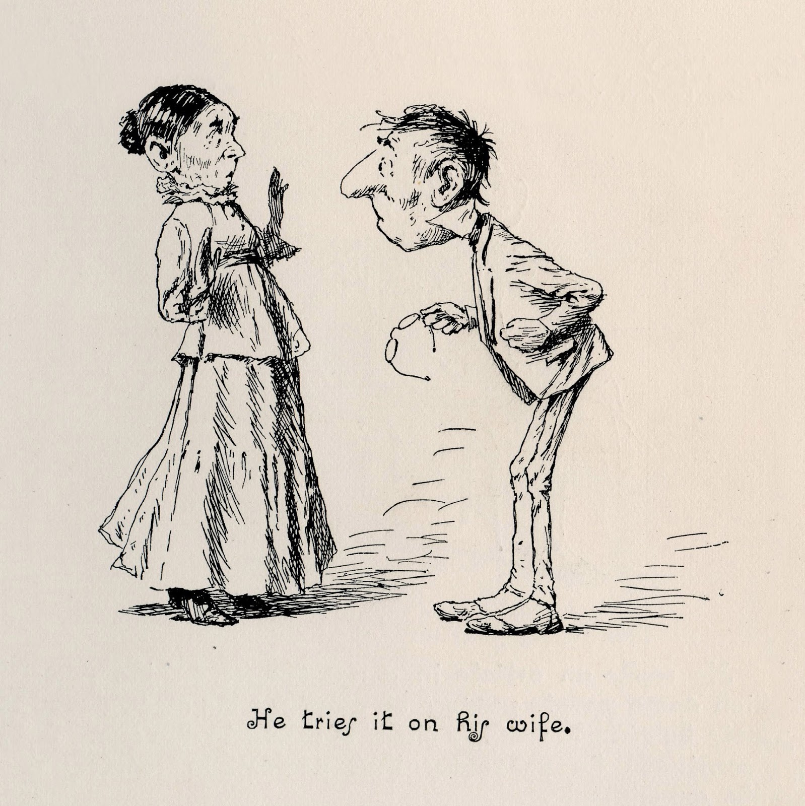
A few years ago I wrote about how the great A.B. Frost made use of the gaps between his sequential drawings.

In the following drawing, a man decides to try hypnotism on his wife. 


The second picture skips over her reaction and goes directly to the end result:


Frost implies the action, then leaves it to our imagination to fill in the blanks.  By involving us in the picture, he can make a humble little pen and ink drawing potentially boundless. 

This pacing of the images is another aspect of what I'd call the vocabulary of visual storytelling.

Like Frost, Leonard Starr sometimes chose not to depict the fateful blow, as in the following strip, where a character circles back to get two agents who have been pursuing the heroine.   Starr makes dramatic use of the empty space between his images.

"I convinced them that we were quite another thing..."
 Another well spaced strip, employing the same device :

"It seems to be clear now...."  If anyone knows the whereabouts of this original, I'd be interested in hearing from you.
There are many other ways in which the timing of sequential drawings can be handled effectively or ineffectually.


 But recently, popular notions about the pacing of sequential drawings have changed.  We see sequential drawing that is intended, as one commenter has said, to be "underplayed, understated, deadpan."  Rather than razor sharp timing and theatrical punchlines, we see time sequences stretched out to convey what has been called "bleak humor." This reflects a different set of artistic goals, but in my view those goals lack some of the elegance and power of the previous pacing.


Sunday, March 02, 2014

THE LOST VOCABULARY OF VISUAL STORYTELLING, day 3


In days 1 and 2 of this series, I tried to show examples of the visual language of drawing, which I think is absent from many of the comics currently embraced as "legitimate" art.  I've discussed the ability to notice revealing details such as hand gestures and facial expressions, the technical skill to capture them, and the ability to manage multiple elements interacting in complex ways. 

Before I go any further, I should emphasize that I am not talking about the mere ability to draw detailed, photographic pictures.  Details are just as likely to be a liability as an asset in a picture.  So it's time to talk about the importance of restraint in drawing.

In the following strip, Starr draws a conversation in the dark, between two silhouettes. 


You won't find any unnecessary details such as fingernails, buttons or folds, just flat geometric shapes until we arrive at the single expression that Starr needs: that eyebrow raised in doubt.   So the moon catches the character's face at that moment before returning to the shadows.


Artists with technical skills often find it hard to resist details, but there is no virtue in detail for its own sake.  Today we see many popular comics with highly detailed drawings that amount to little more than a calamitous blizzard of lines.  Unless an artist makes the choices necessary for prioritization, a drawing cannot cohere.


One reason I like Starr's drawings is his selective use of detail, his restraint of his great technical skill in the service of the picture.

Saturday, March 01, 2014

THE LOST VOCABULARY OF VISUAL STORYTELLING, day 2


Yesterday I suggested that contemporary comic art, for all of its new found legitimacy, often works with a more simplified set of visual tools.  So I'm spending a few days talking about what has been gained and what has been lost in this evolution, using some of Leonard Starr's drawings from the 1960s as examples. 

Today I'd like to offer a few examples of how Starr staged complex drawings.  Here is a scene involving the dynamics between three main characters who are rehearsing for a play:


Oh yeah, and here is a fourth guy, who has no name and is just a low level functionary:


Why in the world would Starr squeeze an unnecessary fourth character into the backgrounds of those cramped panels,  along with all that dialogue? 

It turns out that this anonymous character performs a very important function: he informs the reader, better than words might accomplish in this limited space, of what is going on.  The handsome star of the show is an abusive bully, and the role of this fourth character is just to stand around and cringe  and furrow his brow,  so readers understand who is behaving unreasonably:


In this way he performs the same function as a Greek chorus:  he has no individual identity in the play, but he provides a running commentary for the audience.

Most comic artists today would balk at trying to insert four speaking characters into such a small space.  Without the right storytelling skills It would be too dense and unmanageable.  But Starr manages to do it employing a tool kit of visual techniques that are largely unemployed today.

____________________________________

As long as we're looking at these pictures  I would like to add one postscript:

These drawings were published in a newspaper at a size approximately two inches tall.


The printing technology at the time was  nowhere close to what it is today, so much of the charm of the original drawings and the subtlety of the facial expressions was lost in translation.   Yet, the anonymous fourth character is drawn with more precision and care than the main character in almost any "realistic" newspaper strip today.  I consider that a mark of bygone craftsmanship.