Wednesday, December 08, 2021

POLITICAL CARTOONS part 3: Jack Davis

 Jack Davis is not known for his political cartoons, but I think they represented some of his finest work.

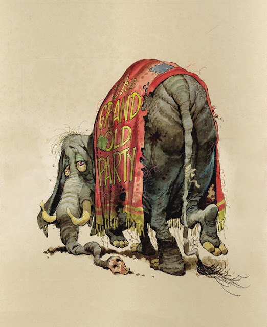
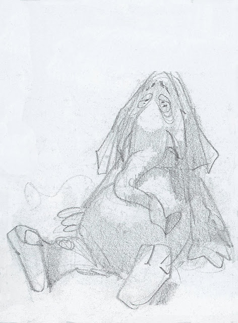
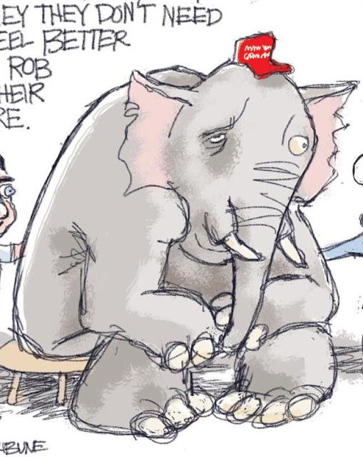
Consider these unpublished cartoons for Time magazine, showing the outcome of an election in which the Republican party suffered losses.


Davis was a master.  He drew lightning fast and with great fluidity.  Once he roughed out his concept...


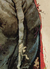
...he had an uncanny ability to work directly into details like the highlights on the wrinkles of the elephants butt.

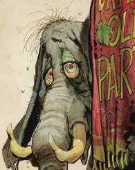
The foreshortening on the patched and threadbare circus blanket, or the shadow on face looking backward are signs of a first class draftsman.


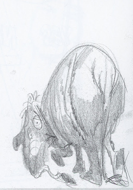
In this next (also unused) cover for Time, we see Davis once again at his brilliant best.  


Thousands of artists have taken delight in drawing thousands of elephants, but has any of them ever squeezed more character and humor into their drawing than Davis?  Note the wonderful sensitive line describing that wrinkled skin.

Once again, Davis laid out his cartoon in a lightning quick preliminary sketch:


Today the popular style for many political cartoons seems to be a naive, simplified drawing style, where the concept is everything, and the role of the drawing is mostly to stay out of the way.


When you go back and contrast the standards for drawing,  you get quite a jolt.


Sunday, December 05, 2021

POLITICAL CARTOONS, part 2: ART YOUNG

Art Young's 1911 cartoon about capitalist greed needs no words to say what it took Karl Marx 106,444 words to say in Das Kapital.


What makes Young's cartoon so powerful?  

Well, for one thing, he grabs our attention with a man teetering on the edge of a cliff, rather than using Marx's approach of 356 pages of dense explanatory text.  

For another thing, Young makes his message seem almost irrefutable by embedding it in the laws of physics.  Regardless of our political persuasion, everyone understands that to get the last of what's in that bowl the man must tip it even further.  Everyone further recognizes that if that chair tilts back any further it will tumble over the cliff.  No one doubts what gravity will do to him then.  Suddenly the demise of capitalism seems like a law of nature, even if you're a big fan of capitalism. 

That's the wonderful alchemy of political cartoons.  Words have to line up in straight rows like little soldiers, forming sentences and paragraphs under the watchful eye of punctuation.  Because they're a linear mode of expression, you can anticipate their destination and begin to think of questions and objections. Political cartoons, on the other hand, arrive in your head at a glance, fully formed, and blossom from there.  

And now, the (perhaps obvious) lesson:  Young had to be an excellent draftsman to pull that off.  He had to be able to draw that figure from just the right awkward angle, capturing the important details and excluding the unimportant ones.  He had to draw the figure large enough so that we could understand what was happening but small enough so that there was room to imply a high cliff.  He suggested that the man was high in the air with those light clouds in the background.  This was not easy.

As the great Milton Glaser said:

A designer who cannot achieve the specific image or idea he wants by drawing is in trouble.

Here are some more gems from Art Young, a great political cartoonist whether you share his politics or not.


In 1916 Louis Brandeis famously wrote about the importance of exposing corruption, “sunlight is said to be the best of disinfectants.” Shortly afterward, Art Young drew this imaginative cartoon of a plutocrat trying to cover up the sun.


Art Young-- a century later, in a different political climate, we can still admire his artistry. 


Friday, December 03, 2021

POLITICAL CARTOONS AT THE CROSSROADS

[In response to your inquiries, I've been away on a mission.  Now I'm back and I still have a few things to say.]


Political cartooning today is challenged by two trends:  

  • The disintegration of intelligence and substance in politics
  • The disintegration of taste and skill in drawing.  

The first trend, the disintegration of politics, must be frustrating for cartoonists trying to parody a parody.  People once feared that political cartoons might dumb down politics, but today cartoons can hardly get dumb enough to keep up.

My real concern is with the second trend, the disintegration of taste and skill in drawing.  Good political cartooning is an art form that calls for specialized drawing abilities.  Unfortunately, today's impatient audiences and obtundent artistic standards place little value on quality drawing.   

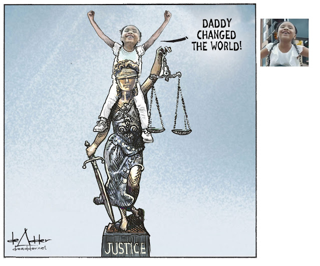
For example, some cartoonists get away with creating a likeness by gluing a photocopy of a head on a poorly drafted body.  


An overlay of scratchy lines creates the illusion that this is a real drawing

Note in the following example how easily a photograph of a face can be incorporated using automation (not, of course, literally with "glue.") 

Cartoon (left) and photograph (right)

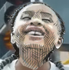
Here is the result when superimposing one on the other:

This technique is analogous to "photo-illustration," a plague which surfaced years ago as a cheap and easy method for illustrators to achieve a likeness when they might lack the talent to do so.


But achieving a reliable likeness is not the goal of the best political cartoons.  The real artistry lies in the caricature of that likeness, the expressive distortions,  the exaggerations and visual liberties.   These artist's tools can help re-energize discussions that have become costive due to too many words.  

For example, consider these two marvelous statements by Matt Davies and Tom Fluharty.  


Davies abandons the laws of  anatomy in this portrayal of his subject as a beast, yet we have no trouble recognizing who it is.  

There was obviously a photograph somewhere at the start of Fluharty's brilliant drawing
but all the artistry comes from the hand and mind of the artist.


As a reminder of the artistic potential of political cartoons, over the next several days I'm going to share examples that I think are excellent and deserve renewed appreciation.

Thursday, September 09, 2021

SEVEN LESSONS IN SEVEN SENTENCES

  • An 18 year old cartoonist named Charles was exhausted and disappointed after being rejected by every employer in town, but before giving up he decided to give art one last try.  
  • His father waited impatiently for Charles to abandon cartooning and get a "decent," financially stable job. 
  • Charles knocked on the door of a struggling start up magazine, fully expecting another rejection, but to his shock the editor purchased one of his cartoons.
  • Thinking he'd finally found his market niche, Charles hastily prepared twelve more cartoons, all of which were quickly rejected.
  • Charles was devastated, so the editor took the young cartoonist to lunch and coached him about life and art.
  • Eager for attention, Charles drew a brash cartoon insulting an author at a rival magazine; the rival magazine complained about the "tasteless" cartoon, but then tried to hire Charles.
  • Charles declined the lucrative offer, staying loyal to the editor of the start up who took him to lunch.

                                    *                *                *                *

The "Charles" in my story was Charles Dana Gibson.  He was paid a total of $4 for that first cartoon, which he sold to a start up magazine called Life.  His "insulting" cartoon (published on January 6, 1887) depicted writer Robert Louis Stevenson as gay.  Rival magazine Puck attacked Life for the tasteless cartoon, but tried to lure Gibson away with a long term contract.  Gibson turned down Puck because he was so grateful to the editor of Life for taking him to lunch.

As Frank Mott wrote in his epic five volume History of American Magazines, Gibson's decision "turned out to be very lucky for Life."

Three years later, in 1890, Charles invented the Gibson girl, which became an international sensation.

  Gibson's cartoons turned out to be hugely profitable for Life and helped solidify its position.  It also made Gibson fabulously wealthy-- wealthy enough to please even his father.  As Susan Meyers noted in her book, America's Great Illustrators, 

All this fanfare over Gibson's work represented a major turning point in publishing history.  Never before had an illustrator so influenced American business; never before had so much money been earned from the creation of a single artist. As magazines competed for his services, the stakes grew higher and higher.  

Collier's magazine agreed to pay Gibson $1,000 per drawing for 100 drawings, but Gibson "categorically refused to desert Life, ever loyal to [the editor who had taken him to lunch]." 

Gibson ended up owning Life magazine and living on his own private 700 acre island. 

His example contains lessons for everybody.


In addition to his "Gibson Girl," Charles became an excellent draftsman capturing a
wide variety of faces, expressions and archetypes for his social commentary.


Monday, August 30, 2021

THE DOLLAR IMPACT OF CARTOONS


This week an appellate court in New Jersey ruled on the economic impact of cartoons. (Michelle Migut v. State of New Jersey Administrative Office of The Courts, Docket no. A-2787-18)

A woman claimed she experienced pain and suffering because she had to walk down a flight of stairs during a fire drill.  She said that a prior foot injury gave her a rare condition known as "complex regional pain syndrome" (CRPS). This CRPS caused her to experience "a lot of pain" when she had to use the stairs rather than the elevator, so she sued her employer for millions of dollars.  

 The lawyer for the plaintiff, perhaps doubting her ability to persuade the jury with mere words, commissioned three cartoons to use with the jury:


The cartoons must have been effective because the jury saw them and awarded $2.5 million in damages.  This confirms what I've long suspected: cartoonists are underpaid.

On appeal, the defendant claimed the drawings improperly influenced the jury. This forced the appellate court to analyze key issues of aesthetic theory that have long puzzled the sages.

The court decided to overturn the verdict for several reasons.

The court was obviously no fan of artistic license.  It ruled, 
The cartoon of a woman in a wheelchair with no legs sitting in front of a closed elevator with smoke bore no resemblance to the plaintiff, who has legs and does not rely on a wheelchair. It also mischaracterized the circumstances of the events, which unfolded in the context of a fire drill, not an actual fire. 
This is a very literalist approach to art by a court that is apparently steeped in the traditions of 19th century realism. We are forced to ask: Would an abstract expressionist court have been more open minded?

Second, when the cartoons were used at trial the judge instructed the jury to disregard them because they were "inflammatory and misleading." The appellate court nevertheless overturned the verdict because it believed the jury would not be able to forget the pictures. "The instruction to ignore... after the jury had already seen them was not sufficient." In other words, the prejudicial effect of a picture cannot be overcome by mere words. The court's ruling goes straight to the heart of aesthetic theory about the relative impact of words and pictures.

If a picture is worth a thousand words, the trial court might have avoided reversal if it had used 3,000 words to instruct the jury. However, if 3 pictures are worth $2.5 million, we may have entered a new paradigm in faded bromides about art.

Finally, the appellate court, warming to its new role as art critic, disapproved of the way the drawings distorted the jury's view of reality and thereby "inflated compensation for the plaintiff's alleged emotional distress." One cartoon depicted the plaintiff's employer as a "buffoon." Another cartoon of "a woman covering her face with her hands under the title: 'Compensation for Emotional Damages' was an appeal to sympathy intended to inflate compensation...."

Philosophers and aesthetes may haggle endlessly about the metaphysics of art, but as I've said before, if you need a concrete answer you're always better off consulting a lawyer.

Thursday, August 12, 2021

GARTER BELTS, THEN AND NOW

Compare this picture of a garter belt by Olivia de Berardinis...

...with this one by John Sloan:
 
John Sloan, Subway Stairs, 1926

Why is the Sloan illustration more suggestive and provocative?  What makes it a more successful work of art?

In Sloan's picture, a random updraft reveals a small, brief glimpse of thigh in an otherwise cold, impersonal sea of travelers bundled in winter coats.  Look at the narratives that radiate from those few inches of flesh:  Only one person (presumably Sloan) among hundreds is positioned to witness this unexpected gift:


The experience clearly left an impression on him.

The woman catches him looking:


Is he embarrassed?  Does he avert his eyes?  What is she thinking?  She can't hold down her dress because her arms are full.  Does propriety even matter any more if they're anonymous ships passing in the night?  Her face, her exposed thigh and the back of the man's head form a narrative triangle here.  It took Sloan seven versions of this drawing before he felt he got the balance just right. 

Olivia's fantasy trambo, on the other hand, has no such narratives.  She's too one-dimensional to contain penetralium. 

Amorous pictures today have become fairly predictable, even from masters of the skill such as Frank Cho or Adam Hughes.  We see the same routine provocative poses with the same anatomical distortions.  We see nudity, or at least an abundance of flesh, drawn with the same smooth, rounded lines.  We see soft, blended colors.  When censorship disappeared and printing quality improved, the same formulas became more and more entrenched. 

But 100 years ago, artists working with far less freedom and more primitive tools created pictures that were more intense than much of what is produced today.  Creativity, like passion, often comes from constrained circumstances. 

For example, etchings-- an inky black medium full of smudges and scratchy lines-- could be quite steamy, especially capturing moments of passion in a gritty, urban world.       


Edward Hopper (above) and John Sloan (below) show us couples grasping for intimacy in a crowded city.  These drawings capture serious moments that we know were preceded by hours of anticipation and followed by hours of reflection.


In Sloan's etching, Turning Out The Light, we see a woman preparing to remove her nightgown but simultaneously turning out the light.  There will be no unearned intimacy for us here; our imaginations will have to work for it.  But these are figures with real humanity, and the expression on her face as she looks over her shoulder at her partner shows us that there is another worthwhile narrative taking place. 


This last etching by Hopper, Evening Wind, is a sensuous tour de force.  Once again an errant breeze plays a central role.  


This time it brings relief from the heat of the city in an era before air conditioning.  Hopper didn't need spandex or corsets or stiletto heels.  He didn't need huge breasts.  His evocation of the sweetness of sticky summer sweat is enough to demonstrate the difference between a real artist and amateurs.

Saturday, July 31, 2021

ALL YOU NEED ARE FEET

Feet can tell you everything you need to know about a relationship.

Jon Whitcomb sells silverware

ad for the Pan-American Coffee Bureau
 

In these two pictures, the women are obviously in control while the men dither.  

But linger a while.  Consider the subtler shades of meaning that pictures are able to communicate:  In the first picture the woman leans in, but her hands remain clasped demurely over her knees because she ain't giving anything away until the deal is sealed.  


The man leans in too; his legs are spread and his arm buttresses his stance-- he knows what he wants.  Yet, his wobbly feet betray his confusion because he's not in control of the negotiations and doesn't know what it will cost him.  

By comparison, the woman's legs are aimed like an Exocet missile.  He has the color of putty while she has the high contrast, red and white coloration of fight-or-flight.  Fire.  Blood. 

All this is conveyed without a single facial expression or word.

Now contrast the first picture with the second picture.  The ring box on the floor tells us why the woman is acting with more abandon.  The lighting in the apartment is lower.  The man's feet go from wobbly in the first picture to almost panicking in the second picture.  (Is his leg even raised a little defensively against the angle of her attack? He knows what he wants but seems a little unsettled by the prospect of getting it.) The sponsor's coffee only appears at the very edge of the picture, a product the company somehow wants us to associate with happy times on a sofa.  And of course, couples can enjoy coffee without requiring a bridal registry, unlike silverware.

In this next picture, we know right away we are dealing with a younger couple.  The artist has shown us malt shop chairs and bobby sox.

ad for Griffith Shoe Polish

Even at this younger age, the girl understands things the boy doesn't.  We don't need to see the boy's blushing face to tell that he is tense and confused.   His feet are straight, rigid and facing forward, rather than mirroring the angle of the girl's feet.  He knows he likes it but he isn't clear what he's supposed to do.

Art equips us with a richer vocabulary for exploring the range of complex human emotions.  The language of pictures can use feet to convey complicated feelings but it can also use hands, or folds in clothing, or shadows on a wall, or the tilt of a picture or its coloration.  It can use activity or quiescence, it can convey meaning with gaps or overlapping layers.  It might even use facial expressions.  The language of words can't hope to keep up.  And if we look at pictures with some self-awareness, we may get sensitized in the process.

What's going to happen to the people in these relationships?  Perhaps some of the women pictured here will get married, become disappointed in their loutish husbands and ultimately decide they can't take it anymore.

Well, feet can tell that story too: 


Monday, July 19, 2021

NEW BOOK FROM TOM FLUHARTY

 Tom Fluharty is an artist with great enthusiasms.  

When he became enthused about dogs, he produced a torrent of drawings and paintings of dogs.  


They were marvelous-- funny, smart and truly insightful about the nature of dogs.


Then for a while he became infatuated with sharks.  He also produced a series of pictures of rock stars, and then a series of orchestra conductors.  Each time, he burrowed into his theme with enthusiasm and energy.  You can see in his drawings the pleasure he takes in playing with the character of his subjects.  

Now it's time for cowboys.

Fluharty has produced a brand new book full of drawings of cowboys.  

As with his previous infatuations his cowboy pictures are a delight, full of loving details, hilarious facial expressions and a variety of situations.  


The book contains 72 pages of new drawings in Fluharty's trademark indigo blue pencil.  I recommend it to all connoisseurs of draftsmanship.  

Fluharty's web site offers two options.  You can either order the regular book, or for those interested in owning an original, Fluharty is also offering a special inscribed edition of the book with an original drawing.    

Monday, July 05, 2021

ONE LOVELY DRAWING, part 66

 I love this tiny (221 × 152 mm) etching by Paul Klee, Suicide from the Bridge.

Smart, funny, compact, dense with meaning-- this little doodle from 1916 is everything that conceptual art today should be but rarely is.

There's sparse room for detail, so Klee chose to define our hero by his hat and moustache-- excellent choices!

Here Klee shows us the weight of time as the moment of destiny approaches:


The path from the bridge down to the water below is filled not just with wind currents and birds... 


... but also with gods and demons.


Splat!!!


X marks the spot

100 pounds of content in a one ounce package.