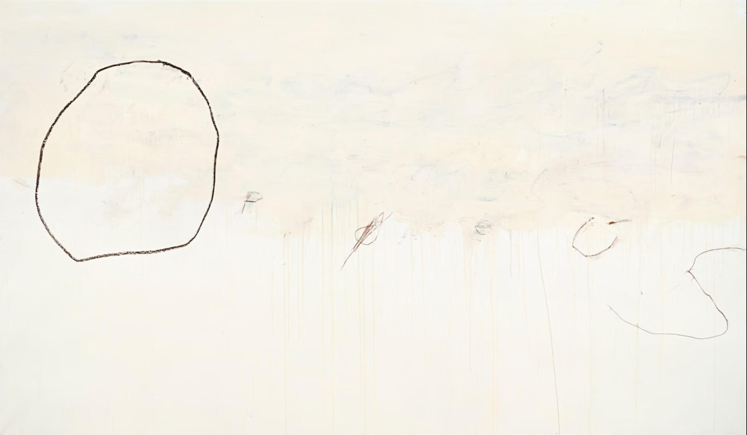
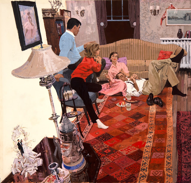
I love Cy Twombly's drawing, Orpheus.
Let's see if you can too.
____________________________________________
In times of uncertainty for painting, artists often revert to their primal roots in drawing to help find their way. As curator Katharine Stout noted, drawing has long been the mechanism for strengthening the gene pool of fine art, contaminating it with strong graphic properties, bold notions from advertising and comics, structural strength from geometric and mathematical systems, and other impertinent strains.
As we've
previously discussed, the 1950s witnessed a renaissance in expressive drawing using basic tools, such as vine charcoal or a lithography crayon. Artists who had long painted polished, realistic images using oil paint or gouache began returning to the simplest, most primal ways to make marks.
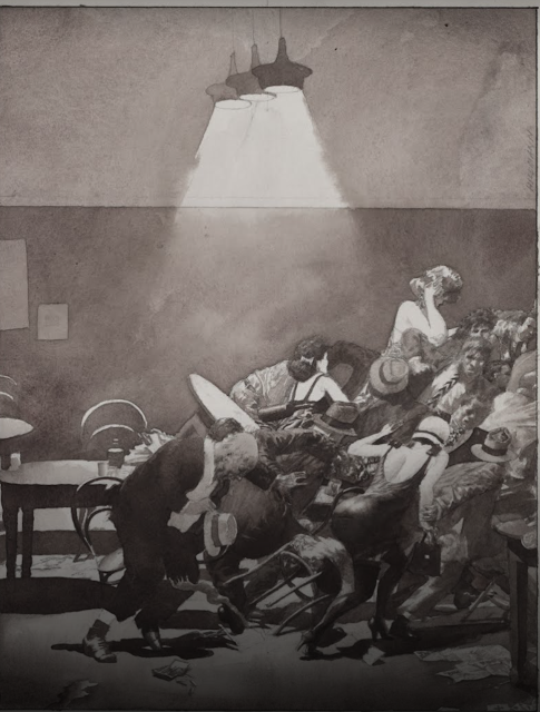
For example, Austin Briggs painted sophisticated oil paintings like this as they slowly went out of fashion...
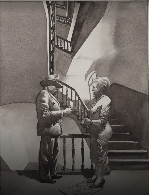
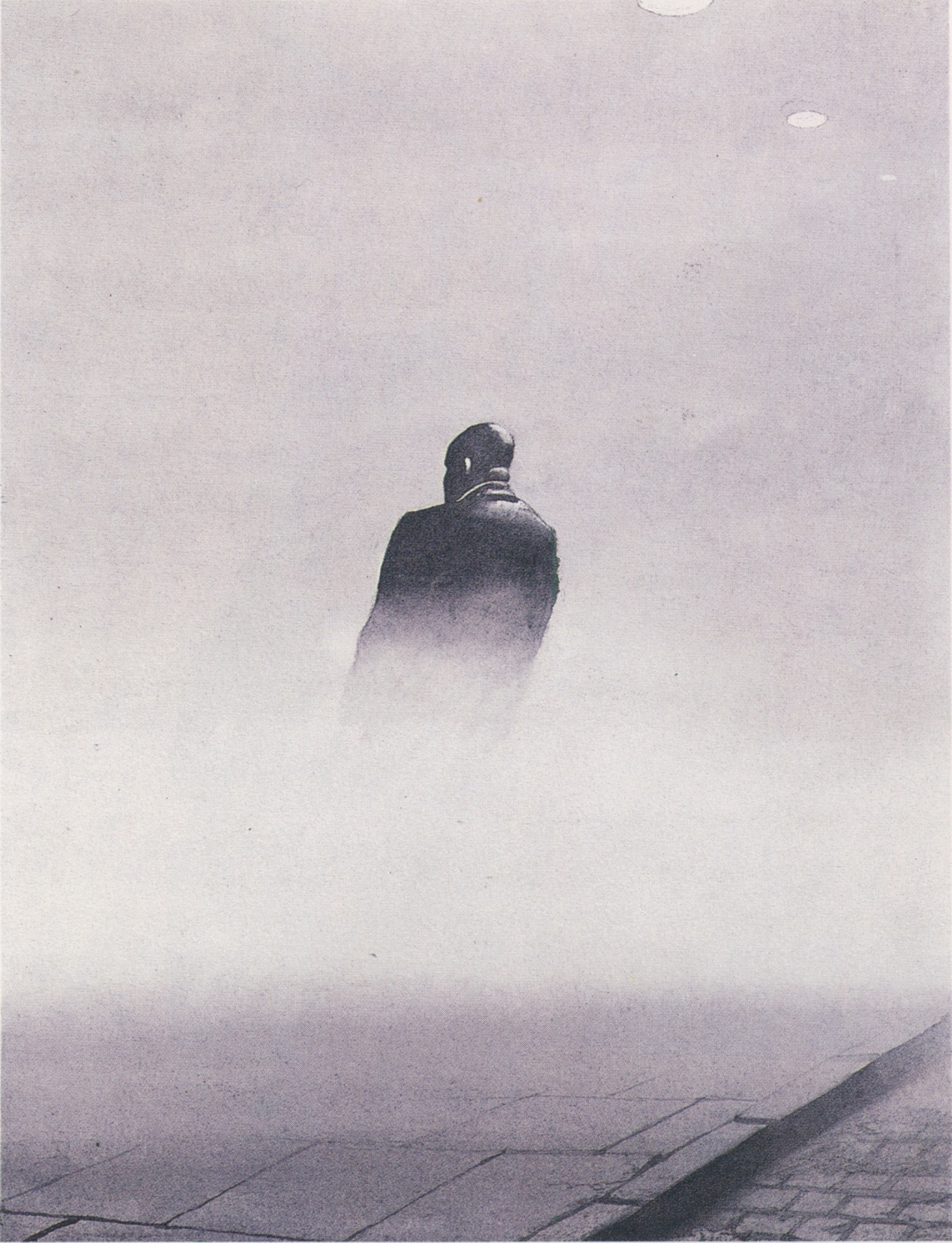
... before finding new vitality in drawings such as this:
Artists such as Briggs, Eric, Sickles, Fuchs and Bouche led the revival of rough drawing tools. They persuaded the leading high end magazines to devote entire pages of prime space to charcoal drawings.
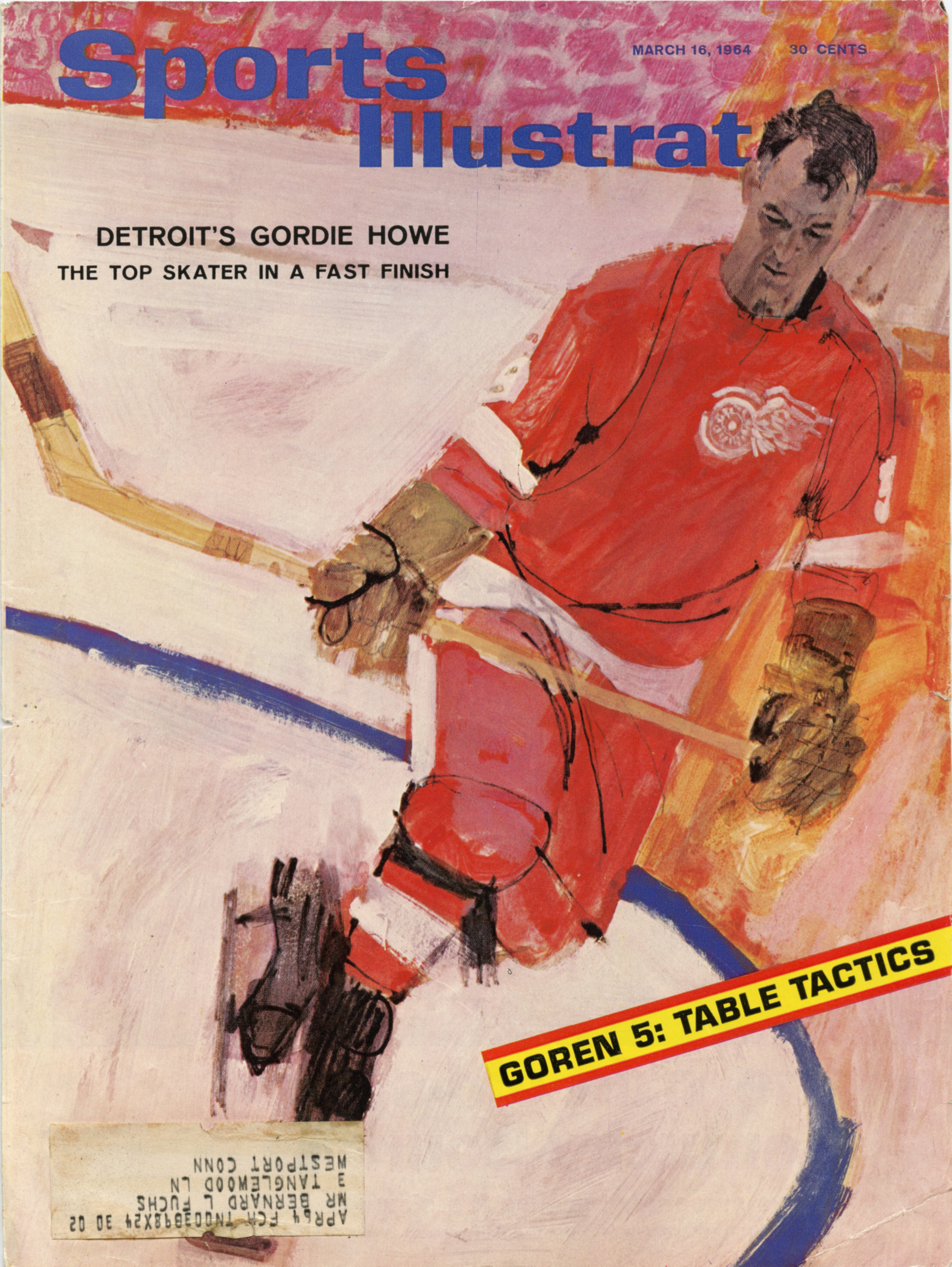
This 1964 illustration by Bernie Fuchs is a snapshot of what was gained from the reintroduction of line. We can see the old world and the new world co-existing briefly side by side:
Fuchs painted the face of this athlete sensitively enough to achieve an excellent likeness...
Yet in the same picture, the rough black line has taken the stage. Look at what a contribution it makes to the painting! It is crude and brutish but transforms the image with explosive energy not found in academy painting.
Notice how uneven the line is. It might have been scratched into the painting with a lupine claw.
Fuchs' cover is an excellent example of that turning point in the evolution of illustration, with drawing and painting juxtaposed against each other in the same image, like a piano and a symphony orchestra juxtaposed against each other with the invention of the piano concerto. People sat up and took notice of the new style. Everyone wanted more.
The most important point to make about these accomplished artists is that, while they were trying to unlearn layers of technical facility and shed hard-earned muscle memory, their artistic taste and sensitivity remained undiminished and were in many cases heightened.
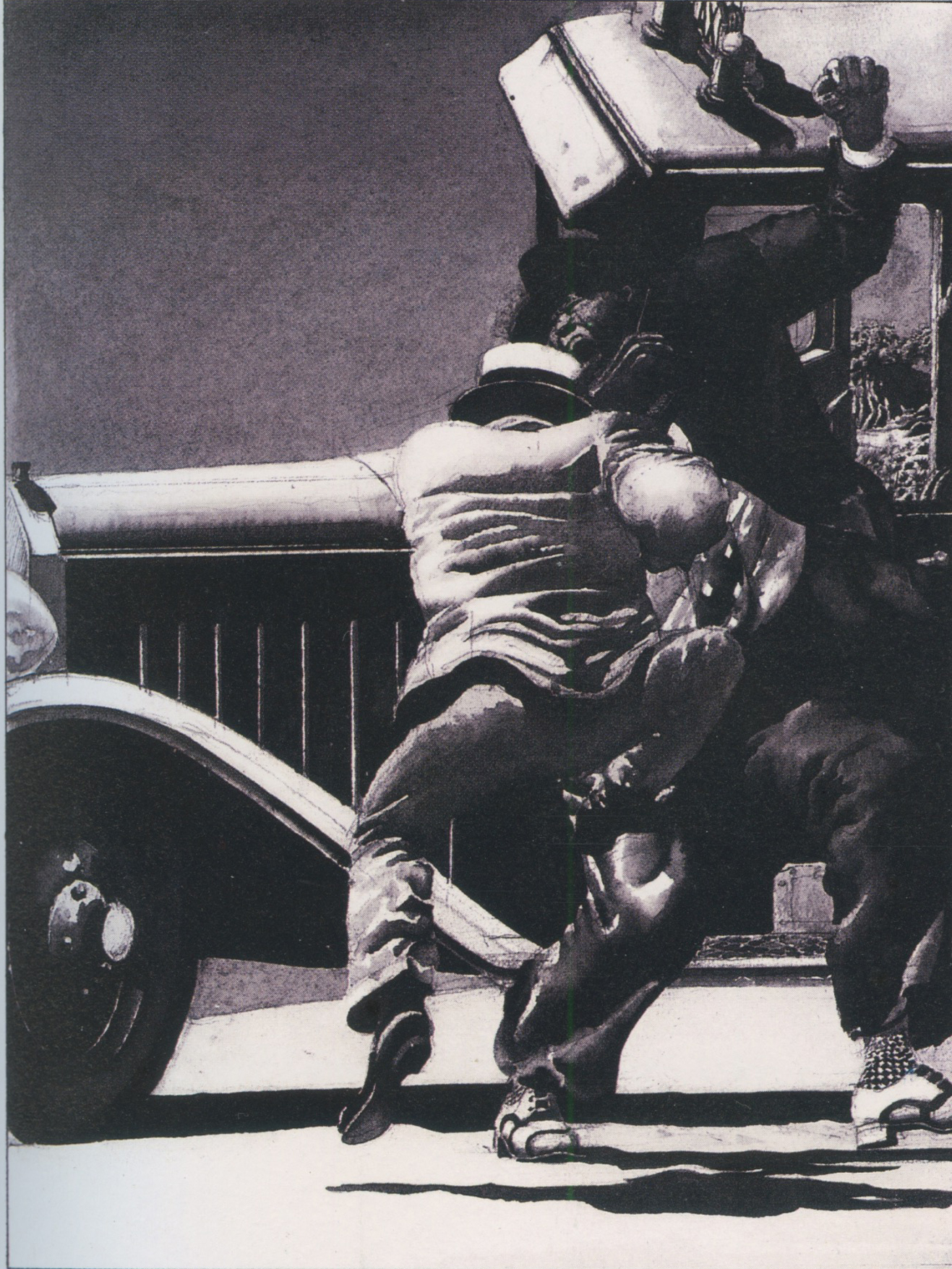
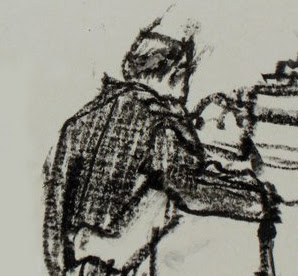
Look at a detail from this drawing by Briggs:
Briggs combines the directness, simplicity and immediacy of the crayon with an underlying sensitivity that persuades us he could perform brain surgery wearing mittens.
Fuchs was a master at marrying sensitive descriptive line with lines that appeared to result from a spasmodic twitch
Why? Because this is part of the physical delight of the drawing, just as impasto is part of the physical delight of painting.
______________________________________
This has been a long prologue to the reasons I love Cy Twombly's Orpheus but if any of you have accompanied me this far, I hope you'll be willing to come with me a little further.
 |
| Orpheus 195.7 x 334.5 cm. (1979) |
Like the great illustrators, fine artists such as Picasso, de Kooning and Twombly spent a lot of time mid-century trying to unlearn stubborn conventions. De Kooning experimented drawing with his eyes closed, trying to understand better the intuitive sources of art. Twombly practiced drawing in the dark, recognizing that such drawings would lose many obvious qualities but interested in what he might gain.
I approach the raw scrapings in Orpheus the way I approach the rough crayon drawings of Briggs and Fuchs. Walking away from realism (or perhaps chased away by photography) they have located lush qualities and brute design in the atomistic levels of mark making. They have focused our attention on the sensuousness of line through extreme simplification-- something academy painting could never do.
But "Ah," I hear you ask, "Do these childish scribbles really contribute anything? I know the story of Orpheus, who descends into hell to rescue his wife, the beautiful Eurydice, but in what way does scrawling his name illustrate that story? Where is the picture of Orpheus heroically fighting the demons of hell?"
I think this painting can stand alone as a lovely abstract design but if you're prepared to go beyond form and look for content, it's there in spades. You won't be able to read it like a story in The Saturday Evening Post; it must be approached more like a fragment of an ancient, time-worn text.
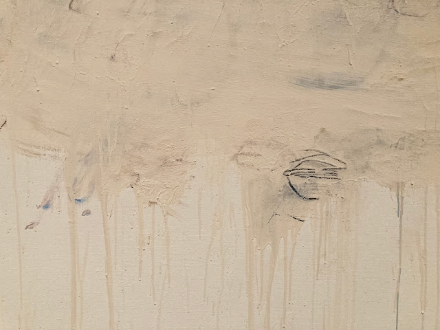 |
| The hero partially obscured by the sifting sands of time |
It helps-- but is not essential-- to know that Twombly was obsessed with the ancient poets Virgil and Ovid and loved Greek and Roman culture. He lived in Italy, in an apartment filled with ancient artifacts. So he well understood the story of Orpheus and its implications for hope, tragedy and mortality.
Even without that background, we don't need a separate written explanation to understand meaning inherent in the visual forms. I couldn't do better than to quote the description by art critic Sebastian Smee:
...a giant O takes up the left part of the canvas. The remaining letters, smudged, and mostly erased, spread to the right and downward, like descending notes on a musical stave. There is a sense of resignation or fade-out in the script's formation, as if the word were not worth completing, the gods having long since departed. But the letters' placement also conjures Orpheus himself descending to the underworld to retrieve his beloved Eurydice.
This is a level of symbolism and beauty that is different from traditional illustrations of stories, but is a fitting experiment for a new generation.
Twombly, a lover of antiquity, was adamant that he wasn't trying to cast off tradition with his innovations. He said, “what I am trying to establish is that modern art isn’t dislocated, but something with roots, tradition, and continuity.”