

I love these powerful pictures by Kent Williams, one of my favorite artists working in graphic novels today. These kinds of images have their roots all the way back in the urschleim.
Williams is also a magazine illustrator, a gallery painter and an art teacher. He teaches contemporary figurative painting in Pasadena, California.

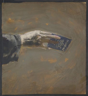
Some of his pictures are more successful than others, but Williams is one of the very few sequential artists who I think makes effective use of the technical tools and creative choices now offered by graphic novels. For example, the following panel from the graphic novel Tell Me Dark displays far more nuanced color and shading than was possible in previous generations of comic books.
As another example, Williams used a kneaded eraser to mold a figure by lifting highlights from a background of vine charcoal. This delicate technique was not possible with the printing technology for earlier comic books.

As another example, Williams used a kneaded eraser to mold a figure by lifting highlights from a background of vine charcoal. This delicate technique was not possible with the printing technology for earlier comic books.

The golden age of illustration began in the late 19th century as a result of the invention of photoengraving. Prior to that time, art could only be published in a book or magazine by painstakingly tracing the original image onto a wooden block which was then carved by hand by an engraver. The artist was at the mercy of the engraver (who often co-signed the finished block) as well as the printer. Photoengraving inspired a mini-renaissance because for the first time, books and magazines faithfully captured the artist's true talent (for better or worse).
Comics have now gone through a similar renaissance. For most of their history, comics were drawn in pencil by one artist, then traced in ink by a second artist for reproduction. Often, a third artist applied color on a separate page or guide sheet as a reference tool for the printer. Now graphic novels have overcome all these limitations of the medium. Today's artists are free to work with delicate line, or subtle gradations in color and value, or mixed media.
While many writers have taken advantage of the freedom of the graphic novel, very few artists have risen to the challenge. Most sequential artists treat the graphic novel like a super sized comic book on glossy paper. Even successful painters such as Alex Ross, who use the new image quality to convey slick, photo-realistic art, don't add much artistic integrity. Their art may be dazzling but it seems thin and lacking in humanity.
Apart from Williams, there seems to be only a handful of artists-- McKean, Miller, and perhaps half a dozen others-- who are doing artwork worthy of the medium.
Apart from Williams, there seems to be only a handful of artists-- McKean, Miller, and perhaps half a dozen others-- who are doing artwork worthy of the medium.
23 comments:
I think the Fountain is his most successful piece of sequential work. I too have an uneasy relationship with his work, his subject matter often bugs the heck out of me but I think he is such and incredible draftsman that I am drawn to his work anyway. The airplanes and couches in his paintings plus the posing of the figure in his work sometimes drives me crazy. He wears his influences, that is for sure, Klimt and Schiele definitely come to mind.
Hmmmmm...I am surprised at your assessment of Alex Ross, I find his work has a lot of enthusiasm for the "spirit" of the characters. He has his hits and misses but he certainly can draw like crazy. I enjoyed Batman: War on Crime quite a bit.
Whilst there's nothing wrong with painted comics I find that they are often stilted and more wrapped up in their own painterly technique than they are in telling the story. Comics aren't just about art, they're about telling something sequentially and paint isn't necessarily the best medium for that, there's something about the quality of painting that requires the reader to spend time looking at it which is often the complete opposite of what should be happening when reading a comic book. This is possibly due to the ingrained response of spending time looking at paintings and that we're used to treating them as single images (in most cases) contributes to this.
To say that comics produced in the old way can't be art or aren't as artistic is very mistaken, sometimes it's making the most out of limitations, be they technical or formal or whatever else, that can make an artist and their work stand out.
The notion that the old production line of producing comics means that they are a lesser product or aren't as beautiful seems strange to me. Films are made by many, many people but nobody would say that they are primitive and not particularly artistic.
"Apart from Williams, there seems to be only a handful of artists-- McKean, Miller, and perhaps half a dozen others-- who are doing artwork worthy of the medium."
Sorry to say this but that's a ridiculous statement, there's not the time or the space to go into how wrong you are on that front, I will say that most of those people barely produce any comics at all and I personally would argue about them being even close to the best that the medium has to offer even if they do provide lovely artwork. I recommend that you might do some more research, maybe take a look at the alternative scene - books published by the likes of Fantagraphics, Drawn & Quarterly and the myriad of amazing work produced in other countries.
I think you have a preference for a certain kind of work in comics and there's nothing wrong in that it's just that the bold, sweeping statements that you've made are somewhat innacurate. Where we do agree is in the fact that photo-realistic artwork is not necessarily better or more impressive than any other kind, in my view it's often less interesting and more uninvolving.
Faz Choudhury
First anonymous, I agree with you 100% about the influence of Klimt and especially Schiele, and as you have noted, there is certainly some eccentricity in his subject matter (although I tend to be more forgiving about that). In some ways, Williams reminds me of Jeff Jones, because I think some of his work misses the target altogether, but when he connects it is so superb, I don't hold the less successful pieces against him.
Second anonymous, I know that Alex Ross has his ardent fans and I will probably hear from a number of them. I don't want to underestimate his work; his technical facility is certainly dazzling. But I think he follows a formula, where he dresses models up in costumes and takes reference photographs and transforms those photographs into paintings. The end result seems thin to me, the same way that the highly skilled work of Boris or Julie Bell seems thin.
Some of Ross' panel arrangements are quite complex, and he obviously works hard, but I wish I saw less attention to the "likeness" part of the job and more of a struggle over the "art" part-- the composition of the overall page, the design, the balance, the harmony, even the choice of visual priorities. I look at individual panels by Ross and say, "wow, that's really impressive," but when I step back and look at the page it often seems lacking in poetry.
Faz, I actually prefer drawings to paintings (as I have tried to emphasize in my series of posts highlighting "one lovely drawing"). I think they are more intimate and spontaneous and can be every bit as sophisticated as paintings. The problem you identify-- of an artist becoming too wrapped up in an individual panel and interrupting the flow of the story-- happens with both drawing and painting. There was a whole generation of artists in the wake of Neal Adams who labored mightily over each panel with a crow quill pen, adding unnecessary detail and fine lines that buried the overall work.
I would never say that comics produced "the old way" can't be artistic. I have often swooned on this blog over the work of Toth, Ditko, Starr, Raymond, Drucker and other "old timers." The interesting thing to me is that technology has now put a whole new collection of tools in the hands of sequential artists. They can now accomplish things they never could before. They don't need to ink a drawing any more; how many of them are making stories of sensitive pencil sketches? The quality of reproduction is better; how many of them are using delicate shading or a more nuanced line (the way that illustrators like Austin Briggs and Bernie Fuchs did, once they were set free?) Their range of colors has become limitless; what are they doing with that? Chris Ware is a good example of an artist who has made good use of the new freedom in formatting, but who else is taking advantage of that tool?
Bottom line, I find it interesting that when illustrators were set free from the limitations of wood engraving, they seized the new opportunities with both hands. We witnessed a renaissance starting with Howard Pyle, Maxfield Parrish, N.C. Wyeth etc., right up through Al Parker, Bob Peak, Bernie Fuchs, etc. I haven't seen the same kind of qualititative change from most of the artists working in graphic novels.
6:57 AM
In response to your response, I believe he was a student of Jeff Jones, along with Jon J. Muth and George Pratt. I think that you can put Bill Koeb in there too, but I am not as sure about that inference.
Like faz, I also find a lot of extremely 'painterly' comics to be stilted, or less successful at visual storytelling than their traditional pen & ink counterparts, however there are some like Kent Williams whose I enjoy.
My absolute favourite of the bunch is the legendary collaboration between Frank Miller and Bill Sienkiewicz. Some of that graphic novel can be seen on the web here:
http://www.wordsandpictures.org/elektra/maingallery.html
It's worth noting that the entire thing was done in the pre-digital era, using just about every medium and material imaginable, including gluing objects straight on to the page.
Oops, blogger ate part of my link! here it is.
Diego and Spacejack, I agree with both of you. I thought that Pratt's Enemy Ace and the Miller / Sienkiewicz collaboration on Elektra were both excellent. Remember how exciting it was to see artists and writers flexing their muscles and expanding the comic book genre in smart, creative ways? Of course, that was a long time ago.
Yes, the art in the Miller/ Sienkiewicz electra collaboration was something else. But the story...I remember a friend saying how they made Electra so powerful she could kick Superman's ass (as can a few Trojans). At the risk of playing the personal favorite game I put in a vote for Dan Clowes. I love his line and sense of composition. His framing isn't daring or inventive but he knows how to tell a story, and write one too.
Hi David,
Sorry if I came across as a bit aggressive in tone and if misundertood anything you were saying, I was probably being a tad over-passionate. I completely agree with what you say about Alex Ross' work. I also agree with other peoples comments on Elektra Assassin - which is a fine piece of painted comics work and I wish Miller would write something as good again. I've mooned over Kent William's work and Dave McKean's and all those painterly artists that have been mentioned but I've found that as time has gone on I find the painting beautiful but the readability and the storytelling to be lacking. To my mind McKean's Cages is the best of his comics work and I think that's because it's mostly linework and spot colour and just reads better as a sequential piece of art.
I guess, in some ways, I'm more of a traditionalist when it comes to comics. I like the simplicity of linework with or without colour and I often find the use of other mediums distracting in comics. Artists like the Hernandez Brothers and Dan Clowes all stick to that tradition of pencils and inks and produce wonderful, interesting work , you mention Chris Ware and he's another artist that is very traditional and old-fashioned about the production of his work - where he innovates is in the formal aspect - one of the main differences between these artists and the old guard is that they ink, and in Ware's case, colour their own artwork.
There are quite a few comics that have just been scanned in from pencils these days and to my eyes they often look unfinished. I understand that inking was more about a reproduction issue and a production line thing but then there's good inkers and bad inkers, interesting inkers and dull ones - the art becomes a collaborative process in some cases, when both artists are on fire, the result can add up to more than the sum of its parts. I think inking can also be a refinement of the drawing and often the drawing is purely a guide for the inking process - using tools to make marks that a pencil could never make.
I would posit that a lot of comic artists choose to have inked artwork even though they know they don't have to thanks to the advances in printing, it's a preference and a choice not a necessity.
I don't think that there's a right or wrong way of doing these things but for me there are certain methods that produce material that works as a whole, whilst there are many techniques and methods that can be brought over from illustration and fine art it doesn't necesssarily mean they'll work well in comics and sequential storytelling.
Anyway, I should say thanks for the post as it's made me use my brain a bit and that's a good thing. Apologies if I've blabbed on too much.
Faz.
Thanks, Faz. I agree with many of your judgment calls. And around here, "over-passionate" is good. If we excluded the contributors who are over-passionate, we'd have nobody left.
This pictures are amazing !!!
I'm a french illustrator, do not hesitate to have a look on my artwork .
B.
This is an impressionant artist. I'm spanish and his work is for me the perfection artist art.
David and others, it is obvious to me that what you said both in this particular article and in these comments, are reaction to the state of american comic scene today and before.
In Europe, the situation is rather different. There were always a LOT of exciting comic series and comic creators.
In countries like France, Belgium, Spain, Italy, England, Croatia etc comic creator was always layout artist, penciler, tracer/inker, color separator, cover artists (and usually writer as well) - all in the same person.
It was like that fifty years ago, it is like that now.
Besides, I don't know if you were exposed to the works of really talented european (and south american) comic artists here capable of creating awesome panels which do not get in the way of storytelling and internal dynamic of a narrative. I do not drop names here because if I mention five I would do injustice to the several dozen of others.
Just my two cents.
Valentino Radman
p.s. IMO Chris Ware is the most uncomicky comic artist I have seen in the last ten years. I can't look at his panel for more than a second without feeling somewhat sick. He and couple of other postmodern "artists" devoided comics and illustration of every single thing that made those art forms exciting.
When I see their works I lose the enthusiasm for drawing and painting. On the other hand, when I see Jeff Jones's, J.J.Palencar's or Jon Foster's illustrations I feel immediate urge to grab my brushes and run to the easel.
I reccomand you to visit web site of croatian Illustrator Tomisalv Torjanac, he shares some yualities you are mentioning her, I think. Link: http://www.torjanac.com/lifeofpi.html
Thanks for posting this work David. I had a young illustrator post on my site the other day stating he couldn't paint with brushes (hand held) the way he can render digitally. I not going to panic after reading this thinking traditional art material and methods are pase with younger artists. Kent appears to use "old school" methods to create his illustrations and that is one reason the graphics are visually powerful - for me.
William's work seems kind of soulless and callous. A lot of style, but no real substance. The guy can paint and draw but it all kind of looks like he has his technique down and repeats a process with a flair of paint strokes to build up an impasto.
His piece, "Encumbrance" has a man pulling a chair with a boy's head buried in the snow or sand. Is the child an encumbrance, domestic life? Is that one of his children? If so, it's pretty rude. There are pieces on his site of nude women sitting in chairs, but they are these skinny asian women who seem to be painted as more of a fetishistic exercise rather than exploration.
William's comics work presents other problems. There is a lack of storytelling, with Schiele like poses substituting any real human gesture. There really seems to be a love of style over content, and when he distorts his figures, it seems the result of some cartoonish exercise rather than in the service of the story. His work in general leaves this sort of "Look at Me!" impression.
As for Mckean. I can't think of an artist in recent history who has stolen more styles and gotten away with it. His work is like "Who do I want to copy yhis week." Is he a Matt Mahurin Clone, a Barron Storey clone, a Jose Munoz clone, or a Starn or Quay brothers clone?
In the case of John Muth, I wonder if Gerhard Richter felt a chill when Muth blatantly ripped off his style for "M?" His work is pretty, and I like his children's books, but his work seems really photo dependent. Also, he really seems like a misplaced romantic. (It is oh so beautiful)
George Pratt on the other hand is a brilliant writer, excellent storyteller and his work seems filled with integrity and content which he cares about. Hi early work leans on Jeff Jones a lot, but as a mature artist, he has forged paths that none of the others mentioned here have heretofore been afraid to enter. The path of self questioning, personal point of view with a complete lack of pretension.
As for other artists who can tell a story, check out Scott Hampton's work, Jose Munoz, Teddy Kristianson's work, and Lorenzo Mattoti's killer comics.
Swim in the Deep Water: New Work by Kent Williams
September 27 – October 25, 2008
Opening Reception: Saturday, September 27, 8 – 11pm
Gallery Hours: Tuesday – Saturday 12-6pm
Merry Karnowsky Gallery is proud to present a solo exhibition by renowned Los Angeles-based artist Kent Williams. Applying his distinctive draftsmanship and painterly breadth, Williams continues to investigate the direct portrayal of human physiognomy and character. Presenting us with paintings that show both the figure in states of quiet observation, as well as full-blown struggle, Williams oscillates between how he portrays the contradictions posed by common existential realities.
Just came across this blog post. Kent Williams has new work up on the Merry Karnowsky Gallery home page currently.
As for myself- I am intrigued enough by Kent's work to look carefully at each one. That is saying something right there. He has a nice sense of focus/non-focus
Post a Comment