
 |
| photo©The William Heath Robinson Trust. |
If you aren’t a fan of the great English illustrator W. Heath Robinson, it’s probably because you haven’t found time to visit the marvelous exhibition of his work at the Delaware Art Museum. It’s a rare opportunity, and one you shouldn't let pass by.
 |
| photo©The William Heath Robinson Trust. |
 |
| photo©The William Heath Robinson Trust. |
 |
| photo©The William Heath Robinson Trust. |
 |
| photo©The William Heath Robinson Trust. |
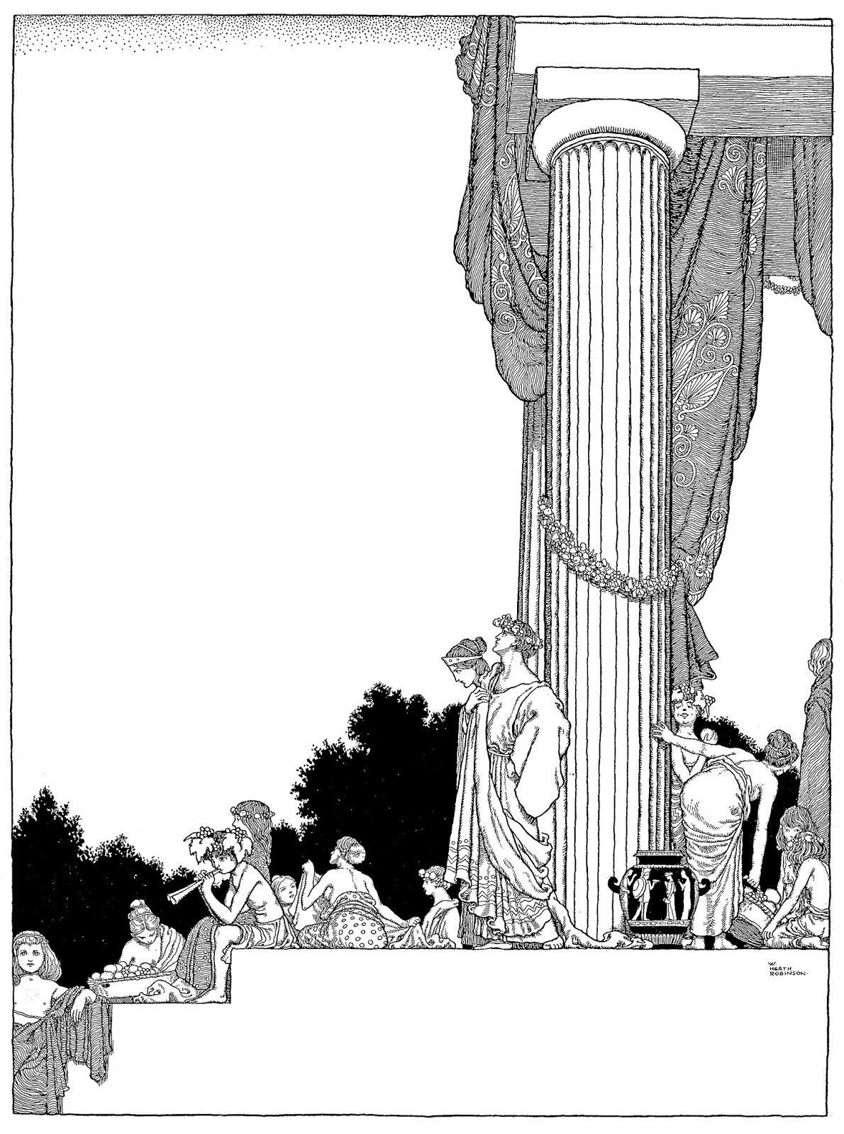
I thought I knew Robinson’s work well; I've long admired his elegant design and his graceful, imaginative line work. But seeing original illustrations such as the following half title from A Midsummer Night's Dream up close and personal gives you a whole different sense for the artist's accomplishment.
 |
| photo©The William Heath Robinson Trust. |
Many people know Robinson's work for his bizarre inventions...
 |
| photo©The William Heath Robinson Trust. |
...but it turns out that Robinson was also a serious lifelong painter, and there are examples of his landscape paintings and other serious watercolors in the show's nearly 70 works.
 |
| photo©The William Heath Robinson Trust. |
The exhibition offers a real reminder about the art of drawing with elegance and charm, but it also shows us a prolific artist who, despite a backbreaking load of commercial advertising and illustration work, took his
artistic standards very seriously, and "tried all through my life as an artist to keep this side of my work alive.”
FOR MORE GREAT ROBINSON:
Recently The Saturday Evening Post selected me to be their new art critic (proving once again that there is no accounting for taste). I've posted several additional works from the Robinson show, along with my full critique of the show, in my column there. I urge you to take a look.
While you're there, you might be interested in some of my other columns on illustration. The Post has generously made available to me their full archive of illustrations, so if you're interested in seeing more work from any of the great Post illustrators (which included just about everybody) let me know.
Many thanks.
42 comments:
One of the greats, for sure. I adore his Uncle Lubin plates. Glad to see him at DAM.
Wish I could see this. Many years ago I lucked upon that thin collection of the brothers' work and was immediately enthralled. Still have it today, even with a bunch of xeroxes inside of other illustrations by them.
Good to know. These are awesome. I like Robinson even more than Rackham.
JSL
It's so nice to observe examples of the period of illustration when bold graphic design was inseparable from the technical execution. Not enough illustration today passes the "squint test."
Yes, a wonderful artist and his work has a much healthier, less claustrophobic feel to it than Beardsley and many others working in this vein. It shows how deeper content is not locked up in 'style'.
Congratulations David! I'm sure you will do a great job as their art critic.
Wow, having access to the SEP's full catalog of illustration is an incredible boon.
I know my interests are parochial, but I would like to see Harvey Dunn's first two or three appearances in the post (June 2nd & 7th, and July 21st, 1906)
Equally, I would love to know if there is any Walter H Everett in the Post between 1919 and 1935 aside from February 18, 1933. But I don't know whether SEP's archives are digitized to the point that such a search would be feasible.
Thanks!
Kev Ferrara-- I agree those Uncle Lublin plates (along with Bill the Minder and one or two other books) are brilliant, Robinson's best. They included some of the Uncle Lublin color paintings in the exhibition. If anyone knows where those Uncle Lublin black and white drawings with the crescent moon are today, I'd love to talk with you.
kenmeyerjr.-- I'm sorry there's no catalog for those who can't make it to the show (although nothing beats looking at the originals). I asked the curator about a catalog and as a substitute she recommended Geoffrey Beare's "The Illustrations of Heath Robinson" which I have now procured from Amazon.
JSL-- Robinson was certainly at that pinnacle of children's illustration with Dulac and Rackham. Personally I prefer Robinson to Rackham as well.
Zoe-- I agree. And while the reproduced images are crisp and clean, the originals showed a whole different level of "technical execution." His water color cartoons had a precision and competence that has today been replaced by Photoshop. But most importantly, the technical execution was in the service of a wonderful sense of style.
chris bennett-- You make an interesting point. One of the things I like best about Robinson's pen and ink illustrations is the white space. So much of 19th century illustration seems overworked to us today, but Robinson had a modern sense of restraint that I respect very much. Great big fields of open space, traversed by one or two graceful, floral lines... and of course, by virtue of that restraint, each individual line acquires more significance than in those "claustrophobic" works.
Sean Farrell-- Thanks very much. It came as a surprise to me, but it's a challenge I relish.
Kev Ferrara-- We're thinking exactly along the same lines. I told the Post the one irresistible element of the job was access to the Post's 200 years of digital archives including many of the greatest illustrators in American history. I plan to retrieve and showcase that work in future columns. Dunn and Everett are two excellent suggestions.
Dead link. When I was young, I saw some Robinson's work and thought it was from Moebius. I searched for years these "rare Moebius works". And now, I'm a fan of Robinson too.
Robinson's work is like the most beautiful bastard child of Rackham and Geary. Well done on this post, David.
i’m surprised that people prefer Robinson to Arthur Rackham. for me he isn’t in the same league. when he ventures into similar territory - flora and fairies, woodland folklore - it just exposes the weaknesses in his drawing compared to Rackham's.
Laurence I agree that Rackham was a great illustrator. IMO Robinson was better because his work was less fussy and cleaner and I think his compositions were better. I like drawings like David's examples 1, 2 and 4. IMO Rackham was much more scratchy but its just personal taste.
JSL
I agree with JSL
I plainly see that Rackham is one of the most amazing penman ever, a master of graceful, subtle silhouette drawing, with an incredible, fertile imagination, and one of the very best ever in terms of appreciation of and attention to nature... but in every single one of his pictures I feel he loses the plot for the quilling, loses lighting, value and color pattern to muddy wash effects, and spends so much time giving me specifics he forgets to give me suggestions, effectively blocking my participation in his work. I still think Rackham is hall of fame material. But I feel I should like his work much, much more than I actually do.
The drawings have nice sense of proportion in both values and scale.
And congratulations on the new Saturday Evening Post position.
"...the technical execution was in the service of a wonderful sense of style.'' David, how can technique be separated from style, as technique can really only reflect ones approach too things, or one's understanding of how to make something work? Isn't technique style?
Tom,
Style is the result of design sensibility, drawing ability, artistic concerns and habits, and physicality at the general compositional level as well as the local rendering level. You are only thinking of it at the local level; as some quality of rendering.
Which means I should have said: 'It shows how deeper content is not locked up in one aspect of 'style'.
I'll a bit late to this thread, being on the road in Florida. Pre-Internet, I was mostly aware of Robinson by name, usually linked to Rube Goldberg. But in recent years I've been noticing more and more of Robinson and was surprised at how good he was in his non-contraption work.
By the way, I second Kev's Walter Everett nomination: Do I here a call for a vote? Oh. I forget. David's vote is the one that counts.
For those who want a basic collection of Heath Robinson's work, I suggest the Dover collection "Golden Age Illustrations of W Heath Robinson". The reproductions are good, and the price is low.
Don Cox
The comments regarding "technique" and "style" have been very good.
When discussing art, I have always thought of "technique" as a general method of working and "style" as a specific manner of using a technique.
For example, when we talk about "dry brush" we are talking about a technique—a general method of working. However, when we talk about "Bob Fawcett's dry brush technique" or "Andrew Wyeth's dry brush technique" we've modified this generality and are now talking about a specific manner of working—a style. Technique and style are two different things. One is a method of working and the other refers to a manner of working.
The term "Style" itself can be difficult to nail down because it can encompass some pretty intangible qualities—the things that can keep discussions going indefinitely.
Actually Kev I wasn't thinking of the local level, I wasn't even thinking of rendering, I was thinking of everything. What is the old classical saying, "What is true for the parts is true for the whole." I am not sure what you mean by rendering. To me, rendering would mean how the work is executed after you have concieved mentally what you are going to do.
I guess what I am trying to say, and feel is, style is not something added on after one learns techniques. One's technique is one's viewpoint, one's philosophical outlook, and that creates style. Which of course includes the whole enchilada, composition, sensibility, drawing ability etc. IMHO
What one has to consider, in making a picture is often quite surprising. And how one arrives at one's answers to those problems as an artist is what truly creates a sensibility and outlook which is reflected in how the work is done. I would say it is the struggle with the how to, that brings style into being.
As Mort Drucker said, "don't worry about style, it will just come."
It seems to me that "technique," is much more then "dry brushing," or glazing or drawing with a pen nib or a brush. Knowing how to use a material is not the same as conceiving the forms and structure you will use to make a work of art. Lot's of people learn techniques but never really learn to draw. A technique is a response to the inherent nature of the material used and the need to express a personal viewpoint. It is a direct reflection of how someone has conceived and understood a problem of expression. You don't learn a technique and then express yourself unless you have already master the real problems of art, form value and color.
Doesn't one still recognizes an Andrew Wyeth or a Claude Monet no matter what material they are using? Style is a reflection of understanding, it is the ability to form an opinion or viewpoint about nature. Another way to say it is a work takes the form of the thought and values of the maker. And the technique is a direct refection of the thought and values of the maker. IMHO
Tom,
The technical is widely understood to mean the practical craft of rendering with pigment. Such craft can be unique, personal and expressive as you discuss it, or logically developed to meet some new artistic challenge, or it can be convention-based. And even if any particular technique begins life as personal expression or logical development, it can still be turned into a convention and used reflexively and by other artists.
Conventions are reproducible rendering methods that are passed between art practitioners without respect, necessarily, to personal philosophy, style, conception, etc. For instance many of the inking techniques used by Alex Raymond, John Prentice, Leonard Starr, Stan Drake, David Wright, Alden McWilliams, Al Williamson, Angelo Torres, Neal Adams, and Mark Schultz are shared conventions. Berni Fuchs'"scrub and bubble" technique became a widespread technique in short order. Frank Reilly taught specific charcoal and brush techniques. Creating spot highlight with an airbrush is a specific technical convention. I and others here could list further examples of such technical conventions all day long.
"You don't learn a technique and then express yourself unless you have already master the real problems of art, form value and color." ~ Tom
irrefutably untrue RE millenial snowflakes and Gen X slacker-asses. Particularly in the realm of black and white line work. True, however in the days of Robinson. Tom's statement is true in a specific generational context, false in the general/universal context.
As per Kev's statement's above, the publication medium is an overriding context for 'ehat technique is or is not'. In inkwork, more so. Especially traditional comicbook work, meaning before the advent of wacom-wankage pseudo-inking. Worse, the Emperor's New Clothes pseudo-comics hiding behind Virtue Signalling, or the bulk of garbage misrepresented as 'ink art' in Alternative Press from the 1990's onwards.
THere is also a crushing difference in the onus upon an illustrator whom is an ink artist PER SE, in a field which relies MOSTLY upon ink art, versus an overall illustrator whom only does occasional ink line work as a portion of their overall-output-for-pay, year after year.
Believe it or not, most of you agree with each other. I believe you are simply tripping over the terms "technique" and "style". When these terms are used interchangeably it can cause confusion.
Technique is simply a generality referring to a method of working. Style is the specific manner an artist employs in the execution of a technique.
to Paul ~
yes and no. Style is the emotional, memetic and semiotic response you which to engender in the hearts and mind of the reader once given the brief of your assignment from your editor/art director/etc. TECHNIQUE is what materials you [bother to learn how to] employ*, and specific physical tricks in employing the materials, AFTER you make the stylistic choices/decisions. It's not airy-fairy crap, especially when a deadline is in place and the better materials may be unavailable, such as metal dip nibs, quality of certain brands of ink, illustration board (r.i.p. the proper Crescent brand of illo board), and more.
* unlike Ware, Vasquez, Bechdel, Buttbisquit, and the bulk of the 'alt-art' community
Ms Trundle: remedial English lessons may be available, beginning with the proper distinction between "who" and "whom".
To *whom* it may concern,
And Mzzzzz or MIssssss-ter Anonymous,
It does not matter a jot *who* you are, but what you posted - luckily and deliciously - is another matter.
As you chose, via your posted comment, to address style, yet ignore content, by employing one of the oldest and ‘busted-out’ cyber retorts in the internet-handbook, which was venerable and wrinkled (not to mention in need of a philosophical labiaplasty) long before Camille Paglia was sadly ousted by overly-priveleged whine-mongers, and before BBS systems were superseded by AOL. In other words, not ‘classic’, but certainly CLICHED.
Also requiring no effort or creativity on your part. In accordance with Chris Ware, Bechdel, Buttbisquit and Kate Leth*.
Similar to the support from the villagers of the Emperor’s New Clothes, or in the case of this thread and others, of those ‘illustrators’ always relying on pol-correct spin-doctoring to abrogate the right of anyone to comment upon what artists arguably can or cannot DO. Such as painting, or bothering to learn how to control a a freshly-dipped metal nib, to properly express a physical contour. As Robinson could, and in fact exemplified. And as most of the non-artists beloved by sjw’s CANNOT.
How unfortunate it is that there are no remedial classes to teach sjw’s that MEASURABLE talent never goes away, MEASURABLE skill never goes away, and that shifting of pop-cultural goal-posts will never change this.
* Kate Leth had to be added for the sake of true gender equality, as she is equally incompetent. Albeit popular.
Now, since 'Mzzzzz or MIssssss-ter Anonymous' has 'done-their-dash' (as we say in the UK and Australia), why don't we vaunt the inking WORK ETHIC of Robinson, plus the SKILL Robinson BOTHERED to acquire, and how that helped shape and re-invigorate ink-line illustration leading to the best work of P. Craig Russell and Berni Wrightson and possibly Frank Frazetta. Rather than looking for an excuse to coddle people WHOM cannot be bothered to learn the difference betwixt stonehenge, (classic vs cliched) vellum bristol, plate bristol, etc.
Juat in case no one picks up the baton, this thread is about INK ART. LINE WORK. Considered controlled (achieved by YEARS of personal sacrifice, physical sacrifice, both in terms of $$ spent on proper materials but also time-spent on mastering/'misteressing' those materials). It's NOT offing easy, at least not for people whom (suck it 'anonymous') must rely on their ABILITY versus their 'social victim status' (suck it, Buttbisquit and Bechdel).
Blogging is easy. Getting a Gillott #404 or #659 nib to 'behave' upon proper substrates is hard. Harder when the berst inks are longer available, or no longer provided by manufacturers in the way they previously did, as now they rely on cheaper components, meaning the end result has a poor ability to achive the desired ink-line as compared to what the so-called 'brand of ink' afforded the illustrator less than 7 years beforehand.
Not that such matters to Bechdel, or Leth, or Vasquez, or Ware.
Not to mention how AWFUL it is to rely upon a Hunt #100 nib while knowing that less than 7 out of 100 of Hunt #100 nibs will perform properly, and then take the steps, bearing this in mind, to make your deadline. Oh, deadlines. The difference between published art and Buttbisquit/Bechdel crap. Or 'fine artist' crap vs illustrators; this blog is titled "ILLUSTRATION ART', not pseudo-fine art ripping off illustration techniques. As Stan Lee often said, 'Nuff said'.
I envy sjw's for never needing to adhere to deadlines. UNLIKE Robinson. He had to make the line WORK for the purposes of the public his linework was intended for with NO excuses.
btw, 'Anonymous', feel free to whine about my typo's above. ;) Versus address any CONTENT of my post.
I guess I kinda of agree with Kitty, it seems to me materials and technique are deeply interwoven. The Chinese have thousands of different analogies for the different mark making and brush handling used to evoke the rhythmic patterns of nature. The artists are all using brush and ink but they all express themselves technically, in different ways. One could say ink and brush is a technique, but I think technique is deeper then that. Technique seems to be more about ordering one's artistic process. Or how one's studying of nature leads to some understanding or viewpoint of how things are arranged which brings artifice into being.
I would say the opposite of Paul, I think the confusion resides in separating technique from style, they are interwoven just like material is interwoven with technique. It seems much more important to see the relationship between these aspects. It is my experience that isolating and defining different aspects of art making dulls the mind instead of awaking the creative impulse.
The more one understands what they are doing or understands what they want to do the issues of technique and style take care of themselves. An English garden is very different from a French garden because of a difference in philosophical outlook and these differences drives the styles and techniques of the gardeners. Otherwise "choosing" a style or technique is a shallow pursuit. It is putting the cart before the horse. IMHO
Why did Wyeth give up his bold, wet, colorful watercolors for a more restrained, dry, monochromic work. Did he choose a new technique or did find himself wanting to express something new?
Tom,
I think we are all in agreement that technique and style are best when inseperable and unified to a deeper artistic purpose or sensibility. Thus using technical or stylistic conventions in an a la carte, off-the-shelf manner must result in shallow work, having necessarily sprung from a shallow sensibility.
Tom, thanks, agreed, and well said.
Kev, as per 'I think we are all in agreement that technique and style are best when inseperable and unified to a deeper artistic purpose or sensibility. Thus using technical or stylistic conventions in an a la carte, off-the-shelf manner must result in shallow work, having necessarily sprung from a shallow sensibility.', no. Wacom inking in comics is *by definition* off the shelf. if coloured by digital means on top of that, more so. And this is relevant as you are a talented comics artist, and Robinson's work helped pave the way for much of the BEST comics work, particularly P. Craig Russell's, whom seems to have had a noteworthy and beneficial effect on your own work.
Kev, as per 'I think we are all in agreement that technique and style are best when inseperable and unified to a deeper artistic purpose or sensibility. Thus using technical or stylistic conventions in an a la carte, off-the-shelf manner must result in shallow work, having necessarily sprung from a shallow sensibility.', no. Wacom inking in comics is *by definition* off the shelf. if coloured by digital means on top of that, more so.
I don't understand the disagreement you are flagging here. Did I write something in praise of robotic digital inking?
Robinson's work helped pave the way for much of the BEST comics work.
Wouldn't you agree that there are about 20 different artists (at least) who "helped pave the way" for much of the best comics work?
particularly P. Craig Russell's, whom seems to have had a noteworthy and beneficial effect on your own work.
Thank you so much for liking my work and saying so. Very generous of you. Regarding PCG, I appreciate Russell's craft, but I don't respond to it as art, and I've never considered myself a fan. Nor have I collected his work, either physically or digitally, nor studied it. So I can't imagine he would have been an influence on me.
Mainly famous for his contraptions, I remember discovering Heath Robinson's Shakespeare and book illustration work at an exhibition in London back in 2003-4.
I remember his pen-work which was deliciously neat and smooth. One thing that struck me was his ability in suggesting a slight depth and tri-dimensionality by only using an absolute minimum of hatching and few perspective devices often choosing plain white or black backgrounds. (Or maybe he did use perspective but not in an obvious or invasive way).
Also worthy to check are his "Rabelais" illustration that display larger figures and a much heavier and elaborate hatch-work and a demonic feel maybe owing to Gustave Dore's gloomy etchings.
Best Regards,
Eddie.
to Kev:
‘I don't understand the disagreement you are flagging here. Did I write something in praise of robotic digital inking? ‘
Are you willing to make a merciless statement DECRYING robotic digital inking versus ‘ the artist has talent’ TRUE inking? Risking the ire of CBR? *wink*
‘Wouldn't you agree that there are about 20 different artists (at least) who "helped pave the way" for much of the best comics work?’
NO. ‘Influenced’ is not ‘paved the way’. More than 20 artists have INFLUENCED comic art since it mutated from the craphole of pure whimsy, but far less have paved the way. In a dollars-and-cents’ ‘sense’. And no, this is NOT a mere semantic difference.
‘Thank you so much for liking my work and saying so. Very generous of you. Regarding PCG, I appreciate Russell's craft, but I don't respond to it as art, and I've never considered myself a fan. Nor have I collected his work, either physically or digitally, nor studied it. So I can't imagine he would have been an influence on me.’
That’s odd, considering that some of your better page layouts, as-per panel-to-panel composition, smacks of some of PCR’s best work, ala his Elric Graphic Novel published by Marvel in 1982.
NO. ‘Influenced’ is not ‘paved the way’. More than 20 artists have INFLUENCED comic art since it mutated from the craphole of pure whimsy, but far less have paved the way. In a dollars-and-cents’ ‘sense’. And no, this is NOT a mere semantic difference.
I'm still struggling to understand your argument. You'll have to define the phrase "paved the way" for me exactly as you understand its meaning. Also by "comic work" I'm assuming you mean comic books, which, as a commercial artform and by any measure, has been historically u.s. dominated.
some of your better page layouts, as-per panel-to-panel composition, smacks of some of PCR’s best work, ala his Elric Graphic Novel published by Marvel in 1982.
Again, thank you for the kindness. Factually, I would not have encountered graphic novels in 1982. I remember hearing about Elric later on, when I started getting serious about comic book art. I never saw the actual book, but the one image I remember seeing and liking was that penciled figure in the circle, with his finger cover his upper lip, underlit, sinister, which was used as an ad for the book. Much later I flipped through Elric at the local comic shop but by that time I was heavily into the brandywine illustrators, plus Frazetta, Coll, Booth, Wrightson, fechin, degas.
Post a Comment