
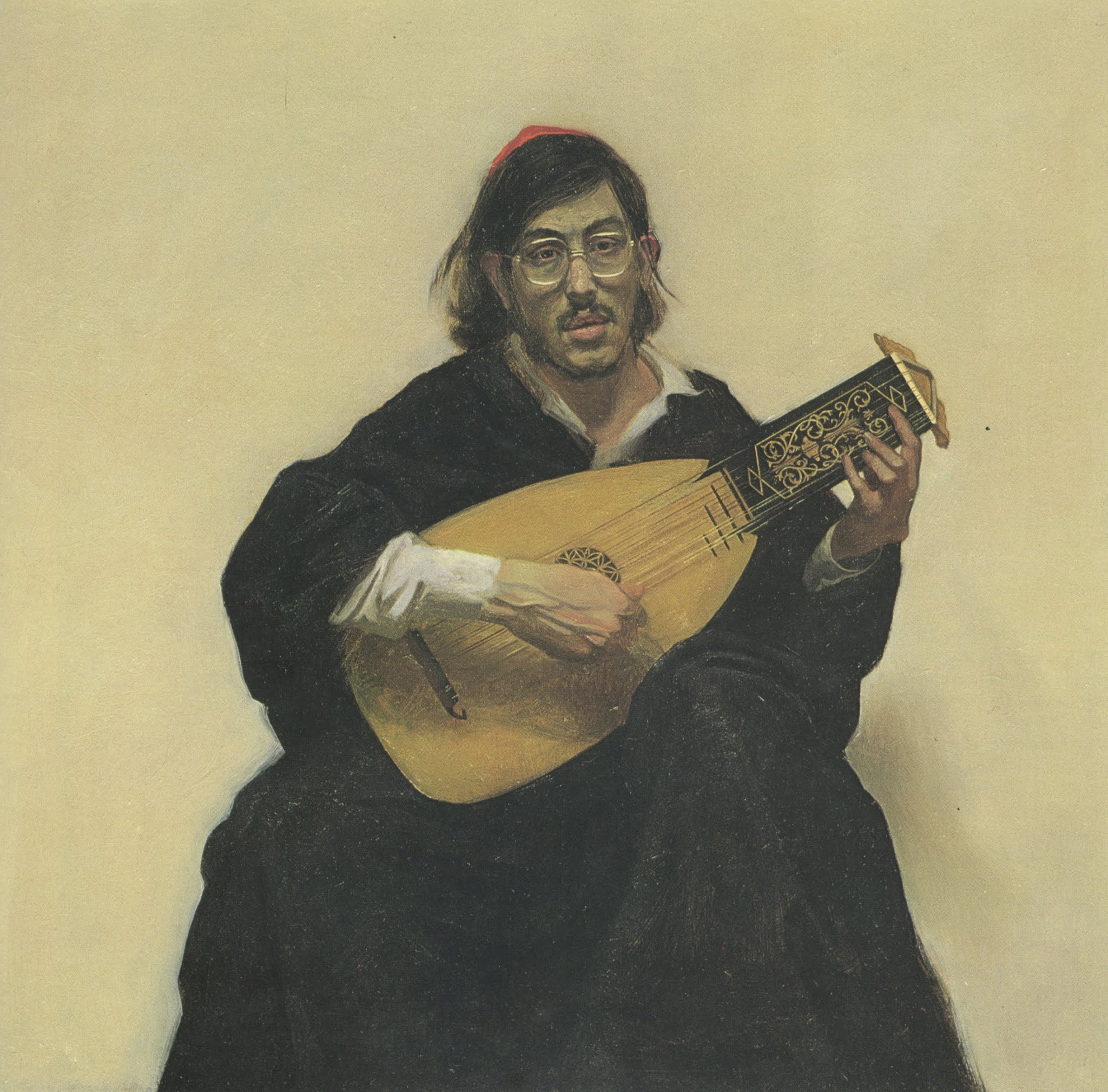
Harvey Dinnerstein had some interesting things to say about the relationship between art and journalistic illustration.
Like his friend Burt Silverman, Dinnerstein was a "fine" artist who earned money on the side drawing reportorial assignments for news magazines. Like Silverman, Dinnerstein specialized in portraits:


Dinnerstein's paintings were more overtly allegorical than Silverman's. Here is Dinnerstein working on his magnum opus, "Parade," inspired by seeing Delacroix's Death of Sardanapalus at the Louvre.


 |
| Detail from Parade |
 |
| Detail from Parade |
Like Silverman, Dinnerstein had an active social conscience and was interested in capturing the political events of his day. After reading about the young Martin Luther King in 1956, Dinnerstein accompanied Silverman to Montgomery Alabama to draw the bus boycott at the start of the civil rights movement.


The drawings were historically important but looking back, Dinnerstein found them artistically lacking. "The drawings were frankly reportorial, concerned with the individuals involved, church meetings, courtroom scenes, and the general locales. In retrospect, the drawings seem limited and anecdotal...."
Over the years Dinnerstein reflected on the balance between reporting the facts of an event and serving the timeless values of art. He wrote about the tension between the "specific and universal aspects of the subject:"
A major element in developing a pictorial image is the integration of particular information with a generalized concept. This is a most difficult question to resolve. If the artist is only concerned with incidental information the image will lack significant form. However, if the generalization is a mannered abstraction, it will become an empty stylization that will lack the organic quality of life.
As he developed as a journalistic illustrator, his approach evolved:
A decade later, in the wake of the assassination of King, and the escalation of American involvement in Vietnam, a protest movement containing many different elements swept across the country. I was commissioned by Esquire magazine to cover these events, and in depicting the demonstrations of the sixties I tried to get beyond the incidental nature of various events, and grasp a larger context of the movement and its implications.
Dinnerstein said he drew his inspiration from Kathe Kollwitz's drawings of the revolt of Silesian weavers in 1524:
 |
| Kathe Kollwitz |
Dinnerstein wrote,
There were amazing events in that period.... Candlelight procession at night, outside of St. Patrick's Cathedral.... Moratorium vigil, that presents aspecys of ritual and reminds me of paintings by Georges de La Tour.... Fort Dix, New Jersey: A protest march onto the military post, past barbed wire barricade, calling on G.I.'s to refuse to obey the orders of their officers. The march is dispersed with gas.... Chicago: An explosion of terrorist violence leaves a tail of shattered glass along the elegant streets of the city's gold coast.... after the killings of students at Jackson and Kent State there is a massive demonstration in Washington.... Communication seems impossible. Suddenly a group of demonstrators remove their clothes and charge nude into the reflecting pool before the Lincoln Memorial. As they are joined by others , an old black woman on the embankment sings the spiritual, "Wade in the Water." It happened! I saw it, and though I did not comprehend everything that was going on, these were remarkable events....
 |
| Burning shack in the Poor People's Encampment near the Washington monument |
 |
| Candlelight vigil for casualties of the Vietnam war |
 |
| Dinnerstein conflates a death at a riot with his memory of a Roman sarcophagus |
 |
| Protestors at St. Patrick's Cathedral remind Dinnerstein of a de La Tour painting |
Dinnerstein's journalistic pictures tended to be less literal than those of many other illustrators who were eyewitnesses to history. He took less pride in capturing specific details because he felt that he captured more of the spirit of these events by staging pictures more consciously with reference to older artistic traditions.
44 comments:
I'm not quite sure what to make of them. I like the bus boycott drawings the best, the ones he later felt were "too reportorial". But I find the others to be too overly dramatic (maybe not the right description?)
The last triggers a sense of a movie poster (ala Star Wars) which seems to be the wrong reaction to an important subject. Why would I have that reaction?
The Kathe Kollwitz drawing is good, but as Wes says, Dinnerstein's work is too posed. In trying to add the weight of history to these moments he instead turns them into myths. The reverence and fanboyism for this time, and for the art he references, shines through, and so you can't trust these paintings. I mean, the guy can paint, but why does he?
I think it goes without saying that Dinnerstein was quite an excellent draughtsman, in pencil and paint. And surely a very intelligent man; a diligent craftsman. That alone should be celebrated. His 'parade' was quite an achievement, maybe of fortitude above all else.*
In the brandywine pictorial philosophy - which, sadly, the nyc social realists of the period had been cut off from (for punk-political, as well as physical/temporal reasons) - it was understood that the solution to incidentalism was to shoot for what was called The Epic. The singular focal idea that connects to an emotion all can feel, and which also connects to some grand struggle that goes far beyond any particular moment, resonating mysteriously, even mystically, through time, nature, and circumstance.
It is terribly difficult to get those who have been indoctrinated into the materialistic presentism and tribalism of moral panic and political fervor to appreciate breadth, scope, and poetics; to distinguish beauty/truth and visual song from the vacuously pretty and the merely decorative. To get out of the moment and see what is common to all, and to find yourself in everyone and vice versa, instead of raging into the void of difference.
In my experience with this old midcentury artistic guard, they seemed to only find the truth/beauty connection in the individual figure or isolated figural group. This was a philosophical-cum-emotional failing; a kind of brutalist view or bitterness about life beyond the body or person, a basic negativity in temperament that was insurmountable. Maybe - who knows - caused by living in a world of metal, glass and concrete, of tenements and subways, poverty and nastiness, jostling crowds and sharp elbows. Regardless, there was ultimately a failure of that aesthetic transcendence necessary to timeless creating.
*(I won't belabor, but only point back to, prior applicable discussions about the anti-aesthetic nature of allegory, the problem of figural stiffness and how it relates to mistaking design principles for compositional principles, and how that relates to the fragmented art teaching of the 20th century and the pervading literalist sensibility that stemmed from the ubiquity of photography.)
Kev, the following was drafted earlier in response to your deleted post (i thought it was more succinct than the one you've replaced it with)...
This is the classic case of the artist with excellent hand-eye skills, who can paint sensitive portrait and figure studies all day, but falters horribly when it comes to narrative work. They usually have some strange sense of duty; that they're not fulfilling their role as a 'fine artist' unless they produce huge, multi-figural works full of allegory, that speak of the plight of the human condition. There's nearly always lots of anguished figures, upraised clenched fists, usually someone on crutches. The downtrodden masses ! Oh the humanity !
In my opinion it's a temperament thing. Some artists are just natural visualiser / storytellers and fall easily into that kind of imaginative / illustrative work. Others, such as the ones you mentioned (deleted post), should stick to what they do best... observational studies. Dinnerstein was a decent portraitist, and figure painter, but not narrative painter.
I would add that this case problem may not be as period and place specific as you suggest (NYC, 60-70s). I can think of many earlier and present day examples of the same type of artist.
p.s. There's also the related issue about the ongoing problem of narrative in painting (my pet theme) in the 20th century, which illustrators are spared, but which 'fine art'/ gallery painters come up against all the time (usually with predictably bad results).
p.p.s. I think i must be the only regular commenter on this blog who can't stand Kathe Kollwitz's work. I know... heresy... but I've said it now).
I think Wes, Matthew Adams and Kev Ferrara have all pointed, in different ways, to a genuine concern about artists who draw on the spot: as eyewitnesses to history they can become so caught up in the events that their artistic sensibilities are overwhelmed. I agree that in his circle of artists (I'd add Silverman, Aaron Shikler, David Levine and St. Julian Fishburne to Kev's list) Dinnerstein succumbed most to the mythologizing, "movie poster" temptation, which I agree is a weakness.
They all banded together as friends in the 1950s because they disliked abstract expressionism, which was then dominant. They shared an interest not just in realism but in the human image. They worked together and sustained each other in a hostile cultural environment. (Dinnerstein tells of acquiring plaster casts that had once been used at Vassar for studio art classes. Vassar concluded in 1928 that such tools were no longer relevant to art instruction so they put the casts in basement storage for 40 years. Vassar girls dragged them out once or twice as a joke props for college dances and wrote graffiti on them in lipstick. Dinnerstein rescued the last few from the garbage.)
I do think some of your political critiques (fanboyism for this time, the hot and consuming presentism of political thinking) sell short the nature of Dinnerstein's experience. He had the foresight to travel to see Martin Luther King when King was still a penniless and largely unknown minister in a tiny church, and Dinnerstein was there ten years later after King was assassinated, the leader of one of the great moral crusades of the 20th century. Dinnerstein's sense of wonder is easy for me to understand, and while we don't want an artist who resorts to Hollywood style awe because his critical faculties have been numbed, at the same time we aren't well served by an implacable artist who passes through such social upheaval without being singed.
Finding the right balance is the challenge for the journalistic illustrator. I was not old enough to appreciate what was happening back then, but it's pretty clear that significant portions of the world were coming apart (the Vietnam war, the assassinations, the cultural revolutions, the invention of the birth control pill, etc.) . You might say the past few months in the US have again challenged some pretty basic assumptions, but today journalistic illustration seems to be totally AWOL. I've seen nothing except photographs. Can anyone point me to a contrary example?
Laurence John-- The problem may be one of temperament, but it seems to me that when this particular group goes astray, it may be because they're too literal. This was a brainy group, mostly liberal, mostly Jewish, very verbal and I think much of their narrative art was handicapped by a need to associate words with visual symbols. You could almost read Dinnerstein's "parade" like a book, from left to right. This figure stands for youth. That figure stands for death. If they were working in the era of Bosch or Breughel such allegorical pictures would be perfectly acceptable, but today they present the problems you describe. Today narrative artists need to de-link their pictures from their philosophical treatises and let the narrative breathe a little.
Saul Steinberg was in the same demographic-- wordy Jewish intellectual artist with a penchant for metaphor and allegory-- but as he became more oblique and gave his IQ a rest, I think he really matured as an artist
I do believe that many in this group of painters were excellent portraitists, which is no small talent. Aaron Shikler did the official portrait of John Kennedy now on display at the White House. But I don't think that as "narrative artists" any of them could hold a candle to N.C. Wyeth, for example.
"Can't stand" Kathe Kollwitz is a mighty strong reaction. I can understand why people downgrade her for being shrill and sermonizing. They feel she straddles the line between art and propaganda. But on the other hand they mostly manage to "stand" her because they think she has powerful graphic skills, a sensitive line and yes, great narrative abilities. For example, what do you think about the storytelling in the conspirators or after the battle?
I think we all understand that good journalism is very important; crucial to a functioning and sane society. We clearly do not agree on just how far journalism per se (not just one's personal/tribal/partisan bêtes noire) has lost its way, or why and what to do about it. That's a discussion for a different, far more depressing blog.
Covering Martin Luther King was an important endeavor, doing it well; twice again as important. I can't say Dinnerstein's reportorial images defy his own assessment of them. They do indeed lack, much so for the very reasons he pondered. Which is why I brought up the brandywine philosophy on The Epic which addresses that issue directly; a matter of imagination, art not fact.
Laurence, regarding your point that "some artists are just natural storytellers" - I certainly agree that talent runs the gamut from genius to hapless. But I've never known a great visual storyteller that didn't know a hell of a lot. The Famous Artists Courses, which were geared toward younger artists, alone contain thousands upon thousands of pearls. The brandywine notes constitute at least two hundred pages.
Reportorial 'Social Realism' in the United States has a long history. Frank Schoonover did a series on children working in coal mines in 1902, while still studying under Howard Pyle. NC Wyeth did his classic Opium Den image in 1913. The 'Ashcan School' was doing its work outside of the publishing world at the same time.
The ashcan school had Robert Henri to guide it artistically. The Brandywiners had Pyle. But the crusading social realist artists of NYC, coming out of the depression... they only had - aside from technical instruction - other crusading artists, mannerist cartoonist/designers mainly; guys like Boardman Robinson and Ben Shahn, and these guys had a makeshift aesthetic education. They concentrated on Marx and marks and sneered at the fogey old poets and their airy romanticism/imagism. (A great number of first hand accounts of these attitudes have been preserved in interviews archived at the Smithsonian.)
And so when the group we are discussing sought to advance their art, they didn't have the philosophical foundation. They had all the most advanced information on form and structure and paint application and design and color and photography but they were starting from zero artistically/narratively like it was 1400 all over again. They could only look to the classical world and replicate its surfaces. And this tradition continues to this day in the atelier movement.
The problem may be one of temperament, but it seems to me that when this particular group goes astray, it may be because they're too literal.
It is all of a piece; the material literalism, the hard boiled headstrong temperament, the "intellectualism", the politics, the righteousness, the deep anxiety, the inability to get beyond the dogma of words and surface symbols. All connected psychologically.
I think much of their narrative art was handicapped by a need to associate words with visual symbols. You could almost read Dinnerstein's "parade" like a book, from left to right. This figure stands for youth. That figure stands for death.
Exactly so.
My point is always that the retreat from Imagism was a regression from a poetic-aesthetic progress that was several hundred years in the making. The avante garde did not understand what it was vandalizing.
David: "I do believe that many in this group of painters were excellent portraitists, which is no small talent."
Agreed, and that was part of my point. Not everyone can be (or needs to be) NC Wyeth.
Kev, not every artist needs to be an 'imagist'. An 'objective' observational portrait, figure study or landscape has its own beauty (if done well) and doesn't have to come from the 'imagist' tradition.
Also, works such as this (this one is by Dinnerstein)...
https://lh5.ggpht.com/pGDcfj68r7BQRe9Pk4z5f4Ju_x0EHx1A0_h8NKNzdYiqkbvUPP3s6CVxhls=s1200
... are clearly trying to do something different than 'imagism'. The construction is like a theatrical tableaux rather than a believable, slice of life drama. The artifice is deliberately obvious, like a stage play. Clearly a different mode of narrative picture making is being attempted.
"Yeah, and it sucks because it's not Brandywine !" you'll cry.
Well, my intuition is that an artist such as Dinnerstein would not have been a great illustrator if only he'd gone Brandywine / imagist. I think he still would have been a mediocre illustrator, and should have stuck to the portraits and observational stuff.
David,
Regarding Kollwitz; content-wise it's 'oh, the darkness and the suffering' dialled up to 12, and heavy handed with it.
Form-wise, there's just so many clunky, weird, awkward, bodged bits of drawing that i can't get past. I realise I'm in the minority, and she's almost achieved near saintly status, but I just had to say it. Apologies to all the Kollwitz fans.
I'm with you on Kollwitz Laurence, so don't feel too alone! Though it's not that I "can't stand" her work, rather, for my taste it feels overtly bombastic and over ripe, cheesy even.
Great discussion though. I'm still trying to properly process Kev's thoughts on the imagist thing, I can only say at this point that the idea seems to be the key to resolving many of the issues raised by David's post.
Laurence,
Robert Henri, whom I mentioned, was not an Imagist. He was an impressionist. But he understood the state of the art of his time.
I use Imagist as a shorthand for the full suite of visual-poetic compositional ideas and expressive tropes known by the time the Golden Age of Illustration was in full flower. Though, if only part of that suite is used, an Image per se may not result. Good art doesn't need to be an Image, obviously. But it does need to be self-consistent and poetic. And poetry entails suggestion and true abstraction, which requires deft and diligent observation and a synthetic imagination.
Impressionism was part of that suite, as was tonalism, romanticism, symbolism, 'art as music', 'art as decoration', Bargue and Bridgman's views on sculptural form, justified abstraction, suggestion/evocation, the truth/beauty connection, teachings on haptic form and linear encoding that became associated with Kimon Nicolaides, and so on. Even art as allegory was part of the toolbox.
Those who knew the extent of the poetic technology of the time could pursue their own unique vision with great confidence, truly schooled, thus with a deep understanding of justification. So we had all these great artists -- Sargent, Mucha, Leyendecker, Gruger, Klimt, Fechin, Brangwyn, Rockwell -- developing unique, brilliant styles, all at the same time, yet each different enough to be instantly recognizable. Coming from a place of deep knowledge and training, the styles were honest expressions, rather than surface characteristics.
Also, works such as this (this one is by Dinnerstein) are clearly trying to do something different than 'imagism'. The construction is like a theatrical tableaux rather than a believable, slice of life drama. The artifice is deliberately obvious, like a stage play. Clearly a different mode of narrative picture making is being attempted.
Mannerism, though it is often located to the 16th century, goes back to the beginning of art history. It is more a species of cartooning than poetry, a constructed/dogmatic realization of a cartoon, as I've mentioned previously. Though we can say that its overall stiff/doll-like surreal/unreal quality is indeed a poetic-visual effect, this mannerist manner always results in that same effect. And it lacks observational sensitivity. So I think it is best seen as a limited subset of the larger suite of poetic ideas I've been speaking of.
An interesting variety of mannerist artwork, all cartoons realized as volumetric-illusions through a dogmatic constructive method:
Chinese Imperial sculpture.
Tamara De Lempicka
William Blake.
Basil Wolverton.
Paul Cadmus
David Inshaw.
Mannerist examples continued...
Rockwell Kent
Boris Artzybasheff
Stanislaw Szukalski
Robert Riggs.
Grant Wood.
Kev, The Dinnerstein I linked to doesn't have the cartoony, stylized forms as in the examples you've posted. The figures (in his painting) are quite realistic. I wouldn't call it mannerist in that sense.
It's the acting and staging that looks artificial and deliberately theatrical.
To me, this sort of deliberate artifice 'breaks the 4th wall'. It says to the viewer "I know that you know that this is an illusion, so we don't need to pretend it's a snapshot of real life".
Interesting Laurence, I'd say the Dinnerstein you linked to feels definitely mannerist. And all the examples Kev posted, with the exception of the David Inshaw, are likewise. (I suspect he posted that one with me in mind, so if he did, I thank him. :) )
Because 'The Badminton Game' feels so extraordinarily rooted in some intensely lived experience, I do not see it as mannerist in the way the others are. But this, as far as my understanding of the term goes, doesn't qualify it as an imagist picture in the sense that a good Rockwell or Cornwell is. But it is neither something like 'poetical journalism (impressionism) of the memory' either. Needless to say, I haven't got to grips with this yet.
Kev, The Dinnerstein I linked to doesn't have the cartoony, stylized forms as in the examples you've posted. The figures (in his painting) are quite realistic. I wouldn't call it mannerist in that sense.
Don't assume that the term 'cartoon' must indicate a wild expression. The stiffness of dogmatism is there in everything in that Dinnerstein; from blocking, to pose, to design structure, to the rendering of volumes, to the flatness of the color fields. But it is more subtly than the examples I posted, so it feels like a hybrid (which it is). My examples were picked to show the variety of mannerism, and many of those are hybrids as well.
I agree that the artificiality is so blatant that it comments directly to the audience. Graphic blatancy combined with formalized dogma always takes on the quality of Symbol; that is the very nature of code.
Laurence John and chris bennett-- I appreciate your perspective on Kollwitz, and she has definitely produced some work that I would agree is guilty of the flaws you describe. Still, my bottom line is that she was a remarkably talented graphic artist.
In the 1930s, some members of the smart Hollywood set looked down upon the work of German film directors. Orson Welles rebuked them, "The people who were defending their children and their lives were in a different situation from the people who were defending their swimming pools and their contracts at Metro." I'm sure you know the story of Kollwitz's life, how she passed through ordeals and suffered tragic losses but still persevered. That makes her an admirable person but it doesn't make her a good artist. For me the relevant question is, did that life also wreck her art by causing her to "dial the suffering and darkness up to 12" or did it give her work a moral strength and purpose that more fortunate artists lacked?
Many years ago I posted some drawings by Kollwitz that showed, in my opinion, that in addition to the "heavy handed" drawings she also did sensitive drawings demonstrating a delicate touch.
As for the darkness of her subject matter, I couldn't take a steady diet of Kollwitz, just as I need a break from Goya and other graphic artists who passed through hell, and who I think emerged powerful and raw. (I distinguish these artists from artists such as Dix, who I think emerged bitter and distraught). But we're living in an era where dark, heavy drawings of people being slaughtered are adored by tens of thousands of fantasy fans at Comic-Con. People lap up black and white pictures with heavy shadows of the Joker killing helpless civilians, or drawings of Tolkien / Game of Throne armies armies butchering armies. Frazetta, who lacked the courage to stand up to his own wife, was famous for dark, sometimes overdone pictures of muscular barbarians bashing each other with battle axes. (That one was for you, Kev!). By what measure, then, should Kollwitz's work be dismissed as too dark and gloomy?
Frazetta, who lacked the courage to stand up to his own wife, was famous for dark, sometimes overdone pictures of muscular barbarians bashing each other with battle axes.
Yes, Frazetta had the good sense to steer clear of his extremely vociferous wife when she was at her most negative, balmy, and controlling.
Mannerism as I understand it: A simple or ideal graphic, cartooned or otherwise overtly designed visual narrative display that is asserted (inflated, sculpted, hammered together, modeled, arranged or otherwise constructed) into an illusory volumetric solidity with only cursory regard to naturalistic justification. (And the cursory justification coupled with the insistent assertion of it into a ‘reality’ is what causes it to be dogma.)
I might split it up this way; that there is Mannerism in Form and Volume. And then Mannerism in 2D Arranging and Staging.
The former gives us the clunky toy-like or doll-like simplicity of the elements and their puffy or blocky volume-illusions. While the latter gives us blatantly unnatural or design-y surface shapes and clunky game-like theatrical blocking.
Both aspect of mannerism have a strong geometric ideality, are anti-naturalistic, and are rarely manifested without the other.
When the environment dominates the Mannerist picture, we tend to get a kind of absurdist illustration or diorama of Medieval religious philosophy: The idea that we are not only all miniscule compared to the universe, but further, we are but ridiculous and simple game pieces, symbols realized as plump or blocky tokens - playing out predetermined moral games and scenarios at the order of awesome controlling forces beyond our comprehension: The silly playthings of Cosmic Fate, the barbie dreamhouse dolls of God, the test subjects of the Engineers, the Second Life of the Simulators playing out, and so on.
While, when figures dominate the Mannerist picture, we tend to get arch Brechtian theatricality; obvious staginess; an alienating, stiff quality with uncanny valley ‘people’ posed frozen in flat-to-the-picture plane silhouettes within the tight confines of a proscenium frame. The puffy-plump, globular, or wooden figures may recall stylized ancient sculpture. The backgrounds tend to feel flat and claustrophobically close to the viewer rather than distant with aerial and linear perspective.
Thanks Kev, also for taking the trouble to formulate it so thoroughly. Very illuminating, and clarifies the understanding within a definitional framework.
But what you have written, along with my feeling that the 'The Badminton Game' realizes an intensely felt a past experience, brings up the question: 'what is mannerism in the aesthetic service of?'
Taking a shot at answering this myself, based on your definition above, I'd say that in the case of 'The Badminton Game', it serves to realize a cherished memory in the form of hallucination or heightened perception, possibly the very state induced in the artist when he beheld the original event, even if the 'event' was an internal fantasy formed of amalgamated experiences.
This seems to set a large portion of Inshaw's work apart from most of the other examples you posted, which I would describe as 'mannerism in the service of decoration or symbol'. For this reason I believe 'The Badminton Game' serves a much richer aesthetic purpose. Does this make sense in your view?
Also, I'd say the imagist version of what Inshaw is doing (poetizing a past experience) by way of mannerism would be something like 'Pegwell Bay' by William Dyce.
https://commons.wikimedia.org/wiki/File:William_Dyce_-_Pegwell_Bay,_Kent_-_a_Recollection_of_October_5th_1858_-_Google_Art_Project.jpg
Forgive my not embedding the link, but I haven't been able to figure out how to apply the appropriate tags to do this, despite some Google searches.
By what measure, then, should Kollwitz's work be dismissed as too dark and gloomy?
Well David, I believe it to be when it is an outcome of narrative distortions in the service of propaganda. Narratives, be they fantastical or naturalistic, playful or brutal, light-hearted or tragic are about the human condition. They feel fake when they tell lies (deliberate or unintentional) about what we really are.
That seems overly harsh on Kollwitz I know, especially when one thinks of what is being done to, say, the Hollywood blockbuster franchises, but hopefully you get my drift.
I do however, wholeheartedly agree that she is an extremely gifted graphic artist.
How much does composition matter here?
For example, the Candlelight vigil for casualties of the Vietnam war is, in isolation, relatively moving and interesting, perhaps even better sans the title. But the Protestors at St. Patrick's Cathedral seems have some of the more obvious elements of a movie poster and reminds me of the most famous of the star wars poster, which is unfortunate, but it might just be me that sees it this way.
https://www.google.com/search?q=star+wars+poster&rlz=1C1CHBD_enUS883US883&tbm=isch&source=iu&ictx=1&fir=yBoF6fdkiU6y2M%252CA_10sV8ngyOqSM%252C_&vet=1&usg=AI4_-kSYHf5SA_UzXS-pXlNsJtrFkT2XqQ&sa=X&ved=2ahUKEwi_2pmNh9nuAhXaIDQIHfZyAGYQ9QF6BAgTEAE&biw=1920&bih=937#imgrc=WcxOMXavgz3jbM
Many illustrators used the compositional elements of the star wars poster of differing size, background elements, multiples scenarios, etc. I’ve seen it on numerous pulp novel covers and many are quite interesting and compelling and convincing. (I’m sure this style has a name but I don’t know what it is.) For example:
https://onmilwaukee.com/articles/saturday-night-in-milwaukee
Does this matter that the Protestors at St. Patrick's has (somewhat) of this quality, or is something else going on that I can’t see? Am I misreading the artists skill or intent? The figures are not really standing together, but are each rising in the scene, each illuminated by their own light only, so not a realistic view at all. Is this a compositional issue?
Thanks all for the great analysis. Such good source of artistic insight.
Chris,
In my view, Inshaw's picture is a hybrid of mostly Mannerism with a dash of Imagism.
The sense of ideality or unreality, and the absurdity of the simple colors, simple volumes and game-like staging belongs to Mannerism. While the sense of mystical echoing is a classic trope from Imagism.
The smallness of the figures in relation to the landscape - in the context of the mannerist realization - relates back to what I wrote above, the feeling of being dwarfed by existence coupled with the feeling of being a tiny doll-like entity, a toy in a much grander game.
All of these things would assist in the feeling that you are looking at something dreamlike or evocative of a distant remembrance.
The Dyce is quite naturalistic, rather than Imagistic, and feels tonalist with its sandy yellow colors suffusing just about everything. The two front-facing and flattish figures (and how all the figures exist in a frieze-like array at a near depth) give it that theatrical stagey quality of mannerism, but only a slight touch of that.
Generally, Imagism has thematic and meaning-generating relations. While Naturalism has naturalistic relations that correspond to nature and fact. The struggle of Imagism is to make it feel naturalistic. The struggle of naturalism is to bend it toward Imagism without getting mannered. The struggle of tonalism is to get sufficient colorvalue contrast to prevent boredom without breaking the tonality.
I've emailed you an explanation of the code to get hyperlinks into your posts.
Kev Ferrara wrote: "The ashcan school had Robert Henri to guide it artistically. The Brandywiners had Pyle. But the crusading social realist artists of NYC, coming out of the depression... they only had - aside from technical instruction - other crusading artists, mannerist cartoonist/designers mainly...."
Perhaps, but aren't there other variables (besides lack of training and bad attitude) that might better explain the erosion of what you call the imagist aesthetic? By the time of the Great Depression there seemed to be little ongoing market for Howard Pyle style stories about King Arthur and Robin Hood. The social conditions that originally inspired the ashcan school had metastasized into more extreme and pervasive conditions that led to a more robust social realism. The public seemed to have less patience for 19th century story telling and those wonderful Scribner's illustrated classics by Wyeth, Parrish and others. The public turned to pulp magazines and comics for their escapism. By the end of the 1930s the costume stories, historical fiction, adventure stories that employed Mead Schaeffer, Dean Cornwell, Rockwell, Tepper and Leyendecker had largely died out. Illustrators either changed their style away from what I understand to be your imagist school (like Schaeffer, Cornwell, Rockwell, etc.) or they starved (like Leyendecker who, despite his remaining talent, could not find work).
It seems that World War II finished off certain kinds of fanciful story telling and focused the public on more grim realities and concrete subject matter. After WW II, the metamorphosis sped up. (Al Parker's discussion of the post WW II illustration market in Walt Reed's Illustrator In America is well worth reading if you haven't already.) By the time Norman Rockwell had his "passing the torch" lunch with the young Bernie Fuchs, both respected but seemed to have little to say to each other because none of Rockwell's wisdom would help Fuchs get an assignment or meet a deadline in the new world of illustration.
I agree that social realism had a resurgence in the 1960s because of civil rights and the Vietnam war, but it doesn't seem fair to attribute much of the erosion of imagist poetics to that.
Kev Ferrara also wrote: "And so when the group we are discussing sought to advance their art... They could only look to the classical world and replicate its surfaces."
Dinnerstein wrote about making use of images from the classical world, and urged his students to do the same. He said, "artists have often developed themes as variations on art of the past. The gestures of figures in art of classical antiquity were reinterpreted by Renaissance artists, and Titian's paintings in turn inspired images by Rubens, Poussin and others. Degas is a prime example of an artist who was absorbed in a study of the old masters all his life." Dinnerstein tried to work in this tradition, melding classical compositions and gestures so that his paintings were "related to the past but rooted in the present."
chris bennett wrote: "I believe [Kollwitz's work be dismissed as too dark and gloomy] when it is an outcome of narrative distortions in the service of propaganda."
It sounds like you're saying that a Kollwitz image of a mother searching for her son among the dead on a battlefield would be unacceptable if it is antiwar propaganda but would be OK if it is a panel in a graphic novel about a battle.
It sounds like it, but I'm sure you don't intend that.
Kev Ferrara,
If Mannerism is a form of cartooning and uses part of the full suite of devices necessary to create an Image, does that mean that cartooning is part of the process of creating an Image, or is Mannerism some kind of bridge between two fundamentally different types of art?
Wes: "The figures are not really standing together, but are each rising in the scene, each illuminated by their own light only, so not a realistic view at all. Is this a compositional issue?"
Wes, the fact that the illustration is reminding you of a montage poster or book cover is a failing on its part, since I'm sure the figures are supposed to be occupying the same space. The fact that the two nearest figures have edges that fizzle out is adding to the floating / montaged feeling that they're not quite in a realistic space. Plus, there's virtually no sense of contact with the ground. Are they kneeling or standing, and on what ?
Also, all the eyes are directing you to the girl's hand, but there appears to be nothing in it. It feels like there should be a large candle there with a visible flame that is the focal point of the picture, but it's weirdly absent.
Kev: "Good art doesn't need to be an Image, obviously. But it does need to be self-consistent and poetic. And poetry entails suggestion and true abstraction, which requires deft and diligent observation and a synthetic imagination"
I'd like to understand how you're defining 'poetry' when you use the word in sentences like the above.
It's such a broad term, and I'm sure there would be lots of art that falls outside what you consider to be 'great art' that could also be described as 'poetic' or uses 'poetic' devices.
If Mannerism is a form of cartooning and uses part of the full suite of devices necessary to create an Image, does that mean that cartooning is part of the process of creating an Image, or is Mannerism some kind of bridge between two fundamentally different types of art?
Brandon,
Thornton Oakley in searching to describe the brandywine/Imagistic method said that it was, at least in part, a 'cartooning of the depths' rather than the surfaces. In other words, it seeks to bring complex expressionism into the internal structure of the work. Which then, subliminally, shines through the more or less naturalistic surface from beneath it.
Expressionism exhibits its cartooning on the surface in a performative, exuberant way to create a vibrant, highly subjective, somewhat de-literalized graphic version of what is ostensibly represented.
Mannerism constructs on a surface a solid-feeling literalist version of a cartoon or design idea, with a surreal result. It can be fun too, but the stubborn use of bluntly simple rendering illusions/conventions is by its nature plodding, and needs to be overcome by other factors of the work. Where expressionism breaks up the surface reality into a kind of anarchic visual music, Mannerism embalms the surface with smearing, smoothing, blockiness, and gross roundness.
So, all to say, "cartooning' is part of all three styles, but is implemented in different ways for each.
I'd like to understand how you're defining 'poetry' when you use the word in sentences like the above.
Poetry uses abstractions to subliminally produce meaningful effects in the mind of the audience regarding the surface depiction. A poem has unity of purpose.
Perhaps, but aren't there other variables (besides lack of training and bad attitude) that might better explain the erosion of what you call the imagist aesthetic?
Yes. For one, during the Depression most periodicals, to survive, became adjuncts of the advertising industry. Couple that with costcutting, and you get the easy cheap flowering of photography. Couple that with the anxiety and issues surrounding economic collapse and you have a growing public taste for literalism, materialism, and journalism. Now the photographic journalistic sensibility and speed/cheapness takes hold, and artists adapt and adopt the same sensibility out of necessity. Speed and cheapness, photography and projection and tracing, cram a little artistry in there if you must. Pander to the AD who is sucking up to the client trying to sell wonderbread and wonderbras to people with no sense of wonder. Television rides in on a big horse and starts sucking up the ad dollars. Let's get radical so we can grab eyeballs back. Let's scribble and splash like the abstract expressionists, let's get negative, let's scare people, let's get funnier, let's get more sensational, what about slicker paper and more color? Let's get political, what about UFOs and tits and cults and murder and movie stars and drug use and exploding volcanoes!? (And so it goes and went.)
Well, a group of talkative, conscience-ridden guys with drawing talent see some things out there that make that angry and they want to do something about it. So they get together and make art nobody really likes.
There's a reason cartoons and graphics and photographs and memes have come to dominate the political realm. This really gets back to the whole problem of political art. It is of the moment and for the moment and made in the moment. It is tactical by nature. It isn't for all time. Or, more accurately, what makes it tactical is exactly the opposite of what might make it timeless. What lasts is what is universal and echoing through history, and this is more church than journalism. And what makes for good art is suggestion, the opposite of the explicit nature of tactical propaganda. Didactic Grand Social Realism paintings are a kluge, at odds with their own purposes. (As well as a scary attempt to turn politics into religion.)
Kev: "Poetry uses abstractions to subliminally produce meaningful effects in the mind of the audience regarding the surface depiction"
Kev, nearly all paintings are built out of interlinking abstract passages of paint (unless they're slavishly photo-real) so that doesn't narrow it down much.
Would you be willing to link to a painting you like and point out what you think are the 'poetic' devices being used in that particular painting ?
I don't expect you to write an essay for our benefit, so it could be as brief as you like.
Kev, nearly all paintings are built out of interlinking abstract passages of paint (unless they're slavishly photo-real) so that doesn't narrow it down much.
I'm trying to do the opposite of narrowing it down, because the width, breadth and scale of poetic effect in the arts is the staggering truth of the matter. When you talk of 'interlinking abstract passages of paint' you haven't even begun to capture the extent of the subject. That is why every great painting requires a treatise filled with demonstrations shown to an audience already holding a paintbrush. Even a great drawing requires a treatise. I can't even explain why a treatise is needed without writing a damned essay.
Every relation can produce an effect. Yes, a patch of paint reacts against another patch of paint. Yes, that is a poetic effect. The two patches form a new unit. Then that unit reacts against other units, forming in turn a new unit of poetic effect. And this larger unit reacts again to others at similar scales, at smaller scales, at larger scales and then again to the entirety, to the gestalt, to the composition as a whole.
What binds the relations is similitude. Break the similitude and the relations are broken, and the effect vanishes. You see a weeping willow sagging. You see a beaten man shuffling to work. Their mutual droopiness rings together. This is called resonance. Resonance is the sensation of relation/similitude. Where there is relation there is effect; poetry. A color relates to a similar color. A shape relates to to a similar shape. A species relates to a similar species.
But with each relation there is also alienation, the difference. Differences repel, visually, physically, sensually, emotionally, conceptually. Similitudes attract, resonate and tension-bind, visually, physically, sensually, emotionally and conceptually.
You imagine a red round face of a baby - therein are four different aspects (redness, roundness, face-ness, and baby-ness) that may be put into a meaningful visual relation with the aspects of other elements in the picture to form an effect. Let us say you neglect to place another red in the picture to relate to the redness of the infant's face? Then you have an unrelated color. Everything unrelated is out of unity, out of scheme, thus lurking outside of a unifying effect. Therefore the red, while it may resonate with the experience of red baby faces in real life, within the picture it is aesthetically lacking in meaning, and will be a dead spot, a graphic curiosity that attracts improper attention. And the spell of the conjured reality is broken.
To achieve unity among so much, you must have a self-similarity active at and between every scale of the work. But unity alone is just a principle of design. Unity of meaning housed in a dramatic narrative or tableau, that is the stuff of poetry. It is all a weave of effective relationships all building and combining into the great effect of the whole; the point is to signify with respect to the narrative and its characters. This brings up the matter of theme, and metaphor, and movement, and quality and condition and attitude and gesture and narration and suspense and setting, stress tension and release, all acting toward the total effect, the unitary purpose.
What is the unitary purpose? The answer is whatever you felt and imagined it to be. Thus only you know. And each solution is unique; a sui generis complex effect. How do you begin to engineer such a thing? Again, it is a weave of meanings. And the more you put in, the denser the weave must be to bring it all into meaningful relation with the overarching idea.
Imagine trying to paint a picture using the intellect when this is the level of poetic suffusion and nonlinear complexity involved! Imagine, further, trying to paint a picture without a governing idea, without a previsualized end point to guide you. Especially when one can finger paint and throw pigment all day long to achieve unconnected effect after unconnected and meaningless effect. This is why Pyle and his acolytes advised doing everything as simply and brutally as possible, and making as many thumbnail sketches as it took to nail exactly the imagined image in mind.
How does one populate the image? Harvey Dunn said, "seek within for appreciations to bring into your work." You once saw, as a child, rustling leaves of a tree glitter like jewels in the sunlight. How do you bring this glittering tree effect into your picture while still painting an identifiable tree with integrity and spontanaeity?
"The girl's mind was a world away." How do you convey that using the common elements of a country kitchen, the common dress of a country maiden, plus one door and two windows? How do you make the composition feel heavy with sorrow? How do you make it feel like love is in the air? How do you draw the world so it feels sick, or strange, or huge or cave quiet? These ideas area all built of effect weaves that form a complex effect totality greater in significance than the sum of its parts.
It sounds like you're saying that a Kollwitz image of a mother searching for her son among the dead on a battlefield would be unacceptable if it is antiwar propaganda but would be OK if it is a panel in a graphic novel about a battle.
It sounds like it, but I'm sure you don't intend that.
This is why I used the words ‘outcome’ and ‘distortions’ in my sentence: “I believe it to be when it is an outcome of narrative distortions in the service of propaganda.”
It's how the theme of the image is realised, not the theme itself that is the problem I have with the work of Kollwitz. So whether she is intending the work to be used in an anti-war poster or a graphic novel is irrelevant to the point. In my view. her work has an innate tendency towards propaganda regardless of the context within which it might be reproduced. Thus its defects, realized in plastic terms, are born of communicating personal agendas (consciously or unconsciously), and this is precisely what makes it feel mawkish, overblown or melodramatic. They are distortions of the truth for persuasive effect rather than insights about truth itself.
kev ferrara said...
"Thornton Oakley in searching to describe the brandywine/Imagistic method said that it was, at least in part, a 'cartooning of the depths' rather than the surfaces. In other words, it seeks to bring complex expressionism into the internal structure of the work. Which then, subliminally, shines through the more or less naturalistic surface from beneath it."
Could bringing complex Expressionism into the depths of the image involve caricaturing the core truth that the artist is trying to communicate? This caricature becoming the cartoon armature that holds the other elements of the Imagist's suite of effects?
Does a cartoon by Don Martin differ from a deep cartoon by N.C. Wyeth in the sense that instead of undergirding everything that makes the image poetic, it stands naked and blatantly spells everything out for the viewer? (in a hilarious fashion). I'm curious if you would consider Herriman's Krazy Kat and Percy Crosby's Skippy as beginning to interact with key aspects of the Imagists suite, and therefore becoming poetic cartoons? Further down the road maybe Sergio Toppi, and then after that, the cartoon has sunk so far below the surface it would be inappropriate to call the work a cartoon?
Sincerely, confused and interested.
Brandon,
Cartooning, as I am using it here, more means composing mainly in line with an emphasis on expressing the idea graphically rather than exaggeration to the point of absurd distortion, as we might associate with Don Martin's wonderful work. You can look at Howard Pyle's preliminary sketches to see what that looks like.
There are many ways to express truth in order to share it, and each in its own way is distorting. If we hear the same truths in new ways - drink the old wine in new bottles - enough, I think we get a fair enough sense of the underlying wisdom despite the fallibility of every language and method we use to share it. Even clarification and focus are kinds of distortion.
Every relationship one can imagine can have truth to it. Relations intertwine with other relations to form a weave of relations; and that weave is a relationship as well, a context. So truths weave with and nest within other truths, and can form true contexts, which can then nest within other larger true contexts, paradigms within paradigms.
A silly, wonderful goofy cartoon can have truth to it, but maybe not truth enough to say it is justified. What makes a truth justified is how well woven with or nested in other truths it. This is how simple truth can be made to lie; it can be set forth in fallacious narrative context to manipulate an audience into thinking something false but desirable to the manipulator (this is politics and advertising in a nutshell.)
Gross exaggeration can be redefined as simple expression released from complex justification. Great visual poetry, or a great image, one can say, is justified sufficiently; in that it is neither under-justified nor over-justified. It is neither bluffed nor over-explained.
All to say, the overtness, wild exaggeration, and lack of justification of a wild Don Martin cartoon makes it a very different thing than what is going on in a great N.C. Wyeth picture.
Thanks Kev, that is very helpful! I'm especially happy to hear you talk about justification, because until now I had understood it basically as the amount and type of rendering used when making a picture. The way you describe it above makes it clear that it is a much more complex and interesting process. I'm happy too, to understand a bit more of why I laugh at a Don Martin cartoon.
It seems that World War II finished off certain kinds of fanciful story telling and focused the public on more grim realities and concrete subject matter.
One of the greatest Imagists of all was also one of the most popular post-WWII artists; Andrew Wyeth.
Edward Hopper was also primarily an Imagist, as was Winslow Homer.
Point being, one must understand that being overtly "fanciful" is only one thing an Image can be.
Maybe had those with "serious" "concrete" artistic ambitions had an actual education in Imagism, they would have had the aesthetic foundation to make art with the poetic potential for popular impact they had hoped for.
Instead they succumbed to the facile denigration and dismissal of Imagism, borne of sniffy insularity and epistemic arrogance. (Maybe even envy directed towards those not dominated by the harsh mistress of left-brain literalism, as they were.)
That so many of the top film directors are and have been Imagists only further highlights their misjudgement.
Post a Comment