
Every beginning art student is taught to draw volume using rounded lines that follow the form:

Yet when Robert Fawcett drew cylindrical columns...

Whoa! What the heck is this???

Did Fawcett miss that art class? I don't think so. He seemed quite proficient in other respects:

But somehow, as Fawcett developed as an artist, he decided there were better ways to draw volume than lots of repetitive fine lines. He used loops and swirls and drybrush that even went against the form, yet it always ended up looking all right in the end.
Some of the other great illustrators seem to have reached the same conclusion, outgrowing those uniform lines in favor of lines with more character and variety. Were they right? Well, let's take a look.
We should start by recognizing that many talented illustrators used the "thousands of fine lines" technique to express form.
Norman Lindsay:


Frank Frazetta:


Lee Conrey:


There's a lot to admire in this technique, but ask yourself, "What exactly am I admiring?" The level of physical effort? the technical skill in controlling so many fine lines? The energy suggested by all that activity? Then ask yourself whether there are more admirable things to admire about drawing.
Take for example the case of Austin Briggs. Like many other artists, Briggs started out drawing thousands of fine lines wrapping around his subject matter. By the age of 20 Briggs was already successful drawing in this style for top magazines such as Colliers.


He quit working as an artist altogether and resolved to start over, taking the time to learn "honest" drawing.


I set about learning to draw, which I never could do before, despite the fact that some of my illustrations had been more or less acceptable. I really didn't know the craft of my profession. I think I had imagination then but I really didn't know how to use it.
At the end of his re-education, Briggs threw out 98% of his lines, but devoted the same level of attention to the few lines that remained. Nothing was done on automatic pilot. Each line became more thoughtful and expressive. Lo and behold, those lines turned out to be every bit as successful at conveying rounded forms.


Compare the following two illustrations by Briggs of the same subject, before and after his conversion:


Briggs abandoned the duplicative lines whose only role was to reinforce the line to their right or left. He became more selective about the lines he chose to emphasize and he found ways other than repetition to emphasize them. And just like the mature Robert Fawcett, whose drybrush swirls we witnessed at the beginning, Briggs became less concerned about staying within the lines:
Alex Raymond is another example of an artist who started out using those fine lines wrapped around the form:

But after thousands of drawings, Raymond came to view the potential of a line more broadly:

Now those are what I call "real lines."
Neither technique has a monopoly on quality. There are good and bad examples on both sides. But it's a mistake to assume that artists who draw with a thousand fine lines work harder. Instead, they often remind me of Abraham Lincoln's story of the preacher who said, "I could write shorter sermons but when I get started I'm too lazy to stop.”
148 comments:
That's really interesting. And it does feel like a representation of the movement from classic illustration to the styles developing during the "golden age of illustration". The intricate hatching being replaced often times by the more "graphic" approach of guys like Parrish, Beckhoff, Hassall that precedes the "Ligne claire" style of illustration and cartooning, focusing on line contouring over volumetric gray toning. Now when you see classic rendering like that it feels like an homage to turn of the century drawing, like in the case of Bernie Wrightson's Frankenstein.
Reminds me of Mark Twain's apology when writing to a friend: "Sorry the letter's long—I didn't have time to make it shorter."
I always associated the "thousand lines" style to engravings and etchings, where to my eye they where just as occupied, if not more, with conveying light and shadow and value. And the values depicted must be consistent with the forms expressed, so the skill is found in how elegantly lines express both properties simultaneously. You know, the dramatic Doré stuff.
But yes, there is something in using the line to convey form without having to explain in detailed form how the light wraps it.
Xombiekat-- Good point. There was a whole era of illustration that moved away from the intricate hatching style, so that Frazetta was branded "out of touch." Yet there were always individual artists such as Wrightson who loved that style and held onto it. It was usually a popular style with the public, for the reasons discussed in this post.
Yes, Parrish and Beckhoff showed what could be done with a cleaner style, and a generation after the Briggs generation, an even more clean, more simplified, flatter style (Potter, Peak, etc.) became popular on the road to ligne claire. But it hasn't all been a one way trajectory away from overworked, complex drawings toward simplification and lucidity. The great draftsmen of Briggs' generation-- Sickles, Fawcett, Parker, Fuchs-- used fewer lines, but the lines they used were more complex in different ways-- rich, lush lines, lines with a rough edge or a charcoal texture or an ink splash- their goal was a sensitivity of line that was the opposite of ligne claire.
Anonymous-- That really does apply. Drawing a hundred identical lines in a row is light labor compared to making artistic choices.
xopxe-- Agreed, in the era of wood engraving those lines were the only way to create tone. I think that's largely how Franklin Booth used them (in the previous post), but I don't think that's how they're being used in today's examples. As talented as those 19th century wood engravers were, and as dramatic as that Doré stuff was, I don't think they could've created the lines of a Lindsay or Frazetta by carving them out of wood. Those are the light and elegant lines of ink on paper, and while part of their curvature does suggest shadows from a light source, there are far too many lines wrapping all the way around the figure or other forms.
Just a comment, Doré etchings weren't wood but "aguafuerte" (don't know in English): zinc plate, covered in wax,and the wax is scratched with a needle. Then you submerge the plate in acid, and the uncovered zinc is dissolved. This allowed for ridiculously fine line work.
As a curiosity, in the Arts et Metiers museum un Paris there's exposed a special machine used to trace parallel lines and do cross hatching.
Very interesting, excellent article.
aguante la fierro
An artist's plastic 'handwriting' is attuned to their sense of form. So there is nothing inherently 'more expressive' in either scribbly marks or tidy marks. The difference lies between an empirical 'searching out' of form and space on the one hand and a methodical constructive approach on the other. The problem (expressive disconnect between content and execution) only arises when an artist's means of formal expression is at odds with their haptic temperament.
I don’t know where you found that horribly shaded cylinder. But it is bad.
Many may not know, given your post, that Golden Age Illustrators were, in fact, not trained to round the form in this way. Rather, they were taught variations on Bargue’s and Bridgman’s construction methods which generally cut across form. (Some commercial art schools may have taught the graded line method for certain kinds of graphic or technical illustration for line engraving or scratchboard. Most illustrators who use the method are self-taught.)
Anyway, early Alex Raymond – your clearest bad example of this type of graded line shading did not actually go to art school. Maybe that’s why it took him until 1950 to actually learn to draw; 20 years after he entered the business.
He was influenced by Matt Clark’s dry brush work and I think probably by Hal Foster’s feathering too. Took him a long time to see past the technique to the good drawing beneath in both those artists. By 1950 he was probably looking at Fawcett, Sickles, and Briggs; the fashions of the day.
The well-known Frazetta masterpiece you’ve posted is obviously full of great drawing, energy and flow which should not be lumped in with Raymond’s early, bluffed-yet-slick work. (Nor does it compare with the Conrey, which is also amateurish artistically, or the other bad works you posted to 'make your point'.)
Here’s a better shot of the Frazetta in the original, where the brushwork isn’t artificially blunted by poor reproduction.
I don’t have time or inclination to explain everything Frazetta’s doing in that image, but I think anybody can see - plain as day - more than words can deny.
As with Booth’s work, to think of the Frazetta only as a technical achievement is blinkered. Frazetta's technique has an effect that conditions the fields of the image, which marry with the aesthetic expression, ideas and movement to create a unity.
The piece is full of life at its core and from the start; painted as well as drawn simultaneously and at one with the idea and pictorial belief. Virtuosity in service of imagination.
The technique is not put on to jazz up the given lines. Like growling the melodies of a songbook standard as a substitute for deeper emotional experience. Frazetta actually performs the scene as he crafts it. Something Fawcett can only fake with his surface-level intelligence.
Compare the sheer celebratory vivacity of the Norman Lindsay piece with Fawcett’s joyless, airless, dirge.
Is the Fawcett picture supposed to be good simply because the Poirot face is good and that figure is accurate to the model? What is this, a life drawing class at the Slade?
Fawcett was more concerned about capturing the girl’s dress fabric lying on the model stand as it appeared in the photograph – techno-academicism for its own sake - than he was fixing her awkward legs so they not only looked sensible and clear but also as if they were actually contacting the stone surface he was supposedly depicting. Her feet seem to be dangling through the gazebo floor, simply because, one assumes, they were dangling off the model stand in real life when the reference photo was struck. (Shows how vacuous his haptic imagination is.).
Actually having consistent lighting between his figures and the gazebo structure also seems to have slipped his mind.
I get it; he was a draftsman, not a painter. But where was his basic figural imagination?
Why the difference in the width of her forearms? Obviously their size difference was caused by photographic distortion; a near-to-the-subject camera exaggerating the perspective. Why didn’t Fawcett fix that? Did he even notice anything was wrong in the context of the perspective set by the two left hand columns?
I guess he had the facts the camera machine told him were the facts regarding that female figure. So rather than imagining the scene as if real, and re-considering the size relationship of those arms at twenty feet into the picture to make a coherent reality, he just set down the facts. But what was he thinking about?
Maybe ‘lines’?
It reminds me of what is said about Hollywood executives choosing which movies to greenlight. They keep selecting sequels over daring, heartfelt and original works because at least they can justify the decision based on past results. The decisions don't need to be right; they don't need to succeed for the company or the artform. They just need to not be obviously wrong.
Growl that photo ref!
Briggs traces.
xopxe wrote: "Doré etchings weren't wood but "aguafuerte" (don't know in English): zinc plate, covered in wax,and the wax is scratched with a needle. Then you submerge the plate in acid, and the uncovered zinc is dissolved. This allowed for ridiculously fine line work."
This intrigued me because I always wondered how Doré managed to produce so much beautiful work in such a short time. I took a look at Malan's detailed biography of Doré; Malan says: "Doré did over 8000 wood engravings, 1000 lithographs, 700 zinc engravings, 70 steel engravings and 50 etchings." According to Malan, most of Doré's most notable works (Dante's Divine Comedy, Don Quixote, Paradise Lost, etc.) were wood engravings, especially after Doré assembled his own stable of favorite wood engravers at the publisher Hachette, like H. Pisan whose name often appears along with Doré's in the corner of many of his images.
Having said that, I'd be interested in learning more about aguante la fierro. I can find precious little about it on the internet. How does it differ from a traditional etching? And is the image reversed, like a traditional etching?
Richard wrote: "Briggs traces."
Not sure what you mean by that. If you mean literally that he traces, that's obviously not true, as nothing that he could possibly trace looked like his drawings. If you mean that he uses photo reference just like Cezanne, Van Gogh, Degas, Gauguin, Toulouse Lautrec, Eakins, Mucha, Brangwyn, Frazetta, Maxfield Parrish, Norman Rockwell and yes, Fawcett, that's obviously true but an illustrator would be foolhardy to ignore photography and fail to make the best use of it. Briggs was quite open about what he thought photography was good for and what it wasn't (unlike Frazetta, Fawcett and Rockwell who dissembled about their use of photographs). Briggs wrote thoughtfully on the subject and I commend his writings to you.
Kev Ferrara wrote: "Here’s a better shot of the Frazetta in the original, where the brushwork isn’t artificially blunted by poor reproduction."
Thanks, I took my version from the official Frazetta family site ("the Frazetta Girls") but I agree that yours is much better and I always want to use the best possible version.
I didn't feel it was necessary to say in order to make the point of this blog post, but I think this Frazetta drawing is decidedly mediocre, hardly worth all the puffing and panting that produced it. Your better version of the image does nothing to persuade me otherwise. You seem to think that I was trying to denigrate Frazetta's drawing by lumping it together with Lindsay's and Conrey's, but I honestly thought the drawings were three of a kind. (The only distinguishing factor was that Frazetta's composition was the most simple minded of the three). That doesn't mean Frazetta wasn't brilliant, it just means that I don't view this drawing as one of his successes, for the reasons that are the subject of this post: too many fine lines, not enough artistic judgment. I'm pressed for time right now but I'll be back with what I hope is a worthy attempt to explain the reasoning behind my view.
Wow, some of the plates of Don Quixote and Paradise Lost seems huge, had no idea those were wood engravings. That's pretty amazing. But yeah, there was a lot of talented people doing the technical work as it was a big industry, from illustrated books to engraved reproductions of famous paintings.
Another example of interest for a more modern use of many lines with engravings and litography is Goya.
On the "aguante la fierro", sorry, it was a interjection of surprise when I saw the name of Ignacio Noé in the comments. Fierro was a legendary Argentinian comics magazine from the 80s, and he was on many of back covers.
I think this Frazetta drawing is decidedly mediocre... I honestly thought the drawings were three of a kind.... I'll be back with what I hope is a worthy attempt to explain the reasoning behind my view.
I believe I already understand your "reasoning". Obviously works of art stand on their own merits, and effect us as they will and as we are able to receive them. What can more words do? You can't dent my love and appreciation of the work, you can't make me unlearn what I know about how it works, and I know from experience that I can't explain anything about aesthetic effects to somebody who doesn't already feel them intuitively. We're at loggerheads.
So at this point I'm probably more interested in others' opinions of the piece.
I'm interested in David's opinion of the piece even if Kev isn't.
JSL
This might be an age thing, as in what we are used to, but as much as I admire Norman Lindsay's work, it always leaves me with the sensation of discovering a hair in my soup. Frazetta is better, but not by much. Still end up trying to spit out imaginary hairs. But that Fawcett drawing, David, is not helping your argument here. I like Fawcett and generally agree with you, but this drawing is kinda dead, rote, half hearted.
I'm interested in David's opinion of the piece even if Kev isn't. - JSL
JSL - What about your opinion? I'd be interested in hearing it.
Still end up trying to spit out imaginary hairs.
Do you really feel that? Or is that just hyperbole?
Do the feathered strokes not coalesce for you into groups - rather they remain singular lines?
I prefer the Lindsay to the Frazetta by a short whisker...
Although the Frazetta is a superior composition by way of focus, the hatching describing the forms of the musculature and also the spaces between is somewhat dislocated, sufficing only as an impression rather than a continuous plastic weave. The formal passages of the Lindsay, on the other hand (apart from some of the heads) are more fluid and integrated, more satisfyingly melodic in their music.
Lindsay: Good quality music towards a 'not quite' resolved finale.
Frazetta: 'Not quite' good quality music towards a resolved finale.
On another day I might give it to the Frazetta, but today I'm in a softer mood...
chris bennett-- I understand and agree with your first two sentences. I start to lose you with your third sentence. Specifically, I don't understand your binary choice ("an empirical 'searching out' of form and space on the one hand and a methodical constructive approach on the other"). Aren't there a dozen other possibilities nestled in there somewhere? A nonmethodical constructive approach? A deconstructive approach (which Picasso claimed was his method)? Is there a non-empirical way of "searching out form and space"? If by "form and space" you mean elements in the realm of the five senses that are perceived by our senses, that would suggest that it is by definition empirical, although a sculptor such as Henry Moore melds elements of observable, empirical "fact" with purely imagined plastic elements, suggesting there must be way stations between these choices. Is your binary distinction really trying to get to the difference between representational and non-representational approaches? By the time I get to your fourth sentence, I admit to being mystified by what you mean by "haptic temperament." I even looked up "haptic" in three different places. I don't mean to be thick, can you help me out?
xopxe wrote: "Another example of interest for a more modern use of many lines with engravings and litography is Goya."
Goya is an interesting and helpful example, I think. He employed a lot of lines, certainly, and because of the nature of etching they were mostly of a uniform width. Yet, I don't think he fell into the trap of Lindsay, Frazetta and Conrey, who lined up row after row of parallel lines marching in lockstep like soldiers. His lines were far more conscious and meaningful, they had more character and had a far more powerful result, especially when he added aquatint, burrin, drypoint and all the other elements that distinguished his work. Rembrandt too used a lot of lines the width of an etching needle, yet his 100 guilder print is an astonishing masterpiece with great velvety depth.
Thanks for clearing up"aguante la fierro," I thought you were just circling back to clarify "aguafuerte." I, too, am impressed with the work of Mr. Noé and very pleased that he stops by.
Ignacio Noé-- Thanks for your comment, I respect your work and am very pleased to see you stop by.
Matthew Adams wrote: "it always leaves me with the sensation of discovering a hair in my soup..."
I love that turn of phrase (without regard to whichever artist it applies to)
Matthew Adams also wrote: "I like Fawcett and generally agree with you, but this drawing is kinda dead, rote, half hearted."
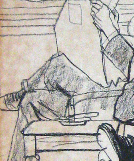
This is not my favorite Fawcett either; it's probably the worst of his Hercule Poirot illustrations. I picked it solely because it isolates a way of drawing a cylinder that breaks the basic rule that that all beginning art students (as well as Lindsay, Frazetta and Conrey) use. Rather than play it safe with a thousand little lines, Fawcett did what he does so well, embraced anarchy with those counter-intuitive dry brush swirls, and still made it look right.
Having said that, this Fawcett drawing was singled out by Francis Marshall in his book, Magazine Illustration, for its excellence. He commented on Fawcett's typical "astringent perfection of draughtsmanship" and noted, "There is, as you see, great detail and an almost photographic finish-- yet his work is in no sense like a photograph." Marshall included this drawing as an example to show readers the staging of a sophisticated illustration: "note the use of the pillars and how the perspective of their bases leads the eye to the man's figure, and the sense of depth given by the pillar in the background...." It was also used in the Famous Artists School materials as a way of helping students notice subtleties of composition and atmospheric perspective that might escape the attention of students raised on fine lines in girlie pictures.
> “ If you mean literally that he traces, that's obviously not true, as nothing that he could possibly trace looked like his drawings.”
I mean that I think he had a habit of taking photographs and then tracing them, not just that he utilized photographic reference. Particularly for small spot illustrations.
The kinds of mistakes you see him make are of the variety I’ve only seen in the work of people tracing — where the measurements are accurate but the anatomy has been misunderstood, the fullness of the form entirely lost, no editing being made to make the thing read more clearly, no actual drawing having been done — merely converting photograph to a kind of unopinionated line work.
For example, I am convinced that Nurse and Child drawing was a literal tracing, not merely a bad copy, of a photograph.
And I’m not aware of a work of his which couldn’t have been traced from one or several photographs. His work has no style, caricature, opinion of any kind. If he didn’t trace, he might as well have, because he’s given us nothing more than a photograph would have (or quite a bit less).
I never understand why he gets included with such fine illustrators, like the others in this post.
Richard wrote: "I never understand why [Briggs] gets included with such fine illustrators, like the others in this post."
I'll offer you three reasons:
1.) He was at the pinnacle of every popular medium platform of his era: In the golden age of comic strips, he drew Flash Gordon and Secret Agent X-9. When the pulp magazine market exploded he was a primary artist for Bluebook and other top pulps. When illustrated magazines were at their zenith he became a cover artist and regular contributor to the biggest, the Saturday Evening Post, as well as other top magazines. As movies became dominant he was called upon to work on Things to Come and other classics. In advertising art, his clients were some of the top companies in the world. When it comes to teaching art, Briggs was a founding "famous artist" for the Famous Artists School, which was once the most successful art school in America. You might say that all these different platforms were wrong to choose Briggs, but they did, and in a highly competitive market. It's hard to think of another artist who dominated in such a diverse array of categories.
2.) I can't think of another artist (possibly Al Parker) who played a more important role in the 1950s breaking up the old Norman Rockwell orthodoxy and paving the way for the hot illustrators of the 1960s, such as Bob Peak and Bernie Fuchs. His palette, his brush strokes, his loose designs, his inventiveness all made it easier for the next generation. There were fringe forces in the '50s such as Push Pin and Robert Weaver, but Briggs was mainstream and his impact was mainstream.
3.) Most important to me personally, more than any other illustrator he led the Renaissance in pencil drawing for finished illustrations. His drawings for TV Guide ads were viewed as revolutionary, but long before that his full page pencil and charcoal drawings for Cosmopolitan and other magazines who had been using full color oil paintings for decades opened a lot of eyes to the potential of linework. He was the springboard for Fuchs and Peak in the 1960s.
They remain singular, while knowing I should be seeing them coalesce. It's not really htperbole, I always thought Norman's woman looked furry while knowing I should be seeing them as smoothed skin.
But I can enjoy good pixel art and not worry about the bumps, so I think there is more to do with what I am used to and acquired taste.
Specifically, I don't understand your binary choice ("an empirical 'searching out' of form and space on the one hand and a methodical constructive approach on the other"). Aren't there a dozen other possibilities nestled in there somewhere?
Yes David, there are, my lack of clarity is at fault here. I should have said "An artist's plastic 'handwriting' is attuned to their sense of form, and this can be thought of as occupying a temperamental spectrum in which an empirical 'searching out' of form and space is at one extreme and a methodical constructive approach is at the other, with every combination/mixture of these in between".
Thus I largely agree with you that:
If by "form and space" you mean elements in the realm of the five senses that are perceived by our senses, that would suggest that it is by definition empirical..."
Although I disagree on a technical point about:
...although a sculptor such as Henry Moore melds elements of observable, empirical "fact" with purely imagined plastic elements, suggesting there must be way stations between these choices.
The best of Henry Moore's sculptures achieve their effect by virtue of maintaining a self-consistent distance/tension between what their plastic elements imply and what they are as explicit abstractions. It is only in the weaker work that this 'distance/tension' between plastic implication and plastic 'fact' becomes inconsistent and therefore aesthetically disrupted, resulting in feelings of awkwardness, perversity or weirdness when beholding it.
...I admit to being mystified by what you mean by "haptic temperament." I even looked up "haptic" in three different places. I don't mean to be thick, can you help me out?
Well, my fourth sentence; "...expressive disconnect between content and execution only arises when an artist's means of formal expression is at odds with their haptic temperament." relates to what I have just said about the principle operating in the sculptures of Henry Moore (or any sculpture at all). So if I give an example of "haptic temperament" with regard to Henry Moore, I will hopefully make my meaning a little clearer:
Moore's haptic temperament was one that overtly translated the observable world in terms of the sensations of our embodied physicality. Of course, all artists do this to varying degrees, but Moore is an example of it pushed to an extreme. Hence his reclining women put one in mind of landscape, and landscape put him in mind of reclining women. The world is manifestly articulated as a body. It is no accident that much of his work resembles bones.
And thinking of bones... Cezanne's 'haptic temperament', for example, was that of a dog exploratorily sniffing through the undergrowth.
PS to Richard-- I think you and I must define the word "tracing" differenty. Perhaps the concept wouldn't have the same stigma for you if artists such as Frazetta hadn't spun lies about their own use of photographs.
Recently Frazetta's granddaughter was asked about Frazetta's ability to work without photos. She responded: "So that was another urban legend. Over the years he claimed he never used photo references, but yeah, that’s a lie. [Not just ] in his early years when he was doing comics and working for Al Capp [but later] like in the early ‘90s and… the mid-’80s where we actually would find the drawing. And then I found a picture of my grandma that matched the exact drawing. So we’re going to publish those one day just because I think it’s just important to tell the truth about an artist and that’s how you propel a legacy. You have to, you have to give truth, but I don’t think there’s anything wrong with using photographs."
If you read the memoirs of artists who aren't afraid to discuss the use of photography candidly (for example, Norman Rockwell) you find that there are a variety of important reasons for using photographs that have nothing to do with a failure to master fundamental drawing skills. The logistical advantages in cost and convenience of models, the artistic advantages of being able to capture angles, positions and distances that could not be achieved with live models in the studio; the benefits of not having to own dozens of costumes piled up in your studio the way Howard Pyle did; the pressure from art directors and clients to respond to modern, tighter deadlines that Leyendecker never faced... again and again, you can read about artists who thoroughly learned traditional drawing skills but who, midway through their careers, adapted to the pressures of modernity while still maintaining high quality.
I know that some fans feel personally betrayed to discover that great artists used photography. Jesse Kowalski, a curator at the Norman Rockwell Museum recently said, "Norman Rockwell… he couldn’t paint anything without the use of photography," which could be the most ignorant statement in the history of illustration. It seems similarly peculiar to me when people attack Briggs (who quit his job as an illustrator mid-career to go back and re-learn the fundamentals) or Fawcett (who had a classical education in figure drawing at the Slade school, who continued to draw live from the model every week after he became one of the most successful illustrators in America, and whose figure drawing was the subject of an entire book by Howard Munce) for being unable to draw without photography. That generation did more old fashioned drawing than almost any illustrator working today, and when they chose to use photography it was with a wide perspective.
PPS to Richard-- I meant to add that, when it comes to Briggs' drawing of the baby and the nurse, look at the broad soft stroke for the back of the nurse's head, which sets a boundary but doesn't distract your eye from the hard lines at the center of the action. Contrast the thin, hard line of the nurse's profile with the broader line under her jaw suggesting depth and shadow. (How many thin lines would Lindsay, Frazetta and Conrey would use to make that same point?) Contrast the lines on the nurse's face with the much thicker charcoal or crayon profile of the baby-- you'd think that a small baby would be drawn with smaller, subtler lines, but that thick forehead and back of the head accentuate the disproportionate size of the baby's head. Compare the beautifully sensitive lines of the baby's face-- a depiction far superior to any of Leyendecker's babies, despite the fact that Leyendecker used live models. When it comes to drawing hair, Lindsay/Frazetta/Conrey seem to favor the Durer approach of drawing every single hair. This is also the approach of the camera, capturing every hair. But I think most great artists after Durer tended to believe that was a waste of time and preferred Briggs' solution with the nurse's hair, here: summarizing hair masses with lights, darks and a few suggestive lines.
My point is that these were are all artistic choices by Briggs and were not "traced" from a photograph.
David: "My point is that these were are all artistic choices by Briggs and were not "traced" from a photograph"
I agree with Richard that the image of the nurse and baby looks like it was drawn over a photo or projected image (by whatever means).
There is always a degree of realism that using photo-ref brings to the drawn image, even when the drawing - over the photo - is casually sketchy (see 'rotoscoped' animation in various loose styles).
This highlights an obvious difference between it (the nurse and baby drawing) and the Lindsay, Frazetta, Conrey, early Briggs, and Raymond; it's fairly easy to get a candid, reportage-like photo of an everyday moment (such as the nurse and baby), but near impossible to get a snapshot of a much more fantastical, dramatic / imaginative scene such as the Lindsay.
You could, of course, spend a long, costly time setting up a photo-shoot of lots of semi-naked, posed, levitating models to use as photo-ref for a fantastical illustration, but would the end result be better because of the added degree of realism of the camera's eye, or would the imagined fantasy world of the illustrator actually be constrained, or even deadened by it ?
They remain singular, while knowing I should be seeing them coalesce. It's not really hyperbole, I always thought Norman's woman looked furry while knowing I should be seeing them as smoothed skin.
But I can enjoy good pixel art and not worry about the bumps, so I think there is more to do with what I am used to and acquired taste.
That's an interesting possibility. Although, I've never met anybody who didn't get this kind of rendering instantly. I suppose, as well as taste being affected, some aesthetic sensibilities can be disabled through certain habits.
You say you enjoy pixel art. I'm assuming you've spent a lot of time playing video games and being on the computer. Would you say you've spent a great deal of your life indoors looking at screens or reading? Also, do you have nearsightedness issues?
Frazetta's points about photography use are often misinterpreted.
Yes Frazetta used reference. Examples of Frazetta's photographs of himself and his wife used as reference for his work were presented in the Frazetta's own publications. Reference pictures for EC stories were presented in EC fan publications. Frazetta was a self-proclaimed camera nut who talked of how much he learned by just looking through the viewfinder of his favorite Canon. There was no secret about any of this for the mildly curious.
At the same time, Frazetta was also an absolute genius at conjuring figures from his own imagination. There are countless eyewitness accounts to him drawing and painting completely out of his imagination. Some of his greatest and most famous works too. And Frazetta worked hard to understand anatomy both functionally and sculpturally in order to bolster that unique talent.
Because Frazetta was so good at Imaginative pre-visualization (He often spent a week or more dreaming his great works before starting to execute them), was such a good draftsman, and was a hell of an athlete himself, he, more than most, understood the problems of photo-reliance and the stiffness it causes. He talked of artists who gathered together and patted themselves on the backs for pictures built *obviously* of photo reference, without regard for the reality of the picture; without regard for Howard Pyle's philosophy of "Imaginative Projection" (which guided his work and most of the great Golden Agers he appreciated.) He obviously had a distaste for artworks built ploddingly by worker bees.
As Laurence suggested above, all the photographs in the world can't get an untalented or unimaginative artist's figures to move like those of a Lindsay or Frazetta.
And photographs are available to everybody; to every artist. The technology is ubiquitous and nearly free at this point. So the attempt to diminish Frazetta by pointing out he used photographs - which he admitted he used - is just picayune carping. The easiest way to stop a naysayer in their tracks is simply to say, "You, dear sir, have all the photography in the world at your disposal. Have at it. Go ahead and try to get that Frazetta-effect in your work if you think the answer lies in the camera. Try to develop a coherent imagistic composition one referenced figure at a time."
One finds quite often that the artists who compulsively criticize Frazetta are stricken by jealousy and resentment. And this blinds them to the simple truth that he was simply far more talented than they are. It's a tough pill for many to swallow.
To the dark, dark side: Frazetta, like most artists, understood the lowness of 'swiping.' Essentially stealing/copying a photo or figure because it is easy and 'right' and "who cares" for the deadline looms. On a few occasions Frazetta himself "swiped" - though not often. A prone figure in one of his Conan paintings being the clearest example. And, now and again he would self-mythologize; over-emphasizing his imaginative abilities and underplaying his use of the camera and reference.
Yes, he was flawed. A flawed man among all us angels.
Jesse Kowalski, a curator at the Norman Rockwell Museum recently said, "Norman Rockwell… he couldn’t paint anything without the use of photography,"
wotta asshole.
Oooooooh, pixel art. Here goes a young russian woman artist, Kev must hate this:
https://www.instagram.com/6vcr/
Disclaimer, I'm myopic from age 9, before ever seeing a computer or a color TV set.
I have spent a lot of time playing computer games and reading, but I also spent plenty of time outdoors as a kid. I grew up in that liminal time in the 80's/90's where kids roamed freely between sessions on the nintendo. I also grew up in Springwood, Blue Mountains, very close to where Norman Lindsay lived, and outdoors there meant following creeks and exploring canyons and hiding beneath ferns. My eyesight has been very good till about a year ago, focusing on small text now takes a lot more effort, but distant objects are still good.
My first introduction to Norman Lindsay, like a lot of children back then in Australia, was The Magic Pudding, the illustrations for that being much less feathery, and does not prepare you for his other drawings.
I did grow up on a steady diet of Rodney Matthews and Roger Dean art, airbrushed and cartoony and a far cry from the thousands of lines technique Frazetta and Lindsay.
Oooooooh, pixel art. Here goes a young russian woman artist, Kev must hate this: https://www.instagram.com/6vcr/
I don't hate that. (It takes a lot to make me hate something. I mostly hate false claims about art, rather than any particular work. Plus the ideologies, emotions, or ignorances that cause people to make false claims about art.)
I find the auto-abstractions done through computation (pixelation) or other mechanical means (cameras) fascinating, actually. It demonstrates something very deep about the nature of abstraction, and the necessary factors involved in order to cause "representation". The kinds of pixelation demonstrated in those works, is only a robotic version of what was being taught at the Cape Cod school in 1920.
Thanks Matthew,
All that is quite interesting. I'm sure there are other instances where the same faculty in you that prevents the coalescing of distinct lines into a field effect - which makes you prefer the smoothly rendered or blank/outlined - causes other tastes as well.
I wonder what you think of Andrew Wyeth and Nicolai Fechin. Versus, say, Dave Stevens and Adam Hughes.
Jesse Kowalski, a curator at the Norman Rockwell Museum recently said, "Norman Rockwell… he couldn’t paint anything without the use of photography," which could be the most ignorant statement in the history of illustration.
What a nightmare. The Rockwell Museum has so many good and sweet people involved. But from the moment it went up, it was also staffed with resentful and ignorant postmodern radicals who reflexively slander Rockwell, or who unconditionally believe slander about him.
For a while I've suspected that Frazetta had been pulling a sort of sleight of hand when it came to the question of photo reference and how much or little he used. Th discussion was always in the context of his paintings. And indeed I wouldn't be surprised if he used as little as he claimed for those. This is because I suspect the bulk of the reference he did use was during his comics career. For there is a degree of naturalism, accuracy, and information in some of that work that exceeds his paintings.
I believe it was in the 50s where there was a genre of photo referenced comics, Rip Kirby being one of the more well known examples. Frazetta's romance comics in particular have a similar look and style yo these types of comics. Combine a great, if not photographic, memory with a few years of doing panel after panel of reference backed work, and it's not difficult at all to believe he used scant references for his more famous work in paint.
Just a theory. And the quality of the final work is what matters, and it speaks for itself.
Auto-abstraction, cameras and robotic art? Kev, yo do not actually know how pixel art is made, do you?
In the beginning, I was as enamored with the Canaveral Tarzan drawings as anyone else. But now most of them are a little too strokey for my taste. The best among them is the one with the tiger and the girl. His touch on that is among the deftest of any ink work I've seen.
But I tend to find the styles of the Lord of the rings portfolio illustrations and City by the Sea to be most to my liking. The proportion between blacks, white space, hatching,and contour lines, in the best of those drawings/panels, is just right. To a point where it's almost unreal that someone could get it so quintessentially right. If it's not clear what I mean by that, I can elaborate later. It's a bear to write substantial commentary on a phone.
Auto-abstraction, cameras and robotic art? Kev, yo do not actually know how pixel art is made, do you?
I was talking about different things using those terms, trying to get at my meaning.
By 'robotic' I meant the use of the pixel square as the constant, basic unit of abstraction.
Whereas the best hand done suggestive artwork has a very wide variety of abstraction types and at least four scales of abstraction.
I think Kev articulated Frazetta's use of photography very well - as usual . In the one time I was in their home , I spent about 4 hours talking to Ellie and looking through his work - from his explicitly erotic work to studies and life drawings . Saw a pack of black and white shots from an idiotic movie ( The Barbarian Brothers ) that Frank was going to do the poster for . And when asked if he used photos she said only for the shadows , and not for every single figure .
I believe that he used them in a different way than Boris did , or Fuchs or Briggs etc. did when he did use them . I would bet there was no tracing in any way in the manner of most illustrators . I think he looked at them for a guide , then did all or most of the rough/final work without checking the reference . Briggs etc worked from the projection or overlay and imitated the casual roughness of true freehand work , varied the line in ways , used various tools etc . I don't believe any of them would relish sitting next to Frazetta with a blank sheet or canvas and produce a figure(s) from scratch .
Having said that , I still love Fawcett Briggs and company . Speaking of true lines , from life and no tracing , google image Sherrie Mcgraw drawings . I know Briggs could draw without tracing , maybe it was expedient for assignments but there is always something missing in the result from using the safety net .
Al McLuckie
In my next career as a psychiatrist, I'm going to develop a diagnostic tool based on the way patients react to the use of photo reference. As far as I can tell from the above comments, if an artist whom you favor uses photos it's a natural, harmless process. If an artist whom you disfavor uses photos, it's deplorable tracing. We seem to be rooting for opposing soccer teams rather than evaluating the quality of images.
The psychoses responsible for these differences in perception become even cloudier when an artist dissembles about his or her use of photographs. And that's before we even get to the battle over whether the end justifies the means in art.
To repeat: I think Frazetta was often brilliant; I have no problem whatsoever with his use of photography. I'd say he was a little petty in his denials but so was Robert Fawcett.
Similarly, I have no problem whatsoever with Briggs' and Fawcett's use of photography.
All three artists abundantly demonstrated that they'd mastered drawing skills. All three were excellent draftsmen who added significant artistic value to the factual material that photographs provided. People who ignore that are, I'd suggest, too busy rooting for their own team.
Finally, I'd say that much of this debate is grounded on a reality 50 years out of date. Illustrators formerly used a balopticon or another type of projector. (If you believe David Hockney, artists were doing that 300 years ago.) They also improved their original drawings by "tracing" multiple iterations on "tracing paper," a prehistoric version of layers on Photoshop (a process which was openly taught by the Famous Artists School). Today, scanned photos themselves are integrated into a digital paintings, and outright copied for their patterns or textures or color schemes. Their digital DNA is lifted out of the photo with no need for drawing skills; they are revised with a slider bar or some other engineering tool which again requires no drawing skills. This is the bulk of how art is produced today, a partnership between artist and software engineer, and the artist's share of that real estate is all headed in the wrong direction.
Given that reality, some of these jibes about the nature of "tracing" by these three fine draftsmen seem a little anachronistic.
If you make the career switch , I think you would be at the top of your field . I don't mean to "jibe" in my comments , no problem with using reference , just in the way it's used - slavishly or lazily vs interpretively . Briggs nurse illo is great , I just think if he took the time to lightly pencil the rough freehand , then evolve it , there would be yet more quality because he would have had to have made more decisions to get the base proportions correct , more consciousness and human feeling into it .
Sorry , have to ask , what are a couple of Frazetta pieces - oil or drawing - that you feel are exceptional ?
I had not heard of Nicolai Fechin before today. I would really like to see his work in person.
I find Adam Hughes and Dave Stevens work pleasant enough, easily digestable, and find it strange that Dave Stevens gained a reputation as a perfectionist. Like, I don't see much thought going into his work. Which is not to denigrate it, I just hope he also spent time doing other enjoyable things and not just hunched over a desk making sure each line created the right effect.
So basically, I prefer Andrew Wyeth and Nicolai Fechin.
And just started imagining what a Andrew Wyeth cover for Superman would look like, I think I would like to see that.
al mcluckie-- Easy. Top ten in no particular order: Death Dealer, the cover of Creepy #9 (a/k/a Winged Terror), Tanar of Pellucidar, Conan the Conqueror, Conan the Avenger, Swamp Demon, Egyptian Queen (before he messed with it), Creepy 15 (Neanderthal), Rock God, and Back to the Stone Age (a/k/a Mammoth, a far better priapic image than the monolithic Tarzan drawing in this post). For my friends out there, remember my birthday is coming up in September.
Favorite pen and ink drawing: probably the Canaveral drawing of the tiger and the pterodactyls. I love lots of unfinished paintings, preliminary studies and quick sketches but they don't have names I could use to identify them.
strange that Dave Stevens gained a reputation as a perfectionist. Like, I don't see much thought going into his work.
??
His work is full up with aesthetic thought. What other kinds of thought are you looking for?
Saying Stevens' work doesn't have much thought going on in it is like saying that Gil Elvgren's work doesn't have much thought going on in it. Or Bougereau's. Has the perfection of the beauties and surfaces confused the eye so much it cannot appreciate that the perfection of the whole didn't "just happen to happen." Everything good about any work of art, as Stapleton Kearns would say, had to be installed.
Don't look at the inherent quality of the lines, look at their meanings. Look at the way everything relates to everything else.
Jesus ! Those are MY top ten !
When I look at a Dave Stevens drawing each line is so meticulously crafted it's hard not to look at their inherent quality.
I want to be careful here, I don't have the language yet to explain really what I mean, and I know I can be, or seem to be, disparaging of artists that in all truthfulness I hold in high esteem. Frazetta, Lindsay, Stevens, all are part of a big library of images I've stored haphazardly in my untidy ADHD brain (which might explain why I find a mass of lines confusing?) and they have all influenced my own much poorer art. But they are also big boys and their work is solid enough to withstand my flimsy attacks.
So, despite what I say here about these artist, I have spent many hours looking at their work and enjoying it. And learning from it.
al mcluckie-- Tell you what. I'll take five and you can take five. I'm not greedy.
But to answer your question Kev, I look at a Dave Stevens picture and yes, everything is thought out, but it also seems that everything he thought about he had already thought about a million times before, and coming to the same conclusion. There appears no growth in his thoughts about aesthetics (at least, none I can see), and I suspect he could have churned out more work at the quality he was already providing (I am basing this on his Rocketeer and Betty Page art, as this is the stuff I know).
David: "In my next career as a psychiatrist, I'm going to develop a diagnostic tool based on the way patients react to the use of photo reference"
I think you're missing the reason why people respond negatively to a 'traced' image.
Have you tried drawing over a photographic image with a heavy, dark coloured pencil for yourself ? (i rate the Faber-Castell Polychromos).
It's really not a difficult thing to do for anyone with basic drawing skills. I've done so much tracing over comped photo-ref in my own job (storyboarding and visualising for the advertising world) that feeling enthusiasm for the result by almost anyone is tricky, however nice their line-work is.
David: "We seem to be rooting for opposing soccer teams rather than evaluating the quality of images"
I'm not siding with one artist or another on this topic.
When i look at an image like the Briggs nurse and baby I almost can't see it as just a 'drawing'. I see it as something like 'a photographic image that has been rendered as a spare line drawing'.
I feel the same when I look at an oil painting that shows its obvious photographic source; it's 'a photographic image that has been rendered as an oil painting'.
When I look at Thomas Fluharty's work based on photo-ref I don't feel the same thing, because his characters have been reconfigured from the ground up, into a completely new physical form, even if details have been based on the photo.
Laurence wrote
"There is always a degree of realism that using photo-ref brings to the drawn image, even when the drawing - over the photo - is casually sketchy (see 'rotoscoped' animation in various loose styles).
This highlights an obvious difference between it (the nurse and baby drawing) and the Lindsay, Frazetta, Conrey, early Briggs, and Raymond; it's fairly easy to get a candid, reportage-like photo of an everyday moment (such as the nurse and baby), but near impossible to get a snapshot of a much more fantastical, dramatic / imaginative scene such as the Lindsay."
Well said! It looks like a "snap shot" drawing and the baby looks like it is going to fall right to the floor as the nurse's hands do not appear to make contact with an actually embodied surface. It looks like there is a pocket of air between her foreground hand and the side of the baby. One only has to look at the work of someone like Alfred Ward's civil war on the spot drawings to tell the difference between photo copying and drawing. But that was different age.
Art harnesses the energy of life and directs and drives it to the artist's goal. This energy is felt in the drawing. It's what captures our interest. The traced line almost always feels monotonous, anemic. The line isn't under the influence of the forces of nature, space, gravity and weight. The artist becomes a seismographer traveling an already existing path. The monotony is felt in the final production and quality of the line work itself and it is off putting. One immediately considers the source of the image, things become suspect instead of honest.
David as someone who discusses technology and innovation in the arts a lot, have you consider that the line block printing technique is what contributed to an excessive array of lines in the earlier illustration you posted?
And if you want your drawing to improve immediately!:)
https://neolucida.com/history/childs-play
When i look at an image like the Briggs nurse and baby I almost can't see it as just a 'drawing'. I see it as something like 'a photographic image that has been rendered as a spare line drawing'.
I feel the same when I look at an oil painting that shows its obvious photographic source; it's 'a photographic image that has been rendered as an oil painting'.
When I look at Thomas Fluharty's work based on photo-ref I don't feel the same thing, because his characters have been reconfigured from the ground up, into a completely new physical form, even if details have been based on the photo.
This is exactly my experience and feeling as well.
And this takes us back to these key topics of aesthetic meaning and effect, and just how and why photographs are stillborn with respect to those artistic qualities. Which some of us have been thinking and talking about for a long time.
If the work has the 'accurate' deadness of the photo, if I can immediately pick that out (as many others here are able to do) the photo hasn't been artistically and imaginatively transformed enough. The photo was supposedly brought in as an assistant to the artist, and the artist put the camera, a dumb unfeeling machine, in charge. This is the cheat, not the use of the photo per se.
To restate: The issue isn't the use of photographs. (How many times does it need to be said?) It isn't a 'cheat' to use a photograph. Photographs are just one tool among many that can be used to achieve the art.
But if the foundation of the art evidently remains the photograph, after all is said and done, the art doesn't have a living soul. Because the photograph has no consciousness; it has nothing to say, nothing to think, nothing to feel; it has no analogies, it feels no relations, it isn't a poet. It's just a capturing of light rays through a pinhole.
While art is the representation of a full thought process aimed at demonstrating, using any visually rhetorical means one can imagine, an intuited imagistic idea.
That some people cannot feel that photographs have no consciousness - contain no thought or heart - makes this a perennial, impossible conversation. And this is, to some degree, understandable.
After all, one sees the giggling baby face and the delighted nurse face, and registers that the nurse is delighted at the giggling baby - and one easily mistakes that for aesthetic emotion. But it isn't. It's just a kind of reportage.
Vis-a-vis Austin Briggs and Alex Raymond cf. Frank Godwin's extensive use of lines (Vignettes of Life, Connie, Rusty Riley).
Laurence John wrote (and others agreed): "It's fairly easy to get a candid, reportage-like photo of an everyday moment (such as the nurse and baby), but near impossible to get a snapshot of a much more fantastical, dramatic / imaginative scene such as the Lindsay."
Actually, if you can bring yourself to look at the "how to paint" books by Boris and Rowena, you can see how even untalented artists take photographs of ordinary models and easily paint them into fantastical scenes of flying robots and winged hotties. When Austin Briggs needed models for the comic strip Flash Gordon, he and his wife would pose in their underwear on a picnic table in the back yard. Depending on whether Flash was riding a horse or commanding a rocket ship, they might turn the picnic table over on its side.
Kev Ferrara wrote: "To restate: The issue isn't the use of photographs. (How many times does it need to be said?)"
Well, I feel that way but apparently Frazetta disagrees with you or he wouldn't deny the use of photographs.
Kev Ferrara also wrote: "the photograph has no consciousness; it has nothing to say, nothing to think, nothing to feel; it has no analogies, it feels no relations, it isn't a poet."
Here I disagree with you. In my view thousands of beautiful, well composed photographs have plenty to say; in fact, they have more profound content and evoke more feeling than Bouguereau's paintings. Photographers such as Sebastião Salgado or Steichen also strike me as more painterly than Bouguereau's glassy paintings. We often say here that an image has to stand on its own, without being propped up by its back story. If we're going to be honest about the way we approach images, give these photographs a fair look, with out being trapped in a web of humanistic nostalgia.
Laurence John wrote: "When i look at an image like the Briggs nurse and baby I almost can't see it as just a 'drawing'. I see it as something like 'a photographic image that has been rendered as a spare line drawing'.
May I ask if you have the same reaction to Fuchs and Peak? They're not trying to fool anyone about their use of photographs.
David: "May I ask if you have the same reaction to Fuchs and Peak? They're not trying to fool anyone about their use of photographs"
Never been a big fan of Peak. Fuchs is such a sensitive and original painter that his painterly qualities are worth looking at despite the obvious debt to photo-ref use.
You'll notice that I didn't go as far as Kev in saying "the photograph ... has nothing to say, nothing to think, nothing to feel". Like you, I also like a lot of photography for it's own sake.
When I said "When i look at an image like the Briggs nurse and baby I almost can't see it as just a 'drawing' "... I'm saying that I view such photo-based illustration work as some sort of hybrid or middle ground between photography and painting or drawing, but it can't (almost by definition) be JUST drawing or painting.
And, the larger point was that photo-ref can impede an artist's imagination if they're trying to visualise an imagined, fantastical scenario.
Laurence John wrote: "I view such photo-based illustration work as some sort of hybrid or middle ground between photography and painting or drawing."
Such an interesting identity crisis has been going on between photography and painting for 150 years. The shame and confusion is so powerful that it intimidated even great artists such as Frazetta, Fawcett and Rockwell into concealing their methods, while other artists such as Degas, Lautrec and Fuchs aren't bothered in the least. Uncertain of how to measure quality in this new world, we have the crazed Savonarolas at the Art Renewal Center waving their pitchforks and torches; we have jealous artists condemning the obvious benefits of photo reference as morally unworthy; and we have critics denying that photography can ever be an art form because the photographer doesn't suffer the way the painter does. (Then there are artists who don't enjoy suffering and who say, "the end justifies the means"-- a good picture stands alone, and legitimizes whatever was done to achieve it.)
What kind of "end" justifies the use of photography? That question remains contested real estate in the trench warfare of art. Some people (including some commenting here) argue that if a picture betrays its genomic connection to photography, it fails. I'm uncertain whether their requirement is that the artist contribute such a large percentage of the creativity that the role of the photograph becomes insignificant, or if the requirement is that the artist simply be more adroit at covering up his or her sources.
If we take the long view, I think it's hard to deny that art has been in a partnership with the photographic sciences (what you call "some sort of hybrid or middle ground between photography and painting or drawing") for a long, long time. Like genetically modified organisms (GMOs) it's now almost impossible to separate the gene pool.
Over the past hundred years the role of photographic sciences has become more powerful and more empowering, subtler and more slippery, and more alluring. Look at how quickly photography, then television and then the internet wiped out the vast market for illustrated magazines-- to me that counts as a TKO in the 5th. In the blink of an eye we had Photoshop, which was originally designed as just a photomanip program, never intended as a substitute for paint. Soon zbrush and other powerful technologies lifted the barricades, allowing hordes of mediocre artists in to autotone their work. Today 3D photobash is the industry standard (although some still dissemble about their methods the way that Frazetta and Fawcett did 60 years ago). As photographic tools become subtler, building blocks become harder and harder to detect.
So I'd say yes, most illustrators today (at least, the ones working in animation, gaming and digital painting) are in a partnership with software engineers. I also think it's fair to say that the engineers are advancing at a more rapid clip than the artists, creating tools so powerful that artists haven't fully figured out how to use them yet.
What would Bouguereau do today? Would he hold fast to his traditional techniques? It seems highly unlikely. Bouguereau tailored his paintings to the market; his photo-idealized nudes were painted to suit the taste of wealthy male collectors. (Bouguereau said, ""What do you expect? You have to follow public taste, and the public only buys what it likes.") If Bouguereau was working today and recognized that the real money was in photo based art, I think the odds are pretty good that he would embrace it enthusiastically.
The challenge of assimilating all these changes and ending up with a coherent, intellectually honest appreciation of visual images has eluded us so far. Like everyone else, I'm still struggling for an answer but as a starter I can say it doesn't bother me that when I look at Briggs' drawing of the nurse I can easily spot the photograph in its history.
Both da Vinci and Dürer explain how to mechanically capture perspective from nature. I wonder how controversial it was at the time.
In my view thousands of beautiful, well composed photographs have plenty to say; in fact, they have more profound content and evoke more feeling than Bouguereau's paintings.
Photos don't say anything. No more than the Nixon White House Tapes 'say' anything. Recordings can be lit or miked or edited this way or that. But fundamentally, they're just recordings of light bouncing off things, and sound emanating off things (or from them).
If a photo has an effect on you, it is because elements in the photos may have been captured in the act of 'saying.' The photo records a sculpture built of life that existed in front of the lens when the shutter clicked. The photo isn't that sculpture. Its a flat facsimile of it.
You may understand a situation in a photo, you may feel empathy or sympathy or appreciation or attraction. You may see the delicacy of a flower, the smoothness of a skin, or the grandeur of a mountain and respond to that. You may find the meaning in those sensual feelings. And we can say that there is some innate, basic meaning to those sensual feelings. But they don't build up to anything more in the actual photo. You may build that greater meaning in your mind.
Experience, only on the rarest of occasions, as many writers have pointed out, is understood in its meaning through the sensual-emotional force of that experience... such that an epiphany is induced. As Robert McKee pointed out, this feels like a religious experience when it actually happens in life. One feels they might be going a bit mad if this profound meaningfulness strikes them full force.
But it is the great purpose of Art to cause this feeling through effective composition. Such begins at the smallest scale of aesthetic understanding.
I also like a lot of photography for it's own sake.
Me too. But if you traced off your favorite photographs, they would still result in crap art. This points to the deeper issue I keep trying to surface.
The photograph has no consciousness; it has nothing to say, nothing to think, nothing to feel; it has no analogies, it feels no relations, it isn't a poet.
The core of good art is suggestiveness; the suggestion of sensual meanings, which build up to sensual understandings, which form complexes of sensual epiphany; which are deeper than language. And which a machine has no inkling of.
Frazetta disagrees with you or he wouldn't deny the use of photographs.
Again, as laid out more clearly and fully earlier, the Frazettas both published and agreed to the publishing of Frazetta's reference photos in various publications. So it wasn't denied in those cases.
And I'm not quite sure where or when Frazetta said he never, ever, ever used photographs or reference material. Maybe you could point me to it? I could understand him downplaying it, certainly.
Also laid out earlier; the 'problem with photography use' in art is those artists who can't really draw out of their imaginations who rely so fully on photographs that their work fairly reeks of it. As with comics that use clichéd tried-and-true premises and standard punch lines, there's a stench of hack to those easy short-cut solutions to 'getting paid for it.'
There is a natural resentment between those who can, and those who are pretending they can. Attention is a competitive business. As well, the appreciators of the real thing are forever baffled and annoyed by the appreciators who can't tell the real thing from the fake thing.
Somebody like Frazetta - the real thing - would naturally want to distance himself from all the hacky fakes. As he was all too aware of the many critical and carping people who long to tear down the great who would jump at the opportunity to 'prove' that there's no such thing as talent.
Kev; "The photograph has no consciousness; it has nothing to say, nothing to think, nothing to feel; it has no analogies, it feels no relations, it isn't a poet."
That may be true for a spontaneous 'captured moment' type of photograph, from a street photographer like Henri Cartier-Bresson.
But how does that tally with someone like Rockwell who has the idea for an illustration / painting first, then carefully directs his models in the photographs like a film director, and art-directs the props and settings, in order to use the photo-reference for the final painting ?
Unless you disagree with my suggestion above that there are artists who work in a middle ground between photography and painting, then the photography would absolutely be part of the creative thought process.
Kev Ferrara wrote: "I'm not quite sure where or when Frazetta said he never, ever, ever used photographs or reference material. Maybe you could point me to it?"
I personally saw him do it, long ago on a panel with Jim Warren in NY. A fan in the audience asked if he used photos or models and he said no, that every once in a while he used a mirror (here he acted out how he made a muscle in front of a mirror and checked out how it looked) but he didn't need photos or models. The fans (average age 13) gasped appreciatively. (He did not say "never, ever, ever" cross my heart and hope to die, but the intended message to his adoring fans was clear.)
Apropos of your comment, "Frazetta was so good at Imaginative pre-visualization (He often spent a week or more dreaming his great works before starting to execute them)" Frazetta also said on that same panel that he sometimes came up with and painted his covers in one night. Specifically, he said that he painted the Creepy cover Neanderthal overnight, that he'd waited until the last minute to come up with an idea and had no canvas or board on which to paint it, so he took a masonite square being used for household repairs and devised a subject he could paint on that background. He said the paint was sometimes still wet when he delivered a cover to Warren.
To repeat, it doesn't bother me in the least whether Frazetta used photos or looked in the mirror, and whether he took a week or a night to plan his paintings. I only mention it here because the issues seem to mean so much to others. Personally, I think the painting Neanderthal qualifies as one of his "great works." I went up to him after the panel, spoke with him briefly and got his autograph which I still have today. I thought that much of his work was terrific then, and although my ardor has cooled for some of his pictures, I still think much of what he did is terrific now.
> Today 3D photobash is the industry standard (although some still dissemble about their methods the way that Frazetta and Fawcett did 60 years ago). As photographic tools become subtler, building blocks become harder and harder to detect.
I could count on one hand the number of times I've made a photobash, but I can definitively say that the experience was lightyears more "creative" and "artistic" than when I've traced a line drawing from a photograph.
My problem with Briggs isn't that I think using technology is cheating. It's that the WAY he used technology is, I believe, entirely empty of artistic intention.
Eytan Zana, whos works are almost entirely built from photobashing and 3d models, is much more of an artist than Briggs (one, two, three)
Creating a Brigg's style nurse-and-baby copy from a photograph is something you will rapidly be able to teach a machine learning algorithm to do. Teaching a computer to dream of a new environment and a composition, and build it from photographs is a long way off.
I'm not saying photobashing is high art, but it's not an absolute copout the way Brigg's tracings are.
But how does that tally with someone like Rockwell who has the idea for an illustration / painting first, then carefully directs his models in the photographs like a film director, and art-directs the props and settings, in order to use the photo-reference for the final painting ?
Maxfield Parrish did this as well.
I think the two major points are first that the artist is using the reference in pursuit of a vision that originated apart from the photo; and second that the artist is transforming the photo imaginatively/haptically/sculpturally (etc) so that the vision is realized in a unified way and wholly personally, shedding the frozen impersonality of the camera entirely.
When both Parrish and Rockwell were at their worst, you could tell that the photo-ness was too present, the residual mental stiffness and physical a-reality/flatness through the paint. (Here’s a Rockwell example with an almost non-existent haptic re-imagination of photo-reference.)When at their best, only the unified imagistic vision presents.
As with Frazetta's action and muscular stress, Rockwell's ability to express character and humor in the way he painted cannot be found in a photo. The simplest thing to say to the naysayers is, again, all the photography in the world is available to you. If you think it's the photos running the show, grab a camera and a paintbrush and prove it.
I personally saw him do it, long ago on a panel with Jim Warren in NY.
Fair enough. Safe to say he was inconsistent on this point.
...all are part of a big library of images I've stored haphazardly in my untidy ADHD brain (which might explain why I find a mass of lines confusing?)
Hmm, that's a really interesting thought.
I don't quite know what the ADHD experience is like, but I had a good friend who had it quite severely, undiagnosed. I believe his parents were neglectful of him and he was essentially raised by the television, popular magazines, and movies.
He had the worst time paying attention until the end of a sentence arrived. He was always trying, and failing to finish thoughts, his and others'. And when he spoke, he asserted more wrong things per paragraph than anybody I've ever known. His whole mental life was a constant jumping to conclusions, usually incorrect.
Maybe part of ADHD is almost like a knee-jerk anxiety reaction against the silence and stillness required to get through an unscrambling process of any complexity to the point of mental coalescence. Or maybe it is the difficulty in unscrambling that cause a kind of panic that results in the flight response?
> Maybe part of ADHD is almost like a knee-jerk anxiety reaction against the silence and stillness required to get through an unscrambling process of any complexity to the point of mental coalescence.
I think that’s close, but I’d reframe it.
I think it's more that some people (myself included) don’t have internal dialogs. And so thinking “out loud”/exploring ideas “out loud”/”acting out” is symptom of how we process new ideas and information.
For people with neurotypical internal dialogs, experiencing us weirdos from the outside, it’s a disconcerting thing. But if we heard your internal dialog out loud, it probably would not make a lot of sense either.
And for me, it’s always frustrating that some people feel the need to work through an idea privately in their own heads first. Why keep it in, when we could work on it together if you’d just put it out there, wrong or right.
Richard-- Just to make sure I understand the breadth of your antipathy toward Briggs, do you have the same view of his drawing of the two men in chairs at their club, which was also clearly done with the aid of a photograph? What about his painting of a woman in a raincoat from this old post, also done with a photograph? (I included some close up details in the old post.)
No not always antipathy. More often than not, I feel nothing at all when I look at his pictures.
I'm no expert on ADHD, just my experience of it.
-There is anxiety caused by ADHD, which in my case is the result of uncertainity, like should I be here doing this or over there doing that, did I get on the right train, how do I act like an adult in this particular situation, I was meant to listen to these instructions but I drifted off and started thinking about something else, again, and now I don't know what I am meant to do and I don't want to ask again, and so on. The anxiety builds up, releasing adrenalin that isn't used up, which keeps me hyper-aware of things I don't need to be aware of, adding to my distraction.
-my fight or flight response tends to be fight, at least to physical danger, and the resulting escalation causes more problems than I can solve. In regards to the danger of paperwork, then my response is flight, which again causes more problems than it solves.
My ADHD might be the reason I se3 drawings like the Norman Lindsey ones as depictions of furry women, but I can't confirm it so it's stuck in the interesting idea basket.
I also wonder if artists, seeing with artist's eyes, can appreciate more readily what Lindsay and Frazetta are doing, while the public might look at it and see fur? To answer that would require a survey, which means paperwork...
I am the opposite. I have quite a busy internal dialogue, which caused problems as I am also carrying on a conversation within myself while conversing with others. My friends tease me about being slow and seeing the cogs move but in fact I am conversing with myself about something else I find interesting and then have to think back to their conversation and catch up. And it's not that I find their conversation boring, I usually enjoy it and sometimes I still want to discuss something they might have said five minutes ago and have moved on from.
And of course, those times when I am not involved in an internal conversation I tend to get too intense in my conversation with others and make them uncomfortable.
I am either pleasantly distracted or boringly intense.
What about his painting of a woman in a raincoat
I remember that post. I remember at first appreciating all the lively rendering-jazz Briggs used. And the accuracy of the drawing.
But I kept looking at it after I posted on that thread, particularly the weirdly flat faces and the ruffling pant cuff, the patness of it all. Something kept gnawing at me. I kept wondering why I was looking at the shadow in her mouth. I remembered seeing the same kinds of mouth shadows in the black and white stills in Famous Monsters of Filmland magazine.
Soon I realized that the piece had telltale photo-ref deadness and flatness, behind all the attempts to mask it with 'action painting' type rendering. Even the dynamic idea of the couple running was an attempt to disguise the origin of the work as a still photograph. (Even though the real couple was running, the photo was still frozen. The painting did not express anything sensually significant or effective about running. It was not composed to express meaning aesthetically.)
This was the first I'd really paid attention and scrutinized that kind of work from that era, because it always left me cold. So I had never really looked into the pieces enough to notice the photo underlayments beneath them until I started attending this blog where they were touted.
As far as I can tell, Briggs was a guy who couldn't really draw or imagine well when he got into the trade. Then (surely out of desperation) he developed a suite of drawing and rendering tricks for copying photographs and disguising that use.
I'm sure it pushed lots of photographically accurate and jazzy work out the door quickly, and he made good money.
But the ultimate influence of his vacuous studio innovation was the clip art business. He was the guy who figured out the short cut that would begin the downward spiral/multipolar trap.
When the illustrator is merely the middleman between a photograph and an art director, he ain't long for this world.
More often than not, I feel nothing at all when I look at his pictures.
Same. My eyes stick to the surface for a bit, then depart. The only reason I ever linger longer is for research purposes.
Kev: "I think the two major points are first that the artist is using the reference in pursuit of a vision that originated apart from the photo"
No argument from me.
"... and second that the artist is transforming the photo imaginatively/haptically/sculpturally (etc) so that the vision is realised in a unified way and wholly personally, shedding the frozen impersonality of the camera entirely"
Also agreed. No one is disputing Rockwell's imaginative or painterly brilliance.
"If you think it's the photos running the show, grab a camera and a paintbrush and prove it."
I never made the claim that the photos were doing all the work (in Rockwell's case). My point is that his photographic stage is a crucial part of the artistic process to get at his vision, and shouldn't be downplayed. Hence my suggestion that there is a middle ground between photography and painting.
"The photograph has no consciousness; it has nothing to say, nothing to think, nothing to feel; it has no analogies, it feels no relations, it isn't a poet."
If a camera is just a tool (which you agree with) then a camera, in the hands of an artist (a poet) is just a tool to get the artist nearer their vision (let's assume we're talking about a talented, visionary artist like Rockwell or Parrish. Not someone who is just going to take a nice shot of their 7 year old child, render it in oil and call it 'art').
David: "What would Bouguereau do today? Would he hold fast to his traditional techniques? It seems highly unlikely"
My bet is that the modern day Bouguereau would be working in animated, hyper-real CGI, creating swarms of pulchritudinous nymphs and dryads levitating, swooping and swirling in the early evening sky. Same subject matter, new technology / medium.
Contemporary Bouguereau wouldn’t be an artist at all, in any medium. Those types of people don’t become artists anymore. My guess is that he’s probably working as a plastic surgeon in Hollywood.
Photography does not capture as the human eye+brain, for good and bad. It's not an intuitive fact, and that's why people still take snapshots of the moon and sunsets, and are surprised by a mundane street action photo. You are skipping the gestalt built in our visual system by millions of years of evolution.
In that sense, drawing and painting are closer to photography than actually seeing the damn thing.
I never made the claim that the photos were doing all the work (in Rockwell's case). My point is that his photographic stage is a crucial part of the artistic process to get at his vision,
I didn't mean you, in particular, in that passage. I'm kind of writing to the general point; that there are people out there who look at Rockwell and just see 'realism' and hear that he used photographs, and just put 2+2 together to make 4, not knowing all the other terms involved. And not having the sensitivity to discern what the artist encodes vs. what the camera encodes.
I think we're in agreement about pretty much everything. As Jeff Jones said about his use of photographs, "I simply need that information."
I also wonder if artists, seeing with artist's eyes, can appreciate more readily what Lindsay and Frazetta are doing, while the public might look at it and see fur?
Both Lindsay and Frazetta simply have too many fans for all of them to be artists. I do think there is something anomalous about you experiencing fur instead of shading.
Whether it has anything to do with your ADHD (or what sounds like anxiety and OCD) is an open and fascinating question.
However, in looking into these kind of psychological questions as they relate to art and poetry, I've come to believe that stress causes literalism; it atomizes what it encounters as a prelude to analysis.
Poetry cannot function in that analytic-critical mode. Poetry requires an open synthetic quality of mind, and a broad quality of feeling with an allowance for any number of types of aesthetic fictions (such as sculpting form with lines) to perform their effects. There is a contemplative necessity to poetry that cannot coexist with the frenetic and distracted.
Briggs changed everyone's style of drawing. Before the 1950s nobody drew like that. He was a huge influence on illustration.
JSL
David wrote,
"As photographic tools become subtler, building blocks become harder and harder to detect."
The history of art really doesn't look like photography. On the other hand the last 150 years of advertising and entrainment certainly does.
It's funny how everyone can tell when you post a picture that was done from a photo David.
Obviously, as you always write, the stresses and strains of selling things in a timely manner is going to influence how a picture is produced. So artist had to adopt their methods to survive by using new “tools’” or references to create their pictures to meet the of an ever increasing demands of the market. The artist simply has no choice. That’s a narrative you like to push. (That's why I asked earlier if the line block method of printing force illustrators into the “many line,” ink drawing method in the early part of the 20th century). Rembrandt made etchings but he also made ink and wash drawings. Could a wash drawing be efficiently and cheaply reproduced in the 1920’s?
How can any real art qualities develop when the whole endeavor becomes one of how can we avoid it's challenges so we can get to press?
Yet you complain about today’s illustration. Perhaps today’s illustration is meeting the demands of it’s markets and clients who probably don’t have the time nor the interest in beautiful “lines., if it doesn’t help get their message across to the viewer. What you don’t seem to sense is the market has very little use or interest in the ‘art,’ part of illustration except for it’s power to grab people’s attention. It probably never has. They want to use pictures to sell magazines and products.
The “art,’’ part, of illustration if given it’s full attention would question many of the “markets’” assumption it makes about “consumers’” and the world it has created. At the most basic level any one who has pick up a pencil , or attempted any art form that requires a skill knows, the one thing they learned right at the start is how little their preconceived ideas about the world are going to help them out. Usually expressed by the comment, “ I don’t have any talent.” On another level for the artist, the “art” itself becomes more interesting then the thing we are attempting to depict.
Each tool we invent and each photo we use is an avoidance of a difficulty that should be overcome with our understanding and only weakens our ability to produce beautiful things.
Isn’t that one of the main beauties of art, a beautiful and simply answer to a difficult problem.
An illustration that is to be reproduced to sell tires can let go of a lot of art qualities. It has a very different intent and different requirements for success then an individual drawing that wants to communicate something about the nature universe and it’s one reason why reproductions of actual drawings, paintings sculptures and architecture is such a disappointment compared to the real thing.
Would Bouguereau simply reject his skills or are you saying he would have never have developed them? How do you know he might not respond like the earlier generation of illustrators who scoffed at the generation that starting using photography? People with skill are not so easily taken in as people with no skill. Bouguereau’s do exist today. There are lots of artist trying to sell their talents for money today.
if you want to paint to satisfy the taste of wealthy business man, well one can stay in the shallow end of the pool.
It is much more interesting and curious to see how photography imparts its own qualities and presence into pictures and that so many people recognize it’s influence immediately. Which I think would give rise to the question why are it’s traits so recognizable? It must lack some quality of human perception.
Hipótesis: in drawing the representation of movement is highly conventionalized, because the way out brain process movement in real life does not map to a drawing conveniently. Photography does not care for those conventions, nor for how our brain process mocement de that matter.
Simetrically, we catch posed photos too.
I’m traveling this week with poor WiFi access so I’m pecking this out on my cell phone and I’m limited in my ability to link to images or respond to specific points.
However, I did want to at least respond to the general point made by several commenters who look at a Briggs drawing and are bothered by the ghost of the underlying photo.
Far be it from me to say what thoughtful people should or should not be bothered by in a drawing, which is the most personal form of visual art. However, I’d like to suggest that the ghost of photography plays a role on both sides of the equation here.
Bouguereau starts with a blank page and works his way toward a photographic image. Briggs starts with a photographic image and works his way toward a blank page. Bouguereau was probably the apex of simulating a photographic style image in the history of art. He painstakingly removed any trace of a human brush stroke from his images and perfected the replication of human flesh. He carefully purged the human opinions that accurate painters such as Rockwell or Leyendecker or Sargent contributed. An astonishing act of skill, yes, but for several decades he was held in disrepute because people said, “Hell, we can achieve that part with the click of a shutter. It’s the expressive/interpretive part that we should value.” They were as bothered by Bouguereau’s photographic goals as you are bothered by Briggs’ photographic roots.
Well, after several years of seeing what the expressive/interpretive side has to offer, and seeing artists / critics abuse that freedom, Bouguereau is back in vogue again. That’s fine. But there’s a reason why, for much of the 20th century— the period when Briggs worked— the photographic likeness was viewed as the easy part. (Hint: it’s not just because the artists were stupid.)
In the classic science fiction novel, A Canticle for Liebowitz, post-apocalyptic monks work painstakingly to reproduce blueprints of technological devices. They didn’t understand what the devices did or how the blueprints were originally made. They colored in the backgrounds by hand, drawing everything in reverse. They were highly skilled at doing for religious reasons what a machine once did instantly.
David: "Bouguereau starts with a blank page and works his way toward a photographic image"
Bouguereau doesn't look 'photographic' in the way Briggs does - based on photo ref.
He's smoothly realistic, but the figures (and practically everything) are idealised and the poses and settings are classical and stagey.
Bouguereau was probably the apex of simulating a photographic style image in the history of art.
What??
More like, photography has been trying and failing to simulate Bouguereau's realistic style for 150 years. But, of course, a camera is but a dumb machine. Whereas Bouguereau was a poet. So the endeavor was doomed from the start
He painstakingly removed any trace of a human brush stroke from his images and perfected the replication of human flesh.
That you can't appreciate his poetry because he blends between intervals, and draws and idealizes like an angel, doesn't mean the intervals and tropes aren't there. It's your insensitivity to the intense subtlety of what he is doing that is the problem. Your critique of his art is actually a critique of your own erroneous beliefs about his work, which you have swapped in for the reality.
He carefully purged the human opinions that accurate painters such as Rockwell or Leyendecker or Sargent contributed.
No. Look closer. He's subtler than your current state of appreciation.
I think it's a good thing that the fractured surfaces of impressionism and expressionism in the context of realistic art tell the viewer "I'm making art here!" But the ease of noticing the fractured surfaces, and the popularity of that mode, seems also to have confused and de-educated many viewers when they returned to view work that is not obviously scaled.
If you don't like Bouguereau, that's fine. I'm not his biggest fan either. But to dismiss him as "photorealistic" and "unopinionated" - almost as if he was an apoetic non-artist - is really an uneducated take. He's an actual master.
I’d refer to James Gurneys post here:
“ This photo shows the same scene that we saw in the engraving. When you see the reality of the model, you realize how much Bouguereau was enhancing or 'plussing' what he saw to match his idealized vision of the world.”
http://gurneyjourney.blogspot.com/2018/02/bouguereau-in-his-studio.html?m=1
From my cell phone:
Perhaps I haven’t been clear about the point I’m trying to make. I actually like Bouguereau, and I would much rather hang one of his nudes on my wall than a nude by Vargas.
My point was to compare Bouguereau with Briggs, two very different painters. If Briggs tries to capture a figure in black and white, using the crudest possible tool, the rough line of a thick litho crayon, we should all recognize that he is on a radically different mission than a salon painter who uses the cumulative learning of 400 years of oil painting, including polishing, glazing, grinding and refining, to create the most lifelike, photographic image that any artist had ever produced up until that time. That’s fine with me, both missions can be valid. But if you’re going to object that you can still see the photographic aesthetic behind the crayon drawing, then I think we should also be honest about the photographic aesthetic in front of the oil painting. In my view, Bouguereau’s work is inspired by photographic verisimilitude; I’ll be impressed if anyone can name another artist prior to Bouguereau who more successfully created a lifelike two dimensional version of human skin or form. In later years his rivals would be Duane Hanson and Ron Mueck.
“But wait,” I hear people object, “you fail to appreciate that Bouguereau has idealized the female form. He is no photorealist.” I recognize that Bouguereau’s women have no cellulite or pubic hair, but I don’t view this as a very high level of idealization. It seems to me to be the result you’d get if you ran a photograph through the Facetune2 App which removes the acne, brightens the eyes and straightens the teeth on your selfie. As an act of idealization I’m not sure I’d put his pictures in the same league with Ingres or George Petty.
The point I was trying to make is that both Briggs and Bouguereau have the taint of photography, one as a starting point and the other as an end goal. I’m not bothered by either taint, I think both artists make contributions of merit. It seems to me that those who do find Briggs’ crayon line too photographic in nature must, to be symmetrical, take an equally tough look at Bouguereau’s lightly perfumed version of hyper realism.
David: "But if you’re going to object that you can still see the photographic aesthetic behind the crayon drawing, then I think we should also be honest about the photographic aesthetic in front of the oil painting"
I don't see Bouguereau as belonging to the same group i suggested above as being a 'middle ground' between photography and painting (Parrish, Rockwell, Briggs, Fuchs etc) because his work doesn't produce the same feeling of looking at a hybrid medium, where the photographic base is evident. Do you know of any evidence that he used photographs ?
I agree that he was going for a type of 'hyper realism' if you want to use that term, but his work lacks the objective realism of the camera's eye, due to the fact that he's doing his own brand of re-modelling and idealising, and wasn't (as far as I know) working from photo reference.
It's the obviousness of the photo-ref-reliance which gives rise to the 'photographic' aesthetic / feel, rather than the 'hyper real' finish (which is why it's evident even in a sketchy line drawing such as the Briggs).
I’ll be impressed if anyone can name another artist prior to Bouguereau who more successfully created a lifelike two dimensional version of human skin or form
I'm not seeing what you're seeing, his skin and form don't strike me as significantly different from works by Van Eyck or his anonymous followers 650 years earlier.
Bouguereau's work is in this sense 'normal'.
I think we should also be honest about the photographic aesthetic in front of the oil painting. In my view, Bouguereau’s work is inspired by photographic verisimilitude;
Bouguereau isn't replicating the finish of a photograph. Like Ingres before him, and the Dutch masters before that, he's replicating the sensation of human vision itself.
There is nothing about Bouguereau's work that feels in any way photographic or mechanically replicated. It's all been synthesized through the artist's understanding of reality. The fuel of human vision has been entirely converted by the flame of imagination and intention into a statement of poetry. Every inch of his canvas's are coated in the substance "mind".
By contrast, Brigg's pictures lack mind entirely. They are mechanical artifice, with a layer of stylistic contrivance overtop. This stylistic contrivance is intended to replicate the sensation of mind, but without requiring any mind to create. This is why they stink and are such a bore to look at.
"Mind" is what makes art art. It's the content. Briggs work lacks that content entirely. Bouguereau's work is rife with that content.
Agree with Laurence and Richard.
When Renoir was finally fitted with eyeglasses to correct an astigmatism, he exclaimed "Good God! I see like Bouguereau!" He pointedly did not say "I see like a photograph."
I do worry that an enormous number of people were so saturated in print culture growing up that they actually think life looks like photography.
Even if one couldn't tell that Bouguereau's work was full of thought, done from life, and according to the lights of his own personal taste (in a very long tradition of idealistic realists), there are more than enough photos and anecdotes that reveal him painting directly from the model to put the accusations to rest.
This is starting to feel like talking to the camera obscura people. If an artist is well trained and can draw and paint from the model with ease, and furthermore has memorized anatomy and understands lighting and color, using a clunky glass plate to create a flat, dumb, small, monochrome facsimile of the model is surely not a top studio priority.
David: "I’ll be impressed if anyone can name another artist prior to Bouguereau who more successfully created a lifelike two dimensional version of human skin or form"
A couple of Caravaggio's have a very realistic look. Both from 1601:
https://artsandculture.google.com/asset/der-ungl%C3%A4ubige-thomas-michelangelo-merisi-named-caravaggio/OAEjjQkNdRL9sg
and this one:
https://upload.wikimedia.org/wikipedia/commons/d/d9/Crucifixion_of_Saint_Peter-Caravaggio_%28c.1600%29.jpg
and this by Joseph Wright of Derby, 1768:
https://upload.wikimedia.org/wikipedia/commons/2/22/An_Experiment_on_a_Bird_in_an_Air_Pump_by_Joseph_Wright_of_Derby%2C_1768.jpg
Last from my cell phone:
While they aren’t my views, I certainly agree that these opinions are within the zone of reasonableness.
I have absolutely no evidence that Bouguereau worked from photographs, just as I have no evidence that Vermeer worked from optical devices, but more importantly I wouldn’t think any more or less of him if he did. I have an academic curiosity to know how he did what he did, but that’s not the measure of his worth as an artist. In that same vein, I’d say the “mind” that pervades Bouguereau’s realism is the “mind” that says, “I sure do like pretty fantasies of naked girls, and I’ll bet my wealthy clients do too.” I don’t think any less of Bouguereau for that either. I like those fantasies too.
I don’t disagree that Bouguereau is “replicating the sensation of human vision itself,” just as the camera lens does, hence my view of their shared vision. To me, Van Eyck’s figures look like space creatures compared to Bouguereau’s, and while Caravaggio’s figures are closer, their golden glow and deep shadows make them qualitatively very different in my eyes. I’d say Paul Delaroche’s painting, The Execution of Lady Jane Grey is about as close as I’ve seen to Bouguereau’s vision and I find Delaroche’s to be a superior painting. I’m sure others will disagree.
I confess that the qualities of drawing that I enjoy most are often the qualities that most distinguish it from academy painting: directness, spontaneity, economy, purity, open endedness, suggestiveness, experimentation, boldness, immediacy. I love the forced binary prioritization as opposed to the endless compromises of glazes. Sometimes, not always. But it’s part of what I like in the drawings of Briggs. I didn’t intend this to become a horse race between Briggs and Bouguereau, only to offer what I see as linkage in the DNA between two radically different art forms.
In Katharine Stout’s book, Contemporary Drawing, she makes the interesting argument that drawing has been the mechanism for strengthening the gene pool of fine art by contaminating it. She points to comics, advertising, graphic arts, architecture, even math and visual analysis as developing new vocabularies for fine art. Maybe I’m willing to forgive some of the tackiness you seem to find because I love that infusion of new energy so much.
David,
You seem to be making the argument that if Bouguereau was on a mission for a kind of painterly 'photorealism' or 'hyper realism' then working from photo ref is the next logical step. I suppose Rockwell would therefore be the heir to Bouguereau, since he went that next step and took photographs for reference material, but still worked in paint.
I can't really argue with that, especially since I've argued before that, at a certain point - in pursuit of 'realism' - you might as well just switch to film making, since you have movement and sound too. Incidentally, I would love to see what Rockwell would have made as a film maker. There's a tantalising hint in the 'Behind the Camera' book, which shows the only photograph Rockwell ever created for use as an advert (for Kodak)... it's very Jacques Tati or Wes Anderson, with the amount of things going on within the widescreen frame.
The question for me is why bother painting at all, if all you do as an artist is set up photo-shoots and then render the image into another medium such as pencil or paint ?
Rockwell, for me, does enough (at least in his best work) with the realisation of the final painting to justify the means, and transcend the photo ref.
Is it enough to do as Briggs did - render a photo into a tasteful line drawing - or is that a facile exercise ?
David: "I didn’t intend this to become a horse race between Briggs and Bouguereau, only to offer what I see as linkage in the DNA between two radically different art forms."
I think the photo-ref debate will run and run, because people are obviously troubled by it.
This type of work is that kind that really makes me despair, and there's a lot of it about today by people who think of themselves as 'painters'...
https://pontonegallery.com/artists/yigal-ozeri/works/
(I have nothing personal against this particular artist. He's just one of thousands I could have picked as an example).
And then there's Holbein, Rembrandt (especially when cleaned), Vermeer...
So you reply; 'None of them quite look like Bouguereau or for instance, Jeremy Mann. Surely the surface look of photography has its influence on them, which would not have been an ingredient in the cultural diet of those artists living before its invention'.
Yes. But there is a 'look' to any era of painting which is subliminally reflective of the fashions, designs and decorative tropes of its time, all of which are ultimately predicated on its technologies. And this goes for how oil paint is used as well as pushing pixels around. In other words; the infrastructure and visual information of our own time will consciously and unconsciously influence the means by which we sing. To take the case of music: the microphone's ability to transmit the intimate qualities of the mouth and vocal chamber made possible the arrival of Frank Sinatra upon the stage, and the development of electrical synthetic effects filters made possible the extension in sonic range, complexity and timbre of the amplified guitar and keyboard, which in turn gave rise to small groups of musicians being able to play large venues and even stadiums. Welcome on The Beatles and beyond. But it is a mistake to think that any of these surface changes affect the fundamental nature of how and why music, or visual art, works upon us. And because of this Bouguereau's worth is in his song, not the instrument.
I have absolutely no evidence that Bouguereau worked from photographs....
Moreover, there was no "photographic style" during the bulk of the era in which Bouguereau worked. Photographs were mostly rare and crappy; a kind of journalistic novelty. It took until the mid 1890s for the dull and grainy camera shots to become a regular aspect of magazines still dominated by illustration.
The photographic takeover of the western imagination only really began with the explosion of movie-going in the 1920s. Followed by the rise of the photo-based magazines of the 1930s, particularly Time and Life. Then TV news and magazine culture in the 60s.
So asserting that "Bouguereau was probably the apex of simulating a photographic style image in the history of art" - when his career began in the 1850s, is simply an ahistorical claim.
I’d say the “mind” that pervades Bouguereau’s realism is the “mind” that says, “I sure do like pretty fantasies of naked girls, and I’ll bet my wealthy clients do too.”
I think this is your most profound blind spot in this whole discussion. That you can't detect the difference between aesthetic realism versus photographic realism - and you can't see that blind spot because of that blind spot.
This inability or insensitivity causes you to miss the core of the question. The crucial difference between a picture having a kind of internal consciousness and a picture having a mechanical nullity at its core is seemingly invisible to you.
Without this sensitivity, to continue in the discussion one must surely glance off the core issues toward what one finds easily discernable; namely the general style of a painting, the blatant narrative aspects including the so-called 'subject', and one's favored intellection and research about those things.
Truly, one cannot understand this stuff from this fan's perspective. Even if that fandom is well-researched and erudite and scholarly. Aesthetics can only be understood experientially.
I wouldn’t think any more or less of him if he did (use photography).
Since you seem to be admitting (over and over again) that you can't detect the lack of consciousness or presence of mind in photographs - the soul-void of the mechanical capture - there would naturally be no stigma for you when and where photographic representation attempts to moonlight as suggestive poetic art. Or where an over-reliance on photographic representation anaesthetizes a purported work of art at its core.
This is like someone without a functioning olfactory sense saying there is no discernable difference between the scent of bakery and the scent of a cesspool. So therefore anybody who asserts that living near a bakery is any different than living near a cesspool is simply making things up.
Laurence John wrote: "You seem to be making the argument that if Bouguereau was on a mission for a kind of painterly 'photorealism' or 'hyper realism' then working from photo ref is the next logical step."
Or if not, the next step on a progression, at least a variation on the same of creative activity. Norman Rockwell used his taste and judgment to select and pose models whose characteristics he captured in photographs which he used in his oil paintings. Steven Spielberg and George Lucas studied those paintings and used Rockwell's creative choices as the basis for their own creative choices in film.. As we watch these qualities pass from camera to oil painting to camera again, photography seems inextricably intertwined with the other visual arts.
I don't claim to have some master blueprint for how these elements fit together in a hierarchy, but I do think we have to be open minded about recognizing and being receptive to quality in its manifold forms, the new variations as well as the sentimental favorites. It just takes a little more effort and courage to separate the 2% wheat from the 98% chaff in newer arts.
Laurence John also wrote: "The question for me is why bother painting at all, if all you do as an artist is set up photo-shoots and then render the image into another medium such as pencil or paint?"
If you don't contribute something with the change in medium, then there's no point at all. For example, I added the next post (about Leonard Starr projecting a photograph as a foundation for an ink drawing) in partial response to this point.
chris bennett-- I agree with you right up to your very last point: "it is a mistake to think that any of these surface changes affect the fundamental nature of how and why music, or visual art, works upon us. And because of this Bouguereau's worth is in his song, not the instrument."
We've had many conversations on this blog about where the song and the instrument overlap, or where quantitative and qualitative become indistinguishable. We've discussed how the invention of the piano freed Beethoven to create romantic music that Mozart couldn't do with a harpsichord in the classical era. You may call the Beatles a "surface change" but if you tried to explain to Beethoven or Mozart that their music didn't affect how or why music worked on them, I suspect you'd get more than just a skeptical expression.
In the case of Bouguereau, I'd argue that his song and his instrument aren't that separable. Putting aside the invention of photography, he'd be mute without the invention of oil paint.
Kev Ferrara-- Unfortunately, the dichotomy you're attempting to draw between photography and painting is so leaky that I'm having trouble finding a practical use for it. I think it makes no sense to contrast the medium of photography ("a dumb unfeeling machine") with the conscious artist who uses the medium of paint. To be symmetrical we must either either compare a dumb camera with a dumb tube of paint, or compare the conscious photographer with the conscious painter.
Similarly, if I assert that photographs can have consciousness or presence of mind, you can't refute it by claiming I'm "admitting that [I] can't detect the lack of consciousness or presence of mind in photographs - the soul-void of the mechanical capture." You're simply assuming the point in contention.
To clarify, I agree that plenty of photographs lack consciousness or presence of mind, but plenty of paintings and drawings do too. (In fact, many accuse Bouguereau of this failing, although I'm not among them.) I find it hard to believe that you've never seen a photograph with consciousness or presence of mind. Photography is a different visual art form than painting so the two can't be compared on the exact same scale, but the same can be said of painting and drawing. At a minimum, good photography involves similar choices of design and composition and lighting, of mood and content and expression. It has the potential to touch viewers emotionally, to give them profound feelings, which is the core job description of art.
You write, "asserting that "Bouguereau was probably the apex of simulating a photographic style image in the history of art" - when his career began in the 1850s, is simply an ahistorical claim."
I beg to differ. The instant that photography was invented, it was applied to making pictures of naked women (The same with movies, Polaroids, videotape, digital photographs, the internet, deepfakes, and every other technology ever invented.) By the 1850s there were already sharp photographs of naked women in classical Bouguereau-type poses with Bouguereau-type backgrounds, especially in France where Bouguereau lived and where he was a collector of photographs. Bouguereau's career may have begun in the 1850s, but he didn't start doing the works for which he is famous until the 1870s, when clear photos reducing highly realistic nudes to a sharp 2D image would have been easy for him to access. I agree with you that Americans in farm towns began receiving photography magazines such as Time and Life in the 1930s but I think that type of photography culture is less relevant to my point. By the 1930s, most painters had long fled Bouguereau's brand of realism, electing not to compete in a race where the camera had such obvious technical advantages. That's why I feel pretty comfortable with my claim that "Bouguereau was probably the apex of simulating a photographic style image in the history of art."
PS-- I don't speak French, but I understand that the word "bouguereau" is French for "big pink fannies." Is there any truth to this?
David: "PS-- I don't speak French, but I understand that the word "bouguereau" is French for "big pink fannies." Is there any truth to this?"
We don't say 'fannies' for 'butts' in the UK David, because it's slang for vaginas (you can imagine the hilarity that ensues due to that mix up) but that aside, yes...
'Bouguereau' breaks down phonetically as Bout Gros Rose.
Bout: butt
Gros: big or large
Rose: pink
Lewis Carroll was photographing nude girls in nature the 1860s.
JSL
I find it hard to believe that you've never seen a photograph with consciousness or presence of mind.
If you can explain how reality itself can be altered such that a photograph - which captures, through a pinhole, an instance-worth of light rays bouncing off of real surfaces - has the same aesthetic encodings as a poetic and sensitive work of art - where every experiential aspect is artistically translated through abstraction (in the real sense of that word) and re-synthesized into sensual effects - into meaning-producing aesthetic forces and force complexes - with their own unique graphic qualities/design which intermingle and interweave across the image - then you'd be a miracle worker.
But you aren't. So you must be talking about something else.
On Boug...
Bougeureau worked from life to produce his work. We have the anecdotes, we have his teaching, we have his philosophy, we have documentation of his process. We also know his influences.
Beyond all that, his work does not look photographic*. Leaving aside his fantastical and allegorical ideas and expert imaginative compositions, his work simply has too much poetry to it, including volumetric depth, sculptural form, color layering, color chords, adjacent-color vibration, flowing gestures, mutual-justification of elements, etc.
The realism in his work has all the hallmarks of having been produced through the direct experience and observation of real flesh and bone and light and shadow, just as the evidence suggests and supports.
That he was able to gather all his preliminary sketching and composing into physically, narratively, and stylistically coherent tableaux on canvas only further demonstrates not only the presence, but also the greatness, of his imaginative capacity.
If you have any anecdote or evidence that contradicts any of the above, please bring it forward.
*If one cannot distinguish the encodings of art (and artistic composing) from the capturing of light rays off actual objects (and the curating of what is before the lens), or at least imagine that such differences exist, then what I am arguing can have no sensible reality.
Maybe if you spent a while studying painterly edges and read up on them, we'd have common ground. Otherwise, it's like what Louis Armstrong said about people who don't get Jazz.
Cinema can not produce poetic nor sensitive works of art neither, i gather.
Since a photo captures a flat facsimile of a reality, a photo can be 'poetic' or 'sensitive' in the way that reality can be so ordered, as a sculpture or theatrical set can be, to express that idea. It can visually journalize that idea as expressed in front of its lens. But it cannot be poetic or sensitive in the way a painting or drawing can be. Because reality cannot be abstracted unto itself for photographing, except in very minor and superficial ways. As well, a camera has only a very limited suite of auto-abstractions that are mostly tonal and superficial, built into its mechanics. And, of course, cameras are fundamentally lossy. A pinhole is the most limited way to view the world ever devised.
Cinema has a whole raft of artistic effects at its disposal... from changes in blocking, to acting, to beats, to cuts, to pacing, movement, music, vocal inflection, sound effects, drama, camera panning and tilting, dolly and boom shots, scenes, sequences, acts, changes in lenses, and so on.
Even so, the film reel, or DVD is not a 'work of art.' It's a medium for carrying a playable reproduction of an artistically synthesized group of recordings.
You may call the Beatles a "surface change" but if you tried to explain to Beethoven or Mozart that their music didn't affect how or why music worked on them, I suspect you'd get more than just a skeptical expression.
In the case of Bouguereau, I'd argue that his song and his instrument aren't that separable. Putting aside the invention of photography, he'd be mute without the invention of oil paint.
Perhaps my point could be illuminated by imagining the following: Beethoven is sitting at his desk writing the score of his last string quartet and behind him a time machine materializes. Beethoven doesn't hear it because he is stone deaf by this stage in his life so continues writing down the musical notes occurring in his head. The door of the time machine opens and Paul McCartney places the sheet music of his song 'Yesterday' in front of Beethoven. There is surprize, but McCartney keeps it brief and returns to the future. Beethoven does not read English so he has no clue as to what the song might be 'about'. Anyway, his eyes scan the notes on McCartney's manuscript and 'plays' the tune and its harmonic changes in his head. As the minor key intervals and their time values chime in his mind he smiles at the wistful line of the A section and how the harmony underpinning the last four identically pitched crotchets shifts to prepare for the tense, brief struggle of longing expressed by the B section. His smile fades as the song returns to the A section embodying a feeling of resignation. He sets it aside and picks up his quill to continue with his string quartet but pauses and thinks to himself (in German), "Tis consoling, two centuries separate us, yet we share the same sadnesses and do speak of them in the same language."
A similar thing happened to Bouguereau, only this time he was bundled into the TARDIS and dumped in ancient Greece. He could not speak a word of Greek and was ostracised for his funny clothes, but when he demonstrated what he could do with a stick of charcoal he was given an apprenticeship with a sculptor and before too long was making a fine living turning out nymphs and goddesses in polished marble.
Chris,
Of course the sheet music for 'Yesterday' could be understood by an earlier composer, but Beethoven wouldn't be able to imagine what the amplified, studio-recorded sound of the Beatles would sound like simply by looking at the notes on the page.
David is making the point that technological innovations bring with them their own the aesthetic qualities and possibilities, which couldn't have existed earlier.
Also, the idea that you can transpose what Bouguereau was doing to ancient Greek sculpture doesn't work. You can only send someone from the present back to the past armed with recent info in a science fiction scenario.
In reality, Greek sculpture was as much a product of the culture, artistic conventions, and technical limitations of its era as Bouguereau's later academic realism.
Laurence,
I don't buy into this relativist argument at all. The filter is not the content, so 'Yesterday' performed by the Beatles, or Errol Garner, or Barry Manilow, or a Techno outfit, or a string quartet does not change the aesthetic core of the song one jot.
And the same applies to the plastic arts. The content stems from the structure, and the structure is predicated on our being-ness as a fundamental commonality of our human physical and emotional essence, regardless of culture or time.
So as to your ideological assertion...
In reality, Greek sculpture was as much a product of the culture, artistic conventions, and technical limitations of its era as Bouguereau's later academic realism.
...I am in complete and strong disagreement, because I believe that the existence of a shared, fundamental aesthetic language of human essence is, for me at least, blindingly obvious whenever I encounter any great work of art of any time or culture. So the idea that meanings are constructs of cultures rather than fundamental insights about our human heart is a direct cause of the rising spiritual distress growing in world (if proof were needed for how pernicious and wrong critical theory is as a medicine for society).
This crap really boils my piss, so I'll go on:
'Critical Theories' are the copper nails driven into the roots of a great tree. That tree may have limbs broken by lightening and fungus growing on some of its boughs, but it is the only living thing in a sterile wilderness of ideological mirages.
The tree is now poisoned within its very sap and its leaves are beginning to fall. If this is allowed to continue the tree will collapse. And with it its fruits, both good and bad. And while we can feed for a time on its rotting carcass, our children will have nothing left to eat but the desert sand.
Each new wave of civilization, or generation of technology provides art with new timbres, motifs, "subjects", patterns, and textures, new technical methods of sculpting, building, and editing, and new plastic media... even new tolerances for certain kinds of intense expressions, complexities, or radical juxtapositions - but not new principles. Because humans are pretty much the same, have been the same, and will remain the same since forever.*
Which is not to say that the basic principles have always been well understood - or even understood at all. Rather, the process of understanding Art and codifying it as aesthetic philosophy has been a 2000+ year journey of (variably) teasing out and (intermittently) articulating in lossy linear language what seems to have been mankind's natural and intuitive sense of nonlinear poetics since the beginning.
As new surface possibilities reveal themselves, it's always a good idea to keep digging down to the core commonalities across time.
*Humans, of course, can be leveled up or retarded in sensibilities, veered toward left brained modes and political obsessions, caged by their living and working circumstances and indoctrinated and hystericalized by their media bubbles, and this will effect what kinds of art they think they like. As they seek out catharsis about specific troubling aspects of their life. But this is more like a therapeutic issue than an artistic one.
Chris,
I was trying to point out that the 'music' of the Beatles is not reducible to the notes on the page. If it was they would have been unknown (Tin Pan Alley type) songwriters, and could have just sold the sheet music. The recorded sound was part of the 'art'.
Musical and visual art analogies are severely limited by the way.
Laurence,
The notes on the stave are the means of defining the intervals, transitions and relationships that build the larger structures and ultimately the entire form of the work's aesthetic DNA, its self-contained world of inter-relationship that will generate its meaning. The music is the relationships, not the notes themselves, or, ultimately, what instrument they are played on. But because we are not musicians the music has to be performed. But whichever way it is 're-presented' it will not alter what is sovereign to its structure.
If one is to judge the artistry of Paul McCartney and (to a lesser extent) John Lennon it must be separated from the idolatry of screaming teenage girls spurred on by the recording industry's publicity machine that put them on the world stage. The best of their songs is wonderful art, but the mod hairstyles, sex appeal, feedback loop of fame, psychedelic hippy bandwagon and deification of 'original vinyl recordings' is just flimflam on a pedestal.
Regarding the use of analogies; to be kissed is not the same as feeling loved, but its better than an explanation why.
chris bennett and Laurence-- I understand the point about the Beatles song Yesterday, but I had in mind something closer to this.. How do you think ol' Beethoven would react?
Or closer to the visual arts, How do you think Rembrandt would react if you went back in time and showed him a Jackson Pollock or a Rothko? Do you think the common aesthetic core of art could transcend 3 centuries of thinking, influences, battles, conversations, Struggles, compromises and new ideas? Im guessing there would be a lot of head scratching going on.
Firstly, most sheet music for pop is slapdash crap. That includes the Beatles songbooks, which, in my opinion, are a laughably simplified mess meant for the absolute amateur.*
Let's put that fact aside and translate the question to this:
Can the Beatles Music be reduced to the Beatles Songs?
I think in some abstract essential way, maybe.
But then I think, what is that essence without some semblance of performance? Ask a computer to play a pop song from a pop songbook, and you will get a robotic recital. This is the problem with reductive abstraction - its not really abstraction because too much is lost.
Just consider the word 'Yesterday' - the vowel sounds alone are musical - from eh to err to ay. Each vowel sound corresponds to a unique resonant frequency (a formant) just as each note corresponds to a regular frequency. So there are notes within notes, intervals within intervals... utterly impossible to capture in written sheet music.
What about the rigidity of the measures and tempo as set out 'in essence' by a score, in comparison to the natural and inevitable elasticity of playing the thing live?
The number of musical relations not covered by the platonic essence of the song will quickly add up if you consider the problem in its full measure. The tone of the guitar against the tone of the bass alone is an interval. Even the hiss of an amplifier exists in artistic tension with the hiss of a cymbal.
As far as I can tell, the entire performance of a song (or any composition in any art form) necessarily exists in expressive tension with its essential underlying structure. The whole point of performance, as far as I can see, is to disguise that the artwork was composed; to humanize and make organic and seemingly spontaneous its cleverly constructed inevitable mechanism of effect. To make it seem as much like a conversation and improvisation as possible.
*Classical sheet music is also lossy in the extreme. Beethoven's scores also could not convey the quality of the piano being played or the room it was played in or the humidity. Or the touch, talent, and temperament of the player playing it. Musical scores are notations have about the same inherent lack of aesthetic expressiveness as text.
Kev Ferrara wrote: "a photograph - which captures, through a pinhole, an instance-worth of light rays bouncing off of real surfaces"
I don't understand why you're thinking of photography as whatever automatically happens if a camera happens to fall and the shutter accidentally clicks to let random light through a pinhole. Just like Bouguereau, a photographer has to make aesthetic choices. He or she has to select a subject matter that appeals to them. Like Bouguereau they have to frame the subject matter in the way that appeals to them, they have to pick an angle, choose the lighting they find most effective, decide whether they want an image that is black & white or color, large or small, grainy or smooth. The size of the pinhole they choose has at least as much impact on the image as the size of the brush that Bouguereau chooses has on his image.
For me the true test of whether all these aesthetic choices I've listed add up to a hill of beans is by comparing a good photograph with a bad painting. If a good photograph is better at provoking moments of thoughtfulness about the human condition, or awe at the designs and rhythms and patterns of the world, or deep feelings of longing or sadness or melancholy; if it is better at performing the highest functions of art than many a bad painting, I don't understand what role of Art you are trying to preserve by defining photography into a different category, or how that distinction benefits the human audience for art.
Kev Ferrara also wrote: "a photo captures a flat facsimile of a reality."
So does a painting, and in particular Bouguereau's paintings.
I understand the point about the Beatles song Yesterday, but I had in mind something closer to this.. How do you think ol' Beethoven would react?
Let us, for the sake of this argument, assume that Beethoven had been made familiar with the magic lantern of video recoding in order that the issue wasn't a distraction when we showed him that particular performance of that particular song by the Beatles...
He would apprehend the amplified instruments as something resembling classical guitars being played standing up and producing a tinny, impure, raw sound and the modern drum kit as providing percussion. But these curiosities, once digested, would have nothing to do with his judgment of the quality of the music itself...
So, he would recognise the form as a repeated twelve bar harmonic sequence (I,I,I,I,IV,IV,I,I,V,V,I,I,I,I) upon which the melody is essentially a series of similar two bar phrase incantations with small variations underpinned with an explicitly relentless, unmodulated and ham-fisted statement of the pulse. Twenty four bars in he would realize its energetic expression of adolescent yearning was not going anywhere else and asked for it to be turned off.
How do you think Rembrandt would react if you went back in time and showed him a Jackson Pollock or a Rothko? Do you think the common aesthetic core of art could transcend 3 centuries of thinking, influences, battles, conversations, Struggles, compromises and new ideas?
Unencumbered by what the likes of Clement Greenburg and his ilk have been telling the art world and the public, he would be able to see the Pollock and Rothko for what they really, really are. The former an energetic, balanced doodle on a very large scale, and the latter a pleasing spread of colour stained upon a big piece of fabric. If we told him that the mandarins of our culture consider it to be art equivalent in quality to his own, he would, quite rightly, think they were raving mad.
Kev Ferrara: "a photo captures a flat facsimile of a reality."
David Apatoff: So does a painting, and in particular Bouguereau's paintings.
??
An artistic interpretation is not a capture - a procurement or plucking of light rays bouncing off of an object into a bloody pinhole. It is a creation filtered through every aspect of the artist, from personality to physicality to emotional state to intellect to education to artistic interests.
Nor is an imaginative work a 'facsimile' of anything in any sense. What is good in art must be abstracted and installed. Nothing could be more basic to the process.
Regarding depth; yes, some Bouguereau paintings have a shallow depth of field, but they are not flat. They still have a sculptural depth of form that a camera cannot produce.
If you think a photo offers this quality of sculptural form, spatial sculpting, subtlety of light and color there’s not much to say. You are lost to your idee fixe.
I'm starting to wonder if you are unable to process certain visual effects. (It is certainly the case that left-brain intellectual or symbol-based beliefs can affect how one perceives visual signs.)
Just like Bouguereau, a photographer has to make aesthetic choices. He or she has to select a subject matter that appeals to them.
Creating and selecting/capturing are two different things.
If you choose to eat a sandwich you didn't create that sandwich. You selected it, then captured it in your mouth. While an artist has to harvest and mill the grain that makes the bread, so to speak. The artist creates from the foundation, from the essence, from scratch; this requires vision and heart and intense mental stamina. It ain't clicking the shutter; the art of the attention deficient.
Artistic interpretation is fundamentally different than mechanical capture. The former necessarily synthesizes thought into every jot and stroke (or the mark goes dead or compromises the work just there)... whereas the latter machine process puts thought into nothing. This is your blind spot. And by continually lurching to equate the artist with the camera you debase artists while elevating Kodak inc.
I have visited this blog for many times but I would like to watch all my faverout contents on this blog . It is impossible to draw cars on this blog like https://growingartpk.blogspot.com
I have a blog and content likeHow to draw Toyota corolla . I have repeated this sentence of How to draw Toyota corolla to rank but failed . Guide me please
I don't know if what i see here is a case of "stuff I like prioritizes certain aspects so because i think my taste is intrinsically better I conclude these aspects are intrinsically more important", or "I believe these aspects are intrinsically more important than others so any art that prioritizes them is intrinsically superior", or "I and my traddition/culture are intrinsically superior", but I'll leave this here:
https://www.youtube.com/watch?v=Kr3quGh7pJA
xopxe,
No one, either side of the argument on this blog, is guilty of what you have just itemised. So I don't know if what I see in your comment is a case of: you are not paying attention, or have comprehension difficulties, or indulging in a snipe.
Xopxe -
Humans are inherently irrational, and even the most rationally argued opinion has irrational precedents. This is a true in art as it is in science.
Expressing that truism gets you no points in a debate. It’s like bringing up Descartes Demon in an argument about whether or not dark matter exists. That’s kid stuff.
Well, I'm most surely indulging in a snipe. But may also have comprehension difficulties, for all the "this is not an argument, this is a rationalization" vibes I get. Specially the silly attempts to somehow rank artistic expressions or even say photography can not capture poetry as painting does because reasons. As if humans did not use, I don't know, words for that purpose.
And talking in weird universal terms when clearly they are not universal. What would a chinese painter think of greek sculptures? Or an indian architect of a academicist painting? Even what would a russian folk musician think about Bach? I cherish my culture and can get silly specific discussing it, but never ever would think that this particular expression is some great manifestation of humanity. What is a great manifestation of humanity is that we all have some specific culture where we can go to great depths into. And I think indian sculptures are ugly, but by god there are much more people, just as human as me, that think otherwise. Just as we must accept that there might exist a culture that does not paint human figures, other cultures must accept that we consider music and dance separate things (a great example from the video i posted above)
And then claims that the virgin with angels is a show of "quality of sculptural form, spatial sculpting, subtlety of light and color" makes it superior to a photo? Specially when is obvious that the three angels are implausibly posed and their relative positions are all messed up. And what's with the shadows? The result is that weird "squint your eyes to get a 3D picture" look.
And funnily, to a modern eye the color looks like a colorization of a B&W photo (and that happens when the sensitivity to different colors does not match human vision's, as happens with film, so the values seen in different materials look uncanny).
There are qualitative differences between modes of representation that some people have spent a lifetime dwelling upon. As well, there are differences in linguistic complexity and compositional orchestration that also produce qualitative differences between kinds of works.
If such aesthetic subtleties are not your interest, area, or sensitivity, the points we raise may be insensible to you, and what I say may seem fantastical, even nonsensical. You shouldn't assume what we're are saying is pretentious rhetoric.
On the other hand, I also can't prove any of what I am saying to you if you can't already sense the qualities I'm speaking of.
The principle of Breadth was a key concept in painting. It is a key factor in the style of both Ingres and Bouguereau which gives it that somewhat flattened look. It was famously set out for the public in John Opie's lectures of 1809. But it was a standard principle dating back hundreds, maybe even thousands of years.
Breadth is a poetic principle. And all poesis results in strangeness. To critique this strangeness for producing curious qualities in the art, misses the point entirely. Look at the effect, not the cause.
A related point; It was purely an accident of the technology that cameras - albeit quite lossily - also produced representations that had some degree of flatness to them.
That youtube video was garbage. And the ahistorical racialist hook was disgraceful. The people who peddle and use such rancor-inducing and divisive claims as clickbait to make a few bucks on their news and media channels deserved to be jettisoned toward the sun. They are neither scholars nor teachers, neither insightful nor wise. They're just unethical narcissists who will use anything to get attention; the true postmodernists.
What would a chinese painter think of greek sculptures? Or an indian architect of a academicist painting? Even what would a russian folk musician think about Bach?
The answer is to recognise the fundamental principles that underpin both, which also goes for my example of Rembrandt and a Pollock, Beethoven and the Beatles, and then ask yourself to what ends are those principles being used.
hey also visit my website
"On the other hand, I also can't prove any of what I am saying to you if you can't already sense the qualities I'm speaking of."
Really, this has all the hallmarks of obscurantist mumbojumbo. The first paragraph literally has no meaning.
A related point, what you call "flatness" in old photography is actually low dynamic range, and our perception is formed by our experience of seeing 150 year old paper prints, which naturally are discolored. If you look at Victorian era glass plates, some of them are not bad at all (except for the weird skin tone rendition).
And on the "racialism" stuff, perhaps it's you who does not have the sensibility to understand the issue. If you only were, like me, a descendant of europeans that justified the extermination and enslavement of whole nations by the fact that they did not match some self-reflecting criteria of civilization and culture. Oh wait, I bet you are.
"The answer is to recognise the fundamental principles that underpin both, which also goes for my example of Rembrandt and a Pollock, Beethoven and the Beatles, and then ask yourself to what ends are those principles being used."
To be honest, I believe this is the wrong way to answer the question posed, because thinking from fundamental principles is not what most people do. The actual "fundamental principles" are a specific set with heavy cultural and historical baggage deeply ingrained in the formation and experience, most surely not shared with lots of other people.
As a result, most of the time the answer would have been either "So much effort and dedication to do THIS???" or "Do you mean they actually enjoy THAT???" (just as you outlined in you examples Rembrandt & Beethoven). Rarely it would go "Wow wait this works", but when it does is against strong reaction but with potentially great effect (R&B for folk musicians? Japanese illustration for french painters?). Of course there must be more instances of failures than successes, simply because it's hard to do.
The actual "fundamental principles" are a specific set with heavy cultural and historical baggage deeply ingrained in the formation and experience, most surely not shared with lots of other people.
This is a claim originated by Heidegger as he sought to convert aesthetics into politics by asserting that it is actually sociology. There was no research behind the claim. He simply asserted it. And the fake intellectuals believed it because it served their political purpose.
But anybody who had studied aesthetics down to the deepest principles knew already this was nonsense.
Luckily science is catching up, as the recent research on similar experiences of the same music across cultures has shown. The foundation of aesthetics is the signs of the natural world abstracted, the ‘orienting reflex’, shape, color, value, and pattern recognition, and so on. As was known in 1905.
what you call "flatness" in old photography is actually low dynamic range
The flatness of all photography is because photographs are not built of effects as good art is, unless those effects occur naturally in the environment – which they only intermittently do. Artists of the 19th century often pointed out that nature had to be organized and edited to make good art.
I don’t think I have to explain the difference between stereoscopic vision and single pinhole camera vision. Turns out there are effects that artists use that can cause similar depth and form effects to real 3D vision, but on a 2D surface. This is a kind of holography. Since reality cannot be so graphically re-ordered to produce these microarragnements, a photograph (capturing said reality) also cannot.
The reason Bargue and Bridgman exist is because the artist must sculpt form consciously; Their study materials are aids to the creation of sculptural visual effects, particularly as it pertains to the figural anatomy. (Though the same way of thinking informs the illusion of structure in all elements including spatial depth.)
Depth and Sculptural form are just the beginning of the discussion. Suffice to say, the qualities that cause aesthetic effects are sensible. I have taken pains to create hundreds of diagrams I share with art friends to demonstrate various effects. They help me test the accuracy of the diagrams and give me feedback. Maybe it is the case that I could show these to you and you would understand me better. But it would take a long time to ramp you up because the knowledge base is wide. And we don’t know each other.
----------------
I am descended of Jews that were mostly murdered in the Holocaust and Italians that were kicked out of Italy for opposing Mussolini. This fact has nothing to do with noting that claims about “music theory being white supremacy” are asinine; emotionally hot buzzword bafflegab evolved to grab attention; clicks and views. And unfortunately Brandolini's law ("The amount of energy needed to refute bullshit is an order of magnitude larger than to produce it.") not only applies but makes detailed responses prohibitive.
First the flatness of the photography "was purely an accident of the technology", and one post later it's because "photographs are not built of effects as good art is"... Wow, if you make this stuff as you go that's pretty impressive.
And you seem to love the word "pinhole". I hope you realize that that's an actual thing and just happens to not be how cameras are built. Cameras have optics, thus apertures, thus dept-of-field effect. It has a piece of glass in front of it? Not a pinhole and does not work like a pinhole. Has to be, you know, "focused"? Not a pinhole.
Then you keep on piling. Binocular vision is not the only mechanism our brain uses to reconstruct space from vision. In fact, stereo is limited to a few hundred meters at best, so no depth from stereo in these beautiful landscapes. We use several mechanism in parallel. Some of them physiological, like feedback from the muscular adaptation of the eye to focus (and this focusing mechanism is actually color-blind, so it needs a change in value to fix on. That's why contrasting colors of similar value seem to "float"). Other mechanisms are model based and work on the formed image (in Computer Vision they are called "scene-based", most fittingly); our brain knows a lot about the world, and is rarely confused whether something is a very small cow or one which is far away. And there are mechanisms that are imprinted directly in the optical nerves and solve problems like occlusion (a line stopping at another is probably going behind it), parallax (when you move closer object seem to move faster than farther ones), and so on. The full Gestalt. If anything, all this is stuff artists had to *learn* to be able to use. Just look all the tears and sweat with perspective trough history.
----------------
Oh, you soooo should read about Heinrich Schenker (a Jewish man himself) and his work
"It is imperative therefore to convince the German people that its enemies of yesterday and today, the foes of its superiority, will remain its enemies tomorrow—eternal enemies! . . . Let the German people be guided by history and what history has to tell us through our superior thinkers, artists,and historians; let them especially learn the lesson of the World War and so construct a true picture of the other nations, i.e. the Anglo-Saxons, the French, the Italians, the Slavs etc. Then they will discover that these peoples all lack power of creativity at the highest level of genius. Genius is possessedness, demonic nature.... No Anglo-Saxon, French, or Italian mother could ever carry in her womb a Moses, a Christ, or a Luther . . .nor yet a Bach, a Mozart, a Goethe, or a Kant.... From this let Germans infer why it is that those nations had to derive their belief in God from the peoples of the East, who were the first to teach the ennobling association of God and man . . . let Germans conclude that they themselves are too good for democracy.... Knowing all of this, however, German sought emphatically not to greet these still lost nations with hatred and contempt. Much rather, for the sake of culture, religion, and truth, they should feel sympathy toward them, and at any price seek to educate them toward humane and aristocratic ways.... Of all the nations living on the earth today, the German nation alone possesses true genius." [1]
"But anybody who had studied aesthetics down to the deepest principles knew already this was nonsense."
Almost nobody makes art from the "deepest aesthetic principles", and for those who do, literally no one cares about their work.
People get motivated to do art by the same stuff that motivates everything else in life. Like contempt for treason (Dante), Politics (Vivaldi), Nationalism (half of the Romanticism), all of the above and then some (Maiakovski), desire to teach knowledge, fear of getting old, repentance, denouncing injustice, and so on. And people that seek art is motivated by the same stuff. Art is meaningless if there is no communication, by definition, and for communication you need a shared language, and sorry, but "aesthetic principles" are not good enough to convince people that "someone who betrays trust should burn in hell", because "hell" is not a universal aesthetic principle, not even a universal concept at all.
First the flatness of the photography "was purely an accident of the technology", and one post later it's because "photographs are not built of effects as good art is"... Wow, if you make this stuff as you go that's pretty impressive.
These points are not incompatible. You may have reading comprehension issues.
Binocular vision is not the only mechanism our brain uses to reconstruct space from vision.
That was implicit in my discussion. The rest of your paragraph includes the obvious list of focus, line occlusion, basic scalar differences, etc.... which are well-known types of depth-illusion effects shared between art and photos. But which have no poetic value because they are not being used metaphorically and they are not purified through poesis. Which is why they function so weakly.
I'm talking about what photos can't do. I'm talking about uniquely artistic effects which manipulate our visual systems and visual comprehension in ways that cannot be captured from light rays bouncing off real objects.
read about Heinrich Schenker (a Jewish man himself)..."the German nation alone possesses true genius."
Henry Ford developed the moving assembly line. He was also an anti-semite. Does that means all moving assembly lines are anti-semitic?
No, of course not.
Guilt by association is a grotesque political ploy; a method of slandering political enemies. It isn't reasoning. It needs to be shamed and shunned from public life.
I know a lot about music theory. I am a student of it, but also critical of it as taught academically because the theories can't account for a lot of what makes a great piece of music effective. Which means it leads studious musicians astray.
It is the quintessential egghead move to think one can get at expression through calculation. And it is the quintessential egghead artist move to make bad but 'interesting' intellectual work based on pseudo-intellectual theories based on calculation. This leads to the common 20th century situation where dumb intellectuals tout dumb intellectual artwork while normal people roll their eyes at the ugliness.
This has nothing to do with morality or politics. It has to do with chatty self-regarding eggheads getting control of the arts by getting in bed with media and educational institutions and spreading the influence of their specious blather to garner status.
Almost nobody makes art from the "deepest aesthetic principles", and for those who do, literally no one cares about their work.
Do you understand how Mucha and Sargent and Klimt and Wyeth and Brangwyn and Sargent and Rockwell and Parrish and Vouillard and Fechin were trained?
"Henry Ford developed the moving assembly line. He was also an anti-semite. Does that means all moving assembly lines are anti-semitic?"
Well, if had he designed an assembly line whith the specific purpose of exterminating jews, we would call anyone using it an antisemite.
Schenker explained to us the purpose of his work, which is to show that german artistic genius is the only valid in the world. I mean, literally that's what it is for.
"Do you understand how Mucha and Sargent and Klimt and Wyeth and Brangwyn and Sargent and Rockwell and Parrish and Vouillard and Fechin were trained?"
That's the point, they were trained. In schools. With teachers and a curricula and a tradition. Had they moved at childhood to Beijing or Mumbai and trained there they would do other stuff. You would not recognize them at all.
Like contempt for treason (Dante), Politics (Vivaldi), Nationalism (half of the Romanticism), all of the above and then some (Maiakovski), desire to teach knowledge, fear of getting old, repentance, denouncing injustice, and so on. And people that seek art is motivated by the same stuff.
Not surprisingly, you only conceive of art in the left-brain way.
All your other character traits also follow the left-brain dominant pattern. (Amazing how McGilchrist nailed all this stuff.)
That's the point, they were trained.
That wasn't the point. They were trained in a particular way, starting from the foundations; the deepest aesthetic principles.
You can't even follow the discussion you are so compelled to find a way to be righteous.
Left-brain pest.
Good night.
xopxe: "And then claims that the virgin with angels is a show of "quality of sculptural form, spatial sculpting, subtlety of light and color" makes it superior to a photo? Specially when is obvious that the three angels are implausibly posed and their relative positions are all messed up."
If we look for all the things in a Boug that differentiate it from a hypothetical staged photo version of the same image we'll find a million things that look weird. But, this is partly why i disagree with David's use of the term 'photorealism' when talking about Boug.
I think a better term is 'heightened realism', although at times it borders on 'hallucinatory realism'.
Everything in the image is artificially staged, idealised (including the choice of colour and lighting), buffed and polished to the nth degree. It's mainly this perfectionist approach that the impressionists found old hat and trite. They wanted a grittier, more everyday realism, looser paint handling and less idealisation.
xopxe: "And what's with the shadows?"
Not sure what you're seeing re the shadows that looks off.
xopxe: "And funnily, to a modern eye the color looks like a colorization of a B&W photo"
Boug's local colours look naturalistic if you compare them to those in Italian or Northern Renaissance paintings:
https://www.metmuseum.org/art/collection/search/436102
The use of distinct colours on separate areas (especially robes) which gives rise to that 'hand tinted' look was an artistic convention of Renaissance painting, and my guess is that Boug is adding just a touch of that deliberately, especially when he tackles a religious theme which harks back to earlier classical paintings.
Having said all of that, we live in a buffed and polished photoshopped age. We see photographic / video work made today with the aid of digital photo manipulation tools, that have as much - or more - artifice and idealisation as a Bouguereau painting. Which is probably why Boug DOESN'T look so anachronistic to modern eyes. We've seen far weirder types of 'heightened realism' in the last 25 years or so.
"Not surprisingly, you only conceive of art in the left-brain way."
Dude, you're sooo out here. If you're going to use scientific and technical terms at least study them in their scientific and technical meaning, otherwise all this namedropping looks plain childish.
And I hope the irony of you calling people "pests" does not escape you.
https://www.amazon.com/Master-His-Emissary-Divided-Western/dp/0300188374
"xopxe: "And what's with the shadows?""
To be honest, I can't pin point it. It's either that some shadows that should be there aren't, like the angels don't cast shadows among them or on Mary, tough seems like they should; or that the underside of the white wing is way darker than the skin that should be in the same shadow. I see it as an effect of "inner luminosity", so to say, but the result looks rather inconsistent to my eye.
"The use of distinct colours on separate areas (especially robes) which gives rise to that 'hand tinted' look was an artistic convention of Renaissance painting, and my guess is that Boug is adding just a touch of that deliberately, especially when he tackles a religious theme which harks back to earlier classical paintings."
In spanish there is an expression "make virtue out of sin", and I wonder if the real root of that taste in colors use actually comes from technical limitations of the pigments and methods used. Perhaps people were much more exposed to color paintings in the form of frescoes than oils or watercolors, so it looked "as it should be".
"Having said all of that, we live in a buffed and polished photoshopped age."
Oh yes, "Photoshop smudge tool" aesthetics is overwhelming. Any glossy magazine cover or ad with a person on it is almost more a digital painting than a photo.
And there are others competing looks, like "Modern style"-derived cartoons, and Manga/Animé which is HUGE among kids&teens. All they share that they are highly optimized for cost-effective production, probably what really matters in the end.
Post a Comment