
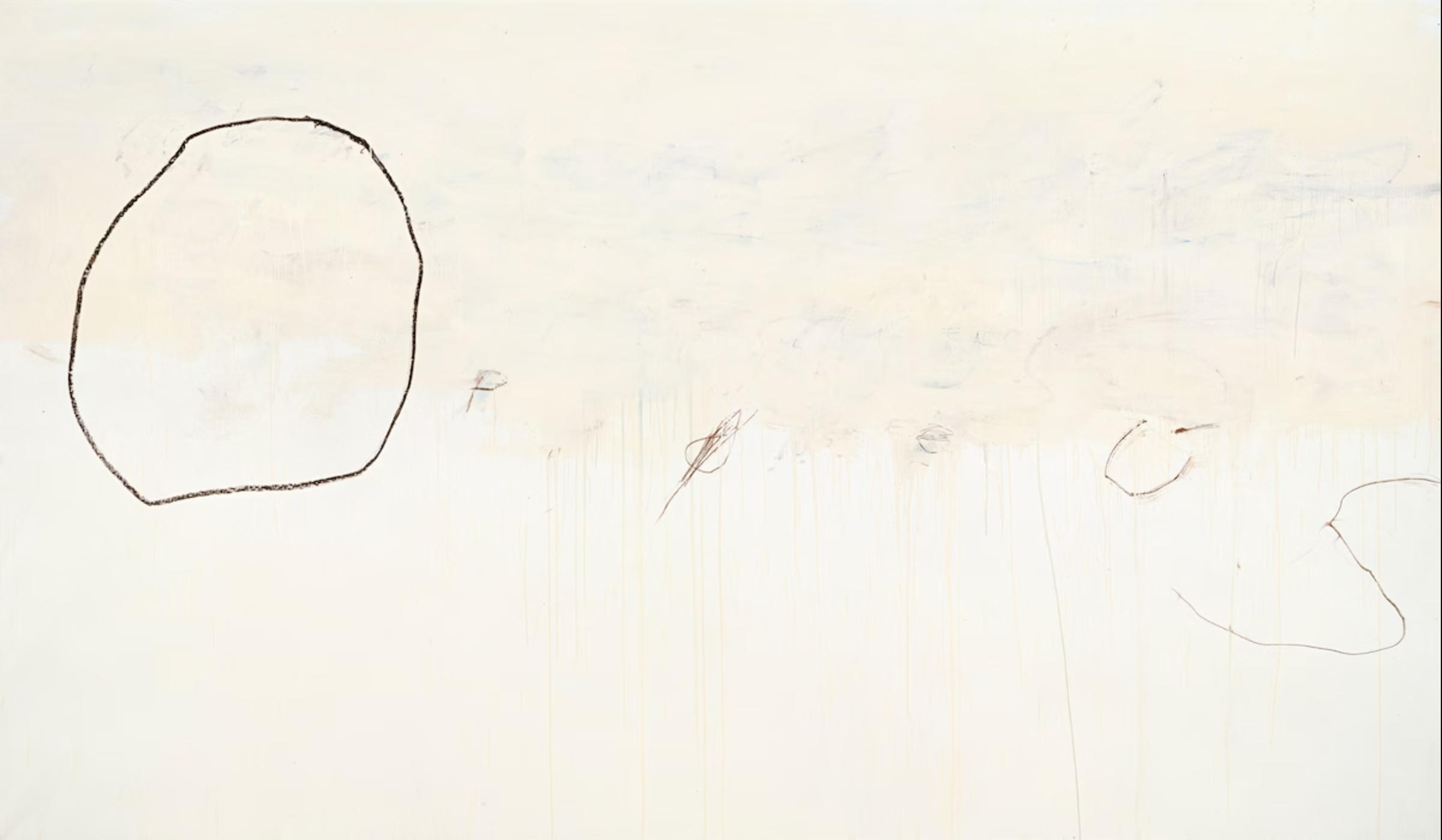
I love Cy Twombly's drawing, Orpheus.
As we've previously discussed, the 1950s witnessed a renaissance in expressive drawing using basic tools, such as vine charcoal or a lithography crayon. Artists who had long painted polished, realistic images using oil paint or gouache began returning to the simplest, most primal ways to make marks.
For example, Austin Briggs painted sophisticated oil paintings like this as they slowly went out of fashion...


This 1964 illustration by Bernie Fuchs is a snapshot of what was gained from the reintroduction of line. We can see the old world and the new world co-existing briefly side by side:
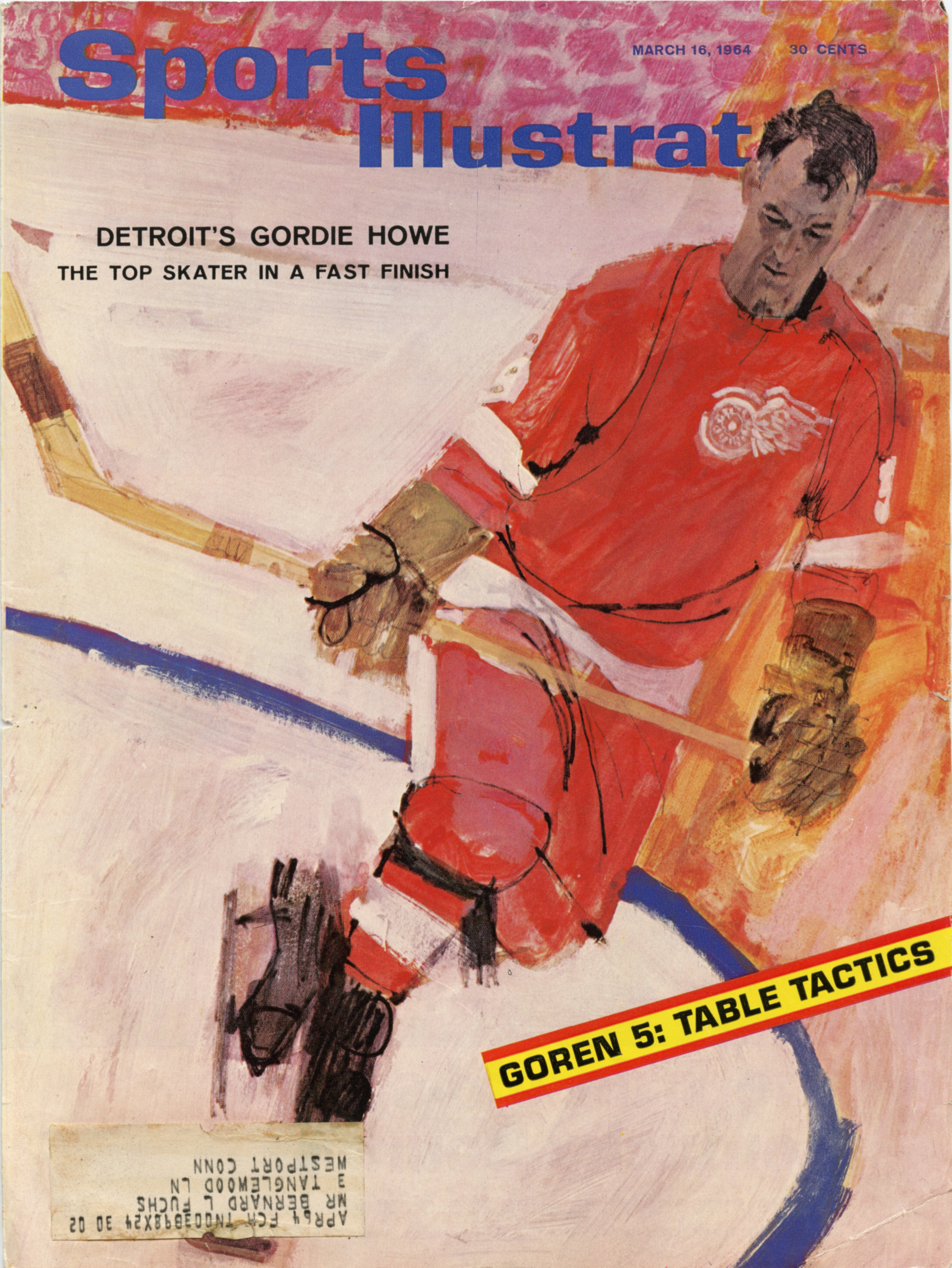 |
Fuchs painted the face of this athlete sensitively enough to achieve an excellent likeness...

Yet in the same picture, the rough black line has taken the stage. Look at what a contribution it makes to the painting! It is crude and brutish but transforms the image with explosive energy not found in academy painting.


Notice how uneven the line is. It might have been scratched into the painting with a lupine claw.

Fuchs' cover is an excellent example of that turning point in the evolution of illustration, with drawing and painting juxtaposed against each other in the same image, like a piano and a symphony orchestra juxtaposed against each other with the invention of the piano concerto. People sat up and took notice of the new style. Everyone wanted more.
The most important point to make about these accomplished artists is that, while they were trying to unlearn layers of technical facility and shed hard-earned muscle memory, their artistic taste and sensitivity remained undiminished and were in many cases heightened.

Fuchs was a master at marrying sensitive descriptive line with lines that appeared to result from a spasmodic twitch


______________________________________
This has been a long prologue to the reasons I love Cy Twombly's Orpheus but if any of you have accompanied me this far, I hope you'll be willing to come with me a little further.
This has been a long prologue to the reasons I love Cy Twombly's Orpheus but if any of you have accompanied me this far, I hope you'll be willing to come with me a little further.
 |
| Orpheus 195.7 x 334.5 cm. (1979) |
Like the great illustrators, fine artists such as Picasso, de Kooning and Twombly spent a lot of time mid-century trying to unlearn stubborn conventions. De Kooning experimented drawing with his eyes closed, trying to understand better the intuitive sources of art. Twombly practiced drawing in the dark, recognizing that such drawings would lose many obvious qualities but interested in what he might gain.
I approach the raw scrapings in Orpheus the way I approach the rough crayon drawings of Briggs and Fuchs. Walking away from realism (or perhaps chased away by photography) they have located lush qualities and brute design in the atomistic levels of mark making. They have focused our attention on the sensuousness of line through extreme simplification-- something academy painting could never do.

But "Ah," I hear you ask, "Do these childish scribbles really contribute anything? I know the story of Orpheus, who descends into hell to rescue his wife, the beautiful Eurydice, but in what way does scrawling his name illustrate that story? Where is the picture of Orpheus heroically fighting the demons of hell?"
I think this painting can stand alone as a lovely abstract design but if you're prepared to go beyond form and look for content, it's there in spades. You won't be able to read it like a story in The Saturday Evening Post; it must be approached more like a fragment of an ancient, time-worn text.
 |
| The hero partially obscured by the sifting sands of time |
It helps-- but is not essential-- to know that Twombly was obsessed with the ancient poets Virgil and Ovid and loved Greek and Roman culture. He lived in Italy, in an apartment filled with ancient artifacts. So he well understood the story of Orpheus and its implications for hope, tragedy and mortality.
Even without that background, we don't need a separate written explanation to understand meaning inherent in the visual forms. I couldn't do better than to quote the description by art critic Sebastian Smee:
...a giant O takes up the left part of the canvas. The remaining letters, smudged, and mostly erased, spread to the right and downward, like descending notes on a musical stave. There is a sense of resignation or fade-out in the script's formation, as if the word were not worth completing, the gods having long since departed. But the letters' placement also conjures Orpheus himself descending to the underworld to retrieve his beloved Eurydice.
This is a level of symbolism and beauty that is different from traditional illustrations of stories, but is a fitting experiment for a new generation.

Twombly, a lover of antiquity, was adamant that he wasn't trying to cast off tradition with his innovations. He said, “what I am trying to establish is that modern art isn’t dislocated, but something with roots, tradition, and continuity.”
73 comments:
I find the piece interesting as a piece of experimental sequential art. One's eye/I is irresistibly drawn back to the O from which the failing letters trail, causing temporal complications and a loop of causality. The drawing of the letters illustrate the verbal text they signify and allude to.
I'm with you through Fuchs and Briggs, but to be honest, you lose me at Twombly.
Though it is of course common for the intellect to let gestalt perspective slip from the mind in the act of chasing a point, that you were able to utterly vanish from all consideration everything that makes the Twombly vacuous, wretched and pretentious is still astonishing. Maybe it is your “love” for it blinding you. But I doubt it.
The only thing I’m sure of is that you want to love it, and were pleased to find something/anything “smart” in it to talk about. How else could you attempt to justify the piece as - even in some small way - worthy of the ludicrous artistic status that has been conferred upon it (and its creator) by the corrupt and illegitimate High Art milieu of our era.
Why offering such a pained justification of either the work or its cultural moment would be of interest to you, I can only guess at. The only thing ordinarily propping up the status of such stupid shit is money and power. And, despite your efforts, high level ‘investment managing’ is its only hope for making it into the future on a wall rather than in a dumpster. To coin a phrase, if it wasn’t worth money it wouldn’t be worth anything.
The Fuchs is nicely colored and active. But it isn’t a good portrait of Gordie Howe who had a pugnacious face and was musclebound. The perils of using any old snapshot to stand in for a person’s actual character. Looks more like Robert Ryan.
Also worth pointing out; the photo reference for this did not capture Gordie Howe in action, rather it is predicated on a tracing of a photo of Mr. Howe skating around outside of gameplay; either Mr. Howe warming-up, or idly skating around during a TV timeout or after a reset. Or at practice. None of the intensity of actual hockey play is present in either his stance or face.
So all Fuchs’ stuck-on jazzy action and vibrating expressionist energy that is meant (one assumes) to evoke the physical tumult and excitement of an ongoing hockey game has been yoked – in actuality - to a photo of Mr. Howe idling on the ice.
So once again with Fuchs the whole thing – the entire narrative conceit - collapses into nonsense. Again, 60s shallow sensationalism at work.
Anonymous-- Agreed. Some people think that sequential art requires a series of boxes in a row, but in fact almost any mature picture leads the eye in a sequential way.
Robert Cosgrove-- I anticipated that response, which is why I blathered on so long in this post, trying to describe what I see as a bridge between Fuchs & Briggs on one hand, and Twombly on the other. I realize it's not going to be to everyone's taste.
Interestingly, many of the great illustrators loved modern art and became good friends with modern artists. Briggs became a charter member of the Museum of Modern Art when it opened in New York, and decorated his large home with avant garde sculpture. Robert Fawcett was friends with Henry Moore and stuck by his friend, the abstract painter Graham Sutherland when he was lambasted by critics. And I've previously written about how I think Fuchs was influenced by the abstract expressionists of his day (https://illustrationart.blogspot.com/2006/01/fine-art-vs-art-thats-mighty-fine.html ). Rockwell kept a book of the work of Dubuffet on the shelf in his studio. These illustrators were clearly open minded people with great visual curiosity. It would have been more remarkable if they simply wrote off what was happening next door in the fine arts.
Kev Ferrara-- I fully expected this post would set guns blazing, and I thought Twombly might be useful soil for the battle. I'm only surprised that it took this long.
As for my motivation in focusing on this particular piece (which should be irrelevant to the quality of the piece, which must stand or fall on it own), I ran into it quite by chance at an exhibition at the Getty Museum in Los Angeles. It is immense (132" wide) which makes its restraint all the more impressive. On first glance coming around the corner it knocked my socks off, and on closer study I thought it was consistently beautiful (although my close up cell phone photos didn't seem to do it justice).
I would agree with you on one thing: I think that Twombly had a lot of misfires. How could he not, when he was experimenting with drawing in the dark? He was an adventurer and encountered a lot of dead ends, but drawings like Prometheus help me understand what he was looking for, and I do not hold his failures against his successes.
I thought Neal Adams said something very smart in a lecture he gave at Comic-Con shortly before his death. Paraphrasing: "People say this is a terrible era for art. I think this is a wonderful era for art. 95% of what is produced is pure shit, but in every era 95% of art is pure shit. In the Renaissance 95% of what was produced was pure shit, but gradually the shitty art fell away leaving only the good stuff that we associate with the period today. When it comes to the art being produced today, we need to do the hard work of finding the good stuff within the 95% shit. Some people don't want to do the work. Some people don't want to take the risk. But for me, that's what loving art is all about."
Thats the approach I try to take to modern and post modern art, including Twombly. If he followed a formula like Rockwell, Twombly wouldn't have produced as many "vacuous" pictures as he did (although even his failures give clues to what he was looking for). Like Babe Ruth he struck out a lot but when he connected-- as I think he did here-- man oh man. Are you sure you're still looking?
I'll respond to your point about Fuchs in a separate comment where I'll have more room.
Kev Ferrara-- P.S. on Twombly: I love your phrase, "if it wasn’t worth money it wouldn’t be worth anything." One of your best.
I think that as a general matter your comment about the harmful effects of money and power (which may turn out to be the same thing) on the current art market is spot on, but don't mistake Twombly for one of those monsters of self-promotion such as Schnabel or Koons. He pre-dated that era and explored his vision with sincerity on a thin budget. There is a traveling retrospective of his work, currently in Boston, and if it comes to your town I'd urge you to check it out.
Kev Ferrara-- It's all well and good that you would've painted Gordie Howe with a different facial expression, but I'm afraid your speculations about Fuchs "using any old snapshot to stand in for a person’s actual character" and "a photo of Mr. Howe idling on the ice" aren't accurate. Sports Illustrated arranged for Howe to pose for Fuchs, who personally took the photographs he later used for reference. Fuchs studied Howe skating up close; he said that Howe was very accommodating, skating in different ways as requested. However, Howe began to lose patience when Fuchs kneeled behind a clear plastic shield and instructed Howe to slapshot the puck right at Fuchs. Howe slammed the puck into the shield so hard, it scared the hell out of Fuchs, who fell over backward. Fuchs got the message that his time was up.
So, whatever your disagreement with the Fuchs cover, it's not the result of using "any old snapshot." For better or worse, this is the effect that Fuchs wanted, using reference photos that Fuchs took.
This is also a good lesson about the contribution of photography. Rockwell, Leyendecker or Dunn could never paint this cover, both because they couldn't make the deadline and because they couldn't capture the speed or the dynamism of the subject.
Fuchs used to describe how every cover of Sports Illustrated became a turf battle between the photography editor and the art editor. The photography editor would growl at the illustrators, "That cover should've been ours." When Sports Illustrated assigned a cover to Fuchs (which it did often), the resentful photographers did their best to sabotage him, blocking his access to a golf tournament he was covering, obstructing his view, monopolizing the Sports Illustrated press passes to events. They became quite adept at undermining the illustrators on weekends or on short deadline, so that the illustrators were unable to get management to intervene and protect their work.
Finally, your amusing comment that "the entire narrative conceit - collapses into nonsense. Again, 60s shallow sensationalism at work" suggests that your artistic calcification has continued unabated. One of the things I admire most about Howard Pyle was that, at a time of great technological and economic change, he seized the future with both hands. I'm curious how you think Howard Pyle, transplanted to 1960, would view this art.
Twombly met the gallery requirements of an identifiable and repeatable brand to sell art and for this reason, a sense of fraud is associated with his simple expressions. So it’s a daring task to reconsider Twombly, and in the context of the lines of Fuchs and Briggs another twist is added. This post is responsive to previous posts and I’m thinking of the lines of Kirby’s cape in the last one, where the lines have such tensile strength that should one take a line at its ends and squeeze them between two fingers they would snap before turning to cloth. That kind of tensile strength is an occupational hazard of some comic art where hard edges vying for attention bring an intensity even to well organized images. It’s very much true in the Kirby example.
It would be hard to call Orpheus a bold and confident work with it’s missing letters and misfired attempts painted over in white. It’s something of the opposite despite its size, a feeble search, a self conscious search perhaps. Many a bold and confident man has found himself wondering where his silent, self conscious and sensitive muse has gone leaving him to wonder, was being bold and confident really such a crime? Eventually room has to be found to accommodate such as Twombly has done in Orpheus, at least that’s what he has accommodated to my yes.
In the same way the undirected directness or barely organized energy that’s found in Twombly’s scribbled drawings one imagines, is supposed to correspond to some kind of root primal or childlike expression. Some people think motherhood is a safe place for a woman to exercise her desire to control until they look into the eyes of the disarming undirected directness of a child. Then suddenly, what made sense doesn’t and what didn’t does. I think Twombly’s scribbles are gunning for that, or some invisible quality easily overlooked as dismissible, but I can’t say if they are successful or that I just never gave them enough time. At least David, I have to say you have made your point and I’m trying to see more, even if I’m not fully there yet.
What has affected me is the way Fuchs really hasn’t succeeded to bring the image to the surface, something he did so beautifully later in his career. Placing my thumb over Gordie Howe’s head, the correlation to Twombly’s line is a connection, but what is more obvious is that the figure is coming apart as he’s trying to bring it to the surface. It’s obvious Howe is gliding casually despite the headline and the angle and placement of the circle adding a sense of movement to the gentle rhythms in the uniform, but the lines on the gloves and especially the back left foot are coming right off the feet and intentionally trying to reach the surface of the picture in a way different than the three lines in the Briggs that remain seated to the swim trunks of the teen about to hit the water.
David, your argument for substantiating the Twombly by stating that it shares the same graphic elements as a Briggs drawing just won't do. The worth of any artwork lies in whatever it is that is greater than the sum of its parts. In other words, the relationships between the parts carries the meaning. If you can point out how the Twombly does this, I think you'll have more of a case.
chris bennett-- Even I can't argue that there is a direct linear progression from Briggs to Twombly, but let me see if I can get them a little closer.
I think Briggs (and others I've noted) told us, "look at the ragged tooth that mother nature put on these lines. Look at what the loss of dexterity (which requires all my dexterity to lose or at least conceal) achieves for the work. Having trouble focusing on my point? Here, I'll remove color and half tones and shading and perspective, giving you line in its most raw form. To shock you out of your unquestioning acceptance of a 3D illusion that you've been swallowing for the past 400 years, I'll even leave in half erased lines, or lines that end nowhere, intentionally creating the illusion of incompleteness to force you to focus on the ontogeny, ontology and epistemology of the act of drawing.
I think Twombly, working 25 years later, took that spirit even farther: "You say you want to contemplate the ragged tooth on a line? How about if I get rid of all those distracting pretenses at subject matter that Biggs and Fuchs kept alive, throw out most of those other lines in the process, and draw you a great big black circle on an almost blank white background 10 feet wide?"
Reduced to that atomistic level while increased to that size, you're basically confronted with a chewed up black line, unevenly drawn by some unknown hand. What used to be hundreds of small choices, such as "should I make this compositional element a little larger or a little greener," now becomes a solitary choice: "where in this huge field should that big circle go?"
I've previously quoted a former art teacher who was trying to explain Barnett Newman's huge blank canvases with one vertical stripe. He talked about the zen of sensing the exact right location for that stripe, then said, "his balls must've weighed 20 pounds apiece when he painted that stripe."
So while you make a valid point about "the sum of the parts," I think much of what Twombly did was take a lot of parts off the table, distilling a very few marks to their essence.
On the other hand, for all you content lovers out there, we should not ignore the fact that Twombly includes very important content in a different form. We're accustomed to seeing illustrations of text like, "He stared into her eyes as lightning crashed in the night sky above." Twombly does it differently, putting the actual text ("Orpheus") in the picture. His content, and his artistry, is in the time worn, battered way he presents it, but still in an epic size like some ancient temple in the human story. The huge circle of the "O" has many mystical and philosophical connotations by itself. That is another way of looking at "the sum of the parts."
You can object, "Putting actual words in pictures is an inferior form of art to painting figures and nature and action." But other cultures feel differently. A thousand years of Islam believes the highest art form is calligraphy. That might cause people to give Orpheus a little consideration before writing if off.
So while you make a valid point about "the sum of the parts," I think much of what Twombly did was take a lot of parts off the table, distilling a very few marks to their essence.
This is the momentous error, and pernicious conclusion and delusion of the materialist take on reality; that essence can be found dwelling in the parts. On a common sense level, you only have to ask yourself why it is that you love someone to see the absurdity of the reductionist point of view in answering such questions on quality.
The huge circle of the "O" has many mystical and philosophical connotations by itself. That is another way of looking at "the sum of the parts."
Firstly, these 'mystical and philosophical connotations' are just the mental wool-gatherings that the left-hemisphere brain can choose to indulge itself in given anything that might be presented to it. For example... I dunno, let's place a monkey-wrench in a glass case inside a museum: "Oh my, observe how this object eludes to our grip on reality; firm only by proxy, a tool at arm's length, our need of it makes a monkey out of us while distinguishing us from a monkey. The worm gear that brings its jaws slowly together, its precision and delicacy contrasted by the long handle's invitation to grip it with brute force. An image of ourselves forged in steel, stood on end it is in the shape of a question mark, asking itself, and therefore us... who are we?" Yadda,yadda,yadda. This stuff can be spun out of one's arse to whatever is put under the glass.
And this is all there is with any contemplation of a big 'O' stuck on a museum wall; just a voluminous rag bag with which to play 'fill-with-connotation'. Consequently I see this as the very antithesis of something being greater than the sum of its parts.
Sean Farrell-- You're exactly right, I offer this post up as a continuation of our recent discussions regarding the capes of super heroes, Kirby's line and Briggs' as well. I thought that discussion was very interesting, and personally I felt enriched by it. I thought I would push the boundaries a little further with Twombly.
Perhaps it's only natural these days that we would question whether Twombly's identifiable and repeatable brand was a marketing ploy, especially since at the end of his life his paintings were selling for millions of dollars. However, he did begin his career in that period before the art market became a church of venality, and his life was riddled with actions that did not seem like wise career moves, such as leaving his job at the Southern Seminary and Junior College in Buena Vista, Virginia to live in Italy and study ancient classics. Not only did he take a beating for his style (which most people of the day seemed to dismiss as crap) but his work was very cryptic and internal, making little or no concessions to an audience or wealthy patrons. A number of his works do seem like scribbles to me, where he is treading water waiting for guidance from the muse on where to go. On the other hand, some of those scribbles turn out to have private meanings for him that would be incomprehensible to viewers. One of those scribbles at the Getty show was of Leda and the swan; There were four large paintings, about 7 feet high, with a little floral effect, which turned out to be tributes to his wife's vulva. Apparently some viewers are capable of deciphering these messages; In the 1990s when a French woman went to the exhibition of his painting, "Say Goodbye, Catullus, To the Shores of Asia Minor" she was so moved that she stripped naked to witness it properly.
Unlike you, I do consider Orpheus a "bold and confident work" if only because I think it takes guts to approach a 10 foot white surface with a thick black stick and draw a big circle. There are ten thousand ways to get it wrong, and there are no objective measurements to tell you how to get it right. You can't get help from a live model or a photograph to calculate proportions, but after you've tarred up that beautiful white surface you can sure tell when you've got it wrong. See my earlier reply about Barnett Newman for an anecdote about why I think Orpheus qualifies as bold and confident.
In a way, I think the same point applies to the Fuchs cover. Fuchs started doing this type of cover after spending years painting super tight, realistic car paintings. He said the hardest part of this growth for him was learning how to "control looseness." The elements you mention ("the lines on the gloves and especially the back left foot are coming right off the feet") stretch the anatomy, but on the other hand they are more representational than the abstract expressionism that was flourishing simultaneously. This picture is a hybrid. As far as I'm concerned, Fuchs tapped that excitement and energy better than Briggs or anyone else of that era, and signaled a hard turn for illustration of the 60s.
David,
Thanks for the funny story. Yes, you have made me appreciate Twombly more than I did.
Your explanations bring home the point that if we dismiss things out of hand, we’re only seeing with partial eyes, we’re treating our visual world as we threat the world according to our needs or values, taking what we value and discarding the rest.
If it’s any consolation to you, I didn’t know the backstory but was reading the lines in Orpheus in contrast to the ink lines of the Kirby, or any confidently drawn subject. The dismissed feminine principle at work in the lines in the Twombly is a type of statement, just as there’s a type of statement in the lines of the Kirby example. That’s where I missed the heroic size of the piece and its confidence.
The dismissed nature of the Twombly lines do talk, they do say something. My male-female correlation was based what was and what wasn’t in the Twombly verses the Kirby, but had no idea the expression of the lines would relate or speak as closely to the story as it did to me not knowing the entirety of the story. As it happened, he fought for his lost Eurydice with a lyre and a broken heart, not with a cape and mighty strength.
I do remember Fuchs once saying I think in the late seventies that it took him a long time to develop his spontaneous style and he did grow terrifically from these early years. There is a kind of whimsy in the lines and marks in the uniform of Gordie Howe which matches a more casual skate, but not the brutish game itself. Some illustrators, even Fawcett were working with a whimsical line that might not have matched their subject during those years.
Respectfully to what Chris was saying, which was very funny, a close look at the nature of different forces within a piece do say something to us, even when they are as pared down as the lines in Orpheus.
chris bennett-- I'm not sure if I'd call this phenomenon a "materialist" approach or a "reductionist" approach, in part because those labels have become so caught up in culture wars I'm not sure they have reliable definitions that I could count on being understood. I do like Arthur Koestler's term "holon" (introduced in his brilliant books "The Act of Creation" and "The Ghost In The Machine"), in which the the essence is indeed found dwelling in the parts. The notion in biology, art and other fields is that something with the integrity and identity of a whole can simultaneously be part of a larger system.
But why isn't our discussion simply a question of good ol' fashioned frame of reference? You would agree, I assume, that you can't see more from a plane window than you can through a microscope? It's just a different frame of reference. So why isn't Twombly's O putting a line under the microscope? Are we able to see more from a Rembrandt painting than from his quick sketch? I'd just argue that they're different, each with their own scale of perfections.
As for your point about the symbolism of a circle, or for that matter the significance of the word Orpheus, I'm not sure why it has to be all "mental wool-gatherings" or nothing. Some people certainly indulge themselves, but on the other hand we've had thousands of years during which smart people saw such symbols as the path to a whole larger than the sum of the letters. I'm sure I must've quoted Bernard Wolfe before: "Not all labels are to be sneered at. The ones that are transparent so they can't be used as masks, and give real names instead of aliases and real addresses you can be sent home to in case you're hit by a truck."
It's all well and good that you would've painted Gordie Howe with a different facial expression,
This is purely an objective matter, nothing to do with me. Related to your claim about the Fuchs being a successful facial portrait. I'd invite readers to do a quick search of Mr. Howe's mug to put the matter to rest.
Sports Illustrated arranged for Howe to pose for Fuchs, who personally took the photographs he later used for reference.
This tracks with the point I made that the reference was clearly taken outside of any actual hockey match, with Howe idly skating on the ice, not "speeding" or intense in active way.
Which is why I said that Fuchs' dynamism - as lovely as it is - is stuck on. Like splatterpainting a slow waltz. The pose itself is wrong for the action being suggested.
(One assumes that Fuchs had never himself played hockey and probably didn't watch games on tv.)
When Sports Illustrated assigned a cover to Fuchs (which it did often), the resentful photographers did their best to sabotage him,
Sounds about right. Photography is such a cheap and easy road to representation that pretty much anybody can do it. So it must be a cutthroat business to get work doing it. In any such field, the business of selling the equipment and the how-to literature (thus the dream) is the real moneymaker.
Twombly does it differently, putting the actual text ("Orpheus") in the picture. His content, and his artistry, is in the time worn, battered way he presents it, but still in an epic size like some ancient temple in the human story. The huge circle of the "O" has many mystical and philosophical connotations by itself.
No Sophist worth the name is without the Gift of Gab. Better your words be framed, rather than his.
The notion in biology, art and other fields is that something with the integrity and identity of a whole can simultaneously be part of a larger system.
Indeed, but a part is not the same thing as the whole to which it belongs. That's to say: in terms of the meaningfulness of a whole, the part belongs to the wholeness but the wholeness does not belong to the part.
But why isn't our discussion simply a question of good ol' fashioned frame of reference? You would agree, I assume, that you can't see more from a plane window than you can through a microscope? It's just a different frame of reference.
Yes. But it is a question of how change in a frame of reference produces change in reference to qualities. For example: The kinds of qualities relevant to a cell jiggling around under the microscope is different to the qualities relevant to the organism to which it belongs.
It is the change in the nature of relevant quality that is important here.
So why isn't Twombly's O putting a line under the microscope?
It is, but the microscope puts whatever is seen under it outside of our frame of functional human meaningfulness. It is not my girlfriend's DNA that I love.
Are we able to see more from a Rembrandt painting than from his quick sketch?
This is a different argument. Where I consider you to be in error is the belief that a close-up of an element of a work of art carries meaning of the work as a whole. A block from the Parthenon will tell you things about travertine marble, but nothing of the temple.
The subject of the post is line, or what a line can say and do. Why it became a focus of the era was also discussed. The confident lines in the Jack Kirby cape differ from those in the Fuchs and the Twombly. So it’s a matter of what the lines are saying in and of themselves because that’s the subject that was brought to attention.
The lines in the Fuchs have to reflect the subject and action of the figure, and it appears Fuchs chose a gliding over the ice, a moment of grace verses an under water knife fight which is another part of hockey.
The Twombly may have been executed with the artist’s confidence, but that bleeding S isn’t of the same nature as Kirby’s bold confident tense lines grabbing one's attention. Some things grab us and others seduce.
The Twombly is made of lines we might ordinarily discard as inept, weak, aimless, unsure, tragic, distorted, impotent, pitiful, even dying. Their nature is distinct from those in the Kirby and Fuchs. Since we can identify some type of emotional reality from each of the three sets of lines, then we reflect on what each set says.
Twombly chose lines which express emotions most of us prefer to discard, so there’s an almost automatic urge to discard the work. We react the same way to children’s scribbles because in a world of struggle, to draw, to work, to survive, they aren’t serious or even reflect failure. Like children, motherhood and old people they wait in line. Twombly is choosing this area to concentrate with his line choices. Tragedy is what we don’t see in front of us until it’s gone. The lines are not even cute as often such lines can be used. The loss is what’s overlooked. It’s not a word game. It’s reflective because the lines have a particular nature. They’re not uniform, not bold, not certain, not exact.
That the reference to the tragedy of Orpheus isn’t a visual reference is an objection, but there’s enough of the story corresponding to the lines as an expression of loss in themselves to make the piece more than what it appears. If it is more than it appears then something was accomplished.
If people get carried away with their words describing art, no one actually gets bloodied. Kirby got carried away with his lines and Fuchs got carried away with his and if getting carried away isn’t part of art then what is? I’m ridiculous and people are ridiculous and sometimes there’s tragedy in that too, because we don’t see it. That’s part of what tragedy is, getting carried away with everything.
PS: to Kev, I’m reading the book Drawing the Natural way and it’s very good. An appreciated recommendation.
That's good Sean.
I've read Kahler's The Disintegration of Form - as you recommended - and found it a sturdy "state of the nation" type unfurling of what had happened to the arts by 1967.
He cited many theorists I hadn't heard of; invariably the postmodern type before that was a word; with attention deficit disorders guiding their wide-eyed exhortations rather than intellectual rigor and erudition. It is always bloody painful to read arrogant vandals trying to justify their revolutionary slogans via sinecure posts.
I was most impressed with the final lecture where Kahler discusses performance art and "happenings" and coins the term "The Cult of Incoherence".
There was a surprising resonance in Kahler's discussions of scientism and destructive analysis with Iain McGilchrist's recent observations on the selfsame plagues.
Ultimately, though, the book is only an academic work. There's nothing actionable in it. Like a million other books on the arts which littered art studio floors from the 1950s through the 1970s, it engages in argument, not poetics; talk about art, not art itself. (I can't tell you how many artists of your generation I know that sought in vain for artistic guidance in libraries full of such books. Thinking the intellectuals had the answers.)
Kev,
Whether it was 1967 or 1968, whatever had survived to that point was extinguished overnight. The younger boomers at the time really were left orphans.
Intellectuals piecing back where it all went wrong can’t create the sensibilities lost because naming them isn’t understanding them. They are things that take a long time to internalize.
To what we don’t see in front of us, reductionism only solidifies the mental block. There’s nothing more certain to bring one to humility than thinking one has it all figured out. So there’s a future buried in there somewhere regarding the poetic and lost sensibilities. Understanding this is giving me more hope than I've had in a while.
Painting is doing much better and that’s a point of optimism too.
To be more specific and to Kahler’s book, one only has to watch television for an hour with the sound off to see the visual madness at work with its endless interruptions and fragmentation. Turn the sound on and it’s worse. That’s part of what changed, a fragmentation that remains today even in painting.
As you’ve described the imaginative process, images don’t always arise from mental churning, but from an observant state, a place of mental continuity that is in a relaxed receptive state. They arise as if on their own. The same with seeing what is unseen and in the process of learning. But our habits are to have a crowded mind. Even if the poetic sensibilities and imaginative process were explained and encouraged, the habits of fragmentation are now very strong and part of the endless information people have to contend with, not just in the arts but in the simplest operations. People still feel driven and rewarded to chase exactly what no one knows. What changed was has become internalized.
Forgive my persistence, but I do think what you’ve been after for a long time is important and I think I have something to add to your concerns.
I’m not romanticizing a former era with it’s economic troubles, but people were experientially closer to life and in a multi-sensory and multi-leveled way. In Nicolaides’ book The Natural Way to Draw, as you know, he presents a sculpture by a blind woman with an impressive understanding of space to show that our understanding of space is formed by more than our eyes. One can get a better understanding of space by feeling the form by imaginatively touching the pencil to and following the form. So one thing the book is trying to introduce drawing as experiencing reality.
People are all about experiences today, camping, running, hiking etc. but experiences have to be internalized, made habits. They’re not simply exercises but also of dispositions that were lost in the revolution. Such is not readily accepted because though people recognize the words, they don’t recognize the experience of the words. More so they have no idea how to abandon themselves to the experience because they have no trust or familiarity with each. Take for example a simple virtue like patience. People today have never been habituated to it. Schools are trying to teach through experience, experientially but in our current world experience is a reprieve. It’s not deep because, experience is a giving of oneself to something and an enemy of a certain type of control.
Twombly is, to me, one of the only modern artist worth looking at. Modern art is, theoretically, all about stripping away the learned and getting back to something like “pure art”.
In his toddler mark making innocence he gets there. Twombly managed to dig all the way back into his darkest reaches of memory and extract those pure works to the surface. Where every other modernist bores me stupid, Twombly clicks something that makes me smile. I like kids art, I’ll take it over the vast majority of adult art. Twomblys modernism gets the same pass my daughters finger paintings do, they’re fun and there’s not much else to say about them. There’s also a man with Down’s syndrome on Instagram who makes modern art paintings who gets the same pass. Quentin Blake gets a similar pass.
It’s better when you don’t know Twomblys titles though, trying to tie these squiggles back to high culture is cringe.
Richard,
What gives a child’s drawing it’s charm and integrity is that it’s the sum of the child’s intention. It’s not masking an ideology, it’s not at odds or at war with itself. There is truth of intention, nothing between the intention (thought) and the drawing. That’s not so true in the era where artists were trying to accommodate their drawings to the picture plane and typography. Such required a learning curve and Fuchs drew upon Degas to find his eventual mastery in that area.
In the drawing book Kev brought up by Nicolaides, the author is teaching a method that’s closer to and undivided from what is drawn and the intention of the drawing, to find a gesture, to find the form, etc. What was so difficult with the art education in the late 60s and 70s was that it was attempting to teach the graphic approach at cross purposes with the sculptural approach. There was a certain snobbery towards the latter.
Worse, there was an elitist and cynical assault on the young people who were not at odds with themselves but quickly became confused. They were taught to think a simple modest person was uptight, a patient person was suppressing something, a person who laughed a lot was hiding their insecurities. There are instances where such is true, but lost was a certain oneness and this new habit replaced former sensibilities which existed in a general sense in the audience of Norman Rockwell. Today a person may understand patience as an attempt to fight an impulse, but back then a patient person was one at home with themselves. Home, oneness, unity. Such ideas were much more understandable before people underwent their education of fragmentation and as parents followed the divorce craze in pursuit of their human potential. At this point the problem has compounded itself.
Enjoy being a Dad!
> It’s not masking an ideology, it’s not at odds or at war with itself
What I like about Twombly and Blake is that their toddler-isms don't particularly seem like put-ons or ideologies.
There's an authenticity in Twombly's psychological regression that is missing in effectively all other modern artists. If this is a learned behavior, he has learned it fluently. Where kandinsky, miro, richter, de kooning seem to be self-conciously stylized, Twombly is transmitting the mental states of children verbatim, there's no Twombly the man left in Twombly.
So Richard, are you saying that you appreciate Twombly's work only when it cannot be distinguished from that of a child?
In short, yes.
Children have a genius that is entirely lost by adulthood. Artists and poets then spend a lifetime trying to learn enough to make themselves as profound as a child. Cornwell is a genius among men, but a dwarf when compared to the pure expression of an eight year old drawing about their hopes, dreams, loves and fears.
I believe if we could capture and hold on to the self-assured honesty of our childhood selves, we wouldn’t have much need for fine learning. We’d already be sufficiently capable of profound expression. What the modern artists and poets pretend at and falsify, children actually have.
Twombly and Quentin Blake and a handful of others are anomalous in that they have retained a thimble of that innocence, which is remarkably rare. I’m not advocating that we should teach Twomblyism in Art Schools, or pressure folks to try to replicate it, mind. To the degree that one is teaching it or attempting to replicate it, they are not doing it, and for most adults the most honest art they can make is adult art. What I am advocating is that in a more enlightened society, children would draw all day, drawing would be just another language, and we wouldn’t hold up someone who draws as an “artist” anymore than we’d hold up anyone who is capable of speaking as an “orator”. I apologize if I’m not being clear.
I believe if we could capture and hold on to the self-assured honesty of our childhood selves, we wouldn’t have much need for fine learning.
I take it from this that whenever you need advice about anything, anything at all, you consult a child.
Children have a genius that is entirely lost by adulthood.
Artists and poets then spend a lifetime trying to learn enough to make themselves as profound as a child.
Cornwell is a genius among men, but a dwarf when compared to the pure expression of an eight year old drawing about their hopes, dreams, loves and fears.
The main artistic gift of (undamaged) children is that they are integrated in personality, psychology, temperament, mind, body, and soul. They live in a state of flow.
Creating artwork that is wholly integrated - equal to the natural unencumbered products of a child's mind - is indeed one of the great goals of adult artists.
But it is rather easy to express simple thoughts crudely. Primitive paintings are no more difficult than pantomiming. Once past self-consciousness, you're home free.
Many great cartoonists, adults in age at least, successfully express themselves simply and with integration. But with the additional feat of having organically developed their own glyph vocabularies.
But with narrative painting.... it is rather difficult, nearing impossibility, to get complex thoughts to a purely aesthetic state, such that they can be apprehended with the same ease as cartoons.
The greatest do achieve it now and again. Which is quite a feat given the complexity of naturalistic representations of experience as modified by advanced aesthetic thought.
This is just why imagination, poesis and poetics are so important. For synthesis is the way of integration regardless of age.
Adults get lost in genre, theory, ideology, cultural relevance, the market, and fame.
Children have a feeling or sensation they wish to transmit or record, and do so earnestly with what precious few tools they have.
If we had followed their lead in the arts, we would not be this position. It takes the kind of self-deception that only an adult is capable of for a generation of scholars to convince themselves that Mark Rothko is doing anything at all. A pack of children, given sufficient millenia, would recreate the Golden Age by instinct and necessity. The same cannot be said for a pack of Ivy League painting professors.
As a rule, I show my paintings and drawings to my children. I have found that their critiques are, if crude, unfailingly right.
The above was in response to Chris.
> But with narrative painting.... it is rather difficult, nearing impossibility, to get complex thoughts to a purely aesthetic state
I believe that if we remained these undamaged fluent speakers of visual expression, maintained that integrated state, it would be common to find such artists.
Art education tries to impose on the dis-integrated juvenile artist the habits of great artists that, if they had remained in a state of flow, would arise organically by the necessity of their desires to express mature feelings.
chris bennett wrote: "Where I consider you to be in error is the belief that a close-up of an element of a work of art carries meaning of the work as a whole. A block from the Parthenon will tell you things about travertine marble, but nothing of the temple."
Perhaps not every meaning of the whole work of art-- that's the point of choice, selection, prioritization in art. But I do think the line in a drawing (not a rapidograph line, but the kinds of expressive lines we're talking about here-- lines with character, sensitivity, nuance) can simultaneously be a whole and a fragment. That's one of the founding principles of 20th century art, and one of the keys to unlocking the meaning in Twombly.
This should not be so controversial because it's also a scientific principle of nature: "A living organism...is a whole consisting of 'sub-wholes,' such as the circulatory system, digestive system, etc. which in turn branch into sub-wholes of a lower order, such as organs and tissues-- and so down to individual cells, and to organelles inside the cells.... They are Janus-faced. The face turned upward, toward the higher levels, is that of a dependent part; the face turned downward, toward its own constituents, is that of a whole of remarkable self-sufficiency."
For me that big bold scratch of an "O" has a meaning. Contrasted with the scratched out and faded letters, it adds an additional meaning. Its role leading the descending letters is another meaning.
Sean Farrell wrote: "The Twombly is made of lines we might ordinarily discard as inept, weak, aimless, unsure, tragic, distorted, impotent, pitiful, even dying. Their nature is distinct from those in the Kirby and Fuchs."
Exactly! Orpheus was a mythic hero very different from Thor; his thing wasn't to bash enemies with a big hammer (a subject at which Kirby excelled). Orpheus had a much more complex and tragic fate, and Kirby's brand of line would not be appropriate. Artists have been drawing Orpheus for over 2,500 years. (The Greek artist Polygnotus drew Orpheus' descent into hell in the 5th century BC. His drawing was undoubtedly closer to Howard Pyle than Howard Pyle was to Twombly.) What marginal contribution would another Pyle or Cornwell or Schaeffer treatment make? Any pioneer such as Twombly is guaranteed to make missteps, but I salute an artist who is still painting Orpheus in the 1970s and tries an innovative approach.
In response to the current discussions of child-like drawings:
Early in the 20th century T.S. Eliot wrote: "We shall not cease from exploration. And the end of all our exploring will be to arrive where we started and know the place for the first time."
This was a fine credo for a century in which artists became newly receptive to the power of art brut, tribal art, children's art, and the art of several other cultures. If you read the essays of Jean Dubuffet (another of my favorites) I think you will find a brilliant and imaginative intellectual who worked in a child-like style exploring some truly innovative concepts.
David, I think you have misinterpreted Eliot's meaning. I believe he is referring to a spiral journey of experience leading to height and depth in understanding above and below an initial understanding - not a linear assembly of 'innovative concepts' in the name of 'exploration'.
But I do think the line in a drawing (not a rapidograph line, but the kinds of expressive lines we're talking about here-- lines with character, sensitivity, nuance) can simultaneously be a whole and a fragment.
Yes, in the same way a carburettor is part of an petrol engine. But this is not where we differ. My point is that the meaning of a fragment is different in kind from the meaning of the whole that it forms a part of. For example: The immediate meaning of a soldier in mortal combat with his opponent is different from the tactical manoeuvre that put them there. And the meaning of the tactical manoeuvre is different from the battle itself. Which is different to the campaign, whose meaning is to defeat the opposition, which is different from the political tensions which the campaign seeks to resolve etc etc.
By your argument, the personal telos and logos of two strangers trying to kill each other is the same as that of the nations of their world. Or: Hand you a block of Travertine and you'll know it belonged to the Parthenon. Notice a slipper and know it belonged to Cinderella.
For me that big bold scratch of an "O" has a meaning. Contrasted with the scratched out and faded letters, it adds an additional meaning. Its role leading the descending letters is another meaning.
Typographic expression installs vague meaning, yes. Now what?
Again and again Burt Silverman's remark about Modernists rings true; that they became distracted by and fixated on rudimentary experiments in design.
Not surprisingly in the tumultuous race for reductive radicalism, all the difficulties that separate the talented from the untalented, the dedicated from the distracted; the dispiriting difficulties of imaginative concentration, of drawing, of contemplating an unseen scene, of living in the subject and as the subject, of perspective, mood, theme, rhythm, of composing, anatomy and light, texture and pattern, of balance, of unity... are silently dispensed with. And if ever mentioned, quickly dismissed as merely the self-serving fiats of a bygone tyranny.
How convenient.
(The Greek artist Polygnotus drew Orpheus' descent into hell in the 5th century BC. His drawing was undoubtedly closer to Howard Pyle than Howard Pyle was to Twombly.)
Yes, narrative art will be closer to other narrative art than narrative art will be to scrawled typography.
What marginal contribution would another Pyle or Cornwell or Schaeffer treatment make?
I would love to find out what "marginal" treatment these great artists would have produced on the subject.
Of course if the artistic "contribution" you are looking for is some regression to the inchoate that would center aesthetic apologetics and exegesis above the actual artistry on display, these fine fellows may not fit the bill.
> What marginal contribution would another Pyle or Cornwell or Schaeffer treatment make?
David, I’m disappointed. You don’t really think this, right?
The flat dismissal of works such as this one often seems built upon a conflation of history and teleology.
Richard-- Let's look at this from a relative perspective. I thrill to see a new Pyle or Cornwell or Frazetta or Fuchs. I love to see what they've achieved with their tools. At the same time, you and I are very familiar with what those tools are. We've seen a thousand artists use them in thousands of variations with varying degrees of success.
For example, we know what a Cornwell face or a Frazetta body is likely to look like. So do a million lesser imitators who've spent their careers gradually nibbling away at the work of masters from behind, copying their methods, plagiarizing their innovations and their solutions, developing a facility which narrows and blurs the gap between brilliance and mediocrity. The masters can't stand still forever.
A Howard Pyle painting of Orpheus fighting his way out of Hades might dazzle me, it might curl my toes, but I can also predict it would have a particular frame of reference and scale. If Pyle set out to convey the weight and tristesse of Orpheus' loss, the bravery and then the tragic fruitlessness of his challenge, the obliteration, with the passage of time, of his heroism and all that he stood for... well, Pyle might use the expression on Orpheus' face, or his posture, or the lighting of the picture or its palette. Perhaps his clothes would be ragged and torn from his ordeal. Sure, these are important and I still love them, but that's what I meant when I suggested that such enhancements might be "marginal," not necessarily small but improvements within an established scale of excellence using established tools, not qualitative leaps or changes in modes of expression.
Are these the only props with which to convey sorrow, to sensitize us to something about our fate, to set us to thinking about the consequences of our mortality? Or is it possible instead to sweep the traditional chess pieces off the board and try something new altogether? That takes a lot of audacity, and anyone who attempts such an effort is guaranteed to start out with lots of failures. Perhaps they feel that such risks are the only way to explore thoughts and emotions that are more profound than the ones in 19th century magazine fiction typically illustrated by Pyle.
Would I ever swap N.C. Wyeth's painting from Kidnapped of David Balfour swept overboard (https://illustrationart.blogspot.com/2016/02/moonlight-magic.html ) for Cy Twomby's entire life's work? Not in a million years. But I'm not going to count out such innovative power just because it flunks Pyle's approach to artistic problem solving. Time is not going to stand still for Pyle, any more than it stood still for Orpheus.
If Pyle set out to convey (...) Pyle might use the expression on Orpheus' face, or his posture, or the lighting of the picture or its palette. Perhaps his clothes would be ragged and torn from his ordeal. Are these the only props with which to convey sorrow, to sensitize us to something about our fate, to set us to thinking about the consequences of our mortality?
Are they the only "props" that Pyle and his compatriots have by which to convey meaning and emotion? Are they really?
Or might you not be in a position to say?
Or is it possible instead to sweep the traditional chess pieces off the board and try something new altogether?
'New' is the most superficial unexamined chant in art. New is painting the floor with your hair and putting your own excrement in a can. New is throwing tomato soup at a Van Gogh. 'New' is for children.
Perhaps they feel that such risks are the only way to explore thoughts and emotions that are more profound than the ones in 19th century magazine fiction typically illustrated by Pyle.
More profound, eh?
'Orpheus' is written in scraggly lettering with some paint drippings. Teeming with significance this is.
Imagine if Twombly had the piece read 'The Ho Chi Minh Trail' or 'Race in America' in scraggly letters with paint drippings. Would that be more or less profound than 'Orpheus' written that way?
What about the word 'Abortion' written in scraggly letters with paint drippings? Wouldn't that be more profound than any Pyle picture could ever possible be?
Let's face facts. Race In America, The Ho Chi Minh Trail, and Abortion are certainly more profound - far more profound - than some silly old myth. I think we can all agree to that. Especially if those words are also written in a scraggly way with paint drippings.
Thoreau said: "Greatness is in the ascent." Journal 2-7-1841.
It's interesting that Twombly chose the pictorial "descent" into Hades as Orpheus' greatness, but it makes sense because Orpheus screwed up the "ascent" outta Hades -- he looked back at his wife Eurydice to make sure she was still following him -- failing to follow the strict instructions of Hades -- thereby losing her forever. His particular greatness then was the courage to go down into Hades to retrieve her, not his failed journey out. Does not the scrawl of Twombly reflect that uncertain courage -- the bold but uncertian O and S -- illustrating his intact and integral Will but the trembling and doubtful middle letters showing the butterflies in his gut, the downward tilt illustrating the descent? Here the greatness is in the descent.
The "scrawl" becomes more meaningful once one consults the myth.
The "scrawl" becomes more meaningful once one consults the myth.
Wouldn't some equivalent meaningfulness apply - with respect to each phrase - if one were discussing works where Race In America, The Ho Chi Minh Trail, or Abortion were scrawled in a similar way?
Couldn't you, in each case, find a way in which a 'descent' of the letters, and their ragged pathetic nature, applies to the subject referenced by the words?
I mean, this is basic typography.
"Wouldn't some equivalent meaningfulness apply . . ."
Sure, why not?
I can envision a right wing southerner scrawling "Abortion" with a big Hawthornian bloody scarlet letter "A" for shame on you, a big "N" at the end starting the word "No!". Certainly a creative yet obvious use of typogaphy for that subject. We might not buy it but we might see it. Trombly's "scrawl" perhaps is more subtle? I dunno. It certainly seemed nothing more than a scrawl to me until this learned discussion. I do think there's probably not enough clues in Orpheus to decipher the painting. Does the size of the painting help, since one cannot really "scrawl" that big? That is, is the size of the scrawl an admission from Trombly that its not really supposed to be a scrawl? Seems like here size matters.
Wes
"Tell me what in the painting represents Hades?" etc.
Does a work of art need to show everything, or may it simply imply the rest of the story?
Do we need to know all of William Carlos Williams poem "I saw the figure 5 in Gold" to appreciate Demuth's painting with the same title? No, but it helps. If Demuth's painting is mere typography then its just a big poster of golden "5"s. But that is not what the painting is about.
"This isn't equivalent. This is more symbolical."
Agreed, and Trombly's painting is probably more that an anti-abortionists bloody sign at a rally.
Are there good examples of typography transcending typography, or are we discussing apples and oranges?
To Chris,
The line is the expression of a line drawing. Its both the means and the end. It is not an element such as a part is to an engine, an engine to a car, a car to a man driving the car. The line is not an edge, a shadow, a passage, which are parts of what the line does and part of the composition.
It’s fine to refer to the character of its parts, or passages of line as elements, or even to refer to line being the chosen medium as an element of the final composed work, and to what’s suggested and implied in the final work, but its all embedded into the final work and inseparable as part of the line. This is true for any work in line. So is the composition then embedded into the line?
When a line drawing is colored like the Fuchs, the line is so much the identity of the skater’s posture that the image would loose too much character to regard the line as an element, even if the line appears to be applied to, rather than part of drawing the form of the figure itself.
The Twombly then has served to isolate line by its character and as a work in line, even if it hasn’t moved many to reconsider consider its value.
Kev ferrara wrote: "New is for children."
"New" is also for Howard Pyle, who embraced innovation, both technological and artistic, and taught his students to look forward to the future.
Whether you like Twombly's result or not, it's not fair to suggest he was doing something new for the sake of novelty. As I've quoted here, he specifically believed that modern art wasn't "dislocated, but something with roots, tradition, and continuity.”
Your notion that we should be able to find something in the painting that represents Hades or the women of Thrace surprises me. You seem to be asking for a level of literalism suitable for a children's comic book. Even Elihu Vedder, one of the more obvious, literal symbolists of the 19th century, knew that if he was going to paint The Questioner of the Sphinx, he had to paint one fragment sticking out of the sand rather than prove himself with the kinds of details you demand.
To my knowledge, Pyle attempted only once to take on the kind of profound topics presented by Twombly's Orpheus, and that was for "The Garden Behind The Moon," which-- although heartfelt-- had no particular depth or complexity. With one or two exceptions, his images were painfully literal. The rest of Pyle's work was mostly of the historical adventure, fairy tale and fantasy type. If you regard the tale of Orpheus, which has provided philosophical sustenance for over 2,500 years as a "silly old myth," what must you think of Pyle's subject matter?
I repeat, I love Pyle's work. I just think his illustrations of florid 19th century magazine fiction was trying for something very different than Twombly, and it is a mistake to try to judge one by the standards of the other.
Wes-- I agree with you on both points. And I think the introduction of Demuth's painting is a helpful reference point in the history of art. If someone wants to go to war against the kind of symbolism presented by a number or other "typography" and insist that that the only permissible symbols are illusions of natural forms, one can pretty well wall oneself off from the last century of art. Some of it-- in fact, much of it-- turned out to be unworthy of consideration but I think we deprive ourselves when we throw out the baby with the bath water.
I previously quoted Sol LeWitt for the proposition that "A drawing of a person is not a real person but a drawing of a line is a real line." I think Twombly has made a drawing of a real line, but one which also offers the kind of meaning that words can provide and even offers at the same time a trace of the illusion of natural forms-- worn by time, covered by sand, defeated by the world.
"now you and a several others go off to consult the LITERATURE about Orpheus, in order to come back and play a game of seeing how the LITERATURE might apply to the lettering."
What's wrong with that?
Much of Alfred Pinkham Ryder's beautiful paintings can't be fully appreciated without reference to specific myths, and the paintings are much more resonant when one knows them, though they do certainly "form their own reality" too -- fuzzy pix of people in boats in the moodlight -- a banal subject matter. The myth behind the paintings help make them NOT banal.
Most if not all of reality is best interpreted by reference to something else. Nothing forms is own reality, except maybe God.
This is likely not a absolute or even a sound rule: "The work does not stand on its own; does not form its own reality." Unfinished art tells us that especially.
Wes
Sean,
If what you are saying were true then there would be no need for wholes, since you seem to believe that the parts contain everything that is meant by the whole.
It is the relationships between the parts (not the parts themselves) that carry the meaning of the whole, and only then will the whole give meaning to the parts.
For example: Two lines are drawn on white paper to evoke an arm - only by way of the relationship between one line, the area of white paper, and the other line does the arm 'become'. And so the arm gives context to the nature of the lines and shape of paper suggested by them. A whole and its parts are co-dependent. Consequently, examining a line by itself, out of context, will mean nothing.
I think Twombly has made a drawing of a real line, but one which also offers the kind of meaning that words can provide
Twowbly's Orpheus is actually a blank canvas with the title written across it.
Thanks Chris,
I used the term composition to refer to the whole. The composition is made up exactly what you described as parts, yes in relationship to things but the drawing remains a line drawing as does a painting remain a painting because it’s done in paint. The line is both the medium and its parts that make up the whole, or composition. A carbon pencil is obviously limited as a medium to paint, but we call a painting a painting because it’s done with paint and so too a line drawing is one done in line.
In the same way we know the use of line in the Twombly is calligraphic because it is part of letters, but it’s still made of line which is a property of its expression, (and argued graphic composition). David introduced Twombly to highlight the nature of other drawings like the Kirby from the previous post, or Holbein or Fuchs and where the line was not calligraphic but part of line drawings. In each of the drawings the line has particular characteristics as mentioned earlier and that character is saying something in its own right and as part of the larger drawing, while also remaining the medium of line. In the post with the capes, the various lines say something in relation to the capes and the stories. So too with the Fuchs, etc.
A painting doesn’t become calligraphy because one might use paint for calligraphy, but only when one does use it for calligraphy, and yes there’s this tussling with definitions in art that’s made up of letters.
By considering the Twombly, we wound up looking more closely at the line in the other drawings and their nature, and to their relationship to the whole. The character of the lines, erasures and extra efforts in the Twombly have their own emotional nature which could be used in any drawing and that was legitimate enough to draw attention to line work as something more than calligraphy as it had been referred to in a prior post regarding predominantly line drawings, before Holbein was brought into it.
David has a real soft spot for the Twombly and that’s a different matter than the other motive he mentioned for bringing it in to compare it with the previous post on line. Underneath the Twombly discussion is an older discussion basically between the merits of the Northern Renaissance art (which oddly enough was the inspiration for the Pre-Rapaelites, and for the Impressionists but for graphic reasons which they also learned from Japanese art) with the Southern Renaissance Art with its volumetric buildout to which the Pre-Rapaelites added the Northern concerns for intense color and surface attention to detail. So in broad terms the Pre-Rapaelites brought much of the two together, while the Impressionists birthed the graphic, expressionist and decorative movements.
David is a fan of the mid century illustrators and so are many, but there’s this battle over when graphics becomes or stops being art. The Pre-Raphaelites, the Impressionists and the Brandywine School took what they wanted and so too did everyone else, but the modernists departed from form and narrative which is the ongoing dispute here. The merit of the dispute has become in trying to uncover what was lost and what was of value in the midcentury illustrators. A stumbling block has been getting carried away with definitions that may refer to multiple things and forget where we are.
Our culture, over the last hundred years, has become infatuated with innocence to the degree that wisdom is believed to be almost worthless at best or bordering on evil at worst. As a consequence, sophistication, along with the skills required to realise it, is now routinely viewed with suspicion. And I'm afraid to say I find all the apologists for the Twombly, while no doubt sincere in their beliefs, to be victims of a century of modernist indoctrination.
chris bennett-- I think the innocence you describe is neither as innocent nor as recent as you suggest. At a minimum it goes back to Rousseau and the mid-18th century. Arguably it goes back further to Plato and all those who believe in innatism and the wisdom of newborn babies.
I think the phenomenon you see with our culture "over the last hundred years" is more a disenchantment with what we once believed was knowledge (and the unwarranted certitude it inspired). The shattering of the Newtonian universe and the rise of quantum mechanics; the shattering of beliefs about the nature and value of culture after some of the world's most culturally "advanced" nations perpetrate the most hideous crimes against humanity; in fact, the shattering of the idea of progress itself, which now seems limited to narrow technological areas. Those disenchanted people have a very different view than yours of who is truly "a victim of centuries of indoctrination."
Far from believing wisdom is "worthless at best or bordering on evil at worst," this view holds that wisdom is essential and must be assiduously applied if we are to distinguish reality from the shadows on the walls of Plato's cave.
There's no guarantee that artists who continue to ask fundamental questions about what they're doing, who work productively for years, who tackle the biggest subjects using great masters such as Ovid, Virgil, Homer and Catullus for guidance, will ever produce great art. But it seems to me that such artists are the opposite of nihilists.
Sean Farrell-- Thanks for your interesting take on things. I concur with you about the effect of isolating a line, and viewing line as both a means and an end. The discussion here about "wholes" in art surprises me, as some of the world's greatest works of art have been "incomplete" fragments, either intentionally (Find me a greater drawing anywhere than Michelangelo's study for the Libyan Sibyl:https://illustrationart.blogspot.com/2006/12/one-lovely-drawing-part-nine.html ) or even unintentionally, as fragments of ancient artifacts can have trigger complete emotions and reactions. And there's no law that says the lines of art can only refer to natural shapes, rather than concepts in the form of words, or even abstract designs.
You're right, I'm certainly a fan of mid century illustrators; also 19th century illustrators, early and later century illustrators. But I also believe there's almost as much raw sewage in the field of illustration as there is in fine art. We have our work cut out for us.
David, your blog and your antagonists have brought the subjects of contention into a much clearer light than I ever had imagined before reading this blog. A lesser man would have folded long ago and that’s a credit to you.
An accent can come forward or recede while it may also be acting graphically left to right, right to left or around and that’s a small part of what dazzles the mind in an unseen way. It’s not one thing or two but can be several acting at once and an unseen part of the what is experienced. It’s very hard to explain exactly which element it is acting when it serves multiple functions. Michelangelo’s study for the Libyan Sibyl is a perfect example where his accents put things in space and act directionally, graphically. The effect is sometimes more powerful when each characteristic is working with nearly equivalent force. A similar effect takes place before a work in line when extraordinary sensitivity is brought to a whole subject, as in Holbein.
Both schools of thought, the Northern and Southern Renaissance produced art that had such qualities and we’re just talking about what is in the act of drawing itself. Similar effects are well known to painters when colors are hard to discern.
If it takes a Twombly or a field of lightening rods to get it going you have my gratitude.
I think the innocence you describe is neither as innocent nor as recent as you suggest. At a minimum it goes back to Rousseau and the mid-18th century.
Yes, but the ideas of Rousseau were not widely prevalent in society at that time. My argument is that these beliefs only started to take proper foothold later, until pathologizing society in the 1960s.
The shattering of the Newtonian universe and the rise of quantum mechanics; the shattering of beliefs about the nature and value of culture after some of the world's most culturally "advanced" nations perpetrate the most hideous crimes against humanity; in fact, the shattering of the idea of progress itself, which now seems limited to narrow technological areas. Those disenchanted people have a very different view than yours of who is truly "a victim of centuries of indoctrination."
I see this point of view as largely an inversion of the situation. My argument would be that the atrocities of the 20th century were not the legacy of the 'old values' but rather the outcome of society's growing disenchantment with them.
Far from believing wisdom is "worthless at best or bordering on evil at worst," this view holds that wisdom is essential and must be assiduously applied if we are to distinguish reality from the shadows on the walls of Plato's cave.
But this is precisely what we do not see happening. Instead of mature debate in good faith and nuanced thinking applied with finesse in dealing with situations at large we have a society, believing itself to be 'progressive', deeply polarizing itself with extremist viewpoints, catastrophism, relentless distraction as cultural nourishment and the insidious policing of free speech. That seems a lot like piling rocks in front of the way out of a shadowy cave to me.
Kev,
Your storytelling notes on how elements serve a larger story, yes I think we all understand what you are saying and agree with you.
But the discernment of the sentient is already a relationship because it comes with a question.
A dog sitting in the sun differs from a human sitting in the sun because one is an animal, even if they are both sharing the same thing and they share an additional affection between them. Your conclusion is that the human is the dog for a moment because the human’s mind is only receptive, which is the general depth of understanding you convey in your last paragraph.
What you’re implying is the cornerstone of modernism.
Receptivity and understanding are not so easily separated accept for verbal purposes.
There’s a vast difference between being drawn into a sensitively observed and painted scene and someone pounding another’s head at a supermarket on a tic tok video.
Elements make up the whole of an observed landscape, but elements which serve multiple purposes may differ from those that serve single linear intentions of purpose. The former give pause to assumption and to the larger matter which is the discernment of reality. Part of such discernment is to distinguish the brutal from the refined.
Your understanding of Zen, of being a child, no less God are empty symbols in a catalogue of empty words and you have pounded that message over and over for years while pleading for the inherent meaning in the sentient, feeling, emotion.
The artists were the canaries in the coal mine of modernism. One can’t hang the travesties of modernism on any single artist like Twombly. Even collectively their influence would have meant little without powerful patrons and their commitment to furthering the cause of modernism on a wide social scale. If just for the subject of line in this discussion, the Twombly by isolating a single set of understandings in his lines, served for an interesting discussion on line.
If David or anyone who was drawn into the Twombly are guilty of anything it is for giving themselves to its consideration and according to you, a delusion because the work violated restrictions against words or previous verbal understandings for affecting what they think they saw in their non art conclusion. Yes, we get that too.
Kev,
Pyle said he preferred the type of art found in books verses the type that hangs in museums. You've made that area your cause and crusade and explained a lot of what readers may have never considered. I have no idea what Pyle was referring to as art that hung in museums, but it might have included art that was well enough, but just didn’t tell specific stories as one finds in books.
When Chris brought up the two lines of an arm being in relationship, the problem in line drawing is rendering them so the two lines aren’t in conflict or flattened in terms of feeling and how one reads them. There are art school ways of doing this and one is to accent one line to read as a shadow and another way is to add a tone that brings the two lines closer together with the tone. Fuchs softened his lines lessening their conflicting nature so one could more easily move across and over them. Beardsly added decoration to many edges. Picasso used a very thin line in Lysistrata which folded directionally into clothing, hair or differed with other objects to read clearly without conflicts.
https://www.moma.org/collection/works/29355?association=illustratedbooks&page=1&parent_id=29350&sov_referrer=association
Your objection seems to be that such is but design, technical, or the primitives of a work. A line drawing demands resolving conflicts unique to it that arise because it isn’t a volumetric buildout. The reading of line also changes with the matter it represents. All the way through its a movement towards the whole of the line drawing. It’s true that many illustrations of the 1950s and thereafter lacked the power of narrative work with a full volumetric buildout. But if what fails the whole is an incomplete expression, or an unresolved passage, how can the discussion of “elements”, parts, or the expression of a line in a line drawing not be a subject worthy of discussion? That is, unless one dismisses the subject of a line drawing altogether.
"What you’re implying is the cornerstone of modernism."
I’m saying that except for its use in language and for the sake of categorical distinction, understanding is not a separate reality from receptivity.
The cornerstone of modernism is that man is his own creation, a collection of the interpretations of reality as defined first through reason and corrected and affirmed through logic and evidence. In and of himself, man is nothing but an animal.
Modernism puts a gap between receptivity and understanding just as Emerson didn’t account for understanding in his search for unity in eastern musings.
In short, tenderness is a major problem in our time because people don’t know what to do with it. It’s reduced to a category of pleasure, a type of part, an element, a primitive, not integral to the whole but a relative part, for lack of any other way to understand it.
I think when push comes to shove many modernists would agree, but have no logical way of accounting how it is and so lapse back into the modernist definition of humanity, leaving people subject to the type of hierarchical categorization that is part of its fragmentation. But it’s not hierarchical categorization of ordering that is the problem, but a misunderstanding. When a person lacks a certain type of categorical understanding a modernist may fall back to the modernist position of viewing humans.
understanding is not a separate reality from receptivity.
“Then why bother reflecting on anything?”
We reflect when we don’t fully understand something, but its inner motivation is coming from what? What makes one think there might be something more to this or that?
Is it from something separate from oneself? Could it be conscience gnawing at one for further understanding and why would this be separate if it comes from inside one?
It’s separate from oneself in terms of explaining it, but seeing someone get pummeled is understood in the seeing. One understands a boxing match is fair game, a mugging is not, beating on a child or old person is particularly grievous, or a child seeing parents fight is an awful event. It’s understood without reflection. Complexities arise in explanations, but they’re trying to attain a oneness with reality or in the case of deception to avoid that oneness, or with something awful possibly to mitigate it. It all relates back to a oneness and a oneness which resides in the reality of self, but that’s not how modernity sees it.
Another aspect of receptivity is that it isn’t always passive, but we’ve come to believe it so because it's implied in the word. A rabbit’s ears respond to the slightest sound because it brings itself to receptivity. People also can bring themselves to receptivity as well as receive things passively.
Where the hippies and eastern craze went off is they believed they were entering some new area of reality by entering into perception and experience, but didn’t understand how experiential reality wasn’t separate from their conscience. They talked about oneness but at the expense of understanding anything else. They never could reconcile what seemed like two different worlds and they rejected conscience believing it was a cultural imposition rather than an integral part of being humam.
One of the reasons modern people are so haunted is because they believe there is no oneness to begin with and so this gnawing is constantly asserting itself for every kind of perfection which calls out in them without understanding their own humanity. This modern assumption that there’s no unity is the mind forever trying to fix everything. It’s trying to find itself which is experiential and receptive as well as the conscience which is trying to find oneness. It’s the same creature.
Thanks for the explanation on the Howard Pyle quote which wasn’t clear in the Wiki page.
Kev,
You asked a question regarding a statement I made and I answered it.
The question was in relation to modernism which eliminated conscience
as a foreign element resulting in an new definition of the humankind
and a fractured reality. For a time the old definition held under reason,
but collapsed in due time from further errors. It was simply a matter
of time before such was disseminated throughout the culture at large.
Conscience is the search for unity in all things.
As children of the modernists the hippies made their mistake.
They marched confidently off to find something, leaving the most
important part behind.
In the note on line drawing I was simply stating that line drawing
presents it’s own unique problems requiring its own solutions.
Nothing was implied about simply copying things, instant artistic understanding or
great art (with its full volumetric buildout).
Hello! I am new to this website and wanted to say that I really enjoyed your post. Even better than the post, though, was the discussion below in the comments.
I am probably not in the same league, but I wanted to comment because I have always been fascinated by the work of Cy Twombly, as it can cause curiosity and revulsion all at once. He lives, in my imaginary, at a room of his own.
When I look at this specific piece, I can't help but read it as the head (but also mouth) of Orpheus in the O, singing its own name - that in turn stands in place of his story told in the sands of time. A representation of time and its relationship with history and myth, the sands of time constantly threatening to erase both, unless they keep being told/sung. I get caught in the cyclical aspect of it, much like the giant circle on the canvas demands our attention.
It is in this sense that I see the relationship with the other pieces, especially where the lines are simplifying and enhancing the feeling of movement - and, therefore, time - through abstraction. But how do you represent only time passing or memory? Somehow, I'd like to think that maybe this was Cy's goal, using the element of mythology, for this piece.
I may be way off here, but the whole conversation in the comments was inspiring, so I thank you all.
Notes on Euan Uglow.
Chris Bennett, are the you same Chris Bennett who studied with Ewan Uglow and wrote the piece found at the link I pasted above? I was idly Googling Uglow, whose work I adore, hoping to find interesting articles or good reproductions of his paintings. (I have the "Collected Paintings," a wonderful book, but, of necessity, many of the paintings are reproduced much smaller than I would prefer.)
I came across the linked article and was startled to see the byline, and I just wanted to express my great love of Euglow's work to someone here who studied with him.
(If you're not the same C. Bennett...never mind!)
Hi Robert,
Yes, indeed I am the same person, and I hope you enjoyed my article. I studied under Euan from 1980 - 1984 at the Slade School. I came to know him through painting from the model for two years in the life rooms (known then as the 'F' studios) before working purely from my imagination, but would always take my pictures to him every Friday, which was the one day he taught there. I loved his unimpeachable pragmatism and very much liked and admired him as a man but would not engage in the idolatry that many students were prey to. He was extremely charismatic.
And yes, that 'Collected Paintings' book is a real treasure isn't it? Worth a bomb now I expect!
Chris,
YES, I did enjoy your article. I hope other regulars on this site will read it and enjoy it as well. If they're not familiar with Uglow--I don't know how well known he is in the States or in general--I hope they can see what an extraordinary painter he was. Thank you for your reply, and, more, for your personal and up-close sketch of Uglow!
I also very much enjoyed that text on Uglow, Bennett. Leafed through my copy of his collected paintings immediately after reading it. Thanks!
Post a Comment