
Capes on super heroes make no sense. They're useless, unwieldy and nonfunctional. They'd interfere with a mission, causing the wearer to trip or get tangled up.
So why are they so popular? Because they're a plaything for artists, shaped only by movement and the wind. A gift of glorious freedom. Compare how different artists make use of that freedom:
Jack Kirby invented big, muscular capes which accentuated his trademark big shoulders on his figures:

Compare Kirby's approach with Kent Williams' notion of a cape: less dynamic with a more erratic, artsy line:

Steve Ditko reveled in long, flowing capes with heavy shadows, consistent with his mystical focus.

 |
| Unlike Kirby's brawny figures, Ditko's willowy figures were part of his DNA. |

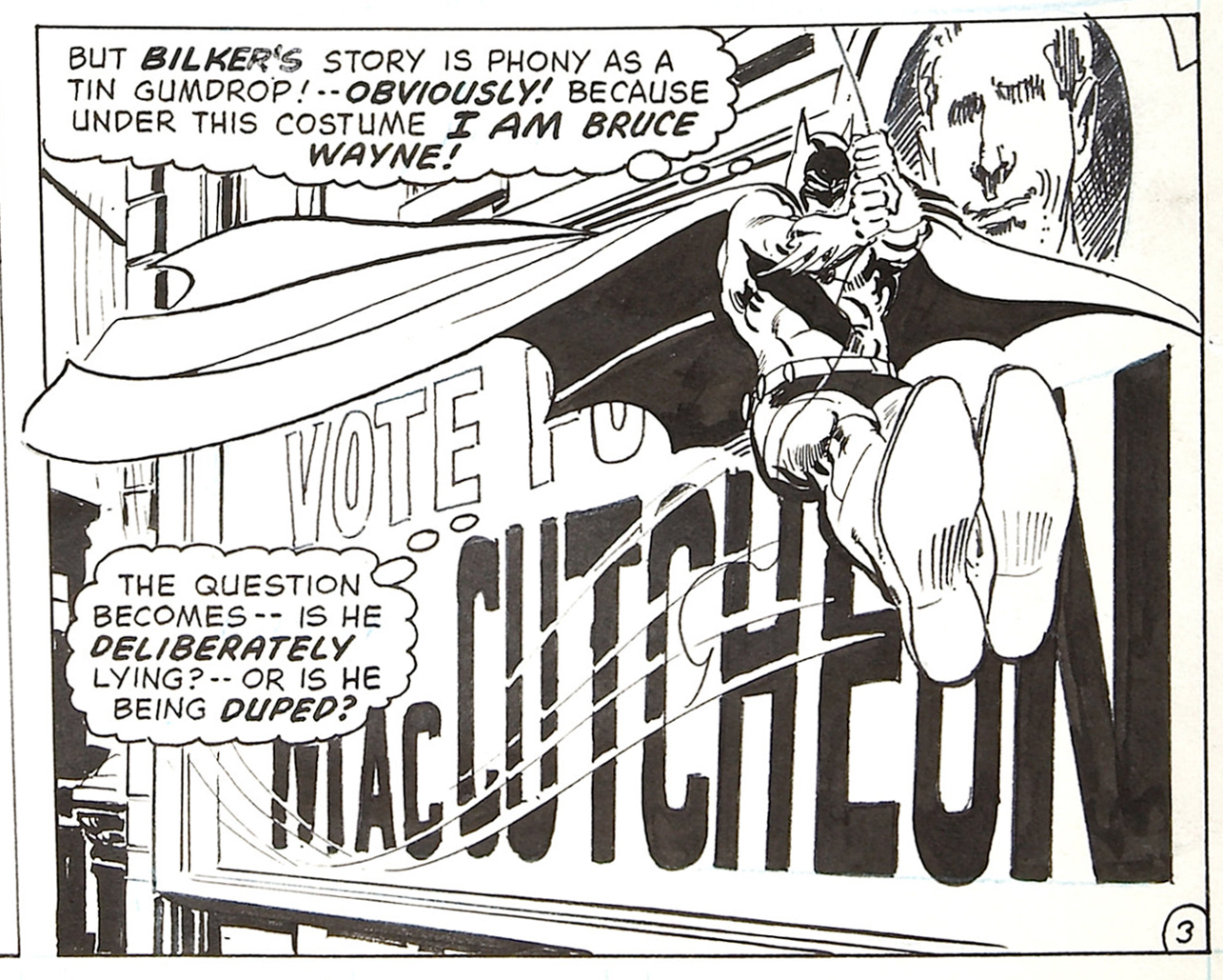
Neal Adams applied a lighter touch, drawing sleek, stylish capes that showed off his fine lines:
With all the rigors and disciplines of sequential comic art, capes are one of the few instances where the artist can kick back and invent whatever abstract shapes they want. As a result, they often exaggerate wildly, making capes bigger and longer than they could ever be in reality:
 |
| Joe Kubert takes liberties with capes (here and below) |

 |
| Ditko too can't resist drawing a cape out of all proportion |
If capes are a good test of the imagination and style of an artist, they also reveal the weakness of artists who have no opinions, or who are chained to photo reference. The cape below may be the most realistic cape of all the examples on this post, but also the most disappointing.

20 comments:
I am reminded of Mazzuchelli’s afterword to his work on Batman: Year One:
«Once a depiction veers toward realism, each new detail releases a torrent of questions that exposes the absurdity at the heart of the genre. The more ‘realistic’ superheroes become, the less believable they are.»
Over the years Ditko drew some of the finest capes in comics. He did flying swirly capes like everybody else, but he seems especially to have loved draping them over things.
The most realistic cape belongs to Dollar Bill', by Moore and Gibbons.
His life came to a tragic end in 1947 when, while trying to stop a bank robbery, his cape was caught in the revolving door at the bank, giving the criminals time to shoot and kill him.
Too bad Hogarth never published " Dynamic Capes " .
They also take up panel real estate where you'd otherwise have to draw more buildings!
They serve to pull the readers attention in the preferred direction.
They are all Superman's fault (and thus Siegel and Schusters fault).
• Well done capes are so animated and identifiable they are practically separate characters from the heroes that wear them. Like a clinging comic sidekick that constantly explains the actions and emotions of the lead character to the audience.
• Mike Kaluta talks about how, in so many fantasy compositions, a tail often saves the day; giving dynamism where it struggles to be found. Same for capes.
• Harold Von Schmidt contributed a section to the Famous Artists Course on "materials that change form" to help compositions and expression. He used artifacts of water surfaces to illustrate his points. Capes would have been a good addition.
• Capes have a second advantage - aside from assisting expression - which is that they cover the very difficult and time-consuming to draw - and not very dynamic - back muscles.
• Love that Neal Adams panel. He was so sophisticated; and had one good idea after another. And his decisiveness is so omnipresent that it goes wildly underappreciated.
• It is interesting that Steve Ditko brought to life not only the most fantastical and phantasmagorical of the major super heroes, Dr. Strange; but also the most down-to-earth and mundane, Spider-Man.
I'd say that capes have a function similar to that of drapery in the old masters; garments affording a plastic means to aesthetically resonate with the scenario.
I posted the above before seeing Kev's comment above, so apologies for some repetition.
In defense of the artist, Captain Marvel/Shazam is supposed to have the shortest of capes; not even down to the back of his knees. I believe that originally his was intended to be like a hussar's pelisse (a fur lined top coat that was often draped over the left shoulder) or at least refer back to this garment in style. Over time artists made it more of a standard cape, and while they may have made it longer, its always been short compared to those worn by other super heroes.
No capes! ~ Edna Mode
Anon's quote of Mazzuchelli raises another point of defense for Alex Ross's Captain Marvel. In effect the more realistic you make someone or thing; the more realistic those things accompanying them have to be. A cape longer than his heels would just look silly, "He's going to step on that thing!"
A rule you could apply to all visual art. The flat bright planes of Picasso's cubistic faces would be a complete horror show (I know some would claim this with some of his pieces anyway.) if done with any form of photorealism. Even quattroccento cityscapes, by say, Masaccio would slip into idiocy by any greater degree of realism, but perfectly fine as they are within his own style.
"No capes!" Edna Mode.
Loved that film. Yet to see the sequel.
Anonymous-- I think Mazzuchelli did a fine job on that series. As for his quote, I agree there are all kinds of reasons why excessive realism is a limiting factor, and not just in comic books. However, I'd note that the Marvel renaissance in the 60s was primarily driven by adding an element of realism to superheroes, giving them every day problems with jobs, romance, etc.
Smurfswacker-- Yes he sure did. I even thought about including that wild hairy thing that Ditko designed around the Creeper's neck and shoulders but I wasn't sure it qualified as a cape.
xopxe-- Congratulations on your memory! Poor old Dollar Bill died an Isadora Duncan death. Gertrude Stein said of the mishap where Duncan's ostentatious scarf became tangled in the wheel of her car and strangled her to death: "Affectations can be dangerous." I'd say the same principle applies to superhero capes.
al mcluckie-- Agreed, and the world is poorer for it. But there are comic artists who drew such stiff, wooden capes (such as Bob Kane) that you'd swear they were schooled by Hogarth.
Paul McCall-- Let's not forget Mandrake the Magician. But for the most part I can't disagree with you. Personally, I always liked Zorro's cape, and I thought the Disney version (not until the 1950s or 60s) was a high point in costume design.
Kev Ferrara-- Thanks, Kev, I think you're spot on with all points. Your first three points are the reason for this post, only better stated. Comic artists could employ the device of a cape to do almost anything because a cape could take on virtually any abstract shape. The talented artists knew how to take advantage of that wonderful opportunity, and you can see their DNA in the solutions they invented. The less talented artists drew realistic capes.
chris bennett-- Agreed. Alert artists have always looked for those opportunities to bring abstraction into their work, whether it's through drapery or hair or water or a cape. Robert Fawcett was amused by the "misconception that abstract qualities are new to contemporary painting, whereas they have been the comparison of excellence since painting began."
Marc Kingsland-- Kudos to you for quoting Edna Mode! I love that movie and love that line.
I agree that a short cape doesn't allow for some of the flamboyant excesses I've shown here, but then the question becomes, if Ross was drawing a longer cape on a different superhero, do you think he would take the liberties and be as self-indulgent as some of these other artists? For example, do you think he could pull off the overly long capes of Kubert or Ditko?
Could he pull off the overly long capes of Kubert or Ditko?
Alas he doesn't seem to try. He has the occasional flourish in shape, but half the time it's hardly better than a photo of a child with a bath towel tied around their neck.
BTW Bobo the Hobo quoted Edna first.
Bobo the Hobo-- My apologies for my inaccurate attribution. You must be a true fan of the Incredibles to pull that one out. Makes me want to go back and see it again. Did you know that the director Brad Bird was the voice of Edna? I sat next to him at a preview screening.
@David Aoatoff - no worries, mate. I want to be Edna when I grow up - what a gal!
Underappreciated cape is Beast's in Beauty and the Beast. Always strong graphically, and reflecting the emotion of the character. I remember its designer and animator, Glen Keane, using it as an example of why, in the development of Tangled, he was fighting for new technology to provide 2D control of shapes and design in the 3D environment. At the time fabrics were always completely simulated, ending up looking like the Alex Ross cape attached to cartoon characters.
Post a Comment