
The 1960 Annual published by the Society of Illustrators was crackling with talent and energy.

The Annual collected illustrations by "fine" artists such as Ben Shahn, Henry Moore, Leonard Baskin and Andy Warhol, all of whom were employed as illustrators that year. Other distinguished illustrators that year included Norman Rockwell, Milton Glaser, Saul Steinberg, Coby Whitmore, Al Parker, Austin Briggs, Bob Peak, Albert Dorne, Bernie Fuchs, Noel Sickles, Robert Weaver, Joe Bowler, Robert Fawcett and Stanley Meltzoff. Legendary cartoonists Ronald Searle, Andre Francois and Tomi Ungerer also appeared in this collection.
Wrong.
Here is what the judges wrote in the 1960 annual:
"The general level of merit was low. More work should have been rejected."
"I was disappointed in the overall quality, too much that was not bad but ordinary."
"The work submitted fell, more or less, into three categories: a.) technically skillful execution of banal ideas; b.) banal execution of banal ideas; c.) some quite lively and fresh work in juveniles and paperbacks."
"The jury generally was disappointed in the overall quality of the work submitted... New trends, while interesting, do not necessarily mean good trends and their derivative 'inspirational' sources are usually rather thinly disguised."
Can you imagine reading such a withering assessment today? These judges were tough guys (yes, the judges were all guys back then) and they pulled no punches. Despite their harsh indictment, they remained pretty open minded about different forms of excellence. Here are examples of the variety of work they selected for that 1960 Annual:
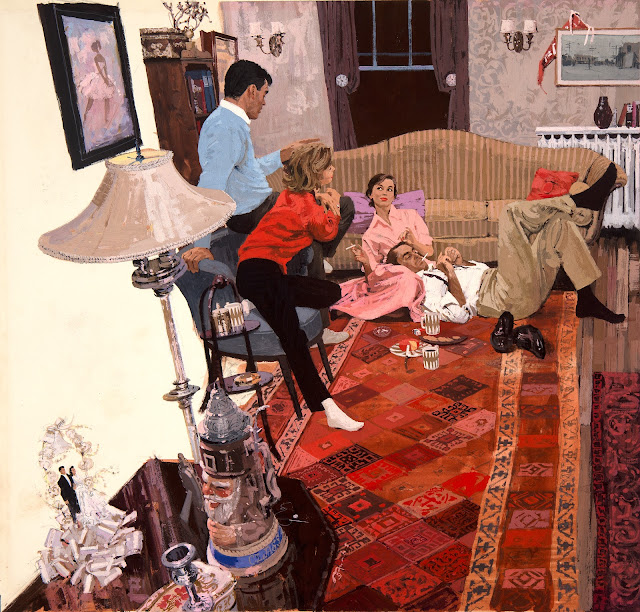 |
| Bernie Fuchs |
 |
| Milton Glaser |
 |
| Alfred Ingegno |
 |
| Austin Briggs |
 |
| Harvey Schmidt |
 |
| In 1960 young Andy Virgil was developing in the style of Coby Whitmore, Joe Bowler and Joe de Mers... |
 |
| ...but Whitmore and the others were already moving on to other creative touches |
 |
| Felix Topolski |
 |
| Robert Weaver |
 |
| The Provensens |
 |
| Jack Potter |
 |
| Daniel Schwartz |
Robert Weaver's criticism was even more fundamental: "Lack of serious artists in the medium."
Hugh White complained: "too many follow-the-leader illustrators and too many still trying to do what photography can do better."
Walter Murch criticized: "the cliche."
Note that the judges didn't hesitate to sign their names to their opinions. They would've viewed it as an act of cowardice to do otherwise.
They didn't view their role as validating the feelings of artists or puffing up their work. Instead, they seemed to believe that the best way to inspire young talent and reflect honor upon their profession was to articulate the highest standards they knew, and apply those standards ruthlessly. That attitude may account, at least in part, for the quality of the artists of that era.
140 comments:
It's weird, I have trouble seeing these as illustrations. If you don't know what they're supposed to illustrate, doesn't that turn them into drawings?
If only because of that, I really like the "myths and legends" one.
"Nice girl . . ." is as fresh as the day it was born.
When all reviews can only be good reviews, the reviews become meaningless.
If it wasn't for Kennedy I would have thought those dull fat cats to be Soviet. Is there really enough space for him there? He almost seems montaged in.
The Fuchs is interesting. The left wall seems to work, but it also appears to dissolve into the floor. It doesn't match up with real space does it?
The power is quietly held by the couple on the floor. "Even lying on down here, I'm in control" Shoes and plates grab for territory while the other couple are mashed together on one chair, but it all seems very friendly. One would like to think they're all social equals and at ease with each other in the evening, perhaps with those on the chair as guests.
Marc, part of the floor between the carpet and the wall is not painted. There are also "tweaks" to the perspective: the window and the floorboard to the right are obvious.
David you wrote recently about illustration students today who don't accept criticism because they think white male racist teachers can't appreciate their work. I recall they wanted a safe space where they could criticize teachers but teachers couldn't respond. Isn't that part of the problem?
JSL
But the criticism as transcribed here is sort of... generic? I bet it could've been thought and written at any time in history a anywhere. Specially if the judges were established/former artists. I bet the scolded artist after reading them just shrugged.
As a teenager (many moons ago) I had the privilege of visiting The Society’s museum in NYC, it was fascinating and inspiring to see all the original great works. Happy to read The Society is still providing free admission to the public.
xopxe-- I agree, the "Myths and Legends" is a real beauty, So strongly designed, and utterly unlike anything else being done that year. One of my favorites.
I don't draw a material distinction between an illustration and a drawing. Is a Rembrandt drawing of two figures talking different from a Rembrandt illustration of two Biblical figures talking?
Wes-- Yes, that stirred up a lot of discussion among illustrators of the day who had previously devoted a lot of effort to painting detailed backgrounds. I don't know if you can tell from this small reproduction but among the very, very details in this illustration are wedding rings on the man's and woman's hands. After all, this was 1960.
Marc Kingsland-- Agreed, "only good reviews" may temporarily fill the role of ego reinforcement but that will be fleeting as compliments are devalued over time. These artists in 1960 weren't looking to be propped up. They spoke the truth as they saw it and were willing to stand or fall based on the quality of their work.
It's noteworthy that the illustrators in this volume were keenly aware that television and photography were starting to gobble up the advertising revenues that once funded illustration. It was a threat to their entire way of life. Yet they knew that inflating their own grades was no way to deal with the problem.
Marc Kingsland-- That Robert Weaver Kennedy illustration was of an earlier, pre-presidential phase of his career. It was the most traditional illustration in a series-- the other pictures were broken up and avant garde in Weaver's experimental style, but I liked this one best. There was a lot of experimentation going on that year.
JSL-- Complexities abound, and there are arguments to be made on both sides, but I'm sadly aware of illustration students/young illustrators who seem to believe the primary purpose of education is validation and praise, and who react to criticism or low grades by lodging grievances about the patriarchy, racism, capitalism and faculty who need to be more encouraging and warm hearted. Several of the artists in the 1960 Annual took a real beating pursuing their innovations but persevered and ended up the better for it.
Marc: "The Fuchs is interesting. The left wall seems to work, but it also appears to dissolve into the floor."
There is no left wall. Here's the complete double page layout:
https://illustrationage.com/2017/12/05/turn-back-the-pages-introduction/#jp-carousel-112812
"There is no left wall." Clearly it's supposed to be read as one though. The hanging picture, the side display table, of the sort always pushed up to the wall. Yet if it is against the wall then there's no space for the back of the single chair. However this is all part of the magician's craft.
The real question is, to me at least, is the white space to the left part of the art? Is that part (not displayed here.)which Fuchs knew would be used for text, part of the composition? I think it most likely is.
The gimmicks that Dorne rightly decries are pretending to be ‘expressionism’. But there is no thought or feeling behind them related to what is depicted. It’s just jazz jive techniques filtering the reference; slop the area, jiggle the line, scribble the texture, swipe and scrub the value, trace with a blunt pencil and don’t lift it up, etc.
So Fuchs puts his colorful lipsticks over the tracing of a badly distorted photo with no idea behind it except to make a warped quilt. Schwartz roughs in a parking lot full of cars – previously flash-frozen by photography - while ostensibly depicting a ferocious automobile race. Weaver fakes his drawing so poorly that it ends up being a munchkin-ization of Kennedy and his broken-legged fellows; the interior completely unimagined and false. Topolski fakes his tail off trying to "loosely" pretend he knows what he is drawing about. The Ingegno bets all on a listlessly inarticulate silhouette. Then frames it with the scribbled kid cloud. Schmidt also garbles the single key silhouette in his picture, and slops the rest in, also pretending such is ‘loose.’ Potter attempts a Red Rose Girl style image, but bluffs the drawing instead of concentrating on it.
It was truly a dire time for illustration. When so much narrative work was reduced to fashion art; slopped in graphic designs pretending to be poems.
Marc: "Yet if it is against the wall then there's no space for the back of the single chair."
I agree, it looks wrong. If the blue chair is correctly placed - the back of it almost touching the invisible wall - then the foreground table would be about 2.5ft away from the same wall.
Marc: "However this is all part of the magician's craft."
If something in a picture looks off and breaks the illusion then it's just the opposite of stage craft. A question like "what's going on with that table ?" is the last thing a painter wants to hear.
Marc Kingsland and Laurence John-- I hope your observations about the left plane of the Fuchs picture will help open the eyes of those who mistakenly think Fuchs simply "traced a photo." Those elements would not be out of alignment if Fuchs was tracing a photograph (unless of course the photo slipped in the balopticon and Fuchs failed to notice).
However, I disagree with you that the left side of the Fuchs picture "looks wrong." I do agree it looks inaccurate as a photograph, but that was not Fuchs' primary concern.
Cezanne is widely celebrated as the father of modern art for inventions such as "breaking the plane," disconnecting lines and distorting perspectival space to build a composition with structural tension and movement. If you look at the horizontal plane of the table top in Cezanne's Basket of Apples you can see it doesn't align because Cezanne sacrificed the laws of classical perspective for artistic effect.
It seems to me that, for the same reasons, the items on the left side of the Fuchs painting are arranged to maximize the effect of the dynamic swoop. The distortion of the lampshade could just be a wide angle camera lens, but the placement of the chair and the table in the foreground and even the tilt of the left wall in the corner where the wall meets the back wall all seem to contribute to the effect Fuchs wanted.
If the chair was pushed back to the left wall and the wall was perpendicular to the ground, it might look more photographically accurate but I think that accuracy would have a deadening effect on the picture. By moving the chair forward Fuchs silhouettes the shapes of that lamp (creating a bridge to the white space) and creates some excellent negative shapes behind the lamp.
Kev, I agree with everything you said about the illustrations.
The following year Potter won and award for excellence with a much better illustration and Briggs also made better contributions.
On the Fuchs...
The missing wall and the missing hardwood floor in front of it have no physical or narrative meaning. Their eradication has left a graphic space shaped to accommodate the text and to direct the eye dynamically into the picture.
In erasing the area to the left of the slate blue chair, the back of the bookcase where it would have met the hardwood floor has also been erased. Which confuses the location of the wall with respect to the back of the chair (due to insufficient suggestive information.)
Visually calculating what's been erased, it looks to me that there's about three feet of hardwood floor gone missing, certainly enough to accommodate a chair.
Given that the angle and type of the distortion of all the elements on the left side and foreground match, it is safe to assume that the chair is properly traced from the distorted photo reference. As is everything else.
Further proof, if needed: That the back of the bookcase that would have been showing awkwardly behind the slate blue chair was excised - also awkwardly (leaving the 'bad narrative question' about the pictorial space) it must be assumed that the blocking of the elements was not designed by hand, but is rather the result of accurate photographic reference creating awkward shapes. Which Fuchs then edited out.
It's obvious to me that the intention of the left side of the picture is to end the picture interestingly and merge it into the text that goes to its left. Instead of giving an arbitrary borderline, the illustration is cut along non-obvious lines from the drawing (for example cutting on the rug and not o the floor/wall edge). So the text wraps around the cake figures, and so on.
What is interesting is that the drawing perspective is broken on purpose, but there is also a perspective effect applied to the text. This second effect is also broken due to the limitations of the typesetting methods (and becoming very hard to read if done "correctly" anyway). It's not true perspective, the text is just left aligned to the inclined border. On the other hand, the title is actually skewed. So the text portion has internal inconsistencies due to practical reasons, that mirror the inconsitencies in the drawing portion.
David, I do see a Rembrandt of two biblical figures talking differently than one of two randos talking. In the latter, what the drawing can change and be affected by is what I know about the world. In the former, is that plus a piece of culture. Say, Alice is Victoriana purely because of Tenniel, Russian folklore is epic because of Bilibin, and hell is beautiful because of Doré.
Kev Ferrara-- I'm glad you've taken to heart my point that tough criticism is important, but I should've added that toughness alone is not sufficient.
You strain so hard to disregard the obvious qualities in these pictures that even your considerable eloquence is overtaxed. It's not clear to me why you'd say that Fuchs' distorted photo reference is "badly" distorted, nor why it "had no idea behind it," nor why you dismiss that splendid carpet as a "warped quilt." I'd say barely one in a hundred pictures by Pyle or Dunn can match Fuchs' delicate interlacing of figures here or their subtlety of expression-- many of Pyle's and Dunn's figures seem physically and psychologically wooden by comparison. Fuchs uses a different palette from a different generation, but I suspect Pyle and Dunn would be impressed by the way Fuchs highlights that crucial white sock, or implies the richness of the pattern of that wallpaper.
The Schmidt and the Inegno were born in an era when abstract expressionism was king. If you see no redeeming virtues in abstract expressionism it's unlikely that you'd forgive Schmidt or Inegno, but I cheer their efforts to combine some of the visual power of abstract expressionism with narrative content, and I included them here as examples of the great variety that was accepted in the 1960 Annual with an open mind. Austin Briggs could paint realistically but became a charter member of the Museum of Modern Art.
The Potter (and some other pictures) suffer from being reproduced in black and white, but I included Potter because I think he is one of the unsung heroes from that era; he worked in Bob Peak's Schiele style before Bob Peak did, but withdrew from illustration at a young age without waiting around to collect honors. I find the Schwartz painting to be well designed (as is all his work) and if you don't think his tilted ground does enough to convey speed, I'd be interested in examples of who you think does it better. Pyle and Dunn never had to paint anything much faster than a trundling ox cart. I recall you once disapproved of Al Parker's blurred lines for conveying a speeding race car. So I sincerely ask: steer me to those you think do it right.
I can never guess which issues or images are going to trigger conversation around here, which is much of the fun. As the white border on the left side of the Fuchs painting seems to be a point of some controversy, here is a little history which I learned from interviews years ago, and which some of you may find interesting:
In the late 1950s and early 1960s, famed art directors Otto Storch and Richard Gangel challenged their top illustrators to come up with fresh ways to blend images and text. The illustrated magazines were losing their audience (and their advertisers) to television, and management wanted to invest their substantial resources in fighting back with more creative use of the unique strengths of magazines. They began publishing in larger format, giving illustrators wide discretion to fill full color double page spreads-- far more space than illustrators ever had before.
The magazines wanted to hook the attention of readers with bold, imaginative images but also to convince readers to stick around long enough to read the accompanying stories. (Subscribers were already getting lazy about reading text, as they discovered that passively listening to TV and radio required less effort). Storch asked Fuchs, Whitmore and a few other greats to look for creative ways to marry the words to images, emphasizing use of the new capabilities of headline typography. The result in the early 60s was a series of illustrations like the Whitmore (Nice Girl From Boston) and the Fuchs illustrations in this post. Fuchs also received a lot of praise for a double page spread (https://farm4.static.flickr.com/3445/3864175547_f6b677e58a_o.jpg) which Storch showed to other illustrators as an example of "the new look." A third example is his double page spread for the Graham Greene story, "The Invisible Japanese Gentlemen" which is buried in the middle of this earlier post of mine: https://illustrationart.blogspot.com/2020/06/the-energy-of-1960s-part-3.html
The point is, while we deliberate about the shape of, and aesthetic reasons behind, the white space in these illustrations, there was also a purely economic reason, dictated by the bosses of the big magazines trying to hang onto their jobs. Ultimately, this strategy was a failure but it helps explain an unusual trend in the early 60s.
David, that story makes a lot of sense. Interestingly, I saw that text/image merged style's rebirth when cheap Desktop Publishing became a thing in the early-mid '90s. I did quite a bit of it on PageMaker 4.0 because it was really easy to do (just flow text and tweak the figure borders), and it looked expensive because before it was usually only seen on professionally designed materials. Before desktop computers, doing that artisanally meant using a photocopier, scissors to cut lines, and lots of glue (hello underground fanzines).
Then Word implemented that functionality, in a limited and ugly fashion, and it lost its aura.
You strain so hard to disregard the obvious qualities in these pictures that even your considerable eloquence is overtaxed.
I don't strain to be honest. It would be more of a strain to force myself to appreciate trivialities like technical execution, pretty colors, fake looseness or graphic design when a picture doesn't make sense aesthetically.
It's not clear to me why you'd say that Fuchs' distorted photo reference is "badly" distorted
It is severely distorted in a way that only a camera distorts.
Thus, when looking at the Fuchs picture - which is ostensibly a quick sketchy rendering of an interior - what enters into the mind unbidden is the point that it is obviously not an image of an interior at all. But a picture made of a photograph of an interior. The evidence (thus idea) of a photo-shoot is woven into the very fabric of the picture.
So the whole pose of it being some spontaneous rendering of a spontaneous moment instantly self-falsifies. It's a kind of shallow trick as short-lived as Tromp L'Oeil's pretense of presenting real objects.
Aside from the error of "caught being tricky" I really find it amazing that more people do not react negatively to the stupidity of photographic outlines as compositional scaffolding. Photographs are just utterly vacuous mentally.
Great art is full of aesthetic and imaginative decisions. Photo-dependent art is full of decisions about the photos.
why you dismiss that splendid carpet as a "warped quilt."
I agree the carpet is rendered splendidly. However, I meant the whole picture is a warped quilt.
What I have written above should not be taken as a blanket criticism of all Fuchs' work. This particular piece just seems to stick in my craw more than most.
The point is, while we deliberate about the shape of, and aesthetic reasons behind, the white space in these illustrations, there was also a purely economic reason, dictated by the bosses of the big magazines trying to hang onto their jobs.
Not «also», but «primarily».
I’d hazard that (different) photographic reference was used for the figures, who look as pasted in as the flying saucer in the previously posted Wyeth. The scene might easily/economcially have been entirely invented on the spot to fit the technical needs of the AD. Start by establishing a narrative connection to text, mock up a basic composition, utilize reference, add interesting shapes, motifs and textures (while having a finger on the pulse of contemporary culture), refine and submit and done, done, on to the next one.
David: "It seems to me that, for the same reasons, the items on the left side of the Fuchs painting are arranged to maximize the effect of the dynamic swoop."
I agree that the diagonal of the left side of the table works with the perspective and goes with the leading of viewer's eyes into the main focal point.
Kev: "Given that the angle and type of the distortion of all the elements on the left side and foreground match, it is safe to assume that the chair is properly traced from the distorted photo reference. As is everything else."
I don't have a problem with the invisible wall or the missing lower bookcase. Just that the foreground table that looks like it should be against the same invisible wall (due to the hard diagonal of its left side) clearly isn't.
Anon: "I’d hazard that (different) photographic reference was used for the figures, who look as pasted in as the flying saucer in the previously posted Wyeth. "
It's probable that Fuchs took multiple shots of the same set up and picked the best poses, but it's also possible that the entire scene is one shot. I disagree that the figures look 'pasted in'. The entire illustration is playing with varying degrees of naturalism vs graphic flattening... edges are too hard, values are deliberately over or under emphasised, colours are over or under saturated, rendering is deliberately rough and simplified in a 'poster' like way in places ... all of which contributes to the feeling that the marks are 'sitting on the surface' more than receding correctly in 3-D space as they would in a more conventional painting.
What we're looking at is a photographic image that has been rendered as painterly graphic mark making, with deliberately non-naturalistic effects. Hence the slightly off kilter feeling of real space vs flattened / cut and paste / collage.
David, incidentally do you know if this painting is gouache or acrylic ?
Kev: " I really find it amazing that more people do not react negatively to the stupidity of photographic outlines as compositional scaffolding"
I enjoy a lot of the images that Fuchs and his peers produced, and I can even understand why the camera became such a much used tool during this period, but I always notice when an image has an obvious photo-ref base, and it alters the way I perceive (and judge) the final image.
Aside from that, these days I'm much more interested in paintings and drawings which move away from an attempt at 'realism' altogether, so obvious photo-ref based modern works usually fail to engage me at all (with the exception of someone like Nicolas Uribe who is such a good painter that his work is worth looking at for the painterly qualities alone, despite the photo-ref use).
The entire illustration is playing with varying degrees of naturalism vs graphic flattening... edges are too hard, values are deliberately over or under emphasised, colours are over or under saturated, rendering is deliberately rough and simplified in a 'poster' like way in places ... all of which contributes to the feeling that the marks are 'sitting on the surface' more than receding correctly in 3-D space as they would in a more conventional painting.</b
Well put. By «pasted in», I don’t mean that it is shoddily done. In the Wyeth, an alienating effect is produced - here, I have the impression of an artist being acutely aware of his cultural surroundings. It is a work expertly & very much of its time.
I suspected art directors were responsible for sending illustration in the graphic direction. Thanks to David for explaining the adaption of graphic influences to accommodate text at the request of art directors.
Potter was a very influential teacher in LA and New York in the 60s and 70s and the schools were teaching Manet’s flat shapes over form in high school by the late 60s. The drawback was that students didn’t learn how to draw form. The era celebrated photography and its graphic nature as “interesting” and graphics had already taken over fine arts. Artists like Neil Welliver and Fairfield Porter who relied heavily on flat shapes were among the first to bring back realistic painting as photo realism was making its debut.
The younger artists like Potter were about 30 years old around 1960 and I learned to draw with Potter using shape as he taught. Not drawing form left me in a bad place by the age of thirty and I had to relearn how to draw form because tracing from photos, which everyone was doing by the mid seventies, held no interest for me.
The images Kev mentioned have obvious flaws including the distorted lampshade in the Fuchs. Some of the images from the 1960 and 61 annuals were attempting to emulate Willem De Kooning’s “gesture” paintings as well as graphic influences from Degas and other Impressionists. The excesses of expressionism were eventually left behind. I disagree that the era was a total disaster as Fuchs did develop the style most have come to identify him through such influences, but for students of the 60s and 70s, they had a steep hill to climb to try and find what the graphic influence was about, no less to discover the form that was lost.
My sincere apologies - again!
I really have no idea why this happens, but it only happens when writing on my iphone. It’s happened before, so I’ve been very careful with my html. But obviously, I’ll have to only use my PC for this site.
Also, as I’m publishing anonymously, I can’t edit or delete my post. Though, if Apatoff can, I suggest he try deleting my threadbreaking post.
SEAN,
Thank you for that interesting story about STUDYING WITH POTTER. Anything further you can add about THE TEACHING of 'FLAT SHAPES' would be appreciated. What was the RATIONALE? And how was this taught in reference to LIFE DRAWING?
Aside from that, these days I'm much more interested in paintings and drawings which move away from an attempt at 'realism' altogether, so obvious photo-ref based modern works usually fail to engage me at all (with the exception of someone like Nicolas Uribe who is such a good painter that his work is worth looking at for the painterly qualities alone, despite the photo-ref use).
LAURENCE,
Agree. URIBE and (for example) FLUHARTY are two examples of great modern artists working in real media who THOROUGHLY UNDERSTAND STRUCTURAL FORM. They have internalized it to such a degree that they can revivify what has been frozen (and reinflate what has been flattened) by photographic capture.
I am interested to hear WHO you are looking at.
Kev: "They have internalized it to such a degree that they can revivify what has been frozen (and reinflate what has been flattened) by photographic capture."
I like that idea of imaginatively 're-inflating' information that has been flattened. I agree that Fluharty is an exemplar of that very thing, and it also demarcates the difference between a 'traced' image and one that has been rebuilt from the ground up. I don't see Uribe as being an inflator though in quite the same way. To me, he's playing in the same semi-flattened / graphic realism space as Fuchs. I actually think he's maybe the best modern incarnation of the style of realism + deliberate flattening that goes roughly: Whistler, Degas, Lautrec, Klimt, (skipping too many early-mid century illustrators to name), Fuchs, David Levine, Barron Storey, Sienkiewicz...
He doesn't trace from photos, and he distorts more than Fuchs, but his concerns are the same as listed above: overly hard edges, saturation, value skewing, weird colouration. If you look at his recent Instagram posts you'll see he's currently geeking out on Vuillard, which says a lot about his interest in flattened space and non-naturalistic colours.
Regarding other artists I'm interested in; I like so many and for so many different reasons that it would be too long a discussion to get into all the reasons why and caveats. I prefer to only mention other artists that are relevant to the discussion, which is set by David and this audience, or that I think other readers might like (which is why I mentioned Uribe, as he seems an obvious fit for this blog).
Love these conversations, opens my mind and introduces me to new artists.
Kev,
Potter was a man with strong likes and dislikes, of purposeful gate and given to black and white concepts. He had a commanding theatrical voice and dramatic teaching style, pacing the room offering ongoing thoughts while the students drew. Each class was based on a premise, large vs: small, long vs: short, soft vs: hard, sometimes just a silhouette with a touch of light, etc. After several tries he would choose a student’s piece and walk it around the room saying emphatically, this is what I want! Jack was much loved but fewer ever really shared a word with him. There was something of a cult following regarding his charisma as almost every fashion illustrator in NYC had been directly influenced by him.
I never understood why one would choose one premise over another, or what exactly was going on and I didn’t know anyone else who did either. The classes were somewhat cryptic. It was just easy for me to do what was asked and after a time I got down as I realized it wasn’t me who was thinking and I quit drawing for about a year. A second teacher Sam Martine also taught drawing based on shape but in an approachable manner and he explained the punishment and reward methodology many teachers used and also the rationale that we recognize things first by their shape. He explained that the dark outline was the basic formula in commercial art, holding the shape together and defining one shape from another. He talked about how the photograph eliminated the drawing and other related subjects, such as breaking the formula and how to draw from photo reference at a distance as if it were life. But the approach being very simple was meant as a beginning point and left very much unanswered.
Potter was a fashion illustrator so that was likely his rationale. What Sam Martine was talking about went back to poster art and also stained glass. But it was confusing at the time as these two teachers who made up the commercial art drawing department at SVA taught nothing about form. I guess it also was assumed that one understood that drawing was part of telling a visual story, but for students who were lost in the weeds, such an assumption was a vital omission.
I remember reading a book called The Disintegration of Form in Art published in 1968.
It was a subject of concern at the time.
https://www.amazon.com/Disintegration-Form-Arts-Erich-Kahler/dp/B002C1C5DK
Kev, in your last paragraph (box form) are you talking about this kind of thing ?
(I can't find a Wyeth example).
https://www.geek-art.net/wp-content/uploads/2020/07/comic-book-illustrator-bernie-wrightson-dies-thumb640.jpg
PS:
One thing both Jack Potter and Sam Martine introduced in their figure drawing classes was line variation as weight, which differed from the simpler standard understanding of line variation corresponding to what is in light or shadow.
The heavy rolling line variations in Carl Erickson’s 1930s and 40s illustrations expressed the actual heavy weight of wool coats and jackets of his era. Potter taught to accentuate the pinch at the waist with heavy line too, which was another use, where Martine taught a pair of slacks would have heavier lines as they fell closer to the ground. In the same way a light cotton blouse, (like one in sunlight) would have thinner lines. This was very complicated stuff to be digesting before one understood line variation as light and shadow. Line variation adds interest, but it has to correspond to something understandable or it’s just complexity as its own end which isn’t desirable. So the idea of keeping a shape simple was complicated by line variations expressing multiple things.
It was refreshing to take a look at NC Wyeth again after reading Kev’s last post, where Wyeth organized many smaller shapes into a few larger tonal shapes. That’s another function of light and dark and the organization of shapes that one might learn presumably in another class. In truth, learning line variations and edges was never really addressed as their own subject. So while students in Potter’s class were drawing straights and curves with robotic emphasis mimicking the passion of their teacher’s voice, Potter’s own use of line as a searching and sometimes feathered edge expressing a sense of tenderness, time and affinity was difficult to weld with the passionate intensity of his class.
The result was something like a receiver in football trying to run before they catch a ball, or in text, not remembering that oral words can have several different spellings for different meanings. Unlike in such areas, in drawing it takes a bit of training to spot the inarticulate fumbling of shapes that are either too similar or too confused to clearly express something. That’s really what happened with the post. Kev noticed an indifference between shapes as various blunders, but then the exchange revealed many new pieces of information.
To his credit, when Bernie Fuchs abandoned the type of painting he was doing in this post, he moved into the purely graphic area timidly, adding slowly to his vocabulary of flatness gradually increasing his intensity of tones, colors, edges and thoughtfulness.
> where Wyeth organized many smaller shapes into a few larger tonal shapes
Are there any serious artists working with value who don't organize/structure their values (compressing values into "local values", simplifying shapes for readability / "good shapes", working towards a ~70:30/~30:70 shadow to light relationship, and editing out acute angles)?
It would seem to me that's the foremost distinguishing feature between an beginner and an intermediate painter.
Sean,
Thank you so much for sharing that.
If I may say, your Potter anecdotes fall in line – almost too conveniently-for-comfort - with this whole developed picture of visual art education degrading through the 20th century.
The long reductive slide from imaginative naturalism and Imagism to imaginative graphics and cartooning. Then to the linear, flat and pseudo-abstracted, then to traced or primitive, and finally to binary punk juxtapositions - mere oppositions - and then to nothing at all with the destruction of all belief in unity and meaning.
Afterwards, more recently, we get the mostly sad attempt to march back out of that aesthetic wasteland; where otherwise talented artists – alienated from the traditions or legacies in which they should have been mentored – made due with learning from mostly fake classicists in personality cults and photo-realist obsessives. With the shining exception of artists like Uribe, Leffel, Fluharty, and Dan Adel. The latter of whom once stated his purpose as “The Undoing of the Undoing.” Which I think goes for anybody producing quality these days in defiance of Le Deluge.
Your point about line weights is also interesting. I’m sure you know those kinds of conventions were taught to comic artists. Essentially teaching the craft as a suite of line-based glyphs to employ tactically as certain situations arise. Which is not that far away from Manga training.
The Line Projection effect you are talking might be the apotheosis of reductive convention-based training. Where, instead of inflating form by pushing out or receding planes, the line itself – merely a surfaced symbol of an edge - becomes the basic material reality. The reduction of plastic form to plastic line.
This kind of weirding of experience via symbolic involution became even more evident when comic artists more recently began putting edge lighting on thick lines that were only functioning as lines. This is essentially typographic thinking; akin to 3-D block letters.
ADDENDA:
Forgot to thank you for the book recommendation, Sean. Just ordered it from ebay. Thanks.
~ Kev
Richard,
What you're saying is true and pretty basic but Wyeth does it so well. It's not the only way to organize a picture and not everyone thinks in terms of formulas such as 30:70 or 70:30 shadow to light relationships or editing out acute angles. There are just a ton of ways to make pictures and it takes a long time to understand a subject like line weight for example. It sounds easy enough when someone explains it but to internalize the different uses for line weight until one sees and draws by its terms can take years to develop. I was addressing Kev’s question as to how Potter approached teaching the figure in life drawing as a shape and after seeing the Wyeth it was an extension of what Jack Potter and Sam Martine were teaching in their graphic approach to figure drawing, which was simplification, but they were teaching graphic form in the figure and not volume which is what Kev was talking about.
So on the surface of it the turn to graphics in illustration was emptier because it is, but it wasn't so simple that by magic people could just sit down and understand all there was to it. The errors pointed out confirm that while art directors may have pushed it, not everyone knew how to work it as effectively as say Fuchs did later in his career. It demanded that the few elements used in the graphic image were different and distinct enough to say something and there was no place to hide if they weren’t. That wasn’t happening in some of the images critiqued, Ingegno, Schmidt, Topolski and Schwartz. In the Briggs the two feet joining the two men aren’t really on the floor and something happened to the hands in the Potter.
As a businessman warns a beginner, you’re going to make mistakes, so try to make little ones. I think Fuchs understood there were ways to mess up the spontaneous look and what he was doing in 1961 was very thin, light colors, little contrast. It was a good bit subdued from the wild scratching and clawing that made up early attempts at excitement.
Kev, I hope it's a good read for you.
xopxe wrote: "Before desktop computers, doing that artisanally meant using a photocopier, scissors to cut lines, and lots of glue. Then Word implemented that functionality, in a limited and ugly fashion, and it lost its aura."
If you read late 19th century books and magazines about illustration, you find a sense of increasing alarm that wood engravers were being replaced by photo engraving. Dedicated craftsmen who had converted the art of Gustave Dore, Howard Pyle and Winslow Homer into engravings for reproduction had been viewed as part of the team for a century. They often signed the final result along with the original artist. What would become of these cherished, highly skilled talents and their families? It seemed the art world was coming to an end.
Kev Ferrara wrote: "I don't strain to be honest."
You are very fortunate. Many people find that honesty requires self-examination, reflection, and reconsideration of principles.
Laurence John-- I think Fuchs rarely used acrylic, as it wasn't yet a very helpful medium. He mostly trained on casein and gouache, which is how he painted this illustration. He attempted watercolor early in his career but found he was a horrible failure with transparent mediums. Later of course he converted to oils.
Kev, thanks for the clarification.
Assuming it's the same artist, what do you think of Daniel Adel's recent work - the 'Hyperabstraction' series ?
"I think Fuchs rarely used acrylic, as it wasn't yet a very helpful medium. He mostly trained on casein and gouache, which is how he painted this illustration." (David)
A long time ago I came across someone who wrote, and I quote from memory: "Degas would have loved acrylics" and it immediately occurred to me that this fast drying medium could be used like a liquid pastel, applied in combinations of scumbles and broken painting layer on top of layer to both draw form and build hue, luminosity and texture. I've used the method for twenty years now and I'm surprised to hear that Fuchs never took to it. I believe the same can be said of Mark English whose surfaces have a similar facture to the later Fuchs.
David, yes. For example as anyone who loves XIX-century science and technology I *love* the signature (Louis) Poyet. It was all over the place, but somehow he's barely known and doesn't even have a wiki entry in english, only french and russian. (tough scientific illustration as a whole gave a hard fight: Scientific American journal switched to photo illustration only in the '90s)
And yes, these transitional times are a curious thing. When a new technology or medium appears, one of the means to establish itself is to show it can do something that is "classy but expensive" cheaply and efficiently. For example, the first electronic synthesizers were advertised as church pipe organ replacements. And it can be argued that synthesizers were finally accepted as musical instruments after Wendy Carlos' "Switched-on Bach" album. It was only sometime after that their true expressive power was found: manipulation of the timbre at a level completely out of bounds for previous musical thinking. So new technologies pass through a phase of "we hate it because it is used to cheapen beauty" to another of "we hate it because it's used to do this thing we don't understand/care for". This happened to synthesizers, photography, CGI, moveable types and Offset printing.
Sean Farrell wrote: "One thing both Jack Potter and Sam Martine introduced in their figure drawing classes was line variation as weight"
Thanks for your very helpful and informative discussion of this. (I like your description of Erickson's "rolling line.") I've always had a preference for drawing, and especially enjoyed that era when drawing re-asserted itself as a medium that could own a double page spread. Noel Sickles, Austin Briggs, Erickson, Bouche and others showed the richness of a sensitive, carbon based line to convey not just weight but volume, movement and a host of other properties. This was a very different world than the ink linework of Gibson, Lowell, Flagg and all those Life Magazine pen-and-ink guys. I attribute the flowering of carbon based illustration in part to the increased ability of printing technology to capture more delicate lines. I spoke with the son of Austin Briggs who relate that after years of full color painting in oil and gouache, his father considered it a personal triumph when he first persuaded the art director of Cosmopolitan to accept a simple pencil drawing for a full page illustration. That seemed to open the door for a lot of other illustrators and led, among other things, to Briggs' award winning series of TV Guide ads.
Another great draftsman, Robert Fawcett, didn't draw with the same nuance as some of the aforementioned, but he too showed how linework could dominate. And Al Parker too.
I haven't seen enough of Potter's work to understand everything he bought to the table, but like the other artists he seemed to wed a highly selective line with a strong sense of design, and the result sang to me in a way that cluttered paintings often did not. I think Peak borrowed Potter's style for some of his own fashion drawings.
I spoke with a student of Potter's just last month who said that while Potter could've had a long and successful career as an illustrator, he abandoned that path relatively early in his career because he preferred teaching.
chris bennett-- a good point. I think Fuchs first learned to control a brush when painting car illustrations in Detroit, and acrylic, because of its fast drying and limited blending qualities, was not the medium of choice. I know he often used acrylic to paint a foundation or background colors for preliminary studies, but I think he usually went over them with gouache or crayon of some other medium for the fine tuning part.
Fuchs' later styles were more accepting of scumbling and broken surfaces, but he was soon into oil glazes because he liked that "illuminated from behind" affect and never really turned back.
interesting that you mention Degas; Fuchs said on more than one occasion that Degas was his favorite artist.
xopxe "it can do something that is 'classy but expensive' cheaply and efficiently"
Does the new technology produce more than the surface appearance of class for viewers who don't appreciate what goes on below the surface?
You are very fortunate. Many people find that honesty requires self-examination, reflection, and reconsideration of principles.
David,
Do you really 'strain' to self-examine, reflect, and reconsider your principles?
"Many people" - in the interests of sanity and the Way of Logos - make deep consideration an integral part of their adult lives. Such that intellectual-ethical self-maintenance operations become reflexive rather than a bother. Like brushing and flossing.
Unmentioned, the attempt to be honest also requires a tough stance on one's knowledge quality. Skepticism of "authoritative" sources. Even a skepticism of one's own faculties, biases, nostalgia, sympathies, research abilities, and due diligence.
More cutting still, one might need to adopt even a skepticism of the public persona one routinely projects; for fear that one might say things habitually for political reasons in order to be seen in a good light by hyperreactive tribal affiliates or to avoid the scorn of the more fragile flowers bearing earwitness.
There are so many pitfalls; so many ways to derange the honesty of a communion.
Kev, thanks for the clarification.
Assuming it's the same artist, what do you think of Daniel Adel's recent work - the 'Hyperabstraction' series ?
Adel is a very crafty artist, in all senses of that word.
The 'Hyperabstraction' paint-roller stuff is him showing up Jackson Pollock. By simultaneously creating an aesthetic reality that feels representational and doing 'action painting.' Meanwhile having a concision of design that Pollock could never imagine.
I don't much like it. For me, it falls under the heading of 'tricky.' But I appreciate it both technically and philosophically. Luckily it doesn't seem like he's abandoned his other subjects in the meantime. At least not yet.
Kev and David,
My first statement that having not learned much about form left me in a bad place for a number of years means I agree with Kev entirely that something got lost along the way and I discovered why I think so many artists having tried to emulate the expressive line of Carl Erickson, Bouche and a few others failed so miserably. I agree that design flows from anatomy and form in space and Bridgman is a good reference to learn about these.
The many who tried and failed at capturing the elegance of these artists, did try to turn line into a type of god without understanding form anatomy and space. Line does recede or come forward with what each is depicting and where it is in space. With this understanding large chunky lines could come forward and recede as desired because the artists understood enough about form to put them in space. They understood that a thick black line acting as an edge shadow, a core shadow, a shadow in a seem or a shadow revealing form under a dress, came and went according to what and where that something was in space.
The three dimensional space is there and all is where it’s supposed to be, but without a full build out of form, freeing the eye to move through the shapes guided by edges and accents. Accents identified themselves in space accordingly and turned shapes inward and outward connecting to the next shape. They were working from models, but also understood anatomy. It would have been impossible to have done these otherwise.
The undulating lines were designed to move as edges and with the form as well. The best of these artists weren’t without form at all and divided their drawings as foreground, middle ground and a hint of background, just as the figures had an eye level, a middle below it and a ground to stand on. The lines themselves were drawn far more carefully and deliberately than they appear just as Sargent painted brushstrokes which were more deliberately painted than they appeared.
Carl Erickson:
https://i.pinimg.com/474x/72/c0/e8/72c0e81fe2a99f77d5c40e3a949a883b--s-fashion-fashion-prints.jpg
https://www.oakauctions.com/ItemImages/000004/4800b_lg.jpeg
https://hprints.com/s_img/s_md/45/45739-ceil-chapman-1949-eric-carl-erickson-1b46656e5bfb-hprints-com.jpg
Potter:
https://i.pinimg.com/originals/e6/60/eb/e660ebc99b072124c3915dc3aba8a2df.jpg
Daviud: Does the new technology produce more than the surface appearance of class for viewers who don't appreciate what goes on below the surface?
At the beginning, the point is to reproduce the surface, that's the point. First, it is unclear what the new technology is good for, yet. Then, you go for what seems to be appreciated and a status symbol. So though it can produce any timbre existing or imaginable, you reproduce pipe organs. Though it can print any text, in any numbers, you print bibles. The first commercial application for CGI was "flying logos".
Furthermore, the vast majority of viewers only recognize effects as signifiers of class without knowing what's "bellow the surface", only that it seems to appear on more expensive work. How does a typesetting system work? What's inside a Stradivary? How do you produce that blue pigment? The majority of even art enjoyers *does not care*.
Sean,
On the 'fashion illustrator' topic...
How do you see those artists you linked and the qualities you find in them in relation to John LaGatta work?
LaGatta 1
LaGatta 2
LaGatta 3
LaGatta 4
Kev,
I have to say that your comments and the addition of the Wyeth pirates with the Bridgman blocked heads, and the Wrightson spoke a million words to an important theme of yours. There are so many ways to build space using differing shapes and forms, the blocked head, the swords, the breaching of the wooden fortifications, the tones and color, the hulk of the men all add to their terror while the point of view allows the viewer a place to take it in. Nothing in the build out and other compositional considerations is its own end and all supports the narrative. A fantastic piece.
As per the fashion drawings of La Gatta verses Erickson and the Potter:
The primary difference is the speed of the lines. When I mentioned relearning how to draw I was referring to drawing out of my head from memory based on anatomy. Such lines have a natural tendency to fluidly as one gains facility with the human figure and this is a quality of the LaGatta images. They lend themselves to speed and of course the form of the body itself, which in his drawings have a tendency to fight the clothing for attention. Some of the clothes were designed to be racy and in that he excelled. La Gatta can at times skirt the edge of daring and such takes a certain warmth out of the image and replaces it with ogling as in the third one titled Milk-Honey.
He is positioning the heads to remove their authority placing emphasis on the clothing and the figure as the other artists do the same. They all removed information from the heads so they lose authority, becoming subordinate to the clothing in as much as a head can.
The speed of the line being more slowly found (in life drawing) in the Erickson and Potter double in function as the type of edges one finds in paintings. The sensitive line is still constructing the figure and clothing but at a slower pace, so the figure is also made subordinate to the clothing and is less overtly sexual. The result is an increased sense of affinity.
In the Picasso a few posts back, his line was so indifferent to form that there was almost no affinity with the figures or their strange shapes. So the Picasso read like text as you put it, without a sense of time, space or affinity.
In the Potter the parts are all supporting the package. Even the marks in the background at right forces itself back on the figure and her gaze out of the picture. It is a well designed image and has overcome much of what you find revolting in photographs.
"In the Picasso a few posts back, his line was so indifferent to form that there was almost no affinity with the figures or their strange shapes. So the Picasso read like text as you put it, without a sense of time, space or affinity." (Sean)
I have to disagree with you on this Sean. Picasso's effects are rarely 'distortions' in the common understanding of the term either for expressive or decorative purposes. He is really applying a sort of fluid or flowing version of cubism that involve continuous changes of scale, proximity and viewpoint. Thinking of his etching you mentioned one is aware, while following the line, of her head being far away, and then, moving down her neck we're getting closer and move under her arm-pit, then our position has flipped to behind her, down to a profile view of a buttock and round again to the front, down a receding leg to a foot seen from the far end of the room etc etc.
In other words Picasso's "sense of time, space or affinity" is constantly changing.
David,
The way you described the era as one of carbon based expressive lines is how it is remembered. An art director I met in 1978 said, I always wanted to be one of those charcoal drawings. My sister said without prompting, I always wanted to be the woman in (Greenhill’s) Lord and Taylor drawings. I bought some old Vogues from 1951 somewhere I can even remember and wasn’t even born when Carl Erickson and Bouche were filling their pages but they bridged the pre war era, war years and post war years accompanying the book and magazine illustrators in the 50s like Fawcett, Briggs and Sickles who for me were also filling pages while I was riding my bicycle. After your comments about the era I went and opened the old Vogues just to see if I was just romanticizing the drawings and I nearly fell over from the smell upon opening one but was quickly reminded why I suffer them. They were great drawings and many superior to the few available online that came largely from the book Fashion Drawings in Vogue published in 1983, author William Packer published by Coward-McCann.
I remember hearing that Potter destroyed a lot of his own work and thought of Walter Everett’s story and then also about how John Fahey published his own solo guitar work beginning in the late fifties and then other solo performances no publisher would touch such as Bola Sete’s remarkable solo guitar work for an album released in 1980 called Ocean and later Fahey’s own interpretations of Sete’s Ocean. Thereafter, Fahey himself lost his creative fire, dying a pauper and yet a bunch of younger solo guitarists have kept this American Primitive/ self taught idea going.
What’s in people that drives them despite all their detractors and so many greats before them I wonder, but when something is good, despite changing times it persists. What can one say about beauty Degas said. I’m sure he was just having a moment of inner amusement at all the talkers. Of course there’s a lot to say, but yes, when something’s good it doesn’t go away.
Reading this site for a long while it strikes me how you and Kev have something in you your other readers share. It’s not a nutty nothing, but it’s a bit nutty just the same. A love of stuff that’s good, even great for being so persistent and for continuing to speak to us.
Chris,
Kyle Stavers, once featured on this blog, spoke in a video about how Picasso blew apart our normal sense of space. He just blew it apart!, she said enthusiastically.
Time is a measure within space and affinity is an intimacy within both.
If space is blown apart and time is blown apart, then doesn’t affinity
get blown apart with it?
What I was referring to was that the lines making up the graphic movements you described in Picasso’s nude model are consistently uniform throughout and indifferent to their surroundings, even flippant compared to the varied lines in the pieces by Erickson and Potter which are sensitive and relational to where they are and the purposes they serve. It's possible Picasso wanted the lines to be superficial in his psychological drama. I wouldn't know. Thanks.
Time is a measure within space
How does this work? This sounds like the "4D world" concept, where the additional dimension is time, but I suspect you mean something else.
Chris,
With respect to your explanation of small and large as foreground and distance I admit that while the turning parts of Picasso's figures read as seeing different points of view as different moments in time, without the overlaps I never read the smaller and larger parts represented in a continuous shape in terms of distance. Thanks for the explanation.
xopxe, If Kyle Stavers said, Picasso blew apart our sense of reality would it have worked? Then time would have been a measure within reality, which is what it is to those who don't believe there is time. It can be hard keeping everyone happy in a world blown apart. No?
It might be fruitful to consider modernist artists like Picasso more as products of their time rather than as singular phenomena. Picasso didn’t blow up time and space, but his approach and works resonated with a zeitgeist of blown up ideals, time and space among them. Cubism is an invented representation of the world just as linear perspective is. And it’s not entirely unlikely that many of the medieval clergy frowned upon that particular distortion of accepted representation of time and space.
The invention of perspective was an attempt to get closer to a sense of reality, not a means of usurping accrued understanding and belief.
What usurped accrued understanding and belief was industrialization and a few reality- warping wars, not the way in which these massive cultural shocks were expressed by people who applied pigmented oil onto canvas.
Chris, don't feed the A.I. Troll account. Otherwise it will continue to make half-sense and you will continue trying to correct it into perpetuity. Don't give it, nor the creep behind it, energy.
(CONTINUED)
I discovered why I think so many artists having tried to emulate the expressive line of Carl Erickson, Bouche and a few others failed so miserably.
Sean
Look closely at LaGatta’s work. I link it here pointedly because it is legitimately loose. All its energetic abstractions – and it is full of graphic life and linear dazzle - are justified with mimetic integrity. His are actual abstractions, and defended as such.
The works of the fellows you posted – like some of what David posted originally - are full of what Harvey Dunn politely identified as “hopeful strokes.” But which we might call Mowattisms (sorry, deep callback).
Dunn said it well when he remarked along the lines of, “You can render it as loosely as you want, so long as you know exactly what it is; its structure.” LaGatta does this in spades. While your examples are so lossy in structure they seem far more speculative than imaginative. Yes the lines are full of variation and specificity. But such only serves to articulate mumbles.
Which is to say, the speed or slowness of the line read – or the speediness or slowness of how a stroke was laid down – does not much matter. What matters is the sensitivity of the artist to relevant information. Sensitivity without meaning – without relevance - is just agitation. And that’s just another version of the random jazzing and jiving of otherwise vacuous lines and fields I’ve been decrying in the hipster illustration ethos that peaked during Kennedy. The legacy of teaching ‘expressive lines’ before actual drawing chops – before actual thinking chops are developed, moreoever – is the proliferation of all manner of form feints - as exhibited in this discussion.
For example, this is a sketch diagram
that exists in fear of concretization. For if it were more fully realized, the fakery would become dogma, and it would sink like a rock. The advertising ellipsis would fill in with leaden fraud and women would turn away. Thus in a sense it is a kite; staying aloft merely by thin framing, light fabric, and wind.
Kev,
The drawings you posted by Lagatta were excellent drawings. I agreed with your original criticism of the pieces kicking off the discussion and loved the one's you posted of Wyeth and Wrightson. I assume you agree with me that the line I was talking about in the Picasso suffers from the artist's lack of affinity with specificity to his subject. His woman could be an interpretation of anyone. I think Sir William Coldspring once said when he first looked at Picasso that its violence frightened him. Not that his first encounter is unique but it is a young artist's first experience not uncommon to lay people.
The point I brought up was that in the drawings of Erickson and Potter, the figure was subordinate to the clothing, which was the subject. Both knew their figures too.
I disagree that the re-posted Erickson was afraid of concretization. Light is washing away a side of the construction in the direction of the woman’s gaze and a directional vector accent at the side of her breast adds emphasis. The construction of the dress on our left side is being slightly opened like an accordion while the figure leans back and on the opposite side where it would fold in is ignored with the empty space serving the back tilting figure. These are deliberate choices which might not be your choices, but the work of Erickson and Potter is not the problem we’ve been discussing. Rather it was teaching shape without any context. Everyone had to take an anatomy class as a foundational course but the classes I described never discussed anatomy and I agreed that this was a serious problem for me and the other students. Finer points weren’t discussed in classes and much of what they did in their professional work was probably as guarded as the way Fuchs or some others guarded their secrets.
Erickson drew for Vogue, a couture magazine for women. The Potter was done for a clothing company catering to women. In Wyeth’s pirates he subordinated some figures to the guy with the blade in his mouth as the primary central look. So there’s a primary moment and secondary, etc. The image isn’t devoured in one gluttonous scoop. It’s dished out in a controlled manner even though it’s a wild scene. In other words, the viewer’s eye is directed, guided, ordered, controlled. Even the build out is subordinated to the central figure as the foreground is in shadow and other heads are partially obscured. I was only pointing out that with multiple heads some are obscured to serve the subject. Likewise in the La Gatta images and that doesn’t rule out secondary motives for doing so. The same thing is happening in the Erickson and Potter where the dress is the star, the primary look and within it movements are being controlled with line variation. You may not think very much of these tools but in their work they certainly thought about them and knew how to use them.
If the re-posted Erickson were a merchandising drawing in a newspaper the client would have demanded more build out as they generally did with tones, buttons, seams and other details. The Vogue drawings aren’t about that, nor was Erickson about hopeful strokes. I doubt very much that comic convention build outs would yield effects as elegant. What I'm saying is that the line variation wasn’t insignificant, without understanding of the figure or desired image, or the outcome of guesswork and ignorance as you seem to be implying.
Sean Farrell-- I have to wonder how much of the renaissance in charcoal and pencil was attributable to the rise of photography. By the 1950s, so much of the magic of realistic images that had once been the exclusive domain of artists had been replicated by photography. The lifetime of labor that went into painting like Bouguereau could be simulated with the click of a shutter, causing many to downgrade Bouguereau's contribution to a variation on Tromp L'Oeil.
Expressive drawing, on the other hand, was a medium better suited for the mid-20th century: it had a directness and simplicity, a spontaneity (or at least the appearance thereof), a rawness and a personal intimacy absent from those labored, overworked salon paintings which were the starting point for much of golden age illustration. Drawing spoke with abbreviation, distilling huge amounts of data into a slender line (and sparing tugboats full of baby linseeds). It assisted in the depiction of modern speed (see, e.g., Bob Peak's racehorse drawing at https://illustrationart.blogspot.com/2012/08/magic-that-believes-itself.html )in a way that salon painting never could.
I raise photography because I'm once again struck by the way photography is an issue in so many of these comments about 1960s illustration. Fine art guiltlessly embraced photography over a century ago; Cezanne, Van Gogh, Degas, Gauguin, Toulouse Lautrec and Eakins were all untroubled by using photo reference. The futurists adapted the blurred look of speed that they learned from film, as did Fuchs. Photography helped develop new vocabularies for art, as artists of good will explored depth of field, multiple successive images, Muybridge-style information and other gifts. Today, demigods of art such as Jeff Koons and Richard Prince no longer make even a minimal pretense of contributing human artistry to their manipulation of photographs.
So why are we few, we happy few, still so troubled by the ghost of photography in some of these pictures? Commenters are troubled by the distortion of the lamp shade in the Fuchs painting, which is the effect of a fish eye lens, deliberately adopted. Some have asserted that "Photographs are just utterly vacuous mentally," or objected that the race cars painted by Daniel Schwartz were "flash frozen" by photography. Others just seem convinced that photo reference is cheating. I can't claim that I'm comfortable with all of the various parameters for the use of photography, but I can't help but feel those fighting a rearguard battle with photography today may miss the anvil of AI dropping on our heads.
Sean Farrell also wrote: "I went and opened the old Vogues just to see if I was just romanticizing the drawings and I nearly fell over from the smell upon opening one"
I can't tell if you consider this a good thing or bad, but for me the olfactory side of old illustrations and comic strips has become a Proustian experience. The evanescence of the paper lends a melancholy touch to the brilliance it hosts. I recently completed a chapter for an international compendium on the history of the magazine in the 20th century; while it has chapters on photography, fiction, art, etc. I could not persuade them to do a chapter on smell.
"when something is good, despite changing times it persists."
Or as Ralph Waldo Emerson said, "Excellence is the new forever." I think much of the art shown on this blog embodies that principle.
". . . the olfactory side of old illustrations and comic strips has become a Proustian experience. The evanescence of the paper lends a melancholy touch to the brilliance it hosts."
Yeah! Shame they wouldn't include such a chapter. The experience of reading comic books (usually Sad Sack or Daredevil or Spidey) in or even the daily newspaper cartoons (Dondi, Judge Parker, BC) in the late 1960's while eating Cheerios still lingers. . .
David,
You’ve offered excellent information and insights why drawing had such a nice run in the 1950s and reflecting on what you said, I think the earlier story of Briggs getting Cosmopolitan to take a chance on his simple drawing in 1951 could have been the spark, just as John Fahey’s nerve to sell publish an album of his acoustic guitar solos set off a new area of recorded music previously dismissed as a waste of time. Art directors played a role, but people with nerve and courage to believe in themselves were the ones who filled the pages.
Upon visiting the website recommended earlier, James Beard’s Unsung Heroes of Illustration, the advantages of drawing form just bounced off the pages. Drawing from imagination or using limited reference progresses so quickly one wonders why it never returned. I think the reason is that many creative people lacked the courage of those who came before them but rather felt the need to follow in their exact footsteps. Bernie Fuchs was a leader, abandoning a style that dazzled the field in his 20s and began a new direction while he was on top the world. When he made that transition, a caravan of people followed him. He kept growing as did Bob Peak and Al Parker before them.
The same can be said of Carl Erickson who was with Vogue for more than 35 years. At Vogue a quick notation with a sense of ease and lightness was the desired look, but Carl Erickson was known to hold his models immobile for agonizing lengths of time. It was a deception and the world was free to dethrone him and Bouche anytime they wanted. Nobody was stopping anyone from doing it, but it just never happened. It’s history now, but the nerve to keep growing remains a rare but necessary quality.
In painting, the rediscovery of form has been at work for a while and narrative is beginning to show up recently in some NY galleries, so I’ve been told. There’s still book illustration and nobody’s stopping illustrators who work with form from illustrating their own books.
The students who were left without a formation and context for drawing form were at a huge loss but who can be blamed for the thousands of aspiring illustrators tracing photos for Workbook ads? So Daniel Schwartz missed an opportunity to make each of his race cars a little different, or stagger them in a more engaging arrangement. All it reflects is that he missed an opportunity, but he kept going. Mistakes can’t be blamed on photographs and neither can remaining stuck in their grasp.
As for the old Vogues, I hadn’t opened them in a long while and wasn’t ready for their distinct odor. Not sure if it’s a positive odor or just a reminder how well the drawings in them have aged.
"Others just seem convinced that photo reference is cheating."
Let’s take care to distinguish 'using photo reference' from 'tracing photo reference' going forward. They are very different issues.
If you accidentally conflate consulting with tracing, you might also accidentally argue against and (of course) defeat the weak argument against using any photo-reference generally (which nobody here makes) and readers might mistake that for you also defeating arguments against tracing.
Furthermore it’s worth distinguishing when whole compositions – figures, elements, props, background, foreground, etc - are traced of a single photo or two, and those where a only a select figure or element or two is traced into an otherwise imagined and hand-drawn composition replete with personal aesthetic decisions.
Lastly, there are two kinds of cheating at play in traced works.
The first is the faking of expertise in perception and drawing ability - a kind of fraud perpetrated on the public.
And secondly there is the cheating of the art of its artistic possibilities by embedding within it and organizing it according to anaesthetic information created by an insensate machine. Which then cheats the audience of richer poetic feeling (in exchange for frozen photographic 'accuracy.')
"Fine art guiltlessly embraced photography over a century ago; Cezanne, Van Gogh, Degas, Gauguin, Toulouse Lautrec and Eakins were all untroubled by using photo reference."
If by ‘Fine Art’ you mean these 6 artists, I think you might be several magnitudes off from a representative sample of the era.
If by 'guiltless' you mean they never mentioned it in public, then yes it was guiltless.
If by ‘embraced’ you mean they sometimes used it, and when they did so it was in order to create work that still looked to be in their own style, rather than photographic in any identifiable sense, then yes they embraced it. (This does not go for Eakins. And why anybody would go for Eakins is beyond me.)
For future reference, you should note that the majority of Degas' photographs date from only the Autumn of 1895. A period when he rarely worked on his art because of his momentary obsession with his camera, which annoyed all his friends of the time. So he probably wasn't a habitual user.
Kev Ferrara-- It seems that when it comes to the marriage of art and photography, everyone is a Goldilocks. Everyone seems to know exactly what's too much, or too little, to suit his or her personal tastes. You are not alone in designating a personal sweet spot somewhere between "using" photos and "tracing" photos that feels right for you. The thing I find interesting is that all this subjectivity-- which should make us humble-- is accompanied by so much fierce indignation and personal shame.
One of the things I like best about this forum is that people here can be pretty tough (like the Illustration Annual judges) about calling out the intellectual gerrymandering that infests the rest of the art world.
Look at all the hypocrisy and subterfuge that accompanies the use of photography. Rockwell was forced to start using photography by his art editors, who wanted him to achieve results he couldn't get by painting models in the studio. He was so humiliated he lied when Oberhardt confronted him at the Society of Illustrators about using photography, and was embarrassed when Leyendecker spied the photographs in Rockwell's studio. Twenty years later, Leyendecker and Oberhardt were both has beens and Rockwell was the most famous illustrator in the world. Robert Fawcett was classically trained to draw at the Slade school and castigated his peers who depended on photographs, yet he had his own personal photographer who discreetly came by to help out. Rodin publicly blasted photography, and yet used photo reference for his illustrations and painted over photos of his nascent sculptures to shape the next steps he wanted to take. Frazetta was another dissembler. These were all brilliant artists, yet they felt the need to disavow photography to keep the magic alive.
Other artists were harder to intimidate. Bernie Fuchs learned to paint highly realistic car ads without photos, but when the benefits of photography were impressed upon him, he openly used photos and was proud of the results. Brangwyn used photos very publicly. Parrish openly used photos. Meltzoff, a classically trained oil painter whose 400 page award winning historical study of painting from Boccaccio to Poliziano (for which he personally translated original source material from Latin and Greek) openly used photographs. Toulouse Lautrec joyfully used photographs, not just for his posters and commercial assignments, but to experiment with visual images with his nude models in his studio.
You too seem emotionally invested in a particular result, which is based on your personal notion of how much photography is acceptable. I gave you a list of seven of the most famous and important artists of the 19th century, and you responded that my list is "several magnitudes off from a representative sample of the era." Would it help if I added Bonnard to the list, who took photos of his wife for his famous bathing series? You push back that Degas only used photography later in his career (which would make sense as photography only became less cumbersome and more accessible late in the 19th century, just as cartoonists such as Stan Drake and Neal Adams began to make more use of photography when the Polaroid camera made it more convenient). But over a decade ago I posted on this blog a couple of Degas paintings that were clearly done directly from photographs (https://illustrationart.blogspot.com/2010/07/from-photograph-to-drawing.html). I would point out that in that same post, I quoted Austin Briggs' discussion about how photography can be helpful and how it can be toxic. Briggs offered, I think, a very thoughtful, sober assessment from a talented, case-hardened veteran.
(CONTINUED)
(CONTINUED FROM ABOVE)
Like everyone else, I have my own notion of which uses of photography are fraudulent and which ones aren't. I confess that I haven't been able to come up with a purely rational, consistent, systematic way to apply my tastes. That's part of why I thrash them out here, and welcome the tough love from voices I respect. But as I tried to suggest above, I get the feeling that the battle over photography was lost long ago, that the battle over Photoshop and other digital tools is over (except for removing the wounded from the battlefield) and that humming you hear in the distance is the sound of bombers carrying AI.
P.S.-- One of the ways in which the aesthetic of photography has influenced the aesthetic of painting is that Howard Pyle taught his students to portray the "peak" or archetypal moment, but photography taught artists to look instead for the casual, offhand moment.
Candid photography caused artists to rethink the unposed scene, which came across as more genuine and authentic than the posed and glamorized ideal of classical illustration. Briggs was one of the leading proponents of this change, picking models, poses and angles accordingly. He would paint faces obscured and subjects scratching themselves in a way that Pyle would've scorned. The Fuchs example in this post, with couples lounging informally together, is in my view an excellent example of this aesthetic,
David,
Thanks for more interesting points, the candid image etc.
Tracing photos does eliminate the drawing process and the interior relationship with drawing stops growing. There’s no place to turn but to the surface and that happened in illustration, even if for different reasons you’ve described.
The concern for graphics gave the impression that graphic understandings were all that was required and form was as close to expendable as one dared. The idea was misleading, not so much for flattening the image as for flattening the mental process of seeing, receptivity and the will to draw.
Fuchs was really an exceptional artist and on another planet. His understanding of design was beyond his peers and as you point out, he had developed his drawing before he departed on a graphic journey.
Returning to Wyeth’s pirates explains some of the mystery, where there is a continuous play of differences and similarities; where we see vertical graphic trees behind differing posts lashed together at varying angles, heads presented differently, one tucked partially behind a post catching a bit of light, the central face emerged into three quarter light, a third obscured by a diagonal rifle and the fourth advancing in shadow nearer the viewer. The knife, swords and rifles differ and hold their own angles. The shirts are differently torn, hands staggered, the movement of the men struggling to scale the wall is advanced by a single raised leg. Heads coverings differ too with one in a subdued red bandana and scarf. While its parts are built out spatially and there’s the use of overlapping, the differences contribute heavily to creation of space even though their distinctions are not the product of built out space but understandings found in making pictures. They are certainly part of the feeling of the picture and the drawing, but when put into words they become reduced to understandings of design.
The understanding of differences as space applies to all kinds of pictures. In the observational drawings of Carl Erickson and in the traced illustrations of Bernie Fuchs, differences serve space.
But for people who didn’t have the understandings and know how of a Bernie Fuchs, eliminating the drawing was as hard to overcome as not understanding how differences create space. Dismissing either is like trying to figure out why one feels bad when they are unreceptive, don’t observe and have lost their will to get up and do anything about it. I expect AI will affect people similarly, removing the habits of observation, receptivity and will to develop themselves. I hope not.
That developed artists used photos to their advantage may not be the real issue though many were embarrassed to admit so. For young students the turn to surface was about as confusing as could be. Many either quit or set about on the long march to figure out what they were missing. But I can’t blame it all on tracing, classes without context or a world blown apart. Young people are famous for thinking they have all they need and march off without directions, and I can’t claim I wasn’t one of them. The art schools operated on a follow the leader star system, so students went off following people who were masters at their craft while knowing nothing themselves. The good news is that staying with it does reveal more than one ever dreamed was there.
One of the things I like best about this forum is that people here can be pretty tough (like the Illustration Annual judges) about calling out the intellectual gerrymandering that infests the rest of the art world.
As has been mentioned already, the quotes you pulled from those judges’ assessments were non-specific and generic. I did pick up on the skeptical stance toward the influence of new trends, though, which tinges the totality with nostalgia. And there is certainly a resonance in this with the sometimes wise and sometimes wizened contributors of this forum.
This push-and-pull of the new and the old is a balancing act for all working artists. Some manage it, some fall. And others jump, never to be seen again.
"when it comes to the marriage of art and photography, everyone is a Goldilocks. Everyone seems to know exactly what's too much, or too little, to suit his or her personal tastes. You are not alone in designating a personal sweet spot somewhere between "using" photos and "tracing" photos that feels right for you."
Oy vey.
“Everybody does it,” “It gets the job done,” “That’s only your opinion man,” and “You’re just biased,” are not refutations of artistic points.
Readers can glance back at my post of 1/10/2023 10:24 PM to see what has been elided.
The potted history of photo use in art I know quite well. You can add in Howard Pyle and Alphonse Mucha to those who used photo reference in their work now and then. Yours is still a hasty generalization of the Fine Art world of that era. Which was yet full of trained painters who hadn’t dumped their classical methods simply because of the Armory Show (or the sudden popularity of Illustration) gave them pause.
I'd be interested to read any contemporaneous public discussions of photo use by painters with respect to the names you've mentioned. The bigger the article the better. Say from the period roughly 1885 to 1930.
(CONTINUED FROM ABOVE)
I’ll never forget looking through Walt Reed’s flat metal file cabinet of amazing drawings in pen, ink and pencil at Illustration House in NYC. Drawers of original Coll, Booth, Flagg, and Gruger masterpieces. He encouraged me to put my (clean) finger on a few to feel the way the pen had dug into the surfaces. I came to the bottom drawer full of thinner transparent works. “Who did these?” “Berni Fuchs,” said Walt as I studied the delicate and almost supernaturally accurate lines, “You know they’re traced.” And that ended that. The tracing paper pile went back in the bottom drawer. And we returned to Coll and Booth.
If A.I. ever manages to paint a masterpiece like N.C. Wyeth’s Ore Wagon, or Pyle’s Galleon but original in subject – which I don’t think it ever will or can - it will long since have learned to trace photos like Berni Fuchs. Because it can probably do that now.
From the introduction to Svetlana Boym’s excellent book, The future of nostalgia:
«The danger of nostalgia is that it tends to confuse the actual home and the imaginary one. In extreme cases it can create a phantom homeland, for the sake of which one is ready to die or kill. Unreflected nostalgia breeds monsters. Yet the sentiment itself, the mourning of displacement and temporal irreversibility, is at the very core of the modern condition».
Italics mine. Posted as addendum to the above comment on Picasso’s supposed blowing up of space and time.
I’d no more examine Picasso’s linework than the lines of the average turkey traced from an open hand.
And why should you? It'd make no more sense than assessing the worth of the posts in this forum by calligraphical standards. Writing used to be drawing as drawing used to be writing, but time and space they are a-changing.
Sean Farrell wrote: "At Vogue a quick notation with a sense of ease and lightness was the desired look, but Carl Erickson was known to hold his models immobile for agonizing lengths of time. It was a deception and the world was free to dethrone him and Bouche anytime they wanted. Nobody was stopping anyone from doing it, but it just never happened."
Exactly. You can see a good example of this "deception" in Bouché's famous drawing of Jack Benny. The published version looks very free and easy, as if drawn with a few sparse marks, but the original (https://music.si.edu/object/npg_NPG.88.71 ) reveals a heavily labored, cut and pasted image with a substantial use of corrective white paint.
Yeats-- the poet of the 20th century-- wrote about the deception of ease:
A line will take us hours maybe;
Yet if it does not seem a moment's thought,
Our stitching and unstitching has been naught.
Yeats wrote that it's the hardest kind of work to simplify content to its very essence, but to do so is to "be thought an idler by the noisy set."
Where did this minimalist perspective start? It's presumptuous to try to put a finger on it, but I'd note that for centuries, artists impressed audiences by showing lots of fine details, as if they deserved credit for their manual labor. I'm thinking of Durer's insane levels of fine linework, or all those detailed paintings with lace on collars, leaves on trees, or thousands of soldiers in clashing armies. We see a challenge to these values in courageous artists such as Turner who started by painting individual flecks of sea foam in huge nautical paintings and ended up with the most simplified, abstracted images reduced to their very essence (yet still dense with meaning).
Sean Farrell also wrote: "So Daniel Schwartz missed an opportunity to make each of his race cars a little different, or stagger them in a more engaging arrangement."
Schwartz was actually one of the leading holdouts for traditional artistic values and methods through the 70s and 80s (along with Burt Silverman, David Levine and a handful of other friends who persevered through a hail of modernist scorn). While RISD was trying to inculcate him with the virtues of cubism in the 1940s, he clung to Rembrandt, Goya, Ingres, Degas, Homer and Kollwitz. I wouldn't say the painting selected by the judges for the 1960 annual was Schwartz's finest composition, but it's a strong picture that does what it's supposed to do. I think it's a stretch to fault photography.
Anonymous, Sean Farrell, chris bennett, Kev ferrara-- There has been a side discussion about Picasso and the relationship (or lack thereof) between his line and form which I found interesting, but I just haven't been in a position to pursue every thread here. As long as it's back, let me raise an issue:
Some of the artists who were engaged with form in the most direct, muscular way-- sculptors such as Rodin or Lachaise, who had to deal with actual mass and volume, making it look good from all sides, and standing up against gravity-- have drawn in a similarly loose, fluid way, untethered from the expectations and constraints some of you have urged. They used line for creative explorations that led to form that passes the test of bronze and stone.
The distortions in Rodin's drawings aren't quite as wild as Picasso's, but they can easily be viewed as a stepping stone. We should also note the group of illustrators who claimed they were liberated by Picasso but have employed his lessons in a moderated, more accessible, commercial form. For example, William Steig drew mundane cartoons for the New Yorker for decades. Then he discovered Picasso and exploded in the 1960s into very free wheeling, imaginative drawings such as his inspirational book, Male/Female.
David, another data point in that direction. Just like sculptors, architects also are very volume, mass, and silhouette obsessed (for obvious reasons), and here is a small collection of human figures by influential architects: https://twitter.com/retokommerling/status/1609505084198486020.
"So Daniel Schwartz missed an opportunity to make each of his race cars a little different, or stagger them in a more engaging arrangement."
Sean,
This is still design-oriented thinking. "Staggering" "Arrangement" "Different."
The point is that race cars are RACING. In media res. And they look dead still. Where is the breakneck speed? The mechanical vibration? The engines roaring? The heat coming off the asphalt? The cheering of the crowd? The clattering nerves of the drivers? The smell of melting tires?
What is Schwartz artistic perspective? What is he trying to express about the race? What is he *imagining?*
The answer is nothing. The cars look like cars. The stadium looks like a stadium. Just as the photo provides. And then a little agitation in the rendering, a little jazzy jive to give the dead husk some surface life. Schwartz - may the court note - had a similar problem imagining and then expressing action in his 'Running With The Red Van' painting. (His whole group failed to grasp aesthetic movement and the expression of material stresses.)
There are lots of ways to suggest, and a lot of experiential ideas to choose from, and a lot of styles to work in. And this goes for any depiction of any subject, not just speed races...
Nicholas Watts
Peter Helck
Tim Layzell (graphic)
Walter Molino (bicycle race)
Bouché's Jack Benny drawing reminds me of that line from Alex Toth, "Reduce it down to the bare minimum, get rid of everything extra, and then draw the hell out of what's left."
Though it 'smells of the lamp' Bouché did well enough on the face - but the arms and elbows show conclusively that the man did not really know how to draw. Which is surely why the face, even though it works, looks labored over. And why the rest of his work is also full of bluff.
The argument that his work was fit for Vogue's purpose doesn't make it great art. It just means it was useful. It had the right tone for the room; a nice kite that the ladies will like.
David,
You know I love the artists of the era you feature on this blog. I’m also a big believer in making mistakes and encourage myself and others to do the same generally as I do in drawing. An artist friend responded to the thought, that’s when you learn stuff. I’m also a believer that while we can experience perfection, we ourselves aren’t and will never be. It’s a refreshing notion and I never meant to acknowledge the missed opportunities or errors to bash the daylights out of artists who left their mark in a very hard business which I wanted to be part of myself but wasn’t.
As tracing and assembling pictures in photoshop became a standard in advertising storyboards, it also began the end of the trade as it was previously known to require drawing by hand, mostly from memory. An artist commented, no one can compete with tracing because, of what Kev described as its, supernatural accuracy.
Adding more confusion to the age was that people didn’t understand that the design followed the idea as Kev has done the good service of explaining and reminding us. Without this piece of information, schools, artists reps and art directors were teaching and looking for techniques which turned everything upside down.
The era of photo based illustration has to be judged on what someone brought to it as such forced the focus of attention to the surface and what was done to it. Breaking the image into multiple pictures as some illustrators did was copied by filmmakers to express excitement, otherwise the idea was simply assumed to be self evident in the traced subject. In short, a general misunderstanding propagated itself.
To that point, if Jack Potter had explained his premise as the desired idea for the drawing, or had he not been such a commanding figure, a student might have asked, Mr. Potter, what do you mean by premise? I’m sure he would have been delighted to explain. If such had happened, decades of confusion might have been avoided.
Shape color and edges are major considerations in painting and though it was taught that way, they were still meant to function for the subject. Nevertheless, when spoken of, edges are taken to refer to surface considerations. But when used in drawing as in painting, edges are a spatial consideration and that makes them a feeling consideration too because we feel space, we feel it as we move through it, with force or gently, and in doing so we feel space as time as well.
In the carbon illustrations era as I will now and forever think of it, the rough carbon edge could change along the way by how the artist handled it, not as technique, but in response to the subject matter and for conveying emotion.
But David, you are dead on that drawings of this era did expand on this painting notion of edges as a spacial and emotional consideration in the way the pencil was handled. It was not calligraphy or its own end but expressing what it was supposed to when handled in relation to way the artist felt and perceived the subject.
It’s true Rodin used an unvarying line to express long sweeping movements, even multiple lines as a breathing movement and Picasso used his line in the particular piece to help explain his very interesting idea, that’s true too. Or when I explained a painting I did in school as a world of organic and inorganic shapes the teacher said, well, your idea is more interesting than the painting, and added slowly, is not well painted. He was right. I had no idea what I was doing. Welcome to the club as another painter said. Or as my artist friend said earlier, that’s when we learn stuff.
"no one can compete with tracing because, of what Kev described as its, supernatural accuracy."
NO!!
No one could compete with tracing because of its SPEED.
Coll, Gruger, Booth, Flagg... so many others, blow away any tracing there's ever been.
But tracing takes the ribbon because its the classic cheap shortcut that burns through a market like a brushfire. Once one person uses it, two do. Then four. And so on. It's about keeping up with the conniving competition trying to elbow their way to the top via subterfuge. The classic multipolar trap that levels everybody down. And eventually ruins a field.
Shortcuts do not compete with greatness at quality. They defeat it at business.
But only once it starts getting taught in schools.
The great tend to remain employed. And revered. But they grow old, sometimes stale, and honor or pride prevents them from pandering and cheapening their work. Or retraining downward. They fall away sooner or later, and are replaced with the hacks coming out of the schools, having learned how to hack from the hacks teaching in schools.
The Fresh Meat leaking into the market are really just jockeys of the new shortcuts.
But then when the next trick effect comes down the pike, they either learn it, fade away, or die. Replaced by the next batch of fresh meat.
This has been happening in the commercial design field in relation to periodicals/media since 1900 at least.
But it was only when the illustration field itself became part of the design field that the same fate befell it. That's why I don't revere the Al Parker artist-as-designer revolution, as good as Parker was.
Once design takes over, the art director takes over the artist, with the client already having taken over the art direction. And clients don't know art.
So we get attention chasing: one trick after another after another swept through: Blunt pencil tracing. Scrub and bubble. Agitation effects. Fracturing. Psychedelics. Airbrush effects and hyperrealism. Then pixelation and photo manipulation by computer. Warp effects, glows, photoshop, 3D renderings. And on and on.
All part of the distraction economy's endless grind through momentary visual novelties. Which is exactly how we got to AI.
All you said is true.
Advertising storyboards were always about speed and that’s part of why tracers couldn’t handle the time demands and quick turnarounds. As pharmaceuticals began dominating tv ads, art directors had to answer to not only to the suits, but lawyers and doctors who became part in the creative process and their concerns were as much legal as visual.
The younger art directors were feeding endless changes from their ongoing in-house meetings. It was art direction by account executives and was like remotely trying to work as an in-house sketch person. And trying to emulate the new photo artists at the same time. The whole thing had degenerated into an incoherent sweat shop.
It started with some people dropping in heads from photographs right on top of drawings, then others cobbling together backgrounds from online photo sources and adding iphone shots of family members acting out scenes which they then lightly painted over on the cintique.
It wasn’t even the fastest way to work, but clients demanded it because it was closer to a literalism they could understand. Continuity and other studios had switched to motion capture but that only worked for a while. New technologies allowed producers to slot in actors for ads in different global markets. Newer artist studios opened using artists from Thailand, etc. Around 2016 the motion capture studios went out of business.
The artist who said it was the photo’s accuracy that he couldn’t match was a terrific draftsman and long time friend of Neil Adams. He also said they didn’t want any line variation which he was very good at. When the agencies stopped calling, it was something of a relief to the people who drew. I’m sure there are a few people out there working very hard for half their old rates. I wouldn’t know.
Al Parker was doing magazine covers for Ladies Home Journal during WWII. So some of them carried a lot of knowledge from their studio system days. By 1985 the agencies or their clients no longer wanted to pay the big fees to the tracing era stars and it ended. Thankfully for younger artists the movie business and comics offered new options.
Kev,
I missed your earlier post about the Jack Benny and the Daniel Schwartz.
I’ll start with the Schwartz by going to Walter Molino’s bicycle race.
A group wants to be read as a group and blend into one overall shape. That’s the nature of a group and we read it that way unless the artist draws significance to the individual parts and in Molino’s group the differences in shirts, bicycle colors, hair colors and hairlines gives each rider their own distinction. Such brings a dynamic within the group.
The speed lines behind the top riders acting as a tail give speed to the group.
The hunched backs and blacks stripes at the top right, the staggering of the riders especially the guy in white with the five stripes across pulling away add tension to the group. Each particularly is pulling away at the concept of a group,
but visually it stays a group because obviously it is. As a group it drives downward and that adds movement too.
It’s not part of the buildout of the form of the riders, but it’s part of the buildout of the group. It is drawing, drawing individuals in a group and that adds space.
If they were all wearing the same shirt and had the same hairline the sense of speed would be diminished. If we throw out the color, the hairline and shirt distinctions become more important and the tonal patterns become more prominent .
The Tim Layzell is also staggering cars in space. The lead car is pulling the others on a string and other broken lines towards the small stuff in the distance. The turned head in the red car and the distinctions of the cars is adding to the sense of space and speed.
These are both great and you have proved your point well.
The Image by Daniel Schwartz using a telephoto lens forcing the background onto the foreground was off to a bad start. The more I look at it, the less I want to talk about it.
I think the cars were taken from different photos. I’m not feeling the continuity of the ground in the foreground and that’s a problem. There’s a discontinuity with the background and the cars in the background feel like they’re in a different race. I don’t know why the lead car in the background looks like it’s leaning to our left.
Unless this is supposed to be a jump shot play on the telephoto lens. But I can't really tell.
I agree the image has more problems than I would care to fix.
Sean,
Thanks for your additional anecdotes. They all track.
A few additional notes to fill out the potted history. (I'll leave aside discussing children's books, New Yorker-type cartoons, regionalism, deco-modernism, and midcentury linear styles.)
It is widely said that the mainstream illustration field crashed in the mid 50s/early 60s because they were wiped out by Television for the ad dollar. And this prompted radical experimentation (gimmicks, tricks, shortcuts, surface effects) to try to attract attention to keep the magazine budgets afloat. But ultimately mainstream illustration lost out, replaced by photos and whatever in the surviving periodicals.
That's true, but not true enough.
The field first smacked the guardrails during the Great Depression 1930s. That's when magazines - particularly women's magazines that ran fiction - in order to survive, became adjuncts to the advertising business initially. This is when we start getting ultra-slick commercial art studios producing essentially white bread cheesecake for advertisements as well as illustrations; illustration that could have passed for advertisements.
There was a decided movement away from illustrations that might negatively effect the emotions of the target audience for the ads. A light airy colorful happy modern tone came to dominate, crowding out individual artistic styles that didn't conform. Which included most of the Golden Age bunch.
Anything adventurous, lurid, or spooky was marginalized into the pulps or comic strips. Then paperbacks and comic books.
This is also the time when photography started encroaching on the illustration field in big ticket areas, like covers. (When Dean Cornwell was the head of the Society of Illustrators he was involved in public protests of this.)
This was also when photography studios and modeling agencies became an important - even essential - part of the illustration world. And they stayed that way for a long time. I've known book cover painters who worked from the 1970s through the 90s, and many were just paint-slingers for the ADs; they were given the photoreference from modelling sessions they had nothing to do with, they visited reference houses in the city to get background reference, and they went home and painted the composite of the two.
Not coincidentally, the 30s was also a time when tracing photos first became commonplace, rather than rare. (Saul Tepper even tried a fully photographed narrative illustration.)
The hyper-commerciality that arose in the magazines during The Depression gave them 30 more years of life. Ironically, the new wave illustrators of the 60s would never have crested at all without the banal slickness that they saw themselves in rebellion against. In fact, the new wave was simply swapped in for the old slickness, tasked, in a desperate period, to perform a similar demographic-drawing function.
Meanwhile during the 1950s, aside from stalwarts of the earlier values like Norman Rockwell, Noel Sickles, Stanley Meltzoff, and Harold Von Schmidt still functioning within the system - a real Golden Age Illustration counter-rebellion was beginning at E.C. Comics.
By the mid 1960s Rockwell was gone from the Post, Meltzoff had gone fishing, Von Schmidt was in a depression, many other illustrators had moved to New Mexico, and mainstream illustration was spiraling, but the revanchist fantasy boom was in full swing.
And then Neal Adams, Berni Wrightson and Mike Kaluta found their way into DC comics. Where Gaspar Saladino was put in charge of display typography.
Kev Ferrara-- you seem to have constructed elaborate arguments around the moment in art history that you personally favor as the high watermark and, like the archangel Michael, you evict from art's garden of Eden all sinners and apostates who've been seduced by design or cubism or abstract expressionism. In this process, you seem undeterred by the fact that, for the past century, art history has spoken with one voice to say, "Kev, you're wrong."
That's OK with me, I admire your enthusiasm and besides I have a few bones to pick with the path of art history myself. Nevertheless, I still think the surest path to truth requires us to retain more of an open mind and be receptive to traces of value in new art forms and languages.
I'm not talking about your probing rebuttals here such as "oy vey" or "NO!!" But I personally think your assertion, "Coll, Gruger, Booth, Flagg... so many others, blow away any tracing there's ever been" is just plain silly. I'm a fan of all four artists you've mentioned, but I've previously explained on this blog why I'm less enamored with Booth and Flagg, and I've seen plenty of Gruger and even Coll that I would consider of less quality than drawings that you might consider "traced." Perhaps someday there will be a digital forum where we can compete one drawing against another, with commentary.
Similarly, there is something of an authoritarian streak behind the insistence that Daniel Schwartz's race cars lack the proper "idea" because they don't show "the breakneck speed? The mechanical vibration? The engines roaring? The heat coming off the asphalt? The cheering of the crowd? The clattering nerves of the drivers? The smell of melting tires?" In a movie about a car race, a director might show none of those, but instead contrast the cars with light, lilting fairy music or show a freeze frame at the finish line looking very much like Schwartz's painting, or show race cars as a pure design to emphasize another side to the vehicles besides speeding engines belching exhaust. They don't necessarily need your idea, or any idea other than form.
It might help reduce the distance between our views if you were able to define what you mean by “tracing“ in a viable, useful way. For example, there were 10,000 tracers who used projectors or balopticons and yet none of them could produce drawings like those of Fuchs or Briggs. God knows they tried-- they even tried putting the drawings of Fuchs and Briggs, rather than photographs, in their projectors and tracing those. Yet, year in and year out the differences in quality were always plain to all-- clients, audiences and fellow artists saw huge differences in the outcome of different "tracings." Or, does your definition of tracing distinguish between artists who came to tracing after having mastered drawing and painting in the conventional way, and artists who turned to it as an alternative to studying those skills? Are you suggesting that great traditional artists who turned to modern methods were sacrificing quality for the rest of their careers purely for money? And how do we compare "copying" done by master painters with "tracing" on a moral scale? What kind of "tracing," oh Goldilocks, is too much?
The fine art community is way ahead of you, developing new vocabularies to justify modern improvement on tracing such as appropriation art, repurposing, transformative use, augmentation, and that old sentimental favorite, sampling. For that matter, if as you say speed and $$$ were the driving justification for tracing, today even tracing is way to slow, replaced years ago with the much speedier scanning, Photoshop and now AI. We seem to be using 19th century arguments against 20th century tools in the 21st century.
(CONTINUED BELOW)
(CONTINUED)
Don't get me wrong, I think art which embodies the relationship you describe between idea and form is wonderful. I just don't think it's the only fish in the sea. For millennia artists have gone back and forth over the dividing line between form and content, producing excellence on both sides. One could argue that Bach's mathematically intricate classical music put priority on form, while Beethoven's passionate romantic music shattered symmetry and precision, disrupting symphonic form for the "idea." Of the transition from the classical to romantic eras, John Cluble wrote that the two decades from 1790 to 1810 marked "the beginning of a new stage in the history of mankind.... New and strange ideas, cheering to many but highly upsetting to others, infiltrated Europe....Poets and musicians differentiated and refined the language of the inner life."
In my view, we don't want to be snookered by fraudsters and we have to have the courage to stand up against popular taste, but at the same time not be one of those "highly upset" by the arrival of Beethoven and the romantic era. How do we tell the difference? Well, that's the challenge isn't it?
Ugh. There are just too many smart people to respond to here, and it's like fighting the hydra. I submit one comment and eight more pop up, even more worthy of response.
Well gents, I have an early flight in the morning, so some of my reactions will have to wait, but scanning the latest comments there is an easy response, already written, to one of Kev's points.
Kev says, "The field first smacked the guardrails during the Great Depression 1930s. That's when magazines - particularly women's magazines that ran fiction - in order to survive, became adjuncts to the advertising business initially. This is when we start getting ultra-slick commercial art studios producing essentially white bread cheesecake for advertisements as well as illustrations; illustration that could have passed for advertisements."
That's an interesting piece of historical speculation but statistically, economically and factually it's not true. If you read Frank Luther Mott's comprehensive five volume "A History of American Magazines" he painstakingly documents how the advertising business took over magazines in the 19th century, not the 1930s, which is what made all those color illustrations by Pyle, Dunn, Cornwell and Leyendecker possible. That's when magazines that had previously existed on subscriptions and street sales learned that advertising revenues could dwarf their previous sources of revenue, and that's what created the modern magazine. It was advertising that paid for all that new content, including color illustrations in magazines that had historically been devoid of any illustration at all except for a few black and white engravings.
That content cost far more to create than the cover price would justify, but mass circulation magazines became more profitable by dropping their cover price to increase readership for advertisers. (The peak of this trend was when the thick, profusely illustrated Saturday Evening Post dropped its price to 5 cents.) Anyone who achieved a circulation of 400,000 could give their magazine away for the price of the postage.
The key point here is MASS circulation magazines. The formula only worked if you had a "general interest" publication (what you call "essentially white bread cheesecake") which wouldn't offend a national audience. And the reason for that is the 19th century industrialization saw, for the first time, the rise of corporate manufacturers selling mass produced consumer goods to nation wide markets rather than craftsmen selling goods in their local village. Those corporations wanted eyeballs in rural Kansas and urban NY, in racist Alabama and abolitionist Vermont.
Illustrations were viewed as a key way to get those eyeballs, and the money poured in for the "right kind" of illustrations, which is why Charles Dana Gibson and other illustrators at the turn of the century became fabulously wealthy.
Thanks for all the very interesting historical information. I do appreciate it.
I had an art director friend who had to reshoot photos so the illustrator could redo hands in a picture. By the '90s the art director was practically Barnes and Nobles who had to approve all book covers. Yes the paint slingers were 100% dependent on the photoshoot. Couldn’t do a thing without it. The nature of it was a prison.
The drawing based on form is from the bone structure out and with a knowledge where muscles attach and how they contract gives an artist an advantage that has to be experienced to be understood. One can see it as well as in the post David did on all the talent in a 1920s Cosmopolitan, but to feel it in one’s drawing is a different way of understanding it.
The argument that artists who don’t know such can’t draw is one I’ve heard many times and I understand it is valid enough because form is a companion one has to get to know from the inside out. Still, I know painters that create form from life that is remarkable and are more observant of what’s in front of them than some from the school of form. There’s a practice in each that no artist can do without if they want to better get to know space.
The patch painting of Hawthorne and Heche is akin to a drawing and painting from life mindset found in Erickson and Potter who drew exclusively from life. Though when I think of the charge that people who can’t draw from their head can’t draw I think of Degas who struggled with his drawing. When he worked out some of his concepts he showed obvious differences between what he observed and figures he improvised from his head.
The English language is a flat one and more so since its users became reductionists. For example, its very easy for the variations and staggering I’m talking about as creating space to be reduced to design because one identifies them sitting on a surface and they don’t start from the process of building a figure from the inside out. But they do affect and create space. They don’t create as much space as forms built out from the bones or lighting, but putting it all together brings a new level of realism in constructed images from imagination that is tops in delivering form. Wyeth’s pirates are a fine example.
Still I have to say I have no problem with things that work and have no axe to grind with either or. Tracing of photos is another matter. Cobbling photos together demands the form be consistent to work and for that skill one has to be able to see the inconsistencies between photos and their errors and fix them. I can only guess what the concept was in the Daniel Schwartz. I suspect the ridiculous hands in the Potter were the result of some last minute editing demanded by the art director.
David offering up the Jack Benny drawing to show the unseen struggles behind Bouche’s line still demonstrates a type of struggle not ordinarily evident in his printed work. Someone wanted a new head on Jack Benny, or a new set of hands, because the mounting of one over the other shows marrying two drawings like that invites errors. I have no idea why the hands were so wonky or the jacket so stiff either. What I have seen before of his work was quite a bit more relaxed and put together. His trade was elongated figures, arms and necks. It can be hard to shift gears or remove well worn habits. Not every effort brings is one's best. Everyone isn’t right for every job.
Frank Luther Mott's comprehensive five volume "A History of American Magazines" he painstakingly documents how the advertising business took over magazines in the 19th century
Illustrations were viewed as a key way to get those eyeballs, and the money poured in for the "right kind" of illustrations, which is why Charles Dana Gibson and other illustrators at the turn of the century became fabulously wealthy.
Yes, I think that is widely understood.
But you are noting something different than what I am saying.
Sure, in the 19th century advertising took over the economics of magazines. Certain illustrators grabbed more eyeballs and so they became wealthy. The Gibsons, Pyles and Leyendeckers were legitimate stars; deserving and unique talents.
But in the Depression 1930s marketing took over the aesthetics of magazines. Which is a different kettle of fish, beyond the economics. The power and emotional variety of the individual illustrator was subsumed to the tone.
And because of the Depression 1930s the bottom dropped out of the ethics of the illustration profession. And so more photo-slaved and blatantly banal/commercial artists showed up. The Andrew Loomises and Douglas Crockwells, say.
Meanwhile Dean Cornwell lectured at the Art Students League of the time - to packed houses - that students should provide something the camera could not; should develop styles the camera could not replace. Harvey Dunn's still packed classes heard similar petitions.
Out of this mindset, a bifurcation in styles occurred in the profession.
I remember telling the illustrator Rob Howard that upon viewing some late Canalettos. That he or his studio seemed to have used some ruler or such for the buildings, but that the distant figures appeared to be 'filled in' with their shapes and tones, rather than their forms being described with the brush tip.
Because of this I told him that I believed that an optical projecting device was used from inside a building and that assistant models were directed to stand in various parts of the square. (Because one just can't trust the public not to move or be in the right place.)
Rob Howard at that moment made no reply, but I did notice in one of his later works that he seemed to take this to it's logical conclusion. He used a barely there, pre-faded as it were, photograph on high quality paper and painted over the top in sort of broken brushstrokes. The scene of US soldiers, and the brush strokes, it occurs to me now, in sympathy with their camouflage pattern. In reproduction the photograph underneath would be invisible, and the resulting picture appearing as though he was able to spend an hour or so quickly painting the men dealing with an unseen opposition. (clearly an impossibility.)
Very effective result, but it did feel like a bit of a cheat. However where does one draw the line if it's still effective? The consequence in this case certainly wasn't lifeless.
Because we do not experience the world like a camera does. So it is only in a camera's information gathering faculty that it can be relevant to the needs of an artist. The mistake is to believe that the photon-graphic machine can embody anything aesthetic at all. Any aesthetic appreciation of a photograph will always be (as it most overtly was immediately after its invention) to how much it resembles the tropes of pictures in general.
"Was Steve McQueen in this movie by any chance?" (Kev)
He was upstaged by the Porche 911s...
A tangent, on space and time and form and narrative:
The past is as unpredictable as the future - neither can adequately mapped out, neither can be settled. Still, we try, and it seems always hard-wired into us to make sense of our lives by fictionalizing them according to that most basic invention and tenet of Western culture, apocalypticism.
We, the living, are always in the middest, in an age of decadence. Our culture is always past its Golden Age, and we are always on the threshold to some imminent and immanent eschaton that we will not only witness, but live through. Our time in history may be short, but it is thus always unique.
Maybe this time it'll be true? But, then again, what are the odds? Does it matter? No - no, it really doesn't. Sense must be imposed. Meaning must be made of it all.
Chris, do not respond to trolls, bots, and AI. These new "posters" are fakes. I don't know what the game is. But if you aren't familiar with the names - or there are no names - do not bother to respond.
Ah, I did feel there was something 'a trifle off' about it. Thanks for the heads-up on this - I'll take your advice.
I would like to correct something I said earlier regarding differences or particularities as having lesser volume than the buildout of volume. Differences and particularities are a fulfillment of volumetric buildout. They take Bridgman or Euan Uglow’s use of the third edge buildout to the next level.
As per the ongoing discussion of differences being referred to as elements of design, or as design, it’s like saying volume is the end result of beauty. There's something backwards about as volume and differences aren’t really separate but for their pragmatic reference as tools. The definition flattens their relational nature, depth or resonance as parts.
As has been covered before, the resonance of colors interacting, or the relational nature of indeterminable colors would be dead if we thought of them simply by their verbal designations as design elements, even though they remain visually vibrant.
Likewise, grunting and groaning visual marks have a physicality to them similar to the undiscernible grunts and groans through which daily life express its physicality.
The power of the particular elements are not without their sensual reality. Drawing them mindfully is a spatial experience-feeling. One feels them when drawing them. In the same way a refined thought is a felt experience. All such dies when labeling them designs or design elements, which was one of the more disengaging and confused notions in art school. While obviously useful as part of composition, they're not indifferent elements plopped into mechanical arrangements for the sake of knocking out an assignment. The word design has the utilitarian nature of suggesting such.
Therein is a love of drawing as its own end such as those by say Egon Schiele.
The fulfillment of volume by differences or particularities mentioned earlier in Wyeth’s pirates might be better felt in the every-where-ness of Walter Everett’s compositions, especially the B+W piece with the nuns, blossoms and physically challenged children out for a day, which is filled with volumetric abstraction. The every-where-ness of Everett’s work comes as close to the every-where-ness and oneness in the theology of the saints as one can get this side of eternity. It’s so close one would hit themselves on the head for missing it. What I mean is that there is an inexplicable dimensionality to refined thought just as there is a dimensionality to visual elements when they reach their fulfillment.
A case for the vitality of parts as beauty and delight expressing love is found in the very popular Brazilian song Waters of March sung by Elis Regina and Tom Jobin with partial translation by a silly and enthusiastic Frank Valchiria, if one has few minutes to wash away the contentions of the thread.
https://www.youtube.com/watch?v=yankHAMcUHI
Kev,
Heard an interview today with Everett museum that you may be most accurately described as *the* WE scholar. Quite the honor.
Thanks Richard.
But Illustration is a small world. Golden Age illustration even smaller. Ain't nobody here but us chickens. If you take an interest in something you end up being the world expert almost by default. Who else tried to track down all of Everett's published work? Probably only me. Because I loved it the most.
Thanks for the information Kev.
As a student the notion of constructing something seemed a very natural thing to do. Designing or de-sign tended to de-signify things or as Dunn put it, disconnect.
I certainly agree with Dunn’s notion of doubt as the short-ciruiting of energy
and confidence with connecting to the work by love. I was trying to get at that
with the use of the word affinity in drawing and art as companionship.
The significance of something starts in its presence and is furthered as
it relates to something else. Even though we use the term design,
nothing is actually de-signed of its significance. Whether it’s a color, a partial blend of colors or a small representation, it’s all significant except in the moment of reassigning it a new function or relationship in a construction.
Significance begins with presence, but presence is not always discernible. One knows things,are knowable, so life is understood as rational and intelligible.
To the saints, a defenselessness opens one to a greater presence of significance as
an act of faith. Significance is everywhere, even in the undecipherable which is
accepted as presence by the preceding understanding of intelligibility. The saint is connected to presence internally as a matter of heart and mind, and there’s a similarity here to Dunn’s idea of the artist being connected by love to his work.
In the Everett, Sisters Pacing Two and Two, the buildout is so extensive that every mark is significant and one can feel and explore its pervasiveness. It’s all moving tenderly in slow motion. We see stark blacks and white rhythms mitigated by shaded shapes of grey and branches forming abundant lines of continuity. The branches have a particular manner of movement, brittle, even thorny, undulating through light and shadows. The branches share their blossoms like rosary prayers pervading the surrounding space touching the needy, extending forward and back into space. A hexagon seat rotates around a tree as branches and blossoms pass by young and old, hands held, a head tilted up, a nun tilted down extending to help a girl walk, three sheep graze near a back corner fence, two partially hidden. In this picture the silence of looking is also an intentional kind of presence to the soft spoken subjects.
Each individual movement begins with the presence of its parts becoming more so as it moves through different relationships. Peter Parrot and Woman Polishing Copper Pots are favorites having similar distinctiveness uniting foreground, middle ground and background through multiple layers of space.
That is a lovely meditation on the Everett Sean, thank you.
You mentioned Euan Uglow a few posts up and I've always been struck by how Euan's visual syntax has some degree of kinship with Everett's maximizing broadness of colour and value in describing form. Witnessed at its most extreme in his Buttons Farm picture, my fascination with Everett's paintings on a technical level has always been how this abstracting broadness is semi-sublimated in such a picture as 'Woman Polishing Copper Pots' and completely so in 'Sisters Pacing Two by Two'.
(Kev - not all the 'anons' are trolls or bots, I've posted that way here once or twice because I don't use a google account and didn't think it necessary to sign, as they were one-off observations rather than presumptions at entering into lengthy exchanges. Have to say that I'd no idea 'ai' had progessed from gibberish to the level of idiot-speaking-in-pidgin-intellectual, but the person/things behind some of the posts did seem to be either attempts at derailing or looking for affirmation of some sort. The contributions here are of a high quality, generally from the same group of individuals; but not everyone else who peeks in has malign intentions. Best regards, ehm...'Bill'...)
Fair enough Bill.
But as a general matter, it seems a very small ask - a minuscule politeness - for people to identify themselves in conversation.
While you're here: Have you posted anything anonymously in the last two month's crop of threads that you could identify for us? So that we may get better at identifying ai trolling.
~ kev
Sorry - no, the last thing I posted for which I can remember details is a reference to Iain McCaig a long time back, and probably nothing since last summer.
And some of the 'anon' comments in the last two or three months seemed in good faith, others less so; but I can appreciate that a tough policy might be necessary.
(I'll have to stick to 'Bill', now.). Thanks.
There’s no demonic communist-ai trolling threat here. Just a self-appointed priest raving about the multiplying dangers outside his church. Demanding nobody speak to the outside voices, lest the Devil take them, too. Demanding people reveal their identity after again and again going back to purge previous threads of the most vitriolic comments, comments that clearly define him in a painful manner. Demanding that true aesthetics cannot be spoken of… unless on his own terms and in his own words.
Demanding pragmatic semantics and semiotics others, but casually speaking in tongues himself.
Demanding, demanding…so very demanding.
Chris, thanks for your comment.
I brought up Uglow because he built out space as an observational draughtsman and could make a leg appear more spatial than it does in real life using the third edge. But he wasn’t a draughtsman of the type whose sense of space and rhythms moved from the inside out. Uglow brought form back into the conversation for fine artists but I will look at him in the terms of value and form you mention. Within the perceptions of spacial buildout there is intimacy, contemplation and thus the presence of intelligibility where in an immersion (baptisma) of them in total resides a genuine mystery. Everett and Uglow each expressed an impressive love affair in this area.
We all saw and understood the graphic influences specifically in the fifties, but getting the backstory from David affirmed that the art directors were directly involved in the sudden change that abandoned the illustrators of form. With form, the word design is additive, but in the graphic era it favored the idea of editing or subtracting things; where the art director became a type of co-artist.
In life, as Kev pointed out, elements are not organized to come at us all at once as they are in an organized picture. Invisible themes, like invisible devises impose a real presence in a painting. Everett addresses the backstory of intelligibility guiding one through a swarm of subtleties until they reach the foremost girl in the picture who appears to be absorbed in an internal experiential presence of order herself. While much storytelling regards the passions, this particular piece addresses order and conscience as a profound peace. It’s an achievement in expressing elusive qualities.
For what gaineth a man the whole world if he loses his soul, is a question that comes to most in reverse by regret. His misgivings must have been deep for it to have had such a dramatic effect.
Now that I’m reading my last comment back to myself, (“demanding, demanding, demanding”) I want to apologize for it. It sounds much nastier than I thought.
The fact is I’m still new here and I don’t really know what is going on. I have been told all my life that I am intelligent. I’ve always thought that I was a kind of genius. And art seems like a fun way to get deep about social issues. But I just don’t understand what everybody is talking about. Everybody here is uneducated.
I also should admit that I’m bipolar and ocd. And I’m not an artist myself. I also have anxiety issues. So if my next Anonymous comment seems to revert back to my former weird and nasty ocd behavior, please don’t judge me for it. I’m sorry I can’t delete that previous comment, because I didn’t use any account in originally posting it. So it stands, I guess, as a monument to my emotional issues - haha. Sorry. I also don’t want to give out my name because I’m afraid to. I know it is rude and aloof, and I can see how it would seem like I am trolling. But I’m just afraid that you will look my name up and find out that I’m just some guy who works at an Apple store (I don't work at an apple store, btw). And then you won’t accept what I am saying. Even though I know what I am saying is absolutely correct.
Kev,
Thanks for the linguistic correction. I had much experience with a minimalist artist who saw design as editing and taught it that way. it was a fairly common way of seeing in the 1970s and it did break down confidence or disconnect. To destruct, deform, denounce, deceive, decertify or demote somehow got applied to design. I must be deluded. How it happened was by those who didn't construct pictures, but who edited designs.
Of course all parts serve the whole. I agreed with what Dunn said, but was adding that elements are something in their own right, even before being applied. I went into that in part because you had referred to them as insignificant. My apologies if I read you wrongly. The entire line of thought was to describe what I found confusing in my art school education.
The blossoms as beads are linked as a hint to the crucifix hanging from the nun on the left side. If it had not been there I might not have made the connection. The temperature of the picture is tenderness as order or order as tenderness. I think that's an easy read, so it wasn't a stretch to link the expression of the girl in the foreground with reception of the prevailing tenderness.
You have also said you weren't too keen on technical analysis so I went with the feeling of the picture. The connections between perception, space buildout, a love of space, presence, intelligibility and defenselessness might sound tribal to you but they are part of the picture. They overlap and consume each other and where one begins and another ends is not easy to discern.
My final comment had to do with human nature that gets carried away with itself and then laments its losses and sometimes wants to give back what contributed to one's sorrow. I have no idea what really happened to Everett and have no claim to know, but it is a heart wrenching story and he was a great artist.
A sort of poetic moment in the unorganized world of life happened at a parking lot at a museum this afternoon when above the spot I parked a street sign read Everett St.
"The blossoms as beads are linked as a hint to the crucifix hanging from the nun on the left side. If it had not been there I might not have made the connection."
This is why I am against interpretation.
You now have a fixed idea in your head that the blossoms represent rosary beads. Even though they don't look or act like rosary beads. You think this because there are nuns in the picture and one has a cross hanging from her neck. But most of all you think this because you thought of it. It occurred to you.
Well no. There's a bunch of Everett pictures with blossoms and which have zero nuns and zero crosses. Blossoms and leaves and flower petals floating on the breeze was one of Everett's favorite motifs.
"The temperature of the picture is tenderness as order or order as tenderness. I think that's an easy read"
Just because you think it is an 'easy read' doesn't mean it's valid. Every good picture has order. Tons of good pictures have tenderness. So are all those orderly tender pictures about 'tenderness as order' or 'order as tenderness?'
Wouldn't more order equal more tenderness? Therefore shouldn't Everett have set everything up to fit on a mechanical grid system?
This is why I am against interpretation.
"so it wasn't a stretch to link the expression of the girl in the foreground with reception of the prevailing tenderness."
Flip the picture horizontally and re-experience the action of the picture. You will see that the girl is leaning away from the nuns and back behind the tree. Gestures have meaning.
The picture is not written in anything resembling English. It's meanings cannot be shoehorned into English. If you try, you will only shoehorn your thoughts into the picture, and you will no longer see the picture.
On another point, it is not that I am against technical analysis. Just that close to one hundred percent of it is bad.
Kev, I decertify the rosary prayers comment and recognize them as blossoms defining no specific symbolic meaning. They reside sporadically and despair of my speculation that they moved in paths or follow branches or as fallen pedals on the ground in linear groupings. Also I depart from designating all suggestion that tenderness is a type of order and delete any description of suggestions of feeling to order altogether since all images have order while having different feelings. I refuse to defend the idea that the crosses represent any form of defenselessness since most people have no recognition of the symbol other than as a piece of jewelry that Madonna wore in videos. I denounce the habits as a sign most of the world holds any particular relation with and I now consider such the garb of an alien tribe of unknown derivation to urban dwellers who buy magazines and have their own universal moral understandings within the limits of logical positivism and pleasure pain parameters. Also I debunk all and every form of individual group orientation as anathema to common visual interpretations. The girl leaning back with the puzzling look is in no way experiencing the spirit of the image which is concerned with nothing but rhythms of visual forces and other non verbal meanings. In fact the little girl could be absorbed in any conundrum or confounding moment that one might associate with her gesture and expression. She could be wondering why she's stuck sitting with these strange shaped people from an alien culture, but we just can't be sure and must assume nothing. The picture is a collection of paint placed in intricate black and white shapes signifying a drama of paint and symbols according to mysteries one can never discern or shoehorn into language. Nor should one consider any associated story. One just gets it or not if they have any humanity in them at all.
I also discard my serendipitous moment of the Everett St. sign as a stupid, humorless comment with a presumptuous lack of tact.
Shame on me. This morning it occurred to me that by her gesture and expression the girl leaning back with the tree might have been autistic and preferred not to be part of the others. Of course even this thought is only a product of language reminding me it is only language. I feel demoralized, demolished and morally deformed. How could I made such a blunder to think the attending gentleness could have effected everyone in the picture, or earlier to have sensed that design as it related to the photo was a process of subtraction.
I want to walk back some comments on errors having given them some more thought. The lamp in the Fuchs was separately distorted and was done to please the concerns of the art director as it fulfilled the integration of the text.
Upon enlarging the Harvey Schmidt as it would have filled a magazine page, the conflict of the combine and yellow light was less egregious than it appears shrunken down. Artists used to have a reverse magnifying glass nearby to double check for such conflicts that could happen as the result of reduction.
Jack Benny was always rubbing his hands in a gesture of miserliness may have accounted for the awkwardness of the hands. His near shrunken stiff torso could have been the reasoning for the stiff jacket, even though there's a mismatch neither appeared traced.
The era of the traced photo came and went. Those who utilized it never built out their space as one does in a drawing buildout and basically treated the photo's surface to bring life to it. But beating a dead horse means something has endured enough and is not really an issue anymore.
Take care Sean.
You too Kev.
To anyone still interested, the vertical trees in the background of the Wyeth image of the Pirates represents the peace and tranquility absent in the hearts of the invading pirates. The poetic twist adds psychological dimension to the image and this too is part of space which would read flatter without the trees as the pirates are flat in their emotional uniformity.
I believe Walter Everett would have researched his subject before embarking. It's not unknown that the invading tranquility in the experience of peace can have a puzzling, even startling effect on a person. I've heard St. Paul described as a neurotic genius for his intensity. A twist as its own end or one unrelated to the subject matter would not have added to the continuity of meaning in the picture. The puzzled face and gesture of the foreground girl adds emotional dimension to the picture's profound message.
A twist for its own sake was used in the photo era of illustration, but adding an extra sense of space, little unexpected things didn't always add emotional dimension.
I admit I was more than a little miffed by the dismissal of the subject as a tribal insight, since meditation on the unsolicited visits of confounding tenderness has been subject that's puzzled humankind since the beginning. More so, each tribe has had to deal with its own subversive marauders and hucksters within and invading marauders from without. I lost my cool. My apologies.
Yes, poetic buildout is as much apart of space as the third edge volumetric buildout and variation of edges as they apply to space are apart of it too.
Were those Sean posts above actually Sean?
I am Spartacus!
My, my they were mine.
See Holbein for line quality that moves with near timelessness and an image that captivates without a poetic surprise, or a volumetric buildout, or an all at once-ness as aesthetic arrest of the buildout in the Everett piece. Also consider Rembrandt's line quality and story telling. Then lets look at the quality of very one else.
See Rembrandt's Prodigal Son and ask, does knowing the backstory really subtract from the incredible feeling of the father's touch on the son's shoulder's that Norman Rockwell described?
In the Everett discussed with the girl being knocked off her horse so to speak, it's a tremendous piece with but one minor detraction that the puzzled girl does appear a bit too photo like in comparison to all the poetry going on in the piece. But that's being very picky. It is a profound piece.
The greatest benefit I gained from reading this (very enjoyable) entry is your inclusion of Walter Murch's comment in the roster of critics of that year's annual collection of "best" illustrations. I first learned of Murch in a continuing education drawing class at Cooper Union 30 years ago. The instructor brought in samples of artists' work each week, and one day he showed several pieces by Murch. I was transfixed instantly. I have long looked for any books or monographs on Murch, and the only thing I ever found was a small exhibition catalogue from Long Island University, published in 1986...and most of the reproductions are in black and white! I bought it, a used copy with a binding coming unglued, at the Strand Bookstore in NYC about 10 years ago.
Seeing Murch's name prompted me to look again for any publications of his work, and I found that a substantial monograph about Murch was published in late 2021! Boom! I immediately bought it from The Strand online (as I left NYC a year ago) and am eagerly awaiting its pending arrival.
Holbein reminds us of the type of drawing from earlier northern renaissance art emphasizing shape and Holbein’s drawing was an advancement of that concern which remained a big part of drawing based on observation and is still a big part of observational drawing.
As one considers greatness and Holbein’s remarkably sensitive line, it could not have been drawn quickly. Unlike Sargent’s painted lines which were painted carefully to behave like his bold lines, a line drawn slowly capturing time as Holbein’s, would be near impossible to do by drawing it quickly. Even tracings from photos drawn to appear as a search for shape and form fall short. They may capture the graphic nature and slow the line somewhat, but it would take far more intense observation to meet Holbein.
To Dunn’s statement mentioned earlier claiming that how fast one draws doesn’t matter, it must have been part of a larger point, because by itself it’s a statement that practically dismisses drawing as an end in itself where line quality is part of the story. To address the statement to anything other than drawing as a preparation for painting would make no sense.
One of the things that gives LaGatta’s women their sleek beauty is his facility and knowledge of the form going into the drawing. His drawing is bold, firm and confident because his line is the same. I think that is self evident.
The photo isn’t just dead as a concept, it’s dead as a model that moves and breathes while an artist struggles to interpret space and gesture. Yes, even with artists who interpret space from observation alone. Something of each process is lost in a tracing and people immediately sense it. What is lost can’t be put back into it, so something else has to be put back over it. Or as some taught, to draw it as if one were drawing a model through observation, rather than tracing it.
To the concerns above, the carbon pencil era, despite the shortcomings of commercialism, use of the photoshoot and its failures, did advance the language of line drawing, and like the smell of cheerios as Wes put it earlier, it remains apart of everyone who grew up reading little books with figures done in ragged ink lines which often spoke at a slower pace, or the carbon pencil lines that varied speed to need.
Yes, I reread what you wrote, per Dunn and you were correct.
To touch on the book Story you recommended some years ago, the premise was the difficulty of teaching morality to a culture that no longer learned it and like Wyeth’s Pirates, the morality is the surprise that’s discovered. That's one area of poetic surprise that was being discussed. But after being entangled in twisting stories over decades to discover moral understandings, have audiences instead succumbed to tempting entaglements without discovering, earning, or living the surprise?
I brought in Holbein to make the point that there is mystery, timelessness and poetry in simpler subjects.
Each of the artists, Holbein, Uglow and Everett, share intensity in their contemplation of space that possesses its own intelligibility, timelessness and mystery. Will and receptivity mix in affinity and the relationship of drawing and the drawn. There is a moral reality in contemplation that is both mysterious and concrete and its presence is captured in their work, even in a simple subject. Mystery in contemplation is a presence not implying anything missing by default, on the other hand immorality is characterized by a missing integrity by intent or to a lesser degree ignorance. In a similar way you seem to be saying that the era of carbon pencil graphic illustration was so lacking. I think that is the general issue debated over and over.
Among many surprises, Holbein utilized lost edges and graphic shapes in his preparatory sketches.
Everett’s beautiful piece blows my mind because he captures such paradoxical sensibilities between intensity and tenderness as does Holbein, or the forgiveness for being human or needy with our vain desire to be perfect and beautiful; or even our relationship with a perfection we long for but remains allusive. This stuff is in the picture. It’s non verbal communication as you have been saying over and over. Poetic yes, in all its surprises.
A pleasure arriving as surprise, one deeper than previously experienced may be rejected for pleasures within one’s own range of self and control. That’s because the experience is confounding. People often just move on, or assume receptivity was its cause. More than a few people react in anger, not at the pleasure, but because they prefer their own pleasures in sense of self, over reforming their will to the required receptivity. A confounding experience doesn’t indicate conclusion.
In viewing art, the same applies where one assumes their sensibilities and experience are the responsible agents of the experienced, when it’s the art that actually initiates what is experienced. Put another way, the viewer and their understandings or lack of, participates in the experience through a receptive and reflective state. The subject of tender everywhere-ness in “Nuns Pacing Two and Two” with its buildout of space as everywhere-ness is a wonder even when looking at Holbein’s unrivaled deeply sensitive lines, edges and shapes.
Re. Fuchs, some more indications of photo reference:
* Squeezed between chair and lamp, a bit of bookcase brown too small and too similar in tone, makes picture hard to read
* Side table with coffee mugs positioned so that chair looks as if it has six legs
* Top of lamp continues into picture frame, the circle at the top just touches it, drawing the eye
* Beer stein continues up into chair/table legs and lamp, creates a visual mess
* Black sock touches sofa and creates confusing forms (esp. with sofa and pants being almost the same color)
* Shadows in directions that don't make sense (no illumination possible from left)
Many more of these if you start looking.
There's so much of it, and Fuchs is so good, that it could well be intentional. But one wonders.
As if the subject of those 1960 illustrations above haven't already been pounded into the ground with subjectivity, objectivity and verbal activity, I will add my two cents worth. I read the first half of the conversation above, which compels me to perhaps shed a little light on Fuchs' 1960s illustrations, at least from a west coast point of view. I was an illustration student in 1958 and 59, 61 and 62, and Bernie Fuchs entered our illustration world in 59, although we didn't know who he was at the time. His rendering skills and unusual but believable posing of his models, overlapping figures, etc., and his Degas like composition grabbed our attention with art student excitement. Since he didn't sign his name or they cut it off in reproduction, we thought at first it might be an Austin Briggs illustration. Fuchs was an admirer of both Briggs and Degas. Soon after seeing that first black and white reproduction f0r a car brochure in the 1959 NY Society of Illustrators annual, he took our breath away as he quickly rose to the top of the illustration world shortly afterward. When Acrylics entered the market a bit later, Fuchs experimented with what we called the "rain storm" technique.... spontaneous slashes of juicy paint strokes conveying drama and action. His Sports Illustrated tennis, golf, baseball and car racing illustrations were the ideal showcase for that look. By the mid 60s, S.F. illustrators were using charcoal line drawings covered with broad acrylic glazes, highlighted with areas of light opaque accents, all executed as though they were given 30 minutes to finish it. Gordon Brusstar, a well known west coast illustrator and later a neighbor and good friend, chuckled while commenting that thanks to Bernie Fuchs, some art directors were reproducing my color roughs done in less than half the time as the finish, for the same price as a finished illustration. I believe one major reason for Fuchs' explosive success and popularity was entering the market at just the right time for experimental acceptance, blending the best qualities of avant-garde painters like Degas and later influenced by experimental compositions of candid street photographers of the 50s and 60s. But Fuchs, like many Asian students and exceptional painters I have known, seem to be hard-wired at an early age with natural talent and graphic skills, advancing quickly while the rest of us struggled with fundamental rules, steps and formulas. I'm not suggesting Fuchs didn't work extremely hard to get to the top and stay on top, but like a child prodigy, he had a gift, an ability to visually analyze the aesthetic world and apparently also the music world, in an extraordinary way. Al Parker, whom I was fortunate enough to meet in 1959 and spend time chatting with him in his Carmel Valley studio, was perhaps the Bernie Fuchs of the 40s and 50s, and was also a talented musician. I read that Fuchs, like most women's magazine editorial illustrators, was also inspired by Al Parker's work. I imagine Fuchs would be the first to agree that when you create outside the box and experiment, especially in the beginning, your failure rate will be much higher. But, in his case, it started an avalanche of new looks to illustration that had only been tinkered with by others in the illustration field. Fuchs did not stray too far from accurate human proportions and a sense of academic realism that kept his work grounded with the lay public. And, after reading articles from interviews with Fuchs, I don't think he paid much attention to what his competition was cranking out or his critics were saying. But they surely paid attention to what he was cranking out, and could hardly wait to see what new look he would use next. And, those are my no-straining honest opinions. ;-))
Interesting. I've never seen that Jack Potter illustration before. Does it say where it originally appeared in?
Interesting. I've never seen that Jack Potter illustration before. Does it say where it originally appeared in?
Post a Comment