
Franklin Booth (1874-1948) learned to draw by studying wood engravings in magazines while he was growing up on a farm in Indiana. He mistakenly thought the engravings had been created with pen and ink, and so developed his highly unusual drawing style simulating engraving lines.

I usually prefer drawings with a more direct and expressive line, as opposed to clusters of lines used to create values. There always seems to be more painstaking effort than necessary in Booth's drawings. Still, when you look at extreme closeups of what Booth accomplished, you have to respect his consummate craft.


I'm impressed that as a wrangler of all those lines, Booth is able to maintain such control over lights and darks. That's not easy:

Contrast Booth's drawing with the work of other, lesser artists who let their lines get out of control:
 |
| John Buscema, inks by Alfredo Alcala |
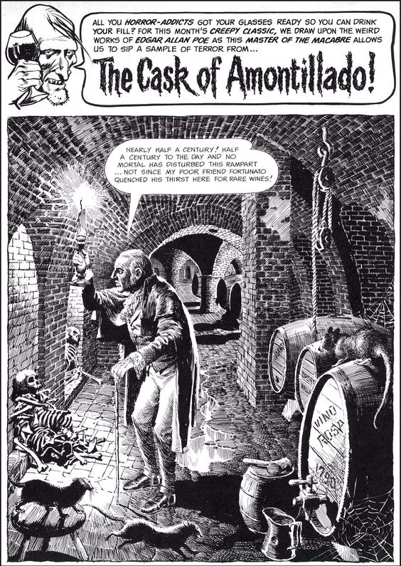 |
| Reed Crandall |
Some fans are impressed by the sheer level of effort in drawings containing thousands of fine lines, as if the level of work gives the picture credibility. But Booth's gift has nothing to do with making lots of scratchy little lines. It's not the manual labor, it's the control.

23 comments:
Hi David, The credit for the John Buscema should also list Alfred Alcala, the inker, as it's more HIS lines I think you're wanting to comment on. Best, Norman Boyd
Love this picture by Booth. Thanks David for posting it.
I agree that quality requires a degree of control of one's means (I say 'degree' because there must always be fruitful optimisation between order and chaos, friction and slippage, direction and waywardness). But control of the pen strokes is way downstream of the source of the picture's intent, vision and aesthetic organisation of which the nature of the smallest pictorial units required to bring this about are an outcome, not an origin. So, it is the quality of composition, I believe, that the distinguishes Booth's picture from the ones you contrasted it with.
I'll concede that to some degree the means employed, what is thought of as the artist's 'style', feeds back into the aesthetic organisation. But this is a bottom up process brought into being by the top down process, not the other way around.
Thank you for posting. This might be one of the few corners of the Internet where one can nourish their sight and mind. It is so rare to encounter beauty on the Internet. Never stop what you are doing!
Great stuff. If you look closely at the 3 faces in the Booth drawing you can see the woman has received some bad news. The little cat in the bottom is almost lost in the thickets of lines and yet Booth captured the playfulness of a kitten.
I have a soft spot for Reed Crandall having discovered his work in Creepy in my younger years. His life in his later years is very sad.
This was one of the key pictures in the Illustration House catalogs that made me realize that it wasn't subject matter that made art good. I'm glad it found a good home!
As Chris said, the composition in this is amazing. So subtle, yet powerful. Booth is disguising what he is doing with the utmost diligence. It all feels so natural and unstudied in its repose, but it is anything but. Every single jot has a purpose.
The pen painting is breathtaking. And again, if you look at Booth's early work, you can see he was mindlessly copying engraving lines. By this point, he had developed both descriptive and poetic ways of using his technique. That the lines wobble up close shows that Booth wasn't obsessive and myopic about he was doing. He was working from some distance back from the board.
Norman Boyd is certainly correct that Buscema wasn't reponsible for that mess of mindless pen work on the Conan; it probably is Alcala. (Norman, I just took a look at your blog. It's amazing! I love the Sheppard stuff particularly, in just a quick viewing of what looks like a treasure trove.)
A couple of comments. 1. Context must be kept in mind--a single illustration is a different problem than a comic book/strip panel. 2. As others have leapt to point out, the finished Buscema art is by Alfredo Alcala, an inker for whom Buscema himself disliked. Buscema's own ink work displayed none of Alcala's fussiness (and indeed, Buscema hardly used a pen when he inked). I myself do not care for Alcala inking Buscema--I think he smothers him--and it always amuses me that the Alcala-inked Buscema conan pages typically fetch the higher prices at auction. 3. I have to dissent from your inclusion of the Reed Crandall example. While there is nothing particularly varied about much of the pen lines, most of it devoted to indicating brick work, the composition and figures seem fine to me, with good spotting of blacks. Crandall's intentions seem quite different from Booth's--Crandall is using hatching lines almost to create a tone--like pasting down zip-a-tone. One can question whether there might not be more economical means to accomplish his purpose, but that is in some ways a matter of personal preference. Sadly, one can trace Crandall's decline as an artist, largely due to vision problems, by following his work through subsequent Warren magazines.
Norman Boyd-- You're right. In fact, when I was thinking of examples of artists who did not fare as well as Booth in this style, Alcala was one of the first that came to mind. I remembered that Buscema's Conan was weighed down with this technique, but Alcala was given no credit on the few examples I saw.
chris bennett-- I agree that that Booth's composition was key to the success of this drawing, but I'd add that the strength of his composition depended in large part on his willingness to turn off the line making machine and leave contrasting white spaces for that house and the brick walkway. This was a restraint that Booth did not always exhibit. In particular, his contrast of the white building with the almost black vines and trees set up a powerful value range that would have been reduced by a lot of grayscale lines.
I also credit Booth with achieving natural, relaxed postures on his figures, especially the man with the pipe and the woman in the doorway. I think those are harder to achieve with that "engraving style" drawing, which often brings a certain stiffness to figures.
max w.-- You're very kind. I love hanging out in this place and hearing what people have to say.
Movieac-- Ah, you noticed the little cat. A very interesting treatment. I got to know Reed Crandall's work the same way you did, through the Warren magazines, and I think those were his best work. Looking back to his work for EC, or forward to his work for later Warren magazines, Witzend, etc. he began to show weaknesses in anatomy and perspective that all those lines couldn't conceal. But like you, I can still point to those early Warren stories, which were very fine indeed, and appreciate them.
It's interesting how many comic artists did some of their very best work for Warren. I'd say Russ Heath, Steve Ditko, Dan Adkins and even Alex Toth fell into that category. Frank Frazetta too. His cover for Creepy No. 9 still astonishes.
Thanks sharing scans of this beautiful Booth original David! Booth, Clement Coll, and a few other pen and ink artists work often makes me think of classical music. It's fun to imagine them conducting at the desk, wielding their ink stained baton.
Kev Ferrara-- I agree with you and Chris about the composition, as previously noted. And like you, I was interested in the "wobble" of Booth's pen up close (such revelations are one of the main reasons for drilling down on details of pictures like this). I've sometimes faulted Booth's pictures for being overly mechanical, but not here. Still, I would be interested in seeing what one of Booth's freehand pencil sketches looked like. I've seen Coll's sketches and they are bracing. (I often think about Robert Fawcett's admonition that drawings always get less vigorous, not more, on the path to finalization.)
Yes, Sheppard was really good and doesn't get enough attention. I showed some of his work a while back but it's probably long overdue to show more.
Robert Cosgrove-- I agree with you and others that Alcala was more responsible for the attributes I was criticizing on the Buscema picture (like Colletta inking Jack Kirby). That's my error, which I have now fixed.
As for the Crandall, I understand why you and others have come to his defense here. As a small boy, I loved that very splash page from the Cask of Amontillado story and spent hours trying to replicate the drawings of the bricks and the geometry of the wine cellar. I thought they were super cool then, and I retain some nostalgic affection for them now. Crandall's pay for all that work couldn't have amounted to more than 17 cents per hour; it was clearly a labor of love. However, it seems to me that even in the 1960s he was having issues with perspective, anatomy, and the aforementioned stiffness in his figures. I think those deficits show less in his early Warren work than they show in his Flash Gordon comics around the same time and in the personal work he put in Witzend. But I think that if you contrast the brick floor in Crandall's drawing with the brick floor in Booth's you may get a feeling for what I called Booth's restraint.
nodnarB-- Thanks. Those guys were in the pantheon alright. Maybe you're right, maybe it's time to delve into more work from that generation.
I like the broom. The hatching got literal.
xopxe-- Did you notice, right next to the broom, the hatching on the woman's dress? Normally we might expect uninterrupted vertical lines tracking cloth hanging down. Booth interrupts those lines with clusters of horizontal slashes. They aren't folds or patches in the cloth. Perhaps they are designed to convey a certain thickness or texture to the cloth, but Booth also seems to do that with smooth surfaces from time to time (as with the sky) to keep the lines from getting boring.
I didn't notice them, but yes, there's something there. When you look at them in the close-up, they seem definitely wonky and dubious. But if you look at the whole picture and imagine them not being there, the dress would've looked weird: a big blot of vertical lines resembling the wood in the barrel to her right and the thing to her left. He needed to break the flatness and convey that there was a different texture. Some drawings have "texture values" just as others use colors, to separate things and suggest their materiality.
Even though Booth is best known for his engraving-like application of lines, it is, artistically, perhaps the least important aspect of his work. As others have pointed out, it is the composition, primarily, but also the excellent drawing — the lively, judicious treatment of the figures deserves special mention — that are this picture's greatest merits.
Gustave Dore made paintings out of some of his engraved illustrations (the reverse of the usual procedure) and one could easily imagine this work by Booth becoming an excellent painting.
David, if memory serves, there are some preparatory drawings by Booth (rough pen sketches and more fully-developed pencil studies) in a book titled "Silent Symphony."
Buscema was great, and no less than Mort Drucker (whom I have held in the highest esteem since my childhood days of eagerly paging through each new issue of MAD to study his work) called him an "amazing artist" who "knew every muscle in the body" and could draw hands expressively — high praise coming from the master of hands himself! (These comments were made in the Drucker documentary by Stephen Silver, which is available for rent on Vimeo.) I have to believe that whomever inked this piece is also responsible for the wonky anatomy, particularly in the area of the quadriceps.
'I've seen Coll's sketches and they are bracing'
Are these available somewhere or in a private collection ?
(Bill)
Did you notice... the hatching on the woman's dress? Normally we might expect uninterrupted vertical lines tracking cloth hanging down... They aren't folds or patches in the cloth. Perhaps they are designed to convey a certain thickness or texture to the cloth, but Booth also seems to do that with smooth surfaces from time to time (as with the sky) to keep the lines from getting boring.
I definitely feel these small, seemingly insignificant, disruptions to the overall hatching of an area are there to connect or link or associate the area to other areas. Very like a touch of differing colour placed within a local tone will help associate that area with another that possesses that colour overall. In the case of the woman's dress these little disruptions, aside from the minor function of being a momentary relief from the dress's general hatching direction, are really there to reinforce a connection or association with the area of hatchings comprising the two gentlemen. This by means of our eye just catching them as it looks back and to across the picture.
I suppose I meant "texture chroma." It's like a Hue-Saturation-Value color space, but for ink. The texture is like the color in that it is a property of the represented surface and can be modulated by the equivalents of saturation and value without losing its identity. These equivalents could be coverage and stroke weight, for example.
"I suppose I meant "texture chroma." It's like a Hue-Saturation-Value color space, but for ink."
Yes. Harvey Dunn taught that texture was coloration. “Texture gives you another color,” he said. But by changing only the polarity of the lines, Booth isn’t even changing texture.
This isn’t only to suggest a change of color, however. As Chris Bennett points out above, these disruptions connect/link/associate with other areas. You will find the angle of these strokes all over the picture. As a kind of linking tone, but also a linking gestural movement.
Further, note that these patches alienate from the fields in which they appear. So they float in front of them. Jeff Jones said that when you paint a figure, you are actually painting the air in front of that figure and not the figure itself. That kind of thinking helps to prevent stiffness in rendering. But also gives a sense of atmosphere, an illusion of spaciousness. And a sense of air and space is something Booth is obviously concerned with in all his best work, including direction of air flow. (Distances between pen strokes too give a sense of air. Which explains why Booth very rarely goes to flat black in his work.)
I don’t believe the idea of introducing random strokes to break up monotony was even a consideration, as nothing was done by these Golden Age greats – when they were flying - without an artistic purpose. Trying to fix boring with pen strokes is a flailing effort to solve a much deeper compositional/conceptual problem.
There’s a unique sense of unity in Booth’s work. Nothing is unresolved. His intuition for line control remains unmatched. A painter with a pen, yes, but this obfuscates the immense skill needed to produce such paintings with a single haired brush.
- - -
Postmodern Anonymouse
Wonderful Booth piece. The post was a joy to read. Thanks.
"This blog on sustainable living is a goldmine of practical tips and environmental consciousness. It's heartening to see such dedication to making a positive impact. Keep spreading awareness!"
https://www.discountdrift.com/promotions
"Kudos to the author for shedding light on the importance of mental health awareness in schools. This blog emphasizes the need for support systems and resources for students."
https://www.couponsstudio.com/all-stores
Cool
Post a Comment