Saturday, April 28, 2007

THE LATEST NEWS FROM THE DISTANT PAST

Holland Carter once wrote, "I go to museums to get the latest news from the distant past."

There's no better place to look for news than in the changing depictions of the human form. Artists have been drawing the human body for over 20,000 years and while the body has remained the same, the drawings keep changing.

Every pose, angle, and facial expression has been drawn a thousand times by talented artists. Look at these figure drawings by the great Annibale Carracci in the 16th century:
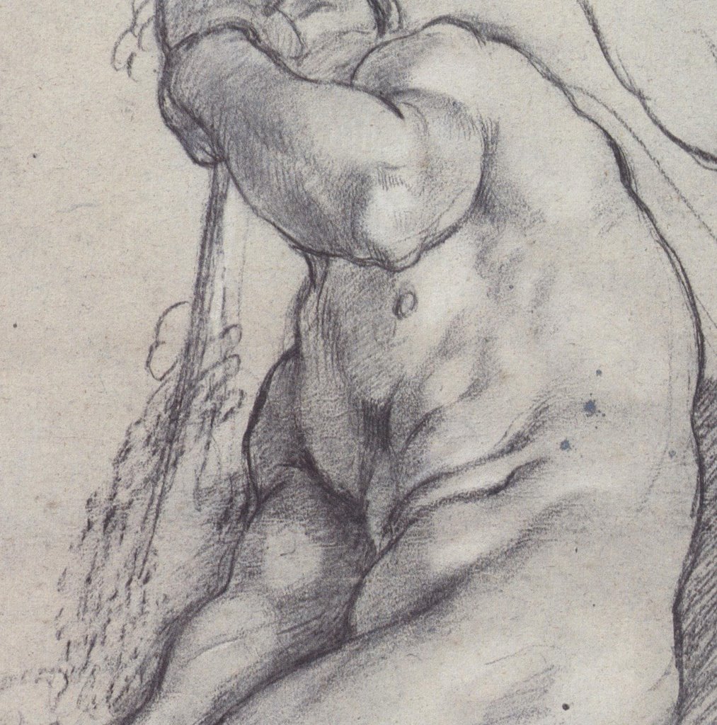
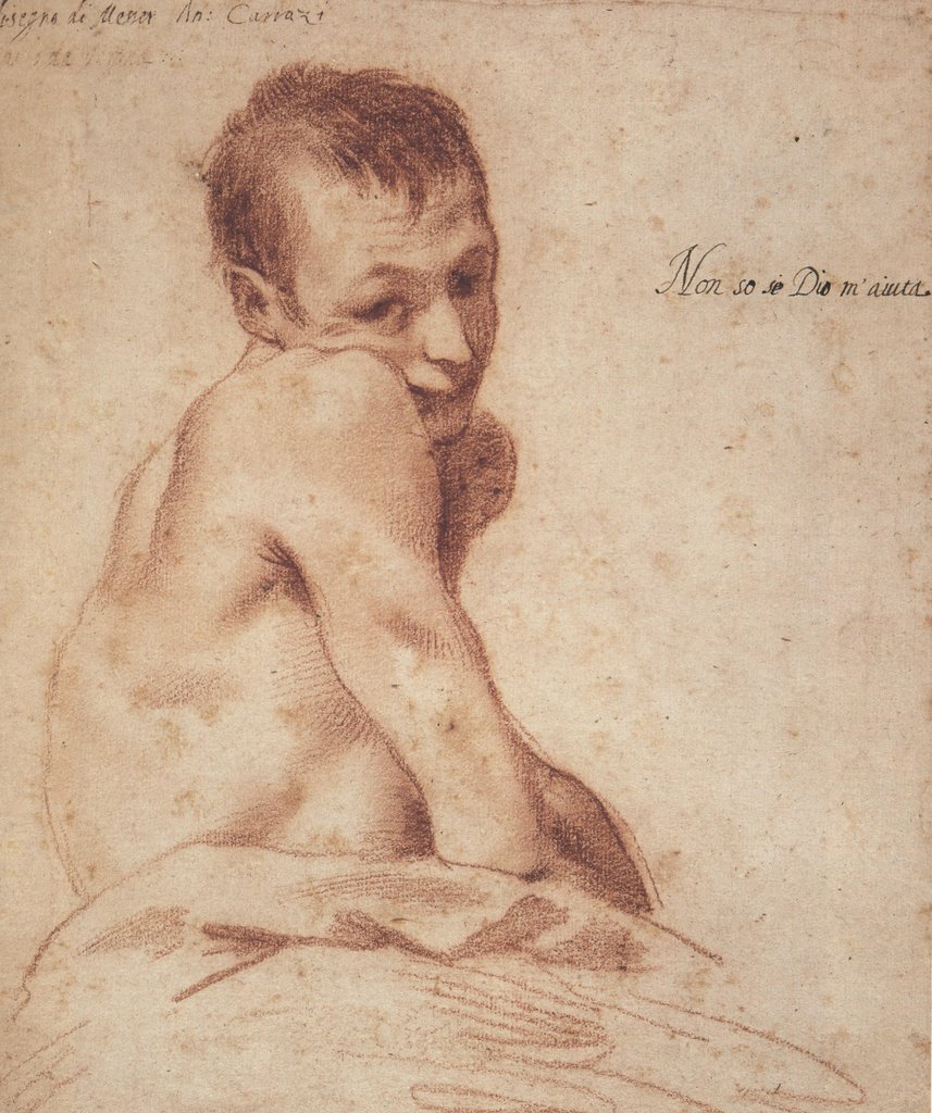
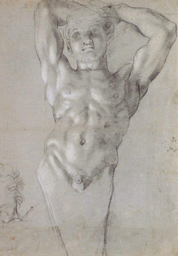


Who would have the nerve to continue drawing the figure after Carracci if there was no new information to convey? What could another drawing possibly contribute?

The fact is, while the human form remains unchanged, each era presents fresh questions for the artist. And even when the question remains the same, the answers continue to change. Look at all the news in this wonderful drawing by Aubrey Beardsley.


Or contrast Carracci's drawings with these recent images by the talented Phil Hale:


The muscles, bones, arms and legs are the same-- and yet what a difference!
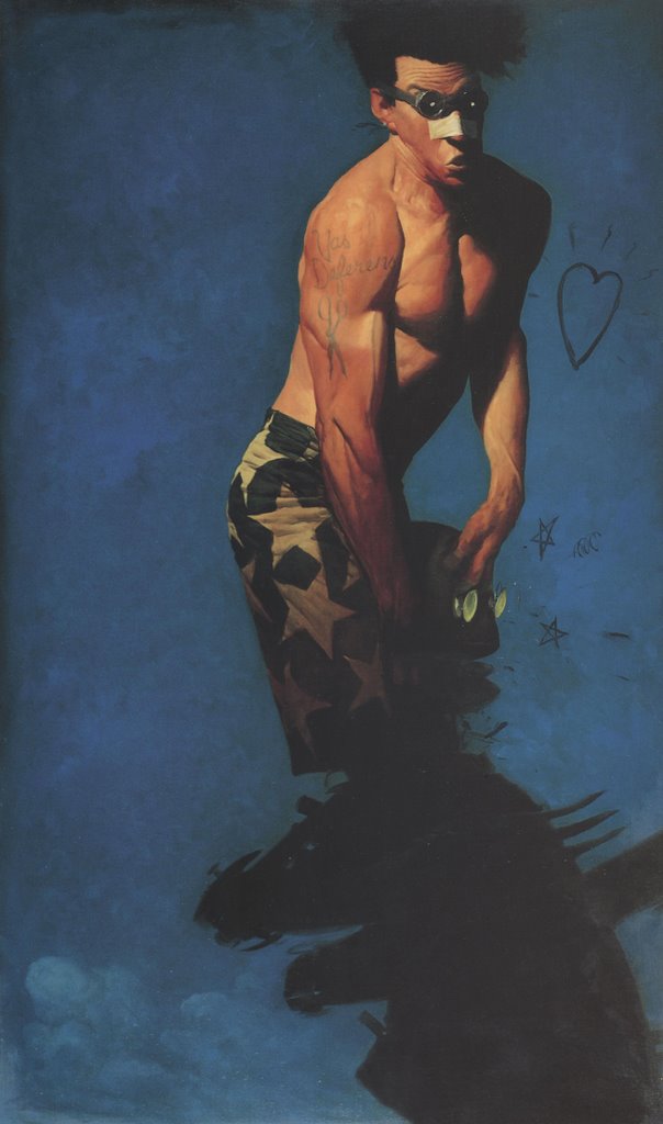


If our bodies were merely machines, they would not be a source of infinite fascination for artists. As it is, artists keep returning to the human form for fresh news about our humanity.

Friday, April 20, 2007

BINARY CHOICES

All the magic of the internet-- the movies, music, youtube animation, color pictures-- comes to you through a series of simple binary choices. Your computer has only two digits (0 or 1) to choose between in processing all that information. The electronic signal is either off (represented by a zero), or on (represented by a one).

Similarly, a line drawing is just a series of binary choices: it is either black or white.


Unlike a painting, which presents a rich variety of layered choices and half-choices, a drawing is a commitment: either line or not line. Look at the bold, black-or-white choices in this stunning set of illustrations by the great Harold Von Schmidt in 1929 for Death Comes For The Archbishop:


The following full page illustration demonstrates the same kind of restraint and care that abstract expressionist Barnett Newman used in selecting the perfect location for a zen stripe on a huge blank canvas.


I admit that I prefer drawings to paintings, sculpture, movies or other art forms. Through a series of binary decisions, an artist can evoke the most extraordinary effects.


These are strong, wonderful drawings worth revisiting by any fan of illustration.

Thursday, April 12, 2007

ART THAT IS "SUI GENERIS" (part 1)


Every once in a great while, an artist creates an image that is sui generis-- one of a kind. You look, you tilt your head sideways and squint, you try to fit it into some existing category, but you're still not exactly sure how to react.

For me, Ivan Albright's painting "the door" (official title: "That which I should Have Done I Did Not Do") is such a painting.


Its dark, brooding subject and its melodramatic title are hardly unique. However, Albright worked on this painting for ten years. It towers over eight feet tall, and it has a level of detail that is, to say the least, psychologically troubling. Albright sometimes painted with a brush he made from one lateral spine taken from a single chicken feather. You are looking at a ten year obsession with mortality and the weight of the road not taken. This is one freaky painting.


Normally a viewer might look at a picture and ask, "Does this composition work? Do I like the color? Is it successful compared to similar pictures?" Such questions don't begin to digest such an epic statement.


Albright was not well known, but he was one of
Jean Dubuffet's favorite artists. Curiously, Dubuffet had the opposite style-- he specialized in spontaneous, impulsive scribbles-- but he was stunned by Albright's door, writing "all the notions on which we have until now based our standards of appreciation of all things are erroneous."


If you are ever in Chicago, I urge you to go see this wonderful painting on display at the Art Institute.


.

Saturday, April 07, 2007

THE GLINT OF MADNESS


Some artists work hard to shed their technical skills and draw crude, child-like pictures. There is great artistic power in the pre-verbal, non-rational space where innocent children, raving lunatics and savage animals dwell.

One of my very favorite artists to tap this power is Jean Dubuffet, who illustrated a number of books and record album covers:


Illustration for La Lune Farcie


A selection of covers
Dubuffet was a prolific gallery painter and sculptor. A brilliant, erudite man and unconventional thinker, he was the first advocate for the art of the insane ("art brut"). I adore his work. Among my favorites are his pictures of cows:


...and his huge terrifying monoliths of men with beards...


...and his intense schizoid landscapes...


Dubuffet did thousands of drawings including a memorable series of "pisseurs"-- a droite, a gauche, and en face.


It is not easy to unlearn what you know and achieve this state. Lots of artists mimic sappy children's drawings, but very few can achieve the raw and disturbing effects that Dubuffet did.

Many of today's illustrators cluster around a few popular styles. You see them throughout the annual Spectrum anthology and the Hugo award nominees. Photorealistic artists interested in exploring a little terra incognita should consider artists such as Dubuffet. After all, Norman Rockwell kept a book of Dubuffet's art handy in his studio.


.

Sunday, April 01, 2007

ONE LOVELY DRAWING, part eleven


This drawing by Bob Peak may seem like a cliche today, but in a far off time, O best beloved, this kind of drawing was totally new. Never in 35,000 years of human drawing had anyone made such a picture. How many artists can make a similar claim?

It's hard to imagine this brilliant, brassy kind of art coming from any culture that existed prior to the 1960s. This drawing radiates the energy and enthusiam of its era, but it also has timeless strengths that stand up quite well.

Peak seems to have developed his drawing style by taking the linework of Egon Schiele and blowing it out of a psychedelic cannon.


Egon Schiele drawing circa 1910


Peak ad for Puritan

Peak later went on to a lucrative career making (in my opinion) uninspired and repetitive movie posters following drab specifications from Hollywood studios. But there was a moment in the 1960s when Peak's designs sizzled. His accomplishment deserves our respect and admiration.

Wednesday, March 28, 2007

KENT WILLIAMS


I love these powerful pictures by Kent Williams, one of my favorite artists working in graphic novels today. These kinds of images have their roots all the way back in the urschleim.

Williams is also a magazine illustrator, a gallery painter and an art teacher. He teaches contemporary figurative painting in Pasadena, California.


Some of his pictures are more successful than others, but Williams is one of the very few sequential artists who I think makes effective use of the technical tools and creative choices now offered by graphic novels. For example, the following panel from the graphic novel Tell Me Dark displays far more nuanced color and shading than was possible in previous generations of comic books.


As another example, Williams used a kneaded eraser to mold a figure by lifting highlights from a background of vine charcoal. This delicate technique was not possible with the printing technology for earlier comic books.


The golden age of illustration began in the late 19th century as a result of the invention of photoengraving. Prior to that time, art could only be published in a book or magazine by painstakingly tracing the original image onto a wooden block which was then carved by hand by an engraver. The artist was at the mercy of the engraver (who often co-signed the finished block) as well as the printer. Photoengraving inspired a mini-renaissance because for the first time, books and magazines faithfully captured the artist's true talent (for better or worse).

Comics have now gone through a similar renaissance. For most of their history, comics were drawn in pencil by one artist, then traced in ink by a second artist for reproduction. Often, a third artist applied color on a separate page or guide sheet as a reference tool for the printer. Now graphic novels have overcome all these limitations of the medium. Today's artists are free to work with delicate line, or subtle gradations in color and value, or mixed media.
While many writers have taken advantage of the freedom of the graphic novel, very few artists have risen to the challenge. Most sequential artists treat the graphic novel like a super sized comic book on glossy paper. Even successful painters such as Alex Ross, who use the new image quality to convey slick, photo-realistic art, don't add much artistic integrity. Their art may be dazzling but it seems thin and lacking in humanity.

Apart from Williams, there seems to be only a handful of artists-- McKean, Miller, and perhaps half a dozen others-- who are doing artwork worthy of the medium.

Friday, March 23, 2007

MEET BOB & BOB


Bob & Bob was a flaky performance art team in the 1970s. They painted themselves yellow and silver and conducted "happenings" in rooms filled with popcorn or foam rubber. They named their happenings "Sex is Stupid" or "Forget Everything You Know." Sometimes Bob & Bob would perform songs against materialistic society:

People go to school and learn from books
Then they get degrees
Then they get a job and drive a Porsche
Bob & Bob had no apparent drawing skills. A booklet of their work describes the team's technique for drawing:

The drawings were nothing more than scribbles but the two found something harmonious there so they decided to draw together on the same sheet of paper.
They also performed comedy routines. Fortunately, Bob & Bob faded away like disco with the dawn of the 1980s. So why am I wasting your time with them? Because recently I looked at some of their drawings and was astonished to find they were truly excellent. I think these deserve a wider audience.

As part of their campaign against capitalism, Bob & Bob copied photographs from the annual reports of banks and large corporations. They drew the corporate executives and boards of directors with magic markers in a crude way. The results were absolutely devastating.


Said Bob & Bob:"These poor bankers have spent their whole lives in classrooms and offices and all they have to show for it is money and wrinkles. We wanted to turn them into art." I find these drawings more lacerating than the art of widely acclaimed social critics such as George Grosz, R. Crumb or Gerald Scarfe.


I am surprised that two goofy featherweights like Bob & Bob were able to produce something so dark and trenchant. These drawings seem close in spirit and quality to the work of Francis Bacon and Marshall Arisman.


.


The alchemy of art is so unpredictable, unlikely artists sometimes produce surprising results. Were these drawings intentional or just a lovely accident? I don't know, but they are another reason why (as if another were needed) the time to stop looking with fresh eyes at new artists is never.

Wednesday, March 14, 2007

ARTISTS IN LOVE, part eight


Edward Galinski, a Polish student, scratched this portrait on the wall of cell 18, block 11, at Auschwitz.

Edward was imprisoned by the Nazis in 1940 for opposing Germany's invasion of Poland. He worked at forced labor in the camp. One day, Edward was assigned to repair buildings at the women's camp next door. There he met Mally Zimetbaum-- a beautiful, doe eyed girl imprisoned for being a Jew.

Edward was completely smitten. He started talking with Mally under the watchful eye of the guards. After several weeks of furtive exchanges, the couple found a way to pass secret notes back and forth between the two camps. Against all odds, through the barbed wire and brutal guards, love bloomed.

Edward realized that Mally would eventually be killed in the gas chambers, so he came up with a daring escape plan. On June 24, 1944, he put on a stolen SS uniform and escorted Mally through the front gates using forged paperwork and passes that Mally had obtained. Once outside the camp, they disappeared into the tall grain and headed for the Czech border.


In his book about Auschwitz, Polish author Wojciech Kielar wrote that when the escape was discovered, every prisoner in Auschwitz spoke about nothing but Edward and Mally. The young couple in love became a symbol of freedom and hope for a new generation.

Edward and Mally had twelve days together. It would have to be enough.

Mally was captured by a German patrol at the Czech border. Edward was safely in the clear, but when he saw that Mally had been captured, he returned and surrendered to be with her. Back at Auschwitz, Edward and Mally were thrown into isolation cells in the basement of block 11. There they were tortured for details of their escape and the names of any accomplices. Another prisoner in block 11, Zbigniew Kaczkowski, recalled that Edward had a secret way of checking at the end of each day to see if Mally had survived: "Every night, pressing his lips to a crack in the door, [Edward] would whistle a certain melody; he would get a reply, the same melody from Mally in a distant cell."


Edward was held in cells 18, 20 and 23. There he paced, desperate and helpless while his beloved Mally was tortured down the hall. In each cell, he drew a portrait of Mally on the wall and wrote their names together.


Edward and Mally never did betray their helpers. Their captors executed them in front of the entire camp to discourage future escapes. Edward was hung from the gallows in the male prison yard. He shouted his last words, "long live Poland," with the noose around his neck. One historical account recalled that at the moment of his death, "an anonymous voice shouted out from among the prisoners: 'Hats off!' and the entire camp, as one, removed caps in a defiant salute." Mally tried to kill herself on the gallows but was intercepted and stomped to death by SS men in front of the women prisoners.


I would like to say two things about the sad story of Edward and Mally.

The first has to do with the role of art. I find it strangely moving that human beings turn to pictures for solace in times of great distress. When the woman he loved was being tortured down the hall and there wasn't a thing he could do about it, Edward drew a picture of her face. There is no logical explanation for this. Why should lines scratched on a wall make him feel closer to Mally? Images contain powerful magic, even at the outer extremes of bearable human experience.

My second point is about-- for want of a better word-- love. Sometimes I think about what Edward and Mally were able to condense into their twelve desperate days of freedom.

Rabindranath Tagore once wrote, "the butterfly counts not months but moments and has time enough." Generally I take little comfort from this because humans are different from butterflies.


But in the case of Edward and Mally one hopes that whatever they shared during those twelve days was enough to sustain them during the ordeal ahead. Years ago Richard Kennedy wrote a fairy tale called the Dark Princess, about two would be lovers, a princess and a jester. The two could never have a life together. In fact, they could not even look at each other or talk to each other. The sum total of their life together was one brief moment as they jumped off a cliff and were able to touch once before perishing in the sea below. Kennedy wrote the following about that touch:

And in that moment they touched, the sun rose a million times for them , and the Princess and the Fool could see each other and all the things of life and the world.... And that moment they touched outlasted the life of the King and Queen, and outlasted the life of the Kingdom. And that moment they touched is lasting still, and will outlast us, too.

Monday, March 12, 2007

WHILE WE'RE ON THE SUBJECT OF HAIR...

Many comic artists draw hair in a kind of shorthand. They select from a menu of 3 or 4 basic styles they once learned, and modify the color or hairline for a little variety. Highly regarded artists such as Alex Raymond, Milton Caniff, Steve Ditko and Jack Kirby were all guilty of this timesaving practice (and as for George Wunder's Terry and the Pirates-- let's not even go there).


One reason I admire Mort Drucker so deeply is that he didn't take such things for granted. In each of these pictures, he looked with fresh eyes for the best way to capture hair with line. It's hard work-- the essence of traditional drawing-- but it really pays off.


Obviously, Drucker isn't relying on any formula here. In the pictures below, Drucker has analyzed and mastered the 3 dimensional structure of each hairstyle. Once he understands it, he can rotate it on an axis in his brain just as if he was born with a CAD CAM software program.


Drucker did not just haul this approach out for wild, eccentric hair. In the following picture, notice how he captures even plain, straight hair with a master's sensitivity.


Although Drucker is justly famous among professional caricaturists who recognize the measure of his achievement, in my view he remains the single most underrated comic artist.