Monday, October 19, 2020

A LAST LOOK AT THE AUSTIN BRIGGS ARCHIVES part one


One of the joys of writing the biography of illustrator Austin Briggs was getting to know and interview his son, Austin Briggs Jr.,  a retired professor of literature and a nationally renowned expert on James Joyce.  Austin Jr. generously shared his father's personal collection of tear sheets and memorabilia containing thousands of images that wouldn't fit in the book.

Now the time has come for me to relinquish that collection.  Once I pass it along to the museum selected by the Briggs family, this amazing stash of images will be well protected but I'm not sure the larger public will ever get a chance to view them.  Many of them are unsigned.  So before I let them go, I'm going to post a large batch of Briggs' forgotten works here for posterity. 

The following images, dating back to the 1920s and 1930s, are not all masterpieces, but they do show the development of a major talent responding to changing times and changing media. 

Briggs drew his first published work at age 18:


Like other young and ambitious illustrators of that era, he worked for pulp magazines and tabloids that once crowded the newsstands but are now long forgotten.  


By 1930, Briggs (now using the name "Bud") was illustrating stories like this lurid tale about the wife of gangster Baby Face Nelson ("His heart was so black with malice that he shot wantonly and with strange pleasure"). 


"She helped wrap his nude body in a horse blanket and dropped it in a ditch.  He was the father of her children but she couldn't get far with a body on her hands."  


From a Harper's Bazar story, The Girl Who Was The Moon (June 1929):


By the mid 1930s, Briggs was supplementing his work for pulp magazines by assisting Alex Raymond on his epic comic strip, Flash Gordon.  We can see how Briggs' work for Bluebook and other pulp magazines paralleled his work on Flash Gordon, and how Briggs' drybrush technique influenced the look of Flash Gordon.  


As I post more of these forgotten works tomorrow, I think you'll see how Briggs inched out of the ranks of a typical pulp artist to become one of the premier illustrators in America.

After Briggs' died, his friend Tom Holloway gave the following memorial tribute:
 
In my many years of association with him I remember few jobs that came easy for him... if they did, his intuition told him something must be wrong, or that he was getting in a rut, and he would do something hard-- not always a success either in the product or the acceptance by client-- but he was slugging most of the time.  


Wednesday, October 14, 2020

ONE LOVELY DRAWING, part 64

I really like this whisper of a drawing by illustrator Henry McCarter (1866-1942).  


To convey the enormity of the sky and the prairie, McCarter uses one of the most powerful drawing tools: restraint.  

White space is a scarce commodity these days, due to the limited budgets of publishers and the excessive vanity of artists.   Many might try a muscular approach to express the grandeur of the sky and the immensity of the land.  They might start with a heroic profile of a pioneer scanning the remote horizon, or begin drawing the hairs on his coonskin cap. 

But the vast majority of this drawing is made up of fluid lines and dots, abstract in form and untethered to any concrete shape.  


The earth, too, is made up of waves of lines.  In isolation they look possibly liquid, possibly abstract. 


But 96% of the picture is all brought together by the remaining 4%: the little guy, cattle and wagon pulled all those random hatch marks behind him into focus and create the appearance of a tightly rendered drawing. 
 

McCarter started his art education studying with tough realists such as Thomas Eakins, but finished it studying in Paris with post-impressionists and other modern artists. When he returned home he made a living doing representational work for Collier's, Scribner's and Harper's but it's clear he retained the lessons of modernism and they served him well.


Monday, October 05, 2020

RON COBB AND THE SWEET SPOT

 Artist Robert Crumb stumbled into the perfect sweet spot.

If he'd been born a few years earlier, he would've been censored, jailed or burned at the stake.  If he'd been born a few years later, during the era of MeToo and Black Lives Matter, his work would've been shunned.


If he'd been less crazy, his art wouldn't have stood out.  If he'd been crazier, he might've followed his brothers into dysfunction and suicide.  Instead, he found the perfect middle ground for a productive and lucrative career.

If Crumb started a few years earlier, art directors would've dismissed him for his lack of technical skill.  Fortunately for Crumb, the illustrators who immediately preceded him fought to open popular taste to naive and crude drawing, placing a premium on personal authenticity and eccentricity. Fine artists who preceded him legitimized comic art and pop art, creating an upward path for Crumb from underground comics.

Crumb wasn't the only oddball artist to benefit from the climate of the 1960s.   The new combination of rock music and psychedelic drugs produced an entire school of poster artists who, in another era, might have trouble finding gainful employment. 


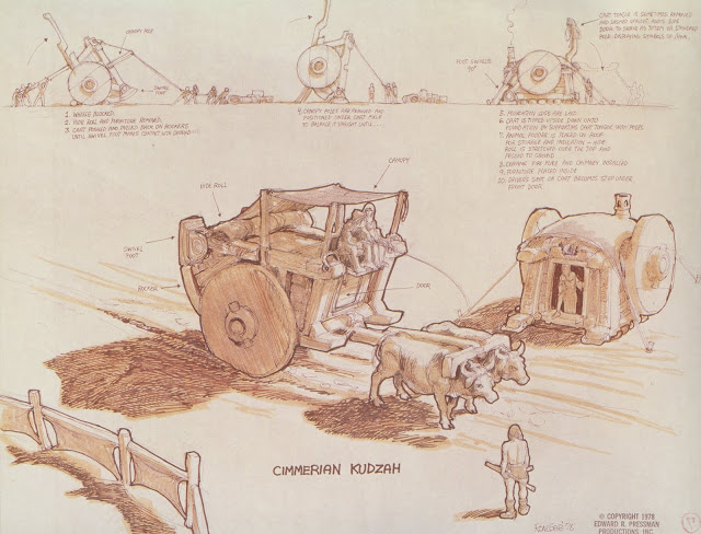
I was thinking about this as I read the tributes to artist Ron Cobb, who passed away last week.  Cobb, too, benefited from that moment of artistic ferment in California. 


Cobb was a California high school student who loved to draw. After high school he worked as a mailman before being drafted to Vietnam. When he left the army he returned to a home transformed by mid-60s craziness. Writer and friend R.H. Fischer reported:

The Vietnam war was less traumatic than was his vast leap out of Army life (structured and predictable) into the great unknown that was Bohemian Hollywood in the early sixties.

One sign of the big shift was the emergence of underground newspapers, such as The Los Angeles Free Press which was launched by an unemployed tool-and-die worker and former organizer for the Socialist Workers Party.  Cobb wandered in the door and became their resident cartoonist.  The street paper became a success and within 5 years Cobb's left wing editorial cartoons were syndicated in 90 newspapers. The 60s revolution, flower power, radical politics and the summer of love swept across the nation, planting Cobb's cartoons in previously establishment publications.


But that wasn't the end of it.  In the 1970s, a lot of creative energy shifted to making science fiction and fantasy films.  The screenwriter for the film Alien lived near Cobb and happened to see him drawing a space ship for an album cover for the rock group Jefferson Starship.  He drafted Cobb to work on the movie-- a job which led to Cobb's involvement with Star Wars and Conan the Barbarian. 


While he worked on Conan,  Cobb ran into a young Steven Spielberg working down the hall.  Cobb's drawing impressed Spielberg who suggested that Cobb direct his next movie about people who have a close encounter with extra terrestrials. Not bad for a middling high school student who liked to draw.  

In short, the 1960s created an artistic interregnum, when artists who might normally live and die in caves on the outskirts of town were free to wander the newly vacated corridors of power in the town center.  They could even occupy the city hall where Norman Rockwell once reigned.  

All the forces of nature and the marketplace seemed to combine to create a sweet spot for unconventional talents and eccentricities.  Robert Crumb's weird masturbatory fantasies sold for millions of dollars and transported him to a chateau in France.  Stoners and druggies achieved lasting fame with their psychedelic posters.  And Cobb, the unschooled Army vet had the opportunity to apply his unorthodox creative visions to shape some of the biggest films of the century.  

Tuesday, September 22, 2020

MORE THAN NOTHING

Legendary animator Richard Williams chased his masterpiece, The Thief and The Cobbler, the way Captain Ahab chased Moby Dick.  "The path to my fixed purpose," cried Ahab, "is laid with iron rails, whereon my soul is grooved to run."  Neither man could swerve from the rails which led ineluctably to their fate. 

The story of Williams' obsession with his film has been well documented elsewhere.  For 24 years, from 1968 to 1992, Williams exhausted one backer after another (including a Saudi prince) in his heartbreaking pursuit of perfection.  He spent 14 years on the first ten minutes of film alone, reported to cost about $31 million (adjusting for inflation).  But what an astonishing ten minutes they were.


To scratch together funding for his project, Williams had to spend much of his time on commercial assignments and negotiating with lawyers and bankers.  Ultimately the film was taken out of his hands.  To cut their losses, Warner Brothers and a financing company sold the pieces to Miramax, which re-cut them and released the movie in a simplified form as Arabian Knight

Before he died, Williams said, "What have I got if I haven't got those awards? I've got nothing; I've got the building and the staff that's in it. And an unmade picture." 

I'd disagree with Williams' valuation of his assets.  

These are some of the preliminary drawings that Williams made over the years as he was working on his masterpiece.


In them, you can see him teasing out the designs and shapes that would later be incorporated in his animated film.


These small drawings are miles from the corporate funded and globally distributed artwork that Williams wanted.  On the other hand, they're also miles away from bankers and lawyers.  The time he spent doing them, and the talents he summoned to create them, had to be more artistically satisfying than the time and talents he spent with corporate backers.   


I'd say that these building blocks of design are a whole lot more than "nothing."  Their perfections are different from the perfections of an animated feature film, but as the great Walt Whitman instructed us, "I do not call one greater and one smaller, that which fills its period and place is equal to any."


Thursday, September 10, 2020

WORTH FIGHTING FOR

My current column for The Saturday Evening Post is about Robert Fawcett, the outspoken illustrator who didn't hesitate to offend clients when he felt it was necessary to protect a picture.

For example, when a client instructed Fawcett on how to change this illustration, he refused.
Fawcett believed the client's changes would degrade the picture, and rather than sell a bad picture with his name on it, Fawcett gave up the assignment and kept his illustration. 

Similarly, when an art editor instructed Mead Schaeffer on how a picture should look, Schaeffer sent this reply: 
Artists fight for many things-- money, credit, returned originals, status, copyrights-- but as I study the history of illustration, I'm repeatedly struck by the way some of the best illustrators fought for a picture. 

Austin Briggs destroyed his finished cover for The Saturday Evening Post right in front of the art director rather than make a change he considered racist. 

When the young Bernie Fuchs started out, a client rejected his finished painting of a car.  He threw Fuchs' painting on the floor and called Fuchs a "prima donna" because Fuchs tried an approach which strayed from official corporate policy. 

It was once considered heresy to illustrate a car in the shadows, or with an obstructed view, or at an odd angle.  Clients expected a sharp, well lit product center stage.  Fuchs fought to sell cars using mood and lifestyle. 
A few years later that same client was standing in line with others, begging for Fuchs' services.  One of Fuchs' co-workers from that era gleefully recalled, "All the local art directors kept calling up saying, I want Bernie! I want Bernie! But Bernie got tired of doing pictures of people holding drinks and just said, 'shove it.'"  He quit his by then lucrative commercial art studio and moved out of town to take a chance on free lance assignments that gave him more freedom.

Cartoonist Bill Watterson, creator of Calvin & Hobbes, famously took a stand against his own syndicate, turning down what he called "trainloads of money" in order to protect his creation from merchandising.  During the conflict, Watterson discovered there were very few precedents on his side: "When cartoonists fight their syndicates it's usually to make more money, not less."
One common theme to all these stories is that the illustrator had to be prepared to take a significant financial hit.  As Robert Fawcett lectured his fellow illustrators (as offensively as possible): 
It should be the aim of every illustrator to withstand the tendency of publications to force his work into a mold, to make him conform to an accepted pattern. This is a difficult thing to do — the financial rewards of conforming are great.... We must be ready to refuse work unless it allows us to conform in some degree to standards that we ourselves set....
Where did this strength come from?  

It's not as if these artists didn't need the money.  Most of them started out desperate for work and would say or do almost anything to get assignments.  In order to understand the measure of their  courage you have to understand how they scratched and clawed for those early commissions.

Mead Schaeffer got his first major assignment by furtively poking around the desk of the art editor at publisher Dodd, Mead.  Schaeffer spotted a manuscript for Moby Dick lying on the desk and volunteered for the job. The art editor explained that he was just about to call illustrator N. C. Wyeth with the assignment.  Schaeffer blocked him and offered to work for free:
 I suggested the following plan. If he would let me have the manuscript I would start at once on a dummy for the salesman. This would include three full-page color illustrations, frontispiece, and papers and jacket. If any one of the staff did not like the work or feel I could not do the finished work, all bets would be off and they would owe me nothing. 
Mr. Chase [the art director] was a little startled, told me to wait, that he must speak to the president Frank Dodd. I waited what seemed like hours until he returned with the boss. He warned me about the cost, that this was a very important assignment but that they would take a chance. I floated out onto the street clutching the precious manuscript so tight that even Sam Huff would have trouble getting it from me. Took subway uptown to 101st, ran up six flights of stairs yelling to [his new wife] “look what I got.” That night we sat up making plans.
Yet, this is the same Mead Schaeffer who told an art editor "stuff this" when the art editor tried to dictate the creative decisions in an illustration.

At first I wondered how such hungry, desperate artists ever transformed themselves into such confident, arrogant artists.  With time I came to realize that there was no inconsistency.  They might not fight over money or copyrights, but they found the courage to fight over what was more important to them.  Illustrator Bob Heindel explained it to me when talking about his friend, Bernie Fuchs:
I know Bernie has tried to choose his assignments, and I know he has done some work he is not so proud of....That's how you learn. But you learn to protect yourself, and mostly if you care about it you learn to protect your work. Bernie was always very protective of his ability. Not that he was vain-- quite the contrary. But he knew what he had. And he always wanted the opportunity to do his very best.
All of the artists I've discussed here had something to protect.  The only reason we know that today is because they protected it.

Tuesday, July 28, 2020

THE STRUGGLE BETWEEN ART AND TIME


Time puts handcuffs on us all.  Sometimes that's a good thing, sometimes bad.  But for certain artists, time creates a special challenge.

In the 17th century, the great poet John Milton went blind at age 44.  He lamented that he had been robbed of the time necessary to fulfill his god-given talents:
When I consider how my light is spent
E're half my days, in this dark world and wide,
And that one Talent which is death to hide,
Lodg'd with me useless, though my Soul more bent
To serve therewith my Maker, and present
My true account...
The English illustrator Raymond Sheppard was diagnosed with cancer around age 33.

As a boy, Sheppard had won several prizes for his drawing ability.  He worked diligently to become an artist, spending countless hours at London zoos learning to draw the birds and animals he loved.


Sheppard became a successful illustrator at a relatively young age.  (A wider variety of his illustration art can be viewed on line at his gallery.) In addition to magazine and book illustrations, he was commissioned to create a book on How to Draw Birds (1940) which became an international classic, as well as Drawing at the Zoo (1949) and More Birds to Draw (1956).  But his cancer put Sheppard in a race against time and he lost that race in 1958, at the age of 45.

I would like to say two things about Raymond Sheppard.

First, even though he was running out of time, Sheppard refused to take short cuts. For years he fought the pain of cancer and the dulling effects of morphine, steering a course between scylla and charybdis, trying to make sure that his drawings turned out as well as he could possibly make them.  It would have been so easy to cut corners with a faster, looser style but Sheppard would have none of it.  I spoke with his daughter Christine who recalled that her father was "not a satisfied artist.  I witnessed his angst.  He'd say, 'No, that's not quite right, I haven't got that right."  It's difficult to maintain high standards even when you have a long life ahead of you.  When you are mortally ill, each decision to go back and "do it better" comes with a dearer price.  

Second, Sheppard realized that the job of art is to rise above realistic details and find the poetry in your subject.  Making hyper-realistic drawings might've served as a helpful diversion from cancer, but Sheppard wasn't interested in diversions, or mindless copying from nature.  He wrote, "When you look at a bird your eye is full of a lot of really unimportant details.... It takes quite a lot of study to be able to see properly, and quickly too, the important shapes and main lines of rhythm of a pose."   He criticized "those awfully boring and tedious sort of 'feathered maps'... looking as flat as pancakes in natural history books."  

A baby rhinoceros sleeping in the straw 


Sheppard was robbed by time, but he responded like a true artist. 


Friday, July 17, 2020

ONE LOVELY DRAWING, part 63


I love this drawing by British illustrator Raymond Sheppard (1913-1958) who was famous for his brilliant pictures of birds and animals. 


Sheppard wrote and illustrated several books on how to draw wildlife.  He honed his skills drawing at the London zoo, where his keen powers of observation enabled him to capture the special characteristics of everything from airy feathered creatures to rolls of fat on lumbering ungulates.

Note in the following detail how Sheppard follows the line of this hippo's spine to show us that there is a skeletal structure somewhere within this mountain of lard.  Also observe how that single leg props up his bulk as fat cascades over the top. 


I've never seen a better drawing of a hippopotamus.

In the following detail, we see Sheppard capture that ponderous head pressed against the ground. All the muscle and bone piled up behind him have collapsed in a jumble, giving up trying to keep that head aloft.


Sheppard achieves what photography can't do.  He clearly loved animals, and this love, combined with patience and a keen eye, reveals what's happening both inside and out of this hippo.

In my view, this is what on-the-site, observational drawing is all about.

Thursday, July 02, 2020

NEW BOOK ABOUT MEAD SCHAEFFER


The newest arrival from Dan Zimmer's Illustrated Press is a major book about illustrator Mead Schaeffer.   To write the book, I interviewed Schaeffer's daughter in her home in Vermont and was given exclusive access to Schaeffer's personal scrapbooks. 

Schaeffer was unusual in that he had three different incarnations as an illustrator. 

From the introduction:

The first time Mead Schaeffer became nationally famous, it was as an illustrator of adventure stories such as The Count of Monte Cristo, The Three Musketeers, Les Miserables and Moby Dick.  Schaeffer was “one of the foremost illustrators of the romantic era of American fiction” according to illustration historian Fred Taraba. Critic Arpi Ermoyan, in her book Famous American illustrators lauded Schaeffer’s “romantic, swashbuckling and theatrical” paintings which earned him a spot in the illustrators’ Hall of Fame. Schaeffer worked for decades painting evocative mood illustrations for some of the top fiction books and magazines of his day.


The second time Schaeffer became famous it was for a tighter, more realistic style of painting for a very different kind of subject. The harsh realities of World War II changed popular taste from the escapism of costume adventure stories to sober realism about modern day threats. Schaeffer played a significant role during the war years with a series of popular and highly regarded covers for The Saturday Evening Post, painted as tributes to branches of the US armed services. Unlike Schaeffer’s earlier work, these new paintings were precise and accurate down to the last detail, from the buttons on the uniforms to the configuration of the stars overhead. 


After the war, Schaeffer became famous a third time. He traveled around the country as a reportorial cover artist for the Post, chronicling American domestic life. Cities, towns and businesses competed for Schaeffer’s attention, eager to win a prized spot on a cover of the Post. By showing the patchwork quilt of America in the 1940s and ‘50s, Schaeffer helped to educate the country. Readers learned about the varied scenes and lifestyles in far corners of America, some of which had previously escaped national attention. In this role, Schaeffer presaged the popular illustrator-as-journalist movement of the 1960s.


By the time Schaeffer retired to a satisfying life as a fisherman, he had become successful and well known for each of these three roles.

The book is now shipping.  For those who think they might be interested, you can find a preview on the Illustrated Press web site.