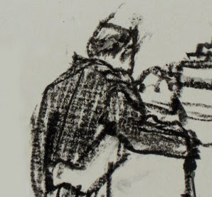
Monday, April 10, 2023

WHEN AL WILLIAMSON GAVE IT AWAY

Artist Al Williamson put so much effort into drawing this story for EC comics, his pay couldn't have amounted to more than 13 cents per hour.


And that's not even including the backgrounds contributed by his buddy Roy Krenkel "for the fun of it."  Williamson later said about his work for EC, "what it shows is that I really loved what I was doing."  

At age 23, Williamson wasn't worried about a pension or a mortgage.   

Apparently he didn't care about posterity either. All that effort went into comic books, the most fragile medium, which were poorly printed on cheap paper that quickly yellowed and disintegrated. 

This was 1955, an era before NFTs and giclĂ©e prints.  Look at the difference in quality between what Williamson poured into the drawings and what emerged for the public in the finished comic book:


And yet, Williamson continued drawing page after page "for the fun of it." He was content with the percentage of beauty that made its way into the printed comic:  


Erica Jong wrote:
In a society in which everything is for sale, in which deals and auctions make the biggest news, doing it for love is the only remaining liberty....  Do it for love and the rich will envy no one more than you. In a world of tuxedos, the naked man is king. In a world of bookkeepers with spreadsheets, the one who gives it away without counting the cost is God.


Williamson wasn't seeking immortality working for crummy little comic books but for that reason he may have achieved at least a form of it.


Monday, April 03, 2023

LEONARD STARR'S OLDER BROTHER


Cartoonist Leonard Starr idolized his older brother, who was killed fighting in World War II. When Starr grew up and began his comic strip On Stage, he modeled a character after his brother.

The character, Grisha Volkov, was a dashing Russian rogue (Starr's family roots were in Russia).  Starr made his character as tough and confident as Starr remembered his brother.  Volkov won every battle, even the one Starr's brother lost.  

When I was barely old enough to read On Stage I was thrilled by the beautifully drawn action scenes featuring Volkov.


I must've traced this image ten times while learning to draw.

I cut the cool drawings out of my parents' newspaper and kept them in a shoebox. Those strips and I have both aged considerably since then, yet I still find them cool.


With a more mature eye, I can see the different ways in which these strips sparkled.  Sure, fight scenes were cool but I learned it was more cool to merely imply the action, with Volkov emerging nonchalant at the end:

In this next scene Starr uses the same device of implied violence, as the Volkov character clears two spies outside his gate, then gets in his car and drives away.


One by one, I grew to appreciate the range of talents that combined to make On Stage: Starr's brushwork, his timing, those subtle facial expressions, his staging. By the time I got to high school I even loved Starr's intelligent dialogue, which I believe was unique in the history of comic strips. Look how he used language to bring his brother's personality back to life, chuckling occasionally at how his brother might react in certain situations : 


When I grew up and met Starr I found him to be possibly the most well read person I'd ever met.  He loved the great Russian authors, particularly Gogol and Pushkin, but he would also seamlessly quote the private letters of Raymond Chandler.   This range enabled him to combine rich characterizations of human nature with blunt, "tough guy" messages:


So... Starr extended his brother's life a little longer with his strip, and now that Starr himself is gone, I've extended it a little further by mentioning these things to you.

Going back through my shoebox of treasures,  I was struck by the fact that there is no comic strip today that comes within ten miles of this kind of work.  The world of comic strips has moved on and today excellence takes entirely different forms.  This genre is as gone as the ancient city of Carthage after the conquering Romans were done plowing salt into its fields.  


Friday, March 24, 2023

BARNEY BISHOP III

You can search the Thesaurus for a synonym for "moron" but you'll never find a word adequate to describe Barney Bishop III, chairman of the Tallahassee Classical School in Florida. 


This week, Mr. Bishop forced the principal of the Classical School to resign because she failed to block the art teacher from showing a picture of Michelangelo's David to a 6th grade class. 

The school promises "a content-rich classical education in the liberal arts," in order to shape a "vibrant and enobling" culture for students, so you can understand why Michelangelo's statue would have no place in their art curriculum.  


Mr. Bishop explained that parents were quite upset by the school's slip up: 
Three parents objected. Two objected simply because they weren’t told in advance. One objected because the teacher said "nonpornography".... [T]hat word is inappropriate.... you don’t need to be saying that word in a classroom in Florida!
In a lengthy interview, Mr. Bishop explained the philosophy of his school: 
Parents, after they saw all the crap that’s being taught in public schools during COVID, decided of their own that they didn’t want their children to be taught that. Here we teach... a traditional, Western civilization, liberal classical education.... We don’t have safe spaces for kids so they won’t be offended by a Halloween costume.
Sixth grade students at Tallahassee Classical School will not be protected from offensive Halloween costumes but they will have a "safe space" to protect from the knowledge that males have a penis.  There is no telling how many students have already been traumatized by this discovery.


Tuesday, March 21, 2023

SO YOU THINK YOU KNOW HOW TO DRAW A MOUTH?

You could study 1,000 anatomy books but none would teach you to draw a mouth like this:


ChatGPT would never create such a mouth for you.  Neither will a camera.  Neither will Photoshop.   

The mouth is a detail from this febrile drawing by Horst Janssen.


Janssen's drawing includes none of the features artists normally focus upon when drawing higher life forms: eyes, facial expressions, a forehead, posture suggesting vertebrae... even a chin would be useful.  If there's body language here, it conveys little more than heated fumbling. Instead, everything is reduced to those chewed up lips, swollen from too much heavy kissing.  You can almost hear the panting from this drawing. 

A corporate letterhead seems like an odd choice of paper, except it suggests Janssen was not in the mood to wait around for proper art supplies.

Other drawings of this subject display far more technical skill.  For example, here's an embrace as visualized by Fragonard:

Note the details in the fabric, the staging with the door and the use of facial expression

In the 19th century the romantic movement turned away from precise academic drawing by artists such as Ingres and David.  Romantic artists felt that a better way to capture the true character of life and experience was not the mimetic representation of nature.  Rather, they turned to the expression of feelings and memory and emotions, setting us on the path to Janssen's lovely, raw drawing.  

Sometimes Janssen's approach to drawing misses.  When you're in the business of inventing new mouths it doesn't always work out.  But when he does connect it can result in marvelous pictures.

Here are other examples of Janssen's work that I admire.


Monday, March 13, 2023

HANS HILLMANN

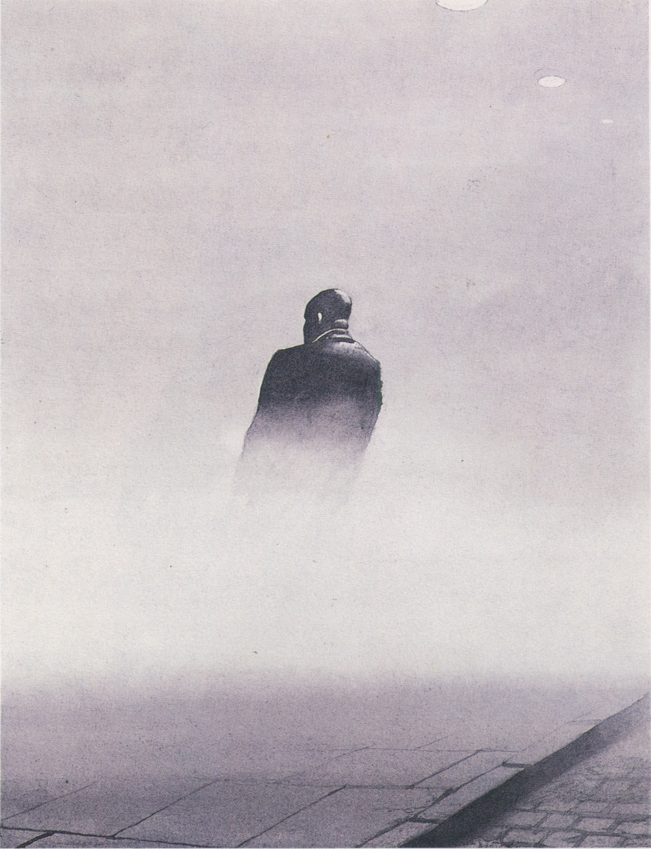
What the heck is happening here?


While some drawings aspire to clarity, others are enhanced by obscurity and mystery.

Carl Sandburg said, “Poetry is the opening and closing of a door, leaving those who look through to guess about what was seen during a moment.”

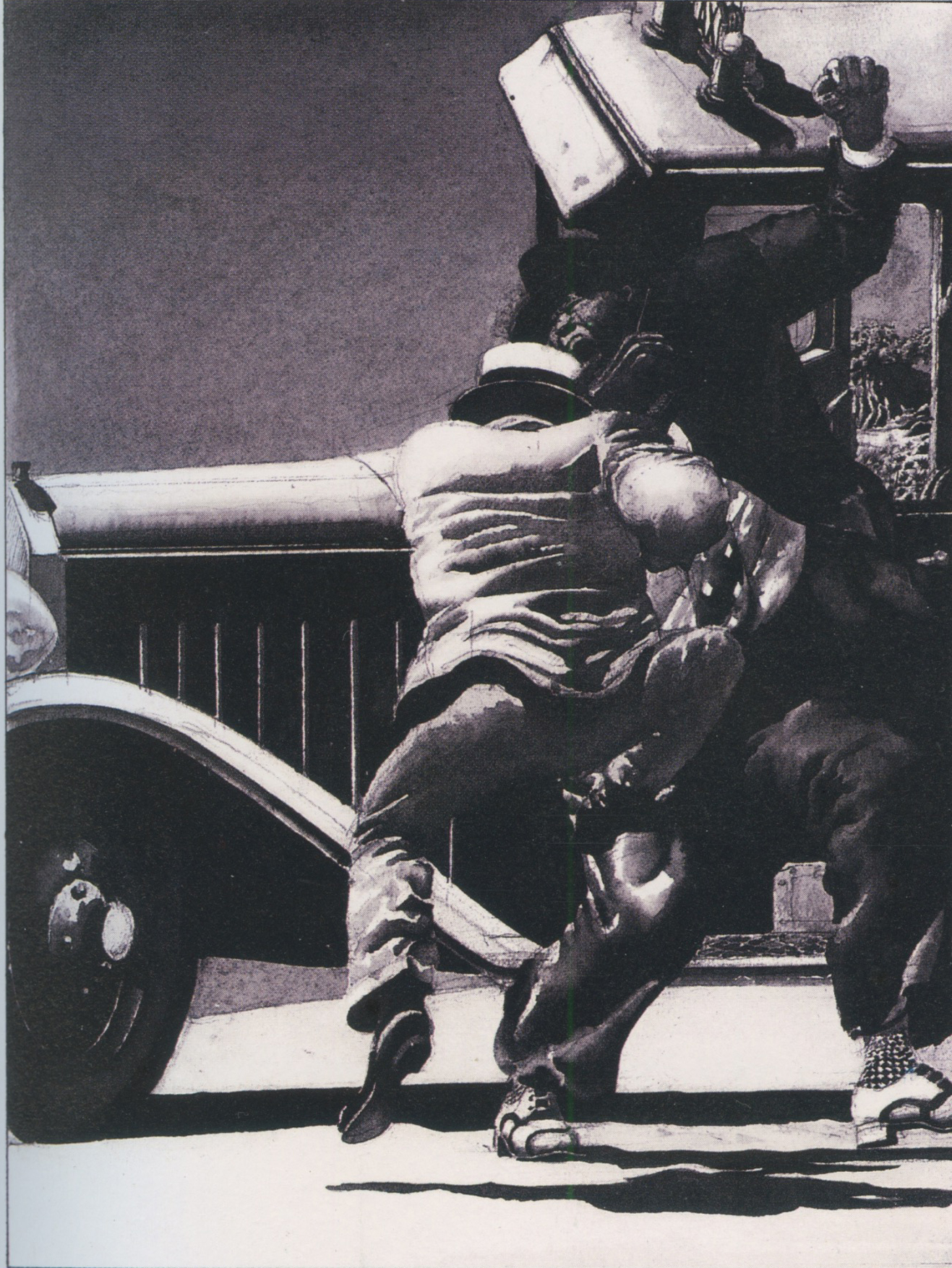
I enjoy the work of Hans Hillmann who was famous for his posters but who also created a number of shadowy noir illustrations for stories such as Dashiell Hammett's 1929 Flypaper.  Note how each of these illustrations is staged to leave viewers "to guess about what was seen."


In the drawings above, Hillmann has cropped out most of the elements that would normally be at the center of an illustration or concealed them with fog or shadow.  But it's important to note that Hillmann's approach doesn't rely solely on the omission of details.  He created many detailed, high resolution  drawings with elements ranging from faux wrinkles in clothing to complex patterns on socks.  This glut of details doesn't make the drawings any more comprehensible.


Many illustrators are celebrated for their ability to create highly realistic pictures-- a skill which is increasingly less impressive as more and more of the work can be accomplished with inexpensive digital aids.  But there is much to be said for artists like Hillmann who can cast a spell using an oblique approach.  


Sunday, March 05, 2023

STERILIZED DRAWING

 This month in 1858, Hymen L. Lipman was awarded the very first patent for a pencil.

The Patent Office requires a schematic drawing with each application.  The drawing must be plain, clear, and straightforward: a simple black line on a white background.  Any use of imagination is strictly forbidden.  No exaggerations, no color, no expressive variety in the line allowed.  

How much important information can be conveyed in such a sterile format?

Here is the drawing Walt Disney used to obtain a patent for his animation camera, 82 years after the patent for the pencil: 


Like the diagram of the pencil, Disney's schematic doesn't begin to convey the wonders that would one day flow from these inventions. 
  

Patent drawings may look sterile, but drawing is a centicipitous art form, and drawings which celebrate clarity and precision above all other virtues have a strength of their own. In his book, The Art of the Patent, Kevin Prince shows how patent drawings have developed a language for conveying information with a plain black line. Federal regulations have established these conventions for showing specific characteristics:


Looking at patent drawings, I enjoy those occasions when we catch a small glimpse of a human pulse.

Here, for example, some Walter Mitty draftsman just couldn't help adding a cool rock n' roller behind this guitar invention.

Scary!

And I'm sure the Patent Office didn't really require a drawing of a bathing beauty to understand how to hold a brush:

A patent artist's equivalent of Gil Elvgren


Even the most sterilized art forms can't quite conceal the mad passion in our blood.


Tuesday, January 31, 2023

LEARNING TO LOVE ORPHEUS

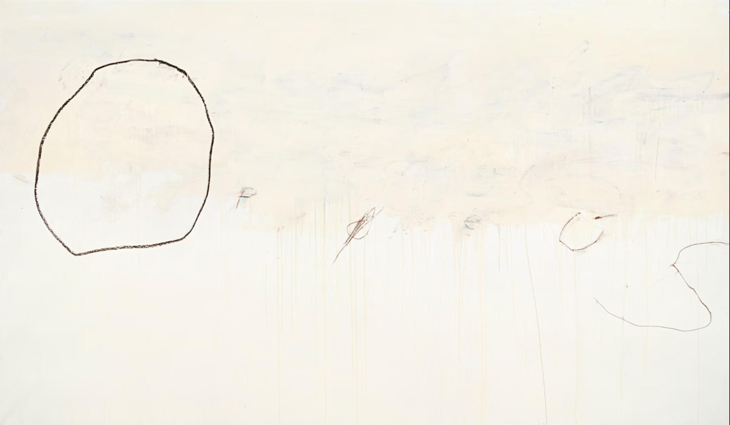
 I love Cy Twombly's drawing, Orpheus.  


Let's see if you can too.

____________________________________________

In times of uncertainty for painting, artists often revert to their primal roots in drawing to help find their way.  As curator Katharine Stout noted, drawing has long been the mechanism for strengthening the gene pool of fine art, contaminating it with strong graphic properties, bold notions from advertising and comics, structural strength from geometric and mathematical systems, and other impertinent strains.

As we've previously discussed, the 1950s witnessed a renaissance in expressive drawing using basic tools, such as vine charcoal or a lithography crayon. Artists who had long painted polished, realistic images using oil paint or gouache began returning to the simplest, most primal ways to make marks.

For example, Austin Briggs painted sophisticated oil paintings like this as they slowly went out of fashion...


... before finding new vitality in drawings such as this:


Artists such as Briggs, Eric, Sickles, Fuchs and Bouche led the revival of rough drawing tools. They persuaded the leading high end magazines to devote entire pages of prime space to charcoal drawings.

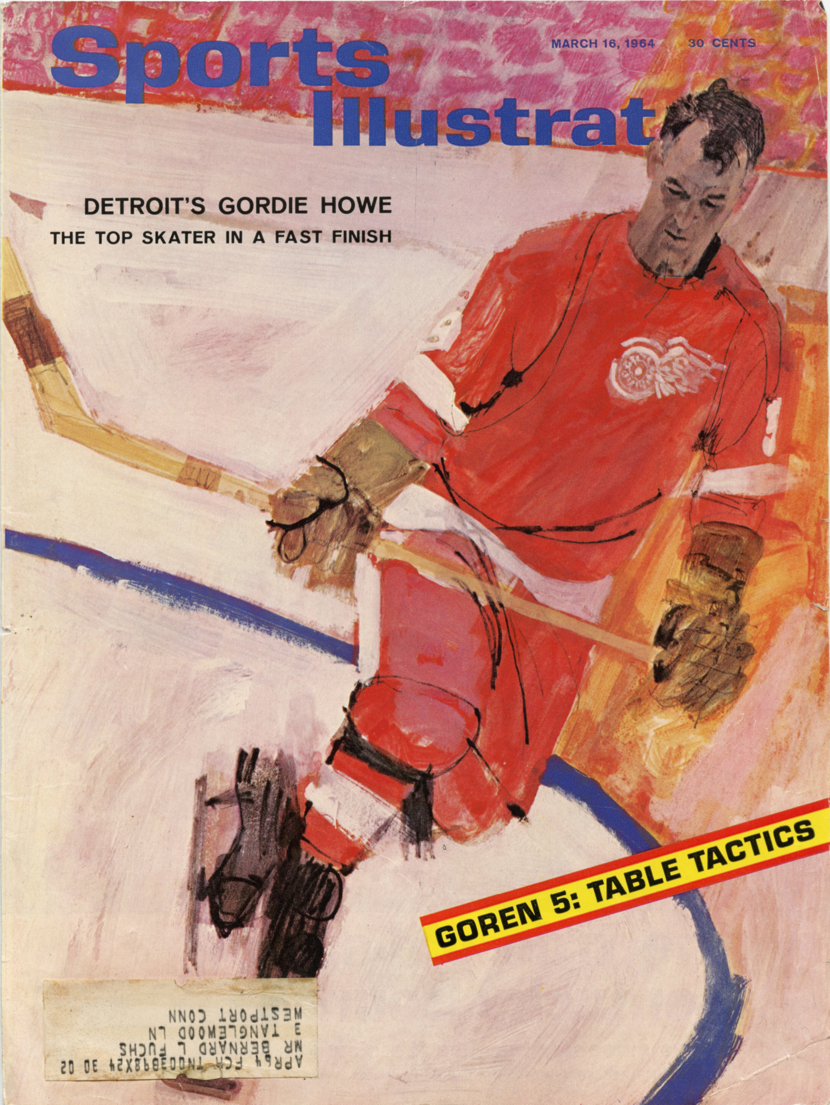
This 1964 illustration by Bernie Fuchs is a snapshot of what was gained from the reintroduction of line.  We can see the old world and the new world co-existing briefly side by side:


Fuchs painted the face of this athlete sensitively enough to achieve an excellent likeness...


Yet in the same picture, the rough black line has taken the stage. Look at what a contribution it makes to the painting! It is crude and brutish but transforms the image with explosive energy not found in academy painting. 


Notice how uneven the line is.  It might have been scratched into the painting with a lupine claw.


Fuchs' cover is an excellent example of that turning point in the evolution of illustration, with drawing and painting juxtaposed against each other in the same image, like a piano and a symphony orchestra juxtaposed against each other with the invention of the piano concerto.  People sat up and took notice of the new style.  Everyone wanted more.

The most important point to make about these accomplished artists is that, while they were trying to unlearn layers of technical facility and shed hard-earned muscle memory, their artistic taste and sensitivity remained undiminished and were in many cases heightened.

Look at a detail from this drawing by Briggs:


Briggs combines the directness, simplicity and immediacy of the crayon with an underlying sensitivity that persuades us he could perform brain surgery wearing mittens.

Fuchs was a master at marrying sensitive descriptive line with lines that appeared to result from a spasmodic twitch


Why? Because this is part of the physical delight of the drawing, just as impasto is part of the physical delight of painting.

______________________________________

This has been a long prologue to the reasons I love Cy Twombly's Orpheus but if any of you have accompanied me this far, I hope you'll be willing to come with me a little further.

Orpheus  195.7 x 334.5 cm. (1979)

Like the great illustrators, fine artists such as Picasso, de Kooning and Twombly spent a lot of time mid-century trying to unlearn stubborn conventions.  De Kooning experimented drawing with his eyes closed, trying to understand better the intuitive sources of art.  Twombly practiced drawing in the dark, recognizing that such drawings would lose many obvious qualities but interested in what he might gain. 

I approach the raw scrapings in Orpheus the way I approach the  rough crayon drawings of Briggs and Fuchs.  Walking away from realism (or perhaps chased away by photography) they have located lush qualities and brute design in the atomistic levels of  mark making.  They have focused our attention on the sensuousness of line through extreme simplification-- something academy painting could never do.


But "Ah," I hear you ask, "Do these childish scribbles really contribute anything?  I know the story of Orpheus, who descends into hell to rescue his wife, the beautiful Eurydice, but in what way does scrawling his name illustrate that story?  Where is the picture of Orpheus heroically fighting the demons of hell?"

I think this painting can stand alone as a lovely abstract design but if you're prepared to go beyond form and look for content, it's there in spades.  You won't be able to read it like a story in The Saturday Evening Post; it must be approached more like a fragment of an ancient, time-worn text.
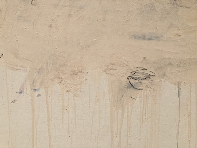
The hero partially obscured by the sifting sands of time


It helps-- but is not essential-- to know that Twombly was obsessed with the ancient poets Virgil and Ovid and loved Greek and Roman culture.  He lived in Italy, in an apartment filled with ancient artifacts.  So he well understood the story of Orpheus and its implications for hope, tragedy and mortality.  
Even without that background, we don't need a separate written explanation to understand meaning inherent in the visual forms.  I couldn't do better than to quote the description by art critic Sebastian Smee:
...a giant O takes up the left part of the canvas. The remaining letters, smudged, and mostly erased, spread to the right and downward, like descending notes on a musical stave. There is a sense of resignation or fade-out in the script's formation, as if the word were not worth completing, the gods having long since departed. But the letters' placement also conjures Orpheus himself descending to the underworld to retrieve his beloved Eurydice.
This is a level of symbolism and beauty that is different from traditional illustrations of stories, but is a fitting experiment for a new generation.


Twombly, a lover of antiquity, was adamant that he wasn't trying to cast off tradition with his innovations.  He said, “what I am trying to establish is that modern art isn’t dislocated, but something with roots, tradition, and continuity.”