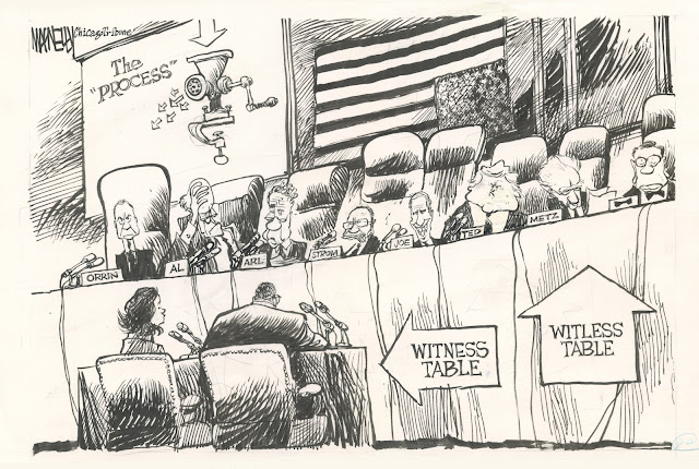
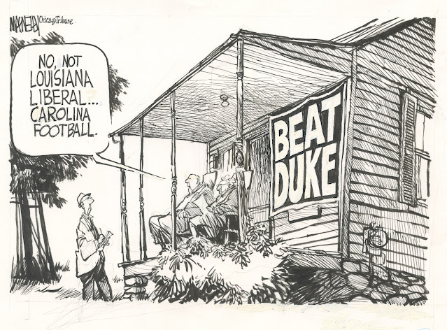
There's a lot going on in this political cartoon by the great Jeff MacNelly.
Using three point perspective, he fits important information neatly through each of the three windows of the ambulance; he wraps lettering and symbols at orthogonal angles around the different vehicles (even respecting the curvature of the motorcycle gas tank); he foreshortens the figures at the end, while decreasing the size of the text in the word balloon; and he even has energy left over to draw the ambulance's front wheels at a different angle than the rear wheels.
It's hard to draw with that kind of precision and detail while still keeping the drawing lively and spontaneous but MacNelly manages it.
MacNelly pulls off the same trick with this next cartoon: recognizable caricatures of eight different senators, sitting in chairs at eight distinctive angles, surrounded by a variety of embellishments.
Even this third cartoon, which appears much simpler, is crafted with a watchmaker's precision.
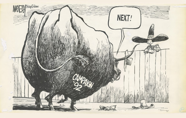
Note the beautifully constructed face of the threatening bull: with only a reverse 3/4 profile to work with (partially obscured by a drooping ear) MacNelly does wonders with that deadly eye, the curl of the lip showing uneven teeth, the hair on the chin and the ring in the nose. Who can draw like this today?
The figure of Perot is tiny in the background, yet his ultra-simplified likeness is convincing, and details such as the rodeo gloves and the big hat are remarkably effective for their size.
Many artists who are able to exert this kind of control let the control dominate the picture. Not MacNelly; his drawings were always jaunty and friendly and informal. How did he do it?
For one thing, look at how he darkened that bull. It's one wild scribble:
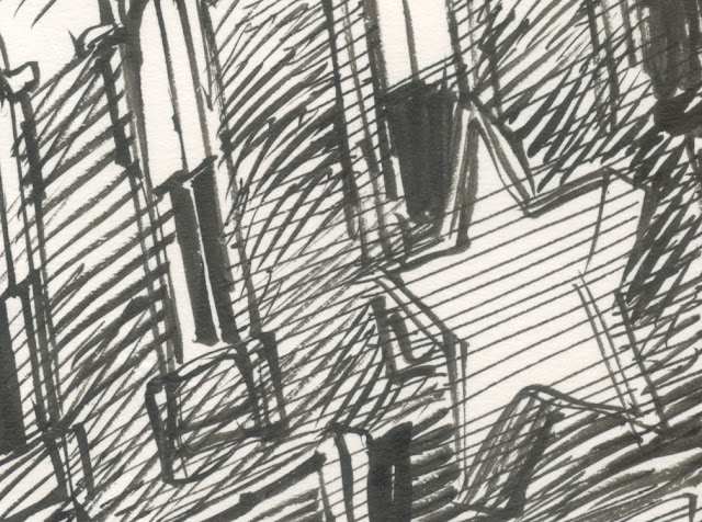
Even when he's drawing something like the shade on the side of a flat wall...
... he doesn't use consistent lines. No gray screen, zipatone or even cross-hatching here.
These disorderly, unsystematic lines infuse his drawing with life. Compare MacNelly's loose approach with the work of other masters of "control," such as Franklin Booth, Virgil Finlay or Reed Crandall. Compare it with the antiseptic technical drawing of Chris Ware and his legions of followers.
Here's another drawing with a level of detail that might prove deadly in the hands of a less certain artist:

MacNelly pulls the same trick shading that wall:
But he has other tricks too. If you're going to draw 16 distinctive people in a line, with their heads cocked at different angles and wearing different hats, you don't want them to serve as an anchor weighing down your drawing, you want them to contribute energy. I love the way MacNelly smears this crowd together with line, and draws them hugging the curvature of the earth.
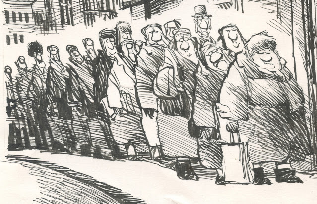
It's hard to think of a more dynamic way of drawing a crowd of patient people waiting in a long line.
Today's shrinking newspaper industry offers so few platforms for artistic talent. Heaven knows what MacNelly would be doing as an editorial cartoonist in today's market. But looking over our shoulder at his dazzling drawings, we get a renewed sense for what good drawing once contributed to journalism, and might contribute again.