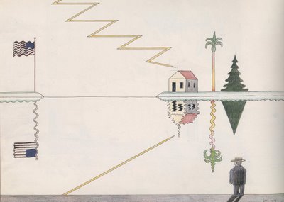
© The Saul Steinberg Foundation/Artists Rights Society (ARS), NY
Saul Steinberg was one of the greatest illustrators of all time. He was so damn smart you could warm your hands by the intellectual glow from his drawings. Yet, his content never overpowered his visual images; they worked hand in hand. Art critic Robert Hughes wrote that Steinberg exhibited a form of "graphic intelligence that had not been imagined in American illustration before him."
This lovely drawing is not one of his more famous or elaborate images, but I selected it because it shows with the most reductive images how Steinberg's mind engages with the elements of the world. As he scans the horizon line, Steinberg plays with the fact that water makes straight things crooked, and uses that fact to make crooked things straight (the evergreen, the lightning bolt) and ends with the coup de grace: the straight flag pole is now corrugated but the waving flag has become straightened!
Steinberg's art could never be expressed by words or images alone. He really required the marriage of the two. Illustrators traditionally capture words in images but Steinberg was probably the 20th century's leading example of illustration as a unified art form.

5 comments:
I am reminded of the work of Guy Billout - but I guess Saul Steinberg did it first. Fantastic post, David.
I can appreciate it intellectually, but it's hard to love it. The more bravura drawing styles of Fawcett and Briggs appeal to me on more levels.
I understand your point, Bob. It does not show up in this particular drawing, but one of the reasons I really like Steinberg is that some of his other work does have much more of a bravura side: grand, sweeping calligraphic flourishes in dense black ink, lovely watercolor horizons and personal fingerprint smudges. They are very different from the light drawing featured here. I just liked this one because it distilled a very rare attribute to its essence.
Neat. That's about all this illustration does for me. I'm not saying I don't like it, but it does remind me Chris Ware. I'd love to have things pointed out that I'm missing, but to me it's just a one-note drawing.
That's a fair comment, Jeff. In a way it is a one note drawing. Steinberg did many drawings that were a full symphony, but I picked this one to try to isolate that one note. In my opinion, it is a pure, beautiful and true note, like something plucked on a long ago lyre.
As for your analogy to Chris Ware, I also picked this drawing to show that I have no grudge against simple, mechanical line drawings of the type that Ware does. It is possible to do great work in that general style. However, I would distinguish Steinberg's drawing from Ware's work in three important ways. First, Steinberg has a much better sense of design. Second, Ware requires a mountain of drawings to come to a mole hill of a conclusion; one has to sift through page after page of his repetitive drawings to get much sense of movement. Steinberg, on the other hand, is a master of economy who draws immense ideas with a light and elegant approach. Finally-- and perhaps this is a matter of subjective taste-- I think that Ware has a very adolescent, self-centered, whining focus while Steinberg deals brilliantly with grand themes in the fresh air. Ware leaves me feeling stultified, while Steinberg leaves me feeling ennobled.
Post a Comment