Thursday, April 16, 2020

PLAGUE ART, part 4

John Cuneo has a mind and sense of humor that are, in my opinion, unique in illustration today.  As far as I know, they're unique in the rest of the world too.

Detail of a sketch on the back of a menu from the Bear Cafe
The internet is flooded with artistic responses to the coronavirus.  Some are more interesting or illuminating than others.  As you'd expect, there's a huge amount of repetition and overlap.  But Cuneo overlaps with nobody.  Every time you go to his instagram page you know you'll see something you haven't seen anywhere else.

The following are some examples of Cuneo's perspective.  Beware!  Because it is Cuneo they are VERY NSFW.  But Cuneo uses sex the way Hitchcock used suspense-- a seemingly "lowbrow" vehicle that a master can employ to deliver powerful, trenchant statements of a high order.

Look how smart this joke is:


Cuneo bypasses the predictable joke that men are such pigs that-- even in the face of a deadly worldwide pandemic-- they think only about one thing.

He also bypasses the predictable joke that the man is so selfish that he wears a mask but cuts a hole in his partner's mask because some things are worth the risk to your partner, y'know.

He even bypasses the joke that his partner understands what a loathsome fellow he is;  she doesn't even bother to yell any more, or look up from her cell phone, she just gives him a sidelong glance with a world weary expression on her face.

Any one of those ideas would be a punchline for one of the better cartoonists today, but they are just way stations for Cuneo on the path to the woman's calm, understated request for the scissors.  What a marvelous statement about human nature, both male and female, in the face of the virus.

Here's another drawing about human interaction during the plague-- a different kind of "safe sex."


But Cuneo is particularly good at depicting lives of quiet desperation that people are experiencing after weeks of isolation at home:


Cuneo is one of those rare artists today who doesn't use a loose, scratchy style to evade scrutiny.  Study the faces on that last drawing above to see how carefully he captures the pathos of the unfeeling husband and the despondent wife.


The hunched shoulders, averted eyes and body angle fend off any attempt at human interaction


One might argue that Cuneo's distinctive voice is in the tradition of R. Crumb, but I think Cuneo is smarter, funnier, and better at drawing.


Thursday, April 09, 2020

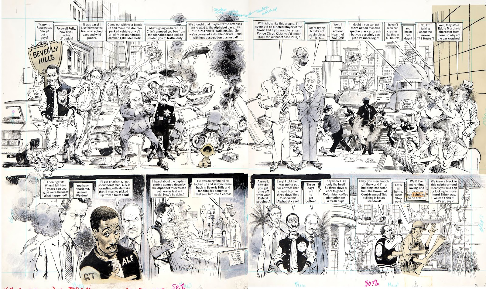
MORT DRUCKER 1929-2020


Last night the great Mort Drucker-- one of the few true geniuses of 20th century comic art--  passed away peacefully.  He left behind a legacy of brilliant art that influenced, and will continue to influence, generations of young artists.


Drucker was such a humble, gentle soul, I could never quite figure out where he found the drive and ambition to stay at his drawing board creating hundreds of beautiful stories, decade after decade.  He was the opposite of competitive, as generous and open minded an artist as I've ever known.  Yet he held himself to excruciatingly high standards as he crafted his marvelous drawings, working out likenesses for his caricatures and populating his pictures with details and humor that reflected his abundance of spirit.


His work inspired a vast and diverse array of artists.  Oil painter Phil Hale said that his ambition in life was once to go work for Mort Drucker at MAD.  And it was widely reported of painter Jeffery Catherine Jones, "if Jones wanted to emulate any artist in his youth, it was probably Drucker and he wrote him fan letters asking questions about the types of pens he used and how he approached illustration assignments."

This wonderful anecdote from Mort's obituary in The Washington Post reveals his influence:
A 1980 spoof of “The Empire Strikes Back” — portrayed by Mr. Drucker as “The Empire Throws Up” — prompted a nasty letter from lawyers representing director George Lucas. They demanded all profits from that issue of the magazine and asked that the original art be turned over or destroyed.  Publisher William Gaines sent them a copy of a letter received days before from Lucas, in which he gushed about the Mad parody and praised Mr. Drucker as the “Leonardo da Vinci of comic satire.”
The art world won't see Mort's like again.


Drucker and his family at his induction into the Society of Illustrators Hall of Fame 


Saturday, April 04, 2020

PLAGUE ART, part 3


Man Throwing Up  by David Lynch
Before David Lynch became a master at making unsettling, creepy films he was a master at making unsettling, creepy drawings and paintings.  He did an entire series of ill, vomiting figures:


This next one is called Six Figures Getting Sick:


From the same series:


I like Lynch's pictures, starting with his early, unconventional comic strip, The Angriest Dog in the World:


Detail

I think he brings a horror to his subject that more skillful artists have missed in the previous pictures I've offered.  This is not because Lynch explicitly paints vomit.  To the contrary,  I think his real strength is taking the most normal, innocuous elements and assembling them in a way that becomes far more ominous and unnerving than any pictures of dead bodies or skeletons.

For example, this next picture is called, She Was Walking to Her Home and Then There Was Someone.


Yikes!

Another example: There is Nothing Here.


Or the unnerving, Who Is In My House? which summons feelings of mental patient level paranoia.


Even words as bland as This Is My Truck become transformed by Lynch's images.


Who would've guessed that such harmless elements could be combined to create such a tone? And if such meanings can lurk beneath such safe concepts, what else is at risk?

The point is, an artist doesn't need to show circling vultures or blood and guts or skeletons...  a nondescript blob on a flat red ground can be more effective.


Monday, March 30, 2020

PLAGUE ART, part 2


The last post suggested that when it comes to depicting a plague, a literal, realistic approach usually falls short.  The examples I posted, and the better examples suggested by commenters,  suggested that mere accuracy is not the best tool for a topic such as this.

As one commenter suggested, imaginative symbolism seems better suited:


Edgar Allen Poe's Masque of the Red Death provided ample inspiration for illustrators such as Harry Clarke to anthropomorphize the concept of death:


The talented John Hendrix also used pen and ink, but with touches of color, to create this different and interesting approach:


Note how Hendrix enhances his symbols with words...

The pride of man coming to naught


I've often criticized today's illustrators who resort to words because they are incapable of drawing.  In my view, Hendrix is an illustrator who gets it right.  His words aren't a crutch, they are an enhancement.  They don't make his pictures more literal, they add an element of mystery and obscurity.

In the following illustration of the plague in Manchuria for a 1911 cover of Petit Journal,  the inclusion of a lot of unnecessary details (such as folds in clothing and rocks on the ground) distracts from what might otherwise have been a dramatic image of the plague personified:


Arnold Bocklin had a better sense of priorities.  With fewer details and less precision, his vision of the plague nevertheless seems more creepy and chilling :


But when it comes to anthropomorphized death, few can compete with the famous Triumph of Death by Pieter Bruegel the Elder, who lived through the black plague in the 16th century.


Friday, March 27, 2020

PLAGUE ART, part 1

Stanley Meltzoff painted this excellent image of the plague in Athens for Life Magazine in 1963.


Was there ever a plague with a greater cultural impact in all of history?

In the fourth century BC, Athens was busy inventing western civilization.  It was in the middle of creating the foundation for philosophy, science, art and politics when it was interrupted by the plague.

The plague in Athens by a Neapolitan artist
 A century earlier, the Greeks had the great epiphany to tie mathematics to reality and fashion an objective science that would alter the relationship between humanity and the world.  As one historian noted, this inflection point was
the point of departure, where it was decided which direction the road will take.  Before that decision, the future orientation of Greco-European civilization was still undecided: it may have taken the direction of the Chinese, or the Indian, or pre-Columbian cultures, all of which were still equally unshaped and undecided at the time of the great sixth-century dawn.
With that choice behind them, Athens blossomed into its golden age, with the great Socrates, Plato, Aristotle, Euclid, Archimedes, Pericles, Sophocles-- and an array of brilliant innovators the like of which the world had never seen.

Who knows where Athens might've gone if the plague hadn't intervened? Devastated by the plague, Athens lost the Peloponnesian War.The plague wiped out Pericles (whom historian Rufus Fears called one of the three greatest democratic statesmen in the history of the world) along with 1/3 of the Athenian population.  Thucydides wrote, "the catastrophe was so overwhelming that men, not knowing what would happen next to them, became indifferent to every rule of religion or law.” The trajectory of Athens was altered by panic, disintegration and military defeat; great minds such as Plato's took a turn toward the authoritarian.  Concepts such as "honor" assumed a different meaning in a society where life was so perilous and unpredictable that reputation no longer mattered.


Thousands of years later, we are still poorer for what the plague did to Athens.

How can art possibly capture the character and magnitude of that loss?  In this 1652 painting of the Athenian plague, artist Michiel Sweerts attempted to use the tools of realism to convey the horror.  

The Plague in Athens by Michiel Sweerts
Despite Sweert's obvious technical skill and attention to detail, I find this painting a sterile and unsuccessful effort.  Over the next few days I'd like to discuss better attempts to use art to react to the plague.


Tuesday, March 17, 2020

EXCELLENT NEW BOOK ABOUT STANLEY MELTZOFF

Dan Zimmer at The Illustrated Press has just released an excellent new book on the legendary Stanley Meltzoff.

Meltzoff was unique among illustrators.  A fierce intellectual, he wrote a 400 page, carefully researched book entitled Botticelli, Signorelli and Savonarola; Theologica Poetica  from Boccaccio to Poliziano for Biblioteca Di Lettre Italiae Studi E Testi XXXIII.  He also wrote scholarly articles such as his "Rhetoric, Semiotics, and Linguistics Look at the Strolling Actresses of Hogarth" in New Literary History, A Journal of Theory and Interpretation.

Yet, Meltzoff was no mere academic.  He initially became famous for his steamy covers for potboiler novels. 


Below, a preliminary study for Act of Passion from the new Meltzoff book.  (Note how in the final version the man's hand has been removed from her throat and her hand now pulls him toward her rather than tugging him away). 


He later moved on to illustrating exciting science fiction and historical novels.  Below, two paintings of courtesans, one from ancient times and one from a New Orleans bordello:


As far as I'm concerned, the apex of Meltzoff's career was his historical series of paintings for Life Magazine, National Geographic and other premier publications:


But Meltzoff continued after this phase to become the country's leading painter of fish:

I wasn't sure how any author was going to do justice to a roving intellect such as Meltzoff's, so I was especially pleased to see that the text of the book is a series of essays by Meltzoff himself.  Especially rewarding is Meltzoff's essay at age 89, "Metamorphoses of a Fishpainter."

This book is a well deserved and long overdue monument to a substantial talent.  

Saturday, March 07, 2020

FEARLESS INKING


India ink is an Old Testament god.

It is unforgiving and irrevocable.   Artists may plead for mercy, but ink permanently records their every shortcoming and uncertainty.  Watercolor will let you renegotiate your choices.  Photoshop will let you reduce the opacity of that layer, guilt free.  But ink obliterates everything, everywhere it goes.

That's why beginning artists, if they are wise, fear ink and try to control it with a rapidograph or a no. 3 brush.  That's also why experienced artists who can draw quickly and confidently with ink are so inspiring.

Consider the terrific drawing by Joe Kubert, above.

In his 70 year career Kubert drew many thousands of pictures under tight deadlines.  During that long apprenticeship he and ink grew to become close friends; he learned how to make the most of ink's liquid qualities and to achieve powerful effects with its dense blackness.  Look how beautifully he controls the structure of this face with just a few loose dabs:


You can't work with that kind of speed and simplicity unless you've already thought out the concave shadows of cheekbones, the receding plane of the chin and the unity of the shadow on the neck and face.  These were strong choices and once made they could not be revisited because the choice wasn't there any more.

I also love the marvelous ink on that skirt--


What character! What personality! What a facility for hydrology! That free flowing ink captures the free flowing skirt in a way that a rapidograph or dip pen never could. Notice Kubert's courageous decision to completely blacken both arms and the shawl.  Turning them into silhouettes was a key dramatic choice for the picture.

And speaking of staging, it was smart to convey a dead body by showing only the feet projecting from the back of a cart, but it was brilliant to direct our attention to the woman by placing her face between those two feet: 


These are the choices of a master who has spent decades figuring out how to make the most out of the limited space in a comic book panel.

 Each of these choices could've easily gone awry as the result of a misplaced brush stroke or even a last minute failure of nerve. Yet Kubert pulled it off like the pro he is.  Ink may seem like a simple binary choice-- black or white-- until you experience its richness in the hands of an artist like Kubert.

Saturday, February 22, 2020

ONE LOVELY DRAWING, part 62


 I think Kathe Kollwitz is one of the most powerful and commendable graphic artists of the 20th century.

She faced a difficult life with courage and purpose, and became famous for her compelling images of injustice, war and poverty.  

This week I'd like to showcase this lovely etching, which was the model for the cover of William Faulkner's 1929 novel, The Sound and The Fury:


Recently we discussed the 20th century move away from representational, narrative art and toward conceptual art which aspired to a higher role: capturing "abstract meaning and phenomena not easily described by literal representations." Conceptual illustrators usually lack the technical skills of their predecessors; they tend to deal more in flat, simplified visual metaphors and other nonliteral approaches which don't compete with a camera.  The conceit was that these new styles were more suitable than traditional skills for depicting today's "sophisticated concepts"

As far as I'm concerned, this lovely drawing by Kollwitz single handedly proves there is no reason why technical skill can't play a key role in grappling with the most profound concepts.

Kollwitz doesn't show us a mere cliché of a skeleton as the grim reaper. With brilliant staging, she shows us the methods of the grim reaper: coming from behind, attaching itself like a barnacle and slowly weighing down-- and wearing down-- its victim.  It pulls her backward into the darkness while her muscles strain futilely for life. 


In front of her, oblivious to the existence of death and insensitive to the mother's pain is young life-- selfish, grasping and also weighing down the mother caught between them.  This is no candy coated vision of children for a popular fiction magazine, this is the greed of new life, doing what nature instructs it must do to preserve itself.


Here Ms. Kollwitz's drawing skills contribute important subtlety and complexity of staging that could never be achieved by a conceptual artist from, for example, the renowned Pushpin Studio.  In addition, her drawing skills contribute immediacy and emotional poignancy to the drawing which I simply haven't seen from her conceptual illustration counterparts.

If any of you fans of conceptual illustration out there can offer examples to prove me wrong, I'd love to hear from you.

Thursday, February 13, 2020