
Pryde and Nicholson brought very different perspectives to their partnership. Pryde was tall and heavy, while Nicholson was short and thin. Pryde grew up in a noisy, eccentric household of "violent views" while Nicholson was raised in a "gentle, well-bred, well-mannered atmosphere." Pryde was outspoken and gregarious, while Nicholson was quiet and detached. Pryde worked very casually while Nicholson was serious and driven. Recalled Pryde, "our opinions on artistic matters differed widely."
If those weren't enough causes for friction, Nicholson fell in love with Pryde's younger sister against her mother's wishes. Colin Campbell's excellent book on the Beggarstaffs reports that "after a courtship conducted largely, it seems, among the coalsacks in the cellar of the Pryde's Bloomsbury home, the couple married in secret at Ruslip on 25 April 1893."
Who could ask for a better foundation for an artistic partnership?
Yet, their clashing perspectives seem to have stimulated them to abandon the dominant styles of their day in favor of a radical new approach. The Beggarstaffs transformed the history of poster art with a series of bold, simple designs using flat images and silhouettes.


In 1896, an arts magazine interviewed the Brothers on their technique:
One of us gets an idea, said Pryde. We talk it over, the other suggests an addition, the matter is reconsidered, perhaps shelved away for months. Finally we draw the design very roughly with charcoal on big sheets of paper, and then place the lines and masses in their places on the groundwork, which is generally of ordinary brown paper.Like Matisse after them, the Biggerstaffs found that it helped simplify their designs if they worked with shapes cut out of colored paper.

Not surprisingly, Pryde maintained that a pen knife was best for this purpose while Nicholson favored scissors.
The Beggarstaff team only stayed together for three short years. They were a commercial failure, as clients were not sure what to make of these bold new images. But their designs became hugely influential with artists in Europe and America, and helped usher in the Early Modern era which replaced the highly ornate art nouveau and arts and crafts movements.
Pryde and Nicholson separated, turning to painting and other artistic pursuits to earn a living. They never again succeeded in achieving the quality they found during their brief but remarkable collaboration.


33 comments:
:')
i'm familiar with the posters - esp. the hamlet and queen victoria ones - but knew nothing about those who created them!
many thanks for this :)
So who was/were the inspiration(s) for the poster artists like Ludwig Hohlwein? This seems to glide right into the style of him and his contemporaries.
These English Beggarstaffs were the real starting point for modern design.From them came Lucien Bernhard and Hohlwein and the Bauhaus.
Huda Tula-- right back atcha!
Claire-- Thanks for weighing in. Yes, some of these images have been circulated widely and show up in the reference books, and yet the story of the Beggarstaffs does not seem to have received the attention it deserves.
Kevin-- the Beggarstaffs seemed to begin the whole transition to the "early modern" era at a time when art nouveau was still riding high everywhere else on the planet. Not just Hohlwein but Otto Wagner, Charles Mackintosh and (as Tony points out below) the great Lucien Bernhard followed the Beggarstaffs away from labored adornment to the simplified, powerful graphics of the "object poster" (sachplakat).
Tony-- I agree. Their accomplishment was quite extraordinary. Two young men in their twenties came together and changed the path of modern graphic design, then found they couldn't make a living doing it and broke up to do other things.
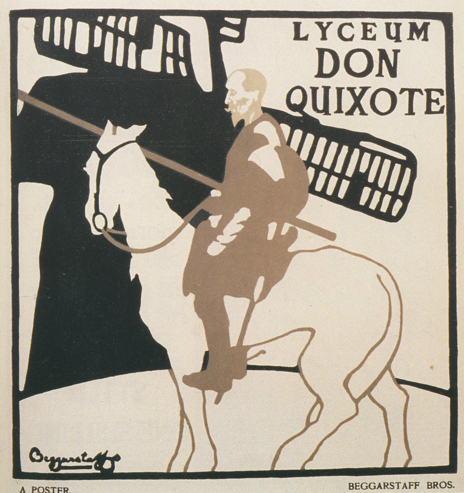
They even tried designing posters for generic products and taking them around to sell to prospective clients but had few takers. They never got paid for that brilliant Don Quixote poster. How did they accomplish such a leap forward? It's hard to say, but I suspect the fact that they came from such different perspectives enabled each one to challenge the assumptions and the blind spots of the other, and come up with something fresh.
Too loose on the dates? 1892
That's some simple but VERY effective graphic design.
Being different can often work to good advantage! Here is another example where differences created optimal results...
Jack Sprat could eat no fat,
His wife could eat no lean;
And so betwixt them both,
They lick'd the platter clean.
Kev Ferrara-- when the Brothers were asked later in life to name their influences, they ignored all of their English contemporaries and said that only one artist really understood posters-- Lautrec. They loved his work. Late in his career, Lautrec began to simplify his style for posters, and I think it's fair to say that the Brothers carried it on from there.
Max West-- Exactly. Making it simple took longer than making it detailed, but it sure packs a punch.
StimmeDesHerzens-- yes, the Brothers must have looked like Laurel and Hardy together.
Nicholson was certainly a capable realist.
There is a book on the Beggarstaff posters by Colin Campbell (1990).
Nicholson's "London Types" are here, , and his alphabet is here.
I imagine the growing popularity of Japanese woodblock prints among western artists had an influence on their design as well.
I agree that Pryde and Nicholson did their best work as the Beggarstaff Brothers, but they both went on to do good things as individual artists. Nicholson produced some superb still lifes and near-minimalist landscapes, while Pryde painted some wonderful stagey-looking interiors and townscapes.
Etc etc-- Sometimes the hardest part of being an effective lawyer is knowing when to restrain yourself from saying something you'd like to say. Similarly, I suspect it can be more difficult for a capable realist to forego using his talents he knows.
Matthew Harwood-- those Japanese woodblock prints were distilled essence of composition; it's hard to imagine anyone seeing them and remaining unaffected by their gravitational pull. Certainly Lautrec, who influenced the Beggarstaffs, was explicitly influenced by them. Plus, all of England was going nuts over Japanese culture (Gilbert & Sullivan's Mikado was wildly popular a few years earlier). But if the Beggarstaffs ever talked about woodblock prints, I am not ware of it.
Desmond-- I agree, they both did respectable work later in life (particularly Nicholson) but I think it's fascinating that the work that really caught fire and established their worldwide legacy was from those three unprofitable years as young men.
I like the first and last posters but the ones in between not so much. I think they fall far below he level of a Lautrec. The Rowntree's poster seems especially dull, almost no sense of tempo to the line and the orientation of the heads seems to lead you no where.
Hamlet seems dull also, no real run around the contour.
I think you find things of interest in other cultures (Japan, China or France) because you recognized something of your own nature in their works but imatating another culture is not the same as discovering your own inherent impulse in it.
I posted links to more of Nicholson's work, but the comment has not appeared.
Thanks, Don. I went back and checked, and for some reason blogger's automatic spam detector picked up on the link you attached. My apologies. I have now manually cleared your comments. I never hold anything back that isn't spam.
I agree with you about the Colin Campbell book, it is excellent. In fact I quoted a wonderful line from it in my post (about where Pryde courted his wife). Interested readers should check it out.
Tom-- actually, I am quite fond of that Rowntree poster. I think it shows us what a delicate balancing act true "simplicity" is. That heavy black shape of the gentleman's coat in the foreground would capsize the whole drawing if the Beggarstaffs didn't make it more interesting by scooping the silhouette of that tea cup out of it, and gently counterbalancing it with that solid black collar on the gentleman at the top of the picture. And the whole image wouldn't work without the irregular pattern on that red vest. Note how deliberately they use that aerated vest to break that heavy black shape into three interesting fragments, with the top hat and the exposed lapel peeping around the side. (What a catastrophe if they'd made the vest solid red!)
All of the shapes we're discussing-- the black coat, the pattern on the vest, the outlines of the other figures-- are heavily abstracted. They convey a familiar reality but on closer inspection you would not get any of those interesting flat shapes with a realistic drawing of a model.
I suspect it can be more difficult for a capable realist to forego using his talents he knows.
David,
I would guess that the more he valued design, the more he may well have found poster work more creatively stimulating and fulfilling than strict realism.
The hardest thing to do is to simplify.These posters are a model of restraint.
David Apatoff - But if the Beggarstaffs ever talked about woodblock prints, I am not ware of it.
"…The influence of Japanese prints on Pryde and Nicholson can be seen mainly in the pure, flat colours of the design. The rectangular panel in the upper right corner recalls similar panels in Japanese woodcuts…"
Description of A Trip to Chinatown in The Beggarstaff Posters, by Colin Campbell. Barrie & Jenkins. London,1990, p.38.
Etc, etc and Texen-- agreed.
Matthew Harwood-- Gee, I read that book. Obviously I should have read it more carefully.
I like the Hamlet (1897) as a concise statement of a figure, but design wise, and content-wise we are told nothing more than the figure. Nothing about the play, the character, or life as presented in the work. Just a figure floating in space. Innovative? Not by 1897.
The poster's main value is that it makes a good illustration in a graphic design history book, which then warps the true history of things in the interest of clear demonstrations of artistic eras or styles.
For Don Quixote (1896), similarly, we are given a configuration of the main symbols of the story and no more. Where is the whimsy? Where is the madness and zeal and the desperation? Have these guys read Don Quixote? This might as well be an ad for beer.
I like the last nouveau picture of the woman (1897), particularly the portrayal of the dog. But that is hardly innovative, given Beardsley's primacy and power in the same style.
I've read about the "brothers" but have never heard much about their influence. The influence of minimalism deriving from Bauhaus type social philosophies may have elevated these fellows historically beyond what is true: Cut-out effects preceded them, and the weak typography, silhouette blobbiness and lack of expression, imo, really don't match up artistically to Lautrec, William Henry Bradley, Edward Penfield, Beardsley, the Wiener Werkstätte group, Mucha, Lucian Bernhard, Hohlwein, The Stenbergs, Cassandre, Ragan, Bass, or Glaser, just to name the cream of the poster crop off the top. (Shep Fairey, they beat.)
Particularly, I think it churlish and deceptive of them not to mention Beardsley, Bradley and Penfield as influences. An argument can be made that they were simply knocking off the above names (along with Lautrec) and doing a rather bad job of it.
(Speaking of churlish, I want to emphasize that I enjoyed reading your post and being reminded of these artists, even though...)
Kev, I agree with you on the Hamlet poster which, notwithstanding its date, was their very first collaboration, before they even adopted their pseudonym or decided they could could work together. I disagree with you on the Don Quixote poster, which I think is superb. The only Beardsley image I like as much is Ali Baba, which is decidedly different in style. For an interesting analysis of how the names you mention come together, check out Heller and Chwast's great reference work, "Graphic Styles From Victorian To Post-Modern." You will note that when they bid adieu to art nouveau and turn the page into the early modern era, the very first example they offer is that Don Quixote poster.
Further reading reveals that the Beggarstaff Boys' Hamlet poster made an exhibition at the Royal Aquarium in October 1894. It was used as a theater ad in August of that year, their first work, as you say.
Apparently the Hamlet poster was the only finished BB poster in a sea of French poster artists (who dominated the show) and other already well established names like Penfield whose work made the trip across the Atlantic for the occassion.
Among these stars, it hardly seems likely that that Hamlet poster would garner attention. Maybe it was the only drab poster in the whole place? Or the only English one?
The Don Quixote poster, (which I like, even though I don't think it is a good advertisement for a production) appears all over now to demonstrate the Beggarstaff style, yet was never used for the production and never saw the light of day until it became a collector's item decades later.
I can see how in their better works the heavy black in flat masses and the rough cut feel seems a contrast to the heavy black in swirling masses of some chic nouveau with its smooth and delicate renderings. But the daylight between them and artists like Penfield or Felix Vallotton seems minimal. I think the style was just in the air.
Do Heller and Chwast posit the spread of the Beggarstaff influence into German graphic design coming through Emil Orlik and Jugend?
Incidentally, in Spain, Art Nouveau was called Modernismo.
Hi David
"They convey a familiar reality but on closer inspection you would not get any of those interesting flat shapes with a realistic drawing of a model."
I am not quite sure what realistic drawings means, but the reason a Lautrec poster looks so good, I think, is because he thought of his shapes as volumes first. I think if you silhouetted the shapes of a Leydecker painting, you would have some amazing shapes because he too thinks in terns of volumes. Or the volumes create the shapes.
I feel like there is too much empty space around Hamlet, in an uninteresting way. But after reading what you wrote about the Roundtree poster I started to gain some affection for it.
Thanks for all the great post David.
wow really cool. reminds me of this kid>
LondonAir
Nicholson was more than a "capable reealist". He produced some very,very good paintings. He carried much of the design rigour of the poster works into these paintings. I can still remember as a child wandering through the Tate in London and stopping in my tracks to look at the painting he did of a plate and knife. Simple themes but with an inner monumentality.
I think you're right.. I've never seen these posters before, but somehow I see traces of modern design elements within their composition. In an odd twist they sort of resemble the contemporary vector art of today, using solid spaced colors and masked details.
This information has been a very uselful reference for my historical graphic studies project, and I agree, more should be know about such a talented pair of designers. It's so hard to find a good article talking about their work over the years - Thanks!
Let's take the De Kooning now. Assume it is 5% of a larger canvas. What is the larger picture? A fisherman's slicker in the rain? What, I wonder?
Post a Comment