Sunday, March 29, 2009

BERNIE FUCHS

In 1958, a staff artist worked patiently in a back room at the famed Cooper Studio in New York, retouching the Pepsi Cola logo on a stack of illustrations. He came to an illustration by a new, unknown artist and stopped dead in his tracks.

Illustrator Murray Tinkelman, who also worked at Coopers, remembers receiving the call: "Hey Murray, come take a look at this." Tinkelman went over to see the new picture. "It was gorgeous" he recalls. The two decided to call in the superstars of Cooper Studios, Joe Bowler and Coby Whitmore. Bowler and Whitmore arrived together to inspect the new painting. Whitmore was "speechless." Bowler said, "I don't know who the hell did this, but the business is never going to be the same."

Bowler was right.


Young Bernie Fuchs arrived in New York and quickly set the field on fire. By the time he was 30, the Artists Guild of New York had voted him "Artist of the Year"-- an unprecedented achievement. His dynamic illustrations for magazines such as McCalls made him famous and attracted dozens of imitators.


So Fuchs was feeling pretty cocky by the time Sports Illustrated called him in the early 1960s to ask him to illustrate an article. Fuchs met with the legendary art director of Sports Illustrated, Richard Gangel. A tough minded visionary, Gangel gave Fuchs an assignment, but as Fuchs was leaving, added-- "Oh-- and I don't want that shit you do for McCalls."

Fuchs could have walked off in a huff. It would have been easy for him to continue working for other clients in the successful style he had already developed. Instead, he rose to Gangel's challenge and became even bolder and more innovative:


Image courtesy of Illustration House gallery


For a later issue of Sports Illustrated, Fuchs turned a portrait of the rather dumpy looking Branch Rickey into poetry.


Fuchs left behind all the imitators who continued to exploit the formula for Fuchs' earlier approach, and instead moved forward to grapple with new challenges. As illustration styles came and went, Fuchs' work was selected each and every year for more than 40 years by different juries from the Society of Illustrators as among the very best work produced that year. No other illustrator can claim such a record.

I am convinced that in order to accomplish what Fuchs has, you need both of the qualities demonstrated in the two stories above. You have to begin with great talent, sure, but perhaps even more important, you have to be prepared to take your initial success and re-invest it in new challenges. There is no guarantee that such a gamble will pay off, but if you are really, really good, that's what artistic success is for.


Sunday, March 22, 2009

SACRED WRITINGS

Some artists try to honor sacred texts by translating the holy words into pictures.  The result is not intended to be read like a conventional book, but rather experienced as visual art.


For example, some Korans from 17th-century Turkey, Iran and North India are so elaborate and ornate they are virtually impossible to read except as a visual embodiment of the beauty of the words. The finest artists, calligraphers and craftsmen embellished these books with gold and jewels to inspire reverence for the content.

When I was growing up on the south side of Chicago, a boy I knew was shot and killed on the school playground by older boys from a street gang.

Virgil White and I sang in the choir together. One night, he foolishly tried to take a short cut through the playground alone. The gang members shot him and left him bleeding to death on the cold concrete. Virgil managed to scrawl the names of his killers in his school notebook: "Greg Vincent and Chap Dog killed me." Then he was gone forever, like a wisp of smoke.


They found Virgil's bloodstained notebook clutched in his hand. Years later, I can't look at it without feeling a pang. The terrible beauty of Virgil's marks on paper still touches my heart more than the most lavishly decorated religious text.
Sometimes crude and hasty images are more inspiring than carefully refined ones.
Sometimes an accidental mark-- such as a bloodstain-- is a more powerful design than the work of great artists.
Sometimes the cheapest materials can create images of greater spiritual significance than images made from the purest gold.


Thursday, March 19, 2009

HUBERT GRAVELOT

[Note: instead of writing a blog post this week, I have been playing hooky corresponding with peacay whose great blog BibliOdyssey is a marvelous source of images. Peacay dug up some rare drawings by Gravelot which he generously shared with me, and to avoid work we agreed to post our resulting exchange on our respective blogs. Peacay contributed the intelligent and classy portions. I contributed the mouthy opinions.]

**This cross-posted collaboration features an attitudinal stimulus package by David Apatoff of Illustration Art with peacay of BibliOdyssey on image wrangling and cattle prod detail.**

Hubert François (Burguignon) Gravelot 1669-1773 trained in Paris as an illustrator-engraver under François Boucher and came to London in about 1732. He was friends with William Hogarth and they both taught at the St Martin's Lane Academy, something of a precursor to the Royal Academy. Thomas Gainsborough was known to have studied under Gravelot.

From France, Gravelot brought with him the ornate styling of the rococo, which he helped promote in his thirteen year sojourn in England. He contributed designs for goldsmiths, furniture makers and the commercial print trade, but his book illustrations - for luxury editions - were particularly influential. He illustrated Gay's 'Fables,' Shakespeare and Dryden, and was one of the first artists to illustrate the novel, designing engravings for Richardson's 'Pamela' and Fielding's 'Tom Jones.'

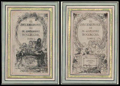
Of the ten images below, the first eight were preparatory sketches for the 'Decameron,' the second-to-last from a Voltaire compilation and the final image is from an unnamed collection (links at the end of the post).


I've been told that one way to measure the quality of an oriental rug is to count its borders. Generally, the more borders around the rug, the more complex it is, and the higher its quality. But I usually find the opposite to be true of drawings: the more fancy borders required to make a drawing look important, the weaker the drawing tends to be. The owners of these Gravelot pictures have surrounded them with up to 14 borders and embellishments (some of them in gold) before you finally hone in on his drawing. Even then, we're not done. Gravelot encircles some of his own drawings with yet another ornate border-- a decorative wreath bedecked with the tools of the arts and sciences, or the symbols of the theatre, or fawning muses overwhelmed by the brilliance of what the reader is about to behold. By the time you finally get through to the drawing itself-- the image at the core where the artist demonstrates what his hand and eye and imagination are capable of-- the viewer has some pretty high expectations.

Unfortunately, I don't see a whole lot here to suggest that Gravelot's drawings satisfy those expectations. These are light, capable drawings. I can understand people preserving and studying them for their significance to the history of the engraving arts, or the manners and customs of his day, but not particularly for the quality of the drawing. Unfortunately, the quality of the drawing is usually the part that interests me the most.


When Gravelot was drawing these pictures, his artistic choices were limited by the fact that the drawings would have to pass through a cumbersome engraving process that was already more than 300 years old. First, the drawing would have to be transposed onto a wood block or metal plate. Next, the plate or block was turned over to an engraver who attempted to carve the image into the surface using sharp and unwieldy tools. This process effectively prevented an artist from drawing in certain styles; Gravelot could not get too spontaneous or fluid with his line, or use half tones in his picture. Finally, the printed picture ended up as a mirror image of the artist's original drawing. The result of this arduous process was a picture several stages removed from the artist's concept.

Not long after Gravelot died, photoengraving replaced engraving as the technique for reproducing art in books and magazines. The new technology set artists free and transformed the entire field of illustration. Delicate nuances in line, subtle gradations in color, detailed images were all reproduced with much greater fidelity, permitting artists to do their very best.


Gravelot may have played an historically significant role as a designer and engraver, but his drawing seems pretty anemic to me. You can see from these preliminary studies how often he has to go back to re-work simple figures he should have been able to visualize and lay out straightforwardly. [title page, outside crowd scene]. Note how tentative his line work is, and how heavily dependent he is upon mechanical tools such as the grid for his vanishing points. [kitchen scene, Imprimerie] Most capable artists could simply intuit perspective in drawings this small, with subjects this simple, but Gravelot's preliminary drawings seem to reveal a well deserved lack of confidence.

One of the purposes of an illustration is to help stretch the reader's imagination by providing an artist's vision of the story. It is ironic then, that illustrating a book as bawdy and rich as the Decameron, we are presented with such wan and lifeless drawings. It's hard to imagine that a reader could not do better on his or her own imagination. These illustrations seem to serve as a visual chastity belt, keeping our minds within legitimate boundaries rather than titillating and unleashing them. There is no commitment or emphasis here, no urgency or merriment in the art to correspond to these stories. By today's standards for illustration, this work seems like a real mismatch between form and content.


Monday, March 09, 2009

SPANKING CATS

Cosmic disturbances sometimes engulf our planet in violent magnetic storms, yet you can sit there calmly sipping your jasmine tea and munching cucumber sandwiches, oblivious to the vast drama going on around you because our senses can't detect magnetic storms. You'd have to look at a compass and see the needle going haywire to figure out that something was taking place.

Art works the same way; we remain unaware of layers of meaning when we lack the experience to understand them. As Goethe said, "We only see what we know."

Back when artists had less freedom to be explicit (and audiences were more sophisticated and patient) artists conveyed messages that went undetected by innocent viewers, but were understood by those viewers who had enough experience to recognize what was going on.

Here, some anonymous illustrator had great fun with an orange crate label:


Here, we see another suggestive fruit offering:


Similarly, you could probably fill an entire book with the facial expressions of beautiful damsels rendered thoughtful by the size of their hero's weapon.

Howard Chandler Christy


Robert Fawcett


What can I say? Most illustrators from that era were men, and this is apparently something guys like to contemplate.

Today we can scroll through images at breakneck speed without missing much because artists no longer need to communicate in layers-- they are pretty free to put anything they want on the surface (regardless of how young the audience is, or how ill prepared they might be for extreme content). Some artists believe that unrestrained art is better art. Others believe, in the words of Gorky, "When everything is easy we quickly become stupid."

Censorship and repression aren't the only reasons to resist spelling everything out on the surface; there are purely artistic reasons as well. You can only fit so much on the surface of a drawing. After that, if you need more room you have to start working below the surface. A layered approach to art can add depth and reward reflection. Most importantly, it adds the superior freedom that only ambiguity can provide.

I love this delicious drawing by Theodore Geisl of Terwilliger Frilliger spanking a cat while the other cats skittishly await their turn.

id=

In 1929 (long before he became famous as Dr. Seuss) Geisl mused about the pleasure of cat spankery: "the peculiar sensation of indigenous largesse one feels when he spanks a kitten given to uncontrollable outbursts of hysterical guffaws."

Multiple themes co-exist in perfect harmony in this little drawing. On one level, the drawing could fit harmlessly in any children's book. But there are different flavors here for those with the palate to taste them.

Some of the best art is a layered experience. As with magnetic storms, you only become aware of the existence of additional layers after you've developed the capability to appreciate them.