Friday, March 24, 2023

BARNEY BISHOP III

You can search the Thesaurus for a synonym for "moron" but you'll never find a word adequate to describe Barney Bishop III, chairman of the Tallahassee Classical School in Florida. 


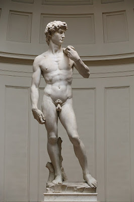
This week, Mr. Bishop forced the principal of the Classical School to resign because she failed to block the art teacher from showing a picture of Michelangelo's David to a 6th grade class. 

The school promises "a content-rich classical education in the liberal arts," in order to shape a "vibrant and enobling" culture for students, so you can understand why Michelangelo's statue would have no place in their art curriculum.  


Mr. Bishop explained that parents were quite upset by the school's slip up: 
Three parents objected. Two objected simply because they weren’t told in advance. One objected because the teacher said "nonpornography".... [T]hat word is inappropriate.... you don’t need to be saying that word in a classroom in Florida!
In a lengthy interview, Mr. Bishop explained the philosophy of his school: 
Parents, after they saw all the crap that’s being taught in public schools during COVID, decided of their own that they didn’t want their children to be taught that. Here we teach... a traditional, Western civilization, liberal classical education.... We don’t have safe spaces for kids so they won’t be offended by a Halloween costume.
Sixth grade students at Tallahassee Classical School will not be protected from offensive Halloween costumes but they will have a "safe space" to protect from the knowledge that males have a penis.  There is no telling how many students have already been traumatized by this discovery.


Tuesday, March 21, 2023

SO YOU THINK YOU KNOW HOW TO DRAW A MOUTH?

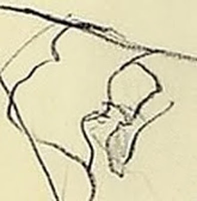
You could study 1,000 anatomy books but none would teach you to draw a mouth like this:


ChatGPT would never create such a mouth for you.  Neither will a camera.  Neither will Photoshop.   

The mouth is a detail from this febrile drawing by Horst Janssen.


Janssen's drawing includes none of the features artists normally focus upon when drawing higher life forms: eyes, facial expressions, a forehead, posture suggesting vertebrae... even a chin would be useful.  If there's body language here, it conveys little more than heated fumbling. Instead, everything is reduced to those chewed up lips, swollen from too much heavy kissing.  You can almost hear the panting from this drawing. 

A corporate letterhead seems like an odd choice of paper, except it suggests Janssen was not in the mood to wait around for proper art supplies.

Other drawings of this subject display far more technical skill.  For example, here's an embrace as visualized by Fragonard:

Note the details in the fabric, the staging with the door and the use of facial expression

In the 19th century the romantic movement turned away from precise academic drawing by artists such as Ingres and David.  Romantic artists felt that a better way to capture the true character of life and experience was not the mimetic representation of nature.  Rather, they turned to the expression of feelings and memory and emotions, setting us on the path to Janssen's lovely, raw drawing.  

Sometimes Janssen's approach to drawing misses.  When you're in the business of inventing new mouths it doesn't always work out.  But when he does connect it can result in marvelous pictures.

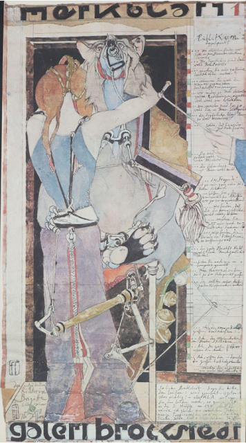
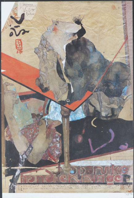
Here are other examples of Janssen's work that I admire.


Monday, March 13, 2023

HANS HILLMANN

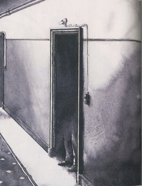
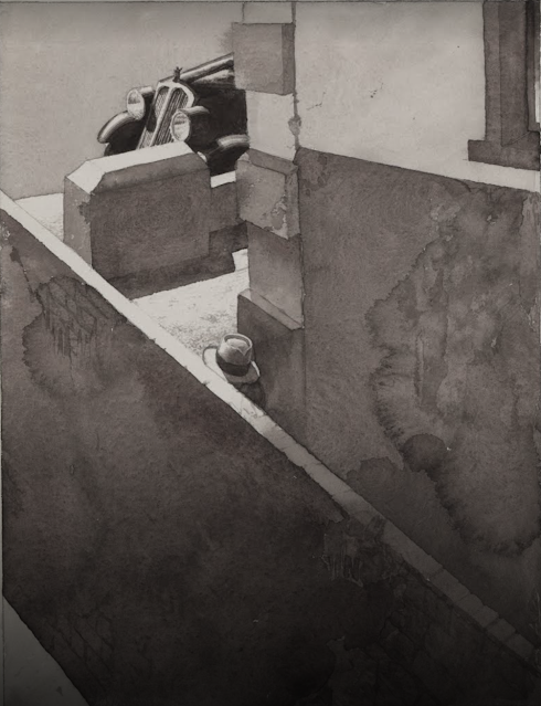
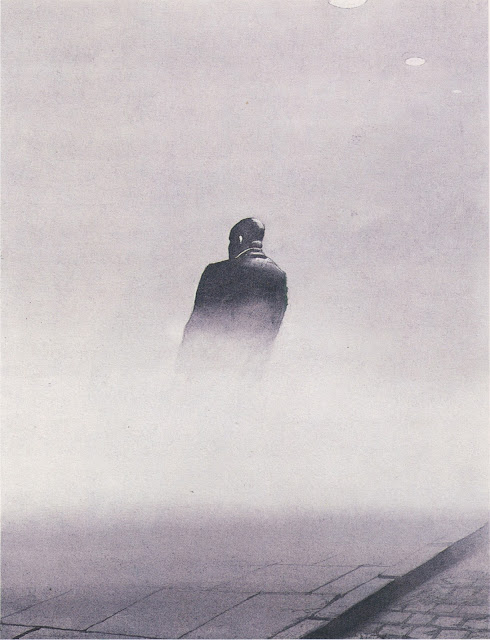
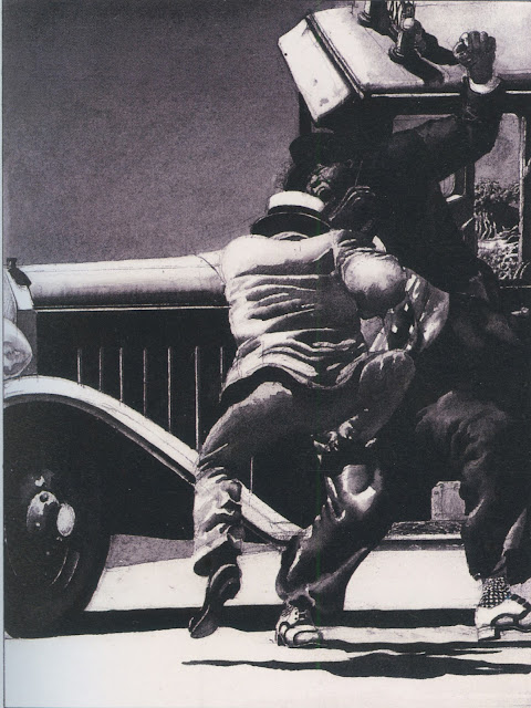
What the heck is happening here?


While some drawings aspire to clarity, others are enhanced by obscurity and mystery.

Carl Sandburg said, “Poetry is the opening and closing of a door, leaving those who look through to guess about what was seen during a moment.”

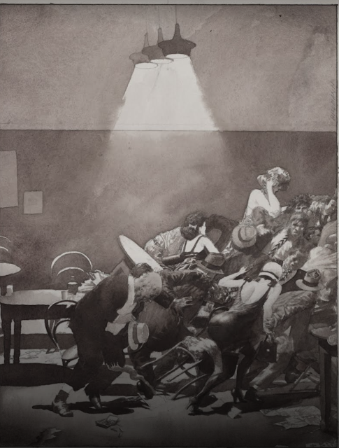
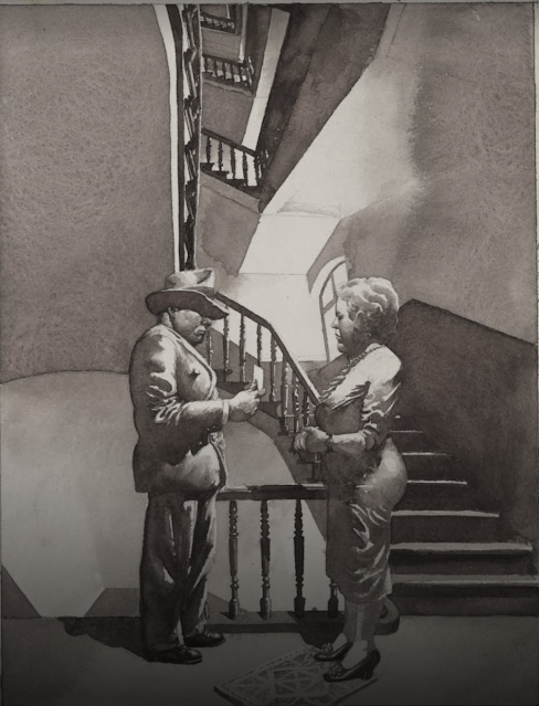
I enjoy the work of Hans Hillmann who was famous for his posters but who also created a number of shadowy noir illustrations for stories such as Dashiell Hammett's 1929 Flypaper.  Note how each of these illustrations is staged to leave viewers "to guess about what was seen."


In the drawings above, Hillmann has cropped out most of the elements that would normally be at the center of an illustration or concealed them with fog or shadow.  But it's important to note that Hillmann's approach doesn't rely solely on the omission of details.  He created many detailed, high resolution  drawings with elements ranging from faux wrinkles in clothing to complex patterns on socks.  This glut of details doesn't make the drawings any more comprehensible.


Many illustrators are celebrated for their ability to create highly realistic pictures-- a skill which is increasingly less impressive as more and more of the work can be accomplished with inexpensive digital aids.  But there is much to be said for artists like Hillmann who can cast a spell using an oblique approach.  


Sunday, March 05, 2023

STERILIZED DRAWING

 This month in 1858, Hymen L. Lipman was awarded the very first patent for a pencil.

The Patent Office requires a schematic drawing with each application.  The drawing must be plain, clear, and straightforward: a simple black line on a white background.  Any use of imagination is strictly forbidden.  No exaggerations, no color, no expressive variety in the line allowed.  

How much important information can be conveyed in such a sterile format?

Here is the drawing Walt Disney used to obtain a patent for his animation camera, 82 years after the patent for the pencil: 


Like the diagram of the pencil, Disney's schematic doesn't begin to convey the wonders that would one day flow from these inventions. 
  

Patent drawings may look sterile, but drawing is a centicipitous art form, and drawings which celebrate clarity and precision above all other virtues have a strength of their own. In his book, The Art of the Patent, Kevin Prince shows how patent drawings have developed a language for conveying information with a plain black line. Federal regulations have established these conventions for showing specific characteristics:


Looking at patent drawings, I enjoy those occasions when we catch a small glimpse of a human pulse.

Here, for example, some Walter Mitty draftsman just couldn't help adding a cool rock n' roller behind this guitar invention.

Scary!

And I'm sure the Patent Office didn't really require a drawing of a bathing beauty to understand how to hold a brush:

A patent artist's equivalent of Gil Elvgren


Even the most sterilized art forms can't quite conceal the mad passion in our blood.