Sunday, March 18, 2012

FRANKLIN McMAHON 1921-2012


Franklin McMahon, the last of the great illustrator-reporters, died last week at age 90.

McMahon worked in a bygone era when newspapers and news magazines relied on artists to add class and grace to the reportage of current events.  For 50 years, McMahon went everywhere and witnessed everything on behalf of news publications such as The New York Times, The Chicago Tribune, Look, Life, Time and Sports Illustrated.

His career as a reporter began in 1955, when McMahon covered the infamous Emmett Till murder trial for Life Magazine.

Emmett Till's aged uncle points a quavering finger at his nephew's murderers

He went on to cover the key events of the Civil Rights movement, the space program and numerous political campaigns.  Unlike a camera, McMahon prioritized the essential elements of his images and conveyed his impressions, adding an important dimension.


Pope John xxiii

The Vatican

McMahon recalled that he was hired by publications that were "confronted with mountains of material and a need to transcend the usual dreary recitation of facts and figures."  His role was to "heighten the emotional reaction to a printed piece and transmit the special flavor of a [subject]."


The Duomo, Milan

Detail of Duomo, above

His documentary artwork also added distinctive elements to annual reports and trade journals:
 

The day of the illustrator-reporter is now gone, just as the newspapers and news magazines where these pictures once appeared are in the process of disappearing.  Many of the professional photographers who replaced illustrator-reporters are being replaced by internet stock photos and amateur cell phone users.


But for many years, talented illustrators such as Franklin McMahon logged a lot of miles pursuing an important craft, making great sacrifices to do quality work.  The death of McMahon is a good time to remind ourselves of their contributions and honor their role. 

Sunday, March 11, 2012

ONE LOVELY DRAWING, part 40

Artists who can't draw have become emboldened by the excuse that traditional drawing skills are less relevant today.  The focus of art has shifted, we are told, from visual appearance to intellectual concept, making the technical skills of yesterday obsolete. 

I've had fun making unkind remarks about this fashion trend, not only because I find the drawing so bad but because the "concepts" that supposedly justify this trade off frequently turn out to be mewling platitudes.  Any artist who claims, "I'm so smart I don't have to draw well" better have more convincing evidence than the pop psychology that pervades so much of today's drawing. 

But every once in a while, some artist gets it right.  They shed the straightjacket of representational drawing while still preserving the important elements: a sensitive, meaningful line, a deep appreciation for form, a strong sense for design and composition.  And they use their freedom from realism to infuse their work with a conceptual profundity that was never witnessed in the golden age of illustration.

Exhibit A is this excellent drawing by John Cuneo:
   

This is a small drawing, about 8 inches tall.  We can tell from Cuneo's subtle treatment of color and line that this picture will require genuine attention if we are to understand what the artist is up to: 

Strange, mismatched eyes give this face a distinctive character

Cuneo recognizes that if you are going to reinvent the human form, it can't just be because you're too lazy to learn anatomy.    Here is an artist who has made an emotional investment in his variations.

There are a thousand ways one might draw a doll with a loose, casual line but it is extremely difficult to achieve the kind of unnerving distortions that frighten us in voodoo dolls and African totem figures.

A hilarious masterpiece of dehumanization

Below, Cuneo adds another layer of horror:


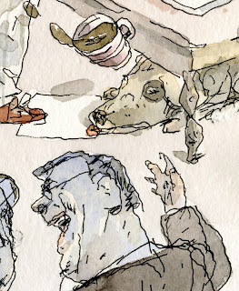
Note how subtly the artist diminishes the distinction between men and dogs by putting a business shirt on the dog in the corner.  At the same time, in the same corner, we are reminded that dogs are slobbering beasts:


That wonderfully drawn "slobbering beast" visually echoes a slobbering human beast on the left:


But this drawing is no simple polemic.  The slothful dog under the table in the background adds a very different (and important) flavor, as does the falling cup of coffee (I love that shadow).

It would be a mistake to go on vivisecting this brilliant little drawing, speculating about symbolism or second guessing the artist's intentions.  I have no idea how much of this drawing is conscious and how much is intuitive.  Cuneo steadfastly refuses to explain any of his drawings, and for good reason.  They are better than that.  

For me, this drawing is the visual equivalent of a Pinter play or a Kafka short story, every bit as profound and smart and funny.   I think it is work of enduring value.