Sunday, June 30, 2013

MAKING PEACE WITH THE MACHINE

The great illustrator Frank Frazetta proudly wrote his personal credo: "I work purely from my imagination, no swipes or photographs."

But this Frazetta drawing...


...was taken directly from a Life Magazine article on a day at the beach:


The great illustrator Robert Fawcett warned his fellow artists against becoming dependent on photography: "photography has been abused, to the point where many illustrators are afraid to put pencil to paper without first photographing their subject exhaustively. Yet when he needed to draw a south sea island native...


...he relied on this photo from Life Magazine:


Norman Rockwell was one of the most successful illustrators in America when he secretly began using photographs.  When his peers asked if he used photographs, he lied:
At a dinner at the Society of Illustrators, William Oberhardt, a fellow illustrator, grabbed my arm and said bitterly, "I hear you've gone over to the enemy." "Hunh?" I said, faking ignorance because I realized right way what he was referring to and was ashamed of it. "You're using photographs," he said accusingly. "Oh...well... you know...not actually," I mumbled. "You are ," he said. "Yes" I admitted, feeling trapped, "I am." "Judas!" he said, "Damned photographer!" and he walked away
I am interested in why some of the most confident, successful illustrators felt ashamed to use photos.  And why, despite their shame, they thought the benefits were worth it.

Since those early days, attitudes about using photos have changed but the role of photos has changed even faster. 

What started as using photos for reference evolved into projecting photos directly on the page, which then developed into light boxing, which changed to scanning photos, later altered with increasingly subtle filters that transform scanned images into a pastel drawing or a watercolor painting or a mezzotint.  To make a caricature today, we have only to apply the Photoshop "liquefy" tool to a photo of a face.  To improve a composition, we have only to employ the "divine proportion" tool.  Technology has played an increasingly vital role in picture making, encroaching more and more on what was once the human core.  It remains to be seen whether artists are following in the footsteps of John Henry.

Far from being resolved, the question "how much dependence on a machine is acceptable?" becomes a new question with each passing decade.

In this context, I think it becomes incumbent on each of us to make our own peace with the point along the spectrum where the role of the machine becomes too great.

I think the talented Matt Mahurin is a prime example of an artist working interchangeably in traditional media, photography, and film:


I find his work, which blurs the line between photos and hand crafted images, imaginative, powerful and personal.  Mahurin writes:
When a client decides to call me, it's not because they are in love with my color palette or feel they can't live without my sense of composition.  I am hired for the way I think-- my ability to express clear thoughts and powerful emotions visually.  Often the technique or style I use to complete an image is merely an afterthought, no more important than the physical act of typing up what already flourishes in the writer's heart and mind.
But perhaps the real challenge to the boundary between art and machine-created images is posed by photographs that today seem to inspire more reverence and awe than more traditional hand made arts do. 

NASA's "pillars of creation"

Pictures adorning Renaissance altars and palace ceilings were valued as high art in part because they elevated viewers by giving them a sense for the sublime. It has been a long time since traditional, hand made arts have aspired to that role.

Monday, June 24, 2013

ROBERT M. CUNNINGHAM

Everyone talks about the importance of "restraint" in making pictures, but restraint is only meaningful if you possess something significant to restrain.  (If you have no talent, you're not actually restraining anything.)

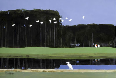
Look at the restraint in this terrific painting by illustrator  Robert Cunningham.  How does he persuade us that his simple blobs of white paint are birds taking off, while the very similar blobs of blue paint right next to them are openings in the trees?

No eyes, beaks,  feathers, feet-- barely even wings-- yet these are lovely birds.


A lot of wisdom and an awful lot of drawing goes into Cunningham's ability to capture the essence of birds in such basic shapes


Cunningham was born in Herington, Kansas, where the flat plains stretch almost forever.  He grew up leading a simple life as the son of a railroad man.  Later, art critic William Zimmer observed, "His native ground has perhaps been an inspiration for the flat, bright planes of color that characterize his work."


Whatever the source of his inspiration, Cunningham never learned to hide behind a lot of frills.

Marvelous!

Cunningham got his first big break in illustration when the visionary art director Richard Gangel spotted his talent and put an 8 page portfolio of Cunningham's work in Sports Illustrated.  From that day on, he developed a long list of discerning clients.  He was elected to the Society of Illustrators Hall of Fame in 1998.

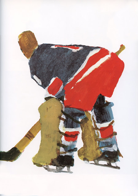
Small touches such as the sunlight through those fins show us that Cunningham knows exactly what he is doing.

It's hard to resist showing off our abilities--  our talent for drawing precisely, our eye for detail, our skill at making fine lines-- but restraint implies a power greater than all of these: the strength to harness our other strengths.  It shows that we are truly the master of our skills.


Tuesday, June 18, 2013

WARRING WITH TROLLS, part 4


"To live is to war with trolls." --Ibsen 

Talented illustrator Austin Briggs painted a NY Giants baseball game for the April 22, 1950 cover of the Saturday Evening Post.

This is not that painting:


Briggs' cover included  an African American woman in the crowd.  When he delivered the painting to The Post,  the editors ordered him to remove her.  Infuriated, Briggs refused.  He broke the painting in half over his knee and stormed out.

As reported in the Westport blog 06880, Briggs' model for the woman was Fanny Drain, a long time employee of the Briggs family.   Briggs' son recalled:
When the Giants were playing she and my father-- whose studio was at home-- would follow the radio broadcasts avidly and vocally; her pride and pleasure in being included in the cover painting were deep.
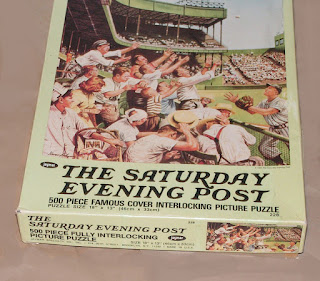
The Post quickly found another illustrator, Steven Dohanos, to repaint Briggs' cover, replacing the African American woman with a white male (the one with a handkerchief on his head).  That is the final version you see above.

The Post loved the result so much, they even released the all white version as a jigsaw puzzle for wholesome families to play.


Briggs' gesture of defiance was expensive for his family, but once the cover was destroyed, there was no going back.  Briggs never regretted his decision.

It is difficult to imagine such an impetuous act of conscience occurring today.  If he was painting today, Briggs would no longer be able to break his picture over his knee because the digital art would've been emailed to the magazine, with multiple copies on his hard drive at home.  The Saturday Evening Post would not have to ask Briggs to paint out the African American woman; they would Photoshop a white complexion on her without the artist's permission in 30 seconds. 

The wonderful efficiencies of Photoshop help eliminate some of the nasty moral choices that once confronted an artist.  We live in a much more efficient world today.  But in the words of Epicetus, "It is difficulties that show what men are."

Monday, June 10, 2013

THE LAST .1 PERCENT

99.9% of our DNA is identical for all human beings.  Yet, there is enough variety left in that remaining 0.1% to make each of us unique.
 
Your individual DNA gives you your distinctive appearance-- your height, nose, skin color, eyes, hair...even your peculiar toes.  It's the only thing that distinguishes you from that goofy looking guy over in the corner.   

Similarly, it's amazing how illustrators working in the same medium and painting the identical subject can end up with such widely divergent results.  Somewhere in that .1% resides an infinite variety of styles.  Here are some examples of how talented illustrators responded differently to the same subject: in this case, a few people in a small boat on the water.

In this first splendid illustration, Tim Bower envisions waves like rows of pyramids...


Contrast Bower's treatment of water with Coby Whitmore's more fluid approach...


Then compare both of them with John Gannam's approach in this 1938 illustration.  Gannam uses a dryer brush to make thrusts like a Franz Kline abstract expressionist painting.


N.C. Wyeth (who understood plenty about water) painted the following boat in profile in order to highlight the water splashing off the bow.


 Bernie Fuchs (who understood plenty about design) perceived the same water off the bow very differently.


Here is another Fuchs variation on our theme, this time arranged from a great distance:


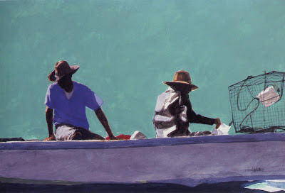
Another talented illustrator, Robert M. Cunningham, was famous for simplifying his pictures to their essence.  Here he displays his distinctive form of brilliance: 

Note the wisdom in Cunningham's deckled surf

Below, Austin Briggs shows he too can perceive the world in flat shapes and colors, but with a very different, impressionistic result:


It would be easy to continue with another hundred variations of people in a boat. All these artists started out composed 99.9% of the same DNA, yet look at the rich, marvelous variety of their work!

I tell you, it's a glorious damn world.


Saturday, June 01, 2013

ONE GREAT HORSE'S ASS, part 2

Years ago when I started this blog, one of my thoughts was to highlight a series of great horse's asses in art-- powerfully painted flanks that transform a whole picture.

After my first installment, I became caught up in exchanges with readers about aesthetics and metaphysics and other highfalutin stuff.  Today I realized that, seven years later, I haven't even made it to my second  horse's butt yet-- a sad state of affairs which I will now rectify.

Look at this fabulous, huge painting by Toulouse Lautrec from the Art Institute of Chicago:

Equestrienne (At the Cirque Fernando), 1887
 Lautrec was a brilliant graphic artist who frequently drew, rather than painted, with his paint brush.  This contributed a strong spine to many of his his paintings:


Nowhere was this done more powerfully than with this horse's haunches:


This ass is the engine that drives the whole painting.  Notice how the rubberized figures of the horse, the ringmaster and the rider are all foreshortened and stretched around the power of that butt.  The same with the curve of that striped barricade.


Perhaps Einstein developed his theory of relativity, about how spacetime curves around heavy objects, by studying this painting.  Someone should check to see if he was in Chicago at the time.