Friday, December 31, 2021

THE END OF 2021

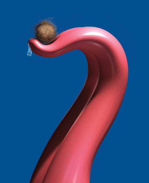
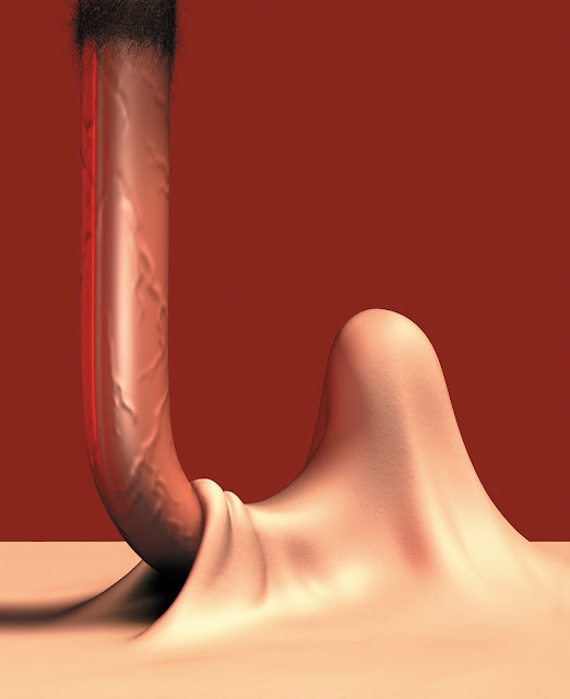
 As 2021 draws to a close, it's time for us to face another end.


Brian Bolland

I want to wish each of you a happy, healthy 2022. Despite the dangers that continue to confront us, I'm sure we can prevail if we're willing to work together and employ Wonder Woman's lasso of truth.


Sunday, December 26, 2021

POLITICAL CARTOONS part 6: ANN TELNAES

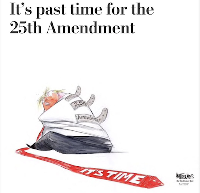
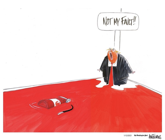
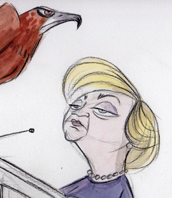
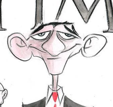
Ann Telnaes, winner of both the Pulitzer Prize and the Reuben award, achieves a distinctive look by blending her skills as a political cartoonist with her background as an animator. (She worked at Disney as well as at animation studios in Los Angeles, New York, London, and Taiwan).

Here are four ways I think her talents combine to make her work so exceptional:

1.)  Telnaes speaks with a strong, clean line in the tradition of Robert Osborn.  An animator's craft doesn't allow for second thoughts, asterisks and footnotes.  There's no cross hatching in animation. Telnaes chooses her best line and commits to it. 

White space is expensive in a newspaper but it's also valuable to a drawing

By sweeping away the clutter and simplifying her forms, she sacrifices explanatory backgrounds and similar crutches, but note how her use of white space strengthens her compositions and projects her ideas more forcefully.
 

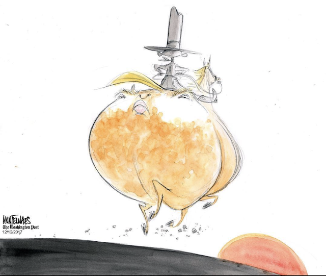
2.)  Telnaes also brings an animator's plasticity to her subjects.  Look at how extreme and cartoonish she's willing to go with this horse's ass, contrasted with its tiny legs, or that ridiculous hat:


Telnaes is able to get away with this kind of extreme exaggeration only because she has the drawing talent necessary to hold the picture together.

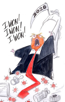
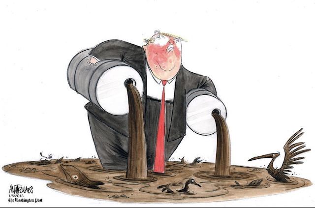
She similarly makes full use of an animator's license by simplifying figures into geometric shapes.  I've previously written about this rubbery trapezoid Trump...


Her characters frequently take their strength from circles, triangles and other basic archetypal shapes.


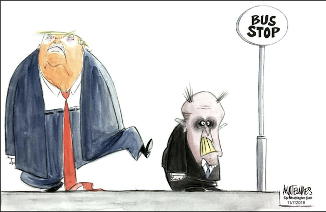
3.)  Her caricatures, however caustic, have an animated cartoon quality to them.  I love her Rudi Giuliani...


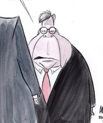
Or this devastating Bill Barr...


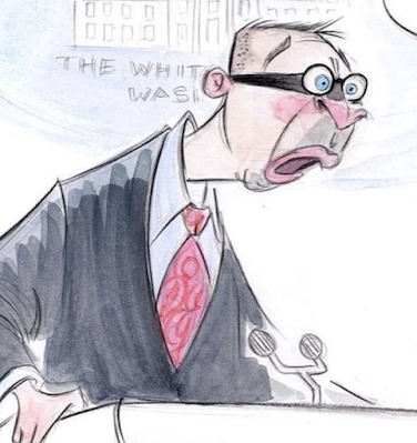
...or Mick Mulvaney...


... and a handful of others:


A caricature of Jeff Sessions, more brutal than a drawing of his face

The creativity, drawing ability and political judgment in these faces are good examples of what I think caricature is about.


4.)  Finally, as a former animator Telnaes has pioneered the introduction of animated GIFs into political cartooning.  Her use of GIFs to portray an animated bobble head doll of Mike Pence , or the dynamics of the balance of power in the Supreme Court or a Trump Paddle ball  are not just superfluous gimmicks, but are integrated into the meaning of the cartoon and enhance the presentation in a way that a static drawing could not.  Another way in which the medium benefits from merging two strengths. 

Saturday, December 18, 2021

POLITICAL CARTOONS part 5: MIRKO ILIĆ

So far this series on political cartoons has focused on artists I admire for their hand drawn line. In the process, I've said some unkind things about the misuse of digital art tools. But of course digital tools in the right hands can create powerful, important, beautiful political images.

Mirko Ilić is off the beaten path from the other artists in this series, but his work is so strong I feel the path should be re-routed to go past his door.

I met Ilić in 2013. I had just finished a rousing discussion with Milton Glaser about art and he said, "You know, you should really meet Mirko. He's right upstairs." I'd never heard of Mirko, but when Glaser picks up the phone and tells someone you're coming, you don't say no.

"Mirko" turned out to be the co-author with Glaser of a book about social and political graphics, and a formidable talent in his own right.


Ilić was born in Bosnia and attended art school in Zagreb.  His first work was as a cartoonist and illustrator, drawing innovative and politically active pictures for Yugoslavian and other European magazines.


Mirko Ilić on terrorism

Soon he was working internationally for magazines such as Heavy Metal and Marvel's Epic Illustrated. He moved to New York in 1986 where he worked for many of the top publications.


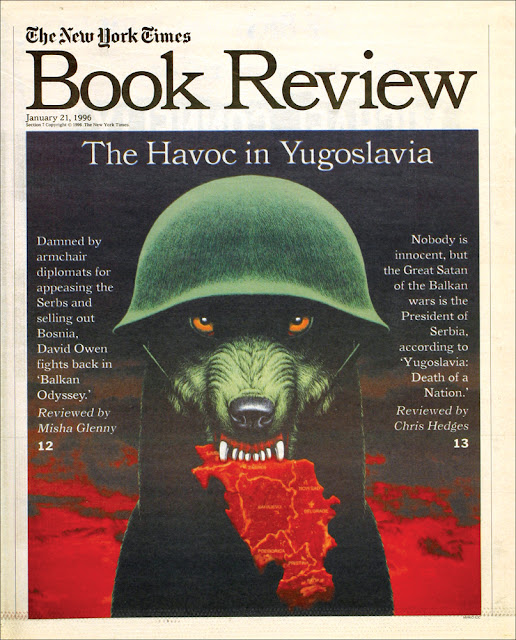
He continued to grow, and in In 1995 he founded Mirko Ilić Corp., a graphic design and 3-D computer graphics studio. Since that time, he has produced bold, imaginative and significant images which have received numerous awards. His work is represented in the Smithsonian Museum and the Museum of Modern Art in New York.


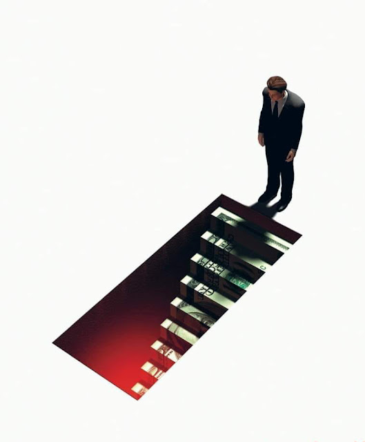
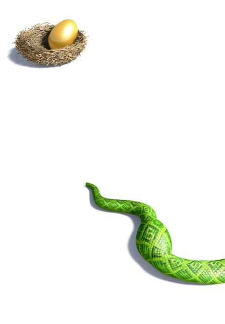
Fraudsters who pilfer your nest egg


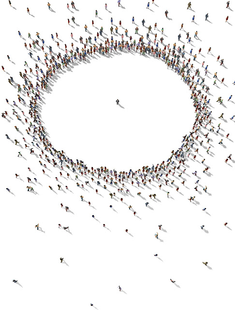
Tribalism


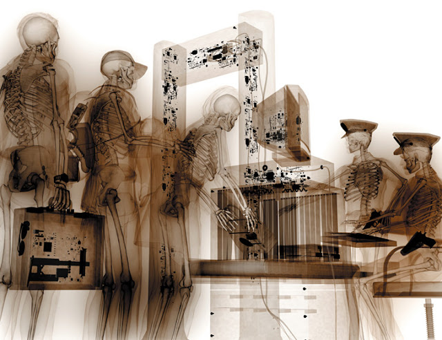
The scope of airport surveillance

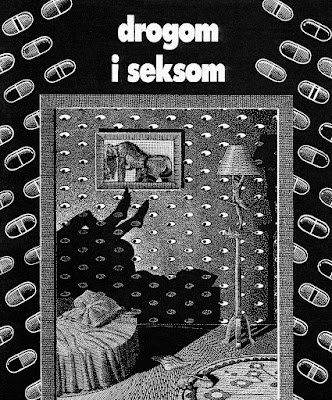
While some artists use the computer as a crutch to simulate realism, Ilic uses the computer to transform the attributes of realism into wildly imaginative and creative images.  These are award winning images from a series on Sex and Lies.


Monday, December 13, 2021

POLITICAL CARTOONS part 4: MICHAEL RAMIREZ

 As far as I can tell, Michael Ramirez can draw any damn thing he wants.

I mean that in both senses: he can get away with almost any concept and he has the drawing ability to execute that concept.

Ramirez seems unfazed by regular death threats in reaction to his controversial cartoons.  He notes that his first death threat came from his parents when he told them he was giving up plans for medical school to become a political cartoonist. 

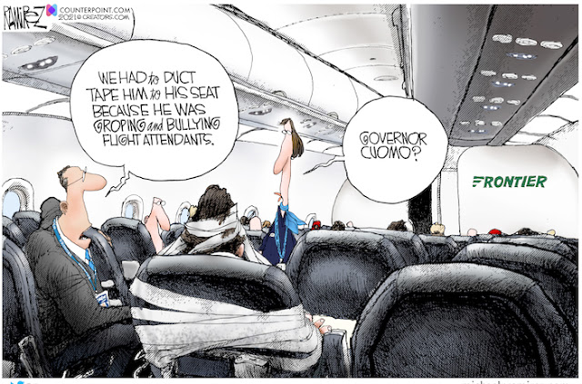
But more importantly for the purposes of this blog, Ramirez seems able to capture any subject he chooses.  For example, he can beautifully draw the perspective inside a confined plane cabin, if that's what his idea calls for...

 
... but at the same time, he can effectively draw perspective in the wide open sky outside.


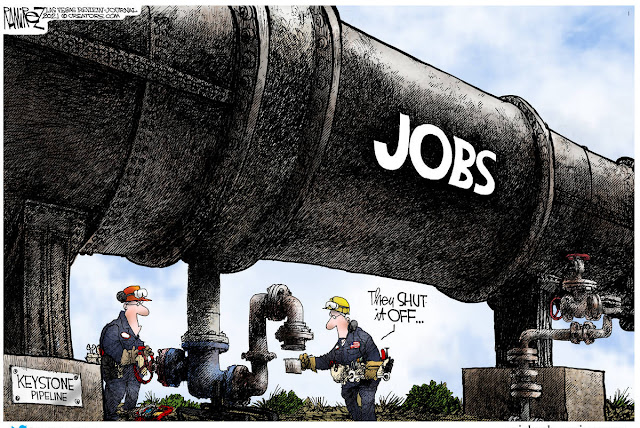
He's great at capturing heavy industrial structures...


...as well as small technological gadgets:


He is fearless about drawing from any angle...


... or taking on historical and anthropological themes:

 
When you ask Ramirez how he was trained to draw such a diverse array of subjects, he responds, "I was always curious about how everything works.... I like breaking the pieces down, finding out the components, how everything works, and then putting them back together." That instinct, combined with a natural talent for recreating whatever he saw, accounted for the vast majority of his art training.

Ramirez says he may have 15 ideas a day and writes them down on cocktail napkins or other stray bits of paper to keep track of them.   


Sometimes when he has a little too much time on his hands, he will draw something fanatical like this:


But this tight, trompe l'oeil drawing is not what impresses me most about his work.  I'm more impressed by pictures like the following, where Ramirez simply drew two backsides against a sky. 
 

 95% of today's political cartoonists, if they had the courage to attempt such an angle, might draw these backs as two rectangles.  Notice how Ramirez infuses character into these backs, to make the drawing work-- the sagging, weary shoulders, the stylized, leaning bodies with their foreshortened heads and big butts-- these weren't taken from a photograph or learned in an anatomy class.  The variety of the linework adds volume, the contrast between the blue and white is very effective, and the whole drawing is staged thoughtfully-- for example, Uncle Sam respectfully takes off his battered hat and places it on his knee.  A lot of nice visual touches contribute to the message of the cartoon. 

Thousands of cartoonists have drawn thousands of grim reapers, yet when it's Ramirez's turn, he puts aside the cookie cutter and makes a fresh effort to produce something worthwhile.
 
Unlike the super-realistic door lock and wood grain in the cartoon above,  in this next cartoon, Ramirez takes liberties with the human form.  Uncle Sam has an impossibly high waist and gorilla length arms.  These exaggerations help meld the two figures together.  For me, these types of drawings work better than intense realism. 


Well known for his conservative views, Ramirez says, "People know philosophically where I stand... but people are drawn to the visual medium, and if you can make it interesting enough, they'll sneak a peak.  Then you've got 'em."

Wednesday, December 08, 2021

POLITICAL CARTOONS part 3: Jack Davis

 Jack Davis is not known for his political cartoons, but I think they represented some of his finest work.

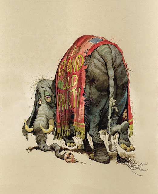
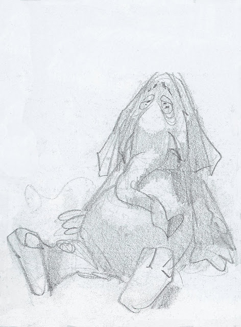
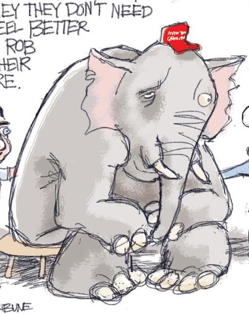
Consider these unpublished cartoons for Time magazine, showing the outcome of an election in which the Republican party suffered losses.


Davis was a master.  He drew lightning fast and with great fluidity.  Once he roughed out his concept...


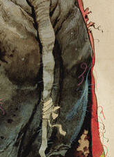
...he had an uncanny ability to work directly into details like the highlights on the wrinkles of the elephants butt.

The foreshortening on the patched and threadbare circus blanket, or the shadow on face looking backward are signs of a first class draftsman.


In this next (also unused) cover for Time, we see Davis once again at his brilliant best.  


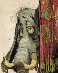
Thousands of artists have taken delight in drawing thousands of elephants, but has any of them ever squeezed more character and humor into their drawing than Davis?  Note the wonderful sensitive line describing that wrinkled skin.

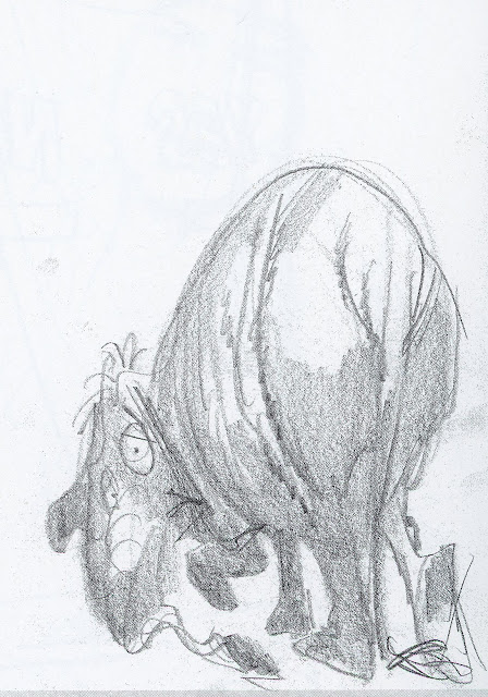
Once again, Davis laid out his cartoon in a lightning quick preliminary sketch:


Today the popular style for many political cartoons seems to be a naive, simplified drawing style, where the concept is everything, and the role of the drawing is mostly to stay out of the way.


When you go back and contrast the standards for drawing,  you get quite a jolt.


Sunday, December 05, 2021

POLITICAL CARTOONS, part 2: ART YOUNG

Art Young's 1911 cartoon about capitalist greed needs no words to say what it took Karl Marx 106,444 words to say in Das Kapital.


What makes Young's cartoon so powerful?  

Well, for one thing, he grabs our attention with a man teetering on the edge of a cliff, rather than using Marx's approach of 356 pages of dense explanatory text.  

For another thing, Young makes his message seem almost irrefutable by embedding it in the laws of physics.  Regardless of our political persuasion, everyone understands that to get the last of what's in that bowl the man must tip it even further.  Everyone further recognizes that if that chair tilts back any further it will tumble over the cliff.  No one doubts what gravity will do to him then.  Suddenly the demise of capitalism seems like a law of nature, even if you're a big fan of capitalism. 

That's the wonderful alchemy of political cartoons.  Words have to line up in straight rows like little soldiers, forming sentences and paragraphs under the watchful eye of punctuation.  Because they're a linear mode of expression, you can anticipate their destination and begin to think of questions and objections. Political cartoons, on the other hand, arrive in your head at a glance, fully formed, and blossom from there.  

And now, the (perhaps obvious) lesson:  Young had to be an excellent draftsman to pull that off.  He had to be able to draw that figure from just the right awkward angle, capturing the important details and excluding the unimportant ones.  He had to draw the figure large enough so that we could understand what was happening but small enough so that there was room to imply a high cliff.  He suggested that the man was high in the air with those light clouds in the background.  This was not easy.

As the great Milton Glaser said:

A designer who cannot achieve the specific image or idea he wants by drawing is in trouble.

Here are some more gems from Art Young, a great political cartoonist whether you share his politics or not.


In 1916 Louis Brandeis famously wrote about the importance of exposing corruption, “sunlight is said to be the best of disinfectants.” Shortly afterward, Art Young drew this imaginative cartoon of a plutocrat trying to cover up the sun.


Art Young-- a century later, in a different political climate, we can still admire his artistry. 


Friday, December 03, 2021

POLITICAL CARTOONS AT THE CROSSROADS

[In response to your inquiries, I've been away on a mission.  Now I'm back and I still have a few things to say.]


Political cartooning today is challenged by two trends:  

  • The disintegration of intelligence and substance in politics
  • The disintegration of taste and skill in drawing.  

The first trend, the disintegration of politics, must be frustrating for cartoonists trying to parody a parody.  People once feared that political cartoons might dumb down politics, but today cartoons can hardly get dumb enough to keep up.

My real concern is with the second trend, the disintegration of taste and skill in drawing.  Good political cartooning is an art form that calls for specialized drawing abilities.  Unfortunately, today's impatient audiences and obtundent artistic standards place little value on quality drawing.   

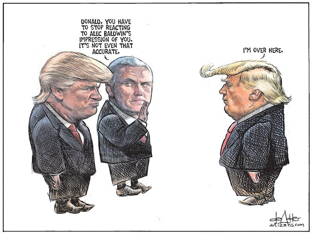
For example, some cartoonists get away with creating a likeness by gluing a photocopy of a head on a poorly drafted body.  


An overlay of scratchy lines creates the illusion that this is a real drawing

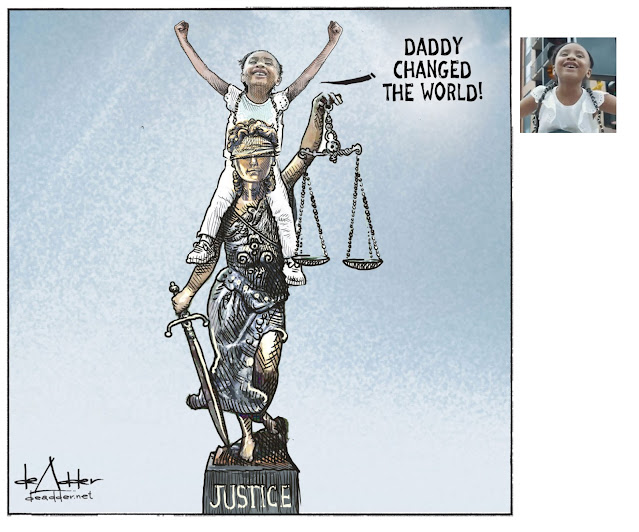
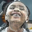
Note in the following example how easily a photograph of a face can be incorporated using automation (not, of course, literally with "glue.") 

Cartoon (left) and photograph (right)

Here is the result when superimposing one on the other:

This technique is analogous to "photo-illustration," a plague which surfaced years ago as a cheap and easy method for illustrators to achieve a likeness when they might lack the talent to do so.


But achieving a reliable likeness is not the goal of the best political cartoons.  The real artistry lies in the caricature of that likeness, the expressive distortions,  the exaggerations and visual liberties.   These artist's tools can help re-energize discussions that have become costive due to too many words.  

For example, consider these two marvelous statements by Matt Davies and Tom Fluharty.  


Davies abandons the laws of  anatomy in this portrayal of his subject as a beast, yet we have no trouble recognizing who it is.  

There was obviously a photograph somewhere at the start of Fluharty's brilliant drawing
but all the artistry comes from the hand and mind of the artist.


As a reminder of the artistic potential of political cartoons, over the next several days I'm going to share examples that I think are excellent and deserve renewed appreciation.