"In the days of the frost seek a minor sun." -- Loren Eisley
The 1950s and 60s were great decades for American illustration. Magazine pages were getting larger, the quality of full color reproduction was getting better, editorial restraints were loosening, and creative experiments were encouraged.
Yet, already the chill winds of photography and television were being felt, and markets for illustration were beginning to dwindle. One by one, the large general interest magazines that previously purchased art by the bushel were dying.
As glamorous jobs became fewer and farther between, illustrators were forced to accept lesser work. One of the more reliable sources of employment between major projects was The Readers Digest. It had smaller pages, low quality paper, and was limited to line illustrations, often with just two colors. On the other hand, it paid illustrators on time. As a result, some of the greatest illustrators of the era, such as Robert Fawcett, Austin Briggs and Noel Sickles, eventually worked for The Reader's Digest.
 |
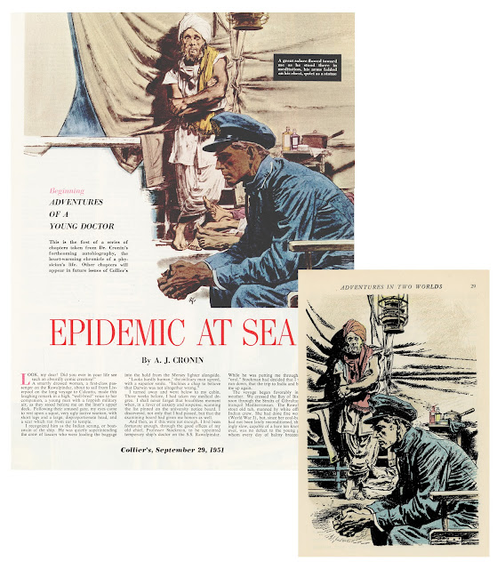
Robert Fawcett illustrated the same story twice, first for Collier's (left) and years later
for The Reader's Digest (right). Note the difference in size and production quality. |
Big shot illustrators who had become accustomed to basking in the public glow and driving fancy cars sometimes had to seek warmth from minor suns. How did they respond to this reduced status?
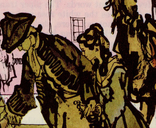
The great Noel Sickles, who had recently done such fine work for
Life magazine, realized he would have to adapt his pictures for the simpler, humbler platform at
Readers Digest. 
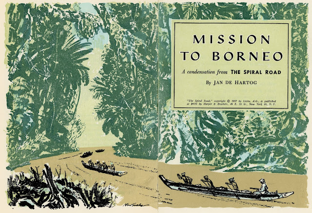
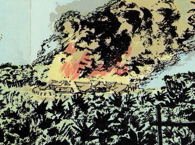
In the drawing below, the coarse pulp paper wouldn't hold a fine line well, even if The Readers Digest had the size or the budget for a detailed drawing of an immense jungle. So Sickles solved the problem with large, jungle-like shapes abstracted and screened.

Rather than be timid with a paper stock where the ink bleeds, Sickles took full advantage of it:

Is the page too small for conveying a panoramic vista? Is the printing process hostile to smooth lines? Not a problem.

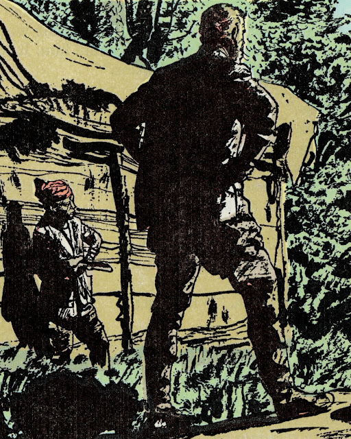
Unlike some of his more slick and polished peers, Sickles was never afraid to go rough.


Sickles became a great illustrator by being tough and resilient and solution-oriented. He wasn't daunted by poor working conditions and he didn't reserve his favors for glamorous projects that afforded him a wide audience. He didn't view a smaller paycheck as a license to turn in second rate work. That work ethic, those standards, were a large part of what put him above so many other illustrators regardless of where his pictures appeared.
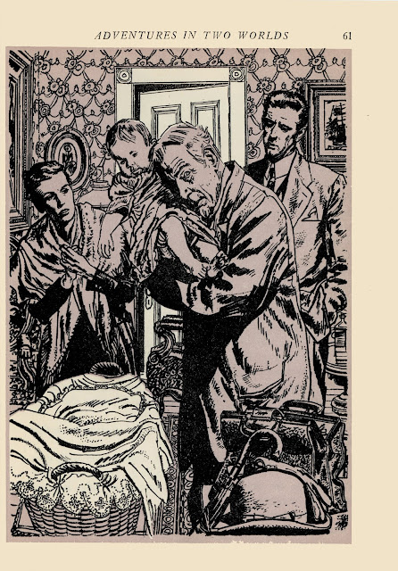
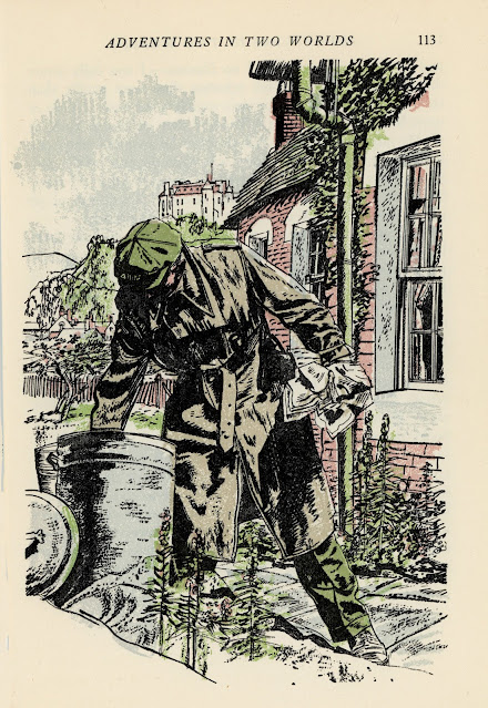
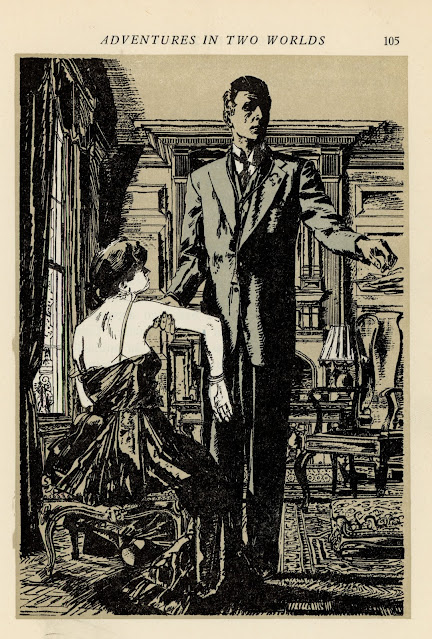
The same thing could be said for Robert Fawcett:


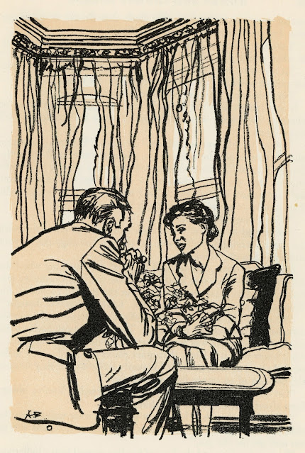
And for Austin Briggs:
 |
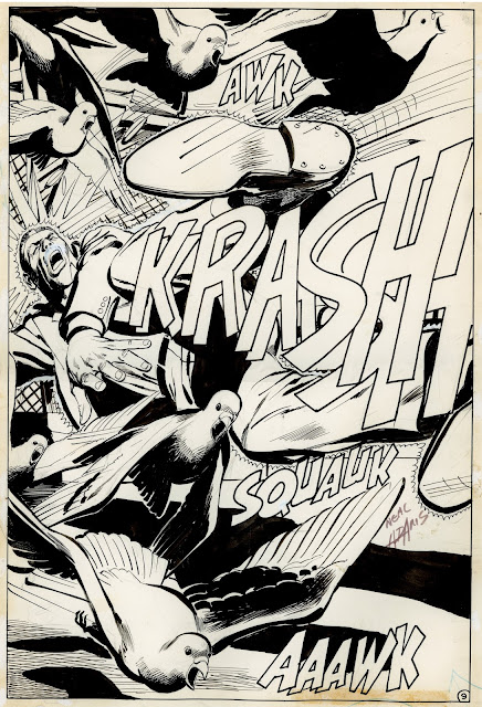
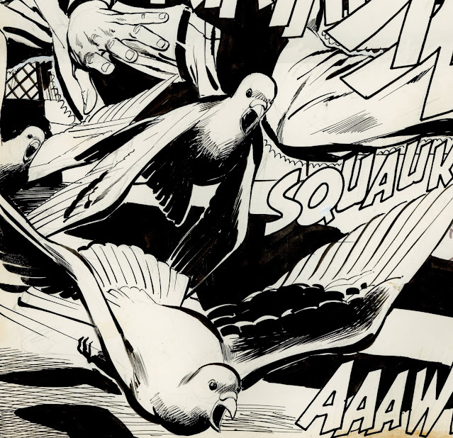
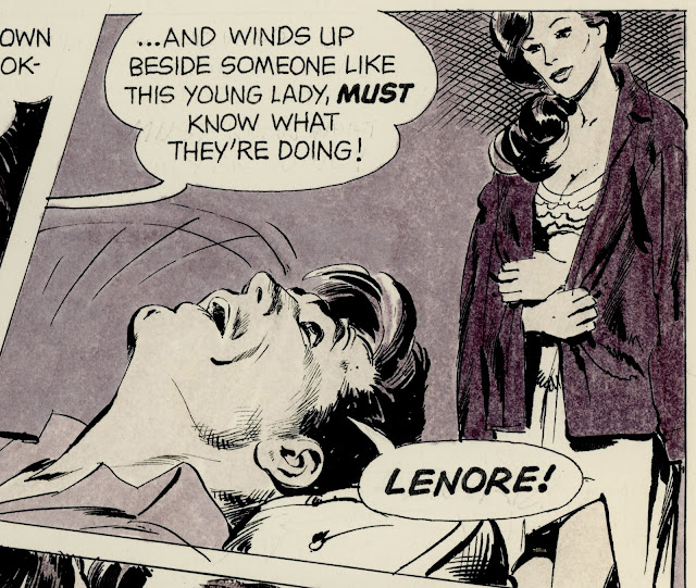
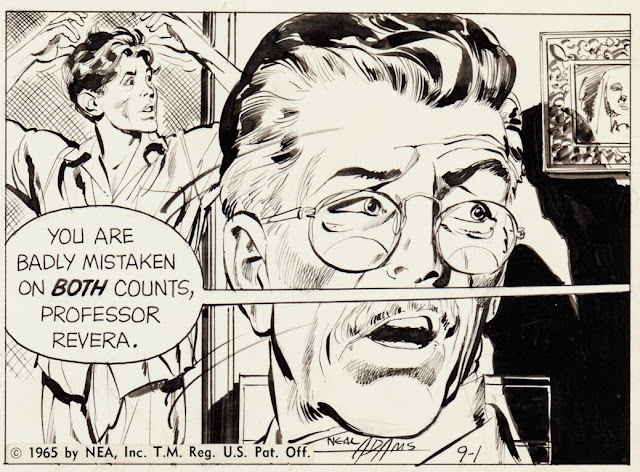
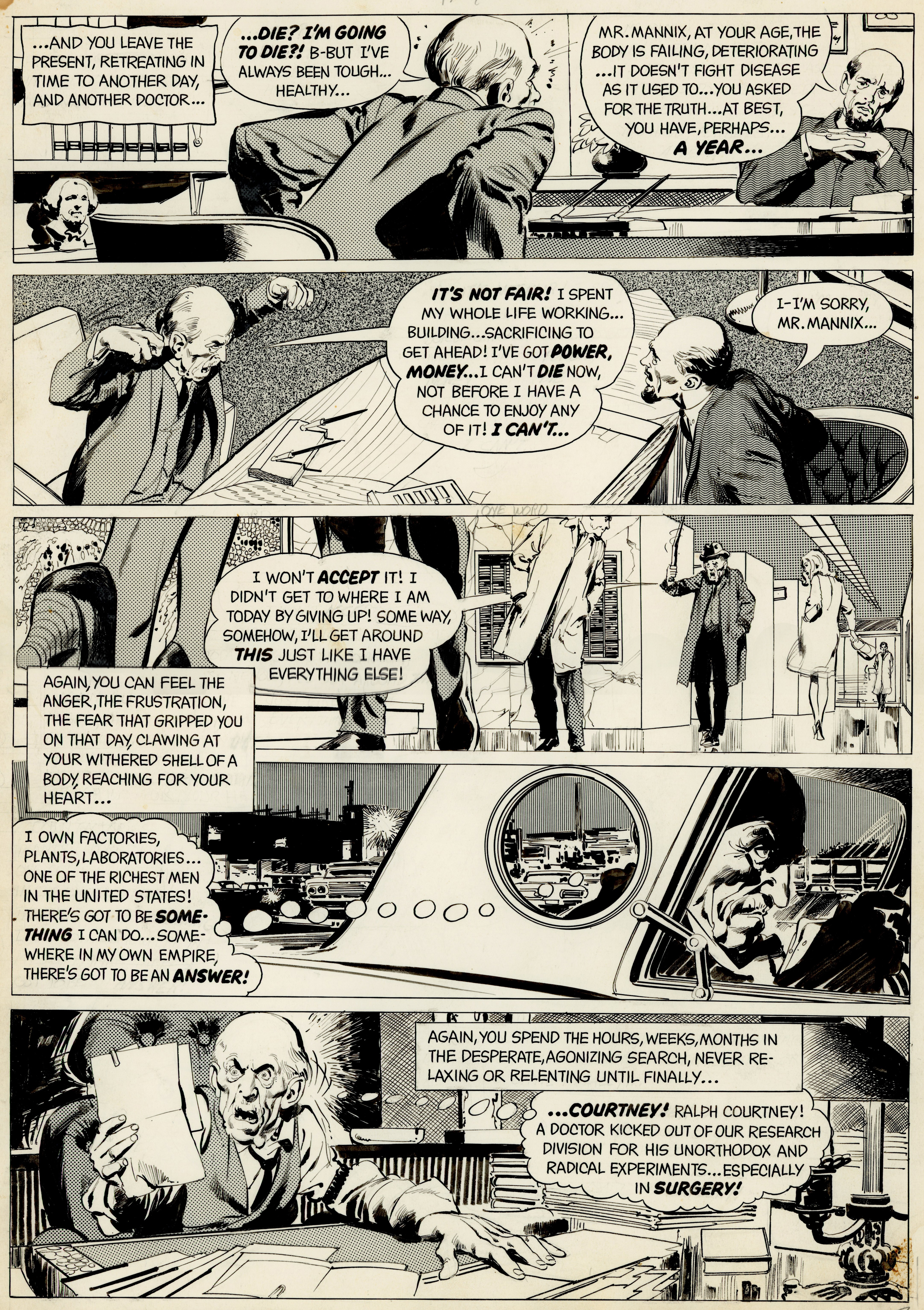
Briggs' distinctive linework was hugely influential at the time when young
cartoonists such as Neal Adams and Stan Drake were learning to draw |
 |
| Horrible Readers Digest color |
 |
| Preliminary sketch |
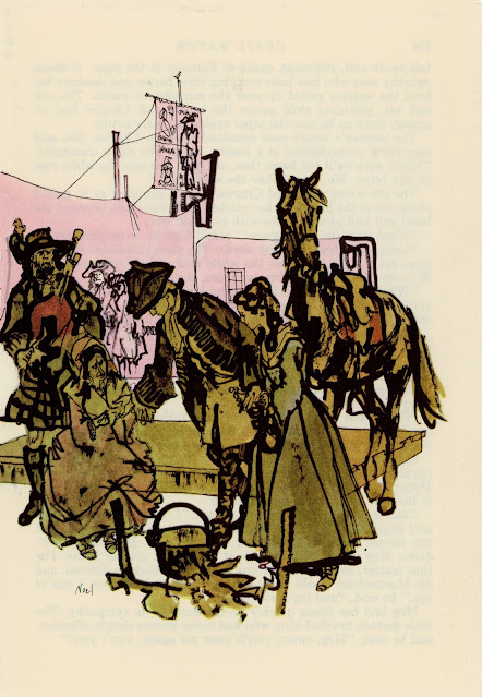
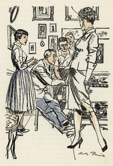
And for Ken Riley:
To survive during the ice age of illustration, these resourceful artists had to gain warmth from such minor suns as they could find. They didn't disrespect the sun gods by doing lesser work. You never know how long that frost is going to last.
Besides, as Fawcett said,
The argument that "it won't be appreciated anyway" may be true, but in the end this attitude does infinitely more harm to the artist than to his client.

