Tuesday, August 26, 2014

THE ONE SECRET THE PROVENSENS KEPT

I am a big fan of the work of children's book illustrators Martin and Alice Provensen.

 .

I especially love their beautifully designed books, The Iliad and The Odyssey and Myths and Legends.


It's difficult to imagine how  a creative team could have been any closer than the Provensens.  The two came from very similar backgrounds: both born in Chicago, Martin and Alice each moved to California when they were twelve.  There they attended high school and college, then went to work for Hollywood animation studios (Martin at Disney and Alice at Walter Lantz).  During World War II, they met and got married, then moved to Washington where they both held jobs supporting the war effort.  


In 1950 the Provensens purchased an abandoned farm in upstate New York, far from city life.   They moved two drawing tables into a barn and started working together, back to back.  Their excellent book, A Year at Maple Hill Farm,  describes their life together on the farm. Their styles blended well and for nearly 40 years  the couple worked so closely that no one could distinguish who had contributed what to their pictures.  In response to persistent questions Alice simply said, “we were a true collaboration. Martin and I really were one artist.” No one ever saw their works in process.


Living and working together in one room there was very little space for privacy or egos.  The two seemed to share everything,  completing each other's thoughts and brush strokes.


Yet, I was charmed to read that there was one small part of their process that the Provensens decided to keep private from each other.  When they were just beginning to formulate an idea, they would sometimes tie a string across the room and hang a sheet or blanket between their two tables.  As Alice recalled, "Once in a while one of us may have had an idea we were just developing that we didn't want the other person to see just yet....We would string a curtain up between our desks."

Even though the drape was purely symbolic-- a flimsy piece of cloth that could easily be breached at any time-- it still had psychological importance.


In those first fragile moments of the creative process, when you're trying to coax an idea into existence, a collaborator's words and voices-- or even a second set of eyes-- might scare it off.   The constraints imposed by an existing vocabulary could rob a new idea of its potential.  

The Provensens might work together all day in the studio, as nekkid as Adam and Eve in the garden of Eden, and never blush once.  But the nakedness of a new idea-- that can be a little too personal, and sometimes needs to be kept concealed.

Monday, August 18, 2014

KNOWING WHEN TO LET GO

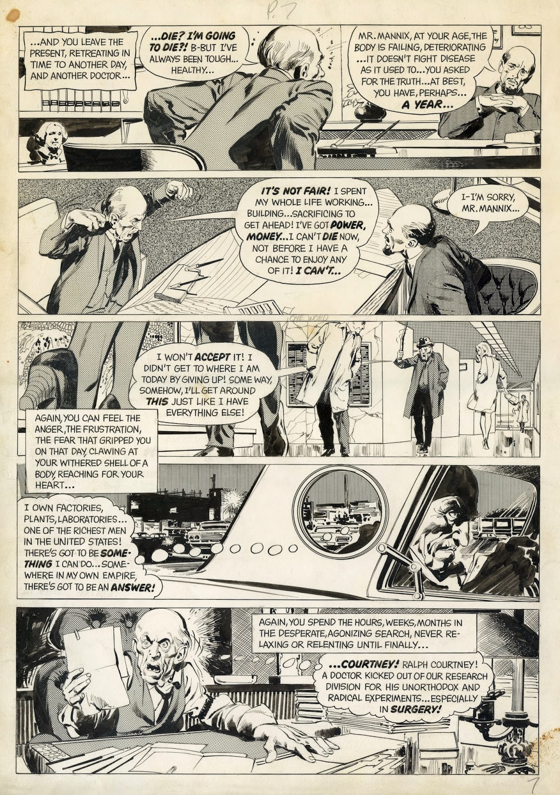
Neal Adams was probably the most technically skillful comic artist of his generation. He was justly famous for his ability to squeeze fine lines and complex poses into densely packed panels:

But skilled fingers don't always know when to quit.  They itch to add more and more of those beautiful lines, and sometimes overwork a picture.
 

 Consider this disastrous reverse profile from an Adams illustration for Playboy:

Adams couldn't stand to be confined to the smooth plane of a cheek; he needed more to draw, so he reached clear around to the other side of the face and clawed the chin, nose and other features into view.  The result is an overworked, exaggerated mess.

A subtler artist might have exercised restraint and implied what was on the far side of that face.  The truth is, it often requires more talent to draw a simple contour than to fill in supporting details.

With one crayon stroke, Austin Briggs brilliantly captures the reverse profile of a balding man

In the following drawing, Kathe Kollwitz buries all of Adams' details in a shadow.  Yet, there is more honest observation in the contour of the silhouette than in the hundred lines Adams drew.


 For Robert Fawcett, being a master of details included knowing when to stop.  As the head turns and facial features go out of the viewer's sight...

 
...Fawcett knew enough to let them go for the sake of the picture:


 I've previously expressed my admiration for this drawing by John Cuneo, who was able to use just a few skittering marks along the circumference of a circle to convey a face turning away:

 
Here are a couple of other examples of Cuneo's sensitive line giving us far more information through judicious restraint:


Last, another favorite I've shown on this blog before-- Richard Thompson's delightful drawing of Santa's spokesman walking away:


All it took was something as delicate as the perspective on the elf eyeglasses (behind the cheek, in front of the nose) to show us the position of his head. There's nothing heavy handed in Thompson's work.

I'm a big admirer of Neal Adams' draftsmanship but sometimes his technical skill seems to run away with the picture.  He seems to have drawn the reverse profile above like the man who searched for his car keys under the streetlight, despite losing them down the block, because "the light is better here."  Adams forced details where they did not belong because that was the only space he had. 

Tuesday, August 12, 2014

HARRY BECKHOFF AT COMIC-CON

Comic-Con, like modern theoretical physics, can be observed on two levels: 
  • the rules of relativity which account for the behavior of large objects (such as galaxies or the Warner Brothers exhibition booth);  and 
  • quantum mechanics which account for tiny objects (such as subatomic particles or the following drawings by Harry Beckhoff). 

Beckhoff (1901-1979) was famous for his tiny preliminary sketches that were dense with information.  

Even at this miniature scale, Beckhoff captures gesture, body language and even the style of chairs


Beckhoff's sketches weren't much bigger than a penny on the floor of the Comic-Con exhibition hall, and received about as much attention, but they are marvelous little jewels.  They served as comprehensive blueprints for  finished illustrations that were ten times larger.

Friday, August 08, 2014

BILL PLYMPTON AT COMIC-CON


Several readers have expressed concern that corporate art-- big institutional projects from major studios and multinational software companies-- will swallow up individual creative voices at Comic-Con.  But each year I encounter artists who are indigestible and irreducible stones in the belly of the dragon.  They refuse to compromise their creative vision (or perhaps they're just incapable of reining in their personal eccentricities).

I encountered Bill Plympton, the famously independent animator and illustrator, sitting at one of the few tables without a ten foot full color banner of semi-nude space nymphettes.  If his booth had a Dolby soundtrack, it was out of commission during my visit.  If Plympton brought a funny barbarian hat, it was nowhere in sight.

What Plympton's booth offered instead was Plympton, sitting on his ass and drawing with a plain old ball point pen,  surrounded by piles of original animation drawings and books about his work. 

Plympton has become justly famous for his offbeat, highly personal, subversive animation:


From Santa: The Fascist Years (2008)


Plympton maintains such control over his art, he is one of the few artists in the history of animation who insists on doing every single drawing himself.

You'd think with that much drawing, his fingers would be worn to little nubs.  Yet, as we compared notes on illustrators we both admired, he picked up a pad and drew my portrait with his ball point pen. He is apparently inexhaustible.

Here are scans of his original drawings:   


 There is an excellent book about Plympton's life and career.  His description of Disney's lucrative  contract offer rivals Faust's meeting with Mephistopheles:

I was hoping that I could work on the Disney projects during the week and during my off-hours and weekends I could work on my own weird offbeat projects.  "Sure," the lawyer said.  "That's fine, and you have our permission but we'll own whatever you create."

"What about if I tell someone a funny story?" I rebutted.

"We own that," he said.

"What if I have a dream?"

"That's ours too." 

Plympton walked away from a lot of money in order to save his work from the corporate de-flavorizing machine. He has made good use of his expensive freedom.

I think Plympton is the real McCoy, with a distinctive individual voice.  I would never have had an opportunity to chat with him and look at his originals up close, if not for Comic-Con.  

Life drawing


Sunday, August 03, 2014

NATHAN FOWKES AT COMIC-CON

I was pleased to see the talented Nathan Fowkes giving practical demonstrations on painting backgrounds at Comic-Con.  


Fowkes is a concept artist for animation studios such as DreamWorks, Blue Sky and Disney.  He is also a highly regarded teacher of drawing, painting, color and design.


Here are a few of his recent paintings for the film, Rio 2:


His finished backgrounds are gorgeous, rich and colorful


...and they benefit from the insights recorded in his hundreds of quick sketches from nature.

Fowkes described the time that he and his new bride had to abandon their first home because it was in the path of a California wildfire.  He stopped and turned around to take pictures of the illuminated orange sky over his home, saying "well, yes... my house is about to burn down but this is great reference."  He is a truly dedicated artist, and his dedication pays off.

Fowkes offered the following wise advice for his audience:
Creating an environment is not just showing our viewer a place, it is creating an experience for them.

False dramatizing is no longer enough for a background.  There are 100,000 concept artists out there who have learned to fake it by putting some dramatic [Photoshop] filter over an image.  We have to do better.

If you want to make an extreme statement, you have to push further and further into what the image is about.

I'm a big admirer of his deft brushwork.


To see more of Fowkes' landscape paintings, visit his excellent land sketch blog.

Friday, August 01, 2014

THE LESSON OF COMIC CON

Ah, San Diego Comic-Con, that buzzing hive of creativity and commerce, where the sublime promenades arm-in-arm with the vulgar, where technology cross-pollinates with whimsy, and where adolescent purity of heart foils even the most well-funded corporate publicity campaigns.

Was there a happier place in America last week?


The vast exhibition hall was chaotic again this year, and I didn't even attempt to navigate it with a purpose.  Like Huck Finn, I learned more by letting myself be carried along by the currents.

Some people sensed a certain repetitiveness to the banners and displays above the dealer tables, although personally I couldn't spot it:


Many exhibitors seemed reluctant to tamper with the standard formula for pose and breast size, perhaps out of fear that any originality might jeopardize their profitability.  They seemed most comfortable distinguishing themselves on the basis of scale and soundtrack volume.


Just as with the most prestigious fine art fairs, originality at Comic-Con had to tread water in a sea of scented bilge, and was sometimes hard to locate.  All of the imitative work could get tiresome, but it was a mistake to blink, or to divert your attention elsewhere. When you paid attention, bright jewels came to you, sometimes in tiny packages:

Microscopic preliminary sketch by the great Harry Beckhoff

When it seemed that the great piles of pandering corporate artwork might topple and crush you, you might turn a corner and stumble across the fiercely independent animator Bill Plympton sitting at a table quietly drawing his own highly opinionated animated movies, one drawing at a time.

Like Winsor McCay, Plympton draws every animation drawing in his films personally

According to IMdb, the award winning Plympton "turned down a 7-figure offer from the Walt Disney Company to animate Aladdin because any ideas he developed while under contract with them would become their intellectual property."

And so it goes with Comic-Con.  Just when you are on the verge of becoming tired or jaded, there is some new revelation waiting around the corner.   Attendees were able to try out the new virtual reality Oculus Rift technology which, according to Wired magazine, will "change gaming, movies, TV, music design, medicine, sex, sports, art, travel, social networking, education -- and reality."  (The technology was developed by 18 year old Palmer Luckey and recently purchased by Facebook for $2 billion.)  If the line was too long, there was always something else awaiting you.  The same was true of the panels and seminars; if you couldn't make it into the "Temple of Art" session with Dave McKean, Kent Williams and Barron Storey, push open another door to see Berkeley Breathed or Drew Friedman


Which brings me to the lesson of Comic-Con (and of life), as I see it:  you shouldn't respond to the glut of imitative and mediocre work by dropping out or letting your eyes glaze over.  The antidote to mundane art is always art that is right and forceful.  You know it when you see it, and its restorative powers continue to be miraculous.