Saturday, June 27, 2020

A CONVERSATION WITH RALPH STEADMAN


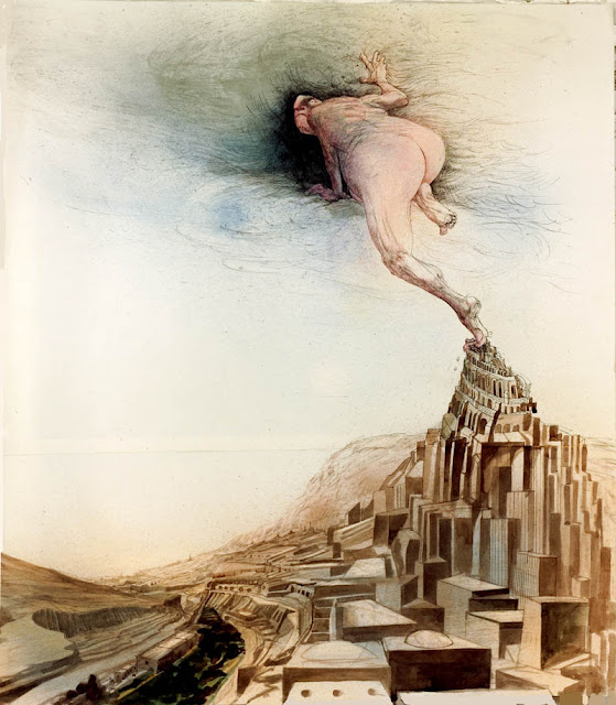
This morning I had an illuminating chat with the legendary illustrator / cartoonist Ralph Steadman.

Fifty years ago Steadman became famous for his scandalous political drawings and his illustrations for Hunter Thompson's books, such as Fear and Loathing In Las Vegas.

Henry Kissinger (detail)

Ronald Reagan (detail)
Today his work is appearing in the very modern virtual art exhibition by Fluorescent Smogg, which they describe as  “cutting-edge showcase... using the latest in 3-D rendering technology to create a totally unique exhibition.”


Steadman's drawings from decades ago remain as relevant as today's headlines:


Viral Menace

GOD Gets the Hell Out

Steadman's fiery indignation has not softened a bit over the intervening years.  ("Trump is the worst creature who lives on this earth," he tells me.)

I spoke with Steadman about his distinctive combination of looseness and control.  His drawings often incorporate accidents of nature-- splatters of ink delivered Jackson Pollock-style-- along with the technical drawing skills of a former draftsman for an engineering factory of the De Havilland Aircraft Company.


A wall decoration at Steadman's recent retrospective exhibition

He described his receptiveness to the accidental:
In a way it starts out like an abstract work of art....  Sometimes I put a piece of paper down...  and I'll drop the water [that I use to clean my brushes] on in it from about 3 foot up.  The smellier the water, the more interesting the patterns you get when it dries. You get textures and things that are marvelous. Decay is an interesting part of the process.  
Steadman also flings ink and sprays color which he blows through a tube.  He says he enjoys the surprises that result from such abstract beginnings:
It surprises me as much as anybody else.  That's what makes drawing interesting. I look at the accidents from the splatters and ask myself,  "How did that happen?"  
That's what he dislikes about using computers for art:
The only thing I like about using a computer is that it can fill in a color.  Otherwise computers are too beholden to rules and regulations.  There aren't so many surprises. With a drawing [by hand] you can still say, "oh my god, that's interesting."
After those spatters "express a creature or a person or a group.... " he develops the drawing with "the straight lines and circles" that he learned at the De Havilland Aircraft Company.

Given his receptiveness to chance and experimentation, it shouldn't be surprising that Steadman's all time favorite artist is Marcel Duchamp because of Duchamp's discovery process.  He says, "Duchamp's work is so unexpected.... Everything's an experiment, and that's how it should be."

After a conversation that spanned fine art, illustration and cartooning I asked Steadman what he considered himself.  "A Welshman" he replied.


Saturday, June 20, 2020

ERIC SILVA


"I like music, I like it sweet I like it blue
But music makes me do the things I never should do." 
                                     -- Ginger Rogers, singing in  Flying Down to Rio                                                                          

I love this poster by Cuban graphic artist Eric Silva. 

Countless thousands of artists have attempted to illustrate jazz.  Most of them resort to standard cliches: hot colors, a trumpet, dancers.  Is there anything left in the tool kit for a young graphic artist who aspires to be original?

Silva's insight was to show the seductive power of jazz with the woman's hands trying to keep her dress down.  While her hands demurely protest, "no!" she continues to stand astride that ithyphallic trumpet which urges "yes!"

With bright colors and a beautiful design (look at those wonderful feet!) Silva takes just an instant-- about as long as we would require to view the poster through a passing streetcar window-- to remind us of a story we already know: the story of propriety unraveled by the music of desire.  This is the same tune that Bacchus played for his corybantes in classical antiquity and it remains in the heart of every commuter on that streetcar.

How does Silva convey this visually?  Well, note that the highest contrast portion of his image (and therefore the part that draws our attention first) is the woman's hands vainly trying to keep her dress down.  (Of course, Silva takes no chances: even if those high contrast colors escape our attention, that glimpse of thigh is guaranteed to grab us.)


Next we follow his design to learn that it is "jazz" that imperils her inhibitions.  Finally we are escorted off the page by the muted colors of the trumpet.

The names of the musicians Silva was assigned to include don't break up the flow of the image because he has wisely reduced their opacity and converted them to air swirling up her legs.

Poster art is a specialized art form, big and sensuous and instantaneous,  Recently it has become less popular but I think Mr. Silva has given us an excellent example of how effective it can be.

Eric Silva showing his work in Havana


Saturday, June 06, 2020

THE ENERGY OF THE 1960s, part 4

At the beginning of the 1960s, Peter Max was a talented, if conventional, illustrator .


By the end of the 1960s, he had popularized a new psychedelic style, with bright pop art colors and cosmic, magical tropes.  For a few years his style became emblematic of the 60s counterculture.


That was long enough to make Max a very wealthy man.  He worked in an 18 room art studio overlooking the Hudson River and drove a Rolls Royce which he had decorated.


Another talented artist who worked in the 60s psychedelic style was Heinz Edelmann, the art director for the ground breaking animated movie, Yellow Submarine.

Edelmann

Edelmann
Edelmann traveled from Germany to London the year Sgt. Pepper's Lonely Hearts Club Band was released, because he wanted to be "where everything was happening." In London he worked with the Beatles on Yellow Submarine, a bright, colorful and phantasmagorical mix of graphic art, animation and rock music.


While Yellow Submarine contains some conventional and even mediocre passages, it also contained highly imaginative and evocative segments.  Edelmann kept the film brimming with energy, resolving that "the style should vary every 5 minutes or so."  Consistent with the adventurous mood of the era, Edelmann went around to the art schools in London hunting for interesting students to work on the movie on the night shift. Op art, collage and finger painting all found their way into the film.

The 60s were too hot not to cool down, but it's difficult to think of another cultural period since that time when art, music, clothing, design and media all came together with so much intensity.


Thursday, June 04, 2020

THE ENERGY OF THE 1960s, part 3

As far as I know, Toulouse Lautrec was the first illustrator to develop the technique of making solid colors more vibrant by painting them in a series of chopping, vertical strokes.

Lautrec
His contemporaries made colors shimmer by painting them in dots or stray marks, but Lautrec's paintings always seemed more vigorous to me because he used slashing marks, drawing rather than modeling with his paint brush.

Lautrec (detail)
Years after Lautrec died, illustrator J.C. Leyendecker used a similar approach, painting everything in slashing strokes, but Leyendecker enhanced the style by tilting his strokes at a jaunty angle. 

Leyendecker
Using this technique, his pictures looked more vigorous and lively than the work of other illustrators.

Leyendecker (detail)

Years later this style of painting turned out to be a natural fit for the energetic1960s.  Bernie Fuchs resurrected the "diagonal line" look, turbo-charged.

Fuchs


Fuchs


Fuchs
Fuchs

 
Fuchs sometimes skewed the entire composition to match those lines, or enhanced the lines with an angle shot perspective.


Pretty soon everybody and his brother was using the slanted line formula.  It was easy enough to adopt, and for a few years was wildly popular with art directors.

Stan Hunter

Robert Andrew Parker

Charles Schorre

Bob Peak

William Shields
Not long after the 60s, this fad died out and illustrators moved on to different styles. 


Tuesday, June 02, 2020

THE ENERGY OF THE 1960s, part 2

Prior to the 1960s, most illustrations would dutifully focus on the subject matter being illustrated.  The content would normally be placed front and center.  But as illustrators acquired more freedom, the aesthetics of the picture increasingly dominated the subject matter.

For example, believe it or not this is an illustration of an airplane:

Verne Bowen

And here is an illustration of an aircraft carrier: 

Austin Briggs

And this is an illustration of a commuter train:

Robert Weaver

Even fairly conventional depictions of subjects such as technical machinery could be jazzed up with bold brushwork and bright colors in the background:

Neil Boyle

Sometimes the efforts to make machinery look "arty" were more successful than others:

Ed Broussard
As an example of the changes brought by the 60s, this picture of a refinery was painted by Al Dorne around 1950:

Al Dorne


But by the 1960s even refineries were looking for a bolder, more artistic image:


Dave Passalacqua

It can be fun fun to trace the development of individual artists during this era.   Robert Handville started the 60s working like this:

Robert Handville

By the end of the decade, his illustrations were far more radical:

Robert Handville
Some of the artistic freedoms that opened up in the 1960s remain available to illustrators today.  Some died a well deserved death.  But the 60s were remarkable as a period of strong experimentation where illustrators were eager to try new things, and after a while art directors and even clients encouraged them to do so.

Monday, June 01, 2020

THE ENERGY OF THE 1960s, part 1

In the 1960s illustration exploded with energy.

 The '60s were a decade of revolution and free love, of rock n' roll and civil rights protests.  After decades working on careful, skilled images, illustrators were unleashed to experiment with bolder,  more innovative styles.

Some tried an uncontrolled look, with spasmodic, convulsive lines and spattered, loose washes.

Bill Hofman

Bernie Fuchs

Another popular style was slashing, violent lines suitable for the dynamic times.

Neil Boyle

Neil Boyle (detail)

Austin Briggs

George Roth (detail)


John Gundelfinger


Cliff Condak

Cliff Condak (detail)

 Jim Jonson


Jim Jonson (detail)


I like this look for its aggressive energy, its spontaneity, and most of all for its very human fingerprint. There were many other stylistic innovations in the 60s as well. Advertising agencies would advertise for artists with hot new ideas. This 1963 ad from Young & Rubicam made clear what kind of talent they were seeking:


I've previously told the story of Bernie Fuchs, whose innovative work in the early 60s for magazines such as McCall's made him the hottest illustrator in town. When art director Richard Gangel hired Fuchs for his first assignment for Sports Illustrated, he demanded that Fuchs push himself even further: "I don't want any of that shit you do for McCall's," he said.
With time, some of the innovations of the 60s became moderated and domesticated. They remain today as cliches of illustration, like the faint echo of the big bang. But I thought it would be fun to spend a few days looking at them in their original savage state, to see if they have anything interesting to offer.