Thursday, May 23, 2019

JOE CIARDIELLO'S FISTFUL OF DRAWINGS

I've previously written of my admiration for the art of Joe Ciardiello.

Ciardiello achieves drama in his drawings by balancing extremes.  He contrasts a light, lacy line with dense, powerful black accents.  He contrasts black and white drawings with spots of vivid color strategically placed.  He contrasts liquid pools of watercolor with a raspy drybrush.
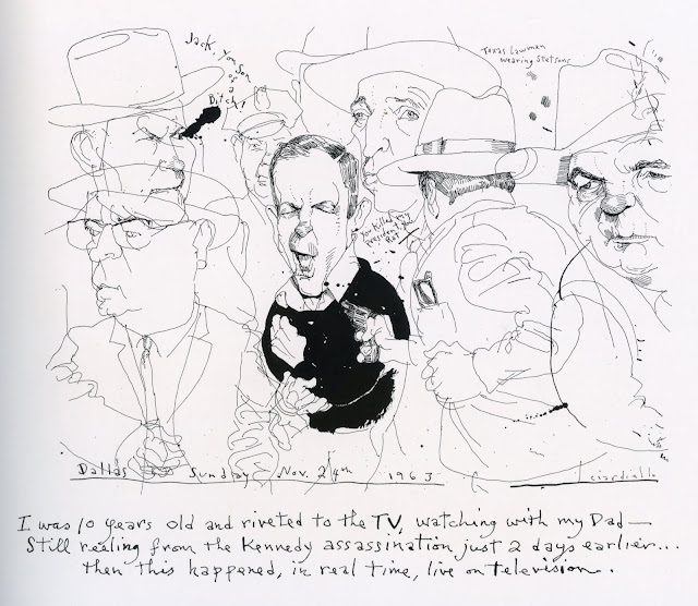
An elegant line contrasted with a thick black brush


A black and white drawing contrasted with jolts of color (detail)


Liquid pools contrasted with scratchy drybrush (detail)

Ciardiello's balance of extremes is delicate surgery in a small space, but when the elements interact well the result is potent images.  Over the years he has produced many excellent pictures in his distinctive style.

Now Ciardiello deserves credit for a different kind of achievement: rather than wait for paying clients to offer him suitable and meaningful assignments in today's parched illustration market, he set out to create his own book of work he could be proud of.  Between other assignments over the past five years he has composed a new book, A Fistful of Drawings.  It is a rare opportunity to see a mature illustrator, unfiltered by art directors and clients, creating images answerable only to himself.

The book is a "graphic journal," a personal memoir about his life and the popular culture he admires.  His pictures include everyone from the Lone Ranger and Annie Oakley to Bettie Page and Al Capone, but he saves his most loving treatments for the movies and movie makers of his youth.  His text is integrated into the pictures as his own handwriting, which is a cross between drawing and lettering.

Here are some of my favorites from the book:


I think this is an extraordinarily beautiful page,  a sophisticated and unorthodox design in which opposite extremes create a healthy tension.  

Some of Ciardiello's pen and ink caricatures are reminiscent of David Levine but unlike Levine Ciardiello uses strong black elements to transform his compositions.


Ciardiello's mix of sensitive descriptive line and abstract design

I think the following double page spread is a real stunner, one of those pieces where the line between illustration and fine art seems to disappear.


The following detail shows how abstract color splatters help loosen and expand the scope of a representational drawing.


Ciardiello's book is for sale from Fantagraphics.

Tuesday, May 14, 2019

ADDING THAT CERTAIN SOMETHING

Over the years countless illustrators have been tasked with making countless illustrations of a woman sitting in a chair.

For example, the following pictures are all from a 1932 issue of The Saturday Evening Post.  


Each is a conventional, respectable depiction of the human form sitting. Each is by a competent artist searching for a fresh approach.  Yet, there is a sameness to these drawings.


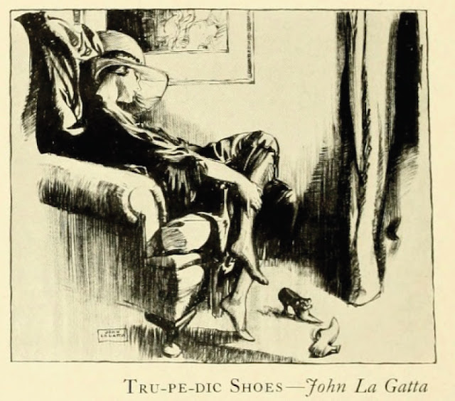
But there was one illustrator in the magazine whose approach stood out from the rest.  John La Gatta  received the same old assignment: draw a seated woman.  But rather than follow the standard conventions for pictures of sitting women, he pushed for something more:  

La Gatta's version of a woman sitting down. She seems to have anfractuous vertebrae and her arms stretch outward like welcoming tendrils.
For other assignments La Gatta would return again and again to the subject of women seated on (or draped sensually over) chairs.  Each new illustration was imaginative, yet truthful:


His pictures remind us of Jane Heap's sly and happy observation:  "Girls lean back everywhere, showing lace and silk stockings...."

The point is not that La Gatta invented a gimmick of using supine postures for women.  The point is that he brought creativity and flexibility to his assignments.   He did not take for granted that seated figures are always perpendicular to the ground.  He did not rest with the predictable rules of anatomy.

And later when it came time for him to draw a woman with perfect posture,  La Gatta's powers of observation provided other ways to make his figures distinctive.  Note here how he exaggerates and plays up her straight bearing, rather than her slouch:


La Gatta became hugely successful in the 1920s and 30s by continuing to look hard at his subject matter after his competitors had stopped looking.  He further supplemented his images with his personal attitudes toward glamour and sensuality.  Together they gave his pictures "that certain something."                                                                                                                                                                   


Sunday, May 05, 2019

BRIGGS DRAWS LITTLE GIRLS

[The forthcoming book about the art of Austin Briggs, from Auad Publishing, is now at the printer.  Unfortunately, there was not enough room in the book for many great images.  Rather than return them to obscurity, I've decided to show several outtakes on this blog between now and the publication date.]

I love Austin Briggs' preliminary drawing of five girls marching in a line through a bar. 

Drawing courtesy of Roger Reed at Illustration House
Note how Briggs uses  the angles of their hats to show their individual characters.  The eldest girl is prim and decorous but by the time we get to the pile up at the end, all decorum is gone:


Briggs adopted a similar approach for the little girls greeting their daddy in the following ad for Douglas Airliners.  Even with his rough, sketchy technique and their backs turned to the viewer, each of these girls has a distinctive personality:


The shy one hides behind her mother, the excitable one leaps in the air, and the middle one wobbles indecisively. 
The drawing is intended to look spontaneous but Briggs did at least a dozen preliminary sketches, trying to tie a hair ribbon on a bouncing ping pong ball. 


This large sketch (19" x 25") and others were tossed on the floor of Briggs' studio as he worked.  That's Briggs' shoe print in the upper right corner.

When Briggs captured touches he liked, he incorporated them in the final drawing.


Briggs' experience shows up in that hand

Before he turned to his charcoal illustrations, Briggs made his reputation doing fully painted illustrations.  Here he paints frisky children in an ad for dog food


He employed a lively brush technique to keep his painting active:


Still, at some point in his career he seems to have realized that the medium of paint unavoidably civilized his pictures.  If he wanted to convey the indecorum of little girls, a crayon or vine charcoal was a more suitable medium.


Despite the seeming crudeness of this line, note how sensitively Briggs depicts the curiosity and lack of coordination in those young fingers.

In an era of slick, full color illustration Briggs was a pioneer in making these basic drawing tools fashionable again.