Saturday, September 25, 2010

DRAWING ATTENTION TO A WHISPER


Illustrator Robert Blechman's tiny, distinctive drawings became a phenomenon in the 1960s. Blechman graduated from college with virtually no artistic training and no portfolio except the work he had done for a college literary magazine. He later recalled,
Nothing could have been more impractical than becoming a professional illustrator. My style--such as it was-- had no precedents and therefore no clear outlets.
Blechman showed one of his school assignments, a hand sewn booklet ("got a B-") to the editor at Henry Holt, who asked if Blechman could make a similar book on a holiday theme. Blechman chose the medieval theme of The Juggler of Our Lady.
I set to work immediately. Clearing the kitchen table of everything but the white paper and Will Durant's Age of Faith as reference, I started the book that evening and finished it the same night. In the morning I took it to Holt, and it was accepted for publication. An epic event in my life.
His feeble, neurotic line, combined with a brilliant concept, caught on immediately and Blechman was launched on a long and profitable career doing books, cards, advertisements and television commercials in his distinctive style.


  Blechman never raises his voice. His special talent lies in compelling huge audiences to stop and listen to his whisper. To achieve this result, he seems to follow a two step process: first, he gets people to pay attention by using empty backgrounds as boldly as his peers emphasized their main subjects. All that negative space surrounding Blechman's tiny little drawings drew more attention to them than a drum
 roll, a crash of cymbals and a spotlight.


 Second, once he has the attention of the audience, he has to deliver a concept that makes it worth their while. Below, Blechman explains how he misunderstood, after his first, immediate success, that he would have to start all over again with something fresh and original:
When the Juggler of Our lady was published and met with great acclaim, I associated success with the book not with me, whom I considered undeserving. Convinced that success lay in producing other Jugglers, I set out to do more of them. Son of the Juggler, Grandson of the Juggler, Grand Nieces and Nephews of the Juggler....They were stillborn, all. In the meantime, the years went by, and, still desperately trying to produce offspring-- Cousin of the Juggler, Bastard of the Juggler-- I would not stop: I could not stop. I did not realize that I was changing from the 22 year old who had sat down at the kitchen table with a pad of paper, The Age of faith, and a vision. No longer the same person I could no longer produce the same work.
Once Blechman returned to wracking his brain to put fresh creativity and honest effort into each new concept, his success was assured. The following illustration from later in his career is only about four inches wide:


 ...yet Blechman still cared enough to make a microscopic adjustment to the length of a nose to make sure the drawing was as funny as possible:


 That's how he became a success.

Sunday, September 19, 2010

ARTISTIC TASTE CONVERTED TO BINARY CODE

When people talk about computer art, they usually focus on the "supply" side: artists using computers to create and distribute art.

But computers have major consequences for the "demand" side of the equation: what viewers want.

We have already witnessed the first primitive applications of computers to understanding what kind of art viewers like and why:

1. In 1994, artists Vitaly Komar and Alexander Melamid conducted a statistical analysis to calculate the ideal painting for U.S. audiences. They discovered that 60% of the population preferred paintings that are "realistic looking" while 88% preferred outdoor scenes featuring lakes or rivers. 53% preferred paintings to have visible brush strokes. Komar and Melamid "translated the numbers into paint on canvas." Their analysis produced the following picture:


2. Information technology is being used to rank the greatest artworks of the 20th century: Economist David Galenson has proposed quantitative methods to rank art, such as the number of times pictures appear in art history textbooks. Other economists, such as Michael Rushton and Charles Gray feel this approach shows great promise. Says Gray: "We all want to believe that there is something special about the arts but I don't buy that there is any difference between artistic and economic value."

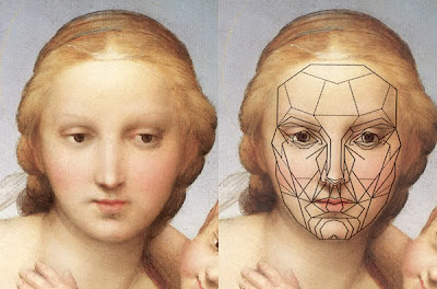
3. Other computer scientists take a different approach, claiming that "with the use of mathematics, computers and massive data bases of attractive faces, we have been able to quantify facial attractiveness in a consistent mathematical computer model...."


Building on historical archetypes of beauty, companies now claim to have calculated the formula for beauty and attractiveness: "it is a mathematical ratio that seems to appear recurrently in nature as well as other things that are seen as Beautiful. The Golden ratio is a mathematical ratio of 1.6180339887:1, and the number 1.6180339887 is called phi." Using computer programs and a trademarked "golden grid," an artist might tailor an image to what viewers would find most attractive.

But these early, sometimes laughable efforts have given way to more sophisticated applications of information technology. Rather than gathering raw data through telephone surveys the way Komar and Melamid did in 1994, science has gained the ability to monitor brain, blood, skin and other biological reactions to art. Until now, these nascent technologies (especially electroencephalography and infrared optical tomography) have found uses in the gaming and neuromarketing industries:
[neuromarketing is] a new field of marketing which studies consumers' sensorimotor, cognitive, and affective response to marketing stimuli. Researchers use technologies such as functional magnetic resonance imaging (fMRI) to measure changes in activity in parts of the brain, electroencephalography (EEG) to measure activity in specific regional spectra of the brain response, and/or sensors to measure changes in one's physiological state (heart rate, respiratory rate, galvanic skin response) to learn why consumers make the decisions they do, and what part of the brain is telling them to do it.
Would a CGI picture evoke a better reaction if the hero's shirt was blue rather than red, or the heroine had longer hair? Would a CGI animated kiss come across as more passionate if it were five seconds longer or shorter?

Computers can identify the electrical activity in the brain that accompanies the thrill of seeing a good work of art. They monitor localized changes of oxy- and deoxy-hemoglobin concentrations in the brain in response to various images. With increasing precision, computers are likely to explain the pharmacological activity that accompanies a diverse range of artistic thrills.

From there, it will become much easier (and more efficient) to stimulate those same reactions by skipping over that obsolete middle man between the work of art and the audience: the artist, who struggled for centuries relying on nothing but highly fallible intuition.


Friday, September 17, 2010

ALL THIS JUICE AND ALL THIS JOY


Seymour Chwast

Some readers didn't like the traditional figure drawings in my previous post:
I can't believe such pointless work is still being appreciated today. Anyone can achieve the same thing in half a second with a camera...

My camera is capable of interpretations too, I can set it to add filters and thus alter the actual captured photons. After all, you can call every human drawing an interpretation...
Some scolded me that to qualify as genuine Art today, "The act of interpretation should be in service of something more" than merely "perceiving form" with pencil or charcoal.

But I can't help it, I'm a sucker for perceiving form.  For me, the melodies that arise from the simple perception of form can rival the most ambitious and elaborate intellectual constructs.

Take the most famous figure painting of the 20th century:


Sure, Picasso wasn't merely capturing a likeness of the human form.  He deconstructed the form, moving in stages from mere likeness to the jagged underside of reality.  But deconstructing a row of human figures is nothing new.  Rembrandt did the same thing 300 years earlier:


Rembrandt's intent may have differed from Picasso's-- Rembrandt abstracted his figures in the service of speed and design rather than to express sociological concepts-- but the outcome is just as freaky:


I'm not deaf to the conceptual potential of figure drawing.  There's no subject more ripe than the human figure for conveying "something more" than mere form.


John Cuneo explains "Why I Went to Art School" from his book, nEuROTIC


Kathe Kollwitz used human forms as icons to convey strong political messages.


But whether an artist is merely trying to achieve a likeness or to convey "something more," every considered line represents a choice and therefore has meaning.  Sometimes it's difficult to find a line that is not "in the service of something more." Consider this phantom figure drawing by Rembrandt:


The background contains ten thousand lines


...yet none of those lines attracts our attention the way these few stray wispy lines do:


Physically the lines are all similar, all made with the same etching needle, but psychologically some weigh more than others. Rembrandt couldn't avoid conceptual content if he tried. And even if he succeeded, the viewer would still perceive concepts. (That's OK).

So when I hear that "real" Art requires something more than perceiving form with a stick of charcoal, I just can't agree. I look at the torrent of figure of drawings produced over the years, from ancient Egyptian walls to the earnest labors of George Bridgman's students, to today's youngsters posting their latest sketch on their blog, and it makes me happy-- even without that conceptual "something more."
What is all this juice and all this joy?
A strain of the earth's sweet being in the beginning.
                    -- Gerard Manley Hopkins


Matisse


Rodin


The Provensens boldly transformed the figure for their wonderful illustrations of children's books


Robert Fawcett used a dry felt tip marker to search for the rhythm in the bodies of construction workers


Jeffrey Catherine Jones found style and grace in the human form

Arkady Roytman posts a new drawing each day