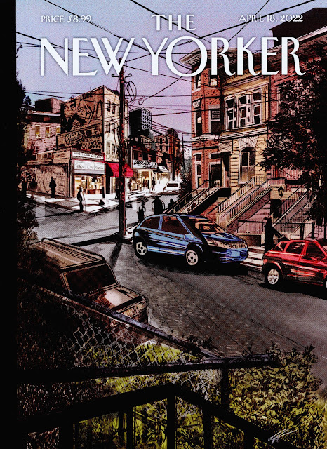
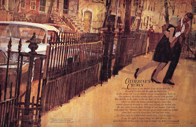
Compare these two city street scenes:
Both pictures show cars parked on the street in front of row houses with metal fences. Both use heavy photo reference. Yet, there's a big difference. For me, one is clearly more successful. Why?
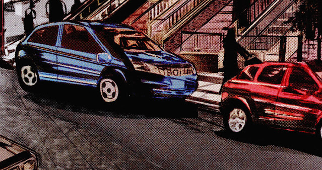
To start, look at the cars pasted on the New Yorker cover. They hover weightlessly, without a common foundation.
The cars in the second illustration are planted firmly on the ground, in perspective.
The fence in the New Yorker illustration depicts individual chain links on top of individual leaves-- details without much effect or purpose.
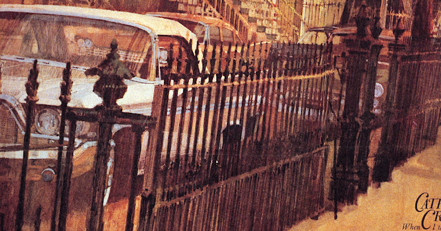
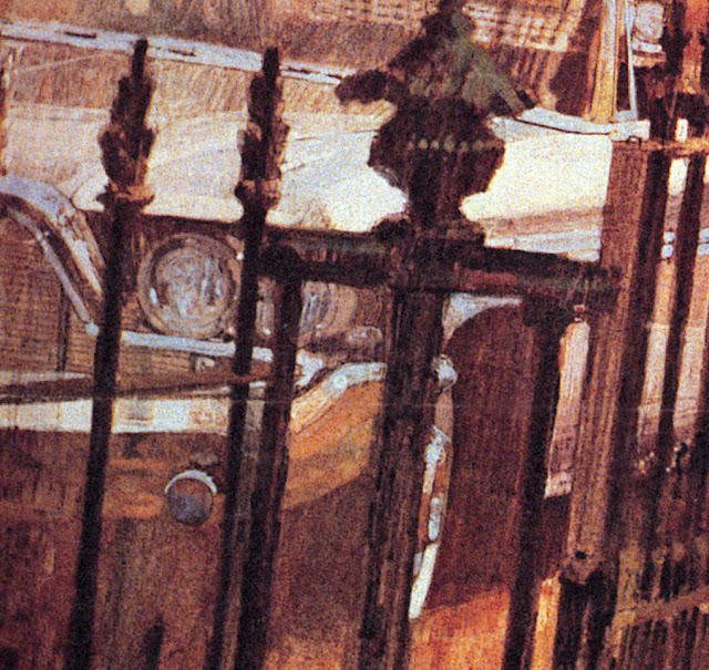
By contrast, the fence in the second illustration adds vigor and controls the depth and perspective in the image. Note that this fence is not drawn mechanically. It creates a realistic impression but there is not a single straight or measured line here:
Next, compare the use of color. The color in the New Yorker cover seems to come straight from a Photoshop bucket. The heavy use of black to control value has a deadening effect on the other colors.
But look at the use of color in the second image. The imprimatura of raw sienna gives even the scumbled black fence posts a depth and a radiance. This is an artist who understands color.
There is obviously no single recipe for a good illustration. Different treatments can be used to achieve different moods or themes. But in my view the ingredients I've listed above, combined with others, create a huge difference in the quality of these two treatments of a similar scene.
So what accounts for the difference?
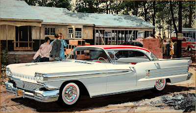
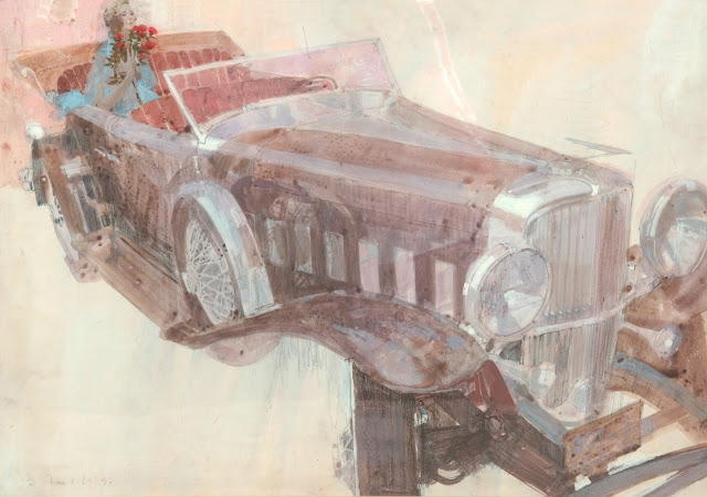
Personally, I think a large part of the difference stems from the fact that the second artist-- Bernie Fuchs-- paid his dues learning how to paint cars realistically from every angle before he ever began stylizing them. Fuchs never had the luxury of cutting and pasting photo-illustrations on a computer. He busted his ass studying the features on cars, blending colors, learning about reflection and painting effects with chrome.
That way, when it came his turn to paint impressionistically and stylistically, he had already earned his opinions. He worked from a position of strength, departing from realism as a purposeful, conscious choice.
The surprising result is that his abstractions and exaggerations were far more bold and inventive than anyone who learned with digital shortcuts.
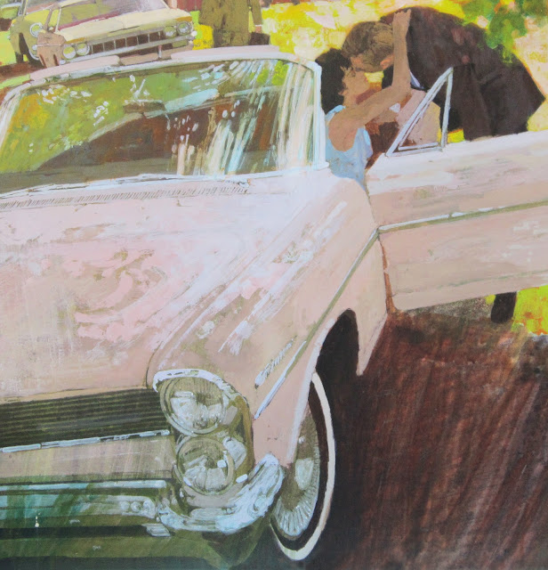 |
| Detail |
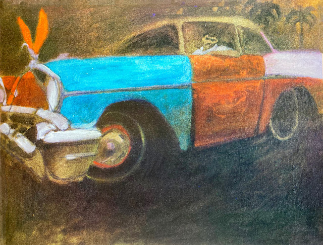 |
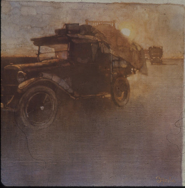
| This last painting-- a car Fuchs saw in Puerto Rico-- was one of his favorites. It hung on the wall of his studio for years, and was there the day he died. |
It is open to debate whether the differences in quality noted above are worth the dues they require. After all, if the audiences (including the art directors) no longer care, or are no longer able to recognize the differences, it might make little economic sense for illustrators living in an era of digital labor saving devices to subject themselves voluntarily to the arduous paths of their forefathers.
I offer no opinion on this question. For now I simply note that there is a difference.

