 |
| All images courtesy of the Delaware Art Museum |
Howard Pyle, the father of modern illustration and one of America's most important painters, died just over a century ago. To commemorate the anniversary of his death, the
Delaware Art Museum mounted a splendid
centennial exhibition reminding us of Pyle's contribution. (You can find information on the show
here and
here.)
Eight years before he died, Pyle asked his art students to sketch their own concept of "The End." The Delaware show includes a selection of those drawings:
In 1903, Howard Pyle and his students gathered for weekly drawing sessions, in which Pyle assigned a subject for everyone to sketch. On the evening of March 25, 1903... sixteen members of the class created sketches of "The End."
Sitting around that room was a charmed circle of young talent. Pyle had received nearly 100 applications for every opening in his school that year. Students such as
N.C. Wyeth,
Frank Schoonover,
Stanley Arthurs,
William Aylward, and
Harry Everett Townsend were at the beginning of what would turn out to be brilliant careers. But on that day in 1903 they had no idea of what lay in store for them, or what their own "End" might be.
Death would catch up with Pyle unexpectedly during a trip to Italy with his family. Who would have guessed that this most American of artists was destined to be buried in a foreign land?
It is hardly surprising that the future nautical painter W.J. Aylward chose a sinking ship for his theme.
Fifteen years later, Aylward would find himself on a ship steaming toward World War I as an artist for the Armed Expeditionary Forces (along with his fellow student Townsend). Passing through the enemy submarine zones with their constant alarms, Aylward had plenty of time to meditate on his choice of an end.
N.C. Wyeth's idea was to draw a man who succumbed to the cold:
Wyeth had a fertile imagination but even he could never have predicted that 42 years later, after a long and fruitful career, he would meet his own fate in a car stalled on the railroad tracks, with his helpless grandchild trapped by his side.
Another student in that room, Frank Schoonover, outlasted all his comrades. He met his end peacefully in the 1970s at the age of 95. He lived long enough to see the empire of modern illustration that arose from such humble origins, and to lecture to the public about those early days at the Pyle school.
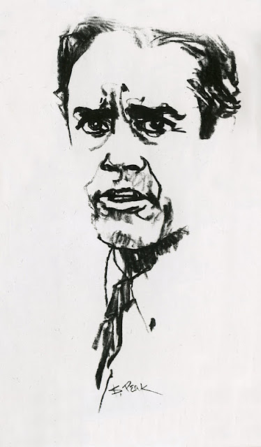
Henry Jarvis Peck envisioned a prisoner's end:
Allen Tupper True, with his preference for western art, envisioned a cowboy hanging from a tree:
Samuel Palmer took a more whimsical approach, apparently viewing the End as the end of a circus performance:
Pyle's huge influence was due in part to the fact that his imagination and talent were perfectly suited for his moment in history. Pyle worked in an era of change, when technology transformed the quality of mass reproduced pictures, and economics transformed the methods of delivering those pictures to the public. His career began when a small handful of black and white journals such as
Century and
Scribners contained primitive wood engravings,
and ended as dozens and dozens of color magazines were beginning to blossom with innovative illustrations and graphic design.
Just as Gutenberg's invention of the printing press in 1440 led to the democratization of knowledge, these changes in the 19th century led to the democratization of art.
Pyle had the vision to hitch his great talent to the technological and economic changes of his day, but the Delaware museum show makes clear that the crucial ingredient for his success remained heart, rather than technology or economics. In his excellent chapter in the Catalog accompanying the Delaware show, painter James Gurney quotes Pyle's students:
Thornton Oakley recalled "During three years with him he did not mention a word about materials, methods, mediums or techniques." Too much emphasis on technique, Pyle warned, would result in a kind of mannered overindulgence, where the means become more important than the message.
Instead, Gurney writes, for Pyle "the expression of an emotion or an idea was paramount." Rather than instructing his students on the technical applications of the new photoengraving processes, he assigned them themes such as "Coming Home From the War" or "The End." He told his students, "Project your mind into your subject until you actually live in it." He wanted them to be able to "smell the smoke" when painting a battle scene. "Throw your heart into the picture," he said, "and then jump in after it."
Then as now, improved delivery systems were not enough to change the world. Pyle could never have been a major catalyst for the Cambrian explosion of modern illustration if his pictures had a less persuasive heart.


