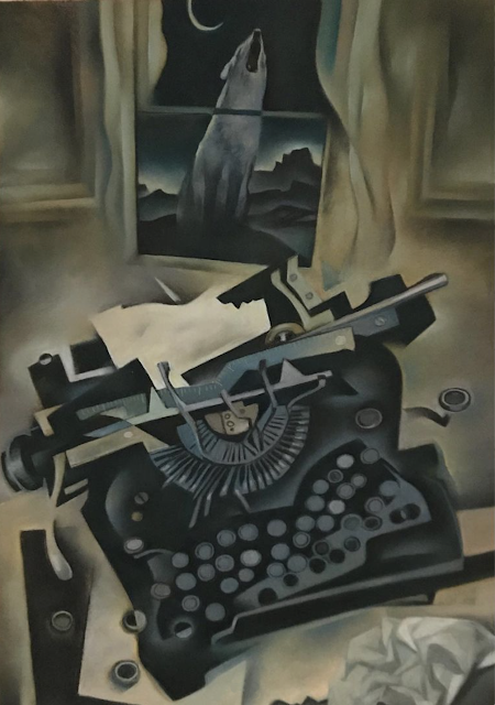
I love this picture by Gary Kelley:
Kelley contrasts the wild world outside with the civilization inside. He has chosen his symbols artfully: a wolf howling in the night; a barely illuminated horizon giving us a glimpse of a savage terrain; indoors, a typewriter, a perfect symbol of order and civilization.
But wait. Something is amiss here. The barrier between the two worlds has been breached, and the machine-- which once stood for the alphabet and straight, uniform rows of words-- has been trashed. Kelley even used a cubist approach to tear the planes of the image asunder. This is a disquieting theme for people who believed electric lights and climate controls would protect them.
What happened here? Has the wolf been in the house?
Or was his feral call from outdoors enough to persuade the typist to renounce civilization? Perhaps a writer concluded that intellect can only take art so far, and that, in the words of Nietzsche, "One must still have chaos in oneself to be able to give birth to a dancing star." To Kelley's credit, in the spirit of the wolf there is no linear answer here, only a rich and rewarding range of oblique explorations.
Today, "conceptual" illustrators have lost interest in many of the traditional challenges of literal imagery. Their goal is to express more abstract concepts using diagrams, visual metaphors and visual puns. Unfortunately, when the idea behind a picture becomes more important than its execution or appearance, many artists take this as a license to draw like crap.
This doesn't need to be. Gary Kelley continues to show us that an artist can explore abstract conceptual issues without abandoning the serious challenges of traditional form creating work. These images present ideas drawing upon the full menu of color, design, exaggeration, prioritization, mood, composition, etc.
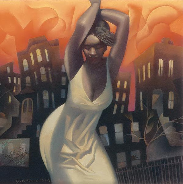
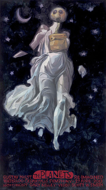
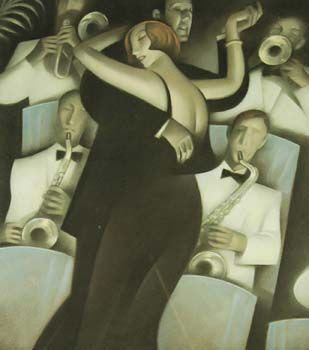
Here are some lovely examples for you to enjoy:


12 comments:
I wondered what happened to Kelley. He's really good. He did those murals at Barnes & Noble.
Check this blog is one of my activities before start to work every morning. Always interesting, always didactic. Thanks!
Kelly's work is always a treat. His Barnes & Noble murals romanticizing great writers elevated the whole look and atmosphere of that store.
On your interpretation of the first image; it seems to me that the wolf's lone note is pure and clean, the animal's gesture clear and direct. Meanwhile the typewriter is a cockeyed hodge podge; a disheveled chaos of keys, latches, strike teeth, and torn and crumpled paper. It hardly seems to be expressing 'wildness' vs 'civilizational order' respectively, as you suggest; almost the reverse. In other words, I'd say it is a mistake to take 'wolf' and 'typewriter' as they connote as words when Kelly has re-coded and re-connoted them visually.
Just what the picture says beyond what it expresses purely visually can only be a guess.
Possibly, the baying wolf outside the writer's window is driving the writer nuts. Possibly the point is that howling alone in the night is simple, but writing alone at night is not only hell but a lone howling of a different kind. Possibly the re/presented liminal space of interiority redolent of privileged white heteronormative spaces manifests cis-patriarchal suprematism that results in a tedious sentence of complete pseudo-scholarly pretension and glib woke self-righteousness clawing for undeserved socio-political power.
Either way, Kelly's stuff is great.
I first saw his work in the 1990s and loved it. What is Kelley doing now?
JSL
I like his 1930-vintage Deco/Moderne style and settings. Perhaps there's some deep, socio-philosophical basis for that. But I don't care if there is or isn't.
MORAN-- I recently had a long and enjoyable talk with Kelley. He remains as active and engaged as ever. In addition to writing and drawing graphic novels, he is working with a symphony orchestra, illustrating music. I covered his symphonic illustrations for The Saturday Evening Post: https://www.saturdayeveningpost.com/2022/04/the-art-of-the-post-the-artist-who-paints-music/
Ignacio Noé-- That's very kind of you. Thank you, I'm a big fan of your work.
Kev Ferrara wrote: "Just what the picture says beyond what it expresses purely visually can only be a guess." I agree. This excellent picture gives us enough to serve as a springboard for a number of speculations, but I do insist that some of those speculations have more merit than others.
^This was an obvious parody!^ (Read the full sentence)
Above comment was referencing this parody sentence: Possibly the re/presented liminal space of interiority redolent of privileged white heteronormative spaces manifests cis-patriarchal suprematism that results in a tedious sentence of complete pseudo-scholarly pretension and glib woke self-righteousness clawing for undeserved socio-political power.
JSL-- For an update on Kelley's current activities, see my latest column in The Saturday Evening Post: https://www.saturdayeveningpost.com/2022/04/the-art-of-the-post-the-artist-who-paints-music/
Donald Pittenger-- That seems to be a common reaction. That 1930s style still resonates with a lot of people, including me.
>Their goal is to express more abstract concepts using diagrams, visual metaphors and visual puns. Unfortunately, when the idea behind a picture becomes more important than its execution or appearance, many artists take this as a license to draw like crap.
As someone who draws like crap and whose task it is to express the most abstract of concepts in pictures, I feel personally attacked. ;)
Was confused by this post until I remembered Conceptual Art didn’t always mean space ships
Nathan Burney wrote: "As someone who draws like crap and whose task it is to express the most abstract of concepts in pictures, I feel personally attacked. ;)"
Apologies for my microaggressions!
Richard-- Yes the vocabulary can hardly keep up with the rapidly mutating variants. The massive (537 page) textbook, History of Illustration by Doyle, Grove and Sherman tells us that "concept art" is art about fictional otherworlds while "conceptual" art communicates an illustrator's point of view through nonliteral images. Steve Heller refers to it as "conceptual or 'idea' art" which seems descriptive enough, but of course Robert Weaver and other artists used a variety of other labels for the phenomenon. Animators seem to use "concept" art to refer to the initial design or prototype. It's all too much for me.
Post a Comment