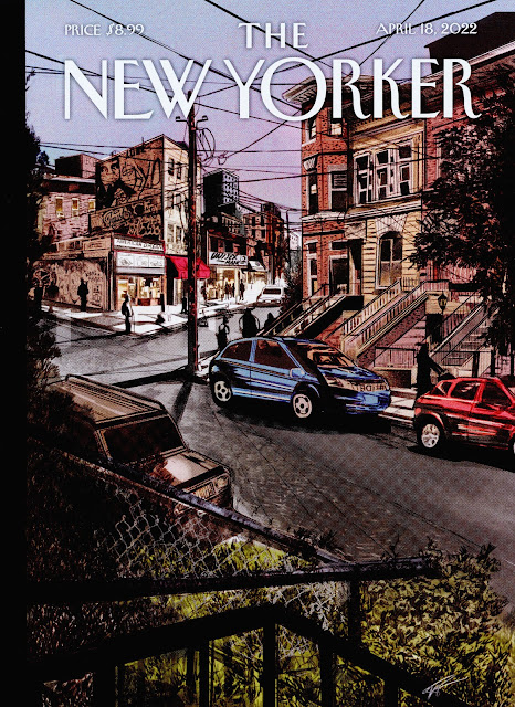
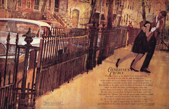
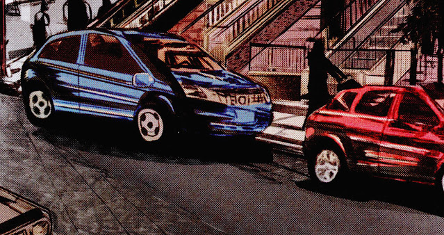
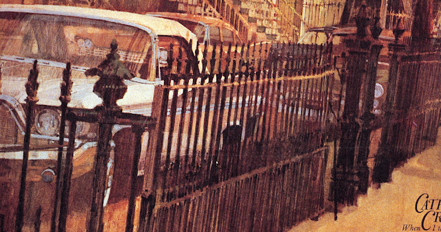
Compare these two city street scenes:
Both pictures show cars parked on the street in front of row houses with metal fences. Both use heavy photo reference. Yet, there's a big difference. For me, one is clearly more successful. Why?
To start, look at the cars pasted on the New Yorker cover. They hover weightlessly, without a common foundation.
The cars in the second illustration are planted firmly on the ground, in perspective.
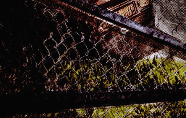
The fence in the New Yorker illustration depicts individual chain links on top of individual leaves-- details without much effect or purpose.
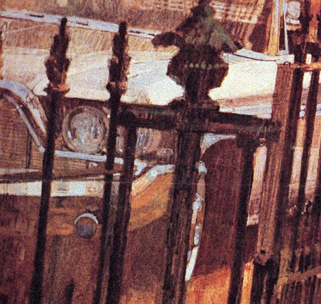
By contrast, the fence in the second illustration adds vigor and controls the depth and perspective in the image. Note that this fence is not drawn mechanically. It creates a realistic impression but there is not a single straight or measured line here:
Next, compare the use of color. The color in the New Yorker cover seems to come straight from a Photoshop bucket. The heavy use of black to control value has a deadening effect on the other colors.
But look at the use of color in the second image. The imprimatura of raw sienna gives even the scumbled black fence posts a depth and a radiance. This is an artist who understands color.
There is obviously no single recipe for a good illustration. Different treatments can be used to achieve different moods or themes. But in my view the ingredients I've listed above, combined with others, create a huge difference in the quality of these two treatments of a similar scene.
So what accounts for the difference?
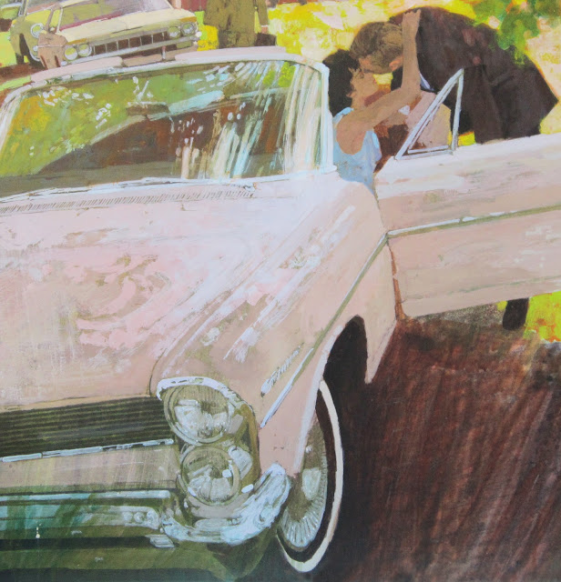
Personally, I think a large part of the difference stems from the fact that the second artist-- Bernie Fuchs-- paid his dues learning how to paint cars realistically from every angle before he ever began stylizing them. Fuchs never had the luxury of cutting and pasting photo-illustrations on a computer. He busted his ass studying the features on cars, blending colors, learning about reflection and painting effects with chrome.
That way, when it came his turn to paint impressionistically and stylistically, he had already earned his opinions. He worked from a position of strength, departing from realism as a purposeful, conscious choice.
The surprising result is that his abstractions and exaggerations were far more bold and inventive than anyone who learned with digital shortcuts.
 |
| Detail |
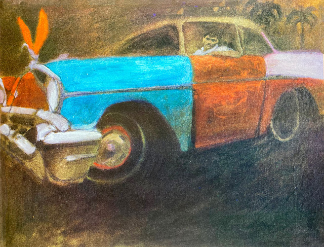 |
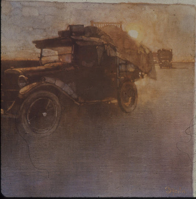
| This last painting-- a car Fuchs saw in Puerto Rico-- was one of his favorites. It hung on the wall of his studio for years, and was there the day he died. |
It is open to debate whether the differences in quality noted above are worth the dues they require. After all, if the audiences (including the art directors) no longer care, or are no longer able to recognize the differences, it might make little economic sense for illustrators living in an era of digital labor saving devices to subject themselves voluntarily to the arduous paths of their forefathers.
I offer no opinion on this question. For now I simply note that there is a difference.



22 comments:
Agreed that The New Yorker cover illustration isn't first-rate. Those cars don't seems to belong there -- the colors, the shine --too much contrast from the so-so background.
And then there's Fuchs. If he wasn't the GOAT, he came damn close. (Spoiler alert: he was.) That 1960 DeSoto peeking behind the fence fits nicely indeed.
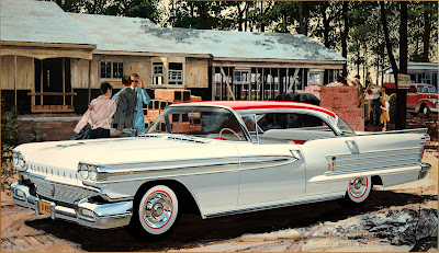
I wonder about the 1958 Oldsmobile ad art. My understanding is that often in those days, one illustrator would do the background and an Art Fitzpatrick semi-clone would do the hardware. Are you certain Fuchs did the car too? I suppose he could have, even though that type of illustration is vastly different from his other styles.
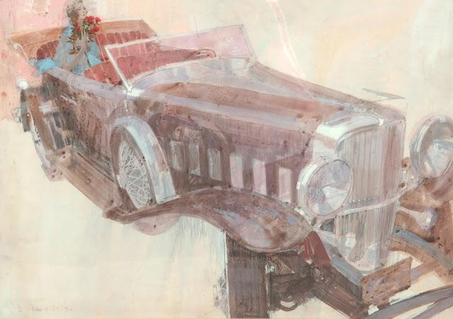
Moving on, that Duesenberg phaeton is teriffic. The main car in the clench illustration is clearly a 1964 Pontiac Catalina, though the one behind it doesn't ring a bell. In a way this accuracy is surprising because in the 1950s, cars shown in Saturday Evening Post cover art were disguised or invented. But then the Post had wads of car ads, and management probably didn't want to be seen favoring one above the others.
Nice post, David.
That New Yorker cover is disgusting.
I'm quickly tempted to point out what once was obvious; that a great part of the poet's job is to actually pay attention, both at a deeper level and more expansively than the ordinary soul; to both observe the specifics and to see through them and beyond them to abstract generalities that remain invisible to most.
But I don't think the 'artist' in question even understands his or her job as being a poet. And neither does the AD. So what's the use?
That Fuchs can rescue a photograph and make a poem out of it, revivifying what the camera naturally kills, is the ultimate testament to how soulful he was; how much of an artist. (The Duesenberg Phaeton is one of my favorite Fuchs poems of one of my favorite automobiles. I find it so lovely I've resisted the temptation to try to understand it.)
In some sense, I think the comparison with Fuchs is such an overmatch that it may not be the best A/B to instruct people on the difference between poetry and thuggery. I'd recommend doing a deep dive on the work of Arthur Getz. I think what we're looking at here is a ersatz Getz who doesn't even know that's what he/she is because they've only ever seen the work of other Getz wannabes who also never actually looked hard at Getz' work. Or the real world. People staring at their goddamn phones aren't artists.
Kev, your own comment is poetry.
What completely broke the New Yorker cover for me was the moment I noticed the brown car on the left. I just can't unsee it.
> Arthur Getz
I fail to see how this is any more successful than Nicole Rifkin’s cover;
https://condenaststore.com/featured/new-yorker-march-12th-1966-arthur-getz.html
Both Getz and Rifkin struggle executing illustrations that do not have an extremely clear value statement and shape language.
This is a common problem. It’s difficult to keep a clear structure to your values when you’re dealing with such complex lighting conditions, and people don’t teach local value anymore.
Happy Easter/Passover/Equinox
*don’t teach *separating* local value
Fuchs (like the Classical masters before him) breaks the whole image into clearly readable areas of local value. Rifkin and other modern amateurs rely too heavily on reality to inform their values, where a single object may have both the lightest lights and darkest darks in the picture.
I fail to see how this is any more successful than Nicole Rifkin’s cover
Because if you are observant and have walked the streets in NYC during a rainstorm in the daytime you will see the truth of what Getz depicted. I couldn't say a similar thing about the Rifkin (taking your word for the artist) because the picture has no expression of the weather, atmosphere, time of year, time of day, or much else. So it doesn't ping experience. (Truth may not even need to ping your personal experience, just actual experience, in order to resonate as honest poetry. Good intuition recognizes the true, it seems to me, even outside direct contact with it. Which is how people can learn from the arts... or spot novel bullshit when they hear it.)
Both Getz and Rifkin struggle executing illustrations that do not have an extremely clear value statement and shape language.
You are putting down Getz's work because he has clear value statements and uses shapes poetically? (Hot take, bro.)
With Getz there is, additionally, long term observation and a sensitivity to general abstract qualities. Yes Getz is more cartoony than Tiepolo, Ingres or J.W. Waterhouse. That's why I think it is more instructive to use his work as a comparison here.
Fuchs (like the Classical masters before him) breaks the whole image into clearly readable areas of local value.
There are a handful of ways of breaking the image up using value or color that different masters use in different eras. Local value is just one of those ways. Which method is chosen depends on the expression of the picture, the temperament or talents of the artist, sometimes the fashion or teaching of the day, etc. There is no illegitimate poesis, provide the poesis is actually poesis.
Rifkin and other modern amateurs rely too heavily on reality to inform their values, where a single object may have both the lightest lights and darkest darks in the picture.
This is a perfectly legitimate aesthetic arrangement under certain circumstances. I don't know where you're getting your Dogma from, but it's Dogma Crapma, and shouldn't be smeared around.
The Rifkin fails because it doesn't disclose any secrets. It is aesthetically (thus narratively) dead. While a work of art worth the name is nothing but shared revelations, aesthetically presented, great and small, yoked to a single great effect.
Donald Pittenger wrote: "I wonder about the 1958 Oldsmobile ad art. My understanding is that often in those days, one illustrator would do the background and an Art Fitzpatrick semi-clone would do the hardware. Are you certain Fuchs did the car too?"
I'm happy to confirm this for the public record. One of the best reasons for a blog like this is to nail down historical facts about such things.
Yes, Fuchs did both the car and the background on that painting. You are correct that the common practice was to team a car painter with a background painter, like AF and VK. However, when Fuchs first started in Detroit it was not clear which category he would fall into, so he had to learn both. He did perhaps half a dozen assignments where he painted both the car and the background, including this one and the truck painting in the 1959 Society of Illustrators annual. Later his employers would decide that he should be a full time background painter.
I interviewed Fuchs on this precise subject for a book I wrote. He had the highest respect for the car painters, and spoke of them in almost poetic terms. He didn't think he ever got as good with cars; I watched him hold the original of that 1958 Oldsmobile 3 inches from his nose and say, "Looks like they had one of the chrome guys come in and clean up that fender after I finished this." I thought it was hilarious that, after 50 years and thousands of paintings, he could examine the painting and remember who did what. Back when he was struggling to survive and didn't know he would turn out to be Bernie Fuchs, those early lessons were clearly burned into him.
Fuchs was proud enough of doing both the car and the background on this one that he signed it.
>You are putting down Getz's work because he has clear value statements and uses shapes poetically?
Not putting down his work. When he’s dealing with subjects where he can simplify an image into a few values and has very clear expressive shapes he makes great pictures. His pictures fall down when the subject doesn’t support that strategy, like the one I linked to. Rifkins pictures are also much more successful when she can veer towards cartooning.
> Local value is just one of those ways.
Absolutely, but I don’t think it can be avoided, unless you want do something like:
- use line
- model everything out
- have chunky impressionistic areas of value
His pictures fall down when the subject doesn’t support that strategy, like the one I linked to.
I don't think that picture falls down. It is a poetic cartoon that concisely and playfully expresses a truth; one that I have personally experienced many times. I can vouch for the abstraction.
I don’t think it can be avoided unless you want do something like: have chunky impressionistic areas of value
This is not an either-or issue.
'Breadth' (derived from nature's inherent modes of organizing) calls for the massing of value contrasts as well as value ranges into larger general conditions. Nature also gives us local values and colors. Any given lighting situation, to be true, is a balance between general and local coding or conditioning; sometimes leaning one way, sometimes the other, but never one without the other (unless the work is a cartoon or graphic design.)
Richard and Kev Ferrara-- I first began clipping illustrations out of magazines because of this street scene by Getz:
https://condenaststore.com/featured/new-yorker-july-8th-1967-arthur-getz.html
I was a small boy when I spotted that cover on my parent's New Yorker and it knocked my socks off. I was astonished by his ability to employ such a loose, casual style to capture the mood and realities of a NY street so perfectly. I looked and looked at that brilliant painting trying to figure out how he did it. When it came time for my parents to throw the magazine away I still hadn't figured it out so I rescued the cover and took it up to my room. It was the beginning of a long, unhealthy habit of preserving images that fascinated me, and it still fascinates me today.
Child David has good taste, that’s a great Getz picture. Simple value statement, strong clear shapes.
You were born for this blog apparently!
Simple value statement, strong clear shapes.
You mean like Malevich?
The Aesthetic/Poetic Effect. That's what everything is aiming toward in Getz's work. Anybody can make a simple value statement or clear shapes. Just like anybody can use a hammer and saw but few people can build a decent doghouse.
I first began clipping illustrations out of magazines because of this street scene by Getz:
That's a great one to start with! The one that first hooked me in was the somber parking garage image from 1957 with the lights of Broadway in the distance.
Looking at the Getz covers available on that site, there's just so many that are great, and so many I haven't seen before. He really was the next step from Hopper and the Ashcan school. With just the right touch of exaggeration and clarification to really make his chords sing. (I think not coincidentally, the only quote I've heard about his favorite painting teacher at Pratt was that he was always talking about Sorolla.)
Any chance of the art of Bernie Fuchs book being reprinted? Only copy I can find online is 2nd hand for 1500$
The photobashing in the fence area is trash.
After revisiting the post and enjoying the comments, the New Yorker cover is growing on me. Is that wrong?
Rafi-- Anyone would be insane to spend anything near that for the Bernie Fuchs book. The publisher warned that there would only be one printing of that book, perhaps as a method of getting fans who were sitting on the fence to go ahead and place orders. I spoke with him about a year ago and he was not inclined to deviate from his original position.
Tim-- Not at all, that's good. I sincerely hope you'll share the factors that caused you to rethink your view. If there are things I'm missing I will gladly go back and take an earnest look.
That older car illustration he did always blows me away. Also, I'm sure many will debate me here, but that man may have been the best draftsman of all time.
Also that more recent New Yorker cover looks like they just took a photo and put a filter on it. Are we sure there was even any actually drawing/painting done by the aritst?
A friend of mine was an illustrator for years, and met Bernie Fuchs. Mr. Fuchs gave him about twenty rough drawings. My friend gave me one and carefully put the rest away. Unfortunately, he misplaced them, and they were lost for the last fifty years. The other day his wife stumbled on them. They are delighted and thrilled, but also wondering what they should do with them. They are sketches typical of many you've published, unsigned, but clearly Fuch's original work. They aren't necessarily interested in selling, but don't want them to just sit in a the back of a closet for another fifty years.
Thank you, Bob
I enjoyed reading this post. I had never seen these pictures before. Your analysis of them makes me understand why an artist would prefer the second picture to the first.
Post a Comment