Every time I visit Manhattan I make a beeline for the Society of Illustrators which, pound for pound, remains one of the most interesting galleries to visit in the city. Many pictures there are not to my taste, but I never fail to learn from and be inspired by their varied assortment of art on display.
Here are some particularly excellent images I want to point out to the world:
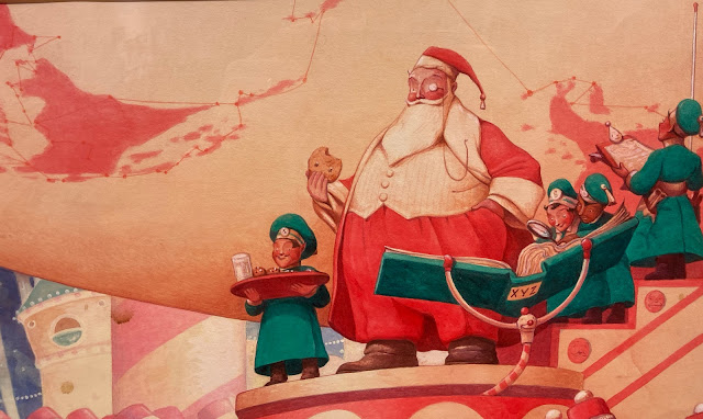
This huge, juicy watercolor by the talented Bill Joyce reminded me that I don't revisit his work nearly enough. Up close the painting just glows in ways that printed books-- or your computer monitor-- can't capture.
Joyce's distinctive imagination shines through in every garment, every hairstyle, every pose, every architectural detail, every lighting effect. This is a beautifully constructed painting.
The Society is also displaying Victor Juhasz's preliminary sketches leading up to his illustration for the short story, The Mailman, about a mousy little man provoked to violence.
Milton Glaser warned students, "A designer who cannot achieve the specific image or idea he or she wants by drawing is in trouble." For proof, look no further than what Victor Juhasz is able to accomplish with his excellent preliminaries for different ideas:
 |
| Juhasz can master extreme foreshortening to fit all the necessary ingredients into the picture, each with the right emphasis. He knows exactly how to balance the weight of the figure in the pose he needs. |
 |
| You want those figures drawn from above? Yeah, Juhasz can do that too. |
 |
| How would that shadow work from a different angle? Under control. |
 |
| Another extreme perspective: a knife's eye view of the situation. |
It's a joy to watch a talented draftsman like Juhasz play with alteratives. Would you find comparable draftsmanship at the Museum of Modern Art? Would MOMA even care that you can't?
Here is the final approved illustration:

In a different vein, an exhibit of children's book illustrations displays, among others, the joyful work of Christian Robinson. His inventive designs are always refreshing to the eye. He is, in my view, this generation's successor to the greatest designer/illustrators, such as the Provensens.

And for one more example in a different category, kudos to whoever at the Society figured out that this mask by illustrator Wladislaw Benda needed to be lit from below, with a red background.
Benda is another excellent illustrator who seems to have slipped through the cracks, but in the 1920s and 30s he was as famous for his masks and costume designs as he was for his illustrations.
There you have it-- a selection of personal high points from the Society of Illustrators this week. Always worth the trip.


9 comments:
In my teens I had a copy of his 1944 book , Masks . Lost but not forgotten .
Thanks for showing Victor Juhasz's work. More than many of today's illustrators he really remembers the importance of good drawing.
Great stuff. As a teenager living in Manhattan, a visit to the society was always an eye opener.
I stopped going when they seemed to go digital but if they're showing work like this I need to get back there.
JSL
Ah, Benda. I’ve always been I’ll at ease regarding his work because his treatment of eyes.
It's great to see those Victor Juhasz sketches. So inspiring to see him apply his formidable draughtsmanship in the service of offering some lucky art director several expertly resolved visual options. Reminds me of another Glaser maxim - Art is work.
David,
Thank you for the shout out. I am humbled that you would spotlight the scribbles. I confess that the sketching process is far more satisfactory at this point in my life than refining the finished piece.
Post a Comment