Sunday, May 15, 2005

MORT DRUCKER


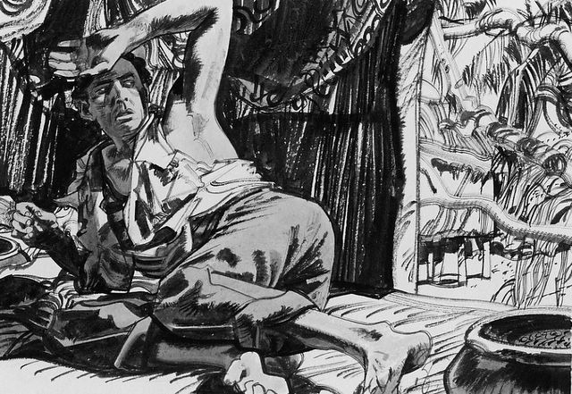
A panel from Drucker's "Patton"

Mort Drucker is the genius caricaturist who was a centerpiece of MAD magazine for decades. His ability to capture a likeness from many different angles and with a variety of expressions bordered on the supernatural. If Drucker had been born 500 years earlier, he might have been burned at the stake for witchcraft. But practicing his art on the pages of MAD magazine for almost 50 years, he remained safely below the radar of most people over the age of 18.


Drucker's Jack Lemmon

One of the most striking characteristics of Drucker's work was how liberally he dispensed his abundant talent. He was able to lavish creative attention on background details and inanimate objects without restraint. While other more prominent caricaturists such as Al Hirschfeld or David Levine might labor for a week over a single likeness in a fixed position, a torrent of superior drawings flowed nonstop from Drucker's miraculous pen. He might easily draw a hundred distinctive faces for a single issue of MAD, depositing them effortlessly in crowd scenes, or in a picture frame in the background, or even on a passing horse or dog.


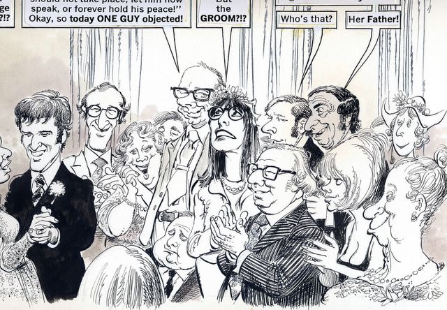
Note the complex architecture of a typical Drucker "background" crowd. Drucker's crowds compare favorably to the famous "group portraits" of celebrities by artist Ralph Barton that caused a sensation in venues such as Vanity Fair in the 1920s.


Theatre audiences gave Drucker an opportunity to indulge himself


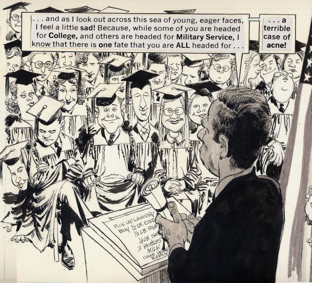
Another crowd scene, this time the hard way: over the shoulder of the speaker, from above.


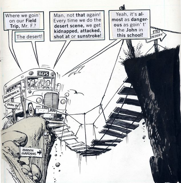
Superfluous background characters each have a distinctive personality

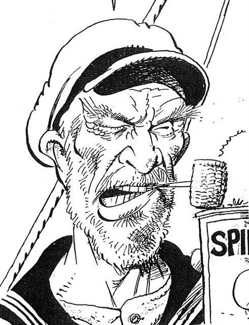
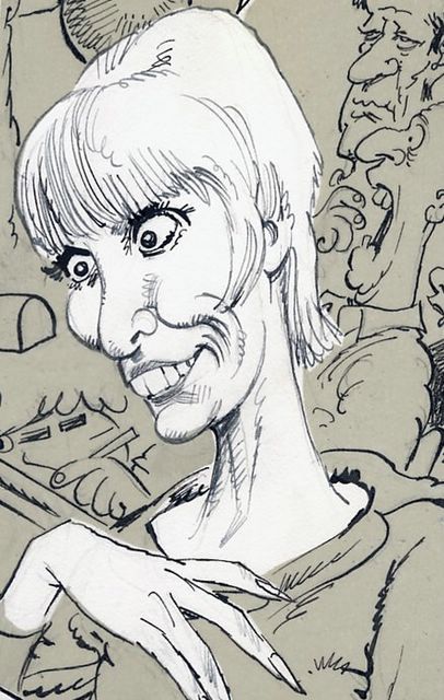
It is difficult to think of an artist who doesn't start from a standard template when drawing the human face, either because their style hardens with repetition or because they resort to shortcuts to save time. You can spot an artist's standard presumptions about the human head, usually camouflaged by a few distinguishing details added at the end. This approach was apparent in the work of excellent artists such as Hal Foster (Prince Valiant) and Alex Raymond (Flash Gordon)as well as lesser artists such as George Wunder (Terry & The Pirates). But Drucker makes no assumptions. With each new portrait he seems to start back at the Garden of Eden and redesign the human head from scratch. Never has an artist drawn the head in so many different shapes and sizes. A garden of Drucker faces follows:


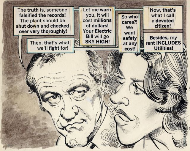
Drucker's brilliant drawings were all rendered in his trademark style, a springing, bouncy line that adds energy to each and every picture. (Drucker's forte was his line work. With a few exceptions, his color work was far less successful). One look at his pictures made clear that Drucker's jaunty line was based on a rock solid understanding of perspective, anatomy and composition.

In addition to being more prolific than other caricaturists, Drucker has the advantage of being a superb draftsman. While many caricaturists mastered portraiture, Drucker mastered anatomy and perspective and technical drawing so that he didn't share the limitations of his more specialized peers. Drucker's brilliance at all around drawing enabled him to transcend some of the limitations of the comics medium. While his artwork may be confined to tiny rectangular boxes, he is able to squeeze the illusion of great depth and scope into those spaces.


Drucker's understanding of anatomy and perspective makes him fearless about taking visual risks.


Drucker seemed to be able to squeeze limitless depth into a tiny panel


Another example of Drucker making the most of a small panel


Drucker's use of perspective at work

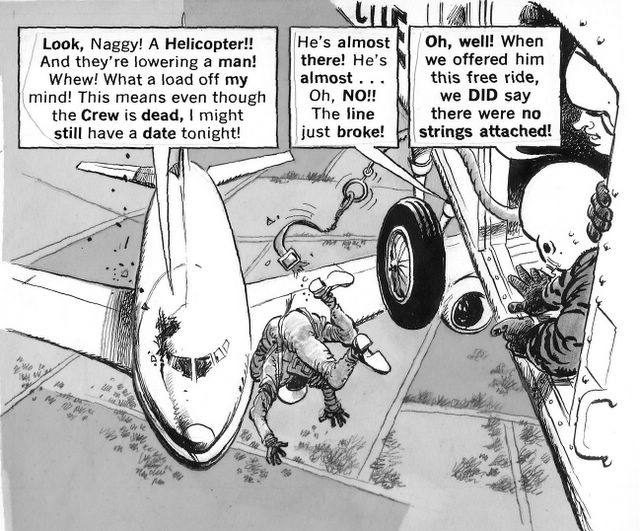
On thousands of pages, he crowded every panel with dense images and still had enthusiasm left over for visual jokes and playful sidebars.


Drucker's enthusiasm for the act of drawing sometimes took him to bizarre lengths.

Drucker sustained his extraordinary quality over many decades, compiling an unrivaled body of work. To paraphrase Bohun Lynch, Drucker "had drawn so many caricatures that he must now wait for new subjects to be born."


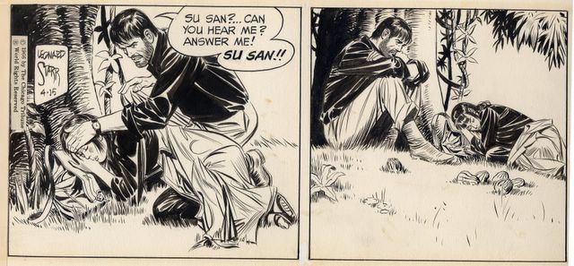
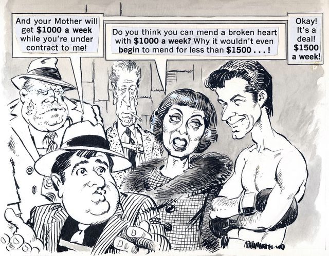
A panel from Drucker's "Godfather"

Drucker's one Achilles heel as a caricaturist seems to be the benvolence of his drawings. He seemed incapable of generating the type of nasty pictures that brought fame and notoriety to Thomas Nast or Daumier.

Those who swoon over the caricatures by Daumier found on museum walls forget that those very pictures originally appeared in the French satiric tabloid, La Caricature. They would do well to invest some time in studying a superior artist hidden in the pages of MAD magazine.

Sunday, May 01, 2005

LEONARD STARR


In my opinion, the best "story" strip of the past 50 years was unquestionably Leonard Starr's On Stage, which ran from 1957 to 1979. At its height in the 1960s, On Stage was unsurpassed by any other strip in its genre, including Alex Raymond's Rip Kirby , Milton Caniff's Steve Canyon, and Hal Foster's epic Prince Valiant. Starr combined a full range of talents to produce On Stage: his drawings sparkled with his fine brushwork and his compelling use of blacks; he captured subtle facial expressions that went beyond anything his peers were doing; he employed strong compositions, his pictures were dramatically and intelligently staged, and he sure knew his anatomy. Above all Starr wrote like a dream; thoughtful, witty and as erudite as his comic page audience would permit. Starr bound all these components together into a consolidated work product that set a new standard for the genre.

John Updike once noted that writers and artists share a common urge to put black marks on paper. Nowhere is the connection between the literary and graphic arts more evident than in comics, where the words climb right into the picture to create a hybrid art form. The creators of comics try to straddle the dividing line between words and pictures, but usually either the pictures or the words dominate. The lesser of the two talents then detracts from the total effect. The medium has a long history of mismatches. There are comics where brilliant drawings are linked to puerile content (such as Alex Raymond's Flash Gordon) or where thoughtful and intelligent stories are saddled with crude drawings (such as Frank Miller's Daredevil). Establishing a balance is difficult, and rare.

Starr was an artist who achieved that balance. His stories, and particularly his depiction of relationships, had insight and depth. The medium has never known a smarter author.

The relationships in On Stage were complex and mature. They made most previous comic strip relationships seem one dimensional and simple minded by comparison.

The dialogue in On Stage often contained the humor and irony one might find in excellent fiction.


In addition to thoughtful dialogue, Starr could stage action sequences with the best. (These are, after all, comic strips).


On Stage combined action with wonderful verbal exchanges


Whether the scene was a windswept mountaintop in some exotic location or in a Manhattan foyer, Starr combined dialogue, facial expressions and hand gestures to give On Stage a quality that none of his peers could match.

Starr's crisp drawing style is supported by his understanding of anatomy and design


Starr's Vietnam story was a highpoint of the strip

The poignant end of the visit to Vietnam

The strip went through different phases. Starr originally planned a career as an ilustrator, but anticipating the demise of illustration in the 1950s, he turned to a syndicated comic strip instead. He rode the decline of the story strip until 1979. As newspaper space shrunk and newspaper circulation dwindled, On Stage shed some of its detail and charm, and Starr jumped ship to take over Annie, the successor strip to Harold Gray's Little Orphan Annie.

Thursday, April 21, 2005

THE GREAT DRAFTSMEN

Drawings have always been a more intimate measure of an artist's greatness than paintings. In the words of Roberta Smith, "drawings are a direct extension of an artist's signature and very nervous system." Measure the drawings of illustrators and cartoonists by the same standards you would apply to the old masters, and I promise you some of them come out very well indeed. Here are samples of lovely drawings that were probably worth a closer look than ones you gave them while flipping through your newspaper or magazine:


Fawcett


Fuchs


Sickles

Arthur Szyk


Frank Frazetta

Thursday, April 14, 2005

RECOGNIZING QUALITY IN UNLIKELY PLACES

Great artists, writers and cultural leaders are often able to discern real quality in the popular arts. Some are not even afraid to talk about it:

Vincent Van Gogh: Before he became a painter, Van Gogh aspired to be a magazine illustrator. He praised the quality of illustrations in magazines such as Graphic, Illustrated London News, L'Illustration, and Harper's Weekly, and clipped out their drawings, which he pasted in portfolios for further study. UCLA art professor Albert Boime quotes Van Gogh's correspondence on this topic: "[Van Gogh] declared: 'I would like to go to London with portfolio and visit the editors and managers of the illustrated journals-also get information about the different processes-a double-page spread allows for broader style.' That he fully intended to specialize in magazine illustration is seen in his hopeful observation that magazine editors would welcome 'somebody who considers making illustrations his specialty.'"

Willem De Kooning: The darling of the abstract expressionist crowd came to America to find work as a commercial artist, abandoning Europe which was then the bastion of traditional gallery art. De Kooning said he was not concerned about the stigma of commercial art. He just knew that America was a place you could get ahead if you worked hard. He later turned from commercial art to house painting when he found that house painting paid more (at that time, $9 per day).

John Updike: a major fan of cartoon art, he collected comic strips from the newspapers, wrote fan letters to comic strip artists and collected their originals. He tried unsuccessfully to become a cartoonist, and later settled for being a writer. But to this day, he says "whatever crispness and animation my writing has, I credit the cartoonist manque." (Hogan's Alley No. 3, p.125)

Ad Reinhart: the famous abstract painter was a newspaper cartoonist in the 1940s and 1950s for the New York newspaper PM. (NYT December 21, 2003).

Michael Chabon, pulitzer prize winning novelist who now works in comic books, described the attraction as follows: "High art and low art, children's reading and adult's reading, the margins of trash and quality....comic books have always been border straddling, even, fundamentally, between words and pictures. There's something stimulating about hanging out at the borders there." (NYT March 17,2004)


Gilbert Seldes, one of the country's most prominent literary and art critic pronounced the comic strip Krazy Kat to be “the most amusing and fantastic and satisfactory work of art produced in America today.” The poet E.E. Cummings wrote an essay praising the art of Krazy Kat and describing the strip as a “living ideal” superior to “mere reality.” Other fans included the painters Joan Miro and Willem de Kooning as well as authors Jack Kerouac and Gertrude Stein.

Saturday, April 02, 2005

WELCOME


Once upon a time, artists found steady employment working for Popes and kings. From the cave paintings at Lascaux to the temple paintings at Karnak, from the Sistine Chapel to the palace at Versailles, the best artists could always feed their families creating artwork for the church or the state. Then, one by one, kings and pharoahs and Popes and Dukes stopped commissioning new art. Corporations emerged as the new centers of economic power. They also became the primary purchasers of art.

Artists were forced to adapt to the new economic realities. There were fewer jobs illustrating the bible and more jobs illustrating women's magazines. The same gifted artists who once might have been commissioned to record historic battles found work painting for corn flake companies and car manufacturers. Although the sponsors and the subject matter both changed, the quality of the artwork did not. Throughout the 20th century, talented artists created drawings, paintings and other objects of great beauty on behalf of their new corporate patrons.


People with uncertain taste had difficulty recognizing the true quality of this work. They became disoriented by its commercial origins. They looked for marble pillars and gold frames to help identify what was beautiful. But those with insight and judgment are rarely misled by the packaging.

Now the world has turned once again. The market for illustration has atrophied and many of the most creative artistic talents have migrated to movies, computer graphics and video games. But for over a century, many of the most talented artists in the world found a steady paycheck in illustration.


This blog is to celebrate the glorious talent of the artists who illustrated stories, advertisements and comics in the 20th century, to showcase their work retrieved from private collections and crumbling newsprint publications, and to welcome dialogue on their accomplishments.


The only way to react to art is personally. In my very personal view, creative artists who are worth a close look include:


Austin Briggs

Frank Brangwyn

J.C. Coll

Dean Cornwell

Robert Fawcett

Frank Frazetta

Bernie Fuchs

Charles Dana Gibson

J.C. Leyendecker

Winsor McCay

Howard Pyle

Alex Raymond

Norman Rockwell

Leonard Starr

Saul Steinberg

N.C. Wyeth


Who is on your list of greats?