Thursday, August 25, 2011

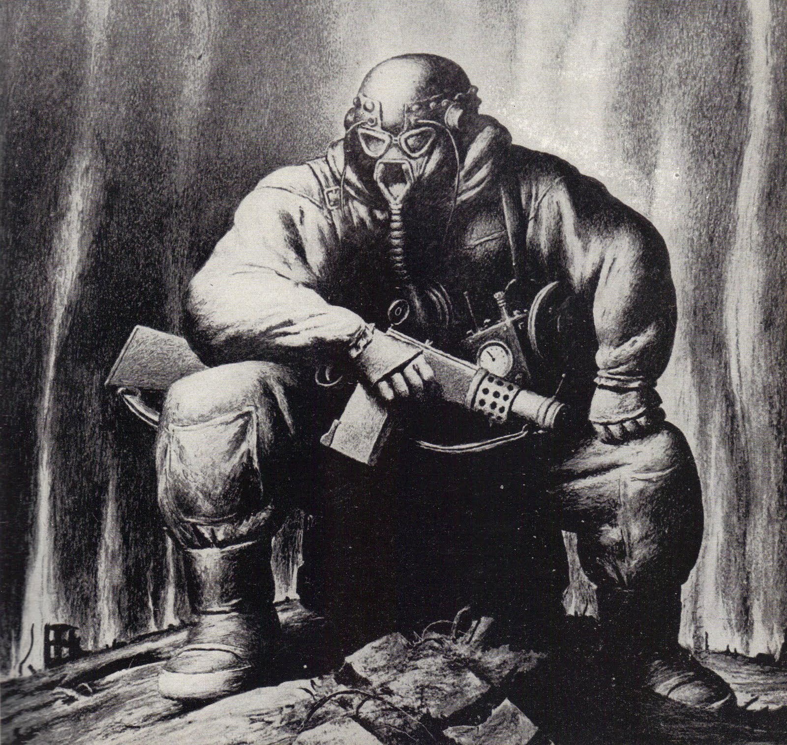
ROBERT RIGGS (1896 - 1970)


Nobody talks much about Robert Riggs anymore, but he was once one of the nation's most highly regarded illustrators.

As Walt Reed wrote, "Robert Riggs was awarded the Gold Medal for Excellence by the New York Art Directors Club for ten consecutive years and received many additional awards." He was elected to the Society of Illustrators' Hall of Fame.  His work is in the permanent collections of the Metropolitan Museum of Art in New York, the Philadelphia Museum of Fine Arts and the U.S. Library of Congress.

What made Riggs so special?  If you went through a checklist of factors that normally make an illustrator stand out, Riggs seemed to have none of them.   His work was not flashy or innovative or glamorous.  He had no special talent for anatomy or facial expressions.  His compositions and colors weren't stylish or bold.  If anything, he favored basic, symmetrical compositions with conventional color schemes:


Note how frequently Riggs plants his subject right smack dab in the middle of his canvas.

Furthermore, his subject matter was hardly topical or crowd-pleasing.  No one would describe his work as romantic or witty or trendy--  no pretty girls, no heart-warming family scenes, no attractive couples in passionate clinches.  And Riggs didn't try to show off with a lot of details and frills.  To the contrary, he simplified and stripped away unnecessary detail.


For me, the special appeal of Riggs' work is in its distinctive weight.  He imbued every subject with a great feeling of solidity and substance-- what Reed calls "monumental" compositions.  Riggs' figures in the following picture are made of the same granite as the mountains behind them.


Riggs didn't follow the recipe for popular illustrations of his day.  He viewed the world in a powerful, muscular way and conveyed his vision as honestly as he could.  That was enough to capture audiences and the respect of his peers. 


Riggs had very few imitators, perhaps because other illustrators just didn't see the world through his eyes.

Saturday, August 20, 2011

JAMES GURNEY GETS HIS CAR INSPECTED

Illustrator James Gurney wrote:
"Yesterday I took my car to the shop because it needed an inspection. The rain was pouring down. There wasn't much space in the waiting room. So I sat under the awning out back between an old rusty engine and a forklift.
While I waited, I sketched the mud puddle beside me. The rain streamed off the corrugated roof  and splashed the water, making big bubbles. The puddle was a sea of overlapping ripples."

I love this little study, not just for how it looks but for what it signifies. 

Gurney is the creator of the famed Dinotopia series, whose books, calendars, posters, prints and collectibles have become a publishing sensation.   He is renowned for his illustrations for National Geographic and his more than 70 book covers, as well as stamps and animated films.

Gurney working on one of his carefully researched illustrations for National Geographic,
with his parakeet on his shoulder 

He authored two excellent books on art, Color and Light and Imaginative Realism and in his spare time he writes one of the best, most informative art blogs around.    I get exhausted just reading about his accomplishments.  Here is his work plan for the 160 illustrations he created for Dinotopia: The World Beneath:


So when Gurney finally gets a few minutes of respite from the easel to take care of routine car maintenance, what does he do?  He becomes so intrigued by the effect of rain drops in a mud puddle that he pauses to produce the lovely study above.

Gurney's fans ask him about his work habits.   He tells them, "I typically work from 8:30 to 5:30 five or six days a week."

Nonsense.

The problem with Gurney is that he can't distinguish between work and play.   Robert Frost wrote about that state of grace, where the thing we need to do and the thing we love to do "are one."
My object in living is to unite
My avocation and my vocation
As my two eyes make one in sight.
Only where love and need are one,
And the work is play for mortal stakes,
Is the deed ever really done
For Heaven and the future's sakes.
Some of the most successful artists are the ones whose eyes can't help but see-- and whose hand can't help but investigate-- the beauty of a rain puddle even while they are waiting in a dreary line for their car to be inspected.

Tuesday, August 09, 2011

41 ILLUSTRATORS AND HOW THEY WORK


A superb new book about illustration, written by the well known expert Fred Taraba, has just been released by Dan Zimmer's Illustrated Press.

An instant classic, the book describes the art and the working techniques of 41 great illustrators in loving detail. It provides a wealth of information you won't find anywhere else, including preliminary sketches, reference photographs and other helpful materials.


The reproductions are beautiful, many from the originals. The production values are excellent.


Taraba wisely chose to sidestep the illustrators who have already been covered exhaustively (such as Norman Rockwell, Maxfield Parrish or N.C. Wyeth) and focus instead on brilliant but slightly lesser known illustrators who deserve greater recognition today.  Austin Briggs, Joe de Mers, John Gannam, Andrew Loomis, Alice Barber Stephens, Saul Tepper, Coby Whitmore... this book is a goldmine of under-appreciated talent.   I recommend it highly.  It is available through the publisher.  

Saturday, August 06, 2011

5 ARTISTS AT COMIC-CON: CRAIG ELLIOTT

Every year at Comic-Con I check in at the booth of Craig Elliott, a talented artist who works for Disney and Dreamworks on animated films such as Mulan, The Emperor's New Groove, Treasure Planet, Shark Tale, Flushed Away, Bee Movie, and Enchanted, Monsters vs. Aliens, and The Princess and the Frog.


I like the strong designs in Elliott's visual development and layout work for the movies.


But  I especially like that Elliott is one of those artists with the ambition, energy and curiosity to keep growing after his day job is through.   Every year when I see him, he seems to have broadened his horizons further.  


His core style is in what he calls "the grand tradition of American illustration, Japanese scroll paintings and woodblock prints, fantasy illustration, and great artists of Europe."  He works in both digital and traditional media, including oil paintings (for exhibition in Paris and the US), sculpture, landscape architecture, and he has now started designing jewelry as well.

Elliott is one of the artists featured in the new Flesk Prime book from Flesk Publications and is the subject of the upcoming book, The Art of Craig Elliott.  If you don't know his work, it's certainly worth a look.

Thursday, August 04, 2011

5 ARTISTS AT COMIC-CON: ASHLEY WOOD


Ashley Wood's energetic pictures have spawned an entire industry.  He went from drawing comic books to multinational production deals with development partners and global media outlets who produce video games of his characters, toys, collectibles, movies and books.  Wood seems to be everywhere, from art galleries in China to movie studios in Hollywood, and shows no signs of slowing down.


In his talk at Comic-Con, Wood proved to be as energetic and blunt as his art.  He said that not long ago his career "really sucked balls"  but he found the right publisher who believed in him, and teamed with the right people.  Mostly, he worked hard.


Sometimes Wood seems to crank out art like one of the gattling guns on his robots, spewing explosive rounds.
I work every day, it's a compulsion.  People say I'm prolific, but as far as I'm concerned people who say I'm prolific are just fucking lazy."
Wood is not the most refined, cautious artist you'll ever meet.  But despite an occasional misfire, Wood continues to generate large quantities of very good art.  He has a strong sense of design, good color, and he knows how to draw and paint.  Says Wood, "I like what I do, but I can  be better.  I am still trying to boil it down to its essence."


When asked where he found his inspiration, Wood responded,
I'm inspired by the fact that I'm going to die.  The clock is ticking, and time is against me.  You can't just wait for an opportunity to come, you have to go out and chase your dreams.  Some people hang out in cafes and talk about doing something, but I'm out there working every day.  I go out on weekends and take pictures of clouds I like.
He was extremely likeable and quickly won over his audience.  Unlike many commercially successful artists who pull the ladder up after them, Wood displays a healthy lack of pretentiousness:
A lot of the art made in the last 30 years was kind of shit.  The idea-based art gets kind of boring if you need someone to sit next to the art and explain it to you.  I've never seen a "lower class" to art.  When comic art becomes more valuable, that's what makes the fine art world gravitate to it.
But Wood's most endearing comments had to do with his family.  He said, "The best thing about making movies is that my kids will think I'm cool."  And his wife?  "My wife is my muse.  If the hair changes on the women in my paintings, it's because my wife changed her hair."

Sunday, July 31, 2011

5 ARTISTS AT COMIC-CON: CHESTER BROWN


Cartoonist Chester Brown stood in front of a room full of people at Comic-Con and described his sex with prostitutes.  As he went through the details, he displayed drawings from his new book, Paying For It:

Brown belongs to that class of oddballs and misfits with a fierce compulsion to share the most scatological, sexual and personal details of their lives.  After Brown showed us drawings of his penis and described how he paid women for sex because he could not obtain sex as part of a well rounded relationship,  I asked whether he considered any part of his life too personal to put in a book.  He responded, "Not as long as it makes for a good story."

The extreme candor of such artists, combined with their vantage point on the outskirts of society, sometimes makes for interesting reading (and occasionally provides insights we couldn't get from more conventional sources).

However,  I don't think Brown's large audiences are lured by his artistic talent.  Most of the time, he draws just well enough to satisfy prurient gawkers looking for unearned intimacy.  Brown is at his best when he is channeling the work of the more talented Harold Gray (in work such as Louis Riel).  

His writing is only a little better-- he manages some nice touches-- but his treatment of sex in Paying For It  has all of the depth, profundity and imagination of a 1970s Playboy Advisor column.


 If you want a sense for how truly insubstantial Brown's work is, compare his treatment of visiting prostitutes with the writings of Henry Miller or Arthur Koestler.  If you want to see vastly superior explicit drawings of the dark side of the soul, check out the work of George Grosz, R. Crumb or John Cuneo.  For me, Brown remains squalor lite.

Friday, July 29, 2011

5 ARTISTS AT COMIC-CON: NATHAN FOWKES

 I have previously written about the work of Nathan Fowkes, a talented artist for DreamWorks Animation, a fine landscape artist, and an art teacher at the Los Angeles Academy of Figurative Art.
I ran into Fowkes at Comic-Con, where he was demonstrating charcoal drawing for an enthusiastic audience.


I have always been impressed with how Fowkes works seamlessly between different media. He uses Photoshop to create wonderful concept, visual development and production art for state of the art CGI movies:


copyright DreamWorks
He also works in oils:

My favorites are his watercolors.  he creates light and elegant landscapes, each one a tiny gem:


At Comic-Con, he displayed his approach with charcoal:


At this point in the demonstration he is saying, "I'm desperately trying to keep it simple. You've got to keep it simple."

I think one reason Fowkes is so successful with a variety of materials is his philosophy,  "There are dozens of ways you can apply the medium. It's the principles of value (light and shadow), structure, edges and composition that really matter."

Wednesday, July 27, 2011

5 ARTISTS AT COMIC-CON: SEYMOUR CHWAST


I just returned from Comic-Con in San Diego.  This week I will write about five of the artists I encountered there.

One of the best things about Comic-Con is that when 43,000 teenyboppers stampede to the far side of the convention hall for a glimpse of some teenage vampire heart throb, you might be lucky enough to grab a quiet half hour with a legend such as Seymour Chwast.

Chwast is internationally renowned as one of the great innovators of 20th century graphic design:


Together with Milton Glaser and Ed Sorel, Chwast founded the famous Push Pin Studio in 1954.


He is the author of many excellent books including the bible on the history of graphic style, which he co-authored with Steve Heller. They wrote:

[T]he new movement in illustration from the mid 1950s to the present can be summed up in one word: conceptual.  Illustration evolved from explicit and romantic realism to conceptual symbolism because the issues and themes covered in magazines were becoming more complex, more critical.  Prior to this, illustrators rejected illusion, metaphor, and symbolism in favor of explicit vignettes.  But by the late 1950s, photographers had vividly captured the surface of life, leaving the depiction of the interior, subjective world to illustrators.
As I have written before, I'm not as quick to write off art that "captures the surface of life."  I'm still a sucker for artists who express their opinions about natural forms using sensitive line, perceptive colors or an insightful composition.  As far as I am concerned, the melodies that arise from the perception of natural form can rival the most elaborate intellectual contrivances.  (I also disagree that there is such a bright line between the "surface of life" and its underlying meanings.)

Still, you could not ask for a better exemplar of the "conceptual" point of view than Chwast, who was among the earliest and most effective exponents of this trend in the US.  Here is his brilliant illustration for an article on impotence for Playboy:


Last week this blog discussed the contortions of "realistic" illustrators trying to conceal parts of human anatomy.   Chwast's illustration not only solves that problem with creative symbolism, he adds an important layer of psychological insight with the tangled cord that prevents the plug from reaching its goal. Traditional illustration offered nothing to compete with this.

I have said some unkind things on this blog about illustrators in the "I'm-so-smart-I don't-have-to-draw-well" school of illustration.  Too many of them ain't that smart, and the concepts they bring to the table turn out to be a poor substitute for a decent sense of design or an ability to draw.  But Chwast is a conceptual illustrator who does it right.  He has the same winning formula that made Saul Steinberg great: a first class mind, a spirit of playfulness that keeps him overflowing with creative ideas, and a true gift for drawing and graphic design.


Our tastes turned out to differ in several instances, but it was a privilege to spend time with him and hear his thoughts on a variety of subjects. I learned a great deal. Those who heard him at Comic-Con were fortunate indeed.

Friday, July 22, 2011

DIALOGUE WITH A FIG LEAF

Ever since civilization invented modesty, the fig leaf has created special challenges for artists.

One of Denis Zilber's typically fun solutions

The awkwardness of Durer's early efforts...


...eventually gave way to more natural looking solutions by artists such as Frank Schoonover, Harold von Schmidt, Al Parker and James Avati:


But the motivations remained the same: to make the censor's prohibition seem like a mere coincidence of nature.  Each artist lies to us, suggesting that our view is being obstructed only by a random spoon or a fortuitous branch.

Art succeeds by directing our curiosity, and sometimes even by satisfying it, but never by thwarting it.  That's why artists attempt to disguise limits imposed on them by the censor.

Below, illustrator Geoffrey Biggs tried using randomly flapping clothes to satisfy his editor's restrictions.  Like most efforts to appear spontaneous, this required careful planning.  Biggs studied the text of a story in which a woman impetuously removes her outfit and  throws it at a man; he then carefully designed a solution which was technically compliant, but which still looked a little too natural for the editors of the Saturday Evening Post.  They went back to the author and demanded that he rewrite the scene to put underwear on the woman, then returned to Biggs and instructed him to change his illustration to conform to the text:     

Before                               After
The mere act of concealing something often attracts our attention.  Viewers may devote as much creative energy to imagining what is behind the fig leaf as artists devote to concealing it.  Some artists take advantage of this human reaction, deliberately playing up the fig leaf with symbolism or colors or shapes.

In the 1950s Illustrator-turned-religious-painter Harry Anderson used a lion for a fig leaf in this painting of the Garden of Eden:


Talk about attracting the viewer's attention... I don't know a single male who doesn't grow uneasy about the proximity of that lion's teeth (which certainly distracts from Anderson's original intention for the painting).

The elements of a painting don't stand still.   We cannot simply place one inert shape in front of another with no visual or psychological consequences.  Objects are imbued with significance, and this is part of what makes our world such a wonderful place.  So we should be neither surprised nor disappointed if an object we employ to conceal something strikes up a dialogue with the thing we are concealing.