Saturday, March 13, 2021

DR. SEUSS


In July 1573 the artist Paolo Veronese was summoned to testify before the Inquisition. This was never welcome news.  The Inquisition had a nasty habit of torturing citizens whose thoughts strayed from the true faith.

It turned out that Veronese's crime was his painting of The Last Supper which the Inquisitors deemed unseemly.


The painting showed cats, dogs and even drunken revelers at the last supper.  The Inquisitor demanded: 
Does it... appear fit to you that at our Lord's Supper you should paint buffoons, drunkards, Germans, dwarfs, and the like fooleries ?.... Do you hold that it is right or even decent to have painted your picture in such a manner?
The terrified Paolo escaped the wrath of his Inquisitors by quickly changing the name of his painting from The Last Supper to Feast in the House of Levi.  The painting remained physically identical, but now the Inquisitors no longer cared.  A simple name change transformed it from a life threatening heresy to a non-event. 

In Hamlet Shakespeare wrote, "There is nothing either good or bad, but thinking makes it so."  Our minds can perceive a palace to be a prison, or a prison to be a palace.  The same painting can be good or bad depending on the title we project upon it.

Last week, the estate of Dr. Seuss (Theodore Geisel) announced that it would stop selling six books by Dr. Seuss which are now perceived to contain "hurtful and wrong" stereotypes.  It's good to be sensitive to malevolent intent and unnecessary hurts, but many of the criticisms now being leveled against Dr. Seuss strike me as fundamentally ignorant about the nature of drawing. 

Professor Philip Nel, author of Was The Cat In The Hat Black? The Hidden Racism of Children's Literature, explained that "The most egregious ones come in If I Ran the Zoo, from 1950, which includes a page featuring the mountains of Zomba-ma-Tant, with helpers who all wear their eyes at a slant."  


But for centuries, Asian artists have been drawing Asians with similar or even more extreme exaggerations. These images remain honored today.  They can be found in traditional, highly respected museums and books.


Exhilarated by the prospect of finding racism, the New York Times jumped to label this next drawing a "crude racial stereotype." 


However, the "slanted" eyes of the Chinese man are virtually indistinguishable from the eyes of half the band playing behind him.


The expressive distortions of the Asian character are no more extreme or derogatory than the expressive distortions of the caucasians or any other character on the same page. 


If the Asian character had been drawn more realistically, he would stand out as the only character in the book drawn that way.  I have yet to see a critic of Dr. Seuss' drawings offer what they consider a "non-racist" way to draw an Asian person in this style.  The same whimsical drawing style is applied uniformly across all characters in the book, none more insulting than the other.  The same quick jots and lines for eyes, the same brightly colored clothes.  Perhaps the drawing of the Chinese man is deemed more insulting because "thinking makes it so"? 

This brings me back to the esteemed Professor Nel, the leading academic responsible for rooting out racist undertones in the work of Dr. Seuss.  I was curious about his methodology so I listened to his lecture, Was The Cat in the Hat Black?  There, he claimed that "The Cat In the Hat is racially complicated, inspired by blackface caricature and by actual people of color." 


How so?  Well, the professor researched different stories behind Seuss' creation of the Cat, and "one story" suggests that Seuss may have gotten the idea for the Cat's white gloves from seeing the gloves on an African-American elevator operator (rather than, for example, seeing the white gloves on Mickey Mouse or Bugs Bunny.)  

If that's not racist enough, the professor continues, "A source for the Cat's red bow tie is Krazy Kat, the ambiguously gendered creation of bi-racial cartoonist George Herriman."  

 
For the coup de grace, Professor Nel reveals that 35 years before he wrote The Cat In the Hat, Seuss wore blackface in a high school minstrel show.

This is the type of mental gerrymandering for which the lunatics at QAnon award scholarships. 

In an era of high stakes and serious issues, important liberal causes are undermined when silly people make themselves such an easy target.  "Thinking" can make a picture seem good or bad, but apparently "not thinking" plays a big role too.
 

Thursday, March 04, 2021

THE VIEW FROM BEHIND

     "Oh the things you can find if you don't stay behind!"  

                          -- Dr. Seuss

When Raymond Sheppard drew animals at the zoo, they'd often turn their faces away.  Most artists would then move for a better view of the face but Sheppard stayed behind.  He found the forms and details from the back to be a worthwhile challenge.  

It's an impossible angle to draw-- no eyes, nose or mouth. No facial expressions, no standard guidelines, formulas or conventions for capturing faces from behind.  What art school teaches how to draw the south end of a northbound horse?


You can't draw pictures like this on automatic pilot; they require pure and honest observation from the very start:


The rear view of a rhinoceros head turns out to be an astonishing landscape of bumps, ridges and knobs.   By "staying behind" Sheppard found a reality more phantasmagorical than anything produced by Dr. Seuss's 's imagination:


The back of a tiny dormouse head was far subtler.  Without conspicuous landmarks and features, its extreme simplicity required the most sensitive line.  


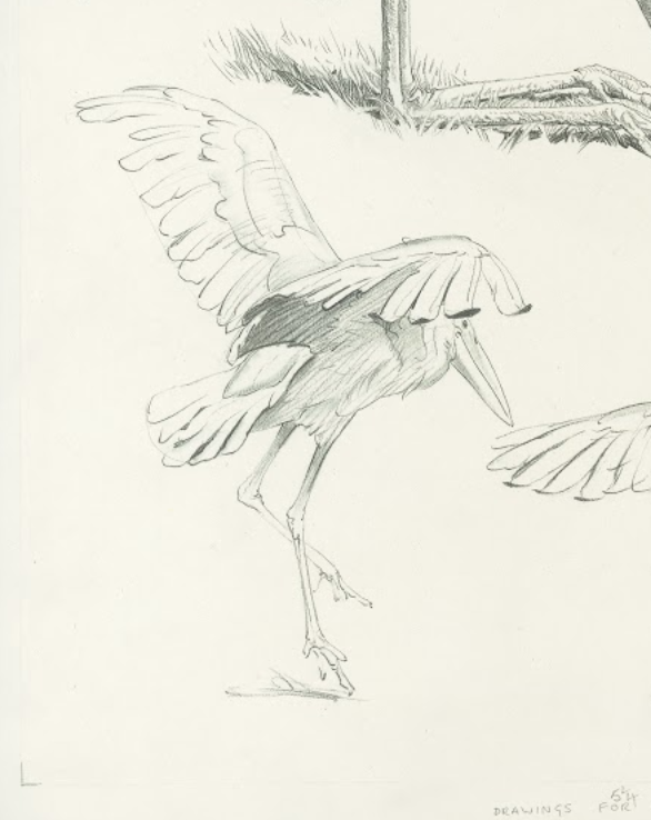
Birds were of course among the most uncooperative subjects, but Sheppard still found details worth recording:


Sheppard's honesty when drawing heads from behind is all the more impressive because, when deprived of facial features, many artists have a great temptation to cheat.  

For example, in the following drawing artist Neal Adams cheated by sliding features over from the front of the face to make them visible.  Frustrated by the lack of details and lines from behind, artists invent marks that don't exist:


Even worse, some art critics, when confronted with the back of a head, cheat by fantasizing about the meaning of the face.  New Yorker art critic Peter Schjeldahl imagines qualities to Gerhard Richter's painting Betty and startlingly concludes that it is "the single most beautiful painting made by anyone in the last half century."
  

This is not art criticism, this is a Kuleshov experiment run amok.  

At least Schjeldahl has the excuse of being in his job too long.  Having used up all his adjectives describing things that are, he now resorts to describing things that are not.  This excuse is not available to the younger Washington Post art critic Sebastian Smee , who chimed in that “Betty is arguably the most famous painting by the most influential artist alive."  Like Schjeldahl, Smee gives the artist a helping hand by fantasizing all kinds of significance to Betty's missing face:
“Betty,” twisting away, evokes for me an impossible yearning: a desire to turn away from the din, the debacle, of political life and to dissolve instead — to bleed, to blur — into an intimate, apolitical present.
This brand of criticism is not about the painting, it's about the critic.

This kind of mendacity makes me value Sheppard's brand of honesty even more.  In the following quick sketch of a leopard, Sheppard draws just enough of the spots to show how foreshortening individual spots can reveal the structure of the animal.  They help make sense of the rear view.


What wonderful economy (a necessity when your subject might get up and move at any moment).

With all due respect to Dr. Seuss, there are wonderful things to be found behind the ear of a rhinoceros or in back of the jaw line of a sow.  These sketches are not flat recitations of fact, they are tests of our vision, our imagination, and our appreciation for the world in which we live.


Tuesday, February 23, 2021

ONE LOVELY DRAWING, part 65


Last year I wrote about the great English illustrator of wildlife, Raymond Sheppard, who spent years haunting the public zoos in London, studying and drawing animals up close.  Despite the fact that his life was tragically cut short by cancer, he had astonishing patience when it came to capturing the details of nature, as if his time was unlimited.  His great devotion earned him a level of understanding that few artists shared.

You can't appreciate the magnitude of his accomplishment until you experience his drawing up close.  The above study from one of his sketchbooks is not very large...


... but it is large enough for  Sheppard to learn the different directions, lengths and characters of the fur, which he expertly records to reveal the structure of the face.  

Compare the long, soft fur on the ears and throat with the short, bristly hair around the snout or the fur above the eyelids.  In this compact space he even teaches us about the sandpaper texture of the nose or the liquid smoothness of the eye.   Note how Sheppard uses dark accents sparingly, to create essential forms such as that mouth.

In this second attempt on the same page, see how Sheppard takes pains to capture the structure beneath the fur, rather than relying on the fur to camouflage the muscle and sinew, the way lazier artists might.  Sheppard's admiration for this creature radiates from his drawing.


Look especially at the place where fur meets antler, and see how Sheppard's pencil understands the different texture of each.


This is one preliminary drawing that really lives up to the term, "study."  There is so much honest observation and work here, it truly qualifies as one lovely drawing.


Friday, February 19, 2021

NEW BOOK ABOUT T.S. SULLIVANT

 After a delay of 100 years we can finally celebrate the arrival of a compilation of work by the brilliant T.S. Sullivant.


Sullivant was part of that blessed generation of ink worshippers that included A. B. Frost, Heinrich Kley and Charles Dana Gibson, and he was as good as any of them.

At 400 pages, this book provides a large, juicy selection of Sullivant's work.  Here Sullivant shows us how the very first cartoonist got his inspiration:


And note how beautifully Sullivant portrays the kaiser dangling from the devil's pitchfork


One of the many delights of Sullivant is how he played with weight.  He could make a pig as heavy as a sack of concrete or as light as a football:


He specialized in drawing massive dinosaurs, elephants and hippos that tripped lightly along:


I was thinking about writing an appreciation of Sullivant's work for this post, but the new book contains such excellent and insightful essays that they'd put my humble observations to shame.  Working artists such as John Cuneo, Peter de Seve and Steve Brodner write loving tributes that demonstrate they are as adept with words as they are with pictures.  

Cuneo writes: 
It takes a second to figure out what's going on.... There's an extra beat of discovery as the viewer is compelled to pause a moment and look a little harder to earn the reward of recognition.  A lesser exaggeration would offer a much quicker "read" but Sullivant will have none of that.  In an age where every image on every page or online platform competes with a trillion others to catch even the most fleeting of glances, I find great pleasure in the drawings of an artist who trusted his skill enough to know that the viewer would accord his work the extra scrutiny it demanded.      

What a wealth of talent and imagination are on display in the pictures and essays of this book.  


Sunday, February 14, 2021

Friday, February 05, 2021

THE JOURNALIST ILLUSTRATORS: HARVEY DINNERSTEIN

 Harvey Dinnerstein had some interesting things to say about the relationship between art and journalistic illustration.

Like his friend Burt Silverman,  Dinnerstein was a "fine" artist who earned money on the side drawing reportorial assignments for news magazines.  Like Silverman, Dinnerstein specialized in portraits:


Dinnerstein's paintings were more overtly allegorical than Silverman's.  Here is Dinnerstein working on his magnum opus, "Parade," inspired by seeing Delacroix's Death of Sardanapalus at the Louvre.


Detail from Parade

Detail from Parade

Like Silverman, Dinnerstein had an active social conscience and was interested in capturing the political events of his day.  After reading about the young Martin Luther King in 1956, Dinnerstein accompanied Silverman to Montgomery Alabama to draw the bus boycott at the start of the civil rights movement.


The drawings were historically important but looking back, Dinnerstein found them artistically lacking.  "The drawings were frankly reportorial, concerned with the individuals involved, church meetings, courtroom scenes, and the general locales.  In retrospect, the drawings seem limited and anecdotal...." 

Over the years Dinnerstein reflected on the balance between reporting the facts of an event and serving the timeless values of art.  He wrote about the tension between the "specific and universal aspects of the subject:"
A major element in developing a pictorial image is the integration of particular information with a generalized concept.  This is a most difficult question to resolve. If the artist is only concerned with incidental information the image will lack significant form.  However, if the generalization is a mannered abstraction, it will become an empty stylization that will lack the organic quality of life.
As he developed as a journalistic illustrator, his approach evolved:
A decade later, in the wake of the assassination of King, and the escalation of American involvement in Vietnam, a protest movement containing many different elements swept across the country.  I was commissioned by Esquire magazine to cover these events, and in depicting the demonstrations of the sixties I tried to get beyond the incidental nature of various events, and grasp a larger context of the movement and its implications. 
Dinnerstein said he drew his inspiration from Kathe Kollwitz's drawings of the revolt of Silesian weavers in 1524:

Kathe Kollwitz

Dinnerstein wrote, 
There were amazing events in that period.... Candlelight procession at night, outside of St. Patrick's Cathedral.... Moratorium vigil, that presents aspecys of ritual and reminds me of paintings by Georges de La Tour.... Fort Dix, New Jersey: A protest march onto the military post, past barbed wire barricade, calling on G.I.'s to refuse to obey the orders of their officers.  The march is dispersed with gas.... Chicago: An explosion of terrorist violence leaves a tail of shattered glass along the elegant streets of the city's gold coast.... after  the killings of students at Jackson and Kent State there is a massive demonstration in Washington.... Communication seems impossible.  Suddenly a group of  demonstrators remove their clothes and charge nude into the reflecting pool before the Lincoln Memorial.  As they are joined by others , an old black woman on the embankment sings the spiritual, "Wade in the Water."  It happened! I saw it, and though I did not comprehend everything that was going on, these were remarkable events.... 
 
Burning shack in the Poor People's Encampment near the Washington monument 


Candlelight vigil for casualties of the Vietnam war


Dinnerstein conflates a death at a riot with his memory of a Roman sarcophagus


Protestors at St. Patrick's Cathedral remind Dinnerstein of a de La Tour painting

Dinnerstein's journalistic pictures tended to be less literal than those of many other illustrators who were eyewitnesses to history.  He took less pride in capturing specific details because he felt that he captured more of the spirit of these events by staging pictures more consciously with reference to older artistic traditions.

Monday, February 01, 2021

THE JOURNALIST ILLUSTRATORS: PAUL HOGARTH

The best journalistic illustrations seem to combine an enthusiasm for facts, a love of drawing, and a third element-- a personality or character which presents the subject matter in an interesting manner that a photograph could not.

Noted illustrator Paul Hogarth (1917-2001) described the third element this way: "The problem is how to make an image compelling, even in an aesthetic way – not just to sit down and make a record."


Hogarth grew up poor and his father, a butcher, tried everything to dissuade his son from becoming an artist.  He cursed the art school where Hogarth earned a scholarship and he refused to even enter the art gallery where his son had his first exhibition. 

A fiery young communist,  Hogarth went off to fight Franco's fascists in the Spanish Civil War at the age of 17.  His close friend Ronald Searle described him as "the original angry young man." 

Following World War II, Hogarth started his career traveling and illustrating different locations.  The communist party invited Hogarth to travel to  Poland, East Germany, Czechoslovakia, Romania and Bulgaria to document the improvements made under communism.  With Ronald Searle, Laurence Scarfe and Percy Horton he traveled to a remote part of Bosnia to draw the building of a new railway.  In the 1950s he became the first British artist to go to China after the war.  He wrote and illustrated a book, Looking at China, as a report to the rest of the world.

Traveling and drawing on the spot, Hogarth developed his personal style: "I developed a very strong sense of composition and design and the ability to extract elements of significance. Editing and exaggeration are also important." 


Hogarth's view of a Las Vegas casino


Detail

Hogarth populated his travelogues with light, whimsical drawings of local people:


Hogarth teamed with many of the leading writers of his day to prepare his reports from around the world.  He illustrated Alistair Cooke's writings about America, Robert Graves' writings about Majorca,  Laurence Durrell's writings about Corfu,  Brendan Behan's writings about Ireland.  Most famously, his long partnership with Graham Greene took Hogarth to more than 20 countries. 


Hogarth was elected to the Royal Academy in 1984 and in 1989 was appointed to the Most Excellent Order of the British Empire-- rare honors for an illustrator.