Saturday, June 18, 2022

ONE LOVELY DRAWING, part 67

Milton Glaser had guts.  Here is his unconventional drawing of Count Basie.

.

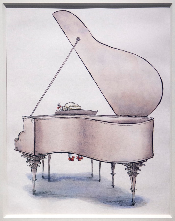
On this blog we've seen many imaginative pictures of a pianist sitting at a keyboard.


Peter Max

Joe Ciardiello

Nick Galifianakis

Bernie Fuchs

Some are clever, some are colorful, some are funny, some are sensitive. Each is excellent in its own way; but only Glaser had the audacity to turn the piano over to achieve this bold, flat design.  It takes a lot of design muscle to lift a piano.   

I love this immense paw, laid down wet.


Glaser was first and foremost a designer, and over a long, long career he kept flipping pianos upside down.  Gotta admire that. 


Saturday, May 28, 2022

BETTER WAYS TO SPEND YOUR TIME THAN CROSS HATCHING


I’ve previously suggested that cross hatching is rarely the best use of an artist's time. It involves much busy work in the service of an unremarkable artistic goal: achieving a consistent tone (as opposed to using lines descriptively to convey information or mark artistic judgments). A form of human zipatone, cross hatching is the kind of work that might often be delegated to an apprentice or a studio helper.

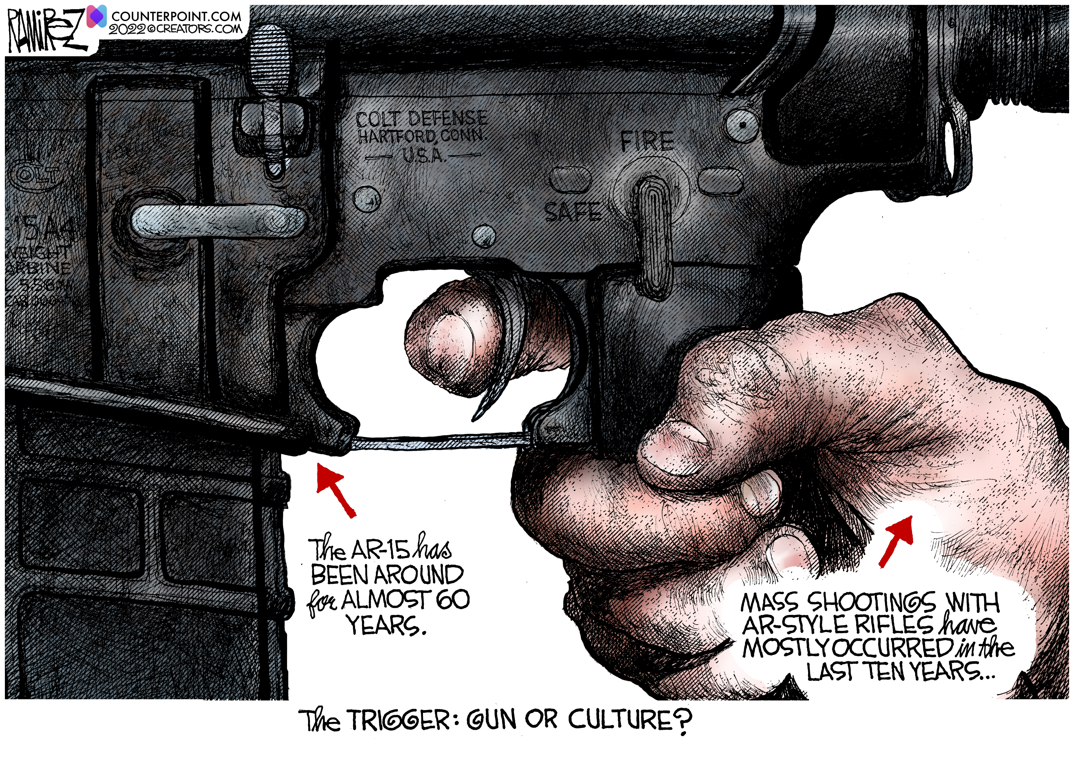
I’ve previously written about my great admiration for the brilliant draftsmanship of political cartoonist Mike Ramirez. His latest cartoon, after the slaughter of little school children in Texas, questions whether the increase in mass shootings is triggered by access to assault weapons or by problems with American culture:


Ramirez writes:
What is the root cause of these mass shootings? The AR-15 long rifle was developed in the 1950s, first sold commercially by Colt in 1964, and has been around for almost 60 years. Mass killings with AR-type rifles have mostly occurred in just the last 10 years.

Ramirez raises a good point.  What could possibly account for the increase in killings over the past ten years, if not cultural problems?  Well perhaps:  

  • In 2004 Congress eliminated the federal ban on assault weapons (Pub.L. 103-322)
  • In 2005 Congress immunized gun manufacturers from liability for harm caused by guns ( Pub.L. 109-92)
  • In 2008 the Supreme Court newly expanded the rights of gun owners under the second amendment, protecting them from regulation. (District of Columbia v. Heller, 554 U.S. 570 (2008))
As I’ve said, crosshatching is not always the best use of an artist's time. Sometimes that time might be better spent thinking through a concept. Or reading a fucking newspaper.

Friday, May 20, 2022

THE WARMTH OF A MINOR SUN

"In the days of the frost seek a minor sun."  -- Loren Eisley

The 1950s and 60s were great decades for American illustration.  Magazine pages were getting larger, the quality of full color reproduction was getting better, editorial restraints were loosening, and creative experiments were encouraged.  

Yet, already the chill winds of photography and television were being felt, and markets for illustration were beginning to dwindle.   One by one, the large general interest magazines that previously purchased art by the bushel were dying.  

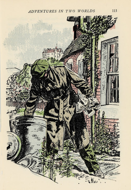
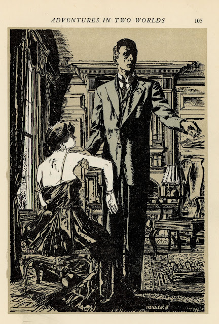
As glamorous jobs became fewer and farther between, illustrators were forced to accept lesser work.  One of the more reliable sources of employment between major projects was The Readers Digest.  It had smaller pages, low quality paper, and was limited to line illustrations, often with just two colors.  On the other hand, it paid illustrators on time. As a result, some of the greatest illustrators of the era, such as Robert Fawcett, Austin Briggs and Noel Sickles, eventually worked for The Reader's Digest.  
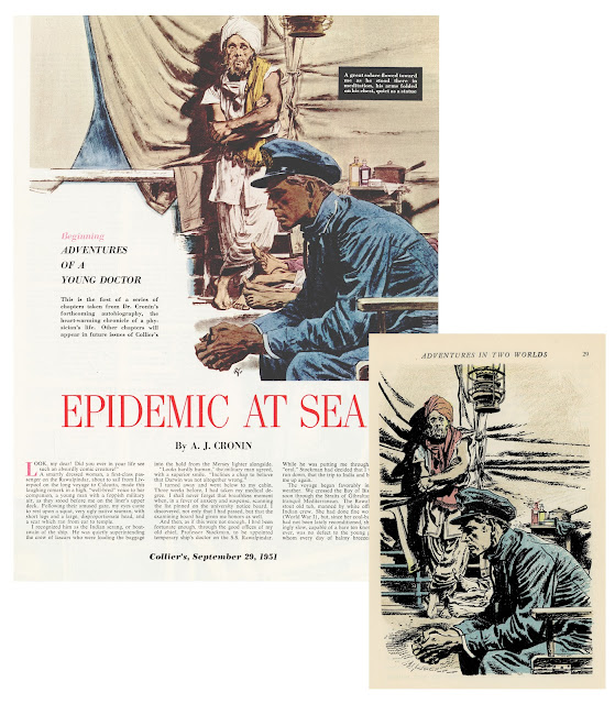
Robert Fawcett illustrated the same story twice, first for Collier's (left) and years later
for The Reader's Digest (right).  Note the difference in size and production quality.

Big shot illustrators who had become accustomed to basking in the public glow and driving fancy cars sometimes had to seek warmth from minor suns.  How did they respond to this reduced status? 

The great Noel Sickles, who had recently done such fine work for Life magazine, realized he would have to adapt his pictures for the simpler, humbler platform at Readers Digest. 

In the drawing below, the coarse pulp paper wouldn't hold a fine line well, even if The Readers Digest had the size or the budget for a detailed drawing of an immense jungle.  So Sickles solved the problem  with large, jungle-like shapes abstracted and screened. 
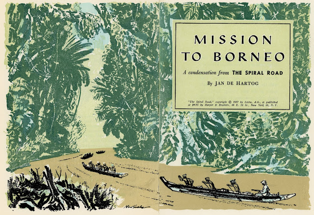
Rather than be timid with a paper stock where the ink bleeds, Sickles took full advantage of it:
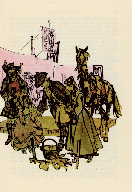


Is the page too small for conveying a panoramic vista? Is the printing process hostile to smooth lines?  Not a problem.

Unlike some of his more slick and polished peers, Sickles was never afraid to go rough.
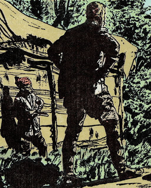
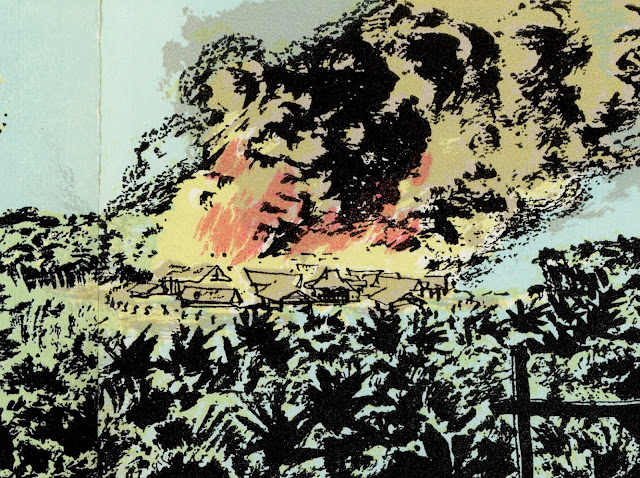
Sickles became a great illustrator by being tough and resilient and solution-oriented. He wasn't daunted by poor working conditions and he didn't reserve his favors for glamorous projects that afforded him a wide audience. He didn't view a smaller paycheck as a license to turn in second rate work.  That work ethic, those standards, were a large part of what put him above so many other illustrators regardless of where his pictures appeared.

The same thing could be said for Robert Fawcett:
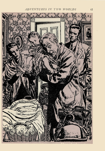


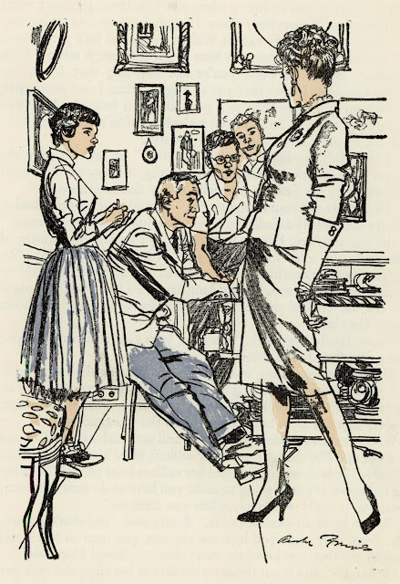
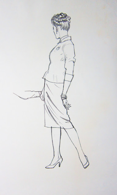
And for Austin Briggs:

Briggs' distinctive linework was hugely influential at the time when young
cartoonists such as Neal Adams and Stan Drake were learning to draw


Horrible Readers Digest color

Preliminary sketch


And for Ken Riley:


To survive during the ice age of illustration, these resourceful artists had to gain warmth from such minor suns as they could find.  They didn't disrespect the sun gods by doing lesser work.  You never know how long that frost is going to last.

 Besides, as Fawcett said, 

The argument that "it won't be appreciated anyway" may be true, but in the end this attitude does infinitely more harm to the artist than to his client. 

Tuesday, May 10, 2022

ARTISTS IN LOVE, part 20

I’ve previously written about Alice and Martin Provensen, the husband-and-wife illustration team responsible for more than 50 children's books. From 1947 to 1987 this remarkable couple worked together seamlessly to create lovely, highly admired illustrations that influenced the direction of children's books.


Now a welcome new art book from the Provensen's daughter, The Art of Alice & Martin Provensen, collects hundreds of those illustrations, mostly from the originals, and combines them with photographs, sketchbooks and information about the magical lives of these two artists.

Married in 1944, the Provensens left jobs at big animation studios (Disney and Walter Lantz) to seek work in New York as illustrators. They carried their portfolio of samples from publisher to publisher until one day they bumped into someone on the street, causing their pictures to spill to the ground. By chance, the "someone" turned out to be famed illustrator Gustaf Tenggren.  As he helped them pick up the art, he was impressed with their work and helped them get their first job.


This was the start of a long and successful career. After illustrating classic books such as The Color Kittens, the Provensens were able to purchase a picturesque farm in New York’s Hudson Valley. They named their new home Maple Hill Farm and converted its barn into an art studio. There, surrounded by rolling meadows, old trees and livestock, they spent their lives working side by side illustrating children's books.


They became "trusted collaborators," passing each picture back and forth, merging their taste and judgment to improve the art.  How were two such creative and innovative artists able to work jointly on every picture? Alice said:

The question we are most often asked is, “how do you work together?“ Everyone asks this of us because the stereotyped image of an artist is that of a lonely, starving figure working in a Garrett. People have forgotten that the first book Illustrators, the illuminators of the middle ages, worked in concert, one to paint the flowers, one to paint the figures, another to do the background and the texts. All through the Renaissance, artist studios were little factories. 

One of the things I liked best about the new book is the wealth of previously unpublished work which demonstrates how the Provensens worked together. They traveled the world, taking their sketchbooks with them and recording ideas every step of the way:


As the Provensens worked on a picture, they would compare their judgments, playing off each other and gaining inspiration from each other.  Alice is quoted in the book as saying “a trusted collaborator is of immense value.… That a collaborator bolsters one’s own sense of security – helps one avoid mistakes."

The Provensens' method for creating art struck me as similar to the way couples compromise in creating a good marriage.  Each brought their own strong opinions,  their own artistic skills, their own vision, yet they recognized they might achieve a wider vision and a larger fulfillment by harmonizing with the right partner.

Two trees conjoined as one: the final resting spot for
Alice and Martin Provensen on Maple Hill Farm


Tuesday, May 03, 2022

THE FEARLESS NEAL ADAMS

 For the last few days, the comics world has showered tributes to the great Neal Adams who passed away on April 28.  There are many different reasons to celebrate this talented artist who transformed the comics industry.  

Personally, I've always admired his fearlessness.

Adams applied black ink quickly and boldly-- a high risk activity.  His eye invented ways to squeeze dramatic black shapes into pictures-- shapes that did not come from photo reference.  


In particular, Adams specialized in balancing delicate, light lines against those heavy, dense black shapes, as we see on the following face:  


It would be so easy to let those heavy inks slip out of control, but Adams never did.  He danced fearlessly on that tightrope. 

Another example of Adams' daring was that he routinely drew figures from the most impossible angles.  Even with the benefit of photo reference, most sensible artists steer clear of drawing the human head from this angle.  Why look for trouble when you're working on deadline?


But Adams seemed to enjoy showing off his talent.  Few could touch him.

This is not to say Adams was perfect.  Especially in his early years his glib, lightning fast draftsmanship sometimes trapped him in a corner, as with the placement of this word balloon:


And his brashness sometimes missed the mark in other ways.  A more cautious person would've been reluctant to propound some of Adams' loony scientific theories.  But that's part of what I liked about Adams-- his utter fearlessness when it came to drawing the line as he saw it.

He was a remarkable talent who made good use of his life.  He shall be missed.


Saturday, April 16, 2022

THE DIFFERENCE

Compare these two city street scenes:


Both pictures show cars parked on the street in front of row houses with metal fences.  Both use heavy photo reference.  Yet, there's a big difference.  For me, one is clearly more successful.  Why?

To start, look at the cars pasted on the New Yorker cover.  They hover weightlessly, without a common foundation.


The cars in the second illustration are planted firmly on the ground, in perspective.


The fence in the New Yorker illustration depicts individual chain links on top of individual leaves-- details without much effect or purpose.


By contrast, the fence in the second illustration adds vigor and controls the depth and perspective in the image.  Note that this fence is not drawn mechanically.  It creates a realistic impression but there is not a single straight or measured line here: 


Next, compare the use of color.  The color in the New Yorker cover seems to come straight from a Photoshop bucket.  The heavy use of black to control value has a deadening effect on the other colors. 


But look at the use of color in the second image.  The imprimatura of raw sienna gives even the scumbled black fence posts a depth and a radiance.  This is an artist who understands color.  


There is obviously no single recipe for a good illustration.  Different treatments can be used to achieve different moods or themes.  But in my view the ingredients I've listed above, combined with others, create a huge difference in the quality of these two treatments of a similar scene.

So what accounts for the difference?

Personally, I think a large part of the difference stems from the fact that the second artist-- Bernie Fuchs-- paid his dues learning how to paint cars realistically from every angle before he ever began stylizing them.  Fuchs never had the luxury of cutting and pasting photo-illustrations on a computer.  He busted his ass studying the features on cars, blending colors, learning about reflection and painting effects with chrome.  


That way, when it came his turn to paint impressionistically and stylistically, he had already earned his opinions.  He worked from a position of strength, departing from realism as a purposeful, conscious choice.  

The surprising result is that his abstractions and exaggerations were far more bold and inventive than anyone who learned with digital shortcuts.


Detail


This last painting-- a car Fuchs saw in Puerto Rico-- was one of his favorites. 
It hung on the wall of his studio for years, and was there the day he died.

It is open to debate whether the differences in quality noted above are worth the dues they require.  After all, if the audiences (including the art directors) no longer care, or are no longer able to recognize the differences, it might make little economic sense for illustrators living in an era of digital labor saving devices to subject themselves voluntarily to the arduous paths of their forefathers.

I offer no opinion on this question.  For now I simply note that there is a difference.