Wednesday, July 26, 2023

RETURNING FROM COMIC-CON

I just returned from San Diego Comic-Con, the happiest place on earth, with the flash mob of  dancing Cap'n Crunches still ringing in my ears.

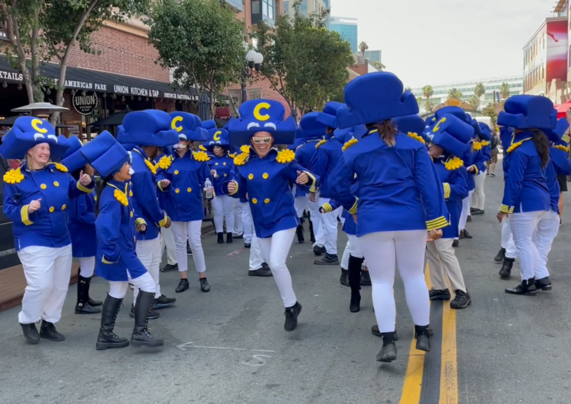
Celebrating a change in the Cap'n's uniform, adding a stripe which promotes him from Commander to Cap'n.

Every year Comic-Con is a petri dish of emerging technologies, raw capitalism, suppositious art, trinket peddlers, cosplay, and new legal developments.  For those with patience and curiosity, there are nuggets of excellence and strength hiding around every corner.

For me, one of the real delights was the bunny rabbit at the bottom of this cartoon by Sullivant:

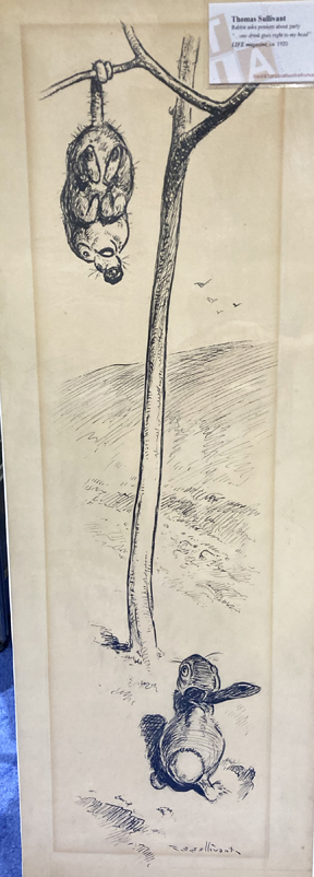
Opossum to rabbit: "I had a drink and it went to my head."
Image courtesy of Taraba Illustration Art

Sullivant drew the bunny the hard way: we are looking down, from behind, with the rabbit's head tilted back.

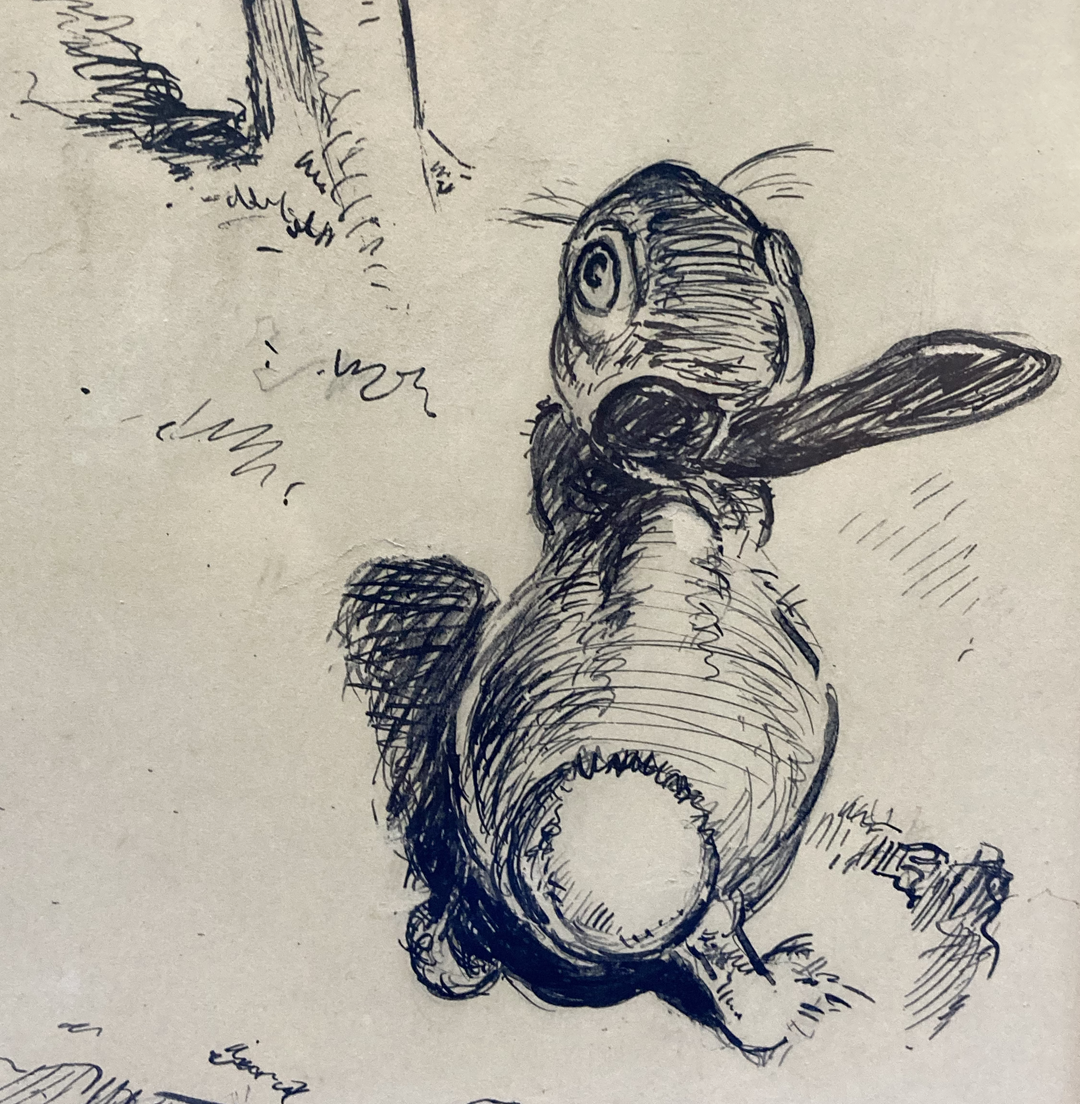
Note Sullivant's foreshortening of those ears

The artist's honest struggle is there for all to witness; look at how he gouged that paper.  Look at those lovely brush marks.


One of the major topics of conversation at Comic-Con was the impact of AI.  Today the machine can do the struggling for us, quickly and invisibly.  No more chewed up paper.  No human sweat and strain unless the machine is instructed to simulate it.  The next generation of artists will be trained in "prompts" and will be able to generate a hundred images of a bunny from any angle, "in the style of Sullivant." 

As you can imagine, the artists exhibiting at Comic-Con were uniformly unhappy about what AI portends for traditional art.  They sold T shirts to make the point.


It's not clear how effective this T shirt campaign will be in stemming the tide of AI.  Artists argue that AI "steals" images but computer scientists and lawyers at Comic-Con say "no," AI does not copy or steal in any sense cognizable under copyright law.  AI learns from pre-existing images as traditional artists do. 

Lots of changes are underfoot.  Evolutionary transformations are taking place.  But regardless of marketing considerations, the strength of good drawing remains immutable.  I often quote Ralph Waldo Emerson here:  "Excellence is the new forever." 


Wednesday, July 12, 2023

PHOTOGRAPHS CAN'T HELP YOU DRAW INVISIBLE LINES

 Cartoonist Stan Drake had a gift for drawing from photographs.  He easily turned photos into elegant line.


But a photograph couldn't show him how to draw those invisible motion lines.  Look how awkwardly Drake expressed movement in this next picture.  

Drake's motion lines are contradicted by the
hair hanging flat and other body language 

Similarly, look how badly Al Hirschfeld-- a talented artist in other respects-- draws the path of this punch:

Contrast Hirschfeld's motion line with the line of Leonard Starr, who understood the arc of an arm:


Motion lines expose many an artist who doesn't know anatomy.  A photograph can't help you map invisible lines. 

Capturing movement with a static drawing requires an artist to imply beyond what is visible.  To show what has taken place before or after the recorded instant,  it helps to understand the distribution of body weight and support, balance and counterbalance, the function of muscle and bone, the flow of clothing and hair.
  
Notice how there's no weight behind this punch.

Photo reference is a great tool for artists who have already paid their dues but if you haven't, it leaves you exposed when it comes to the invisible parts of drawing. 


Monday, July 03, 2023

THE NEW YORK TIMES FUMBLES A LEYENDECKER REVIEW

More than any other profession, art criticism creates temptations to say stupid things.  It's the duty of every critic to resist those temptations.

That was my thought after reading Blake Gopnik's silly review in the New York Times of the current J.C. Leyendecker exhibition in New York.  

People have long understood that Leyendecker was gay, and that his sentiments emerged in his paintings of dashing and muscular men. But in recent years, there has been an effort to abscond with Leyendecker's legacy, injecting gay connotations into every brush stroke, and transforming the artist into a clandestine warrior for gay rights, while neglecting his broader array of artistic talents that produced 322 brilliant covers on a wide variety of subjects for The Saturday Evening Post.  

As far as I can tell, this unfortunate trend began in 2008 in the poorly researched book, J.C. Leyendecker by Judy Goffman Cutler and Laurence Cutler.  It was certainly appropriate for those authors to note that Charles Beach, Leyendecker's model for the famed Arrow man, "was not only a homosexual but a kept man, the live-in lover of the famed artist who thrust himself into such an exalted status," but 200 pages later the book's fixation on "thrusting" continued unabated. We were still reading that "Charles Beach and Joe Leyendecker are held up as examples of monogamy among the gay community, so often criticized for promiscuity," or that "Charles' Dorian Gray image never [ages] in Joe's eyes nor in ours either" or that "members of the gay community [remember Leyendecker] for icons of masculinity and sensitivity." The authors inform us (without support) that Leyendecker was sending out "subliminal" homoerotic messages. 

That book seems to have been the springboard for the new narrow focus in the show, “Under Cover: J.C. Leyendecker and American Masculinity,” at the New York Historical Society, and also in Gopnik's review of the show. 

In 2010 Gopnik penned a puerile attack on Norman Rockwell's art because Rockwell's work "offended" Gopnik.  He wrote, "I can't stand the view of America that he presents, which I feel insults a huge number of us non-mainstream folks."  If Rockwell was insufficiently gay for Gopnik's taste, Leyendecker passes the test because Gopnik fantasizes Leyendecker to be "a gay fifth column into American culture, undermining the majority’s straight erotics" with "a defiant message hidden beneath" and "reveling in [his art's] secret subversion."  Gopnik even sees Leyendecker as "preparation for the uprising that came in 1969 outside the Stonewall Inn."

Turning back for another gratuitous swipe at Rockwell, Gopnik falsely implies that Rockwell was hostile to Leyendecker's sexual orientation: 
Norman Rockwell, 20 years younger than Leyendecker and eventually his neighbor, writes quite brutally in his memoir about how Beach had “insinuated” himself into Leyendecker’s life and especially about the duo’s social withdrawal once he had.
If Gopnik had bothered to read Rockwell's autobiography, he would've learned that Rockwell deeply admired Leyendecker and wrote about him with great affection and concern.

Yes, Leyendecker painted beautiful men who reflected a gay aesthetic.  He also painted beautiful women, beautiful children, beautiful fabric, beautiful metal surfaces and even beautiful elephants. You'd never know it from Gopnik's review.  And that brings me to my primary gripe:  Leyendecker painted major pictures of romantic heterosexual scenes, domestic scenes, parenting scenes and other types of images demonstrating diverse skills. 


But what image does Gopnik select for his review?  The following mediocre, unrepresentative painting, because Gopnik is able to spin it into a masturbatory fantasy:


Gopnik writes:
There’s one case where the subversion was barely hidden at all: In an ad for Ivory Soap, the shadow Leyendecker placed on his model’s crotch seems clearly to hint at an erection, according to an exhibition wall text. You can’t unsee it once it gets pointed out.
Leyendecker exhibitions are too few and far between to be wasted on such nonsense.  Leyendecker was a remarkable talent and the New York Times owes him better coverage than Gopnik monopolizing the conversation with his personal fetishes.  Are there no copy editors left?

Friday, June 30, 2023

THE EFFORT THAT COUNTS


James Dougherty

Lou Reed recalled the time Andy Warhol scolded him for not working hard enough:

No matter what I did it never seemed enough.He said I was lazy, I said that I was young.He said, "how many songs did you write?"I'd written zero, I'd lied and said "ten.""You won't be young forever.You should have written fifteen."

When Reed explained he was uncertain what to write, Warhol brushed him off. 

                    You think too much. 
                    That's cause there's work that you don't want to do.
                    It's work. The most important thing is work.

Milton Glaser was a different type of artist, but agreed on the importance of work.  In fact, he urged that we abandon the word "art" and replace it with the word "work."  Calling it work, like every other type of honest labor, would not only "restore art to a central, useful activity in daily life" but would also eliminate anxiety for everyone who is obsessing about whether they are artists or not.

Saul Tepper

Before the era of video games, civilizations that valued hard work and disparaged slackers were often rewarded with great art.  The Italian Renaissance and the golden age of Greece were two such periods; those cultures faced political strife, religious violence, civil uncertainty and military threats as great as ours yet their artists accomplished great things without electric lights or air conditioning. 

The Stuart period in England (1603 - 1714), a culture which shamed idleness, produced Shakespeare, Ben Jonson, John Donne, and Herbert,  followed by Milton's Paradise Lost and Bunyan's Pilgrim's Progress, before ending the century with Alexander Pope, Daniel Defoe and Jonathan Swift.  It became the cultural home of great painters such as Rubens and Van Dyck.  While this was going on,  Isaac Newton was transforming human understanding of the universe,  Francis Bacon was inventing the modern scientific method and William Harvey was discovering the circulation of the blood. Newspapers were invented and indolent minds which for centuries had dwelt on witchcraft and superstition were challenged.  Great architects such as Christopher Wren and Inigo Jones flourished.  What a fruitful century! 

Of course, not all work pays the same dividends.  A lot of what passes for artistic effort today doesn't seem directed at enhancing the quality of the work.  

  • During the last century, fine art became more fixated on pure self-expression.  Illustration, which involved purposeful work in the empirical world, was demoted to a lower spiritual plane.  But as Glaser wrote, "The dissociation of art from other human activities has impoverished our lives."  He noted, "Michelangelo didn't paint the last judgment to express himself.  He painted it because the Pope wanted to scare the bejeesus out of the congregation."  The type of "work" involved in pure self-expression primarily involves emoting-- which can be difficult to distinguish from laziness.  That's why it helps if fine artists can establish their bona fides with suicide, addiction or emotional incapacity.
  • A second type of effort which preoccupies many of today's artists is self-promotion. Artists such as Hirst and Koons have become sensationalists, achieving fame by causing commotions.  This is the work involved in smashing plates and gluing them to a great big canvas.  While there seems to be no artistic growth or edification from this type of labor, the financial growth can be considerable. 
  • Perhaps the most slippery and inimical challenge of all is the work currently outsourced to labor-saving software such as ChatGPT and its progeny.  "Effortless" art presumes that there was nothing to be gained from the effort.  This assumption may resonate easily with a culture centered around "labor saving" kitchen appliances, but it's not clear that art functions the same way.  Previous civilizations that were less afraid of hard work would be wary of "easy art."  If ChatGPT had spared Michelangelo's four years of hard labor painting the Sistine Chapel, how would that have affected the outcome?


John Cuneo


The type of "work" that goes into creating what we now call art has become increasingly wobbly.  At the same time, much of the art turns out to be increasingly minor compared to what past civilizations have produced.  Are the two trends related? It's too early to say.


Tuesday, May 30, 2023

TRIP REPORT FROM ROME

 Hi, gang.  I'm in Rome studying beautiful sculptures from antiquity.

This place would be a nightmare for Barney Bishop III because several of these sculptures have penises.


One thing apparent from these great sculptures is that each manifests an enormous struggle.

For example, artists struggled to escape mortality and the way of all flesh by preserving as much of tender skin and hot passion as they were able in permanent marble. 


Or, some struggled to escape the limits of two dimensions, with art that literally jumps off the wall:


Many struggled against oblivion, and the inevitable loss of our personality, our face, our individuality.  The  memories of our loved ones gives us the consolation of a few extra years but even that is soon gone.  In Rome we see miles and miles of busts of people hoping for a little endurance.


Some struggled to escape the limits of static material by capturing the freedom of motion in solid rock.

Artists today no longer have to struggle with these heartbreaking constraints. Digitization gives our work permanence. Video empowers us with motion, audio preserves our voices and our personalities, holograms give us three dimensionality.  In so many ways, artists have been freed from the struggle that bedeviled earlier artists.  

So what's the consequence of our freedom?

At the Villa Borghese modern sculpture is exhibited side by side with ancient sculpture, for comparison. Here are two sculptures by modern sculptor,  Giuseppe Penone.


They are exhibited accompanied by long, pretentious explanations by the artist. Minor struggles will invariably produce minor art. 

Saturday, May 13, 2023

EVADING THE SNARE OF MODERN ART

 How do you like this painting of an "intense gaze"?


Yeah, I don't see it either.  

The face is a detail from the painting, "Picking Cotton" by Hale Woodruff, which hangs in the prestigious Yale University Art Gallery.


The curators of the Yale Gallery describe the "intense" face this way: 
The intense gaze of the old man at the center of Hale Woodruff's composition-- like a sharecropper or day laborer-- is amplified by the expressive character of the painting's active, thick brushwork, drawing the eye and focusing our attention.

If you think that's a stretch, art critic Sebastian Smee is able to impute emotions to Gerhard Richter's painting, "Betty," through the back of her head: 
  

“Betty,” he writes, "twisting away, evokes for me an impossible yearning: a desire to turn away from the din, the debacle, of political life and to dissolve instead — to bleed, to blur — into an intimate, apolitical present."

New Yorker art critic Peter Schjeldahl, similarly transported by the back of Betty's head (or perhaps impaired by a stroke?) wrote that the painting is "the single most beautiful painting made by anyone in the last half century."

On and on the blather goes.  The sequepedalian word mongers at Phaidon offer us a long tiresome exegesis of "Betty," conjecturing that Immanuel Kant would favor Richter's "anti-sensibility."  They prattle:
For [Richter] photorealism has long been a project of rupture, the kind of performative desecration that served to uphold its own site of defacement. His faceless Betty is as much a testament to the “thingness” of painting as it is to interpersonal ephemerality.
It takes a lot of Kool-Aid to make it through this brand of art criticism.

For me, these descriptions embody the most dangerous snare underlying modern conceptual art: the snare of being seduced by fanciful verbal descriptions rather than the actual visual qualities of the picture.  As words and ideas become more important than physical execution, the quality of art increasingly rises or falls on the ability of some observer to find words about it. Unfortunately, eloquent people can come up with words to justify almost any position. The oleaginous Jeff Koons, lacking talent, has built an entire empire on his gift of gab.
 
In a more serious era, when art was less superfluous, the great Pericles gave a funeral oration to honor the fallen heroes of the Peloponnesian War.  He urged against valuing the greatness of heroes based on the rhetorical ability of some speaker who comments on them:
The reputation of men [should] not be imperiled on the eloquence or want of eloquence of [a speaker], and their virtues believed or not as he spoke well or ill.
If conceptual art is to be taken seriously, people who believe in the potential of conceptual art (and I am sometimes among them) have a special duty to resist flabby rhetorical excess.
 
I believe it's crucial to growth in arts, and even to the progress of humanity, that we struggle to keep an open mind.  Our ideas should remain broader than our specialties. But in the words of the Maharani of Jaipur, "Don't keep your mind so open that your brains fall out."


Thursday, May 04, 2023

ONE LOVELY DRAWING, part 69


Here are the top 5 reasons why I love this drawing by Tom Fluharty:


1.) I love these hands:


Fluharty is an artist who not only knows anatomy, but has formulated opinions about it.  Photo reference gave him the basic facts he needed about the position of the fingers, but after that the artist took over.  He plays with line the way a great guitarist might play guitar strings.


2.) I love this beard:


Look how brilliantly Fluharty combines lights and darks in this beard.  That thin line doesn't flow in a direction, the way most artists would draw hair.  Instead, it forms crazy static all over the place, before Fluharty comes in with a heavy line and chisels lightning bolts into the beard to give it some sense of order.

3.) I love this face:


Another great example of how understanding anatomy pays off.  Those dynamic lines whipping all over the place don't trace specific facial wrinkles but they create values which demonstrate knowledge of the skull, the eye sockets, the facial features, etc. far better than a painstakingly realistic approach might. When it comes time to enhance the design by distorting those ears, Fluharty knows exactly how far he can take it.

4.)  I love the muscularity of those bold lines:


Fluharty claims to be no fan of abstract art but these bold lines are straight out of Franz Kline.  Superimposed on a network of fine, curling lines which go in all directions, these powerful dark accents contribute vigor and confidence.

5.) I love the way this drawing uses felt tip markers:


Most illustrators today use markers because they're frightened of india ink.  They fear they can't control a dip pen or a brush.  But Fluharty appreciates the visual qualities of a marker-- even one that is beginning to dry out-- and fearlessly takes advantage of those qualities.  Ink-- not even a drybrush--could accomplish this effect, which contributes so much to the energetic feel of the drawing.

In an era of photo-drawing, semi-drawing, AI-drawing and excuses for not drawing, I think this is the kind of work that vindicates true drawing and puts all those excuses and substitutes to shame. 

Monday, May 01, 2023

NOT SO EASY

Don't assume abstract painting is easier than realistic painting.  

True, an abstract painter never needs to worry about getting anatomy wrong, or failing to capture the light accurately.  Still, abstract painters have worries of their own. 

Consider this blast of a painting by Phil Hale. 


Hale knew how clouds look and how to paint them.  He knew how golden sunlight looks on skin.  He understood muscles and tendons, and how to pose the human body (planted here with confidence like the rock of Gibraltar in the center of the painting).  Ah, but the hair-- that's the one part of the picture he had to invent from scratch.  

In his preliminary drawings for this otherwise confident painting, there's only one element that Hale changed and changed again: the abstract shape of the hair.


 How would Hale know when the hair finally looked correct?  


What is the right number of accents grave et aigu that should be spitting from his hair? How long should they be? Should they be straight or curled?  soft or jagged?  Nature provided no clues, so Hale was all alone on these choices.


The importance of this black abstract shape is clear from the fact that Hale made very different choices in other paintings, and those choices had a significant impact on the painting, strongly affecting the "realistic" elements which took up 95% of the picture.


Sometimes Hale's black abstract shape swallowed up the head altogether...


If you're doing it right, it's not so easy to paint abstractly, untethered from mother nature.


Monday, April 10, 2023

WHEN AL WILLIAMSON GAVE IT AWAY

Artist Al Williamson put so much effort into drawing this story for EC comics, his pay couldn't have amounted to more than 13 cents per hour.


And that's not even including the backgrounds contributed by his buddy Roy Krenkel "for the fun of it."  Williamson later said about his work for EC, "what it shows is that I really loved what I was doing."  

At age 23, Williamson wasn't worried about a pension or a mortgage.   

Apparently he didn't care about posterity either. All that effort went into comic books, the most fragile medium, which were poorly printed on cheap paper that quickly yellowed and disintegrated. 

This was 1955, an era before NFTs and giclée prints.  Look at the difference in quality between what Williamson poured into the drawings and what emerged for the public in the finished comic book:


And yet, Williamson continued drawing page after page "for the fun of it." He was content with the percentage of beauty that made its way into the printed comic:  


Erica Jong wrote:
In a society in which everything is for sale, in which deals and auctions make the biggest news, doing it for love is the only remaining liberty....  Do it for love and the rich will envy no one more than you. In a world of tuxedos, the naked man is king. In a world of bookkeepers with spreadsheets, the one who gives it away without counting the cost is God.


Williamson wasn't seeking immortality working for crummy little comic books but for that reason he may have achieved at least a form of it.