Sunday, November 26, 2006

ARTISTS IN LOVE, part six


The illustrator Rockwell Kent (1882 - 1971) loved humanity with great passion. Unfortunately, he was an utter jerk when it came to loving individual human beings.

Kent was famous for his illustrations for Moby Dick, Candide, Shakespeare and Chaucer. He was also the author of several acclaimed books, an explorer, an architect, a dairy farmer, a carpenter, a fisherman, a sailor and an outspoken advocate of socialism who was awarded the Lenin Peace Prize by the Soviet Union for his work to achieve peace and brotherhood.
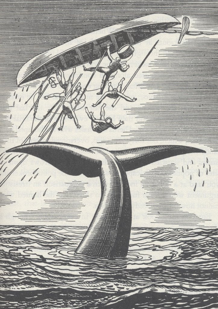


Kent had many wild adventures around the world. He hiked through jungles and over mountains. He explored islands and traveled on freighter ships. Once he attempted to sail around Cape Horn (at the southern tip of South America) in a ramshackle life boat that he bought for a few dollars. Wrote one commentator:


This region, boasting probably the world's worst climate, is buffeted incessantly by winds, swiftly alternating with rain, hail and snow. It is the legendary graveyard of ships and sailors, and Kent [had] the half-formed idea of trying his mettle against the hazardous adventure of sailing "round the Horn."
He was shipwrecked in Greenland and Alaska and lived for extended periods of time north of the Arctic Circle in desolate places like Ubekendt Ejland (Unknown Island). But his first love was painting and he painted almost every day.
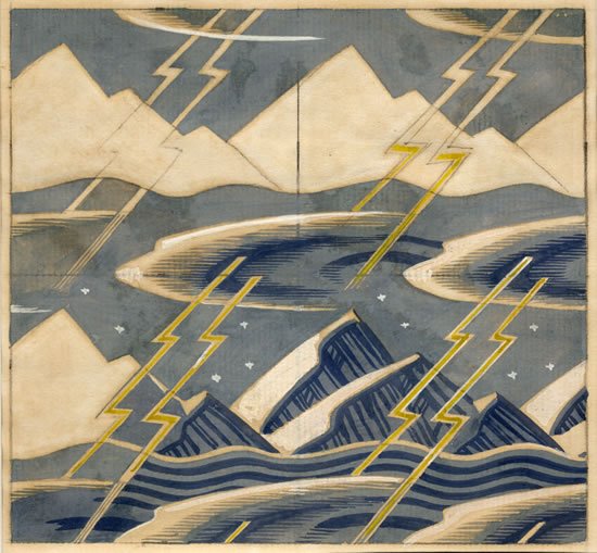


Kent's artistic mentor was the painter Abbott Thayer. While living as a guest in Thayer's house, Kent married Thayer's 17 year old niece over the objection of her family. Four months after the wedding, he resumed a love affair with an old flame. Kent went on to have torrid affairs with a variety of girlfriends while his devoted wife stayed at home and bore him five children. (When one of his girlfriends became pregnant, Kent and his wife had to sell everything they owned to pay her off.) When his fifth child was born, Kent decided that his wife's clinging ways were unbearable, so the couple divorced. Kent learned from this experience and made sure all of his future children were illegitimate. Kent's second wife, Frances, may have hoped Kent was willing to settle down because he built a dream house with her out in the country and named it "Asgaard" after the Norse home of the gods. But at the housewarming party that Kent and Frances held for their friends, Kent overheard someone planning a dangerous boat expedition to Greenland and immediately abandoned Frances and Asgaard for this new adventure. Kent did marry a third time, to a woman the age of his youngest daughter.

Kent courted these women using artwork and poetry, and he praised their beauty with great eloquence. He always felt bad (and a little surprised) when they took the news of his infidelity so hard. One former showgirl committed suicide, jumping to her death into the sea. Perhaps it would have been difficult for a wife to accompany Kent on his rugged travels. Kent recounted one particularly horrifying shipwreck in his autobiography, It's Me O Lord:


Against the hurricane that woke us, sweeping down off the lofty plateau of the inland ice... we could do nothing but... hang onto our anchor ropes. And once the anchors failed to hold, the game was up.
Kent's tiny boat capsized. He and his two companions dragged themselves to shore and trekked 36 hours over rugged terrain with no shelter before they stumbled across an Inuit fisherman. None of them spoke Inuit, yet Kent managed to negotiate food, shelter and a young Inuit native girl.


Even though Kent had no space for a wife on his journeys, he always managed to find room for his paints, brushes and canvases. Following the shipwreck mentioned above, Kent returned to salvage his art supplies and spent two months painting that "vast wonderland of sea and mountain."


I have long been fascinated by the selfishness of artists. Some artists place the demands of their art above the welfare of their family and friends. Sometimes the resulting art is so beautiful, the trade off seems worth it to those of us who aren't personally affected. But it is always difficult to draw a bright line between artists who make sacrifices to protect their art and those who are merely self centered. Through the generations, a lot of collateral damage has been caused by artists fighting for their artistic lives.

Kent lived to be 89. Despite all his advetures, he seemed to have had a wistful old age. In one of his books, he described a poem-song he had learned from the Eskimoes about an old man who remembers

old times when I had strength to cut and flay great beasts.


Three great beasts could I cut up while the sun slowly went his way across the sky.

A sick old man could no longer hope to hang onto a woman, so he wishes his

woman away in the house of another,


in the house of a man who may be her refuge, firm and sure as the strong winter ice.


Sad at heart, I wish her away in the house of a stronger protector now that I myself lack strength even to rise from where I lie.


Sunday, November 19, 2006

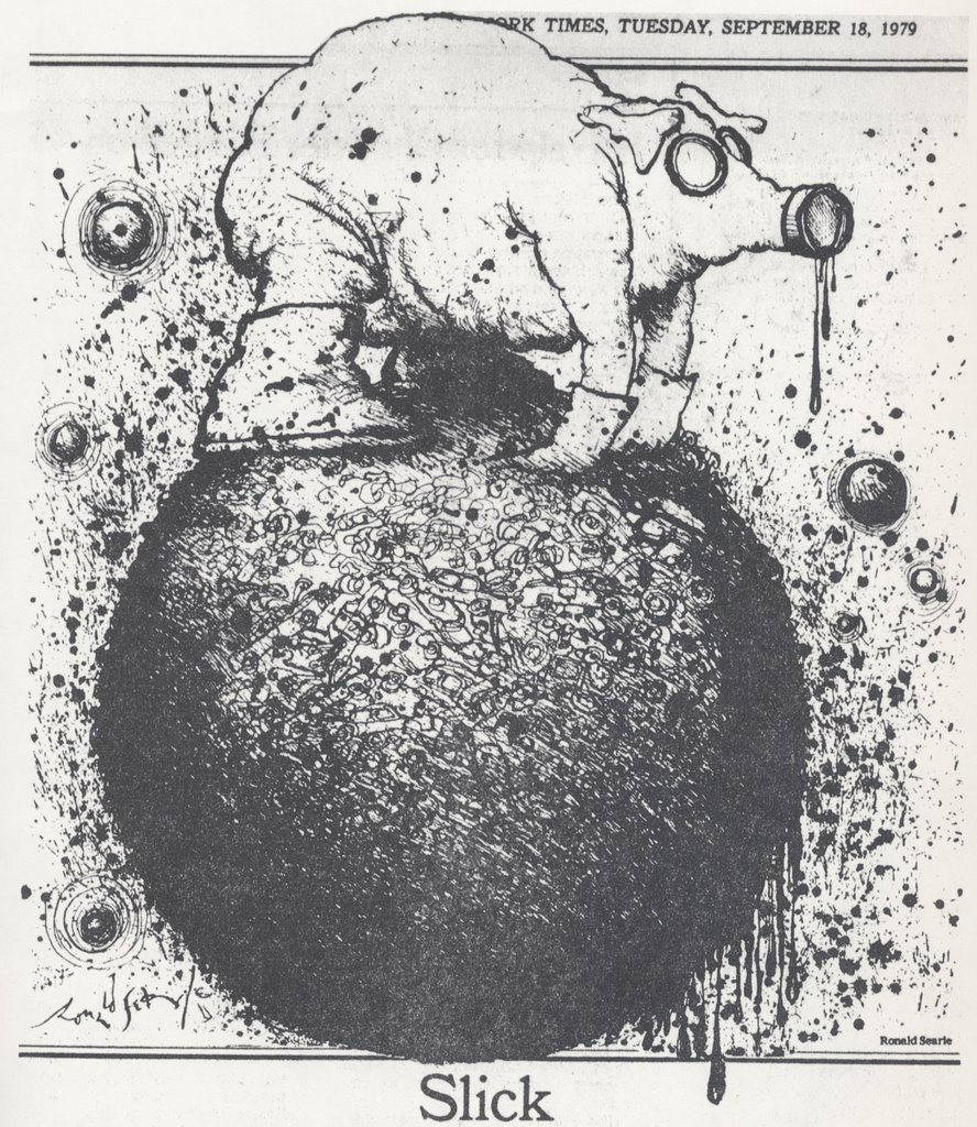
RONALD SEARLE


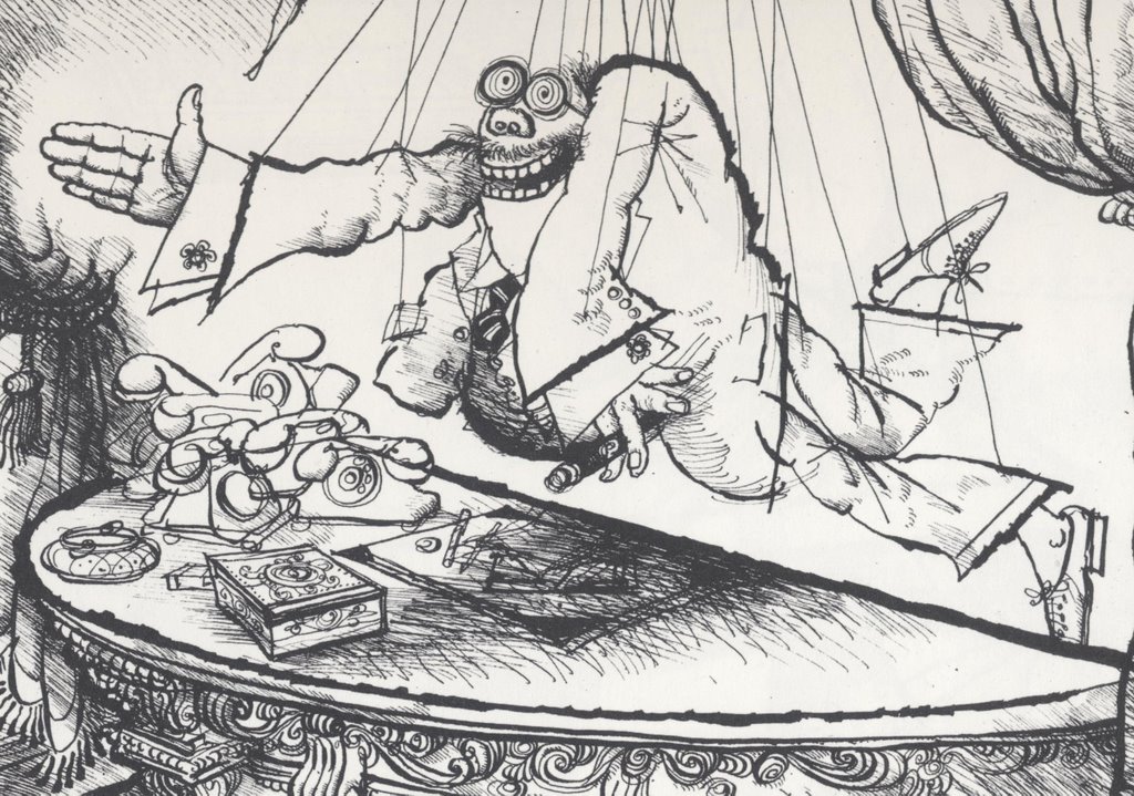
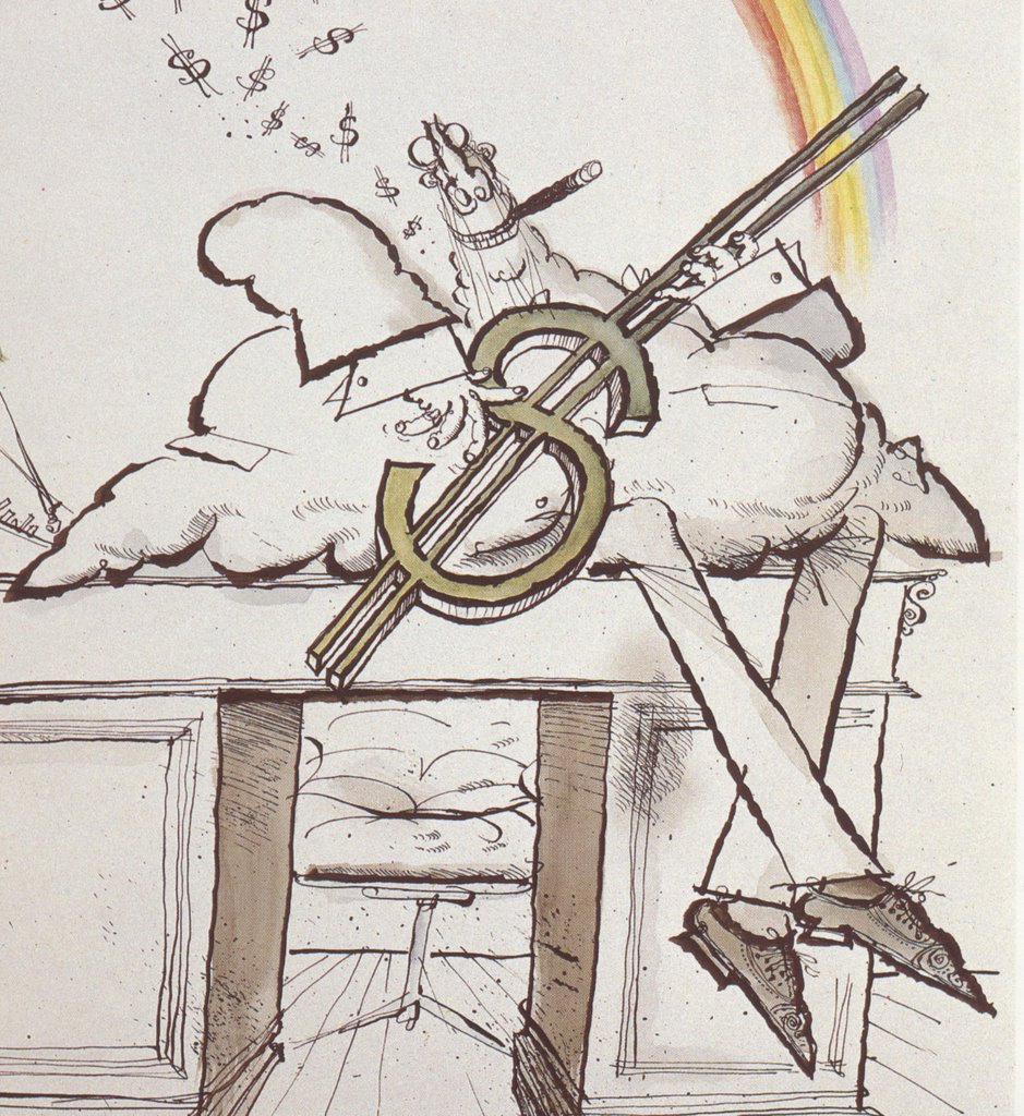
Here are the 5 things I love most about the work of the great Ronald Searle (1920 - ).


1.) He is absolutely fearless with ink: the bite and splatter of his drawing remind you how people used to draw before software was invented.


Searle makes a serious commitment with ink, one that requires not only skill but courage. His drawings have the potential to go horribly awry if Searle ends up an inch to the left or right of his goal.
2.) Searle is able to step back from familar shapes and reinvent them: It is very hard to unlearn our basic assumptions about anatomy. Most artists who try end up merely exagggerating. But look at how Searle reinvents the human form. Think it's easy? Try it yourself. Or ask Picasso.


3.) Searle draws with great visual intelligence. You can tell from his artistic solutions that there is a radiant mind at work here.


4.) Even as an old man, Searle's work is playful and humorous (with all the subversiveness that implies).


5.) Finally, I like the path Searle followed. If I drew the way Searle did when he started out as an illustrator, I would have given up and gone in search of honest work.


Yet, Searle persevered and became one of the most influential illustrators of the second half of the 20th century. You can see his strong influence on Mort Drucker, Pat Oliphant and a whole generation of pen and ink artists who followed him. What happened to transform Searle's work? Was he hit by a lightning bolt? Did he have a mystic vision in the night? No one can say for sure, but I suspect part of the answer lies in the following quote:

At the Cambridge art school it was drummed into us that we should not eat, drink or sleep without a sketchbook in the hand. Consequently the habit of looking and drawing became as natural as breathing.
Searle never stopped drawing, and over the years his powerful style gradually emerged, as natural and organic as breathing.

Saturday, November 18, 2006

WORDS AND PICTURES

[No pictures today-- I am writing from Beijing, China, far away from my art collection, my scanner and my sweetheart (hi, Nell!). But I'll be home in a few days, when I can update my blog with fewer words and lots of good pictures.]

My feeble attempts to analyze pictures using words reminds me of Flaubert's lament:
Human language is like a cracked kettle on which we beat out tunes for bears to dance to, when all the time we are longing to move the stars to pity.
Don't get me wrong-- I'm a big fan of words. They have a tough job: to tame a wild, omnidimensional universe of feelings, thoughts and sensory impressions into a straight line with punctuation and spelling. All I'm saying is that pictures manage to take me a few inches closer to Flaubert's stars than words do.

Beethoven said, "music is a higher form of revelation than philosophy," and listening to Beethoven's Piano Concerto No. 5, we surely believe him. Music is able to achieve that exalted height in part by leaving behind the limitations of words, just as the abstract part of art-- the shapes and colors and design-- leaves words behind. It is as close to music as the visual arts can come.

Call me sentimental, but I prefer illustration to abstract art precisely because illustration combines abstract visual design with those limiting, confining words that provide the content. Some people see the words part as an anchor. I see it as ballast.

Thursday, November 09, 2006

AN ARTIST

A few days ago I posted a segment on Stanley Meltzoff's paintings of ancient Greece. I always wanted to meet the artist behind those glorious paintings, but now I never will. As I was posting my blog, Mr. Meltzoff was lying ill in a hospital. Today he passed away.


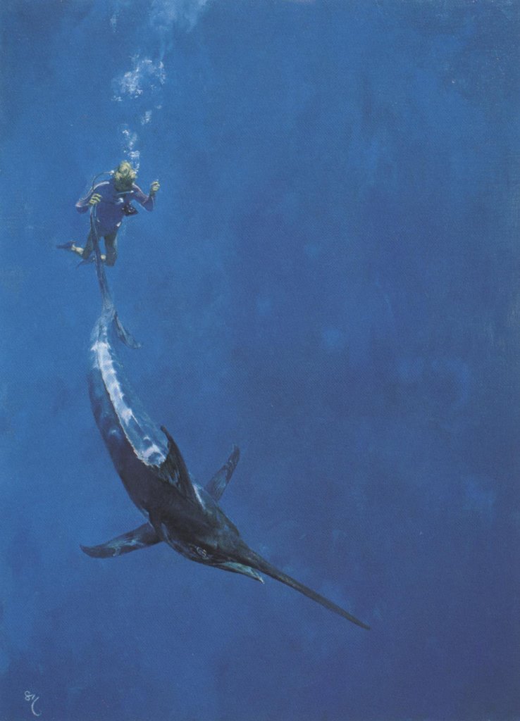
Diver's farewell to Blue Marlin by Stanley Meltzoff


Meltzoff was a gifted author, teacher and artist who painted images from science for Scientific American, historical illustrations for National Geographic and Life, and science fiction covers for a host of publishers.

Like thousands of others, I was enriched by his beautiful work. But I was most inspired by his astonishing intellectual curiosity and his deep artistic purpose. Meltzoff wrote about surviving in the years when the bottom dropped out of the illustration market:
My wife was ill, my children needed college money and I was almost 60 years old. I stood on the corner of 56th and Lexington Avenue in the rain with a soggy portfolio in my hands and improvised a sad little song about defeat, flat feet and flat broke while I tried to think of something to do.
Meltzoff responded to adversity with great artistic potency. He single handedly created a new market for paintings of seascapes and gamefish, which enabled him to combine his expertise in diving with his passion for art. In his spare time he compiled an art reliquarium and wrote a major scholarly treatise, Botticelli, Signorelli and Savanorola, Theologica Poetica from Boccacio to Poliziano. The book is a marvelous work of history, written with great lucidity, insight and humor-- the kind of epic accomplishment that would have capped an entire career for most historians. I recommend it to you.

Please join me in sending thoughts and prayers to Mr. Meltzoff's family. Irene Gallo of the Art Department blog tells me that we can look forward to a book about Meltzoff from publisher Donald Grant books. I will be first in line.

Most people who gamble on earning a living from their creativity have those moments of standing in the rain with a soggy portfolio. William Hazlitt wrote that, "In the end, all that is worth remembering of life is the poetry of it." Whatever else happened in his life, Mr. Meltzoff's gamble paid off royally. One only has to look at his art to know that his life was rich with poetry.

Saturday, November 04, 2006

MELTZOFF'S PAINTINGS OF ANCIENT GREECE


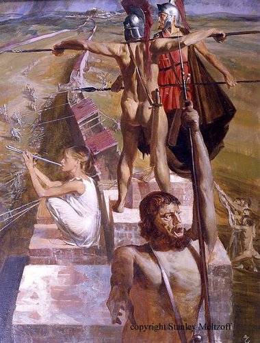
 In 1963, Life Magazine commissioned artist Stanley Meltzoff to illustrate an article about ancient Greece. The result was a set of glowing masterpieces that brought ancient Greece vividly to life.


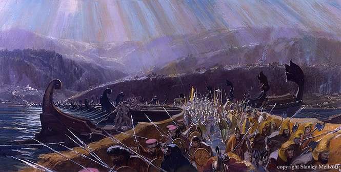
 In addition to the beauty of the images, Meltzoff labored long and hard to make his paintings historically accurate. A meticulous craftsman, he even distinguished the uniforms of the Persians from the uniforms of the Scythians and the Medes. His illustrations conveyed everything from the pathos of an a individual dying in the streets from the plague...


detail from the Plague of Athens (below)


 ...to the grand sweep of the world's largest army storming across the Hellespont to invade Greece.


 These are works of enduring value. They appeared for one brief moment in a 25 cent weekly magazine, then disappeared as Life moved on to a different topic the following week. They aren't displayed in a museum or gallery for the public to admire.


 And yet, having appeared once, they are not gone. I can personally attest that these dramatic images were seared permanently into the memories and imaginations of ten year old boys of that time. I am reproducing them here in the hope that there is another generation out there watching.

Wednesday, November 01, 2006

ABSTRACT ART: THE CONCLUSION

Art sits back, licking its chops and waiting for the next fool who believes art can be explained rationally.

I've never been that kind of fool. As far as I'm concerned, the quality of art can't be determined by the accuracy of an image or the chemical composition of the pigment. The poet W. H. Auden identified a far more reliable test:

In times of joy, all of us wish we possessed a tail we could wag.
All of this goes to say that my current diversion into the darkest depths of abstract art is not an attempt to find objective criteria for judging abstract art.

However, my personal view is that abstract art and representational illustration-- despite their obvious differences-- both deal at their core with the creation of form, and can both be judged by what
Peter Behrens called "the fundamental principles of all form creating work." These principles enable us to place all visual art on the same continuum. They give us a standard by which even abstract art can be measured. With representational art, we often achieve aesthetic qualities by starting with subjects from nature that embody these qualities, while with good abstract art the challenge is to distill these principles one additional level, to their essence.

Where do aesthetic principles come from, and how do we apply them?

Aesthetic principles such as beauty, balance, harmony and proportion don't simply spring forth on butterfly wings. They are derived from our daily interaction with the world. Our experience of nature is the fundamental starting point from which we come to understand what colors "go" well together, or how we experience effective compositions or which designs elicit certain reactions.


Not only that, but the vocabulary of value in art is the vocabulary of morality. Terms such as "beauty" and "harmony" are terms by which we order our lives as well as our paintings. These words don't offer mathematical certainty. They are subjective and imprecise, but they are central to the most important aspects of our humanity so we agree to tolerate a little ambiguity.

Some of you will object that illustration is very different from abstract or nonrepresentational art at the philosophical / political / biological / metaphysical / sexual / or religious level. Yes, all of those elements may play a role in art, but they are always embodied in aesthetic form. Only the form is essential to art.

Some of you are very irritated that abstract or nonrepresentational art is overrun with talentless pretenders who rushed to fill the vacuum when objective standards departed. This is certainly true. Only recently the New York Times published a favorable review of conceptual artist Sherrie Lansing who practices "appropriation art." Explains the review:

She re-photographed Walker Evans photographs and presented the copies as her own to question what labels like "original" and "classic"' meant, and why they were always applied to men.
To this I can only respond that an artistic theory can't be held responsible for all the clowns who subscribe to it.

Finally, some of you will object that abstract art "cheats" because there is no external point of reference by which to judge the success of the work. Non-representational artists never have to struggle to get that arm right or to solve that problem with perspective. But this only makes the job easier for bad abstract artists. The lack of an external reference point makes it harder for a good artist (and for the audience) to determine when a picture is right.

I think the abstract art that I offered before is "true" applying the standards above. It confidently applies the same kinds of form creating principles that God applied in designing the world, and it gets the images right. It creates visual images that obviously did not come from nature and yet seem organically at home in the world. It is deceptively hard to apply the aesthetic principles described above. For me, 99 percent of abstract art falls far to the left or right of the mark, but when it works, I find it credible and important and valuable.


Monday, October 23, 2006

WHATCHA GOT UNDER THAT TATTERED COAT?

[This is not my last digression into the difference between illustration and abstract art. It is probably not even my second to last digression. But take heart, because the end is definitely in sight.]
_________________________________________

The inspiration behind abstract art was bold and brilliant. As Holland Cotter wrote about the invention of cubism:
The day of pure optical pleasure was over; art had to be approached with caution and figured out. It wasn't organic, beneficent, transporting. It was a thing of cracks and sutures, odors and stings, like life. It wasn't a balm; it was an eruption. It didn't ease your path; it tripped you up.

The problem is, once artists cast off the shackles of the old standards, there was no consensus on new standards by which to determine quality. By 1918, the Russian painter Malevich, seeking the ultimate essence of painting, produced an all white canvas:


Fifty years later, the American painter Reinhardt improved on Malevich by unveiling an all black painting:


For peasants like you who might question the value of this kind of art, Reinhardt explained: "A fine artist by definition is not a commercial... or applied or useful artist. A fine, free or abstract artist is by definition not a servile or professional or meaningful artist. A fine artist has no use for use, no meaning for meaning, no need for any need." Got it?

Malevich and Reinhardt were conceptually interesting, but modern art had already turned down the path toward its current dead end. Years later, High Performance Magazine, the avant garde journal of post-modern performance art, published the following goofy article on the work of performance artist Teching Hsieh:


Since July when Hsieh announced that for a year he would not do art, look at art, speak about art or think about art , we have been unable to find out any more information.... Friends speculate that the piece grew out of the frustration he experienced trying to organize a one year torch carrying piece that required a minimum of 400 participants. Even after running full page ads in the East Village Eye and other publications, Hsieh was only able to come up with around 200 interested people, whereupon he dropped the idea and announced his "no art" piece. Fallout from the piece has been that he refuses to visit old friends because they have too much art on their walls, and avoids Linda Montano, his friend and collaborator for his last year-long piece in which they were tied together, because Montano is doing a seven year "art/life" piece in which everthing she does is declared art."

Don't believe me? Look it up. Issue no. 32

Obviously, neither Malevich nor Reinhardt nor Teching Hsieh ever read a poem by Stephen Crane (1871-1900):

If I should cast off this tattered coat,
And go free into the mighty sky;
If I should find nothing there
But a vast blue,
Echoless, ignorant--
What then?
Many artists have disrobed in the hope of consummating a relationship with the existential void, only to discover that the existential void ain't interested.

I agree with Clement Greenberg, one of the earliest supporters of abstract art, who wrote:
The nonrepresentational or abstract, if it is to have aesthetic validity, cannot be arbitrary and accidental, but must stem from obedience to some worthy constraint.

Without the constraints of subject matter, objective standards, technical skill, or even the limitations imposed by dealing with a physical object of any kind, the floodgates were opened to charlatans, profiteers and others who dilute the meaning and pedigree of art.


Next: a solution?

Wednesday, October 18, 2006

MORE ABOUT ABSTRACTION

A few of you have wondered just what the heck I was yodeling about in my last posting on abstract art.

Let's start by acknowledging that abstract art is outside the scope of this blog and outside the scope of my competence. However, I do like some abstract art. If you're willing to take a stroll with an uneducated man into a complex field, we may discover some interesting things together.

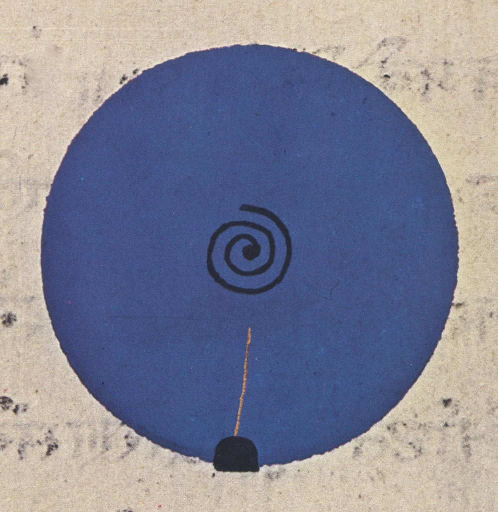
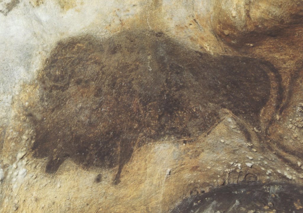
In my view, much of today's fine art scene is self-indulgent nonsense. The Museum of Modern Art in New York contains some great works of art, but the ratio of money to talent there is downright asphyxiating. Dollar for dollar, the art at the Society of Illustrators a few blocks away has more nutritional content. But there is no clear dividing line between art that illustrates a message or idea on the one hand and abstract art on the other. Here are some splendid illustrations that are not very different from the abstract paintings in my last posting:


Illustration of the descent of the divine power through a the symbolic fish-incarnation (from a 17th century Yogic manuscript).


Illustration of the evolution and dissolution of cosmic form from a 19th century Rajasthan book.


Vase painting from Athens in the 5th century BC


Cave painting circa 17,000 years ago.

Clearly, abstract art is no modern invention. It began when art began-- in the upper paleolithic period (from 35,000 to 12,000 years ago). More artistic and technological progress took place in those 25,000 years than in the previous 2 million years combined. That era saw the first explosion of symbolic (abstract) thinking and the accompanying birth of art. The designs and heavily stylized drawings scratched in the walls of ancient caves share a lot in common with today's abstract art. But unlike modern abstract art, which often seems detached and irrelevant, paleolithic art was close to the core of what it meant to be human. It was life-or-death relevant.

I have always liked Anthony Burgess' characterization:
Art is rare and sacred and hard work and there ought to be a wall of fire around it.

Abstract and conceptual art, when it is good, can satisfy that high standard. And since I've blabbered on too long today, I'll offer some thoughts next time on what "good" means to me in abstract art.

Friday, October 13, 2006

ART TO MAKE YOU YODEL

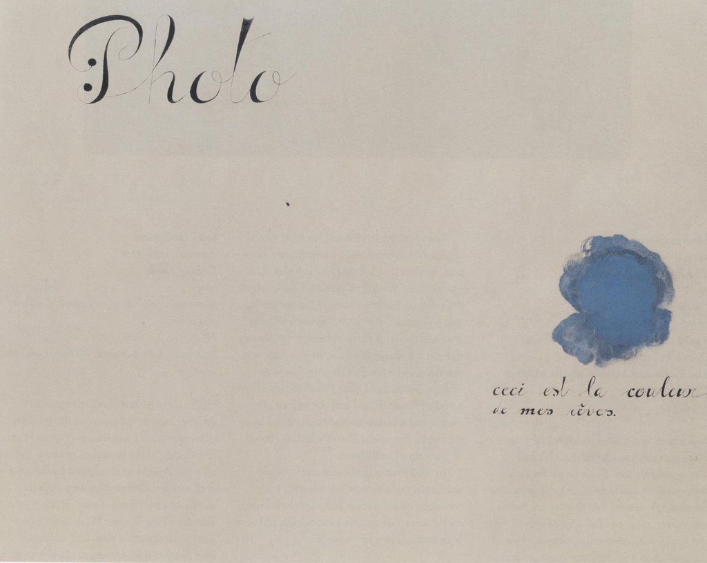
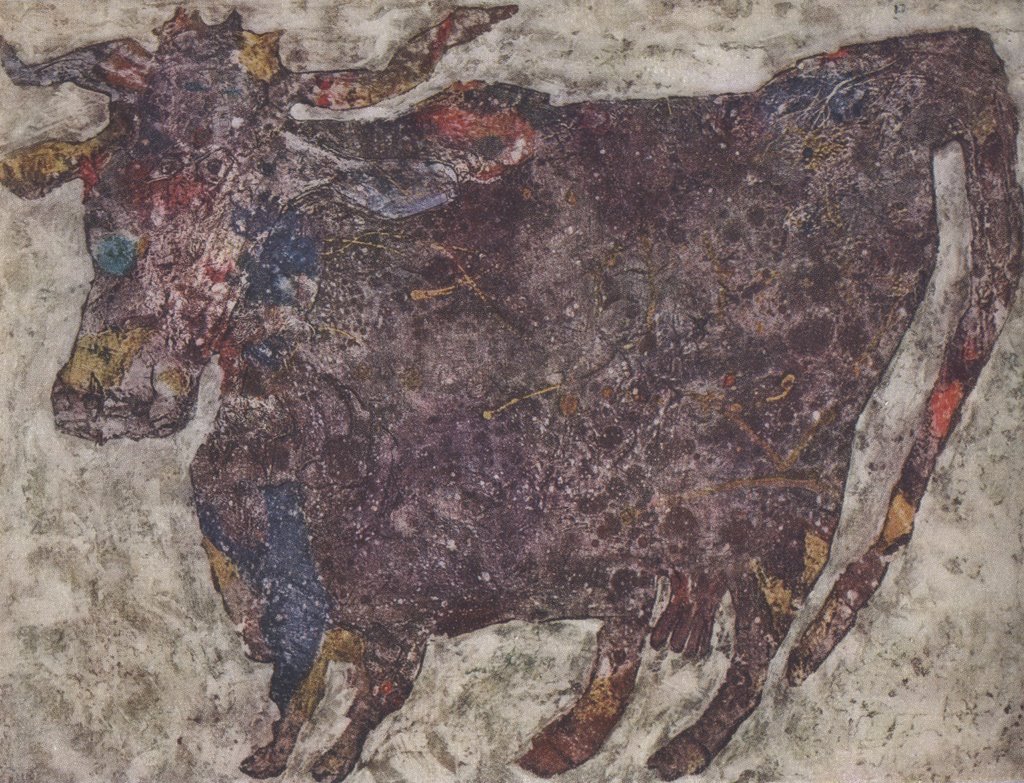
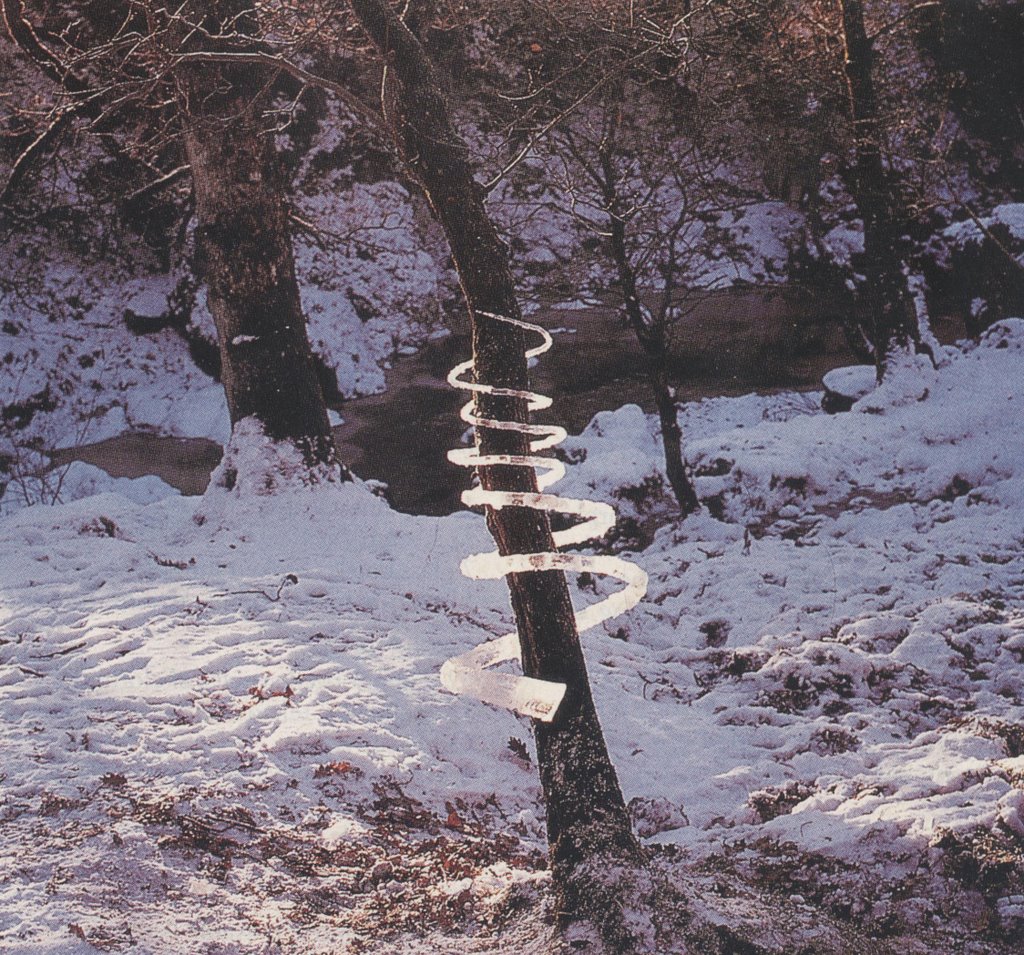
My numerous unkind remarks about modern art have led some to conclude that I am opposed to all such art. Nothing could be further from the truth. I am opposed to bad art, and it is easier for bad art to hide amongst contemporary art than amongst art that requires talent or skill. But I love lots of modern art. Here are some of my favorites. These almost set me to yodeling:


credits: the art above is by, in order, Gottlieb, Miro, Motherwell, Miro, Dubuffet, Goldsworthy


Wednesday, October 11, 2006

ONE LOVELY DRAWING, part eight


This lovely little drawing by Robert Fawcett appeared in Look Magazine in the 1960s. It was just a spot illustration, about 2 inches across. It is not likely to be reproduced ever again.

In the 1960s, illustration went wild. Innovators used psychedelic colors and bold new styles to create increasingly abstract work. Representational art was declared obsolete. Fawcett, who was trained in a rigorous traditional style, remained unperturbed. In fact, he was amused by the "misconception that abstract qualities are new to contemporary painting, whereas they have been the comparison of excellence since painting began."


Today, all those daring 1960s illustrations with the LSD-inspired paisley designs seem quaint and dated. But if you revisit this tiny little drawing by Fawcett, you will see art that is wild in a more lasting, meaningful sense.


Fawcett often drew conventional subjects using conventional media. He was known for scenes of cultured people in English libraries. But don't be fooled by his subject matter-- he drew them with a powerful, vigorous line. This little drawing is like a DNA sample of the pagan force in Fawcett's drawing. It remains far more wild and frightening today than much of the work that "revolutionaries" such as Peter Max or Bob Peak were producing with the "new freedom" of that era.

Friday, October 06, 2006

A HERO'S ROLE AWAITS THE RIGHT ARTIST


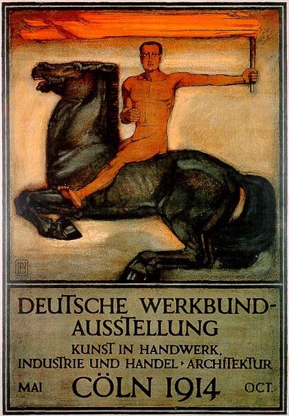
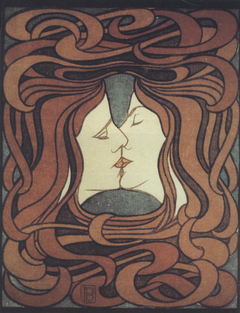
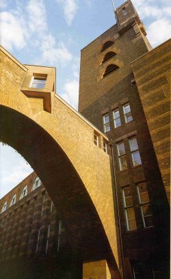
At the start of the 20th century, artists and designers were excited by the prospect of a new era filled with miraculous inventions such as telephones and cars. Science promised a world where humans could begin to create their own environment. But artists with vision recognized that there was also a danger: a man-made world could easily devolve into an industrial wasteland of purely functional objects unless artists were up to the task of creating new designs and forms suited for the machine age. Only designers could preserve beauty in an era when industrialization and mass production began to replace nature. Perhaps the greatest visionary of this period was Peter Behrens, an illustrator for the magazine Jugend, as well as a designer, architect, typographer, teacher and author. He has been called "the first industrial designer."


Behrens designed buildings, stationery, electrical appliances, silverware, typefaces, furniture and environments. He served as the design advisor to one of the world's largest manufacturing concerns, helped to found the German Association of Craftsmen and taught classes that would later become the conceptual underpinning for the Bauhaus. Most of all, he nurtured young apprentices who went on to become the titans of modern design, including Mies van der Rohe, Gropius and Le Corbusier. Behrens said he designed for the modern world by returning to "the fundamental principles of all form creating work."


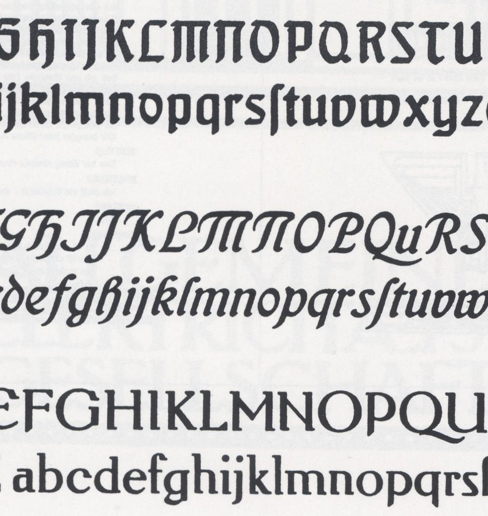
Behrens also designed several typefaces that became standards for the 20th century.


When designing type, he compared the process of the human eye reading text to

watching a bird's flight or the gallop of a horse. Both seem graceful and pleasing. But the viewer does not observe details of their form or movement. Only the rhythm of the lines is seen by the viewer, and the same is true of a typeface.
We all owe a debt to Behrens for helping to preserve a place for design in the human enterprise during the machine age.

But now the 20th century is over. Today's artists and designers face the new challenges of the 21st century. Who will be the new Peter Behrens who develops an aesthetic for the information age?

Information technology has deluged us with more data than we can assimilate-- a capability so dazzling that information has supplanted the role of wisdom or knowledge. As Karrie Jacobs noted,

Computers have seduced us into thinking about ideas-- the intangible stuff that comprises our culture, our mental universe, our homegrown organic realities-- as information. Information has become the end product, rather than the means to achieve that end.
Just as Information can overwhelm our ability to convert data into knowledge, it can overwhelm our ability to process sensory input in aesthetic form. Information streams are added one on top of the other, like ornaments on a Christmas tree.


The typical modern TV screen has a "crawl" with a message along the bottom, a "bug" identifying the station in the lower corner, and pop ups announcing the weather or the next show or the late breaking news. Anyone who has witnessed a message promoting the Gilmore Girls superimposed on the closing poignant moments of The Godfather knows that the domain of aesthetics has been overwhelmed by information. The same could be said of the cacophony of gateways to databases on websites, or even the designs appearing in many magazines. They are not integrated into our lives in an organic or intuitive way.

For those artists who feel that the glory days of art and design are behind us, here is a challenge: whoever finds the artistic vision to apply "the fundamental principles of all form creating work" to the new information age will earn our undying gratitude.


Wednesday, September 27, 2006

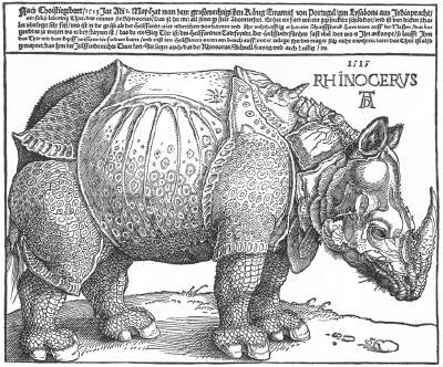
SORRY, BUT MY RHINOCEROS DROWNED

Artists are most creative when they have to explain a missed deadline or a mistake in their artwork. This honorable tradition of excuses goes back as long as there have been artists. One of the best excuses came from Durer, an early illustrator.


The year was 1515, at the dawn of the Age of Exploration. Western civilization was awakening from centuries of medieval sleep, turning from superstition to the Scientific Revolution and the Renaissance. Durer was tasked with drawing a rhinoceros but unfortunately, nobody had ever seen a rhinoceros in Europe. It was an almost mythical beast described by travelers from exotic lands.

Explorers captured a rhinoceros in the far jungles of India. They strapped the great beast into a ship and sent it back to Europe. It was on its way to Italy, a gift to Pope Leo X, when the ship went down at sea.


What could Durer do? He never got to see the rhinoceros, so in the time honored tradition of illustrators everywhere, he faked it from a description and from a sketch in a letter. His drawing (above) was inaccurate in many ways but there was no one to contradict him, so Durer's drawing established the European concept of a rhinoceros for the next 250 years.

I sometimes think about that primordial beast, plucked from its home in the jungle and carried off to a new world. It was destined to become the most famous rhinoceros in history, although that wasn't much consolation when that storm came up at sea. The ship sank, taking the poor, uncomprehending beast down to a watery grave.

Western civilization would eventually improve its technique for studying wildlife. But in 1515, when cultures didn't quite come together-- when the past didn't quite connect with the future, east didn't connect with west, faith didn't connect with rational inquiry-- there stood an illustrator astride the cultures, bridging the gap.

Saturday, September 23, 2006

THE TRIBUTE OF A SIGH

In 1748, Thomas Gray stood alone at dusk in the crumbling remains of a small cemetery in the English countryside. He thought about the generations sleeping beneath the moss-- farmers and plowmen from humble villages where fame or fortune never visited. Soon the ivy would cover the last vestiges of their time on earth.

Gray wrote a beautiful
Elegy to these "unhonored dead" who have no monuments to commemorate their lives. He reminds us:
Perhaps in this neglected spot is laid
Some heart once pregnant with celestial fire.
Their neglect, says Gray, is the way of the world:

Many a flower is born to blush unseen
And waste its sweetness on the desert air.

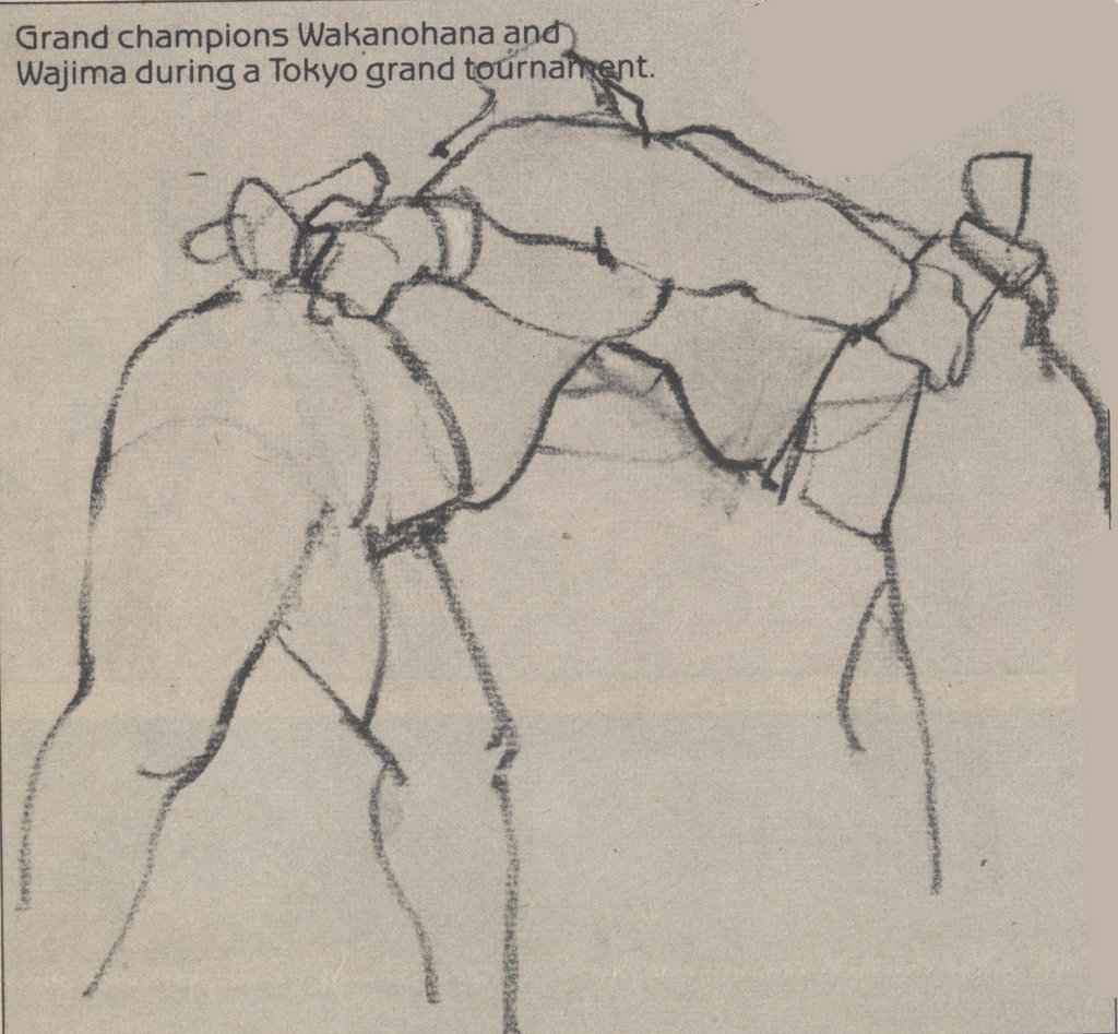
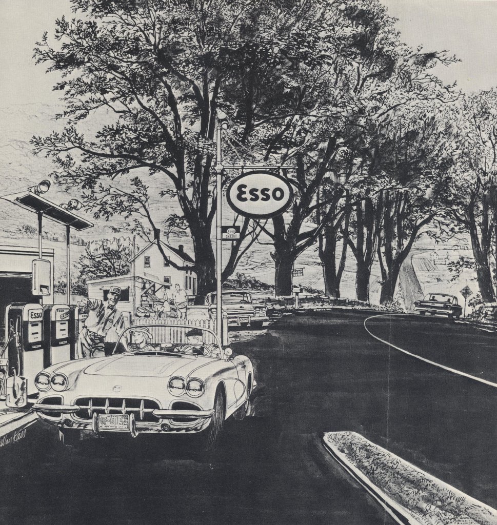
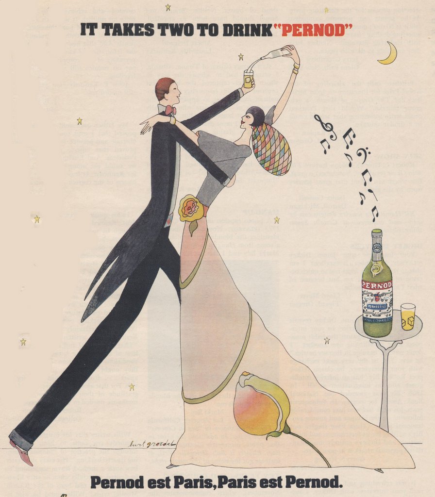
I think of Gray's elegy when I turn the yellowed pages of old magazines or newspapers and see the valiant work of thousands of now forgotten artists: staff artists for newspapers, draftsmen working in the bullpens of commerical art studios, freelancers eking out a living. Much of their art is best forgotten, but many of these artists were great. They remain anonymous today for reasons unrelated to quality-- born too soon, born too late, drank too much, or perhaps just never caught that lucky break.


Before long, these brittle pages will turn to dust. The beautiful work of these artists will be remembered for only another generation or two by their families before passing on to obscurity. I have no idea how many of these artists are still alive, or what became of them, but I am posting a token handful of commendable drawings so the internet might rescue them from undeserved obscurity.


Gray wrote that in the absence of grand memorials, those who came before us at least deserve "the passing tribute of a sigh." I agree, and this is my sigh for these and other commercial artists who labored so hard in the name of excellence.