Sunday, May 26, 2024

NUDE ART CRITICISM


When Cy Twombly's painting,  Say Goodbye, Catullus, to the Shores of Asia Minor (1994) was exhibited in Houston, a visitor to the museum was so moved by the painting that she took off her clothes and danced naked in front of it. She later wrote, “The painting makes me want to run naked."

When Clyfford Still's painting, 1975-J, went on display in Colorado...

 
... a visitor to the museum was so affected by the painting that she pulled down her pants, rubbed her bare bottom up against the painting and slid her way down to the floor (where she urinated).

I agree with their judgment that the Twombly painting is superior to the Still painting.  Nevertheless, we shouldn't overlook the fact that nude criticism suffers from some inherent ambiguities and is therefore susceptible to being misconstrued. 

For example, a young woman critiqued Gustave Courbet’s infamous 1866 painting L’origine du monde, by hoisting her dress up above her waist and sitting on the museum floor in front of the painting with her legs spread. (NSFW).


Her action may have sensitized some visitors to the oppressive colonialist patriarchy responsible for such paintings.  However, a disturbing percentage of the crowd seemed to miss the point entirely, and happily applauded or pulled out their cameras.

Perhaps for this reason, the woman felt it necessary to return to the old fashioned written word, going back to the museum to deface the painting by scrawling "Me too" on it.


Art criticism written in words has a more direct, literal meaning than symbolic nude criticism.  It eliminates a lot of ambiguity.  But of course, ambiguity can be a desirable thing when the critic is a nitwit.  


Saturday, May 18, 2024

ILLUSTRATING THE END OF THE WORLD

Once upon a time, magazines had such high budgets for illustrations that they could commission illustrators to muse about the end of the world. 

For example, Life magazine paid artist Rockwell Kent to imagine four different scenarios for the end of life on earth.  Life's editors explained that an artist's interpretations "suggest reality much more forcefully than a scientist's six-lettered formula:"


The loss of heat

The loss of gravity

Collision with a meteor


Solar flares

Coronet Magazine commissioned a similar set of speculations from illustrator Chesley Bonestell:


In the years following these illustrations, scientists discovered that the universe is expanding at an increasing pace, which points to a totally different ending.  It now seems that the universe is likely to dissipate to a state of maximum entropy-- a cold, empty void where individual subatomic particles become so spread out they will no longer be capable of sustaining life or heat.  In the distant future, form will no longer exist. 

Fortunately, today's illustrators are up to the challenge of illustrating a formless, empty void.  Some publications now substitute photographs for illustrations, but wish to imply that human creativity continues to play a role in the process.  To achieve this result, they add pointless random squiggles around the photograph.


These are excellent illustrations of the dissipation of form at the end of the world.


Friday, May 03, 2024

JOSEPH CLEMENT COLL: THE ENEMY OF CROSS HATCHING

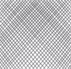
I've said some unkind things here about cross hatching-- those intersecting lines that are used to add tone to a drawing.


Artists who aspire to something higher use line more descriptively, to add dimension, contribute vitality, describe form, or make some other kind of artistic statement.  Cross hatching, like stippling, is the kind of busy work that might be delegated to an apprentice, or even replaced by zipatone.

To illustrate my point, look at what the brilliant Joseph Clement Coll did where lesser artists might have used cross hatching.


Compare the vigor in these details (blown up larger than the orignals) with the quiescence of regular cross hatching.  Even when we step back and can no longer detect these tiny details, the whole drawing remains infused with energy:


In a generation of great line artists, Coll was one of the best.


Monday, April 29, 2024

ONE LOVELY DRAWING, part 73

I love Frederic Gruger's drawing of a confrontation between a Russian princess and a group of leering Bolshevik invaders.


Gruger was famous for making paintings using nothing but a Wolff pencil, cheap cardboard and spit. (Later, he upgraded from spit to water and when he really began making money he added watercolor  wash accents.)

Gruger's illustrations were striking for his ability to achieve rich velvety tones, but he also knew how to draw with a pencil point:


Gruger expertly staged his picture with details and lighting.  Here is an artist who was firmly in control of the room.


But the feature I'd like to point out today is the faces of the mob in the background (reproduced here several times larger than the originals).

In the 1920s, without the benefit of the internet, Gruger captured the ruddy smiles of Eurasian peasants


Each of these ruffians in the front row has a distinctive face, but note that as the faces get further into the background they dissipate into abstraction.  They become shapes in a composition.


The painting on the wall in the background is another example-- rather than draw a representational image, Gruger blurs it into abstraction (with nice strong compositional shapes). 


Gruger's prioritization of elements is part of what holds this picture together so tightly, and makes Gruger an artist, not just a draftsman.


Monday, April 22, 2024

ONE LOVELY DRAWING, part 72

This drawing by James Montgomery Flagg is as confident and brash as Flagg himself.

The drawing is large-- nearly 30 inches (76 cm) and appears to have been drawn mostly from the elbow.


Like Franklin Booth, Flagg created values using numerous parallel lines:


However, unlike Booth, Flagg used bold lines, aggressively combining pen and brush.  Booth carefully planned his drawings, but you can see from Flagg's pencil lines how loose and fluid his preparations were.


This is not digital drawing.  You don't see much like it these days. 


Wednesday, April 17, 2024

ONE LOVELY DRAWING , part 71

Franklin Booth (1874-1948) learned to draw by studying wood engravings in magazines while he was growing up on a farm in Indiana.  He mistakenly thought the engravings had been created with pen and ink, and so developed his highly unusual drawing style simulating engraving lines.


I usually prefer drawings with a more direct and expressive line, as opposed to  clusters of lines used to create values.  There always seems to be more painstaking effort than necessary in Booth's drawings.  Still, when you look at extreme closeups of what Booth accomplished, you have to respect his consummate craft.  


I'm impressed that as a wrangler of all those lines,  Booth is able to maintain such control over lights and darks.  That's not easy:


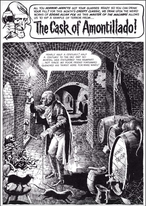
Contrast Booth's drawing with the work of other, lesser artists who let their lines get out of control: 

John Buscema, inks by Alfredo Alcala


Reed Crandall

Some fans are impressed by the sheer level of effort in drawings containing thousands of fine lines, as if the level of work gives the picture credibility.  But Booth's gift has nothing to do with making lots of scratchy little lines.  It's not the manual labor,  it's the control.